7,270 search results
(0.014 seconds)
- Contempo Elan by Poole,
$36.00Where's the party? Don't forget Contempo Elan! This stunning new font comes with it's own party ornaments. The right solution for any festive occasion, this super innovative face comes in two flavors. Contempo Elan Grand Script is a surprisingly elegant alternative to a more traditional formal script. Designed by Wesley Poole of Hawaii, this alphabet is definitely a hip script. Early reviews call this font "remarkable" and "a masterwork". Contempo Elan Ornamental is elegant and fun! Just perfect for those last minute Holiday announcements or any use that requires a classy, celebratory typeface, Contempo Elan Ornamental fits the bill. Equally at home on board the Enterprise or beckoning revelers at Mardi Gras, Contempo Elan belongs in every type library, just for fun. Party on. - Iwan Stencil by Linotype,
$40.99 Iwan Stencil is a new revival of an old display typeface. Based on type originally designed by Jan Tschichold in 1929, the style was revived by Klaus Sutter in 2008. The letterforms in this peculiar design are very high contrast; all of the thin bits are much thinner than the thick parts. They have a modern, upright axis. All in all, the creation has a bit of a Bodoni-gone-crazy touch. The thin elements are the unique part of the design that binds this face together. They almost naturally fade away in the stencil gaps (or pylons), making you wonder if you are really looking at a stencil face at all. These thins contribute greatly to the typeface's overall serif-style, making the design at least a semi serif typeface, if not a full serif one. The lowercase n, for instance, has no serifs of its own, but many of the other letters have clear ones, or serif-like terminals. A serif stencil face is a peculiar variety, especially in this day and age, but in the past they were much more common, if not the norm, The Iwan Stencil typeface has only one weight. Naturally, this is just for display. Use Iwan Stencil to cut real stencils, or only to create the effect of stenciled type in your design work. Ivan Stencil includes all of the characters that you have come to expect in a font. Just because this design was originally made in 1929 does not mean that is has a 1929 character set. Instead, it includes a 21st century, with extended European language support Jan Tschichold, who we have to thank for today's Iwan Stencil inspiration, was a man of many faces. A trained calligrapher who went on to codify the New Typography, would go on to become a teacher, a classical book designer, and the creator of the Sabon typeface. Like all young designers, he was occasionally in need of money. Before his emigration from Germany in 1933, he took on many kinds of commissions. In the late 1920s, a time full of waves of economic turmoil within Germany and across the world, he began designing a typefaces for different European companies, mostly display things like this. For a time during the mid-1920s, Jan Tschichold went by the name Iwan" "
 - Plathorn by insigne,
$24.00 Vast and untamed, the American West once stretched as free and wild as imagination itself. Still beautiful, the Wild West of long ago and the new West of today is now to be found in insigne’s new face, Plathorn. That’s right, folks. When the West called, Jeremy Dooley reached up like Pecos Bill, grabbed it by the reins and pulled it in, then using its wide, roaming elements to design this functional font that still has an unbroken spirit burning deep inside. This down right, no-nonsense, orthodox face leaves off any of that extra fancy stuff that doesn't belong on a ride. Plathorn comes with a family of cowhands as wide as the Rockies, bringing specifically tailored condensed and extended sub-families along with it too. By design, it’s not very obtrusive like its unorthodox reversed tension brethren. Leave those for the next font rodeo. This mount features barely a hint of a serif that hearkens back a hundred years or so to sign painters and package lettering artists of early twentieth century. They're sure to put the sharpness, gumption and grit you need into your copy. So grab a tall glass of Plathorn and drink in the deep taste of America’s big country. Put it in your next magazine. Put it in your brand. This typeface’s offbeat appeal is bound to bring a bit of wild U.S. to your free-spirited work.
 - Young Money by Mans Greback,
$69.00 Young Money is a script font that expresses a sense of forwardness and spontaneity. Its calligraphic strokes were created with a brush, giving it a wild and fast appearance that's perfect for conveying energy and movement. This font is ideal for sporty designs, trendy logos, and anything that requires a touch of youthful vigor. With its Bold and Italic styles, Young Money is versatile enough to be used for a variety of design purposes. The Italic style gives the font a more emphasized look, while the Bold style adds an extra level of impression and strength. The swashes included in the font allow for even more customization, giving designers the ability to create truly unique and expressive designs. Whether you're designing a logotype, poster or product brand, Young Money is a font that perfectly captures the spirit of youth and vitality. Use underscore _ after a word to make a swash. Example: Wild_ Use multiple underscores to make longer swashes. Example: Bonfires_____ Use # after any letter to make a swash version. Example: Spring#Zone# The font is built with advanced OpenType functionality and has a guaranteed top-notch quality, containing stylistic and contextual alternates, ligatures and more features; all to give you full control and customizability. It has extensive lingual support, covering all Latin-based languages, from Northern Europe to South Africa, from America to South-East Asia. It contains all characters and symbols you'll ever need, including all punctuation and numbers.
 - Sabon eText by Linotype,
$34.99 A clear and enjoyable reading experience hinges on the legibility of text copy, especially when reading on screen. This is why Monotype has developed the eText collection of fonts specifically tailored for the text-heavy display environments of e-readers, tablets, mobile devices, and the Web.
 - Amasis eText by Monotype,
$49.00A clear and enjoyable reading experience hinges on the legibility of text copy, especially when reading on screen. This is why Monotype has developed the eText collection of fonts specifically tailored for the text-heavy display environments of e-readers, tablets, mobile devices, and the Web. - Calligraphic Ornaments by ITC,
$29.99English designer Richard Bradley created the Calligraphic Ornaments symbol font for ITC in the 1990s. Drawn in a lively traditional style similar to fine calligraphy, this font's characters set the perfect holiday spirit with little teddy bears, a Santa Claus, ringing bells, holly leaves, and other charms. - Neue Helvetica eText by Linotype,
$42.99 A clear and enjoyable reading experience hinges on the legibility of text copy, especially when reading on screen. This is why Monotype has developed the eText collection of fonts specifically tailored for the text-heavy display environments of e-readers, tablets, mobile devices, and the Web.
 - Kanakira by Jetsmax Studio,
$15.00 Kanakira is a modern sans typeface that is heavy on a geometric take of the neo-grotesque model, with a special ink-trap feature. Available in 9 weights from thin to heavy, Kanakira is ready to be your “go-to” font for any kind of project.
 - Dante eText by Monotype,
$29.99 A clear and enjoyable reading experience hinges on the legibility of text copy, especially when reading on screen. This is why Monotype has developed the eText collection of fonts specifically tailored for the text-heavy display environments of e-readers, tablets, mobile devices, and the Web.
 - Flapstick by PizzaDude.dk,
$19.00 Flapstick is a straight forward and fun sans-serif font. It's 100% handmade and is ready for your "get well soon" cards, children's books, posters of all kinds and anything that needs an authentic handmade look! Multilingual support and alternate versions of a, g and y!
 - Ysobel eText by Monotype,
$99.00A clear and enjoyable reading experience hinges on the legibility of text copy, especially when reading on screen. This is why Monotype has developed the eText collection of fonts specifically tailored for the text-heavy display environments of e-readers, tablets, mobile devices, and the Web. - Adagietto by Hanoded,
$15.00 Adagietto is a musical term and means: ‘fairly slow’. I wasn’t in a rush to create this font, so the name kind of suits! Adagietto is a classic font, ideally suited for posters, book covers and product packaging - and just about everything that needs a classy look.
 - Vintage Poster JNL by Jeff Levine,
$29.00 Modeled from an example in the book “Lettering” by Harry B. Wright (1950), the poster alphabet shown was reminiscent of the kind of style used in the early 1900s by sign painters and show card artists. Vintage Poster JNL is available in both regular and oblique versions.
 - Mysteria by Juraj Chrastina,
$29.00 Stick out a mile with the Mysteria typeface and catch everyone's eye. Using a mix of its two weights helps to create stunning messages. Mysteria’s one-of-a-kind eccentric design of a display face can easily be combined with the matching body text family Gerlach Sans.
 - Palatino eText by Linotype,
$103.99 A clear and enjoyable reading experience hinges on the legibility of text copy, especially when reading on screen. This is why Monotype has developed the eText collection of fonts specifically tailored for the text-heavy display environments of e-readers, tablets, mobile devices, and the Web.
 - Linotype Didot eText by Linotype,
$50.99 A clear and enjoyable reading experience hinges on the legibility of text copy, especially when reading on screen. This is why Monotype has developed the eText collection of fonts specifically tailored for the text-heavy display environments of e-readers, tablets, mobile devices, and the Web.
 - Plumage by Wilton Foundry,
$29.00Plumage is somewhat unusual in that it has elements of calligraphy as well as script in a semi-loose form that gives it a pleasing appearance for both large and small sizes, and interesting flare finish strokes add to its unique character. As I read a dictionary description of "plumage", I realized that in many ways there is a parallel between a bird's plumage and how it is utilized in the context of writing: Plumage varies in pattern and arrangement for different purposes; what it expresses can of course be even more interesting. Plumage is disposable after a season, as new ones become available... imagine, a self-sustaining quill! - I guess that's equivalent to a refill or disposable pen. Historically, quill pens were made from feathers of a variety of birds, each chosen for its special characteristics. The sturdiest and most reliable feathers, however, come from turkeys, swans and geese. Feathers used to make pens are the stiff-spined flight feathers on the leading edge of the bird's wing. Pens for right-handed writers come from the left wing, and pens for left-handers, from the right! Each bird yields 10-12 good quills, and sometimes only 2 or 3 - so small a yield that the geese reared in England could not furnish nearly enough for local demand, and quills were imported from the Continent in large quantities. At one point St Petersburg in Russia was sending 27 million quills a year to the UK. It is said that geese were specially bred by US President Thomas Jefferson (1743-1826) to supply his own vast need for quills - in his lifetime he wrote almost 20,000 letters. The name "Plumage" was selected to pay homage to the noble birds that supplied countless quills for centuries of literary works. Plumage is recommended for any formal or informal invitation, decorations, awards, poetry, plaques, etc. We hope you will have the pleasure of using Plumage. - Well, let me paint you a word-picture of the font “Bauer,” crafted by the talented Samuel Park. Imagine, if you will, stepping into a time machine, dialing the year back to a vintage era where typewr...
- Aethelred NF by Nick's Fonts,
$10.00This unicase typeface, with alternate characters in several of the lowercase positions, is patterned after Mosaik, designed by Martin Kausche for Schriftgeißerei Stempel in 1954. A stencil treatment has been employed, and the outlines have been roughened to enhance its ancient feel. The typeface is named for a king of England, Æðelred the Unready, who ruled over a millenium ago. Unlike its namesake, this typeface is quite ready to do yeoman's duty on your next project. The Opentype, Truetype and Windows Postscript versions of this font contain both the Windows 1252/ANSI character set and the 1250/Central European character set. - Berber by Letterbox,
$50.00 Initially inspired by an untitled typeface from an old hand-lettering book, Berber has been extensively developed over two incarnations to function as a very strong and confident sans. The 2011 Berber revisions have enabled Berber to be used across longer settings as well as its more conventional use on larger applications such as signage. Berber was used as the text face for issue 46 of Eye, the graphic design journal. The typeface now features both king caps and small caps. Extensive additions to the numerals sets and complete opentype sets of international diacritics also extend its usage.
 - XPawnShop by Ingrimayne Type,
$5.00 XPawnShop is a typographical chess font; the pieces are letters. The Pawn is an awkward letter P, the knight is a horse in the shape of an h, the bishop is a decorative letter B, the rook is an elephant with an R shape, the queen is a Q, and the king is an ornate K. Two other XPawnShop fonts are made of very simple pieces, but as a bonus, both have the set of dominoes from the unicode block 1F030 to 1F093. The key layout is a bit complicated; see the key guide for detailed information on how to position pieces correctly.
 - Kingthings Lickorishe Pro by CheapProFonts,
$10.00 Kevin King says: "When I started this font it was called Pestle... It didn't run - it didn't even walk. At some point I thought, Hmm! Looks a bit like Liquorice! And now... Voila! I remember being able to buy about a yard of Liquorice rolled round a central comfit - how fab! Tuppence worth of sticky afternoon! You could also buy bundles of Liquorice root - which looked like black twigs with bright yellow wood - they left my teeth full of black twiggy bits... The past is a strange Lady - Bless her! This was almost Kingthings Leechy... just another one of my bulbous shiny things - I have always liked letter-shapes with 'bottom', probably a 70's thing, as many a seventies thing did indeed possess it - including the fabulous Chaka Kahn... Oooh, Diva!" ALL fonts from CheapProFonts have very extensive language support: They contain some unusual diacritic letters (some of which are contained in the Latin Extended-B Unicode block) supporting: Cornish, Filipino (Tagalog), Guarani, Luxembourgian, Malagasy, Romanian, Ulithian and Welsh. They also contain all glyphs in the Latin Extended-A Unicode block (which among others cover the Central European and Baltic areas) supporting: Afrikaans, Belarusian (Lacinka), Bosnian, Catalan, Chichewa, Croatian, Czech, Dutch, Esperanto, Greenlandic, Hungarian, Kashubian, Kurdish (Kurmanji), Latvian, Lithuanian, Maltese, Maori, Polish, Saami (Inari), Saami (North), Serbian (latin), Slovak(ian), Slovene, Sorbian (Lower), Sorbian (Upper), Turkish and Turkmen. And they of course contain all the usual "western" glyphs supporting: Albanian, Basque, Breton, Chamorro, Danish, Estonian, Faroese, Finnish, French, Frisian, Galican, German, Icelandic, Indonesian, Irish (Gaelic), Italian, Northern Sotho, Norwegian, Occitan, Portuguese, Rhaeto-Romance, Sami (Lule), Sami (South), Scots (Gaelic), Spanish, Swedish, Tswana, Walloon and Yapese.
 - Bauer Bodoni by Linotype,
$45.99 Giambattista Bodoni (1740-1813) was called the King of Printers; he was a prolific type designer, a masterful engraver of punches and the most widely admired printer of his time. His books and typefaces were created during the 45 years he was the director of the fine press and publishing house of the Duke of Parma in Italy. He produced the best of what are known as "modern" style types, basing them on the finest writing of his time. Modern types represented the ultimate typographic development of the late eighteenth and early nineteenth centuries. They have characteristics quite different from the types that preceded them; such as extreme vertical stress, fine hairlines contrasted by bold main strokes, and very subtle, almost non-existent bracketing of sharply defined hairline serifs. Bodoni saw this style as beautiful and harmonious-the natural result of writing done with a well-cut pen, and the look was fashionable and admired. Other punchcutters, such as the Didot family (1689-1853) in France, and J. E. Walbaum (1768-1839) in Germany made their own versions of the modern faces. Even though some nineteenth century critics turned up their noses and called such types shattering and chilly, today the Bodoni moderns are seen in much the same light as they were in his own time. When used with care, the Bodoni types are both romantic and elegant, with a presence that adds tasteful sparkle to headlines and advertising. The Bauer Bodoni was done by Heinrich Jost for Bauer Typefoundry in 1927. This version has finer details of the original Bodoni types. It works well for headlines, logos, advertising.
 - Fab by Canada Type,
$24.95 It's 1984 and everything has sideburns. Shoulder-padded "dress for success" is in, with power suits for women, black and white layers for men, neon brights for the youngsters. Maggie's "enemy within" and "no society" speeches preface the arrival of shopping malls and corporate status symbols. The economy is a philosophy and accountants carry ambiguous but very sophisticated-sounding titles. Thousands of words and expressions are reduced to initials or monosyllabic sounds. Synthesizers are very refined and the music is very catchy. The Macintosh and MTV are making waves. Brands are lifestyles. "Yuppy," Yummy," "Bobo," "Dinky" and "Woopie" are standard consumer categories in advertising lingo. The Volkswagen identity, only 5 years old now, is all the rage in design. VAG Rundschrift, by all appearances a rounded and slightly condensed Futura, is everywhere. Tube design is king. Fast forward two dozen years. Replay, but bigger and much louder. Fab. Let's dance. Fab is Canada Type's tribute to the Eighties. It's a five-font unicase family that brings tube design into the 21st century. The main font is an all-in-one treatment of the shiny roundness that the 1980s were. Fab White is a tightly packed thick outline font that conveys luscious contentedness like nothing else. The Fab Trio package is very useful for layered and colorful design, with the Black style serving as a backdrop, the Bold style as the front forms, and the Fill style for inlining. Fab comes in all popular formats and contains support for Western, Central and Eastern European languages, as well as Baltic, Esperanto, Maltese, Turkish and Celtic/Welsh languages.
 - Airport Cyr - Unknown license

- Flat10 Art Deco by Dharma Type,
$14.99 This 8-bit pixel font is designed with respect for 80s game designers and the pixel font pioneers in middle 90s. Use at size 10 pixels or multiples of 10 and anti-alias off is recommended. List of our Pixel Font Project. ·Flat10 Antique ·Flat10 Artdeco ·Flat10 Arts&Crafts ·Flat10 fraktur ·Flat10 Holy ·Flat10 Holly ·Flat10 Segments ·Flat10 Stencil ·Flat20 Gothic ·Flat20 Headline ·Flat20 Hippies ·Flat20 Streamer ·Behrensmeyer Vigesimals ·Civilite Vigesimals
 - Suburban Collier by Paula Minelgaite,
$80.00 Suburban Collier is a dreamy, humanist demi-serif sister of Romford Stencil typeface. It was created during the COVID-19 pandemic and its name is inspired by Collier Row, a suburban area of Romford, East London (UK). Suburban Collier features subtle ligatures, an alternative ‘a’ and supports Western, Central, Southern, and Eastern European as well as Pinyin. Use it to add character to your body copy or as fancy display text.
 - DF Etalage Script by Dutchfonts,
$33.00 Etalage Script was drawn for the first time in the year 2000, based on a early 20th century lettering stencil with what farmer Boelema at Lalleweer stenciled his grainsacks. Eventually the script letter was developed as a typeface with a wink to the ‘lost’ display types for the ‘display window’ of graphic designer Ariënne Boelens, who in exchange made the website www.lalleweer.nl. What originated the Ariënne should be evident now.
 - You are Superb by DainType,
$15.00 Nicely scribbled script font. It has a masculine, wild and wild mood. It also has a feeling of being torn. It is good when you want to use a lively atmosphere because of the fast flow of strokes. It is good to use when you want a cool and striking design such as a bromide for a rock festival, an album cover for music, a beer package, or a beer logo.
 - NATRON by Posterizer KG,
$25.00 NATRON is rounded and condensed sans serif typeface, designed for tight-fitting text. Supports Latin and Cyrillic codepages for Western, East and Central European, and Baltic countries. The NATRON family has two weights, medium and bold, and a collection of thematic adapted pictograms (for food product packaging and textile industry). This typeface has been designed for all type of visual communication projects and especially for labels and packaging and accompanying declarations.
 - Flat20 Streamer by Dharma Type,
$1.00 This 8-bit pixel font is designed with respect for 80s game designers and the pixel font pioneers in middle 90s. Use at size 10 pixels or multiples of 10 and anti-alias off is recommended. List of our Pixel Font Project. ·Flat10 Antique ·Flat10 Artdeco ·Flat10 Arts&Crafts ·Flat10 fraktur ·Flat10 Holy ·Flat10 Holly ·Flat10 Segments ·Flat10 Stencil ·Flat20 Gothic ·Flat20 Headline ·Flat20 Hippies ·Flat20 Streamer ·Behrensmeyer Vigesimals ·Civilite Vigesimals
 - Temporal by E-phemera,
$20.00Temporal is one in a series of fonts designed for use in creating replica vintage newspapers. It is inspired by the nameplates of major metropolitan newspapers from the 1920s. Its rough character is apparent at headline sizes, and it remains nicely legible at small sizes. In addition to a complete international character set, it contains east and west coast variations for some letters, along with extra ligatures traditional for blackletter typesetting. - Carrot and Strawberry by HIRO.std,
$17.00 Carrot and Strawberry is a Playful Serif Font. This font describes about fun, cute, easy going, and easy to use. FEATURES - Support Opentype Features - Support Ligatures - Numbering and Punctuations - PUA Encoded Characters - Multilingual Support - Works on PC or Mac USE Carrot and Strawberry works great in craft, any product packaging, book, logotype, magazine, editorial, quotes and any projects that need all about cute and fun taste. Enjoy using! Thanks. HIRO.std
 - Magical Source by Java Pep,
$19.00 Introducing Magical Source is a stylish serif font, every character uppercase and lowercase have alternates font. This font is equipped with more than 200 alternative fonts so you can mix and match every alternate based on your taste. This font still outstanding look, although you don't switch on the alternate. Magical Source font is a versatile font, the font can covering to headlines, titles, logotype, branding, pull quotes & monograms, and etc.
 - Flat10 Antique by Dharma Type,
$9.99 This 8-bit pixel font is designed with respect for 80s game designers and the pixel font pioneers in middle 90s. Use at size 10 pixels or multiples of 10 with anti-alias off is recommended. List of our Pixel Font Project. ·Flat10 Antique ·Flat10 Artdeco ·Flat10 Arts&Crafts ·Flat10 fraktur ·Flat10 Holy ·Flat10 Holly ·Flat10 Segments ·Flat10 Stencil ·Flat20 Gothic ·Flat20 Headline ·Flat20 Hippies ·Flat20 Streamer ·Behrensmeyer Vigesimals ·Civilite Vigesimals
 - Tapas by Fenotype,
$20.00 Tapas is a delicious multi type family with a little something for everyone's tastes and needs. The family consists of four distinct members that share same traits but communicate different aspects. Together they’ll create a bold and effortless mix of various flavors and accents. Naturally, the fonts can be used individually too. Use the Tapas type family in packaging, branding or editorial – wherever some delicious flavors are needed.
 - Flat20 Hippies by Dharma Type,
$14.99 This 8-bit pixel font is designed with respect for 80’s game designers and the pixel font pioneers in middle 90’s. Recommended use at 20 pixels or multiples of 20 and anti-alias off. List of our Pixel Font Project. ·Flat10 Antique ·Flat10 Artdeco ·Flat10 Arts&Crafts ·Flat10 fraktur ·Flat10 Holy ·Flat10 Holly ·Flat10 Segments ·Flat10 Stencil ·Flat20 Gothic ·Flat20 Headline ·Flat20 Hippies ·Flat20 Streamer ·Behrensmeyer Vigesimals ·Civilite Vigesimals
 - Suchow by Scriptorium,
$12.00Suchow was developed from a hand lettered storybook title by Willy Pogany. It's designed to give the feel of the Far East, with character shapes reminiscent of oriental brush lettering. The look of the characters is typical of lettering often used around the turn of the century for oriental-themed advertising and decoration, but not seen very often in contemporary use. The full version includes an expanded character set. - Monokind Script by Putracetol,
$32.00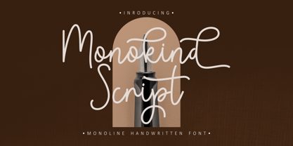 Monokind Script is a elegant monoline handwritten font. A handwritten with elegant style make this font looks natural and perfect for any projects that need handwriting taste. Come with open type feature with a lot of alternates, it's help you to make great lettering. Monokind Script perfect for signature, quote, branding, wedding invite and card, elegant logo, poster, packaging, stationery, website, and many more. This font also support mulilanguage.
