7,269 search results
(0.045 seconds)
- Barnsley Gothic by Red Rooster Collection,
$60.00 Barnsley Gothic is a condensed sans serif font family. It was designed by Steve Jackaman (ITF) in 2017. It was developed alongside its sister font family, Steelplate Gothic Pro, and includes support for Latin 1 and Central/Eastern European languages. The family is named after the town of Barnsley, a coal mining town in Yorkshire, England. In 1960, there were roughly seventy collieries within a fifteen-mile radius of Barnsley town center, however the last of these closed in 1994. Barnsley Gothic has a straightforward, industrious, no-nonsense feel, much like the town it shares a name with. Always ready to do the heavy lifting in any design project, Barnsley Gothic is the quintessential workhorse font family.
 - Snoopy Snails NF by Nick's Fonts,
$10.00Duck! There’s a cream pie headed your way! This wild and wacky face is based on the title card lettering for the original Soupy Sales TV show, a lasting testament to my misspent youth. Both versions of this font contain the complete Unicode Latin A character complement, with support for the Afrikaans, Albanian, Basque, Bosnian, Breton, Catalan, Croatian, Czech, Danish, Dutch, English, Esperanto, Estonian, Faroese, Fijian, Finnish, Flemish, French, Frisian, German, Greenlandic, Hawaiian, Hungarian, Icelandic, Indonesian, Irish, Italian, Latin, Latvian, Lithuanian, Malay, Maltese, Maori, Moldavan, Norwegian, Polish, Portuguese, Provençal, Rhaeto-Romanic, Romanian, Romany, Sámi, Samoan, Scottish Gaelic, Serbian, Slovak, Slovenian, Spanish, Swahili, Swedish, Tagalog, Turkish and Welsh languages, as well as discretionary ligatures and extended fractions. - Maxim by profonts,
$39.99Splendor was originally produced and released in 1930 by Schriftgu� AG, Dresden. The typeface was designed by Berlin designer Wilhelm Berg. Ralph M. Unger, who in the last few years has created a whole series of revivals and redesigns from the hot metal era, ?retrieved? this jewel of a typeface design, redesigning, complementing and digitally remastering it for profonts. Splendor is a broad nip, non-connecting handwriting script of timeless elegance, charm and beauty. It needs tight setting with plenty of space around it. The font contains a number of alternate characters: Two uppercase As, Ss (with descender); in addition, two uppercase Ms, Ns and Zs as well as two lowercase zs. - Rough The Type by Tour De Force,
$15.00 Dusan "Dustin" Jelesijevic wanted to make a font that would be "scary" and "serious" at the same time. Wanna-be-horror and punk-rock-out-of-beers typeface's style invites all interest minors and adults to use this fonts for miscellaneous rebel-yeah situations. For example, if you like to protest in a public against Tour De Force font foundry, please write transparencies using this font, it will hurt us bad. Just don't hack our site with message written in Rough the Type. If you write with West European characters, love being nerdy and to kick some schmucks in the brain, Rough the Type is at your service. And remember - I know what font you used last summer!!!
 - Josephine by Scholtz Fonts,
$25.00Josephine, named for Josephine Baker, the legendary dancer of the 1930s, is a twenty first century sans serif typeface that harks back to the earlier part of last century. Although very modern, it has been greatly influenced by the many art deco fonts produced during the twenties and thirties of the twentieth century.In it I have tried to capture the art deco spirit in a modern humanist font. Josephine is exceptionally readable and yet completely characteristic of the Art Deco period. It can be used for text passages as well as display in posters, advertising, labels and packaging. It is professionally finished and contains all upper and lower case characters as well as all special characters, punctuation and symbols. - Bosten by Letteralle,
$23.00 Introducing the perfect addition to your design! Bold and masculine font! Bosten is specifically designed to make a strong impact, whether you're creating headlines or crafting brand messaging. With its sleek and powerful lines, this font is sure to grab your audience's attention and leave a lasting impression. Crafted with care, this font is not only visually stunning, but also incredibly easy to use. It's compatible with all major design software, making it the perfect addition to any designer's toolkit. Whether you're creating marketing materials, designing a website, logo design, packaging, ads, clothing, merch, etc, Bosten is the perfect choice. So why wait? Take your branding to the next level with this powerful font today! Thank You!
 - Arial Unicode by Monotype,
$208.99Arial was designed for Monotype in 1982 by Robin Nicholas and Patricia Saunders. A contemporary sans serif design, Arial contains more humanist characteristics than many of its predecessors and as such is more in tune with the mood of the last decades of the twentieth century. The overall treatment of curves is softer and fuller than in most industrial style sans serif faces. Terminal strokes are cut on the diagonal which helps to give the face a less mechanical appearance. Arial is an extremely versatile family of typefaces which can be used with equal success for text setting in reports, presentations, magazines etc, and for display use in newspapers, advertising and promotions. - Mikaila Signature by IbraCreative,
$14.00 Mikaila Signature is an exquisite and aesthetic font that epitomizes elegance and grace. Inspired by the beauty of a personalized signature, each letter in Mikaila Signature flows effortlessly with a delicate and sophisticated touch. With its refined strokes and precise curves, this typeface exudes a sense of timeless allure, making it ideal for luxury branding, high-end invitations, and sophisticated editorial layouts. Mikaila Signature adds an air of exclusivity and sophistication to any design, capturing attention and leaving a lasting impression. Whether used for elegant logos or refined product packaging, this font exudes an aura of class and finesse, making it the quintessential choice for those seeking an aesthetic signature font that exudes impeccable style.
 - Arial Paneuropean by Monotype,
$92.99Arial was designed for Monotype in 1982 by Robin Nicholas and Patricia Saunders. A contemporary sans serif design, Arial contains more humanist characteristics than many of its predecessors and as such is more in tune with the mood of the last decades of the twentieth century. The overall treatment of curves is softer and fuller than in most industrial style sans serif faces. Terminal strokes are cut on the diagonal which helps to give the face a less mechanical appearance. Arial is an extremely versatile family of typefaces which can be used with equal success for text setting in reports, presentations, magazines etc, and for display use in newspapers, advertising and promotions. - Quadon by René Bieder,
$25.00 Quadon was designed to fill the gap between traditional serifs and the lasting trend of using sans serif fonts for contemporary design. The result is a modern, clear and infinitely flexible interpretation of slab serif fonts. The open shapes and a large x-height keep the font legible in small sizes while the short descender supports the compact heart and strength of a slab serif. Quadon has a wide range of typographic features and alternative glyphs to create your own and unique version of it. It comes in nine different weights with matching italics. From the sensitive but sharp thinner weights to the punchy and powerful heavy weights, Quadon is well-suited for a wide range of versatile tasks.
 - Nahual Claw by Rodrigo Navarro Bolado,
$32.00 From the depths of an antique civilization is born "Nahual" inspired by my ancestral Prehispanic Culture, with traits that allows it to mimetize itself, hours of painstaking dirty work with the only goal to show all it knows we want to see, to finally give the Jaguar "Serifclaw" attack. This is a display fontface, it comes in two types, "Claw" basically the text font, and "Copete" that are the construction pieces for every single glyph of the entire font, this last also has the negative spaces of some glyphs (a, e, o, A, B, O, for example) I include them but I prefer the font without them. Comments are welcome! rodrigonabo@gmail.com
 - László by Just My Type,
$20.00 We count three inspirations for the László font family. The upper case was inspired by Yomar Augusto’s amazing font Unity, used on last year’s German World Cup Team jerseys; the lower case from a few letters a poster for a Bauhaus show. The name László is an homage to László Moholy-Nagy, peerless Bauhaus designer and teacher. The László type family is stripped down to the typographic core, lean, clean and definitely machined, at home in either a formal or casual setting, i.e. you can take László anywhere. Inspired by watching the World Cup and the German Team’s jerseys. Very clean, simple, Bauhaus-style design, European and highly legible. Usage recommendations Automobile ads, anywhere a European feel is desired.
 - Splendor by profonts,
$41.99 Splendor was originally produced and released in 1930 by Schriftgu� AG, Dresden. The typeface was designed by Berlin designer Wilhelm Berg. Ralph M. Unger, who in the last few years has created a whole series of revivals and redesigns from the hot metal era, ?retrieved? this jewel of a typeface design, redesigning, complementing and digitally remastering it for profonts. Splendor is a broad nip, non-connecting handwriting script of timeless elegance, charm and beauty. It needs tight setting with plenty of space around it. The font contains a number of alternate characters: Two uppercase As, Ss (with descender); in addition, two uppercase Ms, Ns and Zs as well as two lowercase zs.
 - Guadalupana by JVB Fonts,
$30.00 On October 12th 1976 a new basilica was inaugurated in honor and in gratitude to the Patron Saint, the Virgin of Guadalupe, loved by the Mexican people. This basilica was designed by the Mexican architect Pedro Ramírez Vázquez (died on April 16th 2012). It stands out by its hug spacious interior, generously decorated with bronze elements. The aesthetic value of these items even includes many signs and text inscriptions in a particular typeface and style, of which this font is a reinterpretation. The purpose of this project is to revival this eclesiastical written letter forms in bronze and taking them to digital format. I was inspired to this on my last trip to Mexico in September of 2012.
 - Coleface by Roy Cole,
$34.00 Coleface was created by the British typographer Roy Cole, completed shortly before his death in 2012. It comprises six fonts: Coleface 30, 60, 90 and the italics 33, 66, 99. As with his earlier typeface families - Lina, Zeta and Colophon - Coleface is a highly-readable sans serif typeface that offers significant flexibility in terms of its potential uses. Roy Cole studied typographic design under the tutelage of Emil Ruder at the Gewerbeschule in Basel, at a time when typographic history was being made through the creation of a style that epitomized modernity. Consequently the principles of order, simplicity and legibility, fused with experimentation, became a hallmark of his practice, as exemplified in his last font Coleface.
 - My Left Hand by Breauhare,
$35.00 My Left Hand is exactly what it is...well, not my actual flesh-and-blood left hand but my actual handwriting, and I know that it really is My Left Hand because people tell me all the time, "You're left-handed!" When I hear people say that, it always reassures me that I am left-handed, in case I am ever doubtful about it. Five of the last eight U.S. presidents have been left-handed, so we're in good company, no matter which political party you're a fan of. This font has an appealing rough look at large sizes, but at smaller sizes it looks smooth as silk. Digitized by John Bomparte.
 - Albollón by Salsipuedes,
$16.00 In the last years our society has change a lot. Nowadays cities and countries are no longer static territories with well-drawn borders and a population perfectly defined. Globalization is a fact and the best consequence of it is the mixture of races, ideas and cultures, and this is exactly what this typography aims to show. Albollón is at once a semi-serif and a semi-sans serif typeface; it is a mixture made with the best parts from both sides. This way is how I understand a healthy society and a healthy design too. Albollón is designed to work in all types of text, both long and shorts, big and small ones.
 - Thwaites by Eyad Al-Samman,
$20.00 ‘Thwaites’ typeface is fully dedicated to one of my best Canadian friends who I do cherish and value highly. This great and industrious Canadian friend is ‘James Douglas Thwaites’ who lives along with his good-natured family in British Columbia, Canada. For me, James is like a source of inspiration and I do consider him as an ideal in my life. Our strong friendship has started since 1999 and I hope that it will endure just to the last moment of my life. Sometimes I see him as the writer and poet that I learn a lot from, sometimes I see him as a devoted religious minister that I try to understand more about his teachings, and other times I see him as the educator that I strive to imitate verbatim in my life. When I want to talk more about this Canadian friend, I will not be able to give him his due in full. Thus, I will instead mention some excerpts of his biography that he wrote himself saying that: “James D. Thwaites is a self-accomplished man. Having worked in various fields including restaurant management and cleaning, he has achieved his goals of being a full-time teacher, past-time writer, and volunteer religious minister for the Christian Congregation of Jehovah's Witnesses. His personal and academic pursuits have led him to be published in various magazines, newspapers, self-published books, and websites, including his now defunct ‘poetryofthemonth.com’ website. He continues to learn and augment the craft of writing while working primarily in early literacy and delayed literacy learners, teaching reading and literature to a wide age range of students. He views his religious endeavors as an extension of his academic ones. He teaches others both as a public speaker and in one-on-one situations, teaching about the benefits of submission to God and to His teachings. His future goals include expanding his ministry and continuing his writing.” The name ‘Thwaites’ itself comes from Great Britain and originated from the last Viking raids upon England, being an Anglicized version of a Scandinavian term meaning—depending on the source material—either "a place that is difficult to approach" or "a small thicket of trees." Another recitation mentions that ‘Thwaites’ can be described also as an English surname but one of pre 7th century Norse-Viking origins. It may be either topographical or locational, and is derived from the word "thveit", meaning a clearing or farm. As a locational surname it originates from any one of the various places called "Thwaite", found in several parts of Northern England and East Anglia to the south. The various modern spelling forms include Thwaite, Thwaites, Thwaytes, Thoytes, Twaite, Twatt, Twaites, Tweats and Twite. The name, although often appearing unique to outsiders, can often be found within other famous names like Braithwaite, Goldthwaites, or Misslethwaites. With various spellings, some families not including the ‘e’ or the ‘s’ at the end, Thwaites and its derivations—although not exceedingly common—is a name found worldwide. ‘Thwaites’ typeface is simply a sans-serif streamlined, stylish, and versatile font. It is designed using a combination of thick and thin strokes for its +585 characters. Its character set supports nearly most of the Central, Eastern, and Western European languages using Latin scripts including the Irish language. The typeface is appropriate for any type of typographic and graphic designs in web, print, and other media. It is also absolutely preferable to be used in the wide fields related to publication, press, services, and production industries. It can create a very impressive impact when used in headlines, posters, titles, products’ surfaces, logos, medical packages, product and corporate branding, and also signage. It has also both of lining and old-style numerals which makes it more suitable for any printing or designing purposes. ‘Thwaites’ typeface is really the cannot-miss choice for anyone who wants to possess unique artistic and modern designs produced using this streamlined typeface.
 - Youre Gone by Typodermic,
$11.95 Typography is the art of crafting letters and shaping language, and for designers, selecting the right font is crucial. Every typeface has its unique personality and can evoke different emotions, which is why selecting the right one for your project is essential. With that in mind, we introduce to you the You’re Gone typeface—a true gem in the world of typography. This rounded techno typeface with an industrial vibe from the 1980s is the perfect way to add a unique, technical edge to your message. Its dauntless strokes and mellow, rounded edges create an industrial look with a contemporary twist, making it the ideal choice for designers looking for something fresh and modern. With its distinct, detached letterforms, You’re Gone is perfect for capturing attention and leaving a lasting impression. This typeface is ideal for all kinds of design projects, from branding and packaging to websites and social media graphics. Its bold, techno look is perfect for businesses in the technology, manufacturing, and industrial sectors. You’re Gone is a versatile typeface that can be used in a variety of ways. Its rounded edges and thick strokes create a distinctive and memorable look, while its technical vibe adds a sense of professionalism and expertise to your message. It’s the perfect way to stand out in a crowded marketplace and make a bold statement with your design. Overall, if you’re looking for a typeface that combines industrial vibes with a contemporary twist, then You’re Gone is the perfect choice. With its bold, rounded strokes and detached letterforms, it’s sure to make a lasting impression and give your message the edge it needs to stand out. Most Latin-based European writing systems are supported, including the following languages. Afaan Oromo, Afar, Afrikaans, Albanian, Alsatian, Aromanian, Aymara, Bashkir (Latin), Basque, Belarusian (Latin), Bemba, Bikol, Bosnian, Breton, Cape Verdean, Creole, Catalan, Cebuano, Chamorro, Chavacano, Chichewa, Crimean Tatar (Latin), Croatian, Czech, Danish, Dawan, Dholuo, Dutch, English, Estonian, Faroese, Fijian, Filipino, Finnish, French, Frisian, Friulian, Gagauz (Latin), Galician, Ganda, Genoese, German, Greenlandic, Guadeloupean Creole, Haitian Creole, Hawaiian, Hiligaynon, Hungarian, Icelandic, Ilocano, Indonesian, Irish, Italian, Jamaican, Kaqchikel, Karakalpak (Latin), Kashubian, Kikongo, Kinyarwanda, Kirundi, Kurdish (Latin), Latvian, Lithuanian, Lombard, Low Saxon, Luxembourgish, Maasai, Makhuwa, Malay, Maltese, Māori, Moldovan, Montenegrin, Ndebele, Neapolitan, Norwegian, Novial, Occitan, Ossetian (Latin), Papiamento, Piedmontese, Polish, Portuguese, Quechua, Rarotongan, Romanian, Romansh, Sami, Sango, Saramaccan, Sardinian, Scottish Gaelic, Serbian (Latin), Shona, Sicilian, Silesian, Slovak, Slovenian, Somali, Sorbian, Sotho, Spanish, Swahili, Swazi, Swedish, Tagalog, Tahitian, Tetum, Tongan, Tshiluba, Tsonga, Tswana, Tumbuka, Turkish, Turkmen (Latin), Tuvaluan, Uzbek (Latin), Venetian, Vepsian, Võro, Walloon, Waray-Waray, Wayuu, Welsh, Wolof, Xhosa, Yapese, Zapotec Zulu and Zuni.
 - Chubs by Type.p,
$24.00 "Chubs," a typeface specifically designed for large display sizes, perfect for making a bold statement. Each letter in Chubs has been meticulously crafted to possess a thick and prominent appearance, ensuring that your designs leave a lasting impact on viewers. Chubs's distinctive weight and blackness make it an ideal choice for a wide range of applications, including posters, packaging, and logos. Whether you want to create eye-catching promotional materials or design a powerful brand identity, Chubs has got you covered. Within the Chubs typeface family, you'll find two distinct styles, each with its own personality and visual appeal. The first style, "Chubs Black," features letters with a captivating slit, reminiscent of a belly that overlaps. This distinctive groove adds an extra layer of visual interest and uniqueness to your designs. On the other hand, "Chubs Filled" offers a solid and plump appearance, without the characteristic slit. This style amplifies the chubby nature of the letters, resulting in a bold and impactful display. To further enhance your creative options, both styles within the Chubs family include an alternate character set featuring a wink shadow in every letter. These additional characters provide a touch of fanciness and playfulness, allowing you to experiment and add unique elements to your designs. Choose "Chubs" for your next big project, and witness the boldness and charm that sets your designs apart from the rest. Let Chubs bring your ideas to life and make a powerful visual statement that captures attention and leaves a lasting impression.
 - Rolie Twily by Jolicia Type,
$25.00 Introducing Rolie Twily, a font that effortlessly combines the elements of display and decorative styles to bring you a unique typographic experience. This font exudes an aura of Curly Elegant Modernity that is sure to make your designs stand out and leave a lasting impression. Key Features: Display and Decorative Fusion: Rolie Twily seamlessly blends the characteristics of display and decorative fonts, resulting in a versatile typeface that can be used for a wide range of creative projects. Curly Elegance: The graceful and whimsical curls in Rolie Twily's letterforms add a touch of sophistication and elegance to your text, making it perfect for invitations, posters, and branding materials where a touch of luxury is desired. Modern Aesthetic: While rooted in tradition, Rolie Twily maintains a contemporary edge, making it ideal for modern design trends. Its clean design ensure that your message remains clear and stylish. Versatile Usage: Whether you're designing wedding invitations, packaging, social media graphics, or any creative project, Rolie Twily brings a sense of charm and refinement to your typography. Attention-Grabbing: The unique and eye-catching nature of Rolie Twily ensures that your content won't go unnoticed. It's a font that demands attention and leaves a lasting impression. Rolie Twily is the perfect choice when you want to infuse your designs with a touch of Curly Elegant Modernity. Elevate your creative projects and make them truly memorable with this exceptional font. Download Rolie Twily today and watch your designs flourish with a newfound sense of style and sophistication.
 - Odeon by Scriptorium,
$12.00Odeon is the kind of font you would have seen on theatre or concert posters around the turn of the twentieth century. It is based on Art Nouveau sign lettering and has a heavy, playful look that's hard to miss. - Hay Scary by HandletterYean,
$13.00 This is a Halloween-themed font. Its style will make your creativity stands out in your designs. Feel free to use it on any kind of creative design, and cherish your Halloween with this font to make it more festive.
 - Wapstina Love by VType,
$18.00 Wapstina Love is a modern duo font that combines stylish calligraphy with a classic serif font. It comes with one-of-a-kind ligature, making it an ideal font for your blog, logo, social media, branding, poster, quotes, wedding cards etc.
 - Mahaputra by Putracetol,
$14.00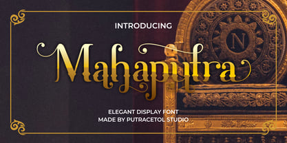 Mahaputra is a vintage display font that is classic, elegant, and unique. Mahaputra is great for any kind of display purpose from logos, t-shirt, apparel, quotes, product packaging, tittle headers, posters, merchandise, social media, labels, branding and greeting cards.
 - Space Captain by Patria Ari,
$15.00Space Captain is a modern all caps font with uniquely sharp and geometric shapes. Alternative wing shapes in the left and right in alphabet included in stylistic alternates. This font perfect for logotype such as technology, construction, automotive, heavyweight, etc. - Tenderfoot by FontMesa,
$20.00This font definitely reflects the name: Tenderfoot sort of gives that Home Sweet Home feeling. No, the little cowpoke on the pony isn't me, a close friend was kind enough to let me use his childhood photo for this font. - Tower by Fenotype,
$19.95 Tower was originally created as a school assignment at the University of Industrial Art & Design Helsinki in 2006. Tower is an experimental dingbat font. Try writing different kind of towers: set font size and leading the same and start experimenting!
 - CA Prologue by Cape Arcona Type Foundry,
$19.00 Prologue was designed to look like a postmodern typewriter. With plain and simple upper cases and trickier lower cases. Three weights give a good variety for all kinds of designs and seem especially well made for headlines and short teasers.
 - Antartida Rounded Essential by Los Andes,
$18.00 Antartida Rounded Essential is a sans serif with rounded terminals. Its simple, kind of neutral feeling is functional, clean and minimal; its rounded terminals make it friendly and warm. It is a family of 4 fonts: 2 weights and their italics.
 - Monster by Fenotype,
$19.95 Monster was originally created as a school assignment at the University of Industrial Art & Design Helsinki in 2006. Monster is an experimental dingbat font. Try writing different kind of monsters: set font size and leading the same and start experimenting!
 - Nosy Note by PizzaDude.dk,
$16.00 Nosy Notes is originally handdrawn, but I digitally traced my sketches and the result is this font - a smooth, super steady and legible comic font. I've added multilingual support, in order for you to be nosy in all kinds of languages! :)
 - Eisha Script by Jorsecreative,
$22.00 The Eisha is a modern, handwritten calligraphic font with a sophisticated flow. It’s perfect for branding, wedding invitations, diaries, cups, mugs and greeting cards. Eisha has a smooth texture, so it will be perfect for all kinds of printing techniques.
 - Freundschafts-Antiqua AR by ARTypes,
$35.00Freundschafts-Antiqua AR is based on a 20th-century German type design. Freundschafts-Antiqua (which was also called Chinesische Antiqua) was designed by the Chinese calligrapher Yü Bing-nan when he was a student at the Hochschule für Grafik und Buchkunst at Leipzig in 1960. It was cast in 1964 by VEB Typoart, Dresden, in 9-pt and 28-pt (Didot). The design combines the best German traditions with the Chinese bamboo pen. It is a unique, wholly modern, yet quiet and dignified typeface which is well suited for text-setting in many sizes. The original design was carefully crafted with all non-kerning letters (none of the letters overhangs its side-bearings); the lower-case f was designed so that no ligatures were needed. The AR fonts include the type's ch and ck logotypes, monetary signs and all the standard accents. The letterfit of the original design is retained and, as can be seen in the attached printable .pdf, text composed at normal sizes is very agreeable indeed. Freundschafts-Kursiv AR A features old-style (non-lining) figures and 'kerning' letters; Freundschafts-Kursiv AR B contains lining (cap-height) figures and all non-kerning letters following the original design of the face. - Arkaim by Dima Pole,
$22.00 Arkaim is a modern typeface in traditional East-Slavic and GreatRussian style in typography. This style is not like any other style in the world. It combines elegance and brevity, depth and modernity, originality and convenience. This unique font is certainly eye-catching. Arkaim font is named after the ancient Slavic-Aryan city located in the South of Russia, which is a symbol of antiquity, wisdom, as well as the unexplored ancient world. Arkaim is not only a historical place, but also a place of Spiritual power. The font Arkaim has many Opentype features that will help to create interesting and unique compositions. An interesting and non-trivial solution is a kind of mixture of all caps and upper/lowercase characters. Arkaim contains symbols of all Slavic and European languages. There are fractions, superscripts and subscripts, and many others. There is a standard number and the old-style number, also Slavic numbers. There are all the historical characters Of the ancient Slavic script called Bukvitsa, today mistakenly called Cyrillic. In addition, here is a free demo font (only with Russian, Belarusian, Ukrainian, Bulgarian, Macedonian and Serbian characters) without Opentype features and other symbols. You can try it.. and love it.
 - Webdings Windows compatible by Microsoft Corporation,Webdings™ is a symbol font designed in 1997 as a response to the need of Web designers for a fast and easy method of incorporating graphics in their pages. Webdings contains a wide variety of Web-related images of the kind found in common use across the Web, as well as some more unusual drawings. User Interface icons suitable for creating page navigation elements are also included. Webdings is ideal for enriching the appearance of a Web page. Because it is a font, it can be installed on the user's system, (or embedded in the document itself) is fully scaleable and quick to render. It's a perfect way of including graphics on your site without making users wait for lots of graphic files to download. Each Webding has been fine-tuned to ensure high quality and clarity on the screen, regardless of the complexity of the individual symbol. Character Set: Picture/Symbol This version of Webdings is the licensable equivalent to the font versions coming preinstalled with Microsoft Windows® since version 8. It is identical regarding font name, language coverage and other font behaviour and is perfect for document exchange with machines that are not running the Windows® operating system.
- Abduction IV - Unknown license

- Office Stamps JNL by Jeff Levine,
$29.00Office Stamps JNL is a collection of twenty-six images recreating the familiar 'stock' rubber stamps used in offices for decades before self-inking stamps and desktop printing made them relics of the past. Modeled from vintage sources, all of the images have been re-drawn by Jeff Levine to have a crisper look than simply utilizing scanned imprints of old marking devices. - Summer Safari JNL by Jeff Levine,
$29.00 Inspired by an image of a 1960s rock and roll concert poster for “The Beach Boys Summer Safari”, this typeface captures the casual, informal lettering of the main headline and makes it available digitally. Evoking sunny days of fast cars, pretty girls and riding the waves, the playfully hand lettered Summer Safari JNL is available in both regular and oblique versions.
 - Molaka by Maulana Creative,
$12.00 Molaka Modern Script Font consisting of a fashionable sophisticated signature-style script with it's own unique curves and an elegant inky flow. Molaka Modern Script Font is perfect for branding projects, logo, wedding designs, social media posts, advertisements, product packaging, product designs, label, photography, watermark, invitation, stationery and any projects that need handwriting taste. Thanks for use this font, MaulanaCreative
