8,429 search results
(0.024 seconds)
- Boo Meringue NF by Nick's Fonts,
$10.00The inspiration for this font made its first appearance in the 1897 American Type Founders specimen book, under the name "Lithotint". As the name suggests, the original was tinted gray (diagonal lines formed the body); this version is solid and spooky, too. The font contains a few ghostly graphics, including ghosts at the bracket positions, a haunted house at the backslash position, and a scary backdrop at the ASCII tilde and ASCII circumflex positions. Both versions of the font include 1252 Latin, 1250 CE (with localization for Romanian and Moldovan). - Nd Tupa Nova by Notdef Type,
$29.00 Tupã is a Brazilian indigienous god of thunder. This typeface is a geometric Sans Serif based on vertical and diagonal strokes. The heavy weights are great for impact layouts and the light weights are perfect to make sutil and strong messages. Tupã has a wide character set, including Cyrillic, with Small Caps, Ligatures, regular and tabular numbers and a lot of alternates. This Font is great for tight leading, including when diacritics are involved, there are alternates and case sensitives symbols to make all blocked. And yes!, there's a Variable Font too.
 - Haverj by ParaType,
$30.00 An original typeface designed for ParaType in 2004 by Armenian designer Manvel Shmavonyan. Based on the lettering created in 1970s by outstanding Armenian type designer Henrik Mnatsakanyan (1923-2001) of the same name. In Armenian ‘Haverj’ means ‘Eternally’. The face resembles many regular text serif fonts but elements like serifs and terminals make it eccentric and a little bit funny. The shape of diagonal legs in capital K and R resembles book lettering of the 1950s—60s. Using it in text, advertising and display typography may lead to surprising effects.
 - Stenzilla by DarezD,
$13.00 Stenzilla is a stencil font based on a rounded sans serif, a careful design, with cuts on the same diagonal axis for the curved strokes and elegant slight curves on the oblique strokes. Useful for branding, highlighted paragraphs, signs, headlines, or reading text. The design incorporates characters from the Cyrillic alphabet, special characters, and characters with diacritical marks. It has the versatility of a sans serif that allows it to be used in a wide variety of designs and styles along with the cut-stroke grace of a stencil font.
 - Times New Roman PS Cyrillic by Monotype,
$67.99In 1931, The Times of London commissioned a new text type design from Stanley Morison and the Monotype Corporation, after Morison had written an article criticizing The Times for being badly printed and typographically behind the times. The new design was supervised by Stanley Morison and drawn by Victor Lardent, an artist from the advertising department of The Times. Morison used an older typeface, Plantin, as the basis for his design, but made revisions for legibility and economy of space (always important concerns for newspapers). As the old type used by the newspaper had been called Times Old Roman," Morison's revision became "Times New Roman." The Times of London debuted the new typeface in October 1932, and after one year the design was released for commercial sale. The Linotype version, called simply "Times," was optimized for line-casting technology, though the differences in the basic design are subtle. The typeface was very successful for the Times of London, which used a higher grade of newsprint than most newspapers. The better, whiter paper enhanced the new typeface's high degree of contrast and sharp serifs, and created a sparkling, modern look. In 1972, Walter Tracy designed Times Europa for The Times of London. This was a sturdier version, and it was needed to hold up to the newest demands of newspaper printing: faster presses and cheaper paper. In the United States, the Times font family has enjoyed popularity as a magazine and book type since the 1940s. Times continues to be very popular around the world because of its versatility and readability. And because it is a standard font on most computers and digital printers, it has become universally familiar as the office workhorse. Times?, Times? Europa, and Times New Roman? are sure bets for proposals, annual reports, office correspondence, magazines, and newspapers. Linotype offers many versions of this font: Times? is the universal version of Times, used formerly as the matrices for the Linotype hot metal line-casting machines. The basic four weights of roman, italic, bold and bold italic are standard fonts on most printers. There are also small caps, Old style Figures, phonetic characters, and Central European characters. Times? Ten is the version specially designed for smaller text (12 point and below); its characters are wider and the hairlines are a little stronger. Times Ten has many weights for Latin typography, as well as several weights for Central European, Cyrillic, and Greek typesetting. Times? Eighteen is the headline version, ideal for point sizes of 18 and larger. The characters are subtly condensed and the hairlines are finer." - Times New Roman Seven by Monotype,
$67.99In 1931, The Times of London commissioned a new text type design from Stanley Morison and the Monotype Corporation, after Morison had written an article criticizing The Times for being badly printed and typographically behind the times. The new design was supervised by Stanley Morison and drawn by Victor Lardent, an artist from the advertising department of The Times. Morison used an older typeface, Plantin, as the basis for his design, but made revisions for legibility and economy of space (always important concerns for newspapers). As the old type used by the newspaper had been called Times Old Roman," Morison's revision became "Times New Roman." The Times of London debuted the new typeface in October 1932, and after one year the design was released for commercial sale. The Linotype version, called simply "Times," was optimized for line-casting technology, though the differences in the basic design are subtle. The typeface was very successful for the Times of London, which used a higher grade of newsprint than most newspapers. The better, whiter paper enhanced the new typeface's high degree of contrast and sharp serifs, and created a sparkling, modern look. In 1972, Walter Tracy designed Times Europa for The Times of London. This was a sturdier version, and it was needed to hold up to the newest demands of newspaper printing: faster presses and cheaper paper. In the United States, the Times font family has enjoyed popularity as a magazine and book type since the 1940s. Times continues to be very popular around the world because of its versatility and readability. And because it is a standard font on most computers and digital printers, it has become universally familiar as the office workhorse. Times?, Times? Europa, and Times New Roman? are sure bets for proposals, annual reports, office correspondence, magazines, and newspapers. Linotype offers many versions of this font: Times? is the universal version of Times, used formerly as the matrices for the Linotype hot metal line-casting machines. The basic four weights of roman, italic, bold and bold italic are standard fonts on most printers. There are also small caps, Old style Figures, phonetic characters, and Central European characters. Times? Ten is the version specially designed for smaller text (12 point and below); its characters are wider and the hairlines are a little stronger. Times Ten has many weights for Latin typography, as well as several weights for Central European, Cyrillic, and Greek typesetting. Times? Eighteen is the headline version, ideal for point sizes of 18 and larger. The characters are subtly condensed and the hairlines are finer." - Times New Roman WGL by Monotype,
$67.99 In 1931, The Times of London commissioned a new text type design from Stanley Morison and the Monotype Corporation, after Morison had written an article criticizing The Times for being badly printed and typographically behind the times. The new design was supervised by Stanley Morison and drawn by Victor Lardent, an artist from the advertising department of The Times. Morison used an older typeface, Plantin, as the basis for his design, but made revisions for legibility and economy of space (always important concerns for newspapers). As the old type used by the newspaper had been called Times Old Roman," Morison's revision became "Times New Roman." The Times of London debuted the new typeface in October 1932, and after one year the design was released for commercial sale. The Linotype version, called simply "Times," was optimized for line-casting technology, though the differences in the basic design are subtle. The typeface was very successful for the Times of London, which used a higher grade of newsprint than most newspapers. The better, whiter paper enhanced the new typeface's high degree of contrast and sharp serifs, and created a sparkling, modern look. In 1972, Walter Tracy designed Times Europa for The Times of London. This was a sturdier version, and it was needed to hold up to the newest demands of newspaper printing: faster presses and cheaper paper. In the United States, the Times font family has enjoyed popularity as a magazine and book type since the 1940s. Times continues to be very popular around the world because of its versatility and readability. And because it is a standard font on most computers and digital printers, it has become universally familiar as the office workhorse. Times?, Times? Europa, and Times New Roman? are sure bets for proposals, annual reports, office correspondence, magazines, and newspapers. Linotype offers many versions of this font: Times? is the universal version of Times, used formerly as the matrices for the Linotype hot metal line-casting machines. The basic four weights of roman, italic, bold and bold italic are standard fonts on most printers. There are also small caps, Old style Figures, phonetic characters, and Central European characters. Times? Ten is the version specially designed for smaller text (12 point and below); its characters are wider and the hairlines are a little stronger. Times Ten has many weights for Latin typography, as well as several weights for Central European, Cyrillic, and Greek typesetting. Times? Eighteen is the headline version, ideal for point sizes of 18 and larger. The characters are subtly condensed and the hairlines are finer."
 - Times New Roman by Monotype,
$67.99 In 1931, The Times of London commissioned a new text type design from Stanley Morison and the Monotype Corporation, after Morison had written an article criticizing The Times for being badly printed and typographically behind the times. The new design was supervised by Stanley Morison and drawn by Victor Lardent, an artist from the advertising department of The Times. Morison used an older typeface, Plantin, as the basis for his design, but made revisions for legibility and economy of space (always important concerns for newspapers). As the old type used by the newspaper had been called Times Old Roman," Morison's revision became "Times New Roman." The Times of London debuted the new typeface in October 1932, and after one year the design was released for commercial sale. The Linotype version, called simply "Times," was optimized for line-casting technology, though the differences in the basic design are subtle. The typeface was very successful for the Times of London, which used a higher grade of newsprint than most newspapers. The better, whiter paper enhanced the new typeface's high degree of contrast and sharp serifs, and created a sparkling, modern look. In 1972, Walter Tracy designed Times Europa for The Times of London. This was a sturdier version, and it was needed to hold up to the newest demands of newspaper printing: faster presses and cheaper paper. In the United States, the Times font family has enjoyed popularity as a magazine and book type since the 1940s. Times continues to be very popular around the world because of its versatility and readability. And because it is a standard font on most computers and digital printers, it has become universally familiar as the office workhorse. Times?, Times? Europa, and Times New Roman? are sure bets for proposals, annual reports, office correspondence, magazines, and newspapers. Linotype offers many versions of this font: Times? is the universal version of Times, used formerly as the matrices for the Linotype hot metal line-casting machines. The basic four weights of roman, italic, bold and bold italic are standard fonts on most printers. There are also small caps, Old style Figures, phonetic characters, and Central European characters. Times? Ten is the version specially designed for smaller text (12 point and below); its characters are wider and the hairlines are a little stronger. Times Ten has many weights for Latin typography, as well as several weights for Central European, Cyrillic, and Greek typesetting. Times? Eighteen is the headline version, ideal for point sizes of 18 and larger. The characters are subtly condensed and the hairlines are finer."
 - Times New Roman Small Text by Monotype,
$67.99In 1931, The Times of London commissioned a new text type design from Stanley Morison and the Monotype Corporation, after Morison had written an article criticizing The Times for being badly printed and typographically behind the times. The new design was supervised by Stanley Morison and drawn by Victor Lardent, an artist from the advertising department of The Times. Morison used an older typeface, Plantin, as the basis for his design, but made revisions for legibility and economy of space (always important concerns for newspapers). As the old type used by the newspaper had been called Times Old Roman," Morison's revision became "Times New Roman." The Times of London debuted the new typeface in October 1932, and after one year the design was released for commercial sale. The Linotype version, called simply "Times," was optimized for line-casting technology, though the differences in the basic design are subtle. The typeface was very successful for the Times of London, which used a higher grade of newsprint than most newspapers. The better, whiter paper enhanced the new typeface's high degree of contrast and sharp serifs, and created a sparkling, modern look. In 1972, Walter Tracy designed Times Europa for The Times of London. This was a sturdier version, and it was needed to hold up to the newest demands of newspaper printing: faster presses and cheaper paper. In the United States, the Times font family has enjoyed popularity as a magazine and book type since the 1940s. Times continues to be very popular around the world because of its versatility and readability. And because it is a standard font on most computers and digital printers, it has become universally familiar as the office workhorse. Times?, Times? Europa, and Times New Roman? are sure bets for proposals, annual reports, office correspondence, magazines, and newspapers. Linotype offers many versions of this font: Times? is the universal version of Times, used formerly as the matrices for the Linotype hot metal line-casting machines. The basic four weights of roman, italic, bold and bold italic are standard fonts on most printers. There are also small caps, Old style Figures, phonetic characters, and Central European characters. Times? Ten is the version specially designed for smaller text (12 point and below); its characters are wider and the hairlines are a little stronger. Times Ten has many weights for Latin typography, as well as several weights for Central European, Cyrillic, and Greek typesetting. Times? Eighteen is the headline version, ideal for point sizes of 18 and larger. The characters are subtly condensed and the hairlines are finer." - Times New Roman PS Greek by Monotype,
$67.99In 1931, The Times of London commissioned a new text type design from Stanley Morison and the Monotype Corporation, after Morison had written an article criticizing The Times for being badly printed and typographically behind the times. The new design was supervised by Stanley Morison and drawn by Victor Lardent, an artist from the advertising department of The Times. Morison used an older typeface, Plantin, as the basis for his design, but made revisions for legibility and economy of space (always important concerns for newspapers). As the old type used by the newspaper had been called Times Old Roman," Morison's revision became "Times New Roman." The Times of London debuted the new typeface in October 1932, and after one year the design was released for commercial sale. The Linotype version, called simply "Times," was optimized for line-casting technology, though the differences in the basic design are subtle. The typeface was very successful for the Times of London, which used a higher grade of newsprint than most newspapers. The better, whiter paper enhanced the new typeface's high degree of contrast and sharp serifs, and created a sparkling, modern look. In 1972, Walter Tracy designed Times Europa for The Times of London. This was a sturdier version, and it was needed to hold up to the newest demands of newspaper printing: faster presses and cheaper paper. In the United States, the Times font family has enjoyed popularity as a magazine and book type since the 1940s. Times continues to be very popular around the world because of its versatility and readability. And because it is a standard font on most computers and digital printers, it has become universally familiar as the office workhorse. Times?, Times? Europa, and Times New Roman? are sure bets for proposals, annual reports, office correspondence, magazines, and newspapers. Linotype offers many versions of this font: Times? is the universal version of Times, used formerly as the matrices for the Linotype hot metal line-casting machines. The basic four weights of roman, italic, bold and bold italic are standard fonts on most printers. There are also small caps, Old style Figures, phonetic characters, and Central European characters. Times? Ten is the version specially designed for smaller text (12 point and below); its characters are wider and the hairlines are a little stronger. Times Ten has many weights for Latin typography, as well as several weights for Central European, Cyrillic, and Greek typesetting. Times? Eighteen is the headline version, ideal for point sizes of 18 and larger. The characters are subtly condensed and the hairlines are finer." - Times New Roman PS by Monotype,
$67.99In 1931, The Times of London commissioned a new text type design from Stanley Morison and the Monotype Corporation, after Morison had written an article criticizing The Times for being badly printed and typographically behind the times. The new design was supervised by Stanley Morison and drawn by Victor Lardent, an artist from the advertising department of The Times. Morison used an older typeface, Plantin, as the basis for his design, but made revisions for legibility and economy of space (always important concerns for newspapers). As the old type used by the newspaper had been called Times Old Roman," Morison's revision became "Times New Roman." The Times of London debuted the new typeface in October 1932, and after one year the design was released for commercial sale. The Linotype version, called simply "Times," was optimized for line-casting technology, though the differences in the basic design are subtle. The typeface was very successful for the Times of London, which used a higher grade of newsprint than most newspapers. The better, whiter paper enhanced the new typeface's high degree of contrast and sharp serifs, and created a sparkling, modern look. In 1972, Walter Tracy designed Times Europa for The Times of London. This was a sturdier version, and it was needed to hold up to the newest demands of newspaper printing: faster presses and cheaper paper. In the United States, the Times font family has enjoyed popularity as a magazine and book type since the 1940s. Times continues to be very popular around the world because of its versatility and readability. And because it is a standard font on most computers and digital printers, it has become universally familiar as the office workhorse. Times?, Times? Europa, and Times New Roman? are sure bets for proposals, annual reports, office correspondence, magazines, and newspapers. Linotype offers many versions of this font: Times? is the universal version of Times, used formerly as the matrices for the Linotype hot metal line-casting machines. The basic four weights of roman, italic, bold and bold italic are standard fonts on most printers. There are also small caps, Old style Figures, phonetic characters, and Central European characters. Times? Ten is the version specially designed for smaller text (12 point and below); its characters are wider and the hairlines are a little stronger. Times Ten has many weights for Latin typography, as well as several weights for Central European, Cyrillic, and Greek typesetting. Times? Eighteen is the headline version, ideal for point sizes of 18 and larger. The characters are subtly condensed and the hairlines are finer." - Ritornelos by PintassilgoPrints,
$24.90 Ritornelos is a lively hand-drawn typeface, perfect for adding that whimsical touch to your designs. It's a unicase alphabet that contains two variations for each letter (accessible through keyboard's upper/lower keys) and handy embellishments.
 - Krete by BluHead Studio,
$29.00 BluHead Studio continues its collaboration with British designer Roy Preston by producing Krete, Roy’s latest text family. This first release of 12 weights includes Light, Book, Regular, Medium, Bold, and Black, each with a drawn italic.
 - SarahfSlob by Ingrimayne Type,
$9.95 SarahfSlob is a crudely drawn, serifed typeface that abhors straight lines and smooth curves. It comes in five weights and ten styles. It is very legible and is suitable when a funny, informal font is desired.
 - Dandy JY by JY&A,
$29.00 Danielle Smith describes her friendly, hand-drawn typeface family, available in roman and italic, as ‘non-élitist and accessible’. Originally created for a theatre project at Massey University, Dandy is reminiscent of Pablo Ferro’s hand-lettering.
 - Danza Macabra by 2D Typo,
$36.00 That's a special horrific font with an intricate pattern of bones. All letters are put together of nonrecurring elements drawn individually by hand. The classical forms as we see it sound afresh with the bones attire.
 - Packed JNL by Jeff Levine,
$29.00One of six fonts inspired by old stencil lettering guides, Jeff Levine has drawn a font which captures the feel of simpler times when signs and posters were stencilled by school children, teachers, librarians and shopkeepers. - Starge by Mans Greback,
$59.00 Starge is a professional hand-drawn typeface. It works perfectly for a crafty project where a functional font is required. The font supports all Latin-based European languages, contains numbers and all symbols you'll ever need.
 - Canadian Animals by Okaycat,
$29.50 Canadian Animals is a picture font with highly detailed illustrations drawn by hand. Comes in outline and silhouettes, it is easy to colour in photoshop. These detailed vector illustrations will help you create your ultimate design.
 - Scurlock by Scriptorium,
$18.00Scurlock is an original Dave Nalle design. It is a rough-hewn, hand-drawn font with some interesting character. It's excellent for doing unique, eye-catching titles and has a bit of a wicked, fantastical look. - LUELLA by Cultivated Mind,
$29.00 Luella is an elegant, hand drawn vintage inspired font by Cultivated Mind. Luella has been carefully crafted and comes in three weights (Regular/Bold/Black). This font works perfectly with the Luella frames and ornaments sets.
 - 2009 Handymade by GLC,
$38.00 This font is not a historical one. Although to make it was quite time-consuming (each glyph was hand-drawn separately, except for the ligatures), this cartoon or comics style font is just made for fun.
 - Crossbar by Gassstype,
$27.00 Crossbar - Natural Hand Drawn Typeface Introducing of our new product that inspired by Street Tagging, graffiti style with a fun theme very good for graffity poster, Hip Hop music, kids poster, flyer, childrenbook, cartoon, comic etc
 - AZ Cut Script by Artist of Design,
$25.00 AZ Cut Script utilizes a simple hand-drawn “old look” to the line work which is designed to have a “worn feel” to it. Ideal for use as headline or sub-head text in your design.
 - Cafeterio MS by Redcollegiya,
$10.00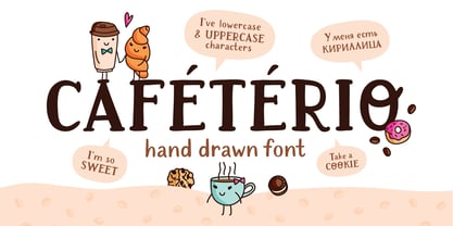 Cafeterio is a hand drawn cute font which makes it great for any children's design, be it a book cover, a t-shirt or a poster. Font includes latin and cyrillic characters, diacritics, numbers and punctuation.
 - Signed JNL by Jeff Levine,
$29.00One of six fonts inspired by old stencil lettering guides, Jeff Levine has drawn a font which captures the feel of simpler times when signs and posters were stencilled by school children, teachers, librarians and shopkeepers. - Shipped JNL by Jeff Levine,
$29.00 One of six fonts inspired by old stencil lettering guides, Jeff Levine has drawn a font which captures the feel of simpler times when signs and posters were stencilled by school children, teachers, librarians and shopkeepers.
 - Delivered JNL by Jeff Levine,
$29.00One of six fonts inspired by old stencil lettering guides, Jeff Levine has drawn a font which captures the feel of simpler times when signs and posters were stencilled by school children, teachers, librarians and shopkeepers. - Sealed JNL by Jeff Levine,
$29.00One of six fonts inspired by old stencil lettering guides, Jeff Levine has drawn a font which captures the feel of simpler times when signs and posters were stencilled by school children, teachers, librarians and shopkeepers. - Susanna by K-Type,
$20.00 A light sans serif designed for Susanna Lakner’s 22 Days mail art project. The characters were drawn on each of 22 evenings throughout November 2004. In December the drawings were scanned to create the Susanna font.
 - Blomma by Up Up Creative,
$16.00 Blomma is a hand-lettered all-caps display font with intricate botanical details. It includes full support for 201 languages, plus a full set of punctuation, numerals, and more, all drawn in the same botanical style. The uppercase and lowercase versions of each letter were drawn independently of one another, so that means you get two versions of each letter to play with. This is so helpful if you want to give a more authentic hand-lettered look to type with repeating letters. Blomma is perfect for monograms, logos, headlines, editorial design, branding, poster design, and more. Blomma includes approximately 390 glyphs.
 - Franklin Stone by Ironbird Creative,
$15.00 Franklin Stone is a organic hand drawn typeface inspired by vintage type with hand drawn feel. Comes with regular, condensed and stamp. This typefaces is perfect for people looking for vintage aesthetic. Suitable for any graphic designs such as branding materials, t-shirt, print, logo, poster, t-shirt, quotes .etc You may not use the fonts in templates or for sale/free or on template websites. ( web/print/app ) We hope you enjoy the font, please feel free to comment if you have any thoughts or feedback. Thanks for purchasing and have fun! Regards, Ironbird Creative
 - Silent Forest by Gassstype,
$27.00 Introducing Silent Forest is a best Terrible Hand Drawn Font that is handwritten brush casually and quickly. Letters are made with brushes on Procreate. Then scanned and carefully drawn into vector format. That is why Silent Forest has charming, authentic and relaxed characteristic more natural look to your text with a more natural look to your text. You can activate Ligature OpenType panel to make these two styles. It also has many alternatives and underlines that make your text and design more interesting. Silent Forest is perfect for homeware designs,branding projects, Logo design, Quotes product packaging.
 - Manualist by Invasi Studio,
$19.00 Meet Manulist, your new go-to font for a natural hand-drawn look full of charm! With its all-caps style and big uppercase letters, this font exudes a classic elegant look. But wait, there's more! Manulist also comes with elegant alternates, adding a touch of sophistication to your designs. And that's not all - this font supports multilingual characters, so you can spread the fun and creativity in any language you desire. Plus, every character in Manulist has a delightful imperfect shape, giving your designs a unique and organic feel. It's like having your own personal hand-drawn masterpiece in every letter!
 - Felek by Mili + Wise,
$12.00 Introducing Felek - hand-drawn sans serif font with a lot of character. Playful, bouncy & cute. Perfect for creating logos, greeting cards, posters, packaging and so much more! Suitable also for longer paragraphs, for example in children's books. Its charming and warm character will help you give your project a truly unique feel. Designed and kerned with care and love to make using it a breeze. What you will get - a hand-drawn font with lots of stylistic alternates and ligatures - a dingbat font with 53 illustrations and icons - multilingual support with accented characters for international designers Happy creating!
 - PiS Malefiz by PiS,
$24.00 PiS Malefiz is inspired by the hand-drawn type on the package of the german 60's version boardgame „Malefiz“, also known as Barricade or Barricata. Extended to five hand-drawn weights PiS Malefiz turned out to be the weird lovechild of Saul Bass and Ralph Steadman, fun and childish plus angry and strange. Just as playing the boardgame, PiS Malefiz is a wild and superfast rollercoaster ride of emotions! Combine the five interchangeable weights for total whackyness or use the clean and legible thin and regular versions for sleek and slender slanting. Have fun! Keep the dice rolling!
 - Fendesert by Edignwn Type,
$18.00 Elevate your designs with Fendesert – the ultimate vintage and stamp font duo. This collection features a pair script and san serif font in regular, rough, and stamp styles. Plus, you get 20 hand-drawn western illustrations for added creativity. Perfect for logos, branding, apparel, and more. Unlock vintage charm with Fendesert. Fendesert font features : - 3 style typefaces (regular, rough and stamp) - Uppercase, lowercase, numeral, symbol, punctuation and alternate in script font - All-caps, numeral, symbol and punctuation in sans serif font - Multilingual - PUA Encoded Fendesert includes : - 7 fonts (script, sans serif and dingbat) - 20 hand-drawn illustrations in dingbat
 - Balmonte by Atharuah Studios,
$16.00 Introducing Balmonte; A stylish hand-drawn script font. This font has been designed with a heart that is completely hand-drawn and the addition of 53 special ligatures creates a perfect balance and beauty. Adding a ligature will give your text extra quality and distinction. It's the perfect choice for stylish branding & logo projects, product packaging, handwritten quotes, editorial design, and more. What's Included: Balmonte comes with a single font file that includes uppercase, lowercase, numbers, punctuation, and multilingual support. That's it! I hope you enjoy it. You can also say hello to me on Instagram: https://www.instagram.com/atharuah_ Thank You!
 - The Blackport by Ironbird Creative,
$15.00 The Blackport Font Pack! is a Hand Drawn Font Pack. This Fonts gives a feel of vintage, classic, old, handmade looked like. This font also already PUA Encoded and I think this font is perfect for people looking for vintage aesthetic or Hand Made font. Come with 2 font styles, Regular and Stamp (Except The Blackport hand-drawn). Suitable for any graphic designs such as branding materials, t-shirt, print, label, logo, poster, t-shirt, photography, quotes .etc NOTE : For all the characters are also available, accessible in the Adobe Illustrator Glyphs Panel, or in Adobe Photoshop Character Open Type Panel.
 - Handy Typewriter by Ana's Fonts,
$14.00 Handy Typewriter is a handwritten typewriter font in 4 handmade weights, with extras. Handy Typewriter has a more casual look than classic typewriter fonts, but can still be used in any designs that need a vintage touch. This font is very legible at a wide range of sizes and looks great in both long or short texts, in digital collages, branding and packaging, social media posts, logotypes, etc. Included in this font family: - Handy Typewriter font in 4 weights: Thin, Regular, Bold and Black, hand drawn from scratch - Handy Typewriter Extras is a set of 62 hand drawn doodles, to decorate your text