6,425 search results
(0.013 seconds)
- Rockwall NF by Nick's Fonts,
$10.00 Two offerings from the Page specimen book, Aldine and Aldine Extended, provided the patterns for this family of Western-style standards, named for the smallest county in Texas, at least area-wise. Both flavors of this font feature the 1252 Latin, 1250 Central European, 1254 Turkish and 1257 Baltic character sets.
 - Hastagram by IbeyDesign,
$17.00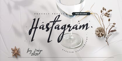 Hastagram Calligraphy Script Font is a fresh calligraphy font. It has a modern style and is perfect for adding an unique look to your watermarks, social media posts, advertisements, logos & branding, invitations, product designs, labels, stationery, wedding designs, product packaging, special events or anything that needs a calligraphy or handwriting taste.
 - Hasty Hand by Gerald Gallo,
$20.00 Hasty Hand is a hand-lettered sans serif font whose appearance suggests that it is the work of someone who writes in haste. The font has an uppercase and lowercase alphabet, numbers, punctuation, symbols, and miscellaneous characters. Hasty Hand is ideal for use where a very casual feel is desired.
 - Modern Appliances JNL by Jeff Levine,
$29.00 If there s a back-story about the design inspiration for Modern Appliances JNL, it's lost to time. An unfinished design for quite a while, this clean sans with an Art Deco flair was recently completed, and the design quality should speak more for its appeal than any promotional blurb.
 - FTY SKORZHEN by The Fontry,
$25.00 At one time very recently, serifs were lost to the design sinners of the world. Now see them found again. Unearthed and rediscovered. Retribution is not far off. We have been unchained from the belief that gothics have provided us no way back from a lack of variety and interest.
 - Someone by Almarkha Type,
$29.00 Introducing Someone – Textured Handbrush Script font with a Signature Style and classy style, this font is great for your creative projects such as watermark on photography, and perfect for logos & branding, photography, invitation, watermark,advertisements,product designs, stationery, wedding designs,label ,product packaging, special events or anything that need handwritting taste.
 - Fathyma by Typesthetic Studio,
$13.00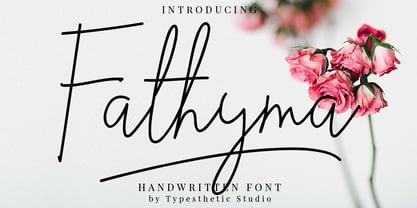 Fathyma is clean & fresh script with a stylish handwritten style make this font looks natural, classy and perfect for any awesome projects that need handwriting taste. With exaggerated strokes and an bouncy baseline, Fathyma has an unmistakable charm; perfect for logos, wedding stationery, cards, gift designs, product packaging and handwritten quotes.
 - Ghiberti LP by LetterPerfect,
$39.00 Ghiberti is a contemporary interpretation of the bold Florentine lettering style used with marble inlaid and bronze cast inscriptions of the fourteenth and fifteenth centuries. The font, consisting of caps and small caps, was designed by Paul Shaw and Garrett Boge in 1997. Ghiberti is part of the LetterPerfect Florentine Set.
 - Docklands by Hemphill Type,
$22.00 An authentic collection of engineered fonts, constructed in East London. Docklands is a handmade font family inspired by the creation of the London docks in the early 18th century. The rough edged sign written style is evocative of the era when iron works and boatbuilding wharfs lined the River Thames.
 - Schwager Sans by Latinotype,
$25.00 Schwager sans is the new version of Schwager. This time with a fresher taste, retaining the same principles of structure, geometry and modernist aesthetics in a contemporary reinterpretation. Designed especially for use in titles, reveals concepts associated with masculinity, technology or sports, perfect for application in cover design, logos, web.
 - Black Rider by Hanzel Space,
$25.00 Black Rider is a supercharged street brush font full of energy. With extra attention to quick strokes and sharp detail, Black Rider is guaranteed to deliver a very loud & fast message; ideal for logos, clothing, quotes, product packaging, movie titles, book covers or anything else that needs a typography turbo-boost.
 - Moline Quotes Sans by Ayska,
$20.00 Introducing Moline Quotes Sans Typeface. it looks natural like a handmade which has a fast dry brush style. That is ideally suited for advertising and packaging, logo, branding and creative industries. The Moline Quotes Sans Typeface is designed to make your next great project look more natural and stand out.
 - Rogsant Soft by Mans Greback,
$69.00 Rogsant Soft is a luxurious sans serif typeface that masterfully blends contrasting letterforms with a gentle flow and delicate rounded edges. Created by Mans Greback & Delaga, this fine and tasteful font emanates beauty and sophistication, making it a perfect choice for luxury branding, high-end fashion, and elegant design projects. The allure of Rogsant Soft lies in its attention to detail and meticulously crafted letterforms, which create a harmonious balance between refinement and legibility. With its clean and polished appearance, Rogsant Soft is an ideal choice for both print and digital designs that demand a touch of finesse and grace. The font is built with advanced OpenType functionality and has a guaranteed top-notch quality, containing stylistic and contextual alternates, ligatures, and more features; all to give you full control and customizability. It has extensive lingual support, covering all Latin-based languages, from Northern Europe to South Africa, from America to South-East Asia. It contains all characters and symbols you'll ever need, including all punctuation and numbers. Mans Greback is a typeface designer from Sweden, whose love for design and typography drives him to create innovative and versatile fonts. His commitment to quality and originality has earned him respect and appreciation from designers worldwide.
 - Aeroko Variable by Monotype,
$279.99 Meet Aeroko, a slick variable typeface that evokes grit and speed, a dynamic play, a future–present competitive edge that evokes motorsport and all progressive brand design. This is a robust type system that creates memorable brand headlines. Powered by four display weights and three widths. Turbo-charged by a two-axes variable font. High performance brands can expect Aeroko to out-pace in every graphic condition. Aeroko is bold and assertive, it moves fast in headlines, it flexes when and where you need it. The forms are boxed and solid from Condensed to Wide, and they provide a distinct contrast when paired with rounder text fonts. Aeroko’s secondary power unit is harnessed from the ever adaptable variable font format. Variable font technology enables vast levels of typographic scale and expression, furthermore it allows Aeroko to react instantly in any digital space to maximize results. Aeroko evokes confidence, this is a typeface that actively encourages you to be courageous and daring with type in your own way. Brands demand distinct and robust typography, much in the same way that drivers demand pace. Aeroko meets these demands with ease, delivering assurance and weight across a valiant aesthetic. Aeroko is designed by Krista Radoeva and the Monotype Studio.
 - Skolar PE by Rosetta,
$70.00 Originally developed for academic publishing, Skolar asserts credibility and sustains comfortable reading. It has established itself as a go-to choice for all kinds of scholarly texts, no matter the field or school of thought: it handles the minutiae of linguistic, scientific, and editorial typography with ease. A classic with a twist, Skolar brings a trace of human touch to serious typography. Thanks to this knack for subtlety, it is also successfully used in other genres from branding to children’s literature. Skolar PE has a vast character set that caters to nearly four hundred languages and transliteration systems (Pinyin, IAST/Sanskrit) using Latin, Cyrillic, and Greek (including polytonic). Its larger x-height, robust serifs, low contrast, and its deft italic make it a pleasure to read even at small sizes. With Skolar, footnotes and bibliography become readers’ best friends. The OpenType feature set is engineered for the most rigorous editorial settings. Tabular, proportional, old-style, and lining figures as well as a full set of fractions, ordinals, and scientific superiors and inferiors will stand up to any conjectural challenge. Language-sensitive forms and compound diacritics will handle the demands of many linguistic texts. The companion families Skolar Gujarati, Skolar Devanagari, Skolar Sans PE, and Skolar Sans Arabic expand its typographic and semantic potential even further.
 - Aeroko by Monotype,
$49.99 Meet Aeroko, a slick variable typeface that evokes grit and speed, a dynamic play, a future–present competitive edge that evokes motorsport and all progressive brand design. This is a robust type system that creates memorable brand headlines. Powered by four display weights and three widths. Turbo-charged by a two-axes variable font. High performance brands can expect Aeroko to out-pace in every graphic condition. Aeroko is bold and assertive, it moves fast in headlines, it flexes when and where you need it. The forms are boxed and solid from Condensed to Wide, and they provide a distinct contrast when paired with rounder text fonts. Aeroko’s secondary power unit is harnessed from the ever adaptable variable font format. Variable font technology enables vast levels of typographic scale and expression, furthermore it allows Aeroko to react instantly in any digital space to maximize results. Aeroko evokes confidence, this is a typeface that actively encourages you to be courageous and daring with type in your own way. Brands demand distinct and robust typography, much in the same way that drivers demand pace. Aeroko meets these demands with ease, delivering assurance and weight across a valiant aesthetic. Aeroko is designed by Krista Radoeva and the Monotype Studio.
 - Nurnberg Schwabacher by Intellecta Design,
$29.95"I digitized and to revitalize NurnbergSchwabacher by the extinct Haas'sche Schriftgiesserei, a German/Swiss foundry established in 1790 and based in Basel/Münchenstein. Many of its shares were acquired by D. Stempel in 1927. On the Luc Devroye site this foundry is listed on the Extinct Foundries of the 18th century page. This design is very similar to another Intellecta best seller: Hostetler Fette Ultfraktur Ornamental, both drawn from the classical type specimen book from Hostetler. The ornamental frame that completes the font is a fantastic baroque ornament that I found in another old book, unfortunately lost now. Luc Devroye, whose book is the source for all of my fonts, writes this about Rudolf Hostettler: He was a Swiss type designer, author of “The Printer’s Terms” designed by Jan Tschichold, of "Technical Terms of the Printing Industry" (5th edition was printed in 1995), and of "Type: eine Auswahl guter Drucktypen; 80 Alphabete klassischer und moderner Schriften" (Teufen, Ausser-Rhoden: Niggli, 1958). He also wrote "Type: A Selection of Types" (1949, fgm books, R. Hostettler, E. Kopley, H. Strehler Publ., St. Gallen and London) in which he highlights type made by European houses such as Haas, Enschedé, Deberny and Nebiolo. Jost Hochuli wrote his biography. - Neue Plak by Monotype,
$57.99 Originally designed in 1928, Plak is something of a lost gem in the type world. Despite being drawn by Futura creator Paul Renner, it never achieved the same popularity and spent decades lacking a much-needed digital revival. Monotype designers Linda Hintz and Toshi Omagari have taken its existing three weights and, after extensive research into the original wood type, extended them into the vast Neue Plak family. The typeface is available in 60 weights that stay true to Renner’s intentions, and offer the same blend of “quirky” details and “German stiffness” – as Hintz describes it. The design is an unusual mixture, bringing together a defiant outer appearance that’s counteracted by more playful details found in the lowercase r, and the large dots of the lowercase i. Other distinctive details include open or strikethrough counters, and a set of hairline widths that reduce Renner’s original design to its bare bones. Neue Plak’s display weights are crying out to be used in editorial, on packaging or in logos, while its text weight works well in both print and digital environments. Neue Plak Text Variables are font files which are featuring one axis and have a preset instance from Thin to Black
 - Rogsant Crisp by Mans Greback,
$69.00 Rogsant Crisp is a luxurious sans serif typeface that combines contrasting letterforms with delicate and fine features, creating a beautiful and tasteful appearance. Designed by Mans Greback & Delaga, this clean and clear font exudes professionalism and style, making it perfect for fashion, art, and high-end branding projects. The elegance of Rogsant Crisp lies in its attention to detail and carefully crafted letterforms, which allow for a harmonious balance between sophistication and readability. With its refined appearance, Rogsant Crisp is an ideal choice for both print and digital designs that require a touch of luxury and delicacy. The font is built with advanced OpenType functionality and has a guaranteed top-notch quality, containing stylistic and contextual alternates, ligatures, and more features; all to give you full control and customizability. It has extensive lingual support, covering all Latin-based languages, from Northern Europe to South Africa, from America to South-East Asia. It contains all characters and symbols you'll ever need, including all punctuation and numbers. Mans Greback is a dedicated typeface designer from Sweden, who continually strives to create innovative and unique fonts. His passion for design and typography shines through in his work, earning him recognition from designers around the globe.
 - Kaat by ChrisNuijen.com,
$29.00 Kaat is a new type (2013). It was designed by Chris Nuijen and named after his daughter Kaat. It represents the period in which everyone has their face behind the latest mobile phone screen or interactive games console. "Kaat"is slick, modern and progressive, to reflect our busy immediate life style, whilst providing the essentials in a period where people can be judged on television. Kaat is here to stay and to evolve. Everyone wants to try to be that little bit different, but essentially we are all the same, with the same inherent needs, just like babies or children. We need to be fed, watered, nurtured and loved, the only difference is in today's world you can do all that from behind a screen. "Kaat" bridges that gap, transcending the basic needs of type, with the sophistication and fast paced sharpness of today, everyone wants to be different but we all stay the same, this is a reflection in the thickness and shape of each glyph. The font represents how we are molded and cast differently in yet we still stay the same, because we need the repetition! Everything needs to be done quicker, simpler and cheaper. We eat we sleep we communicate.
 - Skolar Sans PE by Rosetta,
$70.00 Any prototype you can imagine, Skolar Sans can materialise. This industrious type family is more than just a versatile partner for our award-winning Skolar collection: it is a true sans-serif type system envisioned for the age of responsive design. We developed Skolar Sans to accommodate contemporary typographers and the challenges they confront: an ever-changing spectrum of outputs and devices, in which serious typography can get lost. Skolar Sans is engineered to cope with complex editorial texts and data-rich layouts alike. Its construction is designed for easy reading, and its subtle personal style and a touch of flourish. From gently thin to black, the finely-tuned weight variants will fit any composition from wide-screen dashboards to compact mobile editorial designs. Its four subtly graded width variants allow you to fit any page context with comfort. The 72 styles; 36 weight and width variants in uprights and true italics with ligatures, arrows, scientific figure variants, and fleurons. The two variable fonts (one for uprights and one for the italics) allow user precise navigation of the Skolar Sans design space and streamline delivery. The linguistic scope of Skolar Sans PE is an exact match to Skolar PE: Latin, Cyrillic, and Greek (including polytonic) scripts and support for hundreds of languages and transliterations.
 - Retro Checkbook JNL by Jeff Levine,
$29.00 By the 1990s, the availability of font creation software opened the door to an explosion of creativity, experimentation and exploration into the world of digital typography by amateur and professional alike. The undisputed king of the freeware fonts was Ray Larabie through his Larabie Fonts website. It seemed at the time that Ray’s output was endless, and he amassed dozens upon dozens of fonts that ranged from the ridiculous to the sublime. In fact, Ray was the driving force of encouragement and a behind-the-scenes “mentor” who helped Jeff Levine Fonts get underway in January of 2006. As Larabie’s focus changed to higher-quality commercial type design with the launch of Typodermic, Inc., many of his “less than perfect” font experiments were withdrawn and shelved. Ray eventually turned those lost (and sometimes questionable) typefaces into a bundled zip archive released into the public domain through Creative Commons. One particular design “Boron” (circa 1996) featured computer-oriented lettering as if etched onto a circuit board. Running with this idea, and with Ray's approval, the electronic elements were stripped away, the characters cleaned up and modified, and the font reworked in Retro Checkbook JNL, which is available in both regular and oblique versions.
 - Garet by Type Forward,
$36.00Garet is a modern geometric sans serif. It is characterised by high x-height, clean and soft letterforms with a smooth masculine tone. Garet derives its distinctive oval shapes from the optically perfect circle and has closed counters to further emphasise that form. The Garet type family consists of 11 weights ranging from quite thin to extremely fat and their corresponding Italics to make a total of 22 fonts. And all of them are combined into one variable font that will give you unlimited opportunities to explore and express without the restrictions of the predefined weights. We understand the need for more extensive language support. That’s why the typeface includes Extended Latin and Cyrillic and covers more than 200 languages. Garet also comes with several alternative stylistic sets that will change the overall look of a paragraph, giving it a slightly different appearance. In addition to that, the type family is enriched with an extensive list of OpenType features for advanced typographic layout, including standard and discretionary ligatures, tabular and small figures, fractions, language localizations, case-sensitive punctuation, and more. Тhe wide variety of weights, characters, and additional features allow Garet to be implemented equally well both in print and on-screen media. - Gogh by Type Forward,
$32.00 Gogh is a geometric sans serif with a modern look and traditional spirit. It blends evenly without overly distracting the reader, yet still keeps a rich and distinctive character. The generous x-height, easily distinguishable glyph forms, and open terminals help the eye perceive a block of text smoothly, making it clearly legible. Gogh thrives when used both on-screen and on print media. Gogh type family consists of 10 weights from Hairline to Black and their matching Italics. Gogh is also available as a fully functional variable font, which gives unlimited opportunity to explore typography without the restrictions of predefined weights. Gogh Variable is also the best option if used on the web as it has a much-reduced size compared to the original font family. Regardless of which Gogh family you choose, the typeface covers a broad spectrum of languages, as it includes Extended Latin and Cyrillic. And it also comes with an alternative stylistic set that will completely change the overall look of a paragraph, giving it a more contemporary and display appearance. In addition to that, Gogh type family is enriched with an extensive list of OpenType features for advanced typographic layout, including standard and discretionary ligatures, tabular and small figures, fractions, language localizations, case sensitive punctuation, and more.
 - Ongunkan Younger Futhark by Runic World Tamgacı,
$45.00 The Younger Futhark, also called Scandinavian runes, is a runic alphabet and a reduced form of the Elder Futhark, with only 16 characters, in use from about the 9th century, after a "transitional period" during the 7th and 8th centuries. The reduction, somewhat paradoxically, happened at the same time as phonetic changes that led to a greater number of different phonemes in the spoken language, when Proto-Norse evolved into Old Norse. Also, the writing custom avoided carving the same rune consecutively for the same sound, so the spoken distinction between long and short vowels was lost in writing. Thus, the language included distinct sounds and minimal pairs that were written the same. The Younger Futhark is divided into long-branch (Danish) and short-twig (Swedish and Norwegian) runes; in the 10th century, it was further expanded by the "Hälsinge Runes" or staveless runes. The lifetime of the Younger Futhark corresponds roughly to the Viking Age. Their use declined after the Christianization of Scandinavia; most writing in Scandinavia from the 12th century was in the Latin alphabet, but the runic scripts survived in marginal use in the form of the medieval runes (in use ca. 1100–1500) and the Latinised Dalecarlian runes (ca. 1500–1910)
 - Chaotic Circuit - Unknown license

- Baveuse 3D - Unknown license

- Static Cling - Unknown license

- Fire Wood - Unknown license

- Mister Hand by Chank,
$39.00Mister Hand was created in 1998 from a found object. Chank scanned it in, cleaned it up a little and voila! It's a retro version of the American Sign Language finger spelling alphabet. Uppercase is only the hand shapes, lowercase has the hand shape with the corresponding letter beside it. - Fancy Dancing JNL by Jeff Levine,
$29.00 The 1938 movie musical "Carefree" starring Fred Astaire and Ginger Rogers featured the song "Change Partners" by Irving Berlin. A copy of the sheet music for this song had the title hand lettered in a wonderful tri-line design that has been recreated in the digital typeface Fancy Dancing JNL.
 - Ekberg by Scriptorium,
$12.00Ekberg is based on a sample of poster lettering by Samuel Welo. It's got a spare but stylish and rather modern look. It's a bit of a change from our usual fare, but a gap we need to fill. Ekberg features more than one version of a lot of the characters. - El Hombre by Chank,
$59.00El Hombre is a classic Chank Font from the earlier days of the internet. A consistent fan favorite since its initial release in 1999, this bouncey, blockey font has a sinsister charm and a sassy jaunt to it. It's now available on MyFonts for your personal or commercial use. ¡Muy guapo! - Stockly by Febri Creative,
$15.00 Stockly is a modern and awesome bold font with a strong and fun charm. This will change any design idea to be great and perfect! Stockly can be used for logos, branding, product labels, poster design, banner design, company names, product promotion, and much more. It has multi-lingual support.
 - Brevet by Solotype,
$19.95Authentic copy of the original, with a couple of minor changes to the caps, making them fit better. Although made for the American market by an American typefounder, we found this font in a York, England printshop when we went on a second visit to the famous DeLittle Wood Type factory. - Arista 2.0 by Zetafonts,
$29.00 Arista is a soft round font, perfect for 2.0 logos and contemporary headlines. Arista 2.0 is the definitive release of Arista, with extra characters and corrected kerning. It includes a light version, a extrafilled version for 2.0 style fat borders, and an Alternate version with a lot of style changes.
 - TT Frantz by TypeTrends,
$24.00 Useful links: Using the variable font in Illustrator Working with a variable font in Photoshop TT Frantz is an experimental variable font, distinguished by its slimness and lightness. The variation in the font affects the change in the height of the mean line - by moving the axis adjustment slider you can easily raise or lower the mean line of the font. In TT Frantz, you can find small references to the art deco aesthetics, which are expressed in significantly lowered or, conversely, heightened waist of the letters. In addition, depending on the position of the axis adjustment slider, the closedness of the aperture changes for some letters. In order to preserve the main feature of the font—the change in the height of the main line—we made lowercase characters as tall as uppercase ones, but at the same time we kept small kerns. An interesting fact is that in Cyrillic letters з с а е, the variability of the aperture follows a different scenario in comparison with their Latin sisters. When working on TT Frantz, we tried to make it so that when changing the variability, the width of the characters would not change, and the font would remain monospaced. And in order to avoid holes in the set, we made contextual alternates and several ligatures. Frantz consists of 470 glyphs, and in addition to broad language support (Latin and Cyrillic) it can offer standard and old-style figures, including their tubular versions, as well as ligatures. Important clarification regarding variable fonts. At the moment, not all graphic editors, programs and browsers support variable fonts. You can check the status of support for the variability of your software here: v-fonts.com/support/ But do not despair—even if you do not have access to the necessary software, you still have the opportunity to use TT Frantz in your projects. Especially for you, we have prepared three separate non-variable styles (Frantz A, Frantz B, Frantz C), each of which is responsible for a certain location of the mean line of the font and where this line is already fixed in a certain position (high, medium and low).
 - Curly Millie by Typesthetic Studio,
$12.00 Curly Millie is modern & fresh signature style script font. This font looks natural, classy and perfect for any awesome projects that needs a handwriting taste. With exaggerated strokes and a bouncy baseline, Curly Millie has an unmistakable charm; perfect for logos, wedding stationery, cards, gift designs, photography, watermark, product packaging and handwritten quotes.
 - Mashiny by Multype Studio,
$23.00 Mashiny is a handwritten font with unique curves and an elegant inky flow. Features : uppercase, lowercase, symbol, number, ligature, and also support multi language. Mashiny is perfect for photography, watermark, social media posts, advertisements, logos & branding, invitation, product designs, label, stationery, wedding designs, product packaging, special events or anything that need handwriting taste.
 - Mesquin by MuSan,
$15.00 Mesquin is an all uppercase sans serif font with geometric shapes of characters. It is inspired by lettering from the industrial and good old past, but it still has a strong modern appearance. Its allows versatile design options and works perfectly for headlines, logos, posters, packaging, T-shirts, postcards and much more.


