6,425 search results
(0.013 seconds)
- Renova Pro by Elsner+Flake,
$40.00 Renova was designed by Elsner+Flake in the late 90s as a contractual work. The font family comes as a typical Office pack in EuropePlus layout for at least 72 Latin languages. It is optimized for good legibility in small point sizes.
 - Berliman by ahweproject,
$11.00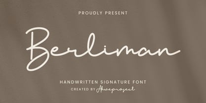 Berliman is a signature script typeface specially made with a natural handwritten style. It is perfect for branding projects, logos, wedding designs, social media posts, advertisements, product packaging, product designs, labels, photography, watermarks, invitations, stationery and any projects that need handwriting taste.
 - Woodhaven Initials JNL by Jeff Levine,
$29.00 Woodhaven Initials JNL were designed using an outline cast shadow wood type set against a rectangle with horizontal "engraving" lines to add background texture to the initials. An ampersand is on the corresponding keystroke, and a blank rectangle is on the period key.
 - erqif by Guixis,
$24.75 This font is a nod to paper notebooks in which a long time ago students made notes. That's why the font looks like written by hand. The inspiration of this family font is the phrase, "Let me go back to the past".
 - Selectric by Indian Summer Studio,
$55.00 Selectric typewriter font. The part of the large, many years project on revival and further development (over 1000 glyphs) of the 20th century’s most famous typewriter Selectric golfball fonts, lost for many decades, not being created since then in digital vector form.
 - Fleischer Display by Lewis McGuffie Type,
$30.00 Fleischer is a rough and playful display typeface good for headlines and posters. The face is based on historical letterforms combined with energetic 20th century pulp-style lettering. Fleischer comes with caps and small caps plus West, Central and East European language support.
 - Mike Samiya by Grezline Studio,
$8.00 Mike Samiya is a playful and unique font crafted very carefully. Mike Samiya is perfect use for a logo for branding, typography design, christmas card, product packaging, invitation, quotes, t-shirt design, label poster, special events and anything that need handwriting taste.
 - McGurr Script - Unknown license

- Shanghai JNL by Jeff Levine,
$29.00 Shanghai JNL is loosely based on the title lettering from “Charlie Chan in Shanghai”, one of the long-running series of detective films featuring the Asian sleuth and his “number one son”.
 - White Xmas by Mans Greback,
$59.00 White Xmas is a beautiful Christmas script typeface. This seasonal family is the ultimate set of decorative Christmas fonts, consisting of no less than 15 styles: Star, Snowflake, Plain, Clean, Swash, Background, and more. Use White Xmas as-is for your New Year's headlines or winter products, or as a layered color font to make the snow and stars shine in a brilliant white. The vast selection of styles makes for infinite decorative possibilities. Use symbols * + # for stars and snowflakes. Use underscore _ anywhere in a word to make a swash. Example: Sea_son Use multiple underscores for different swashes. Example: Christ_______mas (Download required.) Also includes a Color Font, for Photoshop and Illustrator! The two variations are colored in Red and Blue, both decorated with white snow. The font is built with advanced OpenType functionality and has a guaranteed top-notch quality, containing stylistic and contextual alternates, ligatures and more features; all to give you full control and customizability. It has extensive lingual support, covering all Latin-based languages, from North Europe to South Africa, from America to South-East Asia. It contains all characters and symbols you'll ever need, including all punctuation and numbers.
 - Charlot by Molly Suber Thorpe,
$17.99 Charlot is a decorative display font with dozens of beautiful ligatures and ornaments. The vast selection of ligatures and stylistic alternates makes this font extremely customizable. Charlot is perfect for unique branding and title treatments, personal monograms, and vintage-inspired layouts. Charlot has over 150 ligatures in Latin and Greek consisting of: the complete Latin alphabet (with all accent marks), the complete Modern Greek alphabet, 60 ligatures, 33 stylistic alternates, 15 decorative ornaments, borders, and frames, numerals and math symbols, extensive punctuation and diacritical markings. The OpenType ligatures are the fun part. To get the most out of Charlot, use software that supports Open Type fonts (Adobe programs, Corel Draw, Affinity Designer, etc). This type family has tons of built-in OpenType ligatures and alternates, which are what make it so customizable and decorative. You can always access the ligatures, alternates, and dingbats through your software's glyphs panel. For a complete preview of all the ligatures, please look at the 4th image in this product listing. Languages Charlot includes the Latin and Greek alphabets with all accent markings. The most common languages it supports are: English, Catalan, Danish, Dutch, French, German, Greek, Italian, Norwegian, Portuguese, Spanish, and Swedish.
 - Love Wins by Resistenza,
$19.00 In 2007 we shared our first pride together. More than 1 million people took the streets of Madrid for this huge celebration … seeing the diversity of people supporting love was incredibly touching. Gay Pride is a celebration of freedom, human rights and the right to love whoever we want. It’s a memorial for the battles, the lives lost and the pain suffered while fighting for a growing list of equal rights. But let’s not forget there are still places where LGTBQ community is repressed and persecuted. As Letter crafters we love seeing the signs people design for their different pride parades, and we wondered… Why don’t we create a collection of handcrafted lettering to share some love and to add a typographic realness to the party? Love Wins Font is a series of 60 phrases handwritten with expertise and love specially designed to celebrate diversity. The lettering was crafted with different calligraphic tools creating diverse aesthetics. You can use them to create your signs, t-shirts, stickers, poster, banners.. all you need is to spread love during your Pride Celebrations (or day-to-day life!).
 - TT Knickerbockers by TypeType,
$29.00 TT Knickerbockers useful links: Specimen PDF | Graphic presentation | Customization options About TT Knickerbockers: TT Knickerbockers is a contrasting pair of fonts that continues our project series dedicated to different cities. The new project is dedicated to New York with its multiculturalism, historicity, creativity, energy, and to its inhabitants. TT Knickerbockers Grotesk symbolizes the monumentality of New York expressed in both its traditional historic architecture and skyscrapers. Energy, constant movement and the round-the-clock life of New York—all this is reflected in our TT Knickerbockers Script. TT Knickerbockers Grotesk is a narrow contrast sans-serif with characteristic elements sending us back to the 19th century. There’s also a reference to antiqua fonts to be noticed in the font: where in traditional antiqua there would be serifs, TT Knickerbockers Grotesk features a straight stroke ending, and traditional drops (finals, tails and ears) are substituted with rounded strokes. In TT Knickerbockers Grotesk you will find unusual characters, stylistic alternatives and ligatures. The following OpenType features are implemented: ordn, case, frac, sups, sinf, numr, dnom, onum, tnum, pnum, liga, dlig, salt, ss01. TT Knickerbockers Script is a bright and at the same time a little restrained brushpen script with a slight touch of aristocracy. TT Knickerbockers Script consists of 967 characters and also contains a huge number of contextual alternatives and ligatures. For all lowercase and uppercase letters of basic Latin and Cyrillic alphabets we have drawn 236 swashes which, depending on the context, can appear both at the beginning and at the end of a letter. Do not forget to enable OpenType support and enjoy all the opportunities that the typeface provides and its built-in features: ordn, frac, case, sups, sinf, numr, dnom, onum, tnum, pnum, calt, swsh, liga. FOLLOW US: Instagram | Facebook | Website TT Knickerbockers language support: Acehnese, Afar, Albanian, Alsatian, Aragonese, Arumanian, Asu, Aymara, Banjar, Basque, Belarusian (cyr), Bemba, Bena, Betawi, Bislama, Boholano, Bosnian (cyr), Bosnian (lat), Breton, Bulgarian (cyr), Cebuano, Chamorro, Chiga, Colognian, Cornish, Corsican, Cree, Croatian, Czech, Danish, Embu, English, Erzya, Estonian, Faroese, Fijian, Filipino, Finnish, French, Friulian, Gaelic, Gagauz (lat), Galician, German, Gusii, Haitian Creole, Hawaiian, Hiri Motu, Hungarian, Icelandic, Ilocano, Indonesian, Innu-aimun, Interlingua, Irish, Italian, Javanese, Judaeo-Spanish, Judaeo-Spanish, Kalenjin, Karachay-Balkar (lat), Karaim (lat), Karakalpak (lat), Kashubian, Khasi, Khvarshi, Kinyarwanda, Kirundi, Kongo, Kumyk, Kurdish (lat), Ladin, Latvian, Laz, Leonese, Lithuanian, Luganda, Luo, Luxembourgish, Luyia, Macedonian, Machame, Makhuwa-Meetto, Makonde, Malay, Manx, Maori, Mauritian Creole, Minangkabau, Moldavian (lat), Montenegrin (lat), Mordvin-moksha, Morisyen, Nahuatl, Nauruan, Ndebele, Nias, Nogai, Norwegian, Nyankole, Occitan, Oromo, Palauan, Polish, Portuguese, Quechua, Rheto-Romance, Rohingya, Romanian, Romansh, Rombo, Rundi, Russian, Rusyn, Rwa, Salar, Samburu, Samoan, Sango, Sangu, Scots, Sena, Serbian (cyr), Serbian (lat), Seychellois Creole, Shambala, Shona, Slovak, Slovenian, Soga, Somali, Sorbian, Sotho, Spanish, Sundanese, Swahili, Swazi, Swedish, Swiss German, Swiss German, Tagalog, Tahitian, Taita, Tatar, Tetum, Tok Pisin, Tongan, Tsonga, Tswana, Turkish, Turkmen (lat), Ukrainian, Uyghur, Vepsian, Volapük, Võro, Vunjo, Xhosa, Zaza, Zulu.
 - TT Barrels by TypeType,
$29.00 TT Barrels useful links: Specimen PDF | Graphic presentation | Customization options TT Barrels is an elegant scotch style modern serif with strong industrial accents in its design. The TT Barrels project was born from a fictional technical assignment in which we tried to combine the technological effectiveness of industrial production used in engineering and the restrictions imposed by it with a beautiful scotch style serif. We decided to create a typeface that could be used to press letters on the metal body of a car, all while the typeface being elegant, and possessing sophisticated details that are typical of the classic text fonts of the late 19th and early 20th centuries. In the process of designing and sketching, we reconsidered certain aspects and abandoned some of the requirements imposed by the technology of metal letter pressing, for example, from the extensive application of visual compensators, the decreased strokes contrast, and the hyperdeformation of individual letter elements to preserve a more pronounced rhythm of these elements. First of all, we wanted both to maintain the ease of reading for the entire text array and follow the rules of aesthetics of each letter in the typeface, while still leaving some influence of industrialism. In the end, this influence is best manifested in serifs, which are quite massive and have a technologically exaggerated wedge shape. TT Barrels consists of 12 fonts: Light, Regular, DemiBold, Bold, Extrabold, Black and the corresponding Italics. Each outline consists of more than 750 glyphs and includes small capitals, ligatures (for Latin and Cyrillic alphabets), stylistic alternates, old-style figures, and many other useful features. FOLLOW US: Instagram | Facebook | Website TT Barrels OpenType features: ordn, c2sc, smcp, case, frac, sinf, sups, numr, dnom, tnum, onum, lnum, pnum, dlig, liga, calt, salt (ss01). TT Barrels language support: Acehnese, Afar, Albanian, Alsatian, Aragonese, Arumanian, Asu, Aymara, Banjar, Basque, Belarusian (cyr), Bemba, Bena, Betawi, Bislama, Boholano, Bosnian (cyr), Bosnian (lat), Breton, Bulgarian (cyr), Cebuano, Chamorro, Chiga, Colognian, Cornish, Corsican, Cree, Croatian, Czech, Danish, Embu, English, Erzya, Estonian, Faroese, Fijian, Filipino, Finnish, French, Friulian, Gaelic, Gagauz (lat), Galician, German, Gusii, Haitian Creole, Hawaiian, Hiri Motu, Hungarian, Icelandic, Ilocano, Indonesian, Innu-aimun, Interlingua, Irish, Italian, Javanese, Judaeo-Spanish, Judaeo-Spanish, Kalenjin, Karachay-Balkar (lat), Karaim (lat), Karakalpak (lat), Kashubian, Khasi, Khvarshi, Kinyarwanda, Kirundi, Kongo, Kumyk, Kurdish (lat), Ladin, Latvian, Laz, Leonese, Lithuanian, Luganda, Luo, Luxembourgish, Luyia, Macedonian, Machame, Makhuwa-Meetto, Makonde, Malay, Manx, Maori, Mauritian Creole, Minangkabau, Moldavian (lat), Montenegrin (lat), Mordvin-moksha, Morisyen, Nahuatl, Nauruan, Ndebele, Nias, Nogai, Norwegian, Nyankole, Occitan, Oromo, Palauan, Polish, Portuguese, Quechua, Rheto-Romance, Rohingya, Romanian, Romansh, Rombo, Rundi, Russian, Rusyn, Rwa, Salar, Samburu, Samoan, Sango, Sangu, Scots, Sena, Serbian (cyr), Serbian (lat), Seychellois Creole, Shambala, Shona, Slovak, Slovenian, Soga, Somali, Sorbian, Sotho, Spanish, Sundanese, Swahili, Swazi, Swedish, Swiss German, Swiss German, Tagalog, Tahitian, Taita, Tatar, Tetum, Tok Pisin, Tongan, Tsonga, Tswana, Turkish, Turkmen (lat), Ukrainian, Uyghur, Vepsian, Volapük, Võro, Vunjo, Xhosa, Zaza, Zulu.
 - TT Berlinerins by TypeType,
$29.00 TT Berlinerins useful links: Specimen PDF | Graphic presentation | Customization options Please note! If you need OTF versions of the fonts, just email us at commercial@typetype.org About TT Berlinerins: TT Berlinerins is a contrast pair of typefaces which is basically our tribute to Berlin. Just like in the city itself where historicity and modernity are intertwined, the elegant script in our font family symbolizes the modern Berlin, and the grotesque inspired by the wood-type poster types of the first third of the 20th century is responsible for the historic component of the city. The idea of this project emerged in the beginning of 2016 when we've met Evgenia Pestova, a calligrapher from Berlin, who shared the contemporary perspective on calligraphy and the city impressions with us. The wood-type grotesque appeared later, after our another colleague had visited Berlin and told us her fascinating story about the things she had seen. The city is full of contrasts—it is very modern and very vintage at the same time. The photographs and the impressions from the trip have also become the basis of our project. That is how we've added a little of old Berlins roughness and inhomogeneity. TT Berlinerins Script contains 998 glyphs, including more than 240 swashes for which we've written a special feature. We've also drawn a large number of ligatures for TT Berlinerins Script and integrated wide support of OpenType features: ordn, frac, case, sups, sinf, numr, dnom, tnum, pnum, calt, liga. TT Berlinerins Grotesk consists of uppercase letters, includes a set of unusual ligatures and wide support of OpenType features: ordn, frac, sups, sinf, numr, dnom, tnum, pnum, liga, salt and two stylistic sets ss01, ss02 for the ampersand. FOLLOW US: Instagram | Facebook | Website TT Berlinerins language support: Acehnese, Afar, Albanian, Alsatian, Aragonese, Arumanian, Asu, Aymara, Banjar, Basque, Belarusian (cyr), Bemba, Bena, Betawi, Bislama, Boholano, Bosnian (cyr), Bosnian (lat), Breton, Bulgarian (cyr), Cebuano, Chamorro, Chiga, Colognian, Cornish, Corsican, Cree, Croatian, Czech, Danish, Embu, English, Erzya, Estonian, Faroese, Fijian, Filipino, Finnish, French, Friulian, Gaelic, Gagauz (lat), Galician, German, Gusii, Haitian Creole, Hawaiian, Hiri Motu, Hungarian, Icelandic, Ilocano, Indonesian, Innu-aimun, Interlingua, Irish, Italian, Javanese, Judaeo-Spanish, Judaeo-Spanish, Kalenjin, Karachay-Balkar (lat), Karaim (lat), Karakalpak (lat), Kashubian, Khasi, Khvarshi, Kinyarwanda, Kirundi, Kongo, Kumyk, Kurdish (lat), Ladin, Latvian, Laz, Leonese, Lithuanian, Luganda, Luo, Luxembourgish, Luyia, Macedonian, Machame, Makhuwa-Meetto, Makonde, Malay, Manx, Maori, Mauritian Creole, Minangkabau, Moldavian (lat), Montenegrin (lat), Mordvin-moksha, Morisyen, Nahuatl, Nauruan, Ndebele, Nias, Nogai, Norwegian, Nyankole, Occitan, Oromo, Palauan, Polish, Portuguese, Quechua, Rheto-Romance, Rohingya, Romanian, Romansh, Rombo, Rundi, Russian, Rusyn, Rwa, Salar, Samburu, Samoan, Sango, Sangu, Scots, Sena, Serbian (cyr), Serbian (lat), Seychellois Creole, Shambala, Shona, Slovak, Slovenian, Soga, Somali, Sorbian, Sotho, Spanish, Sundanese, Swahili, Swazi, Swedish, Swiss German, Swiss German, Tagalog, Tahitian, Taita, Tatar, Tetum, Tok Pisin, Tongan, Tsonga, Tswana, Turkish, Turkmen (lat), Ukrainian, Uyghur, Vepsian, Volapük, Võro, Vunjo, Xhosa, Zaza, Zulu.
 - Lancelot Pro by Canada Type,
$39.95 When type historians look back on Jim Rimmer, they will consider him the last type designer who just couldn't let go of metal type, even though he was just as proficient in digital type. Lancelot is one definite case in point: A face designed and produced in digital as late in the game as 1999, only to spring onto the new millenium a couple of years later as a metal type cast in three sizes. That was Jim, a time traveler constantly reminding the craft of its origins. This particular time machine was originally designed as a simple set of attractive caps that emphasize the beauty of the variable conventional dialogue between the drawing tool and the intended final form, and the one exchanged within the totality of the forms themselves. Jim designed two weights, with contrast and counterspace being the main difference between them. In 2013, the Lancelot family was remastered and greatly expanded. Lancelot Pro is now a wonder of over 840 glyphs per font, including smaller versions of the caps in the minuscule slots, and alternates and ligatures that can transform the historic spirit of the original design into anything from half-uncial to outright gothic. Language support goes beyond the extended Latin stuff, to cover Cyrillic and Greek as well. 20% of the Lancelot Pro family's revenues will be donated to the Canada Type Scholarship Fund, supporting higher typography education in Canada.
 - Wolfhagen Blackletter by Mofr24,
$13.00 Introducing Wolfhagen Blackletter, an extraordinary font that embodies the perfect blend of medieval-modern elegance. With its strikingly bold and stylish appearance, this typeface effortlessly merges timeless aesthetics with contemporary flair. What sets Wolfhagen Blackletter apart is its ability to seamlessly transcend borders, thanks to its extensive multilingual support, empowering your creative endeavors on a global scale. This font is a true embodiment of sophistication, making it ideal for headlines, art crafts, logotypes, and beyond. Its unique charm and exquisite design concept bring an unparalleled allure to any project it graces. The intricate details and intricate strokes of Wolfhagen Blackletter capture the essence of medieval craftsmanship while infusing it with a modern twist, resulting in a truly captivating and versatile typeface. We created Wolfhagen Blackletter with a vision to offer designers a font that would stand out from the crowd and leave a lasting impression. The marriage of medieval inspiration with contemporary design was a deliberate choice, as we sought to evoke a sense of timeless elegance while meeting the demands of the modern creative landscape. Unleash the power of Wolfhagen Blackletter, and witness the transformation of your projects into works of art. This font embodies the harmonious convergence of past and present, enabling you to communicate your ideas with a touch of history and a dash of contemporary sophistication. Discover the uniqueness of Wolfhagen Blackletter and embark on a creative journey that is both captivating and unforgettable.
 - Daito by insigne,
$29.99 It’s alive! Insigne’s new creation, Daito, is now functional, built to process your logos, business cards, magazine layouts, packaging and more without the slightest glitch. But this new slab serif is no heartless churn of the same factory nuts and bolts. Daito is designed to greet your reader with a friendly face. Inspired by types from the era of the Space Race, this new take on some old faces brings a contemporized, unique set of serif forms to the font race. Daito comes complete with a variety of weights to help you find the best settings for your current needs or moods. Need soft and playful? Daito light communicates its message gently with softened serif. Need a different feel with more authority? With the touch of a few buttons, engage the powerful Black or striking Bold. Additional features with Daito include stylistic alternates, ligatures, titling capitals and small caps among other typographic features. Please note: use magical OpenType-savvy applications such as Adobe Creative Suite, QuarkXPress, etc to keep your font from malfunctioning, shorting, attacking people, or attempting a world takeover. Daito also speaks Western, Eastern, and Central European languages. However, Japanese is not available for this edition. It’s not every day you find a top-of-the-line font like Daito. This machine can handle most anything on your list, short of folding your laundry (though it may make your laundry look nicer). Don’t wait. Order yours today while supplies last.
 - Unigeo by Zetafonts,
$39.00 Designed by Cosimo Lorenzo Pancini with the help of Francesco Canovaro, Unigeo is an eulogy to the design style of vintage computing, with its obsession for geometric modularity, ultra-tight tracking and striped rainbow overload. It aims at giving a new perspective to the ever-useful geometric sans genre, by adding a vintage flair to selected letters while keeping optical adjustments to the minimum, to prioritize the modular, constructed look aspect of the typeface. Furthermore, like every vintage gaming system, Unigeo has been developed with different "memory versions":32, 64 and 128. The main family, Unigeo 64, is display and logo-design oriented, featuring tight tracking and iconic signature letterforms, and referencing vintage design and typefaces from the photo-lettering era. These letterforms are substituted in the Unigeo 32 variant with more contemporary shapes, resulting in a workhorse geometric sans, highly optimized for text use but still suited for logo design and display use thanks to its wide weight range. Last but not least, the Unigeo 128 subfamily gives the same skeleton a striped treatment reminescent of optical art and modernist computer logos. All Unigeo families are developed in eight weights, ranging from Thin to Extrabold, for a total of 40 styles, each provided with an extended character set covering languages using latin, cyrillic and greek glyphs. Full Open Type Features are provided, including positional numbers, legatures and alternate glyphs, as well as a variable font version for each subfamily.
 - Stay Classy Font Duo by Nicky Laatz,
$17.00 Stay Classy! ...with the suave new Stay Classy Font Duo consisting of a sophisticated signature-style script, and an elegant, classy, all-caps serif font. With impeccably refined curves and silky smooth edges, the Stay Classy Font Duo is perfect for adding a classy, modern touch to your projects. Perfect for branding, weddings, social media, product design, stationery and advertising - Stay Classy is versatile enough to add that elegant element to just about any project where a special touch of class is required. THE SCRIPT : To make the script appear as natural as possible in your designs , I have included 2 sets of opentype stylistic lowercase alternates - one of which includes the elegant end letters. Words look more naturally finished off if end letters are formed with a subtle up-curve. Last but certainly not least, a large selection of 30 carefully styled character ligatures ( letter combinations ) have also been built in ( see previews above ) . For those after a more rustic, original look. THE SERIF : The Serif includes carefully constructed built-in opentype kerning pairs to ensure impeccable letter spacing throughout the font. Typically, in any all-caps serif font, there are certain letter pairs (such as OV AW AT AY AV WO and many more ) that often look incorrectly spaced when coupled together, due to their natural dimensions. Built-in opentype kerning pairs eliminate this issue - meaning perfectly balanced letter spacing no matter what you type.
 - Futura by Linotype,
$42.99 First presented by the Bauer Type Foundry in 1928, Futura is commonly considered the major typeface development to come out of the Constructivist orientation of the Bauhaus movement in Germany. Paul Renner (type designer, painter, author and teacher) sketched the original drawings and based them loosely on the simple forms of circle, triangle and square. The design office at Bauer assisted him in turning these geometric forms into a sturdy, functioning type family, and over time, Renner made changes to make the Futura fonts even more legible. Futura’s long ascenders and descenders benefit from generous line spacing. The range of weights and styles make it a versatile family. Futura is timelessly modern; in 1928 it was striking, tasteful, radical — and today it continues to be a popular typographic choice to express strength, elegance, and conceptual clarity. NEW: the new Futura W1G versions features a Pan-European character set for international communications. The W1G character set supports almost all the popular languages/writing systems in western, eastern, and central Europe based on the Latin alphabet including Vietnamese, and also several based on Cyrillic and Greek alphabets Futura® font field guide including best practices, font pairings and alternatives.
 - Herochin by DonyaDesign,
$12.00 Herochin is a modern calligraphy design, including Regular. This font is elegant and beautiful with swash. Can be used for various purposes. such as logos, product packaging, wedding invitations, branding, headlines, signage, labels, signatures, book covers, posters, quotes, etc. Herochin chooses changes to the OpenType, Bond and international language styles for reviews of Most Western Languages. To activate the OpenType Stylistic alternative, you request a program that supports the OpenType feature such as Adobe Illustrator CS, Adobe Indesign & CorelDraw X6-X7, Microsoft Word 2010 or a newer version. How to access all alternative characters using Adobe Illustrator: https://www.youtube.com/watch?v=XzwjMkbB-wQ Herochin coded PUA Unicode, which was given full access to all additional characters without having special design software. Mac users can use the Letter Book, and Windows users can use Character Maps to view and use one of the characters to paste into your favorite text editor / application. How to access all alternative characters, use Windows Character Map with Photoshop: https://www.youtube.com/watch?v=Go9vacoYmBw If you need help or have questions, please let me know. I am happy to help: Thank you & Congratulations on the Design
 - Letterboard by Sunday Creative Co.,
$12.00 Creatives understand the compulsion to make something of worth. And each creative person has a toolbox they grab from often. Letterboard Lite is the narrow geometric sans that can headline or support whatever project is next on your list — the one unfussy tool you’ll use time and again. With its geometric shapes, Letterboard is a ground-floor sans that stabilizes the foundation upon which everything else will be built. It cements the context unobtrusively without begging to be acknowledged. Pair Letterboard with any script typeface and it will highlight that script’s qualities, whether capricious or elegant. Pair it with a serif or slab serif for an obvious change of tone: With a modern slab, trends will be respected, but it will act more coy with an old-school chunky slab. Letterboard’s geometry is easily subsumed as a partner to a range of serifs, from classics to the latest releases. These qualities and its narrowness make it easy for Letterboard to be used as a large display font in headlines or branding applications. Letterboard comes with 270 characters necessary for setting over 150 Latin-based languages: A–Z with diacritics, lining numerals, and the most common punctuation and symbols.
 - Boxy by Hackberry Font Foundry,
$24.95 In my on-going quest for display fonts to be used with my books and on my book covers, I decided I need a squared sans serif. I started the build off of Fiscal, a font I designed back in 2006. I never liked the font, plus my tastes have changed. So, I opened it, made it narrower, increased the x-height, and various stuff like that. I made it much heavier—an ended up with Boxy. Then my brain slapped me and said, "Why don't you make a sorta modern version?" So, I did and decided to call that style Chic. But then I wanted a thin version also. Fiscal was always too heavy and ponderous for me. So, I made the Thin style. Finally, I felt I needed an italic of Chic. OpenType features didn't seem to work well with the family, so all I added was oldstyle figures. So, I ended up with another of my unique families—with two unmodulated fonts: Thin and Medium, and two modulated fonts: Chic and Chic Italic. But, I'm pleased with it. My hope is that you will like it also.
 - Shelly Script by madjack.font,
$16.00 Shelly Script is a modern calligraphy design, including Regular. This font is casual and pretty with swashes. Can be used for various purposes. such as logos, product packaging, wedding invitations, branding, headlines, signage, labels, signatures, book covers, posters, quotes, and many more. nice thing The script includes changes in the style of the OpenType language, binding and international support for most Western languages. To activate the OpenType Stylistic alternative, you need a program that supports OpenType features such as Adobe Illustrator CS, Adobe Indesign & CorelDraw X6-X7, Microsoft Word 2010 or a later version. How to access all alternative characters using Adobe Illustrator: https://www.youtube.com/watch?v=XzwjMkbB-wQ fun thing Script is coded with PUA Unicode, which allows full access to all additional characters without having to design special software. Mac users can use Font Book, and Windows users can use Character Map to view and copy any of the additional characters to paste into your favorite text editor / application. How to access all alternative characters, using the Windows Character Map with Photoshop: https://www.youtube.com/watch?v=Go9vacoYmBw If you need help or have any questions, let me know. I'm happy to help :)Thanks & Congratulations on Design!
 - Diaconia Old Style by Hackberry Font Foundry,
$24.95Diaconia Old Style is a new rendition of my workhorse body copy font that I originally designed to use for the body copy of "Printing in a Digital World." I became increasingly upset with the lack of lowercase numbers and true small caps. Diaconia started life as a modification of one of the Dutch Bible fonts I traced. It has changed a lot since then (although I have a hard time telling how much because I have lost the original). The plain and italic work especially well when used in very large sizes as display faces. The other four variants (small caps, heavy, heavy italic, and black) are designed for use in book production. Because I format all my own books, I was able to design fonts that met my needs exactly: lowercase numbers, SMALL CAPS font, Mac Command, Option, and Control symbols, ballot box in the section slot, and several other special characters. DiaconiaPro is the OpenType family of my body copy workhorse. This is the first font family I ever created: classic, elegant, easy to read. 583 characters: small caps, oldstyle figures, numerators, denominators, lining figures, accents and a lot more. - Vtg Stencil France No1 by astype,
$40.00 The Vtg Stencil fonts from astype are based on real world stencils from several countries. In the case of French stencils the challenge was special, because of the varieties of different widths and weights between the stencil sets – so I made France No. 1, No. 3 and No. 5. The most unique and eye-catching elements of typical French stencils are the figures 1, 2, 3, 7 and a specially 5. The figure 5 changes in style on smaller stencil sizes, its bobble getting replaced by something like a “breve”. The letters J and Q can differ in style too. While the local stencil lettering styles are gradually disappearing in other countries, there are regions in France, such as Normandy and Brittany, where these stencils are still in use today. They are used for technical lettering, which is what stencils were originally intended for, but also for ads and information signs in a more artistic or patriotic context. Over the time, these stencil letters became a globally recognized landmark of French design and French taste. All styles offering an extended Latin character set. » pdf specimen «
 - Schnebel Sans Pro by URW Type Foundry,
$35.99 It took me 12 years to bring this extensive font family to completion. A lot has been changed, transformed, peeled and developed in all those years. For many of my projects I used it as my quarry and so it might have become something like a synthesis of all my imaginations and experiences. To me »Schnebel Sans« represents the optimal design of a contemporary grotesque that perfectly unites dynamics with statics. For copy text the typefaces are very legible, neutrally and remain in the background, but despite this generate the necessary tension when set as headlines. »Schnebel Sans« is available in 48 different styles. It is available as a Pro Font, containing West, East Greek, and Cyrillic or as the Schnebel Sans ME, also containing Arabic and Hebrew. The scripts include small caps and various figure sets. This big range of styles from Thin to Black and from Compressed to Expanded offer many possibilities for design and fulfill all requirements for a professional use. Because of the supplement of several non-Latin character sets, the »Schnebel Sans« is perfectly suitable for global services too. Volker Schnebel, 2016
 - Gellisa Script by madjack.font,
$13.00 Gellisa Script is an elegant calligraphy font. This typeface is casual and beautiful with swash. Can be used for various purposes. such as logos, product packaging, wedding invitations, branding, headlines, signage, labels, signatures, book covers, posters, quotes, and more. Gellisa Script includes a change in OpenType language style, binder and international support for most Western languages. To activate the OpenType Stylistic alternative, you need a program that supports OpenType features such as Adobe Illustrator CS, Adobe Indesign & CorelDraw X6-X7, Microsoft Word 2010 or newer versions. How to access all alternative characters using Adobe Illustrator: https://www.youtube.com/watch?v=XzwjMkbB-wQ Gellisa Script is coded with Unicode PUA, which allows full access to all additional characters without having special design software. Mac users can use the Font Book, and Windows users can use the Character Map to view and copy one of the additional characters to paste into your favorite text editor / application. How to access all alternative characters, using Windows Character Map with Photoshop: https://www.youtube.com/watch?v=Go9vacoYmBw If you have questions, feel free to contact me via email. Thank you very much for finding and enjoying it!
 - Masthiya Script by madjack.font,
$16.00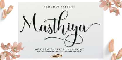 Masthiya Script is a modern calligraphy design including Regular. This font is casual and pretty with swashes. Can be used for various purposes. such as logos, product packaging, wedding invitations, branding, headlines, signage, labels, signatures, book covers, posters, quotes, and others. Masthiya Script includes changes in OpenType style, binding and international support for most Western languages. To activate the OpenType Stylistic alternative, you need a program that supports OpenType features such as Adobe Illustrator CS, Adobe Indesign & CorelDraw X6-X7, Microsoft Word 2010 or a later version. How to access all alternative characters using Adobe Illustrator: https://www.youtube.com/watch?v=XzwjMkbB-wQ The Masthiya Script is coded with PUA Unicode, which allows full access to all additional characters without having to design any special software. Mac users can use Font Book, and Windows users can use Character Map to view and copy any of the additional characters to paste into your favorite text editor / application. How to access all alternative characters, using the Windows Character Map with Photoshop: https://www.youtube.com/watch?v=Go9vacoYmBw If you need help or have any questions, let me know. I'm happy to help :) Thanks & Congratulations on Design!
 - Darshye Script by Solidtype,
$15.00 Darshye Script is a calligraphy script font that comes with exquisite character changes, a kind of classic copper decorative script with a modern twist, designed with high detail for an elegant style. Darshye Script is interesting because it has a soft, clean, feminine, sensual, glamorous, simple and very easy to read typeface, because there are many fancy letter joints. I also offer a number of decent stylistic alternatives for multiple letters. Classic style is very suitable to be applied in various formal forms such as invitations, labels, restaurant menus, logos, fashion, make up, stationery, novels, magazines, books, greeting / wedding cards, packaging, labels or any type of advertising purposes. You need a program that supports OpenType features like Adobe Illustrator CS, Adobe Photoshop CC, Adobe Indesign, Microsoft Word 2010. It's perfect for logos, greetings, branding, quotes, prints, invitations, and crafts. All lowercase letters include an alternate, start & end swash, which makes the font look amazing! These are all coded with the Unicode PUA. Mac users can use Font Book and Windows users can use Character Map to view and copy any additional characters for pasting into your favorite text editor / application.
 - Ekamai by Eclectotype,
$40.00 This is Ekamai, named after the district of Bangkok I lived in. It is based on Quinella, and was supposed to be a quick and easy reworking of that font into a "tight-not-touching" (rather than overlapping) version. As is often the case with quick and easy things, it turned out to be neither, and the vast majority of glyphs needed to be completely overhauled to fit the new system. This face is deliciously plump face, with lovingly rendered curves and just the right amount of cuteness; perfect for food packaging (of the sweeter variety probably!), logos, magazine headlines and the like. It performs admirably in all caps settings. The numerals are expressive hybrid figures (somewhere between lining and oldstyle). The overall feel is friendly and soft, without being overtly saccharine. Ekamai is equipped with subtle contextual alternates (which I'd recommend leaving on) to help with the tight fit, a handful of discretionary ligatures if that's your thing, and a case feature for all caps settings. The stylistic alternates and stylistic set 1 features simply change the # glyph to an attractive numero. Automatic fractions are included along with wide-ranging language support.
 - Bridgerton Outline by Hrz Studio,
$19.00 Bridgerton Outline is a calligraphy font that comes with exquisite changing characters, a kind of classic decorative copper script with a modern touch, designed with high details to bring out the elegance of the style. Bridgerton Outline Font is attractive because the typeface is smooth, clean, feminine, sensual, glamorous, simple and very easy to read, because of the many luxurious letter connections. I also offer a number of viable style alternatives for many letters. The classic style is very suitable to be applied in various formal forms such as invitations, labels, restaurant menus, logos, fashion, make up, stationery, novels, magazines, books, greeting/wedding cards, packaging, labels or all kinds of advertising purposes. . Bridgerton Outline Font is encoded with Unicode PUA, which allows full access to all additional characters without having to have special design software. Mac users can use Font Book, and Windows users can use Character Map to view and copy any of the additional characters to paste into your favorite text editor/application. If you need help or have any questions, let me know. I'm happy to help. Thank you & Happy Designing!
 - Bridgerton Script by Hrz Studio,
$19.00 Bridgerton Script is a calligraphy font that comes with exquisite changing characters, a kind of classic decorative copper script with a modern touch, designed with high details to bring out the elegance of the style. Bridgerton Script Font is attractive because the typeface is smooth, clean, feminine, sensual, glamorous, simple and very easy to read, because of the many luxurious letter connections. I also offer a number of viable style alternatives for many letters. The classic style is very suitable to be applied in various formal forms such as invitations, labels, restaurant menus, logos, fashion, make up, stationery, novels, magazines, books, greeting/wedding cards, packaging, labels or all kinds of advertising purposes. . Bridgerton Script Font is encoded with Unicode PUA, which allows full access to all additional characters without having to have special design software. Mac users can use Font Book, and Windows users can use Character Map to view and copy any of the additional characters to paste into your favorite text editor/application. If you need help or have any questions, let me know. I'm happy to help. Thank you & Happy Designing!
 - Galvantur by Ivangard Studios,
$12.00 Galvantur is a sans serif font, suitable for a wide range of applications. The main characteristic of this font is the slightly alien feel it can invoke, allowing it to really appear different and stand out, comparative to what other sans serifs may look like. The multiple styles included can further help customize your designs and projects, whether it's a body of text or an attention grabbing title. For example switching a block of text from regular style to oblique, can drastically change the overall appearance and feel of said text. Comes in 7 different styles - Regular, Oblique, Bold, Bold Oblique, Outlines, Bold Outlines and Oblique Outlines. To get an idea of the various styles, please check out the preview pictures or use the preview field to type in text. A full list of the glyphs included in this font can also be seen in the preview images. Galvantur supports Latin and Cyrillic based languages. The font includes a single alternative character for the letter "h". Because of the lack of ligatures and alternates, the font is rather standardized and will work with any and all software/applications.
 - Blissful Script by Romie Creative,
$19.00 Blissful Classic is a calligraphy font that comes with exquisite changing characters, a kind of classic decorative copper script with a modern touch, designed with high details to bring out the elegance of the style. Blissful Classic Calligraphy Font is attractive because the typeface is smooth, clean, feminine, sensual, glamorous, simple and very easy to read, because of the many luxurious letter connections. I also offer a number of viable style alternatives for many letters. The classic style is very suitable to be applied in various formal forms such as invitations, labels, restaurant menus, logos, fashion, make up, stationery, novels, magazines, books, greeting/wedding cards, packaging, labels or all kinds of advertising purposes. . Blissful Classic Calligraphy Font is encoded with Unicode PUA, which allows full access to all additional characters without having to have special design software. Mac users can use Font Book, and Windows users can use Character Map to view and copy any of the additional characters to paste into your favorite text editor/application. If you need help or have any questions, let me know. I'm happy to help. Thank you & Happy Designing!
 - Schnebel Sans ME by URW Type Foundry,
$35.99 It took me 12 years to bring this extensive font family to completion. A lot has been changed, transformed, peeled and developed in all those years. For many of my projects I used it as my quarry and so it might have become something like a synthesis of all my imaginations and experiences. To me »Schnebel Sans« represents the optimal design of a contemporary grotesque that perfectly unites dynamics with statics. For copy text the typefaces are very legible, neutrally and remain in the background, but despite this generate the necessary tension when set as headlines. »Schnebel Sans« is available in 48 different styles. It is available as a Pro Font, containing West, East Greek, and Cyrillic or as the Schnebel Sans ME, also containing Arabic and Hebrew. The scripts include small caps and various figure sets.This big range of styles from Thin to Black and from Compressed to Expanded offer many possibilities for design and fulfill all requirements for a professional use. Because of the supplement of several non-Latin character sets, the »Schnebel Sans« is perfectly suitable for global services too. Volker Schnebel, 2016
 - Brigland Script by Romie Creative,
$15.00 Brigland Script is a modern calligraphy font and includes beautiful swashes. It works well in various purposes such as logos, product packaging, wedding invitations, branding, headlines, signage, labels, signatures, book covers, posters, quotes and more. Brigland Script supports changing OpenType languages, binders and international support for most Western languages. To activate the OpenType Stylistic alternative, you request a program that supports OpenType features such as Adobe Illustrator CS, Adobe Indesign & CorelDraw X6-X7, Microsoft Word 2010 or newer versions. How to access all alternative characters using Adobe Illustrator: https://www.youtube.com/watch?v=XzwjMkbB-wQ Brigland Script is coded with Unicode PUA, which allows full access to all additional characters without having to install special software. Mac users can use the Font Book, and Windows users can use the Character Map to view and use one of the additional characters to paste into your favorite text editor / application. How to access all alternative characters, use Windows Character Map with Photoshop: https://www.youtube.com/watch?v=Go9vacoYmBw If you need help or have questions, please let me know. I am happy to help :) Thank you & Happy Designing!
 - Futura Paneuropean by Linotype,
$65.00First presented by the Bauer Type Foundry in 1928, Futura is commonly considered the major typeface development to come out of the Constructivist orientation of the Bauhaus movement in Germany. Paul Renner (type designer, painter, author and teacher) sketched the original drawings and based them loosely on the simple forms of circle, triangle and square. The design office at Bauer assisted him in turning these geometric forms into a sturdy, functioning type family, and over time, Renner made changes to make the Futura fonts even more legible. Futura’s long ascenders and descenders benefit from generous line spacing. The range of weights and styles make it a versatile family. Futura is timelessly modern; in 1928 it was striking, tasteful, radical — and today it continues to be a popular typographic choice to express strength, elegance, and conceptual clarity. NEW: the new Futura W1G versions features a Pan-European character set for international communications. The W1G character set supports almost all the popular languages/writing systems in western, eastern, and central Europe based on the Latin alphabet including Vietnamese, and also several based on Cyrillic and Greek alphabets. - Aire by Lián Types,
$37.00 Aire is what Sproviero would call a < big display family >. We recommend seeing its user’s guide. After his success with Reina, Sproviero comes out with this big family of 7 members: Each of them loaded with lots of sophisticated ligatures, alternates and the entire cyrillic alphabet. The overall impression that the font gives is lightness and delicateness; that’s the reason the designer chose to call it Aire, or Air, in English. "Aire was somehow having a rest from my fat face Reina [...] It started as a really thin style of Reina, but it rapidly migrated from it and grew up alone. And how it grew..." The inspiration came from his own past creations: “The heavy strokes of Reina were shouting for a more delicate thing. Something more feminine. More fragile. Something which had a lot of elegance and fresh air inside”. Aire responds to this: Sproviero found that many of the typefaces of nowadays which are used for headlines (best known as display fonts) have almost always just one, maybe two weight styles. This was his opportunity to try something new. Aire makes it easier for the user to generate different levels/layers of communication thanks to its variety of styles. With this font you can solve entire decorative pieces of design with just one font, and that was the aim of it. Aire was designed to be playful yet formal: While none of its alternates are activated it can be useful for short to medium length texts; and when the user chooses to make use of its open-type decorative glyphs, it can be useful for headlines with dazzling results. On March of 2012, Aire was chosen to be part of the most important exhibition of typography in Latinoamerica: Tipos Latinos 2012. TECHNICAL Aire is a family with many members. In total, the user can choose between almost 6,000 (!) glyphs (1,000 per style). Each member has variants inside, which are open-type programmed: The user decides which glyph to alternate, equalizing the amount of decoration wanted. Every decorative glyph has its weight adjusted to the style it belongs to. Exclusively for decoration, Aire Fleurons Pro is an open-type programmed set of ornaments. And last but not least, remember Aire is delicate. What’s my point? It is not recommended to activate all the alternates at the same time. It is typo-scientifically proved: A maximum of 3 or 4 alternates per word would be more than enough.
