4,258 search results
(0.022 seconds)
- SF Cosmic Age Outline - Unknown license

- SF Cosmic Age Condensed - Unknown license

- TG Aqsa Grotesque Pro by Tegami Type,
$30.00 TG Aqsa Grotesque Pro is the latest version of the font that was previously released in 2017, TG Aqsa Grotesque. In this latest version there are several optical fixes on each glyphs. In this latest version also added 2 new weights namely black and ultra black so that TG Aqsa Grotesque Pro has 6 fonts of different weights. Still maintaining the sans serif grotesque style coupled with the improvement of the letter form make TG Aqsa Grotesque Pro have a good level of readability when applied as a body text. And this version also has extended latin which will support more than 90+ different languages.
 - TA Bankslab Art Nouveau by Tural Alisoy,
$40.00 TA Bankslab graphic presentation at Behance The building of the Northern Bank of St. Petersburg's Baku branch was built in 1903-1905. It was the first Art Nouveau-style building in Baku, Azerbaijan. Later the bank was transformed into the Russian-Asian Bank. After the oil boom in Baku in the 19th century, branches of many banks and new banks were opened in the city. The branch of the Northern Bank of St. Petersburg was among the first banks that was opened in Baku. N.Bayev was the architect of the building for the branch of the Northern Bank of St. Petersburg located at Gorchakovskaya 3 in 1903-1905. The building currently houses the Central Branch of the International Bank of Azerbaijan. My purpose in writing this is not to copy and paste the information from Wikipedia. What attracted me to the building was the word "Банкъ" (Bank) written in Cyrillic letters, which was also used in Azerbaijan during the Soviet era. The exact date of the writing is not known. Every time I pass by this building, I always thought of creating a font of this writing someday. I had taken a photo of the building and saved it on my phone. I did a lot of research on the font and asked a lot of people. However, some did not provide information at all and some said they did not have any information. I was interested in the history of this font but I do not know if this font really existed or it was created by the architect out of nowhere. If there was such a history of this font, I wanted to recreate this font and make it available. If not, I had to create it from scratch in the same way, using only existing letters on the building. Finally, I made up my mind and decided to develop the font with all letters I have got. It was difficult to create a font based on the word, Банкъ. Because in the appearance of the letters, the midline of the letters on A, H, K was very distinct, both in the form of inclination and in more precise degrees. The serif part of the letters, the height of the upper and lower sides, differed from each other. I don't know whether it was done this way when the building was constructed or it happened over time. I prepared and kept the initial version of the font. I took a break for a while. I started digging on the story of the font again. Meanwhile, I was researching and got inspired by similar fonts. Unfortunately, my research on the font's history did not yield any results. I decided to continue finishing up the font. After developing the demo, I created the font by keeping certain parts of these differences in the letters. In addition, I had to consider the development of letters in the Cyrillic, as well as the Latin alphabet, over the past period. Thus, I began to look at the appearance of slab-serif or serif fonts of that time. In general, as I gain more experience in developing fonts, I try to focus on the precision of the design for each font. In recent years, I specifically paid attention to this matter. YouTube channel and articles by Alexandra K.'s of ParaType, as well as, information and samples from TypeType and Fontfabric studios on the Cyrillic alphabet were quite useful. I gathered data regarding the Latin alphabet from various credible sources. I do not know if I could accomplish what I aimed at but I know one thing that I could develop the font. Maybe someday I'll have to revise this font. For now, I share it with you. I created the font in 10 styles. 7 weight from Thin to Extra Black, an Outline, Shadow, and Art Nouveau. The Art Nouveau style was inspired by the texture in the background used for the text on the building. The texture I applied to capital letters adds beauty to the font. If you like the font feel free to use it or simply let me know if your current alphabet doesn't support this font.
 - TA Film Fiction Sans by Tural Alisoy,
$25.00 We've already updated and revitalized Film Fiction Sans to ensure it perfectly matches your evolving creative vision. The inclusion of tabular figures, old-style figures and alternative glyphs expands your design palette and allows you to adapt the font to your unique style. TA Film Fiction Sans has been updated experience the appeal – this can be your font of choice to enhance your brand identity, cinematic efforts and editorial design. This brilliant typeface is not just a typographic tool, but a creative catalyst for headlines, logos, web elements, signage, posters and fashion apparel, packaging. TA Film Fiction Sans does not follow trends, it defines them, imbuing each project with a true modern essence. Embrace the possibilities with 9 different styles, each boasting a large set of 758 glyphs. Discover additional features of OpenType features such as aalt, dnom, frac, kern, liga, numr, ordn, salt, sin, ss01, ss02, ss03, ss04, ss05, ss06, ss07, tabular figures, old-style figures and alternative glyphs. Not only does this font speak multiple languages, it also covers a variety of design needs – offering seamless language support for Western European, Central/Eastern European, Baltic, Turkish, and Romanian languages. Test your alphabet, explore the nuances and witness the transformation. And if you're at any creative crossroads, I'm here for you. If you want to customize TA Film Fiction Sans, need font files or have any other questions, please reach out to me at t@taft.work. TA Film Fiction Sans be the cornerstone of your creative journey. Elevate your designs, embrace innovation and redefine possibilities with TA Film Fiction Sans, where each character tells a story.
 - Cyber Rock by WAP Type,
$15.00 Cyber rock Brush Script bold, cool, cursive, design, editorial, grunge, handpaint, handwritten, ink, letter, logo, logotype, magazine, marker, modern, paint, ragged, ROUGH BRUSH, script, sign, style, stylish, swash, tag tagging, textured, trend, trendy, urban, vintage, written handwritten brush script dry brush cursive font with rough and dynamic look. Ideal for quotes, posters, branding, packaging, illustration, social media.
 - Portsmouth Second Fleet by Open Window,
$19.95 Portsmouth Second Fleet is the rag tag, wild bunch companion to Portsmouth. It is a strong, sturdy typeface with historical character. Its inspiration comes from the height and strength of the wooden tall ships that sailed into port in their day. With caps and small caps, this typeface is great for headlines or subheads for design projects that need a historical or retro feel, such as from the 1940s and earlier. Two different styles that can be layered allow for different colored drop shadows, outlines and fill for even more customization.
 - A Drink For All Ages - Unknown license

- Monkey In The Middle Ages by Intellecta Design,
$24.90 A collection of fonts by the type foundry Intellecta Design. Distressed and antique, use these fonts in display purposes for a stylized type design. Contains a limited amount of letter designs.
 - TA Film Fiction Semi X by Tural Alisoy,
$25.00 Film Fiction Semi Expanded has been updated and will now beautify your designs under the name TA Film Fiction Semi-X. We've already updated and revitalized TA Film Fiction Semi-X to ensure it perfectly matches your evolving creative vision. The inclusion of tabular figures, old-style figures and alternative glyphs expands your design palette and allows you to adapt the font to your unique style. TA Film Fiction Semi-X has been updated experience the appeal – this can be your font of choice to enhance your brand identity, cinematic efforts and editorial design. This brilliant typeface is not just a typographic tool, but a creative catalyst for headlines, logos, web elements, signage, posters and fashion apparel, packaging. TA Film Fiction Semi-X does not follow trends, it defines them, imbuing each project with a true modern essence. Embrace the possibilities with 9 different styles, each boasting a large set of 758 glyphs. Discover OpenType features: Access All Alternates, Case-Sensitive Forms, Glyph Composition / Decomposition, Denominators, Fractions, Kerning, Standard Ligatures, Lining Figures, Localized Forms, Mark Positioning, Mark to Mark Positioning, Numerators, Oldstyle Figures, Ordinals, Proportional Figures, Stylistic Alternates, Scientific Inferiors, Stylistic Set 1, Stylistic Set 2, Stylistic Set 3, Stylistic Set 4, Stylistic Set 5, Stylistic Set 6, Stylistic Set 7, Subscript, Superscript, Tabular Figures TA Film Fiction Semi-X supports Khinalyg (Xınalıq) alphabet Test your alphabet, explore the nuances and witness the transformation. And if you're at any creative crossroads, I'm here for you. If you want to customize TA Film Fiction Semi-X, need font files or have any other questions, please reach out to me at t@taft.work. TA Film Fiction Semi-X be the cornerstone of your creative journey. Elevate your designs, embrace innovation and redefine possibilities with TA Film Fiction Semi-X, where each character tells a story. Questions? Contact us at t@taft.work Instagram @taft.work or @tural_a Visit us https://taft.work/
 - Zushboy by PizzaDude.dk,
$20.00Zushboy is a ragged verion of my own tagging style (even though it has been years and years since I did a thing like that!). The font is spaced tight in order to copycat a real homeboy's handwriting! Yo! - Hot Salsa by Sudtipos,
$59.00 Hot Salsa is a calligraphic script font inspired by the classic, fairly well-made brush letters from the casual sign painting style, mixed with the fast and gestural tags you can find on walls all around the world. This is a fresh font that allows you to play with its numerous swashes, alternates and ligatures to make it feel more sober or a little flirty depending on your needs. Hot Salsa started with a brush pen and a lot of paper. These were later re-traced onto many layers of tracing paper with the intention of maintaining the brush pen and handmade feeling while making the structure consistent to ensure its readability and performance.
 - URLOP by Mikołaj Grabowski,
$9.00 Colour is more fun than black, but multicolour is even better. Let me introduce URLOP, a wide type family suitable for your fancy posters, headlines, covers, illustrations, websites, initials, blackmails, chronicles, signboards, poems and many others. Twelve basic styles, which make the overall construction, give a wide range of opportunities. All of them, being able to mix with each other, vary from a thin INSIDE, through a medium FILL, to a double-stem PLUS styles. And then comes a range of colour fonts, so you don’t have to waste any of your precious time for experiments, because I’ve already done it for you! URLOP is an all-caps display collection consisting of three sub-families of fonts, divided by the usage they are designed for. First of all, there is a wide range of alphabets made in the new OpenType-SVG colour fonts format. This is quite a novelty and a very promising technology at the same time. It allows designers to store colour information inside the font. Due to my experience with layered colour thinking that I explored in my first family - Epilepsja , I decided to make several preset layer combinations in this auspicious format. This sub-group is tagged RGB. Make sure that your field of usage and software support OT-SVG format. However, if you feel a need to experiment in the old-fashioned way, you may buy separate layers under the DIY tag. The last group is very similar to the DIY, but it was optimized to look better when standing without other layers. It’s called PRO*. All styles cover Latin alphabets of Europe, basic Cyrillic and Greek sets. Have fun! Before using the font, read the instructions and specimen attached to font files in the purchased package or download them from the Gallery tab on this site. This will help you avoid making unexpected mistakes when combining layers. *PRO subfamily release planned in 2019.
 - Tabarra Shadow - Personal use only

- Pirates Rum by Fractal Font Factory,
$13.00 Hi! Introducing a vintage layered typeface set named "Pirates Rum". This is an experiment of combining pirate motives with a touch of Gothic. It is a multi-layered decorative font containing a base layer, a layer with internal decorative elements, a layer with a shadow, and a separate aged font. It contains basic uppercase and lowercase glyphs, punctuation, numbers as well as multilingual characters for all kinds of layers. Pirates font, great for labels, logos, headers, and illustrations. Thank you & have a great day!
 - South East by Girinesia,
$17.00 South East is stylish handwritten font. South East looks original and can be used for all your project needs. South East would perfect for Youtube Cover or Thumbnails, sports flyers, mockup , tote bags, kids books, scrapbooks, logos, icons, phrases or quotes for winter greeting cards (Halloween, Christmas or New Year holidays), photo overlay, short phrases, gift shops tags, presentation in social media Pinterest, Instagram, Facebook and more.
 - Streetbrush by Robert Arnow,
$21.99 When I was in high school, I would wreck my notebooks with multiple layers of graffiti tags, which would start in the margins, and then creep in to cover the entire page. I developed a sensibility towards a very fast, expressive use of my hand, which later easily and naturally translated into brush. I used this style typographically on several projects throughout the years, and even turned it into a signature illustration style. Recently, by repeating letters hundreds of times each with brush on paper, this ad-hoc brush style became Streetbrush. The style is characterized by a unique blend of urban grafitti meets Asian calligraphy. The font is best used for large titling or signage, as it is extremely detailed and really captures the feeling of a brush pulling ink across a textured surface. That said, the font will also work well for body copy, and includes most basic symbols. The font has some ligatures, mainly for legibility.
 - Slimetag by PizzaDude.dk,
$15.00A slimy tag font! - Buddy Tequila by PizzaDude.dk,
$15.00A crunchy tag font. - Adrenalina by BRtype,
$25.00 Adrenalina was created in 2003-2007. In 2014 the project was revised and became a font family. The character set was drawn through digital manipulation from photos of pichações taken in São Paulo - Brazil. Pixação is a form of tagging that comes from Brazilian graffiti writers. This style of pichação (or pixação) is also known as tag reto (straight tag).
 - MindCrime AOE by Astigmatic,
$19.95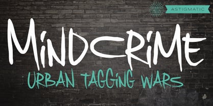 An offbeat graffiti tag-style font.
 - Glotona Black - Personal use only

- H74 Dishonor by Hydro74,
$9.99 Dishonor is a dog town inspired street tag styled typeface.
 - Quick Or Dead by Vozzy,
$5.00 A vintage look layered label font named "Quick or Dead". This font was inspired by American wild west history. The family includes six styles (including effect styles), for sample look at preview. This font will good viewed on any retro design like poster, t-shirt, label, logo etc. For using effects layers: - Type your text in Regular. - Copy that and paste at the same position. - Change the style to Shadow or Texture. Alternates and catchwords: - Capital letters are different than small (look to the preview). - Several small letters have alternates (look to the preview). - For the catchwords type the word (for sample 'with'), select that and turn on 'Discretionary Ligatures' on the 'OpenType' tab. Or paste it from 'Glyphs' tab in any place on your text. This in Illustrator. In Photoshop 'Discretionary Ligatures' you can find in the menu Type - OpenType.
 - Buddy Builder by PizzaDude.dk,
$15.00A laid back tag font. Suitable for text, headlines and yell outs! - Xtencil Pro by John Moore Type Foundry,
$25.00 Xtencil is a typeface inspired by the shapes of the drawing templates letters, based on the letter forms of Photo-lettering Glaser Stencil from universal teacher Milton Glaser who at the same time was influenced by the modernism and the Futura of Paul Renner. Xtencil is a round letter to create a great looks, ideal for posters and headlines. Xtencil not come as a drawing template, but as true Pro OpenType typography. Now in a complete family with upper and lower cases, an inline and a thickened Shadow versions to play with layers, also accompanied by a Dingbats font with fun graphics in the same spirit.
 - Fira Mono - 100% free

- MLE by Martin Wait Type,
$26.00This is a close spaced tagging style that needs to be auto kerned. - Anderson Thunderbirds Are GO! - Unknown license

- It Lives In The Swamp (BRK) - 100% free

- Flying Sausage by Remedy667,
$18.00 Flying Sausage. From beyond the stars it comes to take over your designs. Perfect for any science fiction or horror inspired comics, books, event flyers, pulps, rags, movies, logos, shirts… no design is safe, even drive-in theatre menus?!? Includes a textured version for additional layered effects that make it jump off the screen! You’ll scream for Flying Sausage. Available now!
 - Mustang by Robert Arnow,
$21.99 Mustang is a powerfully expressive brush font that combines an edgy urban aesthetic with a smooth feminine flow. Some have suggested that Mustang is romantic. Some say it has something to do with speed or freedom. While precisely what Mustang expresses is up to debate, there’s no doubt that it’s expressing it with intensity. The style was born in my high school years, when I would wreck my notebooks with multiple layers of graffiti tags which would start in the margins and then creep in to cover the entire page. I developed a sensibility towards a very fast, expressive use of my hand, which later easily and naturally translated into brush. I used this style typographically on several projects throughout the years, and even turned it into a signature illustration style. Mustang is the second font, after Streetbrush, to use this brushwork as its inspiration. Mustang will be especially evocative at large sizes, where the details and sharpness of the shapes really come to life. It also holds together well for use as body copy, but may lose some of its aesthetic integrity at really small sizes.
 - Ademo by astype,
$48.00 Ademo is a classic, shaded and perspective looking display font. The design is based on two typefaces designed by Carl Albert Fahrenwaldt and published between 1931– 1932 by the German Schriftguss AG type foundry. pdf specimen Ademos special Fill fonts can be used for building multi colored text or for special finishing needs like blind imaging, embossing, stamping, partial UV coating and laser cutting.
 - Parmezan MF by Masterfont,
$59.00 Your logo or tag line, your next signage or poster - it's all in this family.
 - Grandecort by Ingrimayne Type,
$9.95Grandecort is derived from the OakPark family. It has lost the serifs, and has moved to a more traditional look. The upper case letters are a bit heavier than the lower case letters, but overall the letter shapes are fairly conventional for a bold, display face. In later 2018 the family was expanded to 9 fonts. GrancMitStripes was reworked to make four new faces: GrancAllStripes, GrancTopStripes, GrancBottomStripes, and GrancCaps. The last can be used as a background layer for the others. Also, The interior of GrandecortShadow was separated out to form GrandecortShadowInside. It has the same shapes as Grandecort-Regular but the spacing of GrandecortShadow and can be layered with the shadowed style to easily create bi-colored letters. - Market by URW Type Foundry,
$35.99 DTC Black Market is best used for price tags and signs in shops, especially in stores and markets.
 - Rolla Cossta by Gassstype,
$25.00 Rolla Cossta - Handwritten Brush Font . Introducing of designs look modern, unique and fun. It’s perfect for labels, quotes, posters, DIY projects, branding, packaging, greeting cards, websites, photos, photography overlays, signs, window art, scrapbooking, tags and so much more!our new product that inspired by Street Tagging, graffiti style with a fun theme very good for graffity poster, flyer, childrenbook, cartoon, comic etc
 - Human Rase by Graffiti Fonts,
$19.99This is a simple and legible tag style font as written with a bullet tip marker. HumanRase includes characters for all uppercase and lowercase keys as well as numbers, punctuation and dozens of other symbols (many more characters than most other tag style fonts). This font works well at large sizes but is also very legible when used for body copy. - Electrofied - 100% free

- Poipoi by Dharma Type,
$14.99 Extraordinary impact and visual conspicuousness. Poipoi is a super 3D sans family for posters, logos and all display. The basic idea is not a brand new. The Stacking type system has been used since before wood type age. As you imagined, colored wood type(woodcut), many other engravings and contemporary printer machine print many colors separately with different printing plates for each color. Poipoi uses the same system for 3d effect. Please use Photoshop or Illustrator, or your favorite graphic design apps that can handle layers. Layers are the printing plates of wood type. You should be able to change text color for each layer. Poipoi "Standard" style is the base of this font family. You can add effects by stacking Highlight and shadow layers. Stacked layers in different color make the text in 3D. Instruction 1. Type your text as you like. 2. Set font-name "Poipoi" and font-style "Standard" 3. Set color of "Standard" layer. 4. Duplicate the "Standard" layer twice (One for Highlight, one for Shadow). 4'. The layer order should be Highlight, Standard, and Shadow from top to bottom. 5. Set font-style and color of "Highlight" and "Shadow" layers. 6. Adjust tracking if you need. (Please use same tracking value for all 3 layers.) For further detail, https://www.dropbox.com/s/xymis7dh5hwxn9q/Poipoi.pdf Poipoi Standard, Highlighted, and shadowed style can be used solely. Rounded terminals add soft, cute, and casual impressions to your design. Spec: Over 400 glyphs! Basic Latin ✓ Western Europe ✓ Central Europe ✓ South Eastern Europe ✓ Mac Roman ✓ Windows 1252 ✓ Adobe Latin 1 ✓ Adobe Latin 2 ✓ Adobe Latin 3 ✓ Almost all Latins are covered.


