10,000 search results
(0.036 seconds)
- Lovely Rose by Namara Creative Studio,
$14.00 Lovely Rose Romantic calligraphy script font inspired by lovely valentines themes. This font is suitable for greeting card, wedding invitation, instagram post, quotes and so on. Feel free to follow, like and share. Thanks so much for checking out my shop!
 - Dungeons by Rometheme,
$18.00 Dungeons font is vintage monoline script font. It has vintage, elegant, old school, classy, and cool. It’s a great font for fashion, apparel projects, signature, album cover, logo, branding, magazine, social media, & advertisements, but also works great for other projects.
 - Kular by Wilton Foundry,
$9.00 I set out to design a monospaced font and decided it would look way better if it wasn't. It gave me the freedom to make the individual glyphs more interesting while retaining the mono-look. The numerals are tabular! Enjoy!
 - Autobahn Std by AVP,
$18.00 Autobahn is a robust masculine sans of near monoline thickness and angular characteristics. Autobahn Std has a full Latin 1 character set but no CE, Cyrillic or Opentype features. For the extended character set and Opentype features, see Autobahn Pro.
 - Magisk Time by Bogstav,
$11.00 This is my roughly handprinted typewrite-ish font. It has all the cool and classic moves of the traditional typewriter look, but with a more rough attitude due to the contextual alternates (which offer 6 different versions of each letter!)
 - Blue Point by Solotype,
$19.95We began with the Victorian font Dotted, so-called because the counters of many of the letters contained a dot. We knocked out the dots, added a lowercase, and voila! a more useful type than the original without losing its charm. - Deco Neue Wilde by Open Window,
$- Deco Neue Wilde is a filter font based on Deco, an original Open Window classic. It sort of speaks for itself but it reminds me of a lava lamp and the countless shapes that you could waste time watching appear.
 - Retroid by Gleb Guralnyk,
$15.00 Hello! Introducing a vintage style font — Retroid. It's a pixelated old-school typeface that imitates 8-bit console graphics. Retroid font has multilingual support (check out a screenshot with available letters and signs). Thank you and wish you a peaceful sky!
 - Huntsman by Solotype,
$19.95Issued from the Haddon Foundry in England. Most of their original faces had names beginning with H, like their own name. Some of their types were designed by Phil May, but we cannot guarantee that this is one of them. - Easter Rabbits by Yoga Letter,
$15.00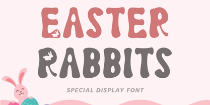 "Easter Rabbits" is a cute and unique display font. This font has bunnies in the letters, making it perfect for Easter occasions. Equipped with uppercase, lowercase, numerals, punctuation, and multilingual support. It is suitable for Easter, spring, summer, and more.
 - Thinkerbery by Mightyfire,
$15.00 Need a semi-formal yet unique font? Thinkerbery is the answer! The look of Thinkerbery is like a digital typing style but still has its uniqueness. We bring a strong looks for your text. Enjoy in creating unique arts using Thinkerbery! :)
 - Western Bevel JNL by Jeff Levine,
$29.00Western Bevel JNL smooths out the ornate design of Stablehand JNL to offer a cleaner slab serif font that retains its Western wood type feel. Aside from Western themes, it can be applied to sports team promotions and other nostalgic projects. - BLT Portage by Black Lab Type,
$12.00 PORTAGE is a slab serif that carries its own weight. Adventurous and rugged, this typeface that evokes the wild country and makes headlines stand out. The typeface was built from a land and forest journal from the mid-50's.
 - Colabero by Motokiwo,
$17.00 Colabero is a minimal and neat sans serif font. It can easily be matched to an incredibly large set of projects, so add it to your creative ideas and notice how it makes them stand out! Only Upper case characters.
 - Thiny Bunny by Sipanji21,
$17.00 hello i'm thiny bunny, a display font with thin characters, cute and funny look. This font is good to use for various graphic designs, such as logos, posters, banners, advertisements, crafting, packaging, stickers, kids, store logos, apparel and other designs.
 - Almost Broken by Rillatype,
$17.00 Almost Broken is a modern display font with bold and strong personality but charmful. this font comes with two version, regular and slanted. Almost Broken is perfect for headlines, logotypes, magazine, advertising, etc. this font also comes with multilingual support.
 - Sunbeat by PintassilgoPrints,
$26.00 Sunbeat is a quite groovy face, but that's not all: this upbeat family is packed with cool interlocking pairs for adding that twist when you need it. Available in three tones, suitable only for projects that sound great. Hell yes!
 - Heldustry by URW Type Foundry,
$35.99 Heldustry is a sans serif design with letterforms partway between Helvetica and Eurostile. The Heldustry font family has a large x-height and wide characters, making it ideal for situations where there is not much copy but pages must be filled.
 - Pentastic by Okaycat,
$24.50 Pentastic is a natural hand printed font designed for the look of written by pen. Clear legible style yet cute and fun. Pentastic features extended characters, containing West European diacritics and ligatures, making it suitable for international environments and publications.
 - Lotus Petal by Mysterylab,
$18.00 With firm roots in the groovy '60s and '70s — but with a modern twist — Lotus Petal is all whimsical and funky lines, coils, and curls. Just the right vibe for a vintage eye-catching banner headline or retro psychedelic poster graphics.
 - Nosy Note by PizzaDude.dk,
$16.00 Nosy Notes is originally handdrawn, but I digitally traced my sketches and the result is this font - a smooth, super steady and legible comic font. I've added multilingual support, in order for you to be nosy in all kinds of languages! :)
 - Doodles by Outside the Line,
$19.00Doodles received honorable mention in U&lc's First Annual Type Design Competition in the Picture Category. Inspiration came from many long hours logged in corporate strategic planning meetings. Check out Doodles the Alphabet designed to compliment the Doodles picture font. - Lourino by Mans Greback,
$59.00 Lourino is a flowing script typeface, drawn by Måns Grebäck during 2018 It is a high-quality font with cute letter shapes and large, round capitals. The font has an extensive set of characters and supports all Latin based European languages.
 - Zinc by K-Type,
$20.00 Zinc is a clean, distinctive family which is essentially a monoline sans serif but with horizontal and diagonal nubs that add a subtle script quality to display type and an easy-to-read rhythm to the flow of ordinary text.
 - Blapuhy by Sealoung,
$10.00 Blapuhy is a lovely handwritten font, designed with the help of a brush pen. Fall in love with its authentic feel and use it to create gorgeous wedding invitations, beautiful stationary art, eye-catching social media posts, and cute greeting cards.
 - Circlet by Solotype,
$19.95Like many of the Victorian decorative fonts, this one had caps only when Barnhart Bros. and Spindler brought it out. In 1990, we decided to draw a lowercase for it, making it more versatile. A good font for period typography. - FM Pointifax by FontMeister,
$- The POINTIFAX family is a typographic flashback to computing of the early 1980s. POINTIFAX is based on a matrix of dots and looks like the output on an old computer screen. Each is built out of dots, horizontal and vertical lines.
 - Lemon Rolls by Illushvara,
$12.00 Lemon Rolls is a cute and casual handwritten font with an incredibly friendly feel. Whether you’re looking for fonts for Instagram or calligraphy scripts for DIY projects, this font will turn any creative idea into a true piece of art!
 - Bitelephant by Kah Khiong Design,
$13.00 Bitelephant is a type of pixel font with Slab Serif. It's unique pipeline characteristic, result a bold & simple font. It's bitmap give a retro game looks, but with a futuristic feel. Suitable for any fun, sci-friction, techno, game & digital theme.
 - Bodoni Unique by Monotype,
$29.99This Bodoni caps only font was an experiment from Dave Farey how tall such a Bodoni could be elongated in its design. It reminds to the look of a fence, but in large sizes it may fit on a narrow window. - Eisha Script by Jorsecreative,
$22.00 The Eisha is a modern, handwritten calligraphic font with a sophisticated flow. It’s perfect for branding, wedding invitations, diaries, cups, mugs and greeting cards. Eisha has a smooth texture, so it will be perfect for all kinds of printing techniques.
 - Altwien by XTOPH,
$32.00 Altwien is a blackletter display font. Inspired by the old street-signs of Vienna and Salzburg. It’s a clear and simplistic looking condensed typeface. Put Altwien into a contemporary, fresh or modern context and get a completely new and unique style.
 - Emirose by Ergibi Studio,
$16.00 Emirose consists of 4 weights: Thin, Light, Regular and Bold, all equipped with many ligatures and alternative letters that look cute and classy. They work very well for your work such as logos, brands, packaging, posters, invitations, headlines, posters, and more.
 - Infidel by Barnbrook Fonts,
$50.00 Infidel is based upon letterforms from the Lindisfarne Gospels and other manuscripts and bibles from across the Middle Ages. These are wonderfully idiosyncratic forms; some beautiful, others unsightly, but all far away from what we recognise as legible letterforms, today.
 - Baskety by Trim Studio,
$12.00 Baskety is a friendly and playful display font with a unique style. Its playful theme brings out a cheerful smile from kids. Get inspired by its adorable charm! Baskety is well suited for many kids products, playful events, birthdays and holidays.
 - Mrs Eaves XL Serif by Emigre,
$59.00 Originally designed in 1996, Mrs Eaves was Zuzana Licko’s first attempt at the design of a traditional typeface. It was styled after Baskerville, the famous transitional serif typeface designed in 1757 by John Baskerville in Birmingham, England. Mrs Eaves was named after Baskerville’s live in housekeeper, Sarah Eaves, whom he later married. One of Baskerville’s intents was to develop typefaces that pushed the contrast between thick and thin strokes, partially to show off the new printing and paper making techniques of his time. As a result his types were often criticized for being too perfect, stark, and difficult to read. Licko noticed that subsequent interpretations and revivals of Baskerville had continued along the same path of perfection, using as a model the qualities of the lead type itself, not the printed specimens. Upon studying books printed by Baskerville at the Bancroft Library in Berkeley, Licko decided to base her design on the printed samples which were heavier and had more character due to the imprint of lead type into paper and the resulting ink spread. She reduced the contrast while retaining the overall openness and lightness of Baskerville by giving the lower case characters a wider proportion. She then reduced the x-height relative to the cap height to avoid increasing the set width. There is something unique about Mrs Eaves and it’s difficult to define. Its individual characters are at times awkward looking—the W being narrow, the L uncommonly wide, the flare of the strokes leading into the serifs unusually pronounced. Taken individually, at first sight some of the characters don’t seem to fit together. The spacing is generally too loose for large bodies of text, it sort of rambles along. Yet when used in the right circumstance it imparts a very particular feel that sets it clearly apart from many likeminded types. It has an undefined quality that resonates with people. This paradox (imperfect yet pleasing) is perhaps best illustrated by design critic and historian Robin Kinross who has pointed out the limitation of the “loose” spacing that Licko employed, among other things, yet simultaneously designated the Mrs Eaves type specimen with an honorable mention in the 1999 American Center for Design competition. Proof, perhaps, that type is best judged in the context of its usage. Even with all its shortcomings, Mrs Eaves has outsold all Emigre fonts by twofold. On MyFonts, one of the largest on-line type sellers, Mrs Eaves has been among the 20 best selling types for years, listed among such classics as Helvetica, Univers, Bodoni and Franklin Gothic. Due to its commercial and popular success it has come to define the Emigre type foundry. While Licko initially set out to design a traditional text face, we never specified how Mrs Eaves could be best used. Typefaces will find their own way. But if there’s one particular common usage that stands out, it must be literary—Mrs Eaves loves to adorn book covers and relishes short blurbs on the flaps and backs of dust covers. Trips to bookstores are always a treat for us as we find our Mrs Eaves staring out at us from dozens of book covers in the most elegant compositions, each time surprising us with her many talents. And Mrs Eaves feels just as comfortable in a wide variety of other locales such as CD covers (Radiohead’s Hail to the Thief being our favorite), restaurant menus, logos, and poetry books, where it gives elegant presence to short texts. One area where Mrs Eaves seems less comfortable is in the setting of long texts, particularly in environments such as the interiors of books, magazines, and newspapers. It seems to handle long texts well only if there is ample space. A good example is the book /CD/DVD release The Band: A Musical History published by Capitol Records. Here, Mrs Eaves was given appropriate set width and generous line spacing. In such cases its wide proportions provide a luxurious feel which invites reading. Economy of space was not one of the goals behind the original Mrs Eaves design. With the introduction of Mrs Eaves XL, Licko addresses this issue. Since Mrs Eaves is one of our most popular typefaces, it’s not surprising that over the years we've received many suggestions for additions to the family. The predominant top three wishes are: greater space economy; the addition of a bold italic style; and the desire to pair it with a sans design. The XL series answers these requests with a comprehensive set of new fonts including a narrow, and a companion series of Mrs Eaves Sans styles to be released soon. The main distinguishing features of Mrs Eaves XL are its larger x-height with shorter ascenders and descenders and overall tighter spacing. These additional fonts expand the Mrs Eaves family for a larger variety of uses, specifically those requiring space economy. The larger x-height also allows a smaller point size to be used while maintaining readability. Mrs Eaves XL also has a narrow counterpart to the regular, with a set width of about 92 percent which fulfills even more compact uses. At first, this may not seem particularly narrow, but the goal was to provide an alternative to the regular that would work well as a compact text face while maintaining the full characteristics of the regular, rather than an extreme narrow which would be more suitable for headline use. Four years in the making, we're excited to finally let Mrs Eaves XL find its way into the world and see where and how it will pop up next.
 - Moon Cresta by Typodermic,
$11.95 Introducing Moon Cresta, a charming typeface with a soft design that’s sure to captivate your audience. The font draws inspiration from the timeless Goudy Sans, while embracing a modern and minimalist style. Moon Cresta’s smooth curves and effortless flow give it a welcoming and friendly vibe, perfect for any design project. Initially, Moon Cresta only came in one style—Regular, which boasts a bold weight that demands attention. However, as designers fell in love with its delicate charm, a lighter weight was later added. To avoid any confusion, the original bold style was still named Regular, and the newer weight became known as Light. So, now you can enjoy the gentle touch of Moon Cresta in two weights—Regular and Light. To take your design to the next level, Moon Cresta also includes discretionary f-ligatures and custom ligatures for KA and RA. Simply use your application’s Discretionary Ligatures feature to access them and enhance the uniqueness of your design. In short, Moon Cresta is the perfect font for those seeking a soft, organic design with a touch of modernity. So why not try it out and see how it can add a touch of warmth to your project? Most Latin-based European writing systems are supported, including the following languages. Afaan Oromo, Afar, Afrikaans, Albanian, Alsatian, Aromanian, Aymara, Bashkir (Latin), Basque, Belarusian (Latin), Bemba, Bikol, Bosnian, Breton, Cape Verdean, Creole, Catalan, Cebuano, Chamorro, Chavacano, Chichewa, Crimean Tatar (Latin), Croatian, Czech, Danish, Dawan, Dholuo, Dutch, English, Estonian, Faroese, Fijian, Filipino, Finnish, French, Frisian, Friulian, Gagauz (Latin), Galician, Ganda, Genoese, German, Greenlandic, Guadeloupean Creole, Haitian Creole, Hawaiian, Hiligaynon, Hungarian, Icelandic, Ilocano, Indonesian, Irish, Italian, Jamaican, Kaqchikel, Karakalpak (Latin), Kashubian, Kikongo, Kinyarwanda, Kirundi, Kurdish (Latin), Latvian, Lithuanian, Lombard, Low Saxon, Luxembourgish, Maasai, Makhuwa, Malay, Maltese, Māori, Moldovan, Montenegrin, Ndebele, Neapolitan, Norwegian, Novial, Occitan, Ossetian (Latin), Papiamento, Piedmontese, Polish, Portuguese, Quechua, Rarotongan, Romanian, Romansh, Sami, Sango, Saramaccan, Sardinian, Scottish Gaelic, Serbian (Latin), Shona, Sicilian, Silesian, Slovak, Slovenian, Somali, Sorbian, Sotho, Spanish, Swahili, Swazi, Swedish, Tagalog, Tahitian, Tetum, Tongan, Tshiluba, Tsonga, Tswana, Tumbuka, Turkish, Turkmen (Latin), Tuvaluan, Uzbek (Latin), Venetian, Vepsian, Võro, Walloon, Waray-Waray, Wayuu, Welsh, Wolof, Xhosa, Yapese, Zapotec Zulu and Zuni.
 - Scheme by Typodermic,
$11.95 Welcome to Scheme, the typeface that’s as friendly as it is stylish. With its rounded stroke ends, Scheme’s letterforms are soft and inviting, like a warm embrace from an old friend. But don’t let its gentle appearance fool you—this sans-serif typeface is ready to help you make a statement. Reminiscent of the technical lettering found on vintage typewriters, Scheme brings a touch of nostalgia to your design, while its vivacious curls and waves give it a modern twist. The creamy appearance of the font adds an extra layer of sophistication to your message. And with four different weights and italics to choose from, Scheme is versatile enough to adapt to any project. Whether you’re designing a logo or creating a marketing campaign, this typeface is sure to lend a reassuring equilibrium to your message. So why not give Scheme a try? With its friendly style and charming appeal, it’s sure to be a hit with your audience! Most Latin-based European, Vietnamese, Greek, and most Cyrillic-based writing systems are supported, including the following languages. Afaan Oromo, Afar, Afrikaans, Albanian, Alsatian, Aromanian, Aymara, Azerbaijani, Bashkir, Bashkir (Latin), Basque, Belarusian, Belarusian (Latin), Bemba, Bikol, Bosnian, Breton, Bulgarian, Buryat, Cape Verdean, Creole, Catalan, Cebuano, Chamorro, Chavacano, Chichewa, Crimean Tatar (Latin), Croatian, Czech, Danish, Dawan, Dholuo, Dungan, Dutch, English, Estonian, Faroese, Fijian, Filipino, Finnish, French, Frisian, Friulian, Gagauz (Latin), Galician, Ganda, Genoese, German, Gikuyu, Greenlandic, Guadeloupean Creole, Haitian Creole, Hawaiian, Hiligaynon, Hungarian, Icelandic, Igbo, Ilocano, Indonesian, Irish, Italian, Jamaican, Kaingang, Khalkha, Kalmyk, Kanuri, Kaqchikel, Karakalpak (Latin), Kashubian, Kazakh, Kikongo, Kinyarwanda, Kirundi, Komi-Permyak, Kurdish, Kurdish (Latin), Kyrgyz, Latvian, Lithuanian, Lombard, Low Saxon, Luxembourgish, Maasai, Macedonian, Makhuwa, Malay, Maltese, Māori, Moldovan, Montenegrin, Nahuatl, Ndebele, Neapolitan, Norwegian, Novial, Occitan, Ossetian, Ossetian (Latin), Papiamento, Piedmontese, Polish, Portuguese, Quechua, Rarotongan, Romanian, Romansh, Russian, Rusyn, Sami, Sango, Saramaccan, Sardinian, Scottish Gaelic, Serbian, Serbian (Latin), Shona, Sicilian, Silesian, Slovak, Slovenian, Somali, Sorbian, Sotho, Spanish, Swahili, Swazi, Swedish, Tagalog, Tahitian, Tajik, Tatar, Tetum, Tongan, Tshiluba, Tsonga, Tswana, Tumbuka, Turkish, Turkmen (Latin), Tuvaluan, Ukrainian, Uzbek, Uzbek (Latin), Venda, Venetian, Vepsian, Vietnamese, Võro, Walloon, Waray-Waray, Wayuu, Welsh, Wolof, Xavante, Xhosa, Yapese, Zapotec, Zarma, Zazaki, Zulu and Zuni.
 - Orliet Pro by Arttype7,
$15.00 Elevate Your Designs with Elegant Luxury Orliet Pro is a meticulously crafted serif font designed to add a touch of elegance and luxury to your visual creations, especially ideal for enhancing the sophistication of logos. This font stands out for its uniqueness, boasting over 50 ligatures and alternative characters with artistic flair. Its well-designed script optimizes your designs, ensuring a seamless integration into your projects. Key Features: Versatile Ligatures and Alternatives: With over 50 ligatures and alternative characters, Orliet Pro provides a wide range of design possibilities. Each character exudes a unique artistic charm, allowing you to customize your text in a myriad of ways. Elegance in Every Detail: The design of Orliet Pro aims for elegance. The serif style adds a touch of class to your projects, making it perfect for creating logos that exude luxury and simplicity simultaneously. Seamless Font Families: Each member of the Orliet Pro font family complements one another effortlessly. Whether you choose the Orliet Pro script or Orliet Pro icons, they work harmoniously to enhance your overall design. Enhanced Design Flexibility: Orliet Pro script and Orliet Pro icons contribute to the ease of design integration. The script is thoughtfully designed to optimize your creative process, while the icons provide additional elements for a professional touch. Cyrillic Alphabet Inclusion: For an added layer of versatility, Orliet Pro includes the Cyrillic alphabet in regular, italic, bold, and bold italic styles. This ensures that your designs can reach a broader audience with diverse language preferences. Optional Details: Design Concept: Orliet Pro was conceptualized to bring an air of sophistication to your designs, with a focus on creating an elegant and timeless serif font. Creation Inspiration: The font draws inspiration from classic design elements, aiming to provide a timeless aesthetic that resonates with a modern audience. Historical Context: While not a revival, Orliet Pro pays homage to the timeless elegance of serif fonts, adding a contemporary twist to meet the demands of today's design trends. Elevate your designs with the timeless elegance of Orliet Pro. Explore the possibilities of serif and script styles, accompanied by convenient font icons, all seamlessly integrated into one versatile font family. Embrace luxury and simplicity in every character.
 - Maus - Personal use only

