427 search results
(0.006 seconds)
- La Fleur Grande by Zeenesia Studio,
$16.00 La Fleur Grande is a an elegant and smooth combine typeface regular and italic serif font. It’s a very versatile font that works great in large. Stylistic Alternate and Ligature makes your project will be awesome. La Fleur Grande Perfect for editorial projects, Logo design, web font, branding, product packaging, magazine , or simply as a stylish text overlay to any background image. This font is PUA encoded, which means you can access all of the glyphs and swashes with ease!
 - La Mona Pro by RodrigoTypo,
$49.00 La Mona Pro is a redesign of the Mona 2012 design. Greek is case sensitive, as also the Cyrillic. La Mona Pro contains ligatures, ornaments, layers, shadows, swash alternatives (72 fonts) Play :)
 - La Pica Bonus by RodrigoTypo,
$29.00 La Picá bonus is a new version with lower case letters, styles and dingbats that represents the popular lettering style.
 - La Brea Typist by Elemeno,
$- - La Maison Brush by Allouse Studio,
$16.00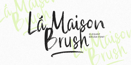 La Maison Brush a Elegant Brush Font with many options underline styles for your need! La Maison Brush is perfect for any tittle, logo, product packaging, branding project, megazine, social media, wedding, or just used to express words above the background. La Maison Brush also come with Multi-Lingual Support. Enjoy the font, feel free to comment or feedback, send me PM or email. Thank You!
 - La Dolce Vita by Angele Kamp,
$26.00 La Dolce Vita is an elegant serif font family with a feminine style. This beautiful collection will instantly add class to all of your design projects. This stylish font family is timeless and can not be missed in your font collection. It is the perfect branding font and will help you to easily create logos, wedding designs, and all other commercial projects.
 - 1792 La Marseillaise by GLC,
$42.00 This font, was created -- inspired from the original manuscript of the French revolutionary song “La Marseillaise”, becoming later the French national anthem, composed in one night (1792 April 25th) by the 32 year old French captain, Rouget de Lisle. It is a “Pro” font containing Western (including Celtic) and Northern European, Icelandic, Baltic, Eastern, Central European and Turkish diacritics. The numerous alternates and ligatures make the font look as close as possible to the real historic hand. Using an OTF software, the features allow variations of each character without anything to do but to select contextual alternates and standard ligatures and/or stylistic alternates options.
 - La Vintage Script by Letterfreshstudio,
$20.00 La Vintage Font is an urban retro font with the style like a logotype lettering. was created to help you designing logotype or lettering style for your Brand or your clients. it has an extensive lingual support, covering European and Asian Latin scripts. The font contains all characters you'll ever need, including all punctuation and numbers. Multilingual Support Alternates, Regular Thankyou
 - La Rose Display by Masa Type,
$15.00 La Rose is Display Sans, designed to look modern & minimal in any setting. Designed for optimal readability, its clean geometric look is perfect for things like fashion, magazine, logo, branding, headers, titles, corporate brochure designs. Typeface also supports Latin-based languages. Other details include 4 font weights, 290 characters, manually edited kerning and an Opentype alternative feature.
 - Las Valles Textured by Kaligra.co,
$29.00 Las Valles Textured is a tall, ultra-condensed sans serif font offered in 4 styles. Combining vintage charm with modern appeal, it boasts unique ligatures and versatile choices. The mix of rounded and regular styles adds a fresh touch. Particularly suitable for headlines, quotes, logos, web, and print design, including magazine covers, posters, and signage.
 - La Carte Pen by AVP,
$19.00 La Carte Pen is a paper textured version of the popular La Carte font. Inspired by a series of handwritten menus produced in 1980, La Carte is a stylish but easy-to-read script that sets as well in body copy as it does in headlines.
 - La Belman Pro by Gleb Guralnyk,
$14.00 Presenting a font family La Belman Pro. This capital vintage style typeface is perfect for label design and different headers. It has 5 weights wich makes it more usable in different sizes and usecases. Lots of ligatures can help you to create a unique lettering compositions. West european characters set is available. Thank you for your attention and have a nice day!
 - VVDS La Truffe by Vintage Voyage Design Supply,
$15.00 Introduce you a new one - La Truffe. A super stylish Didone font. Comes with two styles - Regular and Italic. High contrast strokes gives a refinement into your project. Access your OpenType features to access the large selection of alternate letters and some ligatures. Calligraphic Italic can play with Regular in pair or can be used as independent mainline typeface. More than 480 glyphs total. La Truffe is a versatile font, which can be used in you branding ads, magazine headlines, posters, wedding invitations, product packaging, business cards etc.
 - La Pina Stencil by Apply Interactive,
$30.00 - La Pina Stencil EF by Elsner+Flake,
$35.00 - LA Gang Font Set01 by Rawtoons,
$11.00 This unique font is influenced by the graffiti writing on the walls of Los Angeles. Raw and Uncut. This font can be used on web pages, banners, hats, shirts, advertising. Perfect for all streetwear brands, music groups, and whoever else looking for that raw Los Angeles street style.
 - Cirque De La Lune by Dawnland,
$9.00 Once a year Through mist and rain October soon to end Have no fear Beneath the full moon we gather. Welcome to the show! Now - Silence... Cirque de la Lune is an uppercase only poster/display/headline font in two variants - Eclipse (regular) & Fullmoon (outline). Alternate, nudged or slightly rotated uppercase letters are placed on the lower case keys!
 - La Vie En Flower by Arendxstudio,
$15.00 La vie en Flower is a very feminine and beautiful font with a vintage dressing that is perfect for every project of your design. With "La vie en Flower" you get: Uppercase, lowercase, 2.numeral, punctuation & Symbol multi language support ligatures ss01 ss02 Need help? Please don't hesitate to drop me an email at asep.rendi16@gmail.com if you have any issues. Comments & likes are also very appreciated! :) Enjoy!
 - La Reyna Catalina NF by Nick's Fonts,
$10.00An unreleased typeface called "Aragón", designed by Enric Crous-Vidal, provided the inspiration for this decidedly retro face. It’s quite useful for distinctive and commanding headlines. Both versions of the font include 1252 Latin, 1250 CE (with localization for Romanian and Moldovan). - Hasta La Pasta NF by Nick's Fonts,
$10.00This loopy offering is patterned after a typeface from the 1888 specimen book from the Central Type Foundry of St. Louis, called simply "Spiral". The ragged contours on the original face have been smoothed out, but it still is an attention-getter. Both versions of this font include the complete Unicode Latin 1252 and Central European 1250 character sets. - La Vie Nouveau JNL by Jeff Levine,
$29.00 Early 1900s songwriters had a penchant for devising lengthy titles for their compositions. A perfect example from 1909, "It Is Hard to Kiss Your Sweetheart When the Last Kiss Means 'Good Bye'" is a whopping fourteen words long. The sheet music for this piece has a hand lettered, Art Nouveau sans serif design which became the working model for La Vie Nouveau JNL [which translates to "the new life"], and is available in both regular and oblique versions.
 - Monsieur La Doulaise Pro by Sudtipos,
$45.00 The Charles Bluemlein Script Collection is an intriguing reminder of the heady days of hand lettering and calligraphy in the United States. From the early 1930s through World War II, there were about 200 professional hand letterers working in New York City alone. This occupation saw its demise with the advent of photo lettering, and after digital typography, became virtually extinct. The odd way in which the Bluemlein scripts were assembled and created - by collecting different signatures and then building complete alphabets from them - is a fascinating calligraphic adventure. Because the set of constructed designs looked nothing like the original signatures, fictitious names were assigned to the new script typefaces. The typeface styles were then showcased in Higgins Ink catalogs. Alejandro Paul and Sudtipos bring the Bluemlein scripts back to life in a set of expanded digital versions, reflecting the demands of today’s designer. Extreme care has been taken to render the original scripts authentically, keeping the fictitious names originally assigned to them by Bluemlein.
 - Crème de la Rue by Benedict Herr,
$39.00 Crème de la Rue is an urban-art-influenced stencil font. Cut outs and spraying or painting in huge sizes are possible as well as display use for headlines or short paragraphs in mid and large scale. The Stencil cut is available with 246 glyphs, numbers, accents, arrows and ligatures.
 - Annifont - Unknown license

- Alcohole - Unknown license

- Durianik - Unknown license

- Addict - Unknown license

- Chibrush - Unknown license

- Happy - Unknown license

- Jeepney - Unknown license

- Teenick - Unknown license

- MOGTAHID MAXPIN 7 x8 LA-S by Mogtahid,
$48.00
- Neon Bar by Zefrar,
$19.00 Neon Bar is very useful for any project related to Bar, Music, Panels, Signs and more. It has a unique style and inspired from Las Vegas Panels but the design is too modern and very fit with neon print.
 - Illustrator - Unknown license

- Paradiso AOE by Astigmatic,
$19.95 Inspired by logotype of the Paris Resort and Casino in Las Vegas comes the Paradiso typeface, complete with an unusual array of leaning and unusually large capitals versus a petite lowercase that have a loosely drawn feel. Definitely a typeface with capitals to be used in moderation!
 - Paiute by insigne,
$9.99 Feast your eyes on Paiute, the sultry script that'll have your design looking hotter than a Vegas summer! This font is so seductive, it'll make your audience swoon harder than when Elvis was at the Sands. The exaggerated top stroke and sharply slanted terminals give Paiute a look that's straight out of the vintage Vegas scene. It's like the Rat Pack meets Marilyn Monroe in a smoky casino bar. Whether you're designing a magazine cover, book cover, or movie poster, Paiute is the perfect choice for that extra touch of va-va-voom. It's like sprinkling glitter on your design - except it won't get stuck in your hair. So why settle for boring fonts when you can make your project stand out like a sequined jumpsuit? Let Paiute help you bring that authentic 1960s Vegas vibe to your marketing. Your audience will be shouting "Viva Las Paiute" in no time!
 - Hyper Top by Bisou,
$12.00 Made in La Chaux-de-Fonds (Switzerland), Hyper Top is born while the designer (Bisou) watches "One from the Heart", a movie from Francis Coppola where Las Vegas is completely rebuilt in studio. The opening scene stages the signboard of the Dunes hotel and casino. This is the starting point of the most modern font ever designed by Bisou. Hyper Top is thought from ground up to give a strong impact. Dynamic, joyful, fast, this modern bold font is best suitable titles. It works perfectly with short texts for advertisement like candies, fireworks, protein bars or chewing gums. Just hang it over a prank and trap shop and see the coolest bad ass kids come in.
 - Annifont is a testament to the creative prowess of Annie de la Vega, a testament to her imaginative prowess and keen eye for design. This font embodies a blend of artistic flair and practicality, mak...
- DEADman by Volcano Type,
$29.00The font family "DEADman" is mostly inspired by the weird style of the British illustrator Ralph Steadman. He had a long partnership with the American journalist Hunter S. Thompson, drawing pictures for several of his articles and books e.g. "Fear and Loathing in Las Vegas." Like Steadman's artwork all the letters are painted with ink. The best ones were selected out of hundreds of variations to get the whole character set complete and look uniform. By combining the regular weight with one (or both) of the additional weights "Blotting" and "Squirting" you can achieve a more freaky and psychadelic look. - Nightlife by Studio K,
$45.00 Nightlife is a neon style font family reminiscent of Broadway, Hollywood, Las Vegas and the bright lights and razzamatazz of show business. Not that I want to typecast it. It’s a fluid type style that is equally at home on food and drink, confectionery and fmcg packaging: my original working title for it was ‘Jelly Bean’, for reasons that should be obvious! (Note to designers: to create the neon glow effect in Photoshop, make a duplicate of the type layer, rasterize it and add a Gaussian blur filter of approx. 50%. Then bring the original type layer to the top and offset it as required).


