5,091 search results
(0.009 seconds)
- Kenzira by Graphicfresh,
$16.00 Kenzira - A Hand Drawn Art Deco Font and minimalist character! It's perfect for logos, name card, magazine layouts, invitations, headers, or even large-scale artwork.
 - Kumachi by Linecreative,
$12.00 Kumachi is an ultra condensed font with a stamp style, and is perfect for logos, name cards, magazines layouts, headers or oven large scale artwork.
 - French Cinema JNL by Jeff Levine,
$29.00 The hand lettered title credits for the 1950 French film “Lady Paname” inspired French Cinema JNL, which is available in both regular and oblique versions.
 - Baltazak by PeachCreme,
$23.00 Ink. Messy Ink. Imperfect letters. Baltazak includes uppercase and lowercase letters, numerals, a large range of punctuation and ligatures. All lowercase letters include ending swashes.
 - General Merchant JNL by Jeff Levine,
$29.00 General Merchant JNL is a bold, compressed sans design in the 'Grotesk' fashion with varying character widths and flattened tops on the usually rounded characters.
 - Midnightman - Personal use only

- Calendar Font by Gerald Gallo,
$20.00 The calendar fonts are used for laying out months of the calendar.
 - Tant Ulla by Cercurius,
$19.95 An expanded caps-only cross-stitch font, based on a mid-20th century embroidery pattern. Use it in large sizes for advertising, posters, greeting cards, etc.
 - Greywall by Khurasan,
$8.00 Introducing Greywall, a bold stretch sans serif font. Greywall it perfect for posters, logos, magazines, covers, banners, t-shirts and headers, or even large-scale artwork.
 - Philadelphia by Elemeno,
$25.00Philadelphia is all stars, stripes and Fourth of July fun. It is based on the text font Aldersgate, which compliments it well. Best at large sizes. - Nameplate JNL by Jeff Levine,
$29.00 Two attractive cast metal door signs reading "Men" and "Ladies" from back in the Art Deco era inspired the idea for Nameplate JNL. The left parenthesis key starts the border decoration, and the right parenthesis key closes it off. Nameplate JNL has just a basic A-Z and numeral set; the letters "floating" within the parallel lines of the border to form complete nameplates, apartment numbers or any similarly encased words. A period, comma, apostrophe and dash are on their respective keys. A small blank space is on the left bracket key, a medium space is on the right bracket key and a large space is on the left brace key. There is a small, complete frame on the right brace key. For names such as "MacDonald" or "McIntyre", the small "ac" is on the colon key and the small "c" is on the semicolon key. No kerning has been applied in order to give the type more of an antique, "mechanically assembled" look.
 - Gridiot by Peter Bain,
$10.00 Gridiot is a constructed, semi-serif, two-weight stencil family that expands an approach taken by Josef Albers. Intended for display or headline setting, it features chamfered or bevel-cut corners, used instead of curves. The individual letter components sometimes vary in depth, avoiding a strictly modular approach, while the widths are kept consistent. The lining figures provide a standard set of numbers, and the oldstyle figures align with the lowercase, encouraging lowercase-only setting. Currency and other useful numerical symbols are provided in both versions. The zero is intentionally lighter, following early Renaissance types; there are filled versions as stylistic alternates. While horizontal scaling distorts the relationship between verticals and horizontals in a typeface, since every chamfer in Gridiot is at 45°, changing the horizontal scaling of the type will affect all diagonals equally. When used at a large size, or for a just few words, Gridiot can be very tightly spaced. Remember, any idiot can design a typeface on a grid: Gridiot.
 - Cumbre by Antipixel,
$22.00 Cumbre is a slanted display type with unorthodox anatomy, a dynamic rhythmic structure, movement expression, and intense visual language. An eccentric rebel with ribbon-like moves, a balanced extrovert that makes meticulous use of ink traps. Both the name and design got inspiration from mountain peaks. "Cumbre" in Spanish means summit, and that's the motive for the spiked design and the angular serrated structure. Cumbre is built by balancing sharp angles and venturous curves. The stems are spiky, and they vary in width. Cumbre is slanted and unicase. It has condensed proportions, moderate weight contrast, spacious counters, pointy terminals, and square ink traps. Cumbre is meant for large display settings to make the most out of the precise outlines and the clean intersections. The font styles: 'Sharp' has straight paths and precise intersections. 'Round' has the same outlines but with round corners. 'Stamp' has irregular wavy contours and heavy swelling at intersections.
 - Charcuterie by Laura Worthington,
$20.00 Charcuterie is a collection of ten distinct yet related typefaces, and three ornamental typefaces. Used individually or blended with other fonts from this large family, elements of Charcuterie are well suited for headlines, titling, logos, display, packaging, signage, or advertising. The entire collection lends itself to experimentation, acting as a complete and complex toolbox, enabling you to work in extraordinarily varied ways. Each Charcuterie typeface has different, yet complementary features. Engraved features 135 swash alternates and Cursive boasts 275. Frames offers a broad and endless approach to creating frames of any proportion and style. Catchwords features nine different styles for a total of 82 glyphs. 100 Ornaments include a vast array of arrows, brackets, rules, icons, ribbons and more. See what’s included! http://bit.ly/2c5OzoK *NOTE* Basic versions DO NOT include swashes, alternates or ornaments These fonts have been specially coded for access of all the swashes, alternates and ornaments without the need for professional design software! Info and instructions here: http://lauraworthingtontype.com/faqs/
 - Empire Display by Bean & Morris,
$27.50 Empire Display is a sans serif italic display face which references the styling of the 30s through to the 50s. It has a large x height and with its condensed proportions makes it ideal for headlines, posters or where large size settings are required. It has the unique feature of having the stems and cross bars slightly angled top and bottom. This also helps to create the art deco/modern feel that sets it apart from standard condensed typefaces.
 - Bruna by Antonio Lechuga,
$35.00 Its open counters and large x height give it excellent performance in small sizes. On the other hand, its curved diagonals, generous width and soft shapes give it a friendly but functional personality for a wide range of messages and voices. We recommend the four most extreme weights (Thin, ExtraLight, Black, and Heavy) for large sizes starting at 18 points, and the five intermediate weights (Light, Book, Regular, Medium, and Bold) for small sizes starting at 7 points.
 - DSari by Latinotype,
$29.00 It is inspired by the friendliness and cordiality of neo-humanist typefaces with a mix of rounded shapes, some apexed characters, and a little bit of black. Although it follows the ductus, D Sari is also a daring font with less pointed shapes, as is the case with regular neo-humanist typefaces. D Sari has 22 variants, which make it a very dynamic typeface. Well-suited for highlighting lettering, magazines, motion graphics, advertising, logotypes, signs, etc.
 - Eggnog by Deniart Systems,
$20.00 Eggnog is a slightly heavy typeface that renders very well at even very small typesizes and looks sharp in large headlines. This typeface is egg-ish in shape and we've included a half-dozen eggs in case you're inspired to have some eggnog for breakfast! Eggnog includes a large assortment of extended characters to support many of Europe's languages, including Czech, Danish, Dutch, Esperanto, Finnish, French, German, Italian, Hungarian, Polish, Portuguese, Romanian, Spanish, Swedish, Turkish & Welsh.
 - Config by Adam Ladd,
$25.00 Config was influenced by geometric sans with circular forms but the proportions have been condensed by incorporating straight sides for a design that is sturdy and efficient yet friendly. The neutral design with subtle details makes it functional for type setting in small and large sizes. Its clean nature makes it readable at small sizes but the touch of character—as seen in the notched joints, rounded details, and horizontal/vertical terminals—make it interesting at large sizes.
 - Anker by Supremat,
$39.00 Anker is a super-wide and heavy typeface. At the same time, it has a very large contrast between vertical and horizontal stems. This gives it a certain defiant and aggressive character. The name Anker means anchor in German. That is something very heavy in weight and at the same time has sharp and thin elements in the design. This is reflected in the Anker. Suitable for super large titles, short words, logos or typographic compositions.
 - Backup Generation - Unknown license

- Robotic Monkey - Unknown license

- Quit Smoking by PizzaDude.dk,
$20.00Legible even at small sizes, when viewed at large sizes you'll notice the slight elegant twist! Besides, it always a good thing, if you conside quitting smoking! - Reverberation JNL by Jeff Levine,
$29.00 Reverberation JNL and its slanted counterpart are a throwback to the 1970s and 1980s when fonts featuring horizontal white lines of varying widths implied movement or activity.
 - Coklat Sunda by Graphicfresh,
$15.00 Coklat Sunda is a monoline script family including Regular and Slant versions . It's perfect for logos, name card, magazine layouts, invitations, headers, or even large-scale artwork.
 - ItalicHand by Grummedia,
$24.00Inspired by 11th 12th century Carolingian hand drawn cursive. Elegant and clearly legible this italic looks well in large or small sizes for formal or informal use. - Christine by Typadelic,
$19.00This attractive handwriting typeface from Typadelic exudes casualness and informality. Very readable at small and large text sizes...perfect for scrapbooking, greeting cards and casual letter-writing. - FG Emmy by YOFF,
$19.95FG Emmy works great for both small and large text pieces and headings. I like the way the font bends in different directions. That makes it interesting! - PIXymbols Box 'n Lines by Page Studio Graphics,
$29.00 A font with boxes, bullets, large brace segments, etc. Plus six pt. wide line segments which will generate lines in 16 weights, in any program which supports fonts.
 - Mantap by Sulthan Studio,
$10.00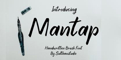 is a sweet and friendly handwritten font. Its natural and unique style makes it incredibly fitting to a large pool of designs. The only limit is your imagination!
 - Seaside by AndrijType,
$17.50 This contrast grotesque works well in text sizes and in large ones. Here are two sub-families: contrast and most contrast Display. Ideal companion for Osnova type family.
 - Happy Dreamer by Seemly Fonts,
$12.00 Happy Dreamer is a simple handwritten font. Its natural and unique style makes it incredibly fitting to a large pool of designs. The only limit is your imagination!
 - Zumbelsburg by Ingrimayne Type,
$12.95 Zumbelsburg is an exuberant, calligraphic typeface. The lower-case letters of Zumbelsburg are fairly standard blackletter characters, but the upper-case letters are ornamental, often with large flourishes.
 - Summer Display by Missin Glyphs,
$15.00 Inspired by the stroke movements of brush lettering ‘Summer Display’ is an energetic family featuring high-contrast and well-proportioned letter shapes suitable for large displays and headlines.
 - Onsdag by Cercurius,
$29.90 Onsdag is a display typeface with many alternate characters. It is designed for large sizes and can be used for logos, posters, book covers, record sleeves, packages, etc.
 - Hand of Dan by Work by Dan,
$12.99 A Hand-drawn font loosely based on Dan’s handwriting. Full of personal charm and interesting upper & lowercase characters, numerals and a large range of glyphs(Including Greek & Cyrillic).
 - MM Agrafa by MM Fonts,
$19.00 A paper-clip-inspired typeface with character. Agrafa is a technical but versatile display face that works well in both large and small sizes. Most of the glyphs are made from one continuous line and shows the constraints of bending a paperclip/wire. The family consist of four weights, Hairline, Thin, Light and Book, last three also comes with an oblique companion. While Hairline works best for setting large headlines/words, the Book weight can be used even for small size texts.
 - Rohn by Nine Font,
$29.00 Rohn is a modern squarish typefamily with a large x-height. Its letterforms are based on the shape of square with rounded corners. With particular details and large x- height, it is more legible at small sizes both on screen and paper. It has seven weights from Thin to Black with corresponding oblique styles and each weight includes ligatures, fractions, old style numbers, case-sensitive forms and more. Rohn is ideally suited for branding, logo, packaging, magazine, poster and editorial design.
 - EB Mensch by Eko Bimantara,
$19.00EB Mensch is a complete humanist sans and serif font family. EB Mensch emphasize expressive and fun characters that visualized by it's letterforms; Large x height, low caps, spacious counters and apertures, characterized by diagonal and sunken stroke ends. Perfect for large display and also to be read in small size. Mensch contain 32 fonts consist of sans and serif styles with 8 weight from thin to black with each matching italics. Its contain more than 440 glyphs which support broad latin languages. - Biago by Letteralle,
$29.00 Typeface in 70s and 80s became the inspiration for Biago. soft and bold are the characteristics of Biago. The large and rounded legs make Biago unique and different from other serif fonts. Biago brings a warm, friendly, unique, and simple impression. Biago is intended for display purposes, such as large headlines, titles, logos, or anything that requires special characteristics and attention. Biago's five width, will give you the flexibility to express your interface and design. Italic and alternate versions are also included.


