10,000 search results
(0.019 seconds)
- Morrello by Putracetol,
$28.00 Morrello is a bold retro decorative serif font with beautiful ligatures, tons of alternative glyphs and multilingual support. It's bold, groovy, clean and unique with vintage fell. Morrello is very versatile font that works great in large and small sizes. Helps to create layout design in 60s or 70s design projects. Come with open type feature with a lot of alternates, its help you to make great lettering. Morrello best uses for heading headlines, cover, poster, logos, quotes, product packaging, merchandise, social media & greeting cards and many more.
 - Elastic Heart by Putracetol,
$22.00 ELASTIC HEART is a display vintage font with beautiful ligatures, tons of alternative glyphs and multilingual support. It’s bold, groovy, clean and unique with vintage fell. ELASTIC HEART is very versatile font that works great in large and small sizes. Helps to create layout design in 60s or 70s design projects. Come with open type feature with a lot of alternates, its help you to make great lettering. ELASTIC HEART best uses for heading headlines, cover, poster, logos, quotes, product packaging, merchandise, social media & greeting cards and many more.
 - Farewell Angelina by Ana's Fonts,
$15.00 Farewell Angelina is an elegant font family with a feminine flair. It includes: - a display font with 3 weights and 2 styles: regular, bold and black in serif and sans, which look great at large sizes; - a text font in 2 styles: regular and italic, which look great at small sizes and in longer texts. Each font includes: - A-Z, a-z, 0-9 - accents - punctuation and symbols - ligatures - stylistic alternates - small caps Farewell Angelina is perfect for magazine layouts, creating logotypes, social media posts, branding and packaging.
 - Barqon by Graphicfresh,
$14.00 Barqon is a vintage display family including Regular and Stamp versions. it's perfect for logos, name card, magazine layouts, invitations, headers, or even large-scale artwork. Barqon includes 2 OTF files within the Zip folder. Features Uppercase Punctuation and Number Multilingual Language Alternate That's it! Get cracking!! I hope you have as much fun using it as I did making it :) If you are still unsure, feel free to drop me a line, I'll try to get to you as soon as possible :) Now go ahead and Get designing already! Thanks
 - Akros by VP Creative Shop,
$20.00 Introducing Akros - Art Deco Serif typeface Akros is luxury, Art Deco inspired typeface with 4 weight, 51 ligature glyphs and multilingual support. It's a very versatile font that works great in large and small sizes. Akros is perfect for branding projects, home-ware designs, product packaging, magazine headers - or simply as a stylish text overlay to any background image. Uppercase, numeral, punctuation & Symbol Light Regular Bold Black Ligatures Multilingual support Feel free to contact me if you have any questions! Mock ups and backgrounds used are not included. Thank you! Enjoy!
 - Kurdis by That That Creative,
$32.00 Kurdis Varibel Font Family is a modern sans serif family with six widths and five Weights Making 30 Set Styles and of course 10,000 more combinations when considering the Variable options. This Typeface is a real work horse for titles. At its condensed Width it is sophisticated and professional with well considered ink traps that help it really stand out at Large Sizes. the Regular width works well for longer bodies of text on websites or posters and the Wide Styles give an elevated look to your average wide sans serif.
 - Mila VP by VP Creative Shop,
$30.00 Introducing Mila - Innovative Super Serif Font Mila is fusion of sans serif and serif styles, loaded with ligature glyphs and multilingual support. Very versatile font that works great in large and small sizes. Mila is perfect for branding projects, home-ware designs, product packaging, magazine headers - or simply as a stylish text overlay to any background image. Uppercase, lowercase, numeral, punctuation & Symbol Regular Ligatures Never seen before Multilingual support Feel free to contact me if you have any questions! Mock ups and backgrounds used are not included. Thank you! Enjoy!
 - Goldenside by Runsell Type,
$16.00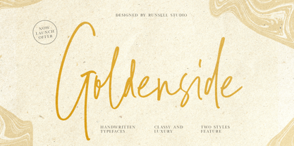 Goldenside is a classy handwriting font with a distinctive curve, inside with some interesting features that are perfect for an authentic-style project . Goldenside is perfectly suited to signature, stationery, logo, typography quotes, magazine or book cover, website header, clothing, branding, packaging design and more. A handwritten script font containing upper and lowercase characters, numerals and a large range of punctuation. This font including alternate glyph. To access the alternate glyphs, you need a program that supports OpenType features such as Adobe Illustrator CS, Adobe Photoshop CC, Adobe Indesign and Corel Draw.
 - Nisse by Typoforge Studio,
$30.00 Say hello to a new Typoforge member! Nisse is a display font family that consists of 4 styles (including italics). The regular and rough versions differ in the amount of wear. It’s inspired by Rex typeface first published by „The Jan Idzikowski and Co. Foundry“ in 1930. Nisse has a high amount of detail making it ideal for large prints and poster design. It is specified by a huge amount of automatic alternates. Each basic latin letter has five versions, the numbers have thee versions and extended latin letters have two versions.
 - Agger serif by S6 Foundry,
$29.00 Agger is a contemporary serif typeface featuring large open counters, curved, round forms, creating a modern and elegant glyph set. The extreme contrast between thick and thin strokes gives Agger a harmonic and stylish look. Designed with an elegance to the letterforms, the font is adapt for the beauty and the cosmetic industry, giving each project a unique style and feel. Agger is perfectly suited for editorial design, branding, magazines, logos, headings, and more. The family Latin supports Western, Central, South Eastern, South American, Oceanian, Pan African, Vietnamese, and Sámi.
 - Saffron Grotesk by S6 Foundry,
$20.00 Saffron is an elegant contemporary neo-grotesque sans-serif typeface with strong stylistic geometric contrasts, drawing on the aesthetics and the typographic standards of Swiss modernism. The distinctive wide-open stance was designed to give the right visual consistency for branding and communications. This authentic and original typeface represents the shifting contemporary aesthetics. Saffron is perfectly suited for headlines, large-format prints, brand identities, social media, advertising, editorial design, posters, magazines, logos, headings, and more. The Saffron family includes six weights, with their relative italics with over 700 glyphs and multi-language support.
 - Antia Notario by Putracetol,
$16.00 Antia Notario is a modern vintage serif font with beautiful ligatures, tons of alternative glyphs and multilingual support. It’s bold, groovy, clean and unique with vintage fell. Antia Notario is very versatile font that works great in large and small sizes. Helps to create layout design in 60s or 70s design projects. Come with open type feature with a lot of alternates, its help you to make great lettering. Antia Notario best uses for heading headlines, cover, poster, logos, quotes, product packaging, merchandise, social media & greeting cards and many more.
 - Pritchard by ITC,
$29.99Pritchard is the work of British designer Martin Wait, a capital, condensed sans serif font inspired by the geometric styles of the 1920s Soviet Constructivist movement. Despite unusual letterforms, Pritchard remains legible and effective in large display sizes. Two fonts make up the Pritchard family: Pritchard Regular and Pritchard Line Out. Pritchard Regular is a caps-only font, but Pritchard Line -- a bold, open font suitable for a wide variety of headline applications -- does include lowercase letters. A similar font from Linotype is Linotype Reducta. Unlike Pritchard Regular, Linotype Reducta's character set contains lowercase letters." - SK Clumster Sans by Shriftovik,
$32.00 SK Clumster Sans is an extravagant multilingual geometric grotesque, developed under the impression of the unique and exciting aesthetics of font design. Its structure is enlivened by an innovative combination of geometric and organic shapes that transform the familiar letter pattern. SK Clumster Sans creates a unique visual impression through a combination of shapes, a large symbolic and weights set, in addition to lively and dynamic angles and lines. The font is suitable for creating original design works that reflect the creative potential of the author and his bold experiments in the field of design.
 - Bellisia by sizimon,
$18.00 Bellisia is a modern calligraphy font and perfect for logotype, website headers, fashion design, wedding card designs and more. It contains a full set of lower & uppercase letters, a large range of punctuation, numerals, and multi-lingual support. Multilingual support : Danish, Finnish,English, Spanish, Dutch, German, Icelandic, Italian, Norwegian, Portuguese, Indonesian, Swedish, Basque, Bosnian, Catalan Cornish, Croatian, Czech, Embu, Esperanto, Estonian, Faroese, Filipino, French, Galician, Hungarian, Irish, Malay, Maltese, Manx, Maori, Meru, Morisyen, North Ndebele, Bokmål, Norwegian Nynorsk, Nyankole, Oromo, Polish, Romansh, Serbian (Latin), Slovak, Slovenian, Swiss German
 - Colatin by Get Studio,
$14.00 Colatin is handmade signature style font with stunning characters. Ideal for logos, name tags, handwritten quotes, product packaging, merchandise, social media & greeting cards. It contains a full set of lower & uppercase letters, a large range of punctuation, numerals, and multilingual support. The font also contains several ligatures and contextual alternates for lower case characters, accessible in the Adobe Illustrator Glyphs panel, or under Stylistic Alternates in the Adobe Photoshop OpenType menu. But If you don't have any OpenType specific software, you can still use Collatin as is with its standard lowercase and uppercase letters.
 - Golden Grotesque by moriztype,
$10.00 Golden Grotesque - Designed by Moriztype. The whole family consists of 9 Golden Grotesque Uprights, 9 Golden Grotesque Italic, 19 fonts in all. The font is informal and friendly at first glance and perfect for any display setting, but the straight, upright Golden Grotesque architecture also makes it perfect for longer copies. Due to its large x-height, it even works well in very small sizes. Golden Grotesque - This contemporary type family is ideal for use in retail, cosmetic, food and hospitality applications and advertising. Golden Grotesque is equipped for complex and professional typography.
 - Gelato Sans by Stolat Studio,
$29.00 Gelato is the Italian word for ice cream, commonly used in English for ice cream made in an Italian style. Gelato Sans designed by Ania Wieluńska is a humanistic typeface with geometric construction. It is characterised by a lot of details, which gives it a friendly and warm character. Scalable and large x height, sharp cuts makes Gelato good choice for many purposes from textes to display usage. All family consist 18 styles with italics from hairline to black. Ania was awarded a TDC Beatrice Warde Scholarship for this type family.
 - Banret by Ryzhychenko Olga,
$12.00 Banret is built using simple geometric shapes. It is mostly the result of my experiments on the other font I made earlier in 2016, called Inventor. Font is inspired by old fonts of the beginning of the 20th century. Capital letters are built with one to four proportions. The font has four weights: normal, and bold, and two alternatives: ribbon, and flag. As far as it is a decorative font, it is not designed for large amounts of text. But it is perfect for creating branding elements, logos, slogans and posters.
 - Zombie Brush by Ditatype,
$29.00 Zombie Brush is a haunting script font that brings the undead to life with its eerie charm and brush-style appearance. Designed intentionally in large letters, this typeface commands attention and exudes a sense of horror and intrigue. Each letter is meticulously crafted with brush-like strokes, adding a touch of handcrafted artistry to the font. The brush-style appearance of this font evokes a sense of chaos and unpredictability, as if the letters were created by an unsteady hand under the influence of dark forces. The large size of the letters enhances the font's imposing presence, making it impossible to ignore. For the best legibility you can use this font in the bigger text sizes. Enjoy the available features here. Features: Multilingual Supports PUA Encoded Numerals and Punctuations Zombie Brush fits in headlines, logos, movie posters, flyers, branding materials, print media, editorial layouts, headers, and zombie-themed projects. Find out more ways to use this font by taking a look at the font preview. Thanks for purchasing our fonts. Hopefully, you have a great time using our font. Feel free to contact us anytime for further information or when you have trouble with the font. Thanks a lot and happy designing.
 - Nextir by Ditatype,
$25.00 Nextir is an extraordinary brush sans serif font that commands attention and redefines modern typography. Designed with large letters and a thick weight, its distinctive square letter shapes are the epitome of strength and contemporary style. What sets Nextir apart from the ordinary is its brush detailing. This unique blend of brush strokes and sans serif elements adds a layer of organic texture to the font. The combination of large letters, thick weight, square shapes, and brush detailing creates a font that makes a striking statement with a contemporary edge. When you need a typeface that combines strength with artistic expression, Nextir is the perfect choice to infuse your designs with boldness, modernity, and a touch of handcrafted elegance. You can also enjoy the features here. Features: Multilingual Supports PUA Encoded Numerals and Punctuations Nextir fits in headlines, logos, posters, flyers, branding materials, print media, editorial layouts, and many more designs. Find out more ways to use this font by taking a look at the font preview. Thanks for purchasing our fonts. Hopefully, you have a great time using our font. Feel free to contact us anytime for further information or when you have trouble with the font. Thanks a lot and happy designing.
 - Big Vesta by Linotype,
$29.99Vesta™ was originally designed as an orientation and information system for the city of Rome, the birthplace of the roman alphabet. The forms are inspired by letterforms found on a frieze in the Vesta temple in Tivoli. Vesta has more contrast than the average sans serif but, like many of other designs of Gerard Unger, let in a lot of light - the letterforms are open, the counters generous. Relatively narrow and hence economical - without feeling too compressed - Vesta is an ideal solution for newspapers and magazines, and numerous other applications, including corporate identity and more. Big Vesta was intended as Vesta's display partner. However, it also performs very well at small sizes - its large x-height and short ascenders and descenders make it particularly economical, making it ideal when space is limited; for example on a mobile display. Vesta and Big Vesta are now available in seven weights - from Light to Black - and include everything necessary for setting extended texts well: italics, small caps, and a range of figures, including old style, lining, and tabular figures. All in addition, Vesta is available as a family of OpenType fonts with a very large Pro character set and supports most Central European and many Eastern European languages. - Aviano Wedge by insigne,
$24.99 Firm and resolute, the sharp, triangular wedge serifs of the new Aviano Wedge stamps your copy with the confidence of late 19th century luxury, wealth, and power. Indicative of banknotes and financial strength, the large, elegant Aviano Wedge is composed in the Latin style. Aviano Wedge takes its original footing from period signage found on a building in Asheville, NC. While shaped largely by engraved faces, the elegant Aviano Wedge maintains the extra-wide comfort and ease found with the rest of the Aviano series. Aviano Wedge comes in six different weights and is packed with OpenType features. As a complement to these characters, Aviano Wedge includes 40 discretionary ligatures for artistic typographic compositions. To see these features in action, please see the informative .pdf brochure. OpenType capable applications such as Quark or the Adobe Creative suite can take full advantage of the automatically replacing ligatures and alternates. Aviano Wedge also includes support for all Western European languages. This new face has also been designed to pair well with the rest of the Aviano series, including our best-selling Aviano, Aviano Serif, Aviano Sans, Aviano Didone, Aviano Flare, Aviano Contrast, and Aviano Slab. Use it alone, or combine Aviano Wedge with any of these other fonts to build the strong presence you’re looking for.
 - Axeo Sans by Asritype,
$15.00 As mentioned on previous released font Axeo (freeform serif), now, the original sanserif font is released with similar name, Axeo Sans. Axeo was release first when Axeo sans is still in minimal glyphs and font weights. However, Axeo sans is released with more fonts, 7 font in roman and 7 in italic/oblique versions, instead of semi condensed. 7 fonts is in roman form of weight: Light, Regular, Medium, Semi Bold, Bold, Extra Bold and Black; and 7 fonts in italic/oblique versions of its weight, respectively. This font weight offers the user to use the best fit to the usage. Axeo sans is neutral typeface, designed for general use. This font has also more glyphs variations and OpenType features. More than 700 glyphs for each cut. While the OpenType is equipped with: Large unmarked Basic Latin caps (ss02-ss05); normal character variation for some letters (ss01); Small caps (c2sc and smcp); superscript for 1, 2, and 3; ordinals for a and o; 5 basic fractions; standard and discretionary ligature; kerning; case sensitive and ornaments. Large Caps is unique setting, additional letters for font variations lover/user, applicable for first letter of paragraph, sentences, for design mean, just for fun or other usage.
 - Nautilus Text by Linotype,
$29.99Hellmut G. Bomm first released his Linotype Nautilus typeface in 1999. Ten years later, he updated and expanded the design. Now users have two additional families at their disposal: Nautilus Text and Nautilus Monoline. Nautilus Text bears more similarities to the original Linotype Nautilus. The letters shows a high degree of contrast in their stroke modulation. Bomm's intention was to create a clear, highly legible face. While the even strokes of most sans serif types eventually tire the eyes in long texts, the marked stroke contrast of Nautilus Text lends the face its legibility. The characters were drawn with a broad tipped pen. Like serif typefaces, the forms of Nautilus Text display a variety of elements. Its characters are narrow, with relatively large spaces between them. This helps create an overall open appearance, and allows a large quantity of text to fit into a small space. Nautilus Monoline's letters share the same overall proportions as Nautilus Text's. But as their name implies, they are monolinear. Their strokes do not have the calligraphic modulation that Nautilus Text features. This allows them to set another sort of headline, making Nautilus Monoline a refreshing display type choice to pair with body text set in Nautilus Text. - Nautilus Monoline by Linotype,
$29.99Hellmut G. Bomm first released his Linotype Nautilus typeface in 1999. Ten years later, he updated and expanded the design. Now users have two additional families at their disposal: Nautilus Text and Nautilus Monoline. Nautilus Text bears more similarities to the original Linotype Nautilus. The letters shows a high degree of contrast in their stroke modulation. Bomm's intention was to create a clear, highly legible face. While the even strokes of most sans serif types eventually tire the eyes in long texts, the marked stroke contrast of Nautilus Text lends the face its legibility. The characters were drawn with a broad tipped pen. Like serif typefaces, the forms of Nautilus Text display a variety of elements. Its characters are narrow, with relatively large spaces between them. This helps create an overall open appearance, and allows a large quantity of text to fit into a small space. Nautilus Monoline's letters share the same overall proportions as Nautilus Text's. But as their name implies, they are monolinear. Their strokes do not have the calligraphic modulation that Nautilus Text features. This allows them to set another sort of headline, making Nautilus Monoline a refreshing display type choice to pair with body text set in Nautilus Text. - FF Neuwelt by FontFont,
$50.99 FF Neuwelt™, from Jens Gehlhaar, is open, inviting, highly legible, and strikingly handsome. Combining the straightforward clarity of a geometric sans with a welcoming warmth, FF Neuwelt’s eight display and text weights, vast range of alternates and extended character set, make for a family with few limitations. While grounded in a solid geometric sans serif foundation, Gehlhaar has drawn a large suite of alternate characters that infuses FF Neuwelt with softened, and ultimately easy on the eyes, humanistic shapes and proportions. Alternative cursive italic forms and a choice of round or square punctuation are also available at the click of a mouse. FF Neuwelt is spaced for sizes larger than 16 point, while FF Neuwelt Text has more open letterspacing to set perfectly at sizes smaller than 16 point. In addition, five key lowercase characters were drawn with more legible shapes. The result is that FF Neuwelt adapts from text to larger sizes and one stylistic mien to another with ease and grace. FF Neuwelt is a natural for interactive design, performing well on both large digital displays and small screens. Counters are generous and apertures are open, making them a perfect choice when setting text as microcopy or in short blocks where quick and accurate comprehension is the goal. Even the heaviest weights translate well to on-screen reading. FF Neuwelt also speaks with authority in large sizes on big screens. Equally at home in print environments, FF Neuwelt is a perfect choice for long-form text, captions, editorial, packaging, point-of-purchase design – as well as extensive branding projects. Its many choices of alternative characters make for a design that draws the reader in, without overpowering the message. Although he has drawn typefaces in addition to FF Neuwelt, Gehlhaar is primarily a filmmaker. Directing commercials with style and grace, his work includes spots for Nissan, Apple, Emirates Airlines and Microsoft. As a creative director, Gehlhaar has worked on a broad range of projects for Coca-Cola, MTV, EPSN, Volkswagen and more.
 - Surfbars by Creative Toucan,
$13.90 Surfbars is a handmade multi-language Latin / Cyrillic font that was inspired by surfing, sand, and playful style. Comes in Regular, Italic, Underlines, and Splashes This font includes a full set of fun and unique uppercase and lowercase letters, numerals, and a large range of punctuation. Overall it contains more than 760 glyphs with 220 alternatives and +10 interesting ligatures, swashes, and underlines. With this font, you have complete freedom to use and combine various different letters, alternatives, and ligatures, by that you can be sure that your design or any kind of project will be a unique masterpiece. Also, the combination and usage of different letters and ligatures gives you the opportunity to have fun and at the same time create your own unique style. THE PRODUCT CONTAINS: • More than 760 glyphs, 220 alternatives, 60 ligatures which are unique and playful • This font includes Latin Plus diacritics. • Surfbars support Latin Plus languages (Latin Multilingual language support) • Surfbars support the Cyrillic alphabet. Ideal for loud messages. Made with flat marker adding realistic moves in it. Very interesting to use for logos, name tags, handwritten quotes, product packaging, merchandise, social media & greeting cards. Also, ideal to make t-shirts designs and other clothing products.
 - Bordonaro Spur by Estudio Calderon,
$35.00 Bordonaro Spur - Bordonaro Script’s partner - is a typography strongly influenced by old beer labels and includes some serifs based on Frederic W. Goudy’s Copperplate, but with some softened spurs adding an elegant and soft texture to the text. It is ideal to be used on large bodies and has a set of special ligatures ideal to be used in branding. Psss...Check out the NEW Bordonaro Spur with Rounded corners , same version but soft! FEATURES Co = company1 Co = company2 Estd = established Inc = incorporated Ltd = limited Mc = mac Rd = Road St = street And also from Adobe CC you can activate Style Sets (SS) and get ideal ligatures for ordinal numbers: 1st = st 2nd = nd 3rd = rd 4th = th Bordonaro Script and Bordonaro Spur are two typographic styles that were designed under the same characteristic features with the idea of combining them to obtain better results, for that reason, we recommend merging them in a creative way and you will realize everything you can design with them. The banners designs are based on old brands of beer labels, coffee packaging, sports logos and in some cases we use Copperplate Gothic but only as a complementary font in order to harmonize the layout of the elements in each banner.
 - Sedid Pro by Fontuma,
$24.00 Sedid, “solidity; It is an Arabic term meaning “righteousness”. In particular, the correctness and soundness of a word is indicated by this word. The fact that I gave this name to the writing family is to point out its accuracy and robustness. This typeface, which is sans serif, consists of three families: ▪ Sedid: Font family containing Latin letters ▪ Sedid Pro: Font family including Latin, Arabic and Hebrew alphabets ▪ Sedid World: A family of typefaces including Latin, Cyrillic, Greek, Arabic and Hebrew alphabets Those who have versatile works should meet the Sedid Pro writing family to meet a new face of writing and make a difference to their work. This font is serious, elegant and solidly built. The Sedid Pro font family can be used as text and header fonts in publishing, digital media and websites. Sedid Pro also has a nice-looking, flexible, geometric face with smooth lines and transitions. The inner and outer spaces of the font are proportioned so that the text can be read easily. Sedid Pro font family consists of 14 fonts, seven plain and seven italic. The font family includes open type features, as well as a large number of ligatures, small caps, modifiers, and currency symbols of many countries.
 - Neue Plak by Monotype,
$57.99 Originally designed in 1928, Plak is something of a lost gem in the type world. Despite being drawn by Futura creator Paul Renner, it never achieved the same popularity and spent decades lacking a much-needed digital revival. Monotype designers Linda Hintz and Toshi Omagari have taken its existing three weights and, after extensive research into the original wood type, extended them into the vast Neue Plak family. The typeface is available in 60 weights that stay true to Renner’s intentions, and offer the same blend of “quirky” details and “German stiffness” – as Hintz describes it. The design is an unusual mixture, bringing together a defiant outer appearance that’s counteracted by more playful details found in the lowercase r, and the large dots of the lowercase i. Other distinctive details include open or strikethrough counters, and a set of hairline widths that reduce Renner’s original design to its bare bones. Neue Plak’s display weights are crying out to be used in editorial, on packaging or in logos, while its text weight works well in both print and digital environments. Neue Plak Text Variables are font files which are featuring one axis and have a preset instance from Thin to Black
 - Milky River Cyrillic Script by Ira Dvilyuk,
$17.00 Milky River Cyrillic playful childish font contains the uppercase and main & alternative lowercase letters. And also the full set of double letters a large range of numerals and punctuation. The Milky River font will be perfect for use in all your fun design projects be it logos, labels, packaging design, blog headlines. Also, it will look great on mugs, cards, kids' books headlines, or other typographic projects. Milky River Cyrillic playful childish cute font contains the Cyrillic glyphs too. The Milky River symbols are an additional font with 36 hand-drawn doodles, catchwords, arrows, and swashes and can help to make your design more original. Combine and arrange swashes and illustrations to create your own designs and make borders, frames, dividers, logos, and more (just use a-z and 0-9 keys in the included Milky River symbols font). A different symbol is assigned to every uppercase or lowercase standard character so you do not need graphics software just simply type the letter you need. Support for 31 languages: Latin glyphs for Afrikaans, Albanian, Basque, Bosnian, Catalan, Danish, Dutch, English, Estonian, Faroese, Filipino, Finnish, French, Galician, Indonesian, Irish, Italian, Malay, Norwegian Bokmål, Portuguese, Slovenian, Spanish, Swahili, Swedish, Turkish, Welsh, Zulu. And Cyrillic glyphs support for Russian, Belorussian, Bulgarian, and Ukrainian languages.
 - Parkour by Resistenza,
$39.00 Parkour Brush Font takes the repertoire of moves and free spirit of this modern sport and bring it to a graphic definition. Handwritten with authentic dry brush imperfections and a bouncy baseline to evoke the energy of this urban sport discipline which emphasizes the athlete to be strong and flexible as to be able to move quickly and efficiently through any given environment. Sounds like a fun game, right? This font comes with a full set of upper and lower case characters - giving you the extra freedom to turn your text into authentic custom-made hand lettering. Parkour Marker font Includes a large range of glyphs including numerals, punctuation & multilingual support. It comes with a perfectly paired handy set of bonus Swashes and extras perfect to complete and customize your layout. Perfect for branding, social media, stationery, advertising, logos, handwritten quotes, product packaging, header, poster, merchandise & greeting cards. Features: - OTF Font file - Punctuation & numbers - Splashes & Splatters - Alternate letters - Uppercase letters - Multi Language To enable the OpenType Stylistic alternates, you need a program that supports OpenType features such as Adobe Illustrator CS, Adobe Indesign & CorelDraw X6-X7. There are additional ways to access alternates, using Character Map (Windows), Nexus Font (Windows), Font Book (Mac) or a software program such as PopChar (for Windows and Mac).
 - Austral Slab by Antipixel,
$15.00 Austral Slab is a hand-drawn layered font designed by Antipixel, with unique textures & styles that combine giving your work a distinctive impression. This font comes in three weights, Regular, Light & Thin, with irregular outlines and uneven/crooked strokes, giving your work more personality and making it exclusive and powerful. For this same reason it can be used in a vast variety of projects, such as logos & branding, stationery, book covers, magazine design, clothing prints & tags, packaging, animated videos, and many more! Austral Slab has three sets of alphabets in uppercase and lowercase to avoid repeating the same character pattern, and giving the font a more natural handwritten feel. This is included in the Open-Type Contextual Alternates, which applies an automatic substitution of glyphs as long as the Open-Type features are activated. Also, Austral Slab offers other Open-Type features such as Stylistic Alternates, Ligatures, Discretionary Ligatures, Fractions, Superscript, Subscript, Denominator, Numerator, Scientific Inferiors & Kerning. This font has a very large glyph coverage and can be used in a wide range of languages, including English, Spanish, Italian, French, German, Polish, Czech, Vietnamese, Finnish, Icelandic, among many others. The style Maplines Thin is offered Free for commercial & personal use!
 - Nexa Slab by Fontfabric,
$35.00 Nexa Slab is a geometric slab serif font whose design is based on the already popular best-seller Nexa . The font family contains 3 basic forms: italics, obliques and uprights, each of which has 8 different weights. This visual richness makes it the ideal slab serif font family for the web as well as for print, for motion graphics, logos, t-shirts and so on. It is also great for headings, fitting nicely with both small and large typesetting text blocks. Nexa Slab draws from the rich traditions of the classic Neo-Grotesque slab serif fonts such as Lubalin Graph, Rockwell and Memphis, which conceal the richness of typesetting text in its crucial advertising function. Just like these fonts, it’s design is subject to rational, carefully thought-out, thick and thin bars with a low contrast between them. The letters are characterized by the strict geometry and square proportions of the original, extra-fortified by suitably balanced slab serifs. Nexa Slab is serious without being rigid and inflexible, finished and lacking in nothing, systematic without being monotonous, and though it may seem at first glance to be more suitable for short, direct messages; in the hands of a master designer... it can build and create exquisite and harmonic designs. Open Type Features: Lining figures (proportional and tabular) The “f” ligature set Alternate characters (a, g, y) Automatic fractions Automatic numerators Automatic denomerators Automatic subscript and superscript Automatic ordinals Extended language support (most Latin-based scripts supported)*
 - Toby Font by Ingo,
$19.00 A playful handwriting of a child Twelve-year old Tobias Düsel designed the characters of this font in 2002 during his family’s furlough in the USA. He drew the alphabet freehand in pencil on a piece of stationery, and clearly had examples of the well-known college and military fonts in mind. The characters in their basic form are geometrically thought out, as well as the construction of the shadows. But remarkably, while drawing, Tobias Düsel did not reach for the obvious aid of a ruler. In fact, the strokes of the letters are not linear, rather are recognizably well-balanced with declining and increasing straights as can be seen in polished classical fonts. Originally this font consists only of upper case letters — all other characters (punctuation marks, figures and similar) have been modified from the components of the capital letters. Complementary to the original Outline-Shadow-Version TobyFont Empty, the variations TobyFont Inside and TobyFont Full are also available. ”Empty“ is, so to speak, the frame of the typeface as “Inside” is the filling, and “Full” is the sum of both. All three versions have the exact same body size so that they can be placed over one another congruently. In this way the effect of a font in two or three colors can be attained. TobyFont is excellently suitable for designing “picturesque” or “hand-carved” contents; large weights are especially charming and striking.
 - Tambau by Tipogra Fio,
$30.00 Tambau is a display typeface crafted by Matheus “Fio” Gonçalves, a Brazilian design student, still in college, inspired by Brazilian concert urban posters and wood type that I saw at the Oficina Tipográfica São Paulo. The font was first made for a magazine project in design school, making it beautiful on giant pages headlines, billboards, signs, etc. There’s no lowercase, the character set is dramatic and objective. The uppercase is actually expanded letterforms causing some eyes and breathing paths to the very condensed and very modular glyphs, which creates a quite interesting striped texture between form, counterform and spacing. The lots of ligatures come to give it more closure between the letters, when they try to form blank spaces. So do the diacritics, fitting in the space given to them by the dynamic letterforms, making dense rectangular blocks. You may use Tambau as big as you can or do a high tracking to it and still it will be pretty. The titles can be dynamic, just condensed or just large. It’s on your own. Don’t be afraid to play with Tambau, it’s an alive typography. Curiosity: For the magazine in design school, the pilot project of Tambau was cut in a MDF board, to print it with texture and paint. Later was added more characters, languages and special glyphs to it. Set: Tambau is a singular font typeface, with extended and condensed characters, numbers, ligatures, punctuation and symbols for Basic, Western, Central and South Eastern Latin languages.
 - Asterisk Sans Pro by Eclectotype,
$45.00 The market for humanistic sans serif type families is saturated, so what can a new release add, and what does it take to stand out from the crowd? Asterisk Sans Pro (named after my favourite glyph to make) aims to be a highly versatile type family; massively useful due to its pan-European language support and bounty of OpenType features which make it the ideal choice for demanding typography. The look is contemporary; details which give the fonts character at large sizes all but disappear when small, making the middle weights suitable for large chunks of text. The family ranges from a hairline ultra light to a pretty weighty black – a must in a new typeface. Asterisk Sans Pro supports Latin, modern Greek and Cyrillic, with localized forms for Bulgarian, Serbian and Macedonian to boot. This is rare enough, but to have small caps for all these scripts in both upright and italic fonts is a big plus. Your client may not need all this language support right now, but this typeface gives them the option to grow while keeping a consistent look, and at a similar price point to families with a much narrower scope. The ability to customize Asterisk Sans Pro through the use of Stylistic Sets in OpenType savvy layout programs means you are really in control. Want more italic forms in the uprights? Go for it. A more Roman italic? Easy! The spurless m, n, r and u, accessible through SS13 give a graphic, almost bauhaus feel. The Dutch IJ glyph can be changed to a much cooler thing using SS14, and the family even supports ij-acute. Other OpenType features include a wealth of numeral styles (tabular and proportional, lining and oldstyle, plus small cap figures, numerators, denominators, subscript and superscript) and automatic fractions. There are also case-sensitive forms for all caps settings, a bunch of useful arrows, and superscript lower case Latin letters. All in, there are well over 1200 glyphs per font, making Asterisk Sans Pro an invaluable tool in your typeface arsenal, great for everything from corporate identities to editorial work, apps to cookbooks.
 - Courage by Positype,
$35.00 High-contrast? High impact? Have Courage? Eye-catching and (extra, extra) bold, Courage balances ultra-high stroke weight, delicate details, and unique letterforms with a self-indulgent passion that will make you feel a little guilty using it. Honestly, use it large and don’t try to force it into a small space, because these fearless letterforms need room to move. Flavored with both upright and italic styles, each font includes an indulgent level of alternates, swashes and titling options, visual elements and more. A backstory with a different name Years ago, I was commissioned to take my Lust typeface and produce something unique to use for large format graphics for an event…cool. It needed to be hyper-contrast with a lot of over-the-top details. With a tight turnaround, I looked for primers within my development catalogue to help me, and settled on some early work on a typeface I had drawn called Hedonist. I used those sketches and its conventions to retrofit and build out Lust Hedonist (only to see the project go bust on the client’s end). I intended to go back shortly after the Lust Hedonist release to finalize a retail version of the OG Hedonist, but I never could settle on the look of the 'g' or the numerals, got distracted with other projects, and never picked it back up… until last year. After randomly doodling a fat, flat ‘g’ with an extremely tilted counter axis, I knew immediately how it could be used and that (re)set things in motion. Only problem was, in the process of refining the letterforms I began truly dissecting the pieces, rediscovering all of the recklessness within Hedonist, and decided on fundamentally rewriting the approach to the typeface… literally flaying it to the bone. I’m much, much happier with this finished typeface now, but the name no longer fit the moniker given to the first, adolescent approach—there’s far more audacity and cleverness in these letterforms, tenacious in their resolution now. As a result, the name Courage fit the mettle of this typeface so much more, so I kept it.
 - Martini at Joe's by steve mehallo,
$19.56 Googie Architecture, also known as "Midcentury Coffee Shop Modern," was born in California during the Atomic Age. Martini at Joe's is based on lettering from several historic Googie sources - many of which no longer exist. The futuristic Martini at Joe's collection was named for Northern California's famous Italian-themed "Joe's" restaurants, some of which are still serving up large portions of charbroiled beef steak, canned buttered veggies and pretty decent martinis. Martini at Joe's contains many fabulous typographic extras – and is available in single font packages or as a 15 font interchangeable Megaset (with "italic-esque" obliques and "retro obliques"). Martini at Joe's is perfect for use as commercial signage, on the menu for your coffee shop, supper club, tiki bar, fish grotto, smorgy, space port or destination casino. It also holds its own in any vintage store, on greeting cards, t-shirts, hi-brow gallery announcements, product skins, your 'zine masthead, on the faceplate of your futuristic microwave oven, tv dinner packaging, at millionaire's conferences or even embellishing the fuselage of your latest jet airline venture. Martini at Joe's: there's no better way to say, "Hold the olive, I'm having a moment."