10,000 search results
(0.023 seconds)
- Clairveaux by Scriptorium,
$12.00Clairveaux is based on samples of an ornate 12th century calligraphic style. It has some interesting features, including small caps which combine some characteristics of both traditional upper and lower cae character forms. It's ornate enough to look decorative, but not overwhelmingly complex, and looks remarkably attractive when used for titles in a large size. - Awendela Beloved by Muksal Creatives,
$10.00 Awendela Beloved Modern sans serif Font typeface with beautiful Ligature and alternate special glyphs, ornament and multilingual support. It's a very versatile font that works great in large and small sizes. Perfect for editorial projects, Logo design, Clothing Branding, product packaging, magazine headers, or simply as a stylish text overlay to any background image.
 - Arcle by The Northern Block,
$12.80 A modern geometric typeface with precise radius detailing. Each character has it’s own unique subtleties and style variations, with careful adjustment you can create dynamic page layouts. The elegant curves are best demonstrated using the lighter weight at large scale. Details include 5 weights, a complete character set, manually edited kerning and Euro symbol.
 - Monstellar by Raditya Type,
$15.00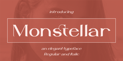 Introducing Monstellar Elegant Typeface Monstellar is a Minimalist Modern Elegant font with beautiful ligatures, and multilingual support. It's a very versatile font that works great in large and small sizes. Monstellar is perfect for branding projects, Logo design, Clothing Branding, product packaging, magazine headers, or simply as a stylish text overlay to any background image.
 - Green by ITC,
$29.99Green is the work of British designer Timothy Donaldson, known for his experimentation with letter forms. This typeface features a sharp stroke contrast and eccentric lower case letters, giving it a vital, clean-cut style. Green is perfect in both large display sizes and small text sizes and gives any work a fresh, new look. - Glamline by Tadiar,
$17.00 Glamline Font is classic and modern sans serif font carefully designed and well looking with Latin Extended character set. It is good for Text and Headers with lowercase and uppercase letters both! Glamline ideally works in luxury, fashion, cosmetics, wine and food areas. Please see the large preview images to see how it works.
 - Kubrickle by Discourse Type,
$29.00Kubrickle is an unique typeface release by the Discourse Type foundry. It comes in three styles a block, stencil and swash. The swash types comes with an large set of special ligatures that can give you titles an edge. Combine the three different styles to create dynamic typography suitable for album covers, magazines and flyers. - Kudryashev by ParaType,
$30.00 The typeface (formerly known as Kudryashevskaya Entsiklopedicheskaya) was designed in 1960-1974 by Nikolay Kudryashev and Zinaida Maslennikova at Polygraphmash type design bureau for the Bol'shaya Sovetskaya Entsiklopedia (the Large Soviet Encyclopaedia) publishing house. New improved digital design and extention of character set was done by Natalia Vasilyeva and released by ParaType in 2008
 - Tessen by Canden Meutuah,
$15.00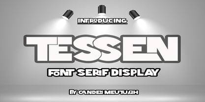 This is a very versatile font that works well in both large and small sizes. This font is perfect for branding projects, logo design, clothing branding, packaging, magazine titles, advertisements, t-shirts, postcards, editorials, magazine headlines, product packaging, and displaying masculine and feminine qualities. equipped with uppercase, lowercase, numbers and full punctuation + Multi-language support
 - Blobs, Brushstrokes & Balloons by Outside the Line,
$19.00 50 blobs, brush strokes, balloons, ovals, scribbles and a few characters. Outline, color, flip or flop. Reverse type out of brush strokes and or use them to underline type. Best used in large sizes as clip art. An easy and quick way to add a creative and artistic flare to any job. Lots of variation.
 - Kholodos by Grigorij Gushchin,
$15.00 Kholodos - the slang name of the refrigerator in Russia. This font contains 383 characters, supports Latin, Cyrillic, Latin-1 Supplement, and also has the symbols of the Ukrainian and Belorussian alphabets. A font feature is a large number of alternates that define the connection of letters. Kholodos - the perfect solution for vibrant retro lettering.
 - Batticuore by Resistenza,
$39.00 Batticuore means “palpitation” in Italian and is a powerful word. This font family is inspired by brush lettering, Batticuore provides two variants, Regular and caps. Both scripts are based on a brush strokes with a little contrast. A large set of ligature and alternates are included. More about Opentype Features: https://bit.ly/opentype-rsz
 - Yogeo by Rochart,
$14.00 Give your designs a classy feel. "Yogeo" is perfectly suited to stationery, logo, typography quotes, magazine or book cover, website header, clothing, branding, packaging design and more. A minimalist serif font containing uppercase and lowercase characters, numerals, a large range of punctuation, international language and ligatures. I hope you make something cool with it!
 - Fello by Australian Type Foundry,
$23.99 Fello is a geometric sans-serif with a university pedigree. Featuring some of the quirkiest alternates you will ever see, Fello is designed with a modernist tone of voice. Fello is great for display use but also has a large character set and includes many Opentype features, which makes it suitable for text use too.
 - Beton by Linotype,
$29.99The Bauer Typefoundry first released the Beton family of types in 1936. Created by the German type designer Heinrich Jost, the present digital version of the Beton family consists of six slab serif typefaces. First developed during the early 1800s, by the 1930s slab serif faces had become one of many stock styles of type developed by foundries all over the world. Because of their distance from pen-drawn forms and their industrial appearance, they were seen as “modern” typefaces. (Their serifs kept them from being too modern.) The first slab serif typefaces were outgrowths of didone style text faces (e.g., Walbaum). As newspapers and advertising grew in importance in the western world (especially in “Wild West” America), type founders and printers began to create bigger, bolder typefaces, which would set large headlines apart from text, and each other. Through display tactics, businesses and industry could begin to visually differentiate their products from one another. This craze eventually led to the development of monster sized wood type, among other things. By the 20th Century, the typographic establishment had begun to tame, categorize, and codify 19th Century type styles. It was in the wake of this environment that Jost developed Beton. The Beton family is a type “family” in a pre-1950s sense of the word. Although six styles of type are available, only four of them fit in logical progression with each other (Beton Light, Beton Demi Bold, Beton Bold, and Beton Extra Bold). The other two members of the family, Beton Bold Condensed and Beton Bold Compressed, are more like distant cousins. They function better as single headlines to text set in Beton Light or Beton Demi Bold, of as companions to totally separate typefaces. - Guhly by Ingo,
$35.00 A modern Sans Serif — prosaic, designed geometrically, beautiful in large sizes All the dimensions of the font are based on Factor 10. The general principle of construction leads to slim forms and nearly equally wide characters. So the font appears very solid but is actually difficult to decipher in longer texts. Along with the ”normal“ Guhly Regular there are also the two versions Guhly Light and Guhly Bold, whereas in each only the vertical strokes [Guhly Light] or horizontal [Guhly Bold] have been changed in strength. The result is a very individual decorative effect which slightly reflects old circus and western scripts. The lower case characters in the version Guhly Book are, therefore, optimized to be suitable for longer texts in smaller font sizes — because after all, sometimes you should read a bit more than just the headline… The design of a shampoo bottle stands behind the creation of this sans serif display font. Prominent, clearly constructed forms with circular arcs define its appearance. This is a font primarily designed for use with capital letters — for all sorts of advertising purposes, headlines and titles. But lower case letters also belong to a good functional font; so, of course, Guhly includes them and ligatures for the more ”critical“ letter combinations as well as stylistic alternates for the letters K (or k), V (v) and o. As a decorative “encore”, the Guhly family also contains the “normal” weight in two variants: on the one hand the Guhly Cutout – these are letters without counter, as if the letters were cut out and the internal surfaces fell out; and on the other hand the Guhly stencil – as the name suggests, a stencil font with the typical bars that give a stencil the necessary cohesion.
 - Cinematica by Underground,
$14.90 Cinematica was specially designed for film credits in communication pieces. Due to its space saving qualities, geometric elegance of its shapes, and eight wights; it allows a wide range of uses. Its geometry makes Cinematica able to harmonize and unify any text, incorporating the necessary signs for composition in English, Spanish, Italian, French, German and Portuguese. The Regular weight also incorporates statements that usually appear in film credits (such as "directed by", "produced by", etc.) that have been programmed as predetermined ligatures and can be accessed by typing a short sequence of signs to avoid typing the full phrase. To make the most of the alternatives proposed, use applications that support Open Type. Take a look at the User Guide.
 - Ingram BT by Bitstream,
$50.99Ingram BT might be described as Deco, or Arts & Crafts, in style. Created by Alex Marshall, it is a very condensed design with high-waisted uppercase glyphs that feature dots rather than straight lines for the middle hairlines. There are two sets of alternate glyphs accessible via stylistic and contextual OpenType features. The contextual alternates offer the most interesting glyph substitutions. There are also oldstyle and tabular figures, superiors and inferiors, as well as unlimited fractions. Ingram is a very handsome, casual typeface, with a slightly rough finish. The compact lowercase remains very readable at text sizes and it is a pleasure to turn on the earth tone colors and typeset left and right justified paragraphs! The extended character set supports Baltic and Central European languages. - Lust Text by Positype,
$29.00 Yes, finally. This one took the most time and the most restarting. Years went into imagining what Lust Text should look like and how it should structurally behave in order to truly improve upon a setting that includes any of the Lust typefaces. I approached it as much from the side of the type designer, as I did a potential user. The flow, the warmth, the personality needed to be there, but all of the excess had to be removed responsibly. In the process, and in need of inspiration, I looked backward to historical artifacts and precedent. In each early Lust Text approach, the solution was lackluster and/or vanilla and not actually a ‘Lust’ typeface. The exercise was not in vain though. By exploring past examples, I found my footing drawing for media now and how it might be used later—all the while, producing seamless, elegant curves and restrained indulgence (that sounds almost silly to say, but I like it). The Lust Collection is the culmination of 5 years of exploration and development, and I am very excited to share it with everyone. When the original Lust was first conceived in 2010 and released a year and half later, I had planned for a Script and a Sans to accompany it. The Script was released about a year later, but I paused the Sans. The primary reason was the amount of feedback and requests I was receiving for alternate versions, expansions, and ‘hey, have you considered making?’ and so on. I listen to my customers and what they are needing… and besides, I was stalling with the Sans. Like Optima and other earlier high-contrast sans, they are difficult to deliver responsibly without suffering from ill-conceived excess or timidity. The new Lust Collection aggregates all of that past customer feedback and distills it into 6 separate families, each adhering to the original Lust precept of exercises in indulgence and each based in large part on the original 2010 exemplars produced for Lust. I just hate that it took so long to deliver, but better right, than rushed, I imagine.
 - Astire Klarish by Dora Typefoundry,
$20.00 Introducing, Astire Klarish is a new retro serif with all clean and soft lines, tight curves, a combination of regular and italic versions adding to the appeal and trendy elegant look! This serif typeface that looks amazing in both large and small settings is perfect for your design needs yet still clean and elegant to apply to a variety of other formal forms such as invitations, labels, logos, magazines, books, greeting/wedding cards, packaging. , fashion, make up, stationery, novel, label or any kind of advertising purposes. WHAT YOU GET : Astire Klarish Regular (Open type) Astire Klarish Italic (Open type) Astire Klarish Bold (Open type) Astire Klarish Bold Italic (Open type) This type of family has become the work of true love, making it as easy and fun as possible. I really hope you enjoy it! Thank you.
 - ITC Lubalin Graph by ITC,
$40.99 ITC Lubalin Graph® was initially designed by Herb Lubalin and drawn to fit the requirements of typographic reproduction by Tony DiSpigna and Joe Sundwall in 1974. Its underlying forms are those of Lubalin's previously released ITC Avant Garde Gothic, but its shapes were modified to accommodate large slab serifs. Its condensed weights, which include small caps and oldstyle figures, were later additions by Helga Jörgenson and Sigrid Engelmann in 1992. The family, with its generous x-height and overall tight fit has come to represent the typographic style of American graphic design in the 1970s. The typeface is at home when paired with mid-century modern design and spare sanses or more traditional text faces from the period. ITC Lubalin Graph covers four weights in its condensed width from Book to Bold, and five weights in its normal width.
 - Altivo by Kostic,
$40.00 Altivo is a proper workhorse sans serif. Sixteen OpenType fonts in eight weights (with true Italics) range from Thin to Ultra. Meticulous care was taken to ensure high legibility in text sizes on the screen. The typeface is designed to have wide proportions, generous x-height, loose spacing, ink traps, large apertures and low stroke contrast. Altivo’s ink traps are not only a functional design feature, they also look interesting and lend character to the typeface in headlines. True Italics, small caps and multiple sets of figures, as well as a complete set of lowercase superscript were all included in the family to accommodate high typographic standards. If you need to pair it with a serif font, you can’t go wrong with Chiavettieri, since both typefaces were made with the same basic proportions, and their tabular figures are the same width.
 - AM Sans One by URW Type Foundry,
$39.99 When designing AM Sans One, it was a great challenge for me to develop a modern sans serif, which despite the large number of existing fonts in this sector has its own unique character. Starting point for the design concept was the cap O, designed as a rectangle with rounded corners, and not as usual as a circle or oval. The O should form the basis for the whole alphabet. Another feature are the characters with oblique starting and end strokes such as "A, V, W". These have not exactly straight, diagonal lines, but have a slight curvature. Thus, these letters do not look too geometric. Also the cap K deviates slightly from the usual shape which makes AM Sans One different from other already existing fonts. I could well imagine applying this font for areas such as engineering or architecture.
 - ALS Schlange Sans by Art. Lebedev Studio,
$63.00 Schlange is a rich typeface with rounded terminals. The family includes five sans serifs and five slab serifs in weights from ultra liight to bold. Schlange’s personality is determined by an open aperture and quite large lower case characters in comparison with the upper case set. Schlange’s personality is open and friendly, giving a text it’s used for a soft, warm appeal. Schlange will work well as a display type (think titles, short magazine call-outs, ad banners, and such), but it’s not a good choice for extensive bodies of academic text. Available in numerous weights, the typeface provides rich opportunities for mixing and matching and is great for typographic compositions. These qualities make Schlange a dream type for a packaging designer. It will feel at home in design for cosmetics or sweets, postcards, children’s books and menus.
 - Clover by KA Designs,
$12.00 Clover is a modern retro font with a light, bubbly feel! This font is perfect if you are after a fun script font that has a lot of edge! The versatility of this font reaches wide. Use this one for branding, logos, advertisements, shirts, stickers, social media, invitations and more! The complete package includes a complimentary shadow version for easy and perfect layering every time! Clover will take you right back to the 70's but still provide a fresh look to your designs!
 - Magazin ST by siquot'types,
$39.99 Magazin ST is powerful but delicate. What fascinated me seeing, a couple of letters, in Bob Roy Kelly's book (American Wood Type:1828-1900) were the little squares in the corners that represent a glow from lighting coming from below and from the right. Such ambiguity excited me and I thought that today with digital resources it wouldn't take long to do it. Seeing it working is excellent. Look In the posters what it is for and the effects it produces, including the sensation of relief.- L.S.
 - Ultima Pro by TipografiaRamis,
$39.00 Ultima Pro is a geometric sans serif typeface family of eight styles – light, regular, bold and black in roman and italic respectably. Ultima Pro typeface is an upgrade addition to Ultima family (2010). All glyphs have gone through shape refinements, and the amount of glyphs was significantly extended, which enabled support of more Latin languages as well as full support of Cyrillic. Fonts released in OpenType format with some opentype features. The typeface is ideal for use in display sizes though is quite legible in text.
 - Styling by Los Andes,
$25.00 Styling is a simple, light, sans-serif typeface inspired on old cars and planes with an aerodynamic shape. The font comes in 5 weights plus italics. Styling and Styling Alt families offer professionals a wide range of creative options. Styling was created in 2014, while its designer was 30,000 feet in the air and the plane was flying over some Latin America cities. A flight full of flavours and shapes. This typeface is the result of anxiety and speed. Keep on rollin’ and fly high with Styling!
 - Red Hot Mama NF by Nick's Fonts,
$10.00The Zanerian Manual of Alphabets and Engrossing, published in numerous editions since 1895, featured many elegant and elaborate script typefaces. However, it seems that, from time to time, calligraphers just want to have fun, and this little number is definitely fun. Light, lively and just a little loopy, Red Hot Mama is sure to add just the right amount of spice to your special project. Both versions contain the complete Unicode 1252 (Latin) and Unicode 1250 (Central European) character sets, with localization for Romanian and Moldovan. - Calendula by ParaType,
$30.00 Calendula is a humanistic font with low contrast and one-sided serifs. There are eight styles: four regular of different weights from Light to Bold and corresponding italics. The main set of regular styles is close to upright italics, so the font is percieved as informal and friendly. However, Calendula allows you to combine business with pleasure by switching the stylistic set, and turns into a calm text font with traditional upright forms. The font was designed by Natalia Vasilyeva and released by Paratype in 2017.
 - VTC-KomikaHeadLinerChewdUp - Personal use only

- Jackrabbit's Bar & Grill - Unknown license

- Empire by Monotype,
$29.99Empire was originally designed in 1937. This version is an all-capitals face with tall condensed characters. The Empire font can be used for headlines and posters where space is tight, or where an empression of height is desired. - Kadigan by Missy Meyer,
$12.00 Kadigan: (noun) A placeholder word. A kadigan can be used to substitute for any other noun: persons (John Doe, Acme Company), places (Anytown, 123 Main Street) or things (whatchamacallit, thingamajig). Just like kadigans can be used in nearly any situation, the members of the Kadigan font family can be used in nearly any design! These sans-serif beauties are clear and easy to use, but they also have a little bit of wiggle in their strokes and weights, for a fun hand-lettered look! The three members of the family: - Kadigan Light: An all-purpose lightweight stroke, with sharp corners. - Kadigan: A nice mid-weight stroke, with slightly rounded corners. - Kadigan Heavy: A thick, chonky stroke with pillowy rounded corners. And each member of the family is packed with features, including: - All of the basic stuff you expect from every font; - 340+ extended Latin characters; - Cyrillic character set; - Greek character set; - Those character sets? Support over 110 languages! - 52 double-letter ligatures for variety (That's right, EVERY letter. I'm looking at you, savvy revved trekkers!); - A full set of small caps (including Cyrillic & Greek); - And more! (Seriously, it was hard to stop.) So whether your work is in English, Español, български, ελληνικά, Türkçe, or over a hundred other languages, this cute and fun sans-serif may be just what you've been looking for!
 - Pueblo by Monotype,
$29.99Like many of Jim Parkinson's alphabets, Pueblo began as poster lettering. It shows a range of influences: turn-of-the-century sign painting, old Speedball lettering books, and a touch of art nouveau. While developing Pueblo, Parkinson debated whether to make the ends of the serifs rounded or square. Rounded looked more like the work of a Speedball lettering pen, but squared stroke endings made the letters more legible at small sizes. The finished design sports serifs that are just slightly rounded. According to Parkinson, the design feature is “enough to be noticed at large sizes, while going virtually unnoticed at smaller point sizes,” adding to the versatility of this distinctive typeface. - Axion SSF by Type Innovations,
$39.00 Axion SSF is an original design by Alex Kaczun. Axion SSF is a style variation based on his original Axion typeface family of fonts. It is a display font not intended for text use. It was designed specifically for display headlines, logotype, branding and similar applications. The entire font has an original look which is strong, dynamic, machine generated and can be widely used in publications and advertising. Axion SSF is a futuristic, techno-looking and expressive typeface with an appearance of machined parts with sharp and rounded edges. This attractive display comes in roman with lower case and lining figures. The large Pro font character set supports most Central European and many Eastern European languages.
 - Klanting by Kulokale,
$17.00 Klanting is a stylish, clean, and modern condensed sans font, with style that is very different from the others. This font comes in two styles, Regular and Oblique Version. Klanting is well-suited for posters, social media, headlines, magazine titles, clothing, large print formats - and wherever you want to be seen. Inspired by the style of design that is currently popular, and this is the answer to all the needs of every idea that you will pour in this modern era. We highly recommend using a program that supports OpenType features and Glyphs panels such as Adobe Illustrator, Adobe Photoshop CC, Adobe InDesign, or CorelDraw, so you can see and access all Glyph variations.
 - Accia Forte by Mint Type,
$39.00 Accia Forte is a strong serif typeface with high contrast, large x-height and prominent serifs. Its loud contemporary feel will be ideal for titles as well as posters and web appearance. The font family contains 8 weights from Thin to Extra Bold, with matching true italics. It supports extensive language support including Cyrillic, as well as numerous OpenType features such as small caps, ligatures, several sets of figures, case-sensitive punctuation, ordinals. Accia Forte is a member of Accia Type System. It encompasses five typefaces ranging from sans-serif to expressive serif, giving you the possibility to create sophisticated cohesive designs. Accia Type system consists of Accia Sans, Accia Flare, Accia Piano, Accia Moderato, and Accia Forte.
 - Ultra Condensed by Outside the Line,
$19.00 Ultra Condensed is a three-font family with a full character set. Ultra Condensed is a remastering of Tall Skinny Condensed from 1999 which continues to be a favorite. While similar, the fonts are not interchangeable. Shapes of some letters have changed, kerning and spacing are different. Tall Skinny Condensed does not have a full character set. Ultra Condensed Lettered is a hand lettered version of the hard edged Ultra Condensed. Ultra Condensed Line also hand lettered, is a thinner version of Ultra Condensed Lettered. These three fonts work well together or with a non condensed font, great for headlines at a large size. Works well for lots of copy in a small space.
 - Dovens by Twinletter,
$15.00 Dovens is our newest family of san serif fonts. This evolutionary typeface was created to bring luxury and a unique feel to your designs. The collection includes 18 different styles, making them perfect for a variety of projects. This font provides unique anatomy for optimizing beauty and personality – including titles, text, large paragraphs, logos, posters, and more. Dovens has everything you need to create stunning graphics – and more importantly – leave a lasting impression on your audience. of course, your various design projects will be perfect and extraordinary if you use this font because this font is equipped with a font family, both for titles and subtitles and sentence text, start using our fonts for your extraordinary projects.

