10,000 search results
(0.046 seconds)
- SF Zero Gravity - Unknown license

- Scrawny Kids - Unknown license

- Blast Beat - Personal use only

- Gothic Flames - Personal use only

- SF Baroquesque Condensed - Unknown license

- Stays In The Cave! - Unknown license

- SF Speedwaystar Condensed - Unknown license

- Spinach - Unknown license

- futurama dingbats - Unknown license

- Z-Rex by Cool Fonts,
$24.00 Z-Rex looks like the copies I was getting from a lousy copier before I threw it out. You might think it has been eaten by a T-Rex, or maybe it looks like swiss cheese blech.
 - Westin Black by Miller Type Foundry,
$19.00 Westin Black is a great alternative to Cooper Black. Heavily influenced by clarendon typefaces, Westin Black also has a slight humanistic touch. It comes with open type features like old style figures, tabular figures and some ligatures.
 - Himeka by Nirmalagraphics,
$14.00 Himeka features a handwritten style with a revised, unique look. This font is suitable for a variety of uses including logos, clothing and anything that might compliment a feminine touch. It includes ligatures and multi-lingual support.
 - BARBEDWIRE PERSONAL USE - Personal use only

- JASON PERSONAL USE - Personal use only

- Amper MF by Masterfont,
$59.00 Will this be your next tattoo? Or will this be your new Yacht logo?
 - Quirky by Scholtz Fonts,
$19.95 The idea for Quirky was born while I was looking at a book of etchings by British artist Graham Clarke. His signature, crawling spider-like across the page, fascinated me with its casual, almost messy, inky dark and light drama. I started scribbling the alphabet as I imagined he would write it, based on his signature, then continued, adding curls, making the characters more angular, and refining the dramatic play between dark and light. Finally, Quirky appeared. Apparently casual, Quirky is, in fact, a true connected script. Quirky is characteristic of contemporary handwriting: It appears loose, angular, unstructured, and free, while maintaining good form and legibility. Its baseline is varied, creating an impression of impatient handwriting, without losing legibility. Quirky comes in five styles: condensed -- the most dramatic form, with great drama between thick and thin condensed black -- as with condensed but allows the user to provide exceptional emphasis wide -- increased readability wide black -- increased readability and emphasis splat -- messy and ink-blotted -- a hint of grunge Use Quirky for advertising, for humorous greeting cards, for a funky fashion look or tongue-in-cheek spooky media. Quirky is a fully professional font with extensive use of OpenType Ligatures. For example: most common double letter combinations such as "ee" are rendered as two, slightly different shaped "e"s. This variation in letter shapes removes the cues by which the reader identifies that he is viewing a FONT and thus conveys a strong sense of hand-lettered text. Language support includes all European character sets and has been designed to be used with the following languages: Afrikaans, Albanian, Basque, Bemba, Cornish, Danish, Dutch, English, Estonian, Faroese, Filipino, Finnish, French, Galician, Ganda, German, Icelandic, Indonesian, Irish, Italian, Kinyarwanda, Luo, Malagasy, Malay, Manx, Morisyen, North Ndebele, Norwegian Bokmål, Norwegian Nynorsk, Nyankole, Oromo, Portuguese, Romansh, Sango, Shona, Somali, Spanish, Swahili, Swedish, Swiss German and Zulu.
 - Sterling Script by Canada Type,
$54.95 Sterling Script was initially meant to a be digitization/reinterpretation of a copperplate script widely used during what effectively became the last decade of metal type: Stephenson Blake's Youthline, from 1952. The years from 1945 to 1960 saw a heightened demand for copperplate faces, due to post-war market optimism, as well as the banking and insurance industries booming like never before, which triggered the need for design elements that express formal elegance and luxury. The name Sterling Script is a tip of our hat to England, the Stephenson Blake foundry's country of origin. It is also a historical hint about copperplate scripts having been used mainly for banking and bonds in the 19th century. Originally we just wanted to resurrect a gorgeous metal type from the ashes of forgotten history. But after the main font was done we saw that the original s really needed an alternate. We made one. But we felt sorry for the original s and didn't want to see it dropped from use altogether, so we saved it by building a set of ligatures that solve the minor connection problem with the s at large sizes. Before the completion of the ligatures, a few different alternates were also drawn, and we were faced by the fact that the single font we set out to do was now a much larger set than we anticipated. While thinking about how to split up our unexpected bundle of large characters, we drew a few more alternates and some swashes. This abundance "problem" reached a certain point where there was no looking back, so we just decided to go all the way with this font. We added many more alternates, swashes, ligatures, and two full sets of each beginning and ending lowercase letter. The result is over 750 characters of sheer elegance. Sterling Script has many features that set it above and beyond other copperplate scripts: - It has 2 beginning and 2 ending alternates for every single lowercase character. The beginning and ending variants on the vowels are also available in accented form in the appropriate cells of the character map. - Sterling Script is the ultimate elegant font choice for luxury design. Very elegant, but not too soft. Its strong and confident shapes convey a message that is real, comforting and assuring. - One of the eventual purposes of expanding Sterling Script this extensively was to create a script that finds the middle ground between formal and informal without compromising either trait, a script where the degree of formality can be gauged, tweaked, cranked up or toned down depending on the layout's needs. Aside from beginnings and endings, there are multiple variations for the majority of the basic characters. This is a formal script on steroids, where twirls and swashes can be set to come out unexpectedly from any place in the word, which is great for reducing the inherent rigidity of words set in copperplate scripts and "humanizing" them whenever needed. This is especially useful for wedding, postcard and invitation design, where not every viewer of the collateral material has something to do with banking or insurance. - With such an extensive character set, a designer can easily set a word or a sentence in 10 or more different ways, and choose the perfect one for the task at hand. This is particularly useful for work where details are of utmost importance, like logos, slogans, or elegant engravings that consist of one to three words. Let those swashes and twirls intertwine for maximum elegance. The Sterling Script complete package consists of 7 fonts: Sterling Script, Alternates, Beginnings, Endings, Swashes, Swash Alternates, and Ligatures. Sterling Script is available in five different purchase options and price ranges. But with such a massive offering of variation, the Sterling Script complete package is definitely the most value-laden set in its class. Once you use Sterling Script, you will never want to go back to other copperplates.
 - Juvenis by Storm Type Foundry,
$32.00Designs of characters that are almost forty years old can be already restored like a historical alphabet – by transferring them exactly into the computer with all their details. But, of course, it would not be Josef Tyfa, if he did not redesign the entire alphabet, and to such an extent that all that has remained from the original was practically the name. Tyfa published a sans-serif alphabet under the title Juvenis already in the second half of the past century. The type face had a large x-height of lower-case letters, a rather economizing design and one-sided serifs which were very daring for their time. In 1979 Tyfa returned to the idea of Juvenis, modified the letter “g” into a one-storey form, narrowed the design of the characters even further and added a bold and an inclined variant. This type face also shows the influence of Jaroslav Benda, evident in the open forms of the crotches of the diagonal strokes. Towards the end of 2001 the author presented a pile of tracing paper with dozens of variants of letter forms, but mainly with a new, more contemporary approach: the design is more open, the details softer, the figures and non-alphabetical characters in the entire set are more integral. The original intention to create a type face for printing children’s books thus became even more emphasized. Nevertheless, Juvenis with its new proportions far exceeds its original purpose. In the summer of 2002 we inserted all of this “into the machine” and designed new italics. The final computer form was completed in November 2002. All the twelve designs are divided into six variants of differing boldness with the corresponding italics. The darkness of the individual sizes does not increase linearly, but follows a curve which rises more steeply towards the boldest extreme. The human eye, on the contrary, perceives the darkening as a more fluent process, and the neighbouring designs are better graded. The x-height of lower-case letters is extraordinarily large, so that the printed type face in the size of nine points is perceived rather as “ten points” and at the same time the line spacing is not too dense. A further ingenious optical trick of Josef Tyfa is the figures, which are designed as moderately non-aligning ones. Thus an imaginary third horizontal is created in the proportional scheme of the entire type face family, which supports legibility and suitably supplements the original intention to create a children’s type face with elements of playfulness. The same applies to the overall soft expression of the alphabet. The serifs are varied; their balancing, however, is well-considered: the ascender of the lower-case “d” has no serif and the letter appears poor, while, for example, the letter “y”, or “x”, looks complicated. The only serif to be found in upper-case letters is in “J”, where it is used exclusively for the purpose of balancing the rounded descender. These anomalies, however, fit perfectly into the structure of any smoothly running text and shift Juvenis towards an original, contemporary expression. Tyfa also offers three alternative lower-case letters *. In the case of the letter “g” the designer follows the one-storey form he had contemplated in the eighties, while in “k” he returns to the Benda inspiration and in “u” adds a lower serif as a reminder of the calligraphic principle. It is above all the italics that are faithful to the tradition of handwritten lettering. The fairly complicated “k” is probably the strongest characteristic feature of Juvenis; all the diagonals in “z”, “v”, “w”, “y” are slightly flamboyant, and this also applies to the upper-case letters A, V, W, Y. Juvenis blends excellently with drawn illustrations, for it itself is modelled in a very creative way. Due to its unmistakable optical effect, however, it will find application not only in children’s literature, but also in orientation systems, on posters, in magazines and long short-stories. - Earthbound - 100% free

- Odishi - Unknown license

- 914-SOLID - Personal use only

- Gelato Luxe by Eclectotype,
$60.00 Back in 2011, Gelato Script was the best-selling brush script font on MyFonts, and has remained popular, appearing on everything from designer handbags to primetime TV shows; from food blogs to wedding invitations; from glossy magazines to (not so imaginatively!) ice cream shops. All these years on, and it struck me that there is much that could be improved on; there are certain glyphs that never quite felt right. So I decided to update Gelato Script, and this is the result, Gelato Luxe. What started as a simple update quickly spiralled into a total overhaul. There is not a single glyph in the new version that’s the same. The entire font has been tweaked and tinkered with and redrawn and respaced and rekerned to get it to this point. While I wanted to maintain the feel of Gelato Script, Gelato Luxe represents a massive leap in sophistication, with new alternates for smoother connections, and a totally new OpenType engine, with no fewer than seventeen stylistic sets. Gelato Luxe is a truly versatile script font. You can effortlessly change the feel by playing with the many OpenType features. Make sure contextual alternates and standard ligatures are switched on, and it will work like a charm right out of the box. See also Gelato Fresco for a further updated version, this time with extra weights!
 - BlincType Letterpress Fontpak by Chank,
$99.00 Add some old fashioned charm to your designs with the distressed alphabets in the new BLINCtype Letterpress Fontpak, a brand new font collection containing 8 letterpress-inspired fonts from the creative minds at Blinc Publishing in St. Paul, MN. The BLINCtype Letterpress Fontpak contains a handy concise assortment of old-school display fonts. From the old Western "WANTED" poster look of Prospect Modern, to the no-nonsense all-caps classic Goshen and its lowercase companion Gideon, these fonts are inspired by wooden letterpress blocks and other archaic technologies. It's like having your own letterpress print studio! Except it's all instantly downloadable right now as easy-to-use fonts! Designers love working with the Cheltenham-esque Gomorrah and its grittier, grungier counterpart, Sodom. The bouncy Golgotha has a rough and tumble readiness that exudes a hand-made charm, while Hamilton Offset has a cryptic, experimental look and feel that gives the impression of double-vision. You also get the newest member of the Blinc font family, Player Piano, which was based on punch-cut stencil letters on an old player piano paper song roll. Purchase the BLINCtype Letterpress Fontpak today and you'll be able to download and start using these 8 great fonts right away! The BLINCtype Letterpress Fontpak contains the fonts: Gideon, Golgotha, Gomorrah, Goshen, Hamilton Offset, Player Piano, Prospect Modern and Sodom.
 - Rare Bird Specimen VI by Rare Bird Font Foundry,
$200.00 Specimen VI is a refined hand by artist Aileen Fretz of Plume Calligraphy: thoroughly modern yet absolutely timeless. We have our sights set on this one becoming an instant classic. OBSERVATIONS Specimen VI takes its inspiration from the old world, while remaining thoroughly contemporary. It is unique while maintaining legibility. DEFINING CHARACTERISTICS At 2,580 characters, we dare say it is one of the most robust script fonts on the market today. The font includes extensive Opentype programming that authentically replicates Aileen’s unique handwriting pattern. As you type, watch the letters automatically adjust between connected and disconnected forms. Specimen VI also features formal titles, prepositions, social media wordart, and web navigation wordart, serif and sans serif Roman numerals, in and out-stroked letterforms at beginning and end of words, multiple alternate lowercase t cross-strokes, realistic double-letter ligatures, seamlessly connecting calligraphic letters, multiple styles of alternate capital letters, including swashes, and basic Latin encoding. Specimen VI is a typesetters’ dream. POTENTIAL SIGHTINGS In the pages of your favorite wedding tome; the signage, robe embroidery, and dinner menus of that coveted boutique hotel on the Italian Riviera, the labels of an artisanal hand-poured candle line, your new favorite Rosé, hand-crafted Belgium chocolate truffles, the indie cosmetic line fit for royalty, in any instance that you may be in need of a refined modern script.
 - Kfontz by 066.FONT,
$9.99 Kfontz is a display font that simulates the appearance of typewritten text. Each letter in Kfontz has been carefully designed to resemble the effect you get with a typewriter. This effect adds a sense of nostalgia to the text, as if it were from a bygone era, adding an authentic charm to the designs. Kfontz retains its varied and extravagant style, giving the text a lightness and a certain nonchalance. Remastered in 2023.
 - Fredy Youth by Mightyfire,
$14.00 Introducing Fredy Youth - Multilingual Handwritten Font. The characters of this handwritten font exude a subtle charm, maintaining a delicate balance between sophistication and simplicity. Each letter is carefully crafted with a light touch, capturing the essence of handwritten notes while maintaining a modern and refined aesthetic. The absence of unnecessary embellishments allows the font to convey a sense of clarity and purity, making it a versatile choice for a wide range of design projects.
 - Sanchez by Latinotype,
$- CHECK OUT Sánchez Niu (new, nova, neue, next) Sánchez, designed by Daniel Hernández, is a serif typeface belonging to the classification slab serif, or Egyptian, that bears a strong resemblance to the iconic Rockwell, but with rounded edges— offering contrast and balance to the square structure. Sánchez & Sánchez Condensed comprises 12 variants, ranging from extra light to black, each of the same x-height. Regular and Italic variants are available for free. Download specimen pdf
 - Bermula by Typehill Studio,
$25.00 Bermula is a Contemporary, Classy, and Warm Serif typeface. Bermula has a Clean and Smooth details. The design was intended to improve upon the Legibility. Bermula included 16 Fonts. Regular and matching Italic, from Light to Black weight. Also included Variable Font support. OpenType features allow for the implementation of typographic such as Ligatures. and added Latin Language support. It’s a perfect choice for Branding, Magazines, Posters, Advertising, Print, Packaging, Headlines, Logos, Web Design etc.
 - Megista Display by Great Studio,
$19.00 Megista display is a modern serif font with a unique ligature style, a high contrast and light font perfect for feminine logo signs, fashion heads & editorial designs, branding projects, Clothing Branding, packaging, magazine headings, advertising, T-shirts, postcards and much more. Megista display is also included full set of: Uppercase and lowercase letters Automatic ligatures Multilingual characters Numerals Punctuation If you have any questions, don't hesitate to contact me. Thank you, Great Studio
 - MC Saffoers by Maulana Creative,
$13.00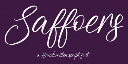 Saffoers is a fancy handwritten script font. With light contrast stroke, fun character with a bit of ligatures. To give you an extra creative work. Saffoers font support multilingual more than 100+ language. This font is good for logo design, Social media, Movie Titles, Books Titles, a short text even a long text letter and good for your secondary text font with sans or serif. Make a stunning work with Saffoers font. Cheers, Maulana Creative
 - Espect Retro by Mans Greback,
$59.00 Espect Retro beckons to the discerning eye with its harmonious blend of the modern and the classic. Its wide, yet hairline-thin structure gracefully extends into elongated serifs, giving it a poised and elegant stance. The extended x-height isn't just noticeable; it's a celebration of design that evokes charm and cuteness in every curve and counter. Espect Retro's lightness radiates a fashion-style sophistication, making it a go-to for classy projects.
 - Vasche by Maulana Creative,
$16.00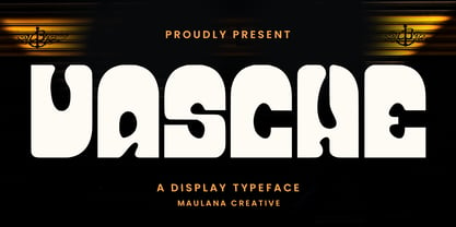 Vasche decorative display font. Light stroke, fun character with a bit of ligatures and alternates. To give you an extra creative work. Vasche font support multilingual more than 100+ language. This font is good for logo design, Social media, Movie Titles, Books Titles, a short text even a long text letter and good for your secondary text font with script or serif. Make a stunning work with Vasche font. Cheers, Maulana Creative
 - Yuletide Doodles by Outside the Line,
$19.00 Yuletide Doodles is the perfect font for that quickie Christmas party flyer, menu, or invitation. Or make your own gift tags. The uses are endless. This font includes gifts, ornaments, snow globe, snow man, holly, olive branch, lots of trees and stars, a light bulb, deer, moose, wreaths, pine boughs, skate, stocking and crown. This font works well with Christmas Doodles and Christmas Doodles Too . Mix and match to your heart's desire.
 - Rocket Clouds by Wacaksara co,
$18.00 Introducing our new font called Rocket Clouds inspired by Sythwave Style, 80's Music, and Neon Light Sign. This font offer the aesthetic style and retro mood for your design needed. The Rocket Clouds style has a universal and timeless design. This font uses style of classic sign typography. Rocket Clouds immediately engages you no matter what you use it for. It’s beautiful for product labels, houseware and text overlay to any background picture.
 - Bradia by Locomotype,
$20.00 Going back in time, Locomotype presents Bradia, a classic style font that brings out a vintage and old-fashioned feel. Available in three weights: Light, Regular and Bold. Discrectionary Ligatures feature is also included to enhance some letter pairs when applied to typographic designs. Bradia is a stylish and versatile typeface perfectly suitable for a wide range of applications, especially headlines and short lines of text, posters, packaging, logotype, in both print and digital media.
 - Asequek by Maulana Creative,
$15.00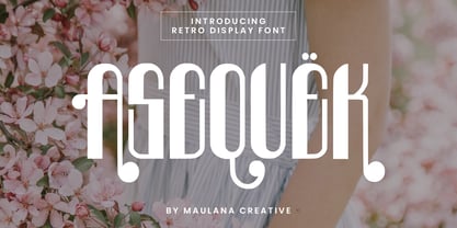 Asequek Retro Display Font. Light stroke, fun character with a bit of ligatures and alternates. To give you an extra creative work. Asequek font support multilingual more than 100+ language. This font is good for logo design, Social media, Movie Titles, Books Titles, a short text even a long text letter and good for your secondary text font with script or serif. Make a stunning work with Asequek font. Cheers, Maulana Creative
 - P22 Bangersfield by IHOF,
$29.95 Bangersfield is a four-member font family from Robby Woodard. With line treatments clearly inspired by cased meat products, these fonts function as a healtier alternative to Comic Sans. The casual hand lettering works well for light-hearted design and comic lettering. These fonts are stuffed with opentype features, extra ornaments, and a full Central European character set—over 400 characters per serving. Satisfy your hunger for a fresh take on a stale genre!
 - Pinatas Masters by Piñata,
$17.00 Original Foundry: TypeType Original name: TT Masters Pinatas Masters is a very emotional typeface. This typeface will add to your design sincerity and warmth. Pinatas Masters typeface consist of 4 different subfamilies: Pinatas Masters, Pinatas Masters Birds, Pinatas Masters Rough and Pinatas Masters Condensed. Each subfamily consists of 5 styles: Thin, Light, Regular, Bold and Black. Scope of typeface: DIY, handmade stuff, interior design, infographics, graphic design, logotypes, packaging, design of exhibitions, presentations.
 - Rissyetta by Maulana Creative,
$14.00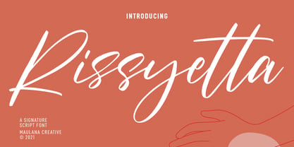 Rissyetta is a slanted signature script font. With light contrast stroke, fun character with a bit of ligatures. To give you an extra creative work. Rissyetta font support multilingual more than 100+ language. This font is good for logo design, Social media, Movie Titles, Books Titles, a short text even a long text letter and good for your secondary text font with sans or serif. Make a stunning work with Rissyetta font. Cheers, MaulanaCreative
 - Affront by fontkingz,
$19.00Affront is Carsten Raffel's first font for fontkingz. It is a very extended computer-generated font-family with three members: regular, light and a stylish doublette-version. Affront fonts include a full character set. The capital letters are monospaced, some of the lower case letters look very unique. This font works best for logotype- and headline design. It looks good on futuristic refrigerators, Science-fiction film posters and modern dance music cd-compilations.


PreviousPage 250 of 250