9,168 search results
(0.027 seconds)
- Sreet Pieces by Tomatstudio,
$12.00Now everyone can create simple pieces of graffiti in an easy way. With all our experiences in the real graffiti scene combined with our skill in creating fonts, we create these "Street Pieces." This is a simple version of a wildstyle graffiti piece; you can clearly read the font; unlike heavy wildstyle, which not everyone can read clearly, your message is still clear with this font. It's very easy to use, but for a better result, you should adjust the kerning and lead manually because the real graffiti is like that, and use your own graffiti style because there are no rules in graffiti. In this package, you’ll get two fonts. "Street Pieces Line" for the line, and "Street Pieces Fill" for the fill. Don’t forget to combine with "alternate" fonts; see the preview fonts for the sample; and also add a drop shadow or extrude effect to make it more realistic. - ZF Gently by ZooFont,
$22.00Gently, newly released by ZooFont, is a sans serif typeface that harmoniously combines straight lines and curves in a clean form. The stable form, which has its origins in handwriting, and the look of analog sensibility are enough to inspire confidence. Gently has a total of 9 weights, so it can be used freely anywhere, from body text to headlines. In addition, the height of the letters is economically calculated to achieve a reasonable line spacing, ensuring comfortable readability in various digital media. A cool breeze blows, a soft smile spreads across your lips, When I'm with you, the love in my heart seems to awaken. Your sweet whispering voice makes my heart flutter. Gently has the following features: 9 weights (from Ultra light to Ultra Black) extended latin 450+ glyphs fixed width numbers The Latin extension offers more than 130 languages with extensive multilingual Latin support for Western, Central, and Southeastern Europe. - Neon Bugler by Breauhare,
$35.00Neon Bugler is a font based on the third logo created by Harry Warren in early 1975 for his sixth grade class newsletter, The Broadwater Bugler, at Broadwater Academy in Exmore, Virginia, on Virginia’s Eastern Shore. This font design has these principles as its parameters: The letters generally follow what would be natural stroke directions; no sharp corners, all gentle turns; no lines back up over each other, cross each other, or run into each other. All of this civility between the lines produces an unintentional but welcome neon quality about it. This font can have a variety of vibes depending on its context--it has a certain nostalgia to it, yet it also has a slick, clean, futuristic look. It can even be used in a semi-grunge setting. This is a very versatile font! And if you like this font, check out the new boxy version of it, Neon Bugler Squared! Digitized by John Bomparte. - Mantika News by Linotype,
$67.99Mantika News™, from German designer Jürgen Weltin, was designed to expand the Mantika super family with text and display typefaces for setting newspapers and periodicals. The suite of typefaces is comprised of regular and bold designs, with italic counterparts, for setting continuous text, and light and extra bold versions for setting larger sizes in headlines, sub heads, pull quotes and decks. The typefaces intended for text copy were designed with shared character widths, so that changes can be made in typeface choice without disrupting line endings or column length. The display designs have a slightly smaller x-height and shorter ascenders creating a more elegant demeanor while ensuring compact multi-line display copy. In addition, fonts of Mantika News have a large Monotype W1G (World Glyph Set 1) character set enabling the setting of Greek, Cyrillic and over 20 Eastern and Western European Latin-based languages. Proportional figures are available, in the OpenType® fonts, as an alternative to the tabular designs. - Grand Slam SG by Spiece Graphics,
$39.00Grand Slam is based on an old cardwriting style known as Poster Gothic. This dynamic letterstyle was used in the heyday of the Hollywood movie poster because of its powerful and snappy appeal. The face is of uniform thickness and made as wide as possible without interfering with legibility. Its vertical strokes seem to be thickened slightly where normal serifs would be. It is interesting to note that another group of tiny little serifs populate the entire design. Grand Slam comes with a complete set of alternates including small caps and small figures. A lowercase has been added for greater versatility. Grand Slam is now available in the OpenType format. In addition to small caps, lining figures, oldstyle figures, petite lining figures, and swashes, this expanded OpenType version contains some new stylistic alternates. These advanced features work in current versions of Adobe Creative Suite InDesign, Creative Suite Illustrator, and Quark XPress. Check for OpenType advanced feature support in other applications as it gradually becomes available with upgrades. - Geographica Script by Three Islands Press,
$39.00Time-tested elegance is what you’ll get with Geographica Script, a handwritten typeface steeped in 18th century sophistication. Source materials include the maps of Emanuel Bowen (circa 1694–1767), Geographer to King George II, as well as English and American trade cards from the middle 1700s, including the work of artist and printmaker William Hogarth (1697–1764). A kindred font to our Geographica serif family, Geographica Script is a painstaking replication of the elegant roundhand cursive seen in engravings of the period. Geographica Script has more than 1,100 glyphs, including scores of standard and contextual ligatures, three full uppercase alphabets, historical forms, decorative flourishes, and full Latin support. It’s also got fifty evocative ornaments inspired by map and trade card illustrations, e.g., lion rampant, unicorn rampant, crowns, anchors, sailing ships, whale, dolphin, sun, moon, and many others. Note: To prevent Microsoft Word from cutting off Geographica Script’s extra-long descenders, set line spacing (Format —> Paragraph —> Spacing) to 1.5 lines. - VV Neonica by Vintage Voyage Design Supply,
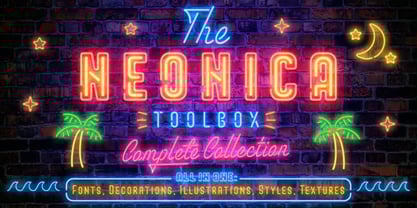
$15.00The Neonica Toolbox - a complete collection to creating awesome neon designs! This is a complete collection which included the fonts, decorations, illustrations, Adobe Photoshop styles and HQ background textures as brick or rusty grunge walls. Create awesome graphics for few simple steps! VV Neonica contains mono lined sans, volumetric sans with inline font option and mono lined script. Also, you'll get the decoration and illustration fonts. Create your own neon signs or add the decoration to your neon graphic. The illustration font has one color or up to three color options. That mean you'll be able to create a full color neon illustration graphic for few seconds! Also, the Neonica Collection comes with Adobe Photoshop styles file (.ASL). Just add it into your Photoshop and get 19 neon colour realistic effects. This file works with any Photoshop versions. As a desert you'll get 6 HQ JPG (4000x4000 pix; 300 dpi) background textures. All the additional materials (Photoshop styles, PDF Guide and Textures) you'll can get here Enjoy! - Rebekah by Ascender,
$29.99Rebekah Pro is a revival of ATF’s Piranesi family, the regular being designed by Willard Sniffin, and the remaining weights designed by Morris Fuller Benton. Tom Rickner first revived Benton’s Italic for use in his wedding invitations for his marriage to Rebekah Zapf in 2006. He completed the character set in 2009. Rebekah Pro captures the elegance and distinction of the original. Tom carefully studied samples from 1930s American Type Founders catalogues and created a digital version with meticulous care. While considered an informal script because its letterforms do not connect, Rebekah Pro has graceful strokes and a truly elegant appearance. Tom created a variety of typographic enhancements not found in the original Piranesi italic font. These OpenType typographic features offer a distinguishing touch to everything from invitations and announcements to greeting cards and advertisements. Rebekah Pro contains the Latin 1 character set and the following OpenType typographic features: Swashes, Small Capitals, Ligatures, Alternates, Oldstyle Figures, Proportional Lining Figures, Tabular Lining Figures and Ornaments. - The Vintage Town by Nathatype,
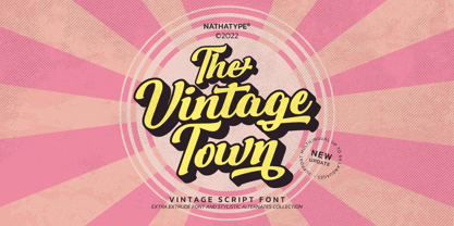
$29.00Looking for a font that will make your branding stand out? Do you sometimes have an appetite for a bit more wholesome typography? Looking for a fabulous, retro, and adventure font? We've got what you want. The Vintage Town- A Script Font The Vintage Town is a script font that has a varied base line, fine lines, retro, and fun touches. This font features thick and angular letters that easy on the eyes and nice to look while it’s also easy to read. It is becomes more special with extruding version option. Fall in love with it's authentic feel and use it to create gorgeous titles., beautiful poster designs, eye-catching social media posts, cute logos, and many more. Our font always includes Multilingual Support to make your branding reach a global audience. Features: Ligatures Stylistic Set Swashes PUA Encoded Numerals and Punctuation Thank you for downloading premium fonts from Natha Studio - Augmento by R9 Type+Design,
$35.00Augmento™ is a large contemporary font family from R9 Type+Design. We designed this typeface right smack on the sweet spot between formal and casual. The rounded rectangular structure gives Augmento the corporate, trustworthy look while the quirky stems add the fun, playful feel. This unique, versatile type family is excellent for a variety of applications such as posters, packaging, editorials, and web design. The completed Augmento™ family consists of 3 widths, 6 weights, 36 styles, and over 550 glyphs each, and packs with OpenType features such as stylistic alternates, case-sensitive punctuations, and date vs fraction recognitions. It also comes with 3 sets of figures (Proportional lining, Proportional Oldstyle and Tabular lining), and supports most Latin-based languages. With all these features in your toolbox, you can make your design sing as loud (or soft) as you’d like. To find out more about Augmento™ Opentype features and type specimen, please visit www.r9typedesign.com - SG Scratter by Studio Gulden,
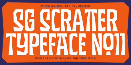
$30.00SG Scratter is a dynamic and eye-catching display font that is sure to make any design stand out. With its sharp and crisp edges, this font exudes a sense of boldness and confidence that is perfect for headlines, logos, and branding projects. This font is available in six distinct styles, each with its own unique personality and character. From the sleek and sophisticated SG Scratter Regular to the more daring and adventurous SG Scratter Bold, there is a style to suit any design need. With its clean lines and modern aesthetic, SG Scratter is versatile enough to be used in a variety of design applications, from print to digital media. Its legibility and clarity make it a great choice for everything from posters to websites. So if you're looking for a font that combines elegance and edge, look no further than SG Scratter. With its sharp angles and bold lines, it's sure to make your design pop and stand out from the crowd. - Biargabara Script by IM Studio,
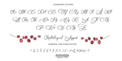
$13.00Biargabara is a Script font that has various basic lines, fine lines, classic, elegant, modern touches. Can be used for various purposes. if you want to use it for your work, this font can be used easily and simply because there are many features in it to load a lower complete set of letters and include initial letters and terminals, alternatives, binding and support for many languages. Files include: * Biargabara OTF * Biargabara TTF To activate the alternative OpenType Stylistic, you need a program that supports OpenType features such as Adobe Illustrator CS, Adobe Indesign & CorelDraw X6-X7, Microsoft Word 2010 or newer versions And this font has provided PUA Unicode (code-specific fonts). There are additional ways to access alternatives / swash, using Character Map (Windows), Nexus Fonts (Windows), Font Books (Mac) or software programs like PopChar (for Windows and Mac). If you need help or advice, please contact me via email "ikhsanm240@gmail.com" Thank you! - SG Larchett by Studio Gulden,
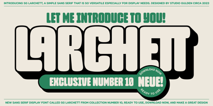
$20.00SG Larchett is a stunning new sans serif font perfect for display. It features clean, elegant lines and a modern, minimalist design that is stylish and versatile. The font is characterized by its balanced proportions, uniform stroke width, and subtle variations in letterform, giving it a distinctive and sophisticated appearance. The unique features of SG Larchett make it ideal for use in a wide range of design applications, including branding, advertising, packaging, and web design. The font's clean, uncluttered lines and legibility make it easy to read even at small sizes, while its bold, striking appearance ensures that it stands out in any design. SG Larchett is a font that commands attention, yet remains understated and refined. It is the perfect choice for designers looking to make a bold statement with their typography while maintaining a sense of elegance and sophistication. Whether used in headlines, logos, or body copy, SG Larchett is a font that will impress. - Chokellate by Alfaraby Studio,
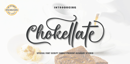
$15.00INTRODUCING Chokellate font family a fonts of Chokellate font family duo stylish calligraphy that have a varied base line, fine lines, classic and elegant touches. Can be used for various purposes. Such as title, signature, logo, wedding invitation, t-shirt, letterhead, nameplate, label, news, poster, badge etc. Chokellate font family displays stylish calligraphy alternate characters. Includes initial letters and terminals, alternatives, ligatures and multiple language support. The Features of this fonts is: * Standart ligatures * Stylistic Alternates * PUA Unicode (Private Use Areas) * Swash Programs that support in this font is a Adobe Photo Shop, Adobe Illustrator, Adobe Indesign, Corel Draw and Microsoft Office. OpenType features can be accessed by using OpenType smart programs such as Adobe Photo Shop, Adobe Illustrator, Adobe Indesign, Corel Draw and Microsoft Office. can also be accessed through the character map. Special greetings for all, all of us all smoothly in running the routine. Thank you for your purchase!. - Kalender Serif by Gurup Stüdyo,
$10.00∙Kalender is designed as a high-contrast modern serif for display use. Kalender is provides you an elegant and luxurious typographic colour. ∙When Kalender's lines invisible at small sizes you can use Kalender No 2 which have thicker lines and serifs to assist readability. ∙Kalender Blok is arranged for situations which are diacritical marks overflow to leadings of the headline and headline typographical color is affected negatively from this situation. For this purpose, majiscule diacritical letters are resolved within the letter height. However, when this is done, new forms are obtained by integrated diacritical marks with letters instead of directly merging them. The idea behind this approach is to preserve the typographic value of diacritical marks and emphasize the semantic value of diacritical letters. 68 letters have been redesigned in this way. And also Kalender have different meanings in Turkish: large, humble etc. I considered this name appropriate because it described the structure of this font well. - Falling Richees by Zamjump,
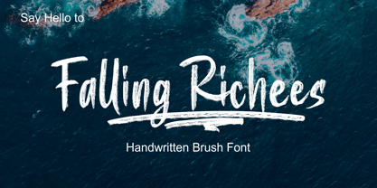
$21.00Falling Richees is a handwritten script with authentic dry brush imperfections. Falling Richees has a final letter combination to get the look you want :), besides Falling Richees also has a swash combination, to be placed under the writing you made, this is very easy to use, because this feature I intentionally made as an alternate type of letter lowercase. (see the example in the preview image) No special software is required to access any of the standard or alternative fonts - additional letters are provided in two forms 1. ending swash, 2. line swash :) WHAT IS INCLUDED: Falling Richees.ttf Multi language Ending swash Line swash For people with opentype-capable software: The alternatives can be accessed by turning on the 'Alternative Style' and 'Ligatures' buttons in Photoshop's Character panel, or through any software with a glyph panel, e.g. Adobe Illustrator, Photoshop CC, Inkscape. I hope you have fun using Falling Richees ! Happy creative! - Delight Muffin by Nathatype,
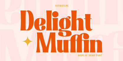
$29.00Delight Muffin is a display serif font in thickly designed weights for modern, friendly, and stylish design purposes. Generally, every letter of this font is in rounded shapes with a few spaces given. The top and the bottom parts of the letter are the thinnest ones with hardly invisible differences between the thick and the thin lines, which contrast the low lines. With Delight Muffin’s legibility, it is possible to use the font in various text sizes. Features: Stylistic Sets Ligatures Multilingual Supports PUA Encoded Numerals and Punctuations Delight Muffin fits for various design projects, such as posters, banners, logos, magazine covers, quotes, headings, printed products, invitations, name cards, merchandise, social media, etc. Find out more ways to use this font by taking a look at the font preview. Thanks for purchasing our fonts. Hopefully, you have a great experience using our font. Feel free to contact us for further information when you have a problem using the font. Thank you. Happy designing. - Fishwrapper by E-phemera,
$25.00Fishwrapper is a three-member font family (Regular, Bold, and Italic) designed to replicate the look of authentic vintage newspaper typography. The fonts are rough and are meant to be used at newspaper sizes. All three fonts have a complete alternate alphabet built in: using the contextual alternates feature will automatically substitute alternate versions of most glyphs, so that identical characters do not appear side by side, thus helping to create the look of metal type. Fishwrapper Regular has a complete set of small caps built in. Each font features assorted rule lines and other decorative material, many accessible through the discretionary ligature OpenType feature (three em dashes in a row, for example, will become a rule line), as well as fractions and a full international character set. Used in conjunction with some of E-phemera's vintage headline fonts, the Fishwrapper family is intended as a complete vintage newspaper and job-printing type solution. - Neon Bugler Squared by Breauhare,
$35.00Neon Bugler Squared is a soft, boxy version of Neon Bugler, which is a font based on the third logo created by Harry Warren in early 1975 for his sixth grade class newsletter, The Broadwater Bugler, at Broadwater Academy in Exmore, Virginia, on Virginia’s Eastern Shore. This font design has these principles as its parameters: The letters generally follow what would be natural stroke directions; no sharp corners, all gentle turns; no lines back up over each other, cross each other, or run into each other. All of this civility between the lines produces an unintentional but welcome neon quality about it. This font can have a variety of vibes depending on its context-it has a certain nostalgia to it, yet it also has a slick, clean, futuristic, sci-fi look. It can even be used in a semi-grunge setting. This is a very versatile font! Digitized by John Bomparte. - Bihext by Ingrimayne Type,
$10.00The letters of Bihext fit into the trapezoids formed by bisecting hexagons from the top corner to the bottom corner. Because these trapezoids have two orientations, there are two sets of characters and the typeface was designed assuming that the user would want to alternate these two character sets. The alternating of characters is done automatically with the OpenType feature of contextual alternatives (calt) in applications that support it. The typeface is monospaced with very tightly letter spacing. If the letter spacing seems too tight, consider alternating colors to make the individual letters stand out as an alternative to loosening the letter spacing. Almost certainly the user will need to adjust line spacing if more than one line of text is used. The family includes an outline style that can be used in a layer above the filled style. A decorative, display face, Bihext is too difficult to read to be used for long text. - ZF Captiva by ZooFont,
$22.00The name Captiva is derived from the word captivate, meaning 'enchanting' or 'capturing the heart'. Captiva is a geometric sans serif font with a harmonious blend of clean shapes and straight lines, diagonal lines, and curves. The simple yet sophisticated design shows a soft yet hard, hard yet beautiful appearance. It has a total of 9 thickness levels, and the edges and strokes are rounded to give the user a peaceful impression. The non-decorated form gives the user a comfortable reading of the text, and the high height value and wide inner space make it stand out from other fonts. In addition, it provides comfortable readability in various digital media as well as in general printing environments. Captiva has the following features: 9 thickness levels (from thin to heavy) extended latin 450+ glyphs fixed width numbers The Latin extension offers more than 130 languages with extensive multilingual Latin support for Western, Central, and Southeastern Europe. - Ervha by Yukita Creative,
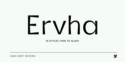
$9.00Introducing Ervha Modern Sans Serif Typeface Ervha is a modern sans serif font with a minimalist and trendy style. This font has 10 styles from thin to extra black Perfect font for print and digital projects. Quality fonts can help your projects become more modern and classy. This font also supports other languages The clean and sharp lines of sans serif fonts are the main reason many graphic designers prefer this font style for both screen and print use. Clean lines and sharp edges can be displayed more clearly on the screen which improves legibility for users. What do you get when you buy this font? Ervha is one font you need Affordable and versatile Multilingual support and complete character set Designed by a Typeface Designer Get one font for any occasion Multilingual support in this modern sans serif font Well known for its exceptional readability Enhance your Project by using Ervha Sans Serif Modern as your font of choice. - 1565 Venetian by GLC,
$20.00This set of initial decorated letters is an entirely original creation, drawn inspired by Italian renaissance engraver Vespasiano Amphiareo's paterns published in Venice circa 1568. It contains two roman alphabets : the first of large Initials, the second of small caps. Both containing thorn, eth, L & l slash, O & o slash. It can be used as variously as web-site titles, posters and flyers design, publishing texts looking like ancient ones, or greeting cards, all various sorts of presentations, as a very decorative, elegant and luxurious additional font... This font is conceived for enlargements remaining very smart and fine. The original height of the initials is at least about one inch equivalent to about four lines of characters, small caps may have the same height than the caps of the font used with, but cover two lines is better. This font may be used with all GLC blackletter fonts, but preferably with "1543 Humane Jenson", "1557 Italic", "1742 Civilite", "1776 Independence" without any fear for doing anachronism. - Lenga by Eurotypo,
$29.90Lenga is a kind of beech originally from South America. The explorers who discovered this beech in Tierra del Fuego, thought it looked like a tree from their home country and named it 'Lenga'. Like many of southern hemisphere beeches, the Lenga beech is fast growing and hardy, making it an ideal timber tree. It regenerates easily after fires. The wood has good quality, moderate durable, and easy to work. The Lenga fonts were inspired in the nobility, robustness and flexibility of those trees. They have a distinctive personality within contemporary atmosphere. These fonts are quite appropriate for headlines, subheadings and with its text flow works very well for long texts. Their legibility is suitable for editorial purposes mainly in newspapers and magazines. Lenga comes in 16 styles carefully done in OpenType format. All styles contain standard and discretional ligatures, proportional lining figures, lining old style figures, scientific superior/inferior figures. The complete set supports Western European, Central and Eastern European languages. - VLNL Cleaver by VetteLetters,
$29.99Chop chop! VLNL Cleaver is an important tool in the Vette Letters’ kitchen. It’s a butcher knife of a font. Razor sharp, ultra heavy and with pointy slanted serifs. At first glance it seems straight-lined, but a closer look revails that all straight lines are curved inward slightly, which enhances the sharp image even more. Cleaver was originally designed by DBXL for cutting meat - hell, it even hacks right through bone. It can easily splice a chicken in one slash or seperate ribs, just like that. You can also very well use it to chop up hard vegetables like pumpkin or squash on the chopping block. It gets better, the opposite blunt side can be deployed to crush ingredients like garlic, nuts or spices like black pepper. You could use a grinder, but with Cleaver it’s more fun, isn’t it? VLNL Cleaver is suitable to give a sharp edge to flyers, posters, logos (Heavy metal bands and other) or magazine headlines. - San Remo Casual SG by Spiece Graphics,
$39.00Now is a great time to dust off your old motor scooter and take a ride along the Italian Riviera. Let’s head to the flower city of San Remo, Italy - the namesake for this versatile, 1950s style script. Try San Remo on your next brochure or flyer project. You may want to consider using it to create a special logo or icon for your personal stationery. It’s perfect for any job that requires linked or connected letters. And for your convenience, this dashing design sports a variety of alternate characters plus lining and old style figures. San Remo Casual is also available as an OpenType font. It contains lining and oldstyle figures, prebuilt fractions, stylistic alternates, and a wide assortment of f-ligatures, plus more. These advanced features currently work in Adobe Creative Suite InDesign and Illustrator. Check for OpenType advanced feature support in other applications as it gradually becomes available with upgrades. Ciao! - Subway Circle by Hanoded,
$15.00My eldest son Sam always wanted to visit Japan and he has been saving up for a ticket for years now. We should have traveled there this year, but due to the pandemic, that was impossible. We’re now trying to go next year. Sam and I did make some kind of itinerary and I told him how we were going to get around, as I have been to Japan many times. I told him about the Shinkansen trains, the cute Tram in Nagasaki and the immense subway system in Tokyo. One of the lines in Tokyo is the so-called Yamanote Circle Line, which I have used on numerous occasions. A new font name was born and it stuck to this particular font! Subway Circle is a 100% handmade font. It is rounded, slightly slanted and comes with a sunny disposition. I am sure that, when you use it, you will find your 生きがい… ;-) - Lemony by Din Studio,
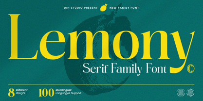
$29.00Lemony is a serif font family in 8 different volume options expressing formality and elegance in your designs. Its family character is that it has small lines in horizontal or vertical forms on the letter body, easing readers to read the letter as the lines guide readers’ attention to the reading directions. As a result, you may use this font on any text sizes. In addition to the font weight variations, you will have freedom of how and where you should use the font. Enjoy the available features here. Features: Ligatures Multilingual Supports PUA Encoded Numerals and Punctuations Lemony fits for various design projects, such as posters, banners, logos, magazine covers, quotes, invitations, greeting cards, merchandise social media, etc. Find out more ways to use this font by taking a look at the font preview. Hopefully, you have a great experience using our font. Feel free to contact us if you require more information when you are dealing with a problem. Thank you. Happy designing. - SL Borges by Sudtipos,
$29.00A man purposes himself the task of drawing the world. Among the years, he populates a space with images of provinces, reigns, mountains, bays, ships, islands, fishes, rooms, instruments, heavenly bodies, horses and people. A while before he died, he discovers that patient labyrinth of lines traces the image of his own face. J. L. Borges. SL Borges is a homage to the genial Jorge Luis Borges, illustrious Argentinean writer who lived between 1899 and 1986. Sharply depicted by Augusto Costhanzo, SL Borges synthesizes to icons the big themes that obsessed him: the infinite, labyrinths, libraries, identity. But it although traces lines over the more human side of the writer, who loved cats, fervent politics and the taste of Tango. SL Borges abridges a sum of original iconographic illustrations in True Type format, which masterly synthesizes the most important themes of the grand genius of the literature. SL Borges takes part of the "Icons of Icons" Gallery, developed by SinergiaLab for Sudtipos - Redbird by Eurotypo,
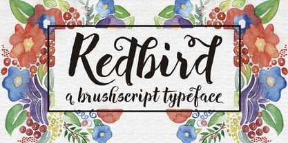
$34.00Redbird is a modern hand-painted script with an irregular baseline. Rough edges and imperfect lines give to this brush font a unique and trendy look. All glyphs have been carefully painted giving your words a wonderful flow. Fat and thin stroke in this font impresses the harmony. Want to give your projects an organic, hand-painted look? Redbird font contains 584 glyphs, with inky lines, and "perfect or imperfect" painted edges, including a few extra character alternates, swashes and ligatures for a genuine hand-lettered effect. This font includes OpenType features that may only be accessible via OpenType-aware applications, a Central European language support. Bonus: 60 useful ornaments and a lot of catchwords that you use for the most demanding design project! Redbird looks lovely on wedding invitations, greeting cards, logos, business cards and is perfect for using in ink or watercolour based designs, fashion, magazines, food packaging and menus, book covers and more! - Abort Mission by PizzaDude.dk,
$12.00This is the kind of letters I drew in school back in the 1980ies. I would never have guessed that I would do the same thing like 40 years later! I remember making a simple space game for my VIC-20 computer, and I needed some "data letters" (as I called it) - as far as I can remember, this is close to what I made 40-like years ago. Also, I was inspired by the well known series "Stranger Things" - you know, all that 80ies theme stuff took me down memory lane! :) Anyway, all the letters are handdrawn, using a squared paper as guide - at it may look simple, but it took me quite some time to finish this font (hence the name!) - Amherst by Linotype,
$29.99Amherst is a family of blackletter-inspired typefaces. This family, created by British designer Richard Yeend in 2002, is unique in that it mains the feel of blackletter/medieval type without relying directly on historical forms. Amherst is split into two different sub-families, Amherst and Amherst Gothic. Amherst is very geometric interpretation of Fraktur. Fraktur was a style of German type very popular in central Europe from 1517 until the early 20th Century. Its letters appear "broken" at certain angles and joints. Still, we recommend using it primarily for display purposes. Amherst is available in three weights: Regular, Bold, and Heavy. Amherst Gothic is very loosely inspired by late medieval letterforms, often called Texturas or Gothics. However, the letterforms of Amherst Gothic seem just as inspired by the Art Deco movements of the 1920s and by contemporary sans serif type design as anything else. Nevertheless, certain letters in this typeface do appear more "gothic" than others, especially A, D, M, Y, d, r, and x. Amherst Gothic is made up of three fonts, Amherst Gothic Split, Amherst Gothic Split Alternate, and Amherst Gothic Italic. Amherst Gothic Split has in-lined characters, and appears very ornamented. The alternate characters in Amherst Gothic Split Alternate are quite medieval in their appearance. Amherst Gothic Italic is the least medieval-looking of the set; its characters are very round, and more geometric. All six styles of the Amherst Family are OpenType format fonts, and include old style figures. - Ambroise Std by Typofonderie,
$59.00An exquisite Didot font in 18 series Ambroise is a contemporary interpretation of various typefaces belonging to Didot’s late style, conceived circa 1830, including the original forms of g, y, &; and to a lesser extent, k. These unique glyphs are found in Gras Vibert, cut by Michel Vibert. Vibert was the appointed punchcutter of the Didot family during this period. It is the Heavy, whom sources were surest that Jean François Porchez has been used as the basis for the design of the typeface family. In the second half of the 19th century, it was usual to find fat Didots in several widths in the catalogs of French type foundries. These same typefaces continued to be offered until the demise of the big French foundries in the 1960s. Ambroise attempts to reproduce more of what we see printed on paper in the 19th century; a more accurate representation of Didot punches. So, the unbracketed serifs are not truly square straight-line forms but use tiny transitional curves instead. The result on the page appears softer and less straight, particularly in larger sizes. The illustrious Didot family of type founders and printers Every variation of the typeface carries a name in homage to a member of the illustrious Didot family of type founders and printers. The condensed variant is called Ambroise Firmin. The extra-condensed is called Ambroise François. Ambroise Pro brought back to life: fifteen years in the making! Club des directeurs artistiques, 48e palmarès Bukva:raz 2001 - Floro by Andinistas,
$29.95Floro is a typographic family with 3 members designed by Carlos Fabian Camargo. Its idea combines medieval ideas, grotesque, stencil and grunge for T-shirts, stickers, advertising material design. More specifically the concept of Floro join several DNAís coordinating X height, ascendant, descendant and wide, in which proportions and adaptive optics were determined to inject great visual impact when composing titles. Its forms and counter forms have imperfections controlled with vitality and consistency. Floro is useful for ranking words and phrases with corroded edges and creases between the lines of his letters. In that vein, Floro refers to improvised design, deletion and copying. For that reason, its determinants seem stencil patterns that attract the attention of the reader. Its inaccurate decisions were planned that way, in which the type of contrast seems made with a flat tip and the amount of contrast between thick and thin is medium. Its sizes, regular and italic shine by their systematic wear and terminations sometimes in pointed forms resembling medieval darkness. In short, we can say that Floro comes from the miscegenation of Gothic calligraphy texture, foundational calligraphy and some refinements of gothic writings with italic sans-serif ideas of late 19th century. Even with the blur appearance, floro has ideal proportions to pile for horizontal and vertical areas when composing titles with striking looks and robust. And finally, floro dingbats are related shields and stamps, to accompany the written resulting useful at the level of visual support and hierarchical. - Antique by Storm Type Foundry,
$26.00The concept of the Baroque Roman type face is something which is remote from us. Ungrateful theorists gave Baroque type faces the ill-sounding attribute "Transitional", as if the Baroque Roman type face wilfully diverted from the tradition and at the same time did not manage to mature. This "transition" was originally meant as an intermediate stage between the Aldine/Garamond Roman face of the Renaissance, and its modern counterpart, as represented by Bodoni or Didot. Otherwise there was also a "transition" from a slanted axis of the shadow to a perpendicular one. What a petty detail led to the pejorative designation of Baroque type faces! If a bookseller were to tell his customers that they are about to choose a book which is set in some sort of transitional type face, he would probably go bust. After all, a reader, for his money, would not put up with some typographical experimentation. He wants to read a book without losing his eyesight while doing so. Nevertheless, it was Baroque typography which gave the world the most legible type faces. In those days the craft of punch-cutting was gradually separating itself from that of book-printing, but also from publishing and bookselling. Previously all these activities could be performed by a single person. The punch-cutter, who at that time was already fully occupied with the production of letters, achieved better results than he would have achieved if his creative talents were to be diffused in a printing office or a bookseller's shop. Thus it was possible that for example the printer John Baskerville did not cut a single letter in his entire lifetime, for he used the services of the accomplished punch-cutter John Handy. It became the custom that one type founder supplied type to multiple printing offices, so that the same type faces appeared in various parts of the world. The type face was losing its national character. In the Renaissance period it is still quite easy to distinguish for example a French Roman type face from a Venetian one; in the Baroque period this could be achieved only with great difficulties. Imagination and variety of shapes, which so far have been reserved only to the fine arts, now come into play. Thanks to technological progress, book printers are now able to reproduce hairstrokes and imitate calligraphic type faces. Scripts and elaborate ornaments are no longer the privilege of copper-engravers. Also the appearance of the basic, body design is slowly undergoing a change. The Renaissance canonical stiffness is now replaced with colour and contrast. The page of the book is suddenly darker, its lay-out more varied and its lines more compact. For Baroque type designers made a simple, yet ingenious discovery - they enlarged the x-height and reduced the ascenders to the cap-height. The type face thus became seemingly larger, and hence more legible, but at the same time more economical in composition; the type area was increasing to the detriment of the margins. Paper was expensive, and the aim of all the publishers was, therefore, to sell as many ideas in as small a book block as possible. A narrowed, bold majuscule, designed for use on the title page, appeared for the first time in the Late Baroque period. Also the title page was laid out with the highest possible economy. It comprised as a rule the brief contents of the book and the address of the bookseller, i.e. roughly that which is now placed on the flaps and in the imprint lines. Bold upper-case letters in the first line dramatically give way to the more subtle italics, the third line is highlighted with vermilion; a few words set in lower-case letters are scattered in-between, and then vermilion appears again. Somewhere in the middle there is an ornament, a monogram or an engraving as a kind of climax of the drama, while at the foot of the title-page all this din is quietened by a line with the name of the printer and the year expressed in Roman numerals, set in 8-point body size. Every Baroque title-page could well pass muster as a striking poster. The pride of every book printer was the publication of a type specimen book - a typographical manual. Among these manuals the one published by Fournier stands out - also as regards the selection of the texts for the specimen type matter. It reveals the scope of knowledge and education of the master typographers of that period. The same Fournier established a system of typographical measurement which, revised by Didot, is still used today. Baskerville introduced the smoothing of paper by a hot steel roller, in order that he could print astonishingly sharp letters, etc. ... In other words - Baroque typography deserves anything else but the attribute "transitional". In the first half of the 18th century, besides persons whose names are prominent and well-known up to the present, as was Caslon, there were many type founders who did not manage to publish their manuals or forgot to become famous in some other way. They often imitated the type faces of their more experienced contemporaries, but many of them arrived at a quite strange, even weird originality, which ran completely outside the mainstream of typographical art. The prints from which we have drawn inspiration for these six digital designs come from Paris, Vienna and Prague, from the period around 1750. The transcription of letters in their intact form is our firm principle. Does it mean, therefore, that the task of the digital restorer is to copy meticulously the outline of the letter with all inadequacies of the particular imprint? No. The type face should not to evoke the rustic atmosphere of letterpress after printing, but to analyze the appearance of the punches before they are imprinted. It is also necessary to take account of the size of the type face and to avoid excessive enlargement or reduction. Let us keep in mind that every size requires its own design. The longer we work on the computer where a change in size is child's play, the more we are convinced that the appearance of a letter is tied to its proportions, and therefore, to a fixed size. We are also aware of the fact that the computer is a straightjacket of the type face and that the dictate of mathematical vectors effectively kills any hint of naturalness. That is why we strive to preserve in these six alphabets the numerous anomalies to which later no type designer ever returned due to their obvious eccentricity. Please accept this PostScript study as an attempt (possibly futile, possibly inspirational) to brush up the warm magic of Baroque prints. Hopefully it will give pleasure in today's modern type designer's nihilism. - Satero Serif by Linotype,
$29.99Satero was designed by Prof. Werner Schneider in 2007. Never before have we had so much written material to consume; this is the age of mass-communication. Unfortunately, the decision of which typeface to use is too often made lightly. The typeface is one of the most elementary means of language, and it can play a major role in a text's legibility and the amount of time the reader needs for it. The Satero Type System offers a high degree of legibility due to its dynamic and forms. The individual characters have been based on classical concepts. They are clearly made, and leave all unnecessary elements behind. The type works to create an environment of extreme legibility. Essential parts of the a, c, e, s, and r are to be found at the x-height line, which is the most important area of a line of text in determining legibility. The Satero Type System includes two members whose basic forms are the same. The Sans Serif members are more horizontally differentiated than common grotesques, which aides their legibility. The Serif design employs asymmetrical serifs, avoiding elephant feet" altogether. Their dynamic is progressive. The condensed nature of the seriffed counterparts is optimal for newspaper and magazine applications, where space is at a premium and paper must be saved. All fonts in the Satero Type System include a number of alternate glyphs, as well as ligatures and proportional lining figures; all weights except the Heavy and Heavy Italic fonts are also equipped with small caps, small cap figures, and oldstyle figures as OpenType features. " - Future Flow by VP Creative Shop,
$15.00Introducing Future Flow typeface - 8 fonts Looking for a font that combines classic elegance, romance, and a futuristic vibe? Look no further than Future Flow! This unique typeface offers eight distinct font styles, each with its own personality and flair. Plus, it's designed to support a whopping 87 different languages, making it a versatile choice for designers and creatives around the world. So whether you're creating a logo, designing a website, or crafting a marketing campaign, Future Flow has got you covered. Try it out today and see where its flowing curves and sleek lines can take you! Language Support : Afrikaans, Albanian, Asu, Basque, Bemba, Bena, Breton, Chiga, Colognian, Cornish, Czech, Danish, Dutch, Embu, English, Estonian, Faroese, Filipino, Finnish, French, Friulian, Galician, Ganda, German, Gusi,i Hungarian, Indonesian, Irish, Italian, Jola-Fonyi, Kabuverdianu, Kalenjin, Kamba, Kikuyu, Kinyarwanda, Latvian, Lithuanian, Lower Sorbian, Luo, Luxembourgish, Luyia, Machame, Makhuwa-Meetto, Makonde, Malagasy, Maltese, Manx, Meru, Morisyen, North Ndebele, Norwegian, Bokmål, Norwegian, Nynorsk, Nyankole, Oromo, Polish, Portuguese, Quechua, Romanian, Romansh, Rombo, Rundi, Rwa, Samburu, Sango, Sangu, Scottish, Gaelic, Sena, Shambala, Shona, Slovak, Soga, Somali, Spanish, Swahili, Swedish, Swiss, German, Taita, Teso, Turkish, Upper, Sorbian, Uzbek (Latin), Volapük, Vunjo, Walser, Welsh, Western Frisian, Zulu FEATURES Uppercase, lowercase, numeral, punctuation & Symbol Regular and italic Cut, display, futuristic, line, stencil, two line styles 8 fonts No special software is required to type out the standard characters of the Typeface. Feel free to contact me if you have any questions! Mock ups and backgrounds used are not included. Thank you! Enjoy! - Satero Sans by Linotype,
$29.99Satero was designed by Prof. Werner Schneider in 2007. Never before have we had so much written material to consume; this is the age of mass-communication. Unfortunately, the decision of which typeface to use is too often made lightly. The typeface is one of the most elementary means of language, and it can play a major role in a text's legibility and the amount of time the reader needs for it. The Satero Type System offers a high degree of legibility due to its dynamic and forms. The individual characters have been based on classical concepts. They are clearly made, and leave all unnecessary elements behind. The type works to create an environment of extreme legibility. Essential parts of the a, c, e, s, and r are to be found at the x-height line, which is the most important area of a line of text in determining legibility. The Satero Type System includes two members whose basic forms are the same. The Sans Serif members are more horizontally differentiated than common grotesques, which aides their legibility. The Serif design employs asymmetrical serifs, avoiding elephant feet" altogether. Their dynamic is progressive. The condensed nature of the seriffed counterparts is optimal for newspaper and magazine applications, where space is at a premium and paper must be saved. All fonts in the Satero Type System include a number of alternate glyphs, as well as ligatures and proportional lining figures; all weights except the Heavy and Heavy Italic fonts are also equipped with small caps, small cap figures, and oldstyle figures as OpenType features. " - FF Child's Play by FontFont,
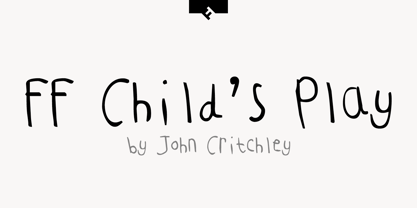
$62.99British type designer John Critchley created this script FontFont in 1993. The family has 7 weights, and is ideally suited for advertising and packaging, editorial and publishing as well as poster and billboards. FF Child's Play provides advanced typographical support with features such as ligatures and alternate characters. It comes with a complete range of figure set options – oldstyle and lining figures, each in tabular and proportional widths. - Berlin Sans by Font Bureau,
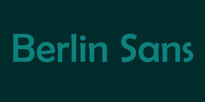
$40.00Berlin Sans is based on a brilliant alphabet from the late ’20s, originally released by Bauer with the name Negro, the very first sans that Lucian Bernhard ever designed. Assisted by Matthew Butterick, David Berlow expanded this single font into a series of four weights, all complete with expert character sets, plus a dingbat font. Imaginative & little-known, it promises enticing opportunities to the adventurous typographer; FB 1994


