10,000 search results
(0.05 seconds)
- Rosy Lee by Hanoded,
$15.00 Rosy Lee is Cockney slang for a cup of tea - which I drank when it was time to come up with a name for my new font. Rosy Lee (the font) is a 3D typeface with a lot of character. Would look great on posters, packaging (maybe even tea) and book covers. Comes with all the diacritics. So... Fancy a Rosy, luv?
 - Voluptate by Fontscafe,
$39.00 The "Voluptate Pack" font is a smart sophisticated handwriting pack that includes ‘Voluptate’, ‘Voluptate Classic’ and ‘Voluptate Elements.’ Every single character in our ‘Voluptate’ font distinct and given every letter a unique identity – very much like a person’s handwriting. Of course the characters are similar enough to work hand in hand, but not so similar as to appear as an obviously computer generated type set. The ‘Voluptate Classic’ is very similar in design and ever so slightly informal in its appearance. A thoughtful mix-and-match of both these fonts can give a delightful appearance to your designs. You could use the Voluptate on most areas of the text for example, and the ‘classic’ to emphasize a more personal touch to certain areas, say for example where you may be quoting somebody’s word. When you get the pack you also get a handy ‘Voluptate Elements’ set of designs that can enhance your creations in so many ways. All 3 are available individually, but it's like getting the elements for free when you buy the pack.
 - Floopi - Unknown license

- Floopi - Unknown license

- Seacoast by Fikryal,
$18.00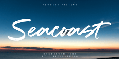 Seacoast is a hand brush font perfect for crafting, branding, invitation, stationery, wedding designs, social media posts, advertisements, product packaging, product designs, label, photography, watermark, special events, or anything. Seacoast comes with a full set of uppercase and lowercase letters, ligatures, multilingual symbols, numerals, and punctuation.
 - Changer by Fikryal,
$18.00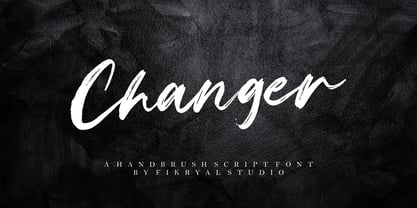 Changer is a hand brush font perfect for crafting, branding, invitation, stationery, wedding designs, social media posts, advertisements, product packaging, product designs, label, photography, watermark, special events, or anything. Changer comes with a full set of uppercase and lowercase letters, ligatures, multilingual symbols, numerals, and punctuation.
 - ITC Officina Display by ITC,
$29.99When ITC Officina was first released in 1990, as a paired family of serif and sans serif faces in two weights with italics, it was intended as a workhorse typeface for business correspondence. But the typeface proved popular in many more areas than correspondence. Erik Spiekermann, ITC Officina's designer: Once ITC Officina got picked up by the trendsetters to denote 'coolness,' it had lost its innocence. No pretending anymore that it only needed two weights for office correspondence. As a face used in magazines and advertising, it needed proper headline weights and one more weight in between the original Book and Bold."" To add the new weights and small caps, Spiekermann collaborated with Ole Schaefer, director of typography and type design at MetaDesign. The extended ITC Officina family now includes Medium, Extra Bold, and Black weights with matching italics-all in both Sans and Serif -- as well as new small caps fonts for the original Book and Bold weights. - ITC Officina Sans by ITC,
$40.99When ITC Officina was first released in 1990, as a paired family of serif and sans serif faces in two weights with italics, it was intended as a workhorse typeface for business correspondence. But the typeface proved popular in many more areas than correspondence. Erik Spiekermann, ITC Officina's designer: Once ITC Officina got picked up by the trendsetters to denote 'coolness,' it had lost its innocence. No pretending anymore that it only needed two weights for office correspondence. As a face used in magazines and advertising, it needed proper headline weights and one more weight in between the original Book and Bold."" To add the new weights and small caps, Spiekermann collaborated with Ole Schaefer, director of typography and type design at MetaDesign. The extended ITC Officina family now includes Medium, Extra Bold, and Black weights with matching italics-all in both Sans and Serif -- as well as new small caps fonts for the original Book and Bold weights. - ITC Officina Serif by ITC,
$40.99 When ITC Officina was first released in 1990, as a paired family of serif and sans serif faces in two weights with italics, it was intended as a workhorse typeface for business correspondence. But the typeface proved popular in many more areas than correspondence. Erik Spiekermann, ITC Officina's designer: Once ITC Officina got picked up by the trendsetters to denote 'coolness,' it had lost its innocence. No pretending anymore that it only needed two weights for office correspondence. As a face used in magazines and advertising, it needed proper headline weights and one more weight in between the original Book and Bold." To add the new weights and small caps, Spiekermann collaborated with Ole Schaefer, director of typography and type design at MetaDesign. The extended ITC Officina family now includes Medium, Extra Bold, and Black weights with matching italics-all in both Sans and Serif -- as well as new small caps fonts for the original Book and Bold weights."
 - Wakerobin by Monotype,
$50.99 Wakerobin takes its charming swagger from the hand-painted billboard, poster and signage lettering of the mid-19th century. These showy styles did everything they could to stand out from the background cacophony of advertising, with signwriters using sharp and high contrast serif letters, squared block shapes, or art nouveau forms to grab the attention of passersby. Wakerobin embraces the spirit of these letterforms, bringing these various styles together in one typeface - as if users had their own sign painter on hand. Just as lettering artists had to adapt to a variety of sizes - from wide streetcar lettering to compressed forms that squeezed into narrow Victorian windows - the variable version of Wakerobin scales up and down in width to fit whatever environment the user’s working in. The static fonts come in three widths and five weights. As well as its adaptability, Wakerobin is bursting with vintage flavour, making it hard to ignore. Its distinctive, spiky serifs would be right at home on food and drinks packaging, as well as shop windows, adverts, and any other place that calls for some typographic showmanship. It performs particularly well in busy environments, or anywhere with a lot of visual noise - just as its historic predecessors did. And while Wakerobin is first and foremost a display typeface, it’s surprisingly elegant when used at text size, or in the lighter end of the weight spectrum.
 - Wakerobin Variable by Monotype,
$209.99Wakerobin takes its charming swagger from the hand-painted billboard, poster and signage lettering of the mid-19th century. These showy styles did everything they could to stand out from the background cacophony of advertising, with signwriters using sharp and high contrast serif letters, squared block shapes, or art nouveau forms to grab the attention of passersby. Wakerobin embraces the spirit of these letterforms, bringing these various styles together in one typeface - as if users had their own sign painter on hand. Just as lettering artists had to adapt to a variety of sizes - from wide streetcar lettering to compressed forms that squeezed into narrow Victorian windows - the variable version of Wakerobin scales up and down in width to fit whatever environment the user’s working in. The static fonts come in three widths and five weights. As well as its adaptability, Wakerobin is bursting with vintage flavour, making it hard to ignore. Its distinctive, spiky serifs would be right at home on food and drinks packaging, as well as shop windows, adverts, and any other place that calls for some typographic showmanship. It performs particularly well in busy environments, or anywhere with a lot of visual noise - just as its historic predecessors did. And while Wakerobin is first and foremost a display typeface, it’s surprisingly elegant when used at text size, or in the lighter end of the weight spectrum. - Sortie Super by Lewis McGuffie Type,
$40.00 Sortie Super is a take on one of the kings of display lettering - Caslon's high-contrast, reversed stress 'Italian' style. It looks great at big sizes and in short flurries... and shouldn't be used in confined spaces. When compared with the original face, the weight and contrast of Sortie Super has been exaggerated. To add gravity to the letters I've increased their width overall and reduced the spacing to a hair-line fracture for added visual impact. Characters like 'S', 'E','O' and 'Z' are relatively close to their historical precedents - however the terminals on the 'C-G-S-З-Є', which have been drawn so to be more consistent. Other aspects, such as the leg of the 'R' and 'Я', the apex of the 'A' and the spur of the 'G' are revised and simplified, to help spacing and optical weight across the alphabet. Also, to reduce visual noise terminals in characters like 'C', 'J' and 'R'' are horizontally aligned. Meanwhile, the central horizontal strokes in the 'B', 'P' and 'R' etc are reduced to a hairline, so as to create a more simplified system of thick-to-thin. The temptation when drawing this kind of esoteric display alphabet is to start to rely on modular components. Which, while copy-paste-repeat is a sure-fire way to make the face more visually consistent, it's a lazy method that risks allowing the font become soulless and mechanical. An early experiment I made was making a monospaced version, which was useful in headlines, but it lost that loving feeling. So, by maintaining a handful of flourishes – the tail of the '?', the inky drop of the '!', the bulbous gloop of arms of the 'Ж' and 'К', the swirling legs in the 'R', 'Я' and 'Л', the big-bowling weight of the 'J' and 'U' – plus a few in-built inconsistencies and a bit of its own silliness, Sortie Super retains some of the organic warmth of its ancestor. Conversely, the counters, apertures and negative space are largely rigidly geometric, which helps give the revival font a bit of a modern touch. Sortie Super is an uppercase-only display font that comes with Western, Central and East European Latin, extended Cyrillic, Pinyin, as well as a set of hairline graphic features and symbols.
 - Dopelton by Variatype,
$22.00 Introducing Dopelton, a signature font that transcends the ordinary, embodying the essence of personal style and sophistication. Crafted with meticulous attention to detail, Dopelton is more than a font; it’s a stroke of individuality, a visual symphony that transforms signatures into works of art. Each letter in Dopelton carries a distinctive flair, reminiscent of a signature penned by a hand writer. The fluid strokes seamlessly merge, creating a harmonious rhythm that captures the art of the handwritten with a contemporary twist. The balance between elegance and readability is finely tuned, making Dopelton versatile for various design purposes. Dopelton is not confined to the limits of static characters; it adapts to the natural flow of the hand, ensuring a unique signature experience every time. The font’s dynamic nature brings authenticity to digital signatures, providing a touch of human warmth in the digital realm. The details of Dopelton are a testament to its craftsmanship. Subtle curves, refined loops, and a tasteful interplay of thick and thin lines give each letter a signature-worthy personality. Whether used for branding, invitations, or personalized stationery, Dopelton adds a touch of refined charm to any project. This signature font is designed to make a statement—bold yet graceful, modern yet timeless. Dopelton is more than a font; it’s an extension of your identity, a signature that leaves a lasting impression. Elevate your designs with Dopelton and let your words carry the unmistakable touch of personalized elegance. FONT FEATURES Additional Accents 68 Languages Kerning Alternates Ligatures Swashes
 - Rayna by melifonts,
$5.00 Rayna is a simply beautiful handwritten font that is suitable for scrapbooking, notes to friends, and stylish logos. It is both elegant and versatile, including both Latin and Cyrillic alphabets with support for most European languages. This delicate typeface's swooping curls and sweet lines are the perfect addition to your handwritten font collection!
 - Delfin Scripts by Eclectotype,
$40.00 Delfino Script is a cool, connecting script that can appear both retro and contemporary. Curved on the outsides of strokes, and jagged inside, the forms look like an abstraction of strips of tape, folding and flowing, or even marker pen style lettering. This script is not created by any pen though - its forms are constructed, not painted. Typographic features like ink traps add sparkle to the text. OpenType features include ligatures, contextual alternates (for more realistic connections) and stylistic sets. Stylistic Set 1 changes certain upper case letters into forms more suited for all caps setting, although they can also be used freely with the lower case. Set 2 changes the r into a less scripty form and set 3 adds a connecting tail to the q. Delfino Script would find itself at home in cookery books, fashion blogs, vintage car magazines and set large and proud on expanses of concrete, or, most likely, whatever you might have in mind for it! Delfina Script is practically identical to Delfino save for round tittles, periods and any other dot shaped glyph components. Strangely for such a little change, it does seem to give the face a different character.
 - Matahari Sans by Studio Sun,
$36.00 Matahari (English : Sun) is the power source of life. The symbol of power and energy that synergies with other part of daily lives. It is one of the most fundamental thing us humans need, just like communication. And like Matahari itself, words are powerful enough to make a living. Referring to Grotesque Font and influenced by the works of Eric Gill, Matahari Typeface is available in 3 widths and 7 weights, also in Oblique version in each font. The font uses oldstyle and transitional letters (double-story ‘a’ and ‘g’). It has a humanist gesture, the thickness of the font is semi-monolinear where the horizontal and vertical size is almost equal, making the font reach its maximum optical readability even in small sizes. The font anatomy refers to the basic geometric square-sized of the letter ‘M’, while the letters of S/C/G/c/e have uneven curve shape which give the sense of humanist and flexibility. This typeface is ideal for various design needs, from Printing to On-Screen/Digital Reading, from Brand Identity, Posters, Caption, Headline, to Body Text. With the numbers of widths available, the font can be used for all kinds of purposes (Label, Signage, Packaging, Website, etc). Supported well over 75+ languages, including Greek & Cyrillic, Matahari Typeface will give you an excellent way in aesthetic communication and message-delivering.
 - Qonora by Charles Casimiro Design,
$22.50 Qonora is an innovative new sans-serif text face that combines flowing, almost calligraphic strokes with a post-modern sensibility for a look that works as well on the printed page as it does on screen. Its comfortable proportions and no-nonsense streamlining (note the lack of spurs, serifs or any unnecessary ornamentation) make it an excellent choice for legibility even at very small point sizes. Qonora includes a true italic, drawn independently from the Roman. Strokes for the italic have been re-weighted to complement the Roman, and idiosyncratic italic glyphs have been substituted where appropriate. The typeface’s extensive Hebrew implementation (including diacritics and cantillation marks) is an important part of its character. The Latin, Cyrillic and Greek ranges of the face maintain a consistent ethic of form and function.
 - Surprise Pro by Naghi Naghachian,
$58.00 Surprise Pro is designed by Naghi Naghashian. It is a delicate decorative headline font. The character set of this Font supports most western languages including: Afrikaans, Basque, Breton, Catalan, Danish, Dutch, English, Finnish, French, Gaelic, German, Icelandic, Indonesian, Irish, Italian, Norwegian, Portuguese, Sami, Spanish, Swahili and Swedish. There are 17 additional symbol characters: euro, litre, estimated, omega, pi, partialdiff, delta, product, summation, radical, infinity, integral, approxequal, notequal, lessequal, greaterequal, and lozenge. It also includes the characters necessary to support the following central European languages: Croatian, Czech, Estonian, Hungarian, Latvian, Lithuanian, Polish, Romanian, Serbian (Latin), Slovak, Slovenian and Turkish.
 - Orange Milk by Almarkha Type,
$25.00 Orange Milk is a quirky and fun script full of charm With 2 version Regular and Line . It will take any DIY-project to the next level! Orange Milk is perfect for Craft , product packaging, product designs, label, branding projects, logo, wedding designs, social media posts, advertisements, watermark, invitation, stationery and any projects Simple installationsAccessible in the Adobe Illustrator, Adobe Photoshop, Adobe InDesign, even work on Microsoft Word. PUA Encoded Characters – Fully accessible without additional design software. Fonts include multilingual support Image used : All photographs/pictures/vector used in the preview are not included, they are intended for illustration purpose only. Thank You
 - Letterose by Krafted,
$10.00 Introducing Letterose - A Calligraphy Font Letterose Calligraphy font is designed and carefully handcrafted elegantly and gracefully for your website, for your social media branding, Pinterest banners, printed invitations, and more! Letterose Calligraphy font will never go wrong for your audience, clients, guests or anyone around you! What you’ll get: Multilingual & Ligature Support Full sets of Punctuation and Numerals Compatible with: Adobe Suite Microsoft Office KeyNote Pages Software Requirements: The fonts that you’ll receive in the pack are widely supported by most software. In order to get the full functionality of the selection of standard ligatures (custom created letters) in the script font, any software that can read OpenType fonts will work. We hope you enjoy this font and that it makes your branding sparkle! Feel free to reach out to us if you’d like more information or if you have any concerns.
 - Sweet Pattern by Krafted,
$10.00 Sweet Pattern, just as sweet as flowers, flawless as you! A perfect font for your minimal yet beautiful website, social media branding, Pinterest banners, printed invitations, and more! Sweet Pattern fonts, like a fragrance, speak your heart, your audience’s, clients and guests and people around you! What you’ll get: Multilingual & Ligature Support Full sets of Punctuation and Numerals Compatible with: Adobe Suite Microsoft Office KeyNote Pages Software Requirements: The fonts that you’ll receive in the pack are widely supported by most software. In order to get the full functionality of the selection of standard ligatures (custom created letters) in the script font, any software that can read OpenType fonts will work. We hope you enjoy this font and that it makes your branding sparkle! Feel free to reach out to us if you’d like more information or if you have any concerns.
 - Socotra by Kaidosan,
$16.00 Socotra is a modern grotesk with a cool appearance, consisting of a modern and unique style. with a very versatile style and is perfect for a great resource for designers to explore, beautiful eye-catching artwork, interesting social media posts and much more that goes well with this socotra font
 - Gallos by W Type Foundry,
$25.00 What comes to your mind if I say Architype, Geometric, Gaelic, and Uncial? An impossible combination of features? An unrealistic setup of tastes as weird as your music list? Or some part of a joke told by your favourite comedian? Just chill and stick to the idea that is possible. Gallos combines the conceptual historical elegance of the Uncials with the practical rationalism of the Geometric style. Moreover, this typeface is composed by two sub families: Gallos Uncial and Gallos Architype. The letters “M”, “N”, “W”, “a”, “m”, “n”, “r”, and “w” differ between these two models. The first one is related to both: The Uncial script aspect displaying the leaned “a” with a closed bowl, and the classical geometric style depicting more conventional uppercase and lowercase letters “m” and “n”. The Architype one is inspired by Paul Renner’s Architype model, thus the leaned “a” has an open counter, the “r” is composed by a stem and a dot, and the rest of the mentioned letters were built using square rational features. Both models are connected by classical Uncial features such as the curved stroke “e” and curved shaft “t”, and with Gaelic vibes which can be seen in uppercase and lowercase letters “K” and “X”. Also, the curved descender “g” and “y”, alongside the curved stem “z” connect really well with the rest of the system and provide more uniqueness to the Gallos type family. Without further ado, we say to you: let’s make Uncials popular again!
 - Blue Goblet Emblems by insigne,
$32.99 The designer-favorite Blue Goblet family has grown with Blue Goblet Emblems. Blue Goblet Emblems are unique and abstract symbols that are rendered in Cory Godbey's unique illustration style. These creative and dynamic ornaments can be resized easily without any loss of quality, and can easily be converted to outlines and modified. These ornaments can be combined to form unique compositions or inserted directly into layouts. Combine them to form unique patterns and motifs. Please see the sample .pdf to see all 58 ornaments in action, and be sure to check out the original Blue Goblet brush script and Blue Goblet ornaments, frames and vignettes and florals. Blue Goblet Emblems is a collaboration between insigne Design and Portland Studios. Use this sample .pdf as a guide to quickly refer to your favorite emblems. All the ornaments in this guide are sized at 75pt, and the copy and headers are set in Blue Goblet.
 - Alecko by Evolutionfonts,
$- Alecko is a distinctive didone-style typeface, which is strongly influenced by calligraphy, but is at the same time drawn with mathematical precision. Its advantages are summarized in its slogan: “One typeface, many possibilities”. Once you decide to use it, you can alter its look in a variety of ways: Should the contrast between the horizontal and vertical strokes of the glyphs be high or low? Is it appropriate to apply engraving to the letters (and what color?). Should the glyphs be connected to one another? Alecko is equipped with a lot of alternative characters, which are automatically inserted as you type, in order to achieve a “handwritten” look, however, it can also work without them. Each of these options is appropriate depending on the design context and we want to encourage you to explore every one of them, which is why we sell the whole family for a considerably smaller price, than the combined price of all weights. And If you don't feel like spending money at all, just download the free weight. Have fun.
 - Stribe by Fateh.Lab,
$10.00 Stribe, this is an amazing work. Why? ... because this is not just talking about fonts, but more than that, with the spirit of Street Art, stribe invites you to explore with your wild ideas, I'm sure this will really make you feel happy in creating the work that you will wake up to the front. Supported by 3 font choices that are very sweet and also strong, stribe answers all your difficulties in choosing font support that suits your taste. And the most exciting thing is, you get a free bonus vector illustration that is very detailed and also has a very strong Street Art spirit, and is made very original, so what are you waiting for, have Stribe as soon as possible. Thank You
 - Clip by Setup,
$19.95 Clip is a display typeface inspired by the shape of a paperclip, but it’s not designed with the usual minimalistic modular approach. Instead, Clip mimics the construction, proportions and contrast of classic bold text typefaces and has one unique characteristic: each of its characters is drawn with only one single line. Clip family consists of 3 fonts, Hair, Light and Regular, each with 745 glyphs (supporting more than 70 latin based languages), 4 stylistic sets and advanced OpenType features. When Stylistic set 1 is activated, the overlapping loops contract, giving the text a whole new character. Moreover, every uppercase character is also available in an ornamental swash variant, which means most of the capitals have four different versions. Learn more about the OpenType features in Clip fonts at http://www.urtd.net/clip.
 - Romanovsky by ParaType,
$30.00 Romanovsky is the font developed on the base of samples from the catalogue of Osip Lehman foundry in Sankt Petersburg. Original Latin design that was used for Romanovsky can be found in Feder Grotesk by Jacob Erbar. The current digital font is not a scanned version of Lehman’s samples but a newly drawn typeface that differs from the original in many details. Romanovsky is a sans serif typeface with narrow proportions and noticeable contrast. It will be good for headings and display matters. Character set covers languages of Western and Central Europe and Cyrillic-based languages. It also contains around 20 ligatures of uppercase letters for the most frequent combinations. Designed by Vasily Biryukov. The bold weight was developed together with Olexa Volochay. Released by ParaType in 2013.
 - California Street by Letterara,
$14.00 California Street is the perfect handwritten font: Sweet, innocent, light and charming, this one-of-a-kind typeface will add a unique charm to any design project! California Street font was created to look as close to a natural handwritten script as possible by including 64 ligatures. With built in Opentype features, this script comes to life as if you are writing it yourself. You can see it in the picture shown. A wide range of swashes (a-z) and alternates (A-Z, a-z) are included so that you can give your logo or name a custom, hand-calligraphy look. This font is available in 10 fonts in 1 typefaces : Thin, Light, Regular, Semi Bold, Bold, Thin Italic, Light Italic, Italic, Semi Bold Italic, Bold Italic and most importantly, California Street is perfect for you.
 - Questal by insigne,
$21.99 Questal is an intriguing unicase serif. The face appears rather eccentric, yet it still retains a refined character. The typeface is wider than most, but not to the degree that Aviano is extended. The font includes some interesting OpenType alternate characters to extend the quirky quality of the letterforms even further. If unicase isn't your thing, the Questal family also includes a small caps variant for more traditional uses. Use Questal for eye-catching and distinctive logotypes or headlines.
 - MFC Phonograph Monogram by Monogram Fonts Co.,
$19.00 The inspiration source for MFC Phonograph Monogram is a vintage monogram specimen named “Kent” showing only a CBA sample. It was a style I could find no other reference for, but was desperate to recreate this record like styling of monogram. Finally, it all comes to life in MFC Phonograph Monogram. I even threw in a little dog and phonograph icons hidden in the font as decorative icons reminicent of old Victrola records. Phonograph Monogram supports two and three letter monograms, although the two letter style break from the circular record design and creates a zulu style shield design. MFC Phonograph Monogram uses the Ligatures feature, available in most OpenType savvy applications, such as Adobe Illustrator CS (see Fig. 1). The Ligatures feature is typically enabled automatically, but you may need to confirm this in your program if you are not certain. If any second lowercase letter typed does not automatically switch to form the right side of the rounded form, you do not have Ligatures enabled.
 - Groovy by Krafted,
$10.00 Want to give your design a vintage look that still speaks to modern audiences today? Choosing the right font can do the trick. Introducing Groovy - A Vintage Modern Font. Use this unique font for web pages, social media, apps, ads, printed materials, clothing, packaging, and anything else your brand needs to stand out from the crowd. What you’ll get: Multilingual & Ligature Support Full sets of Punctuation and Numerals Compatible with: Adobe Suite Microsoft Office KeyNote Pages Software Requirements: The fonts that you’ll receive in the pack are widely supported by most software. In order to get the full functionality of the selection of standard ligatures (custom created letters) in the script font, any software that can read OpenType fonts will work. We hope you enjoy this font and that it makes your branding sparkle! Feel free to reach out to us if you’d like more information or if you have any concerns.
 - Mela by Resistenza,
$39.00 Mela was created with a pointed brush and walnut ink using thick brushstrokes. The original idea was to make a kind of urban graffitti with a fat brush, but the final result is more refined and elegant. Something new - light and bold together. The letters are a little bit slanted using sharp strokes, the brush gives the illusion of a fat-tipped marker. This handmade typeface has a lot of contrast, it brings together the beauty of the calligraphic shapes and strokes with the esthetics of a modern urban style. It creates a carefree feeling, contemporary, adding a perfect modern touch to your work. The possibilities for customized layouts are limitless, using the opentype ligatures and alternates to you make Mela your own. Mela Pro contains 473 glyphs: alternates, ligatures, icons, ornaments, and much more. Mela regular is limited to letters, figures and punctuation. Mela & Mela Pro are perfect for headlines and short texts. Use it for magazines, packaging, advertising, branding, posters, editorials, TV, movies and websites to give to your projects the unmistakable human touch of beautiful handwritten letters.
 - Coastline by Surplus Type Co,
$9.00 Introducing Coastline - A textured script typeface which features regular & alternate fonts in both .otf and SVG format! You can choose whether you want the heavily textured result with the SVG version, or a more solid design with the .otf font, and also interchange your letters using the Alternates for a more natural handwritten look. Coastline is great for countless areas of design and works equally well for creating quotes, posts & advertisements as well as physical goods like apparel, posters & housewares.
 - Conthrax by Typodermic,
$11.95 Looking to add a high-tech touch to your designs? Look no further than Conthrax, the ultramodern, futuristic font that will take your typography to the next level. With its sleek, orthogonal sans-serif forms and plastic, consumer electronics-inspired shapes, Conthrax is the perfect typeface for all your sci-fi, technology, and futurism-inspired projects. But Conthrax isn’t just about looks—it’s also about precision. Its industrial accuracy and scholarly authority make it the perfect choice for conveying complex technical concepts and cutting-edge research. And with a wide range of mathematical symbols, fractions, numeric ordinals, and monetary symbols, you’ll never be at a loss for the perfect way to illustrate your point. Available in seven weights and italics, this typeface will make your designs stand out from the crowd and give them a high-tech edge that’s sure to impress. Try Conthrax today and take your designs to the next level! Most Latin-based European, Vietnamese, Greek, and most Cyrillic-based writing systems are supported, including the following languages. Afaan Oromo, Afar, Afrikaans, Albanian, Alsatian, Aromanian, Aymara, Azerbaijani, Bashkir, Bashkir (Latin), Basque, Belarusian, Belarusian (Latin), Bemba, Bikol, Bosnian, Breton, Bulgarian, Buryat, Cape Verdean, Creole, Catalan, Cebuano, Chamorro, Chavacano, Chichewa, Crimean Tatar (Latin), Croatian, Czech, Danish, Dawan, Dholuo, Dungan, Dutch, English, Estonian, Faroese, Fijian, Filipino, Finnish, French, Frisian, Friulian, Gagauz (Latin), Galician, Ganda, Genoese, German, Gikuyu, Greenlandic, Guadeloupean Creole, Haitian Creole, Hawaiian, Hiligaynon, Hungarian, Icelandic, Igbo, Ilocano, Indonesian, Irish, Italian, Jamaican, Kaingang, Khalkha, Kalmyk, Kanuri, Kaqchikel, Karakalpak (Latin), Kashubian, Kazakh, Kikongo, Kinyarwanda, Kirundi, Komi-Permyak, Kurdish, Kurdish (Latin), Kyrgyz, Latvian, Lithuanian, Lombard, Low Saxon, Luxembourgish, Maasai, Macedonian, Makhuwa, Malay, Maltese, Māori, Moldovan, Montenegrin, Nahuatl, Ndebele, Neapolitan, Norwegian, Novial, Occitan, Ossetian, Ossetian (Latin), Papiamento, Piedmontese, Polish, Portuguese, Quechua, Rarotongan, Romanian, Romansh, Russian, Rusyn, Sami, Sango, Saramaccan, Sardinian, Scottish Gaelic, Serbian, Serbian (Latin), Shona, Sicilian, Silesian, Slovak, Slovenian, Somali, Sorbian, Sotho, Spanish, Swahili, Swazi, Swedish, Tagalog, Tahitian, Tajik, Tatar, Tetum, Tongan, Tshiluba, Tsonga, Tswana, Tumbuka, Turkish, Turkmen (Latin), Tuvaluan, Ukrainian, Uzbek, Uzbek (Latin), Venda, Venetian, Vepsian, Vietnamese, Võro, Walloon, Waray-Waray, Wayuu, Welsh, Wolof, Xavante, Xhosa, Yapese, Zapotec, Zarma, Zazaki, Zulu and Zuni.
 - Velino Text by DSType,
$55.00 Velino is the most recent of our premium typefaces. The serif version comes in two packages with three widths: Velino, Velino Condensed, and Velino Compressed. The display package contains high-contrast typefaces, with a modern flair—very feminine but with plenty of character, especially designed for fine print in big text sizes. The text package was designed for any running text. Its proportions and colors make it the ideal for text, even in very difficult conditions such as newspaper printing. We also designed the perfect companion to this enormous type system: Velino Poster, a slab serif typeface with only one weight and its respective italic, but with plenty of muscle, for every time some extra strength is needed, such as setting very big text, magazine covers or newspapers’ special sections. Finally, we designed Velino Sans and Velino Sans Condensed to perfectly match the weight and proportions of Velino, all with matching italics.
 - Stempel Garamond LT by Linotype,
$29.99 Opinion varies regarding the role of Claude Garamond (ca. 1480–1561) in the development of the Old Face font Garamond. What is accepted is the influence this font had on other typeface developments from the time of its creation to the present. Garamond, or Garamont, is related to the alphabet of Claude Garamond (1480–1561) as well as to the work of Jean Jannon (1580–1635 or 1658), much of which was attributed to Garamond. In comparison to the earlier Italian font forms, Garamond has finer serif and a generally more elegant image. The Garamond of Jean Jannon was introduced at the Paris World’s Fair in 1900 as Original Garamond, whereafter many font foundries began to cast similar types. The famous Stempel Garamond interpretation of the 1920s remains true to the original Garamond font with its typical Old Face characteristics. The bold italic was a modern addition at the end of the 1920s and the small caps provided an alternative to the standard capital letters. In the mid 1980s, a light version was added to Stempel Garamond. Since its appearance, Stempel Garamond has been one of the most frequently used text fonts.
 - Sunday Popice by Nathatype,
$29.00 Sunday Popice is a delightful display font that brings a dose of cuteness and whimsy to your designs. With its rounded shapes and high contrast, this typeface exudes a unique charm that is perfect for adding a touch of playfulness to any project. Designed with love and attention to detail, Sunday Popice captures the essence of childlike joy and innocence. Each character is carefully crafted with rounded edges, creating a friendly and approachable appearance. The high contrast between thick and thin strokes adds a dynamic and lively quality to the font, making it truly stand out. This font's rounded and soft shapes evoke a sense of warmth and coziness, reminiscent of a Sunday afternoon spent in the company of loved ones. Because of the unique style, for the best readability use this font at large text sizes. Enjoy the available features here. Features: Multilingual Supports PUA Encoded Numerals and Punctuations Sunday Popice fits in children's books, product packaging, greeting cards, headlines, logos, and any design project that requires a touch of whimsical elegance. Find out more ways to use this font by taking a look at the font preview. Thanks for purchasing our fonts. Hopefully, you have a great time using our font. Feel free to contact us anytime for further information or when you have trouble with the font. Thanks a lot and happy designing.
 - Rockwell Nova by Monotype,
$40.99The Rockwell® Nova family is a sturdy, optically monoweight design with blunt, straight-edged serifs and a no-nonsense attitude. It's the quintessential example of the appealing and eminently usable slab serif type style. The 13 designs of Rockwell Nova make for a robust and adaptable typeface family. Based on the original Monotype Rockwell suite of fonts, Rockwell Nova is an exceptionally durable design that suggests feelings of frank honesty when set in text composition. It is also an exceptionally versatile display design that can be used for headlines, subheads - or virtually anyplace where a strong presence is required. Rockwell Nova OpenType® Pro fonts have extended character set supporting Greek, Cyrillic, most Central European and many Eastern European languages, in addition to providing for the automatic insertion of ligatures and fractions. - VLNL Wasabi Turbo by VetteLetters,
$35.00 Wasabi is one of the key ingredients in the Japanese kitchen. Also known as japanese horseradish, it is an extremely spicy condiment made out of the graded root of the Wasabi plant. Its spiciness is different than that of a chili pepper though, more like a hot mustard. The spicy taste shoots right through your nose, but does not last for long. Wasabi is traditionally used in sushi and sashimi dishes, soba noodles, and in a number of Japanese snack foods. Equally sharp and stingy, VLNL Wasabi Turbo was designed by Donald Roos. Despite its japanese outward appearance, the font has its origin in lettering found on a German book. It is hot, and edgy like a samurai sword. Wasabi Turbo will stand out as headline and logo!

