10,000 search results
(0.079 seconds)
- Yippie Yeah by Almarkha Type,
$25.00 Yippie Yeah Sans & Slab is a Cute & Playful Font full of charm . It will take any DIY-project to the next level! Yippie Yeah Sans & Slab is perfect for Crafts, Poster, product packaging, product designs, label, branding projects, logo, wedding designs, social media posts, advertisements, watermark, invitation, stationery and any projects
 - Terasu Brush by Prioritype,
$18.00 Introducing a new brush font with a cool texture, you can use in your project to apply to music events, clothing products, crafts, image previews, creative posts and much more. As an illustration you can see some of the preview above. Features: -Uppercase -Lowercase -Numeral -Punctuation -Multilingual -Ligature -Swash Thanks.
 - VLNL Bonen by VetteLetters,
$30.00 While sketching for a music project logo, Donald DBXL Beekman looked at several wood type alphabets as a starting poing. One of these was No.120, patented in 1880 by William Hamilton Page. With its distinct diagonally cut serifs and round shapes cut off at top and bottom, it bore just the right feel for the project. DBXL digitized the alphabet, adding all characters needed for a full set. During this process all shapes were widened, tweaked and streamlined to enhance consistency and rhythm along the whole font. VLNL Bonen is an all-caps display font with a very specific western cowboy or circus look. For instance burger or barbecue grill restaurants would do well with this one. We can easily see it shine on a festival flyer or poster as well, and not just country & western festivals. VLNL Bonen is suitable for any ‘big’ use that needs to stand out of the crowd. Bonen is the Dutch word for beans, a world wide source of nutrition and proteins it comes in a multitude of shapes, colours and sizes. Beans are also the most eaten foods in a cowboy’s diet along the trail. Available in abundance and easily preserved and transported, many recipes on the cattle drives in the American Wild West used beans. Think of chili, mashed beans with biscuits and bean soups. “Keep them doggies movin’, cowboy!”
 - Line Washington by Aqeela Studio,
$20.00 Line Washington is a thin and elegant handwritten font. Fall in love with its incredibly versatile style and use it to create gorgeous wedding invitations, beautiful stationary art, eye-catching social media posts and more! This font is PUA encoded which means you can access all the glyphs and sweeps easily!
 - Grange by Device,
$39.00 The Device interpretation of the classic “Grot” thick/thin sans style. Unlike the traditional models on which it is based, Grange takes a rational, consistent approach across wide range of weights and widths for contemporary use. The "Text" weights are designed for use at smaller sizes, and have more open character shapes and spacing for legibility. The font includes alternative curved and straighter versions of key characters, most obviously the lower-case ‘g' and capital ‘R', allowing the font to take on either a sharper or warmer, more playful appearance. These can be toggled on or off using the ‘Alts' feature in Illustrator, or ‘Stylistc Sets’ in Indesign. Contains proportional, lining and tabular numerals. Perfect for both headline and text.
 - Liquoia by Wiescher Design,
$39.50 Liquoia are three scripts with lots of contrast and different embellishments. Liquoia-A has the elegant, flaming decoration it blends well with Fleurons-Six. Liquoia-B has the flowery embellishments and goes very well with my Ornata-A and Ornata-B. Liquoia-C is the plain, straightforward and solid floating script. The name is derived from "liquid", meaning it is a fluid script that has a distinctive waveform. The "oia" part of the name comes from Sequoia, the sturdiest tree that came to my mind. Your sturdy, floating designer Gert Wiescher
 - Kaapeli by Suomi,
$20.00 I've had mixed feelings about Kabel; It is a brilliant headline font with a lot of character, but it's the characters I have problems with. The versions of all big foundries have the same flaws (in my opinion), especially lowecase a and s. So I finally went ahead and made an all new version. It is not Kabel, but very much like it. It has unique x-height, weight and width, and many individual characters are also different from the original.
 - Organika by Melvastype,
$28.00 Organika is a hand drawn type family of six fonts. It includes upright and italic brush script, sans and serif fonts. Because of the uneven edges, loose forms and bouncing letters Organika has an organic, friendly and casual feeling. The script has lots of alternates that gives you possibility to build your text almost like handwriting with all the charming imperfections and variations that a real handwriting has. If you enable Discretionary Ligatures OpenType feature (dlig) it replaces automatically lower case letters with an alternate when the letter is repeated. So there are never two letters next to each other that are just the same. The script also has a few neat underlines to choose from to give your design the final touch. With the Organika sans and serif fonts you can add some variety and contrast to your design with the matching casual hand written feeling.
 - Vintage Binary by Putracetol,
$26.00 Vintage Binary - Display Typeface Font is a captivating font that embodies the essence of vintage and retro aesthetics. With its classic display style, it evokes a sense of nostalgia and adds a touch of ornamental and decorative flair to your designs. This font is a perfect choice for logos, badges, emblems, titles, headlines, posters, branding materials, and more. The vintage retro style of Vintage Binary brings back the charm and nostalgia of bygone eras. Its classic display design captures the essence of vintage typography, giving your designs a timeless appeal. The font is adorned with ornamental elements and decorative accents, adding an extra layer of visual interest and artistic flair. Whether you're creating a logo for a retro-inspired brand, designing a vintage label, or crafting an eye-catching poster, Vintage Binary is a versatile font that will help you achieve an authentic and visually stunning result. With Vintage Binary - Display Typeface Font, you can infuse your designs with the vintage charm, retro vibes, and artistic details that will capture attention and make a lasting impression.
 - Marmellata Jar 02 by Fontscafe,
$39.00 So you just designed a night club brochure, and now need to change gears to help you make a design that oozes with love and togetherness? Let our Marmellata fonts help you get into the mood! A part of our Marmellata package and also available individually, the Jar 02 is something to be tried to be believed. This font takes you to that special place in your heart, reserved for your most cherished memories... It is great because of its simplicity, very much like all things from childhood! Don’t get us wrong though, this is not just a ‘childish’ font. While it would work great for children’s designs, we believe it would also be very fitting in designs that call for a touch of nostalgia, love, comfort, well-being and happiness. And yes, we agree that all children remind us of all of the above!
 - Veggie Spray by PizzaDude.dk,
$16.00 I bet a lot of people would love to have a Veggie Spray - I bet they would use it to turn candy, ice cream, cakes and other fattening products into something more healthy! Well, this font has zero calories and is 100% handmade, and comes with contextual alternates - which means that every letter has 5 different versions!
 - Automatic Typewriter by Ana's Fonts,
$16.00 Automatic Typewriter is a monospaced typewriter font in two styles: Upright and Oblique, and two weights: Regular and Bold, plus an Automatic Underline version of each font, for a total of 8 fonts. This makes it versatile and ready to use in modern and vintage designs alike. This font is also very legible at a wide range of sizes and looks great in both long or short texts, in digital collages, branding and packaging, social media posts, logotypes, etc.
 - Grayson Rough by Gleb Guralnyk,
$14.00 Introducing a modern display font Grayson Rough. It's a textured grunge typeface that has a lot of ligatures and stylistic alternates. The OpenType features can help you to create awesome and unique lettering compositions with unexpected characters combinations. Use capital letters to access all this features. Nevertheless Grayson Rough can be a quite simple font if you type a small letters, which can be useful for short supporting text. This font has west european multilingual support (check out the screenshot with available characters).
 - 1871 Dreamer 2 Pro by GLC,
$42.00 Like our first "1871 Dreamer Script" this script font was inspired from a lot of manuscripts, notes and drafts, written by the famous american poet Walt Whitman. However, it is a very different font, with a higher x-line, numerous different ligatures, alternates and twin letters, including fractions, and, as a real "Pro" font, usable not only for Western European, but also for Eastern and Central European, Baltic and Turkish.
 - Benn by Factory738,
$5.00 Benn is a bold and strong font family. Inspired by a car shape, it's sturdy uncompromising style is felt through the controlled letterforms and fluid touches. A balance of hard lines and smooth curves. Benn works great in any branding, poster, logos, magazines, films. The different weights give you full range to explore a whole host of applications, while the alternate glyphs give a fluid and modern feel to any projects. Eight styles Alternate glyphs are available Numbers & Punctuation Extensive Language Support Thanks for having a peek at Benn.
 - Hawkes by Kimmy Design,
$15.00 Hawkes is an extensive handmade typeface family that comes with a bundle of weights, widths and styles, all designed to work cohesively. Here is a breakdown of the Hawkes family. Hawkes Sans: The primary subfamily is a sans-serif typeface that includes nine fonts: three weights (light, medium and bold) and three widths (narrow, regular and wide). Within this set are an array of stylistic features; including small capitals, character style alternatives, discretionary ligatures and contextual alternatives. See details below for more information on OpenType Features. Hawkes Variable Width Sans: The secondary subfamily is the same base sans-serif fonts but combined in variating widths. Essentially, it takes all three widths of each weight and randomly mixes them together. This creates a funky and creative alternative to the more traditional sans-serif set. The variations are for the uppercase, lowercase, small capitals, ligatures and numbers. Hawkes Script: The last subfamily is the script typeface. It’s a quirky script with variations of its own, including ligatures, swashes and contextual alternatives (again, see below for further details.) The script font works great as a complimentary style to the sans-serif, or on it’s own. FEATURES Alright, let’s get into all the extra goodies this typeface has to offer. Small Capitals: Small caps are short capital letters designed to blend with lowercase text. These aren’t just capital letters just scaled down but designed to fit with the weight of both the lowercase and capitals. With Hawkes, small caps can either sit on the baseline (in line with the base of the capital and lowercase) or to be lifted to match the height of the capital letters by applying the discretionary ligature setting in the OpenType panel. These small capitals have a dot underlining them that sit along the baseline. The feature offers a unique display affect that is great for logos, titles and other headline needs. Discretionary Ligatures: A discretionary ligature is more decorative and unique combination than a standard ligature and can be applied at the users discretion (as the name indicates.) The specific styling for these ligatures varies for different fonts. With Hawkes, they are used as an all capital styling feature, or to lift the small capitals to align with the height of the capitals. In the former setting, both lowercase and uppercase letters are first changed to all capitals, then a specialized set of letter combinations are transitioned so small characters are positioned within a main capital letter. These combinations only happen with main characters that include an applicable stem, such as C F K L R T Y. Some of these combinations include two or three characters. When Small Caps is turned ‘on’, this feature will lift the small caps to the height of the capital letter. For more information, please check out the user guide! Stylistic Alternatives: Stylistic alternates are a secondary form of a character, often used to enhance the look or style of a font. For Hawkes, these alternatives provide a slightly more handmade feel. A - the capital and small capital A will lose its pointed apex and become rounded. Think of it more as an upside-down U than an up-side-down V ;-) Oo, G, Ss, Cc- these characters’ topmost terminal becomes a loop. The O is applied automatically, the G S and C need to be turn on individually. Titling Alternatives: This feature does sort of the opposite of what it intends. Instead of being used for titling purposes, this feature makes the text look better in paragraph text settings. Kk Rr h n m - curved terminals on the are straightened e - the counter stroke also gets straightened from a more looping motion y - the shape of y is changed from a rounded character to a sharper apex (think more like a ‘v’ than ‘u’) Contextual Alternatives: Contextual alternates are glyphs designed to work within context of other adjacent glyphs. With Hawkes Sans, there are three slightly different variations per character. The feature rotates the application of each variation. This helps with organic authenticity, so if you have two e’s next to each other, they won’t look identical (reflecting the natural variations in handwriting and lettering.) With Hawkes Variable width fonts, I have created a contextual pattern that randomizes the widths of each character. So, when the feature is turned ‘on’ in the OpenType panel, the widths would alternate in a pattern such as: Narrow, Wide, Regular, Narrow, Regular Wide, Narrow, etc. It happens automatically so the user doesn’t have to think or worry about getting a random seed. With Hawkes Script, contextual alternates allow strokes to connect properly from one character to the next while maintaining a believable, natural flow. Connecting strokes are present for two letters next to each other but are replaced by a shorter stroke when located at the end of a word or sentence. Some characters have in-strokes when located at the start of a word. When a character is preceded by a capital letter that doesn’t connect, it too needs an in-stroke or altered spacing. This feature is complicated and messy, but luckily you don’t really have to think about it! I’ve done all the coding so all you have to do is turn ‘on’ the feature in the OpenType panel and you are off to the races! I’m just letting you know what’s happening behind the scenes. Swashes: These are just for Hawkes Script and provide tail swashes to the start and ends of letters. There are three different options. You can pick the basic option by turning ‘on’ the swash feature in the OpenType panel, or you can pick using the Glyph panel. Stylistic Sets: This feature work in new versions of Illustrator CC and InDesign CC. You can pick specific styling sets instead of turning on an entire feature. For example, let’s say you want to have a loopy S, but not a loopy C or O, you can just turn on the S in the Style Set. It also helps create the little drop box that pops up when you hover over a character, showing you the alternates associated with that character. This makes it easy to pick and choose specific styles you want in a word or headline. ---------- And there it is folks! That’s all the basic info on Hawkes, I know it’s been a lot and I appreciate you hanging on. If you are like me and need more of a visual reference to accessing all these goodies, I’ve made a user guide to help navigate Hawkes and everything it has to offer. Altogether this extensive family boasts 14 total fonts in a wide array of styles, weights and widths, making it a great addition to any handmade type collection. Enjoy!
 - Cherrious by Cooldesignlab,
$12.00 Cherrious is a soft and sweet handwritten font. Fall in love with the original feel and love-shaped swash character. This font is perfect for creating beautiful wedding invitations, beautiful stationery art, eye-catching social media posts, Logos, Brands, and cute greeting cards. This display font is the perfect choice for creating original and extraordinary designs. This font is PUA coded which means you can easily access all the heart themed glyphs ! It also features many special features including glyphs and alternate ligatures.
 - Grange Text by Device,
$39.00 Grange Text is optimised for smaller text sizes, having more open character shapes and spacing. Use the non-text version of Grange for larger sizes and headlines, which has tighter spacing and detailing. Grange is the Device interpretation of the classic “Grot” thick/thin sans style. Unlike the traditional models on which it is based, Grange takes a rational, consistent approach across wide range of weights and widths for contemporary use. The font includes alternative curved and straighter versions of key characters, most obviously the lower-case ‘g' and capital ‘R', allowing the font to take on either a sharper or warmer, more playful appearance. These can be toggled on or off using the ‘Alts' feature in Illustrator, or ‘Stylistc Sets’ in Indesign. Contains proportional, lining and tabular numerals.
 - VVDS Sunshine Bridge by Vintage Voyage Design Supply,
$12.00 Sunshine Bridge is a retro modern font family, featuring a retro brush script with an artistic modern bold sans serif. They complement each other perfectly. You can use the Sans as main and Script as additional, or vice versa. This family gives you a modern look with a vintage mood. So, you can use it both as in vintage-look projects - Beer bar or Brewery logo etc, or as Modern magazine headline or any modern print. It includes a lot of OpenType Features in Script with Swashes and Alternates to give you a little more hand-touch look. The family includes: Clean and Pressed versions Well Kerned Multilingual Support OpenType Features Modern / Vintage look
 - Selfie Neue Rounded by Lián Types,
$29.00 INTRODUCTION When I started the first Selfie back in 2014 I was aware that I was designing something innovative at some point, because at that time there were not too many, (if any) fonts which rescued so many calligraphy features being at the same time a monolinear sans. I took inspiration from the galerías’ neon signs of my home city, Buenos Aires, and incorporated the logic and ductus of the spencerian style. The result was a very versatile font with many ligatures, swashes and a friendly look. But… I wasn’t cognizant of how successful the font would become! Selfie is maybe the font of my library that I see the most when I finally go out, (type-designers tend to be their entire lives glued to a screen), when I travel, and also the font that I mostly get emails about, asking for little tweaks, new capitals, new swashes. Selfie was used by several renowned clients, became part of many ‘top fonts of the year’ lists and was published in many magazines and books about type-design. These recognitions were, at the same time, cuddles for me and my Selfie and functioned as a driving force in 2020 to start this project which I called Selfie Neue. THE FONT "Selfie for everything" Selfie Neue, because it’s totally new: All its glyphs were re-drawn, all the proportions changed for better, and the old and somehow naive forms of the first Selfie were redesigned. Selfie Neue is now a family of many members (you can choose between a Rounded or a Sharp look), from Thin to Black, and from Short to Tall (because I noticed the feel of the font changed notoriously when altering its proportions). It also includes swashy Caps, which will serve as a perfect match for the lowercase and some incredibly cute icons/dingbats (designed by the talented Melissa Cronenbold) which, as you see in the posters, make the font even more attractive and easy to use. You'll find tons of alternates per glyph. It's impossible to get tired with Selfie! Like it happened with the old Selfie, Selfie Neue Rounded was thought for a really wide range of uses. Magazines, Book-covers, digital media, restaurants, logos, clothing, etc. Hey! The font is also a VF (Variable Font)! So you can have fun with its two axes: x-height and weight, in applications that support them. Let me take a New Selfie! TECHNICAL If you plan to print Selfie Neue VF (Rounded or Sharp), please remember to convert it to outlines first. The majority of the posters above have the "contextual" alternates activated, and this makes the capitals a little smaller. I'd recommend deactivating it if you plan to use Selfie for just one word. Use the font always with the "fi" feature activated so everything ligatures properly. The slant of the font is 24,7 degrees, so if you plan to have its stems vertical, you may use Selfie with that rotation in mind. THANKS FOR READING
 - Terfens Contrast by insigne,
$35.00 Terfens draws influence from chancery scripts, updating it for the twenty-first century. Terfens Contrast is derived from Terfens' DNA and retains its humanist tone. It’s tall x-height gives it a friendly but not informal feel. With Terfen Contrast, calligraphy-inspired letterforms are rendered with a high contrast nib, lending raw vitality and expressivity. This juxtaposition gives the letters a sense of firmness and energy, but also of heavenly, delicate beauty. Terfens is a full-service branding and packaging solution, containing a lot of personality, combining the passion of a broad nib pen with the beauty of a brush. Terfens is a "workhorse typeface" comprising 48 typefaces in three widths and eight weights. There are ligatures and swashes in all weights, as well as support for more than 72 languages. Another powerful typeface to add to your collection of eye-catching fonts. Terfens draws influence from chancery scripts, updating it for the twenty-first century. Terfens Contrast is derived from Terfens' DNA and retains its humanist tone. It’s tall x-height gives it a friendly but not informal feel. With Terfen Contrast, calligraphy-inspired letterforms are rendered with a high contrast nib, lending raw vitality and expressivity. This juxtaposition gives the letters a sense of firmness and energy, but also of heavenly, delicate beauty. Terfens is a full-service branding and packaging solution, containing a lot of personality, combining the passion of a broad nib pen with the beauty of a brush. Terfens is a "workhorse typeface" comprising 48 typefaces in three widths and eight weights. There are ligatures and swashes in all weights, as well as support for more than 72 languages. Another powerful typeface to add to your collection of eye-catching fonts. • Recommended uses: modern branding and logo design, powerful editorial design, exciting packaging, and a wide range of additional jobs. • 54 font styles, including eight weights, eight italics, and three widths. • Each weight has 500+ glyphs. Useful Opentype features include: Access All Alternates, Discretionary Ligatures, Denominators, Fractions, Kerning, Standard Ligatures, Lining Figures, Numerators, Oldstyle Figures, Ordinals, Scientific Inferiors, Subscript and Superscript.
 - Salty by Fenotype,
$40.00 Salty - not fat just big boned. Salty is a hearty brush family that’s great for any kind of display use from packaging to poster & logos to headlines. Salty has bold and clear basic letterforms and lots of alternates for more customised look. Salty family consists of Script, Caps and Extras and two weights of each. Salty script is equipped with plenty of OpenType features: Keep Automatic Ligatures on to keep the flow and click Swash, Stylistic or Titling Alternates for extra goodies or manually select from even more alternates from Glyph Palette. Salty Caps is a vivid set of casual caps that play well with the script but can also be used on their own. Salty Extras is a set of ornaments and swashes designed to support the script. Some of the Extras are designed so that they can be used to customise the letters - to create your own Alternates.
 - Ongunkan Phoenician by Runic World Tamgacı,
$50.00 Phoenician/Canaanite The Phoenician alphabet developed from the Proto-Canaanite alphabet, during the 15th century BC. Before then the Phoenicians wrote with a cuneiform script. The earliest known inscriptions in the Phoenician alphabet come from Byblos and date back to 1000 BC. The Phoenician alphabet was perhaps the first alphabetic script to be widely-used - the Phoenicians traded around the Mediterraean and beyond, and set up cities and colonies in parts of southern Europe and North Africa - and the origins of most alphabetic writing systems can be traced back to the Phoenician alphabet, including Greek, Etruscan, Latin, Arabic and Hebrew, as well as the scripts of India and East Asia. Notable features Type of writing system: abjad / consonant alphabet with no vowel indication Writing direction: right to left in hortizontal lines. Sometimes boustrophedon. Script family: Proto-Sinaitic, Phoenician Number of letters: 22 - there was considerable variation in their forms in different regions and at different times. The names of the letters are acrophonic, and their names and shapes can be ultimately traced back to Egyptian Hieroglyphs. For example, the name of the first letter, 'aleph, means ox and developed from a picture of an ox's head. Some of the letter names were changed by the Phoenicians, including gimel, which meant camel in Phoenician, but was originally a picture of a throwing stick (giml).
 - Jacine by Eurotypo,
$28.00 Jacine Family includes four handwritten fonts. In addition it includes very useful extra elements. Jacine Script and Jacine Script Inline are informal and youthful fonts with many stylistic variations, swashes and ligatures. Jacine Sans and Jacine Sans Inline add a little seriousness. Both of them are designed to play together but they also work great on their own. Jacine Ornaments has a lot of beautiful ornaments that work very well with the two styles of fonts. With all this, Jacine Family Font will allow you to create elegant works. Remember that to access to all additional characters, you must use software that is truly compatible with OpenType, such as Adobe CS applications, or we recommend using the Glyphs palette. Jacine Family is created for any project from logos, magazines and book covers, children's material, fashion, headlines, cards, posters, websites, packaging and, basically, anywhere you want
 - Aspire SmallCaps by Grype,
$18.00 Geometric/Technical style logotypes have been developed for car chrome labels since the early 1980's. Many of these sleek logotypes are lacking an expansive family to enhance and express their brand in a richer sense, becoming true brand workhorses. The Aspire SmallCaps family finds its origin of inspiration in the ACURA automotive company logo, and from there expands to an 6 font family of weights & oblique styles, striving to become a workhorse. Aspire SmallCaps is perhaps the most true to form tribute to the original all capitals inspiration logotype. It maintains all capital forms (whether standard or smallcaps) and yet is still strikingly powerful in its presence and readability including numerals, and a comprehensive range of weights, creating a straightforward, uncompromising collection of typefaces that lend a solid foundation and a broad range of expression for designers. Here's what's included with the Aspire SmallCaps Family bundle: - 438 glyphs per style - including Capitals, Small Caps, Numerals, Punctuation and an extensive character set that covers multilingual support of latin based languages. (see the 6th graphic for a preview of the characters included) - Stylistic Alternates - alternate characters that remove the angled stencil cuts for a more standardized text look. - 3 weights in the family: Light, Regular, & Black. - 3 obliques in the family, one for each weight: Light, Regular, & Black. - Fonts are provided in TTF & OTF formats. The TTF format is the standard go to for most users, although the OTF and TTF function exactly the same. Here's why the Aspire SmallCaps Family is for you: - You're in need of automotive sans font family with a range of weights and obliques - You're love that ACURA letter styling, and want to design anything within that genre - You're looking for an alternative to Eurostile with more stylized letterforms. - You're looking for a battle-tech typeface for your futuristic war chest labelling. - You just like to collect quality fonts to add to your design arsenal
 - Chalk Cowboys by Learning Kiddos,
$18.99 Chalk Cowboys is a vintage chalk font, handwritten by me. It has a real chalkboard feel and is a: textured font handwriting font has bonus shape elements and full Latin support As a bonus you will get real chalkboard shapes (as seen in preview pic three). Get creative and use this retro font for: a menu food branding as a display font for invites chalk lettering (of course =)) shirt designs magazine layout Instagram posts or any Social Media posts, really This font also works great as a running text, too. =) Don't forget to check out my two other fonts: Casual Crew Signsurfers Script
 - Hugehito Brush by ijemrockart,
$13.00 Introducing a lovingly handmade new typeface, Hugehito Brush, a fun and imperfect modern brushed script font with a tough of uniqueness driven. Design like a professional with this typeface that fits perfectly for your wedding invitations, street ads, Instagram posts, t-shirt design, branding, and much more.
 - Giovanetta Script by VzType,
$13.00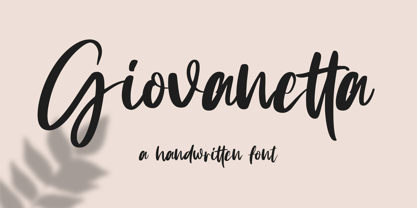 Giovanetta is a natural handwritten font. This font is perfect for logos, invitations, stationery, wedding designs, social media posts, advertisements, product packaging, product designs, label, photography, watermark, special events, and more. Giovanetta Script comes with a full set of uppercase and lowercase letters, multilingual symbols, numerals, punctuation.
 - Light Bearer by Letterara,
$12.00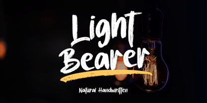 Light Bearer is a cool handwritten font. It's ideal for branding and decorate your projects. The Light Bearer font has a classy and modern look that can be used for logos, branding, posters, advertisements, stationery, movies, social media posts, youtube channels, and much more! This is a PUA code which means you can access all the glyphs and sweeps easily!
 - Sambelethok by RGB Studio,
$19.00 Sambelethok an excellent font for modern hand-lettered logo designs. Sambelethok is a font intended for logotype creation. But with almost 500 glyphs inside the font, you can also create many of other typography designs. Stylistic Alternates, Swashes, Contectual Alternate and Ligatures is a list of features from OpenType which you can use to pairing the letters each other powerfully. This font is great for your next creative project such as Logotype, printed quotes, invitations, cards, product packaging, headers, Letterhead, Poster, Apparel Design, Label, and etc. Files Include : Basic Latin A-Z and a-z Numbers Symbols PUA Encode Multilanguage Support Thanks and have a wonderful day, If you have any questions, please get in touch with us Don't forget to check out our other products.
 - FS Millbank by Fontsmith,
$80.00 A sign of something better When designer Stuart de Rozario surveyed the fonts used in signage on London’s public transport systems, he reached a dead end. They seemed staid, sterile, lacking in personality, and ill-suited to use by modern brands. He was pointed in another direction entirely. ‘The driving force behind my thoughts was to design something more current and fresh without compromising legibility and clarity. A font with both personality and function, that’s versatile and large and small sizes, and effortless to read, but which also says something new.’ Speed reading Late for a meeting and can’t find your way? Trying to catch a flight? Lost in a hospital? Reading signs is a different business to reading a book or a newspaper. Text on signs needs to be deciphered quickly and effortlessly. So the legibility criteria for signage letterforms are different to those for normal reading, too. Throughout FS Millbank’s uppercase and lowercase alphabets, characters have been given features for extra definition, including: wide ink traps on the A, K, M, V, W, X and Y; a serifed i, accentuated spurs on the a, d, l u; and different x-height shapes on the b, g, p and q. Distinctive forms and generous, open internal shapes all help the quick reading of sign text, and wide, open terminals and counters allow similar letter shapes to be distinguished easily when viewed at different angles. Running down a corridor, maybe... Positive/negative Standard type tends to glow on the kind of dark backgrounds often used for signage, and look heavier than its true weight. To correct the imbalance caused by this optical trick, special weights of the typeface have to be drawn for these ‘negative’, light-on-dark applications. These are lighter than their comparable positive weights to overcome the ‘glow’ effect. After extensive tests of the negative weights, at all sizes, we achieved the right optical balance. Glowing, glowing, gone. Icons This wouldn’t be a signage typeface without its own set of icons, or symbols, to help people find what they’re looking for. So, to sit alongside the positive and negative fonts, we’ve created a comprehensive set of 172 icons, covering a wide range of applications from transport and user interface to information and directional. Designed within the typeface capital height, they sit on the baseline and are spaced centrally.
 - Stout Boots by Putracetol,
$24.00 Stout Boots is a bold style serif font with strong character and soft features. Stout Boots is equipped with Swash, Stylistic and Titling alternates as well as with Standard and Discretionary Ligatures And this font Stout Boots is a stylish font that is both retro and bold font. It's thick curves give a groovy vibe with the serifs bringing it slightly back to traditional. Comes with alternatives and ligatures, helps to create stunning logos, quotes, posts, blog posts. branding projects, magazine imagery, wedding invitations, and much more. The alternative characters were divided into several Open Type features such as Swash, Stylistic Sets, Stylistic Alternates, Contextual Alternates, and Ligature. The Open Type features can be accessed by using Open Type savvy programs such as Adobe Illustrator, Adobe InDesign, Adobe Photoshop Corel Draw X version, And Microsoft Word. This font is also support multi language.
 - Baldufa Paneuropean by Letterjuice,
$139.00 Baldufa is a charming typeface with strong personality, which looks very comfortable in text. There is a search to obtain complicated curves and detailed features, which gives the typeface a touch of beauty and elegance. However, this is also a self-conscious design that claims through the rounded serifs and irregular vertical stems appreciation for quirkiness and human imperfection. The letterforms are inspired by the slight distortions and idiosyncrasies that came with old printing methods. It has distinct, features such as rounded serifs, irregular vertical streams, ink traps and extremely thin junctions. In the Italic, serifs have been removed to enhance movement and expressivity. These experiments in form have not come at the cost of legibility: The typeface remains suitable for both small and display text. Baldufa Paneuropean covers Eastern and Western Latin, Greek and Cyrillic Extended.
 - Kunta by ArimaType,
$18.00 Kunta is a modern vintage serif font packaged in a modern and unique style, complete with access to your OpenType feature to access a large selection of alternative fonts and binders, choose the font you like from a variety of uppercase and lowercase letters to get a luxurious and elegant look. A quirky, fun, and versatile serif series with lots of ligatures and alternatives to spice up any design you fancy. This font is perfect for branding projects, Logo designs, Clothing Branding, packaging, magazine titles, advertisements, T-shirts, postcards and many more.
 - Dettreon Smith by Letterena Studios,
$10.00 Looking for the perfect font to use on invitations or branding? Hoping to travel your audience to a world of gorgeous, elegant, versatile, yet modern? Then, you go to the right path. Introducing Dettreon Smith - A Signature Font Dettreon Smith is a modern and elegant handcrafted signature font to embrace your audiences or guests. Every stroke and curve was created to capture the essence of elegance and style. Perfect for social media posts and ads, printed quotes, t-shirt designs, packaging, or even as a modern text overlay to any background image. Dettreon Smith includes Multilingual Options to make your branding globally acceptable. Features: Ligatures Swash Multilingual Support PUA Encoded Numerals and Punctuation
 - Andron 2 by SIAS,
$44.90 The sister fonts Andron 2 English and Andron 2 Deutsch provide a groundbreaking new possibility to render literature text bodies in a sophisticated traditional and yet modern way of type. In German typographic history there has once been a long-lasting struggle called the Frakturstreit (the blackletter quarrel). It was about wether German text ought to be composed in blackletter or rather in Roman type, a question upon which even Goethe, Schiller and other period celebrities got grey over time. However, blackletter type remained alive and has just recently seen an astonishing renaissance. This is not about a blackletter revisionism or some ‘mixture’ concept arguably bridging the gap between either worlds. Andron 2 English and Andron 2 Deutsch offer a new approach to circumvent that old antagonism. As for the lowercase letters I applied certain features of blackletter type onto the glyphs – but entirely abandoned the principle of the broken stroke as such. The result is a lowercase alphabet in the classical Andron style which may be considered an attractive alternative for text in English, German or even other languages. So it’s no longer entirely about choosing between ‘modern’ Roman or ‘ancient’ blackletter only. Andron 2 English Regular and Andron 2 Deutsch Regular feature the same lowercase glyphs but differ in the majuscules (Andron 2 English has normal Latin capitals). ++++ 2012 + NEW! +++ In response to its growing popularity we now present five new fonts as part of the Andron 2 series. Andron 2 English is completed by an Italic and a Bold font. Andron 2 Deutsch now contains three interesting alternative fonts: Italic, Scriptive and Laendlich. Last but not least – A new set of wonderful classical typographic ornaments is part of the Italic and Scriptive fonts. – You can also purchase these ornaments separately as “Andron Ornamente”.
 - MB SIXTYTHREE by Ben Burford Fonts,
$20.00 A heavy black display face with lots of retro 'cool'. Modernist to the extreme MB SIXTYTHREE oozes 'mod' culture. Great for magazines & headlines, logotypes, posters, album artwork.
 - Virnature by Alit Design,
$19.00 Presenting 🍃The Virnature Nature Script Font🍃 by alitdesign. Welcome to the Virnature font page, Thank you for visiting and finding this font. The Virnature font is inspired by elegant script fonts combined with the concept of nature. It can be seen by the beautiful and fitting leaf ornaments that make the Virnature font besides elegance also unique with the concept of nature. The Virnature font includes full set of Uppercase and Lowercase Basic Characters, Numerals, Punctuation and Multi lingual support. Also it contains ligatures and a lot of stylistic alternatives to perfectly re-create natural calligraphy and nature concept designs (check the previews in order to see them all). The Virnature font has alternatives that you can combine between swashes and symbols that have the theme of elegant nature. Besides that this font is very easy to use both in design and non-design programs because everything changes and glyphs are supported by Unicode (PUA). The Virnature Nature Script Font has a total of 768 glyphs including symbol, multilingual. Language Support : Latin, Basic, Western European, Central European, South European,Vietnamese. In order to use the beautiful swashes, you need a program that supports OpenType features such as Adobe Illustrator CS, Adobe Photoshop CC, Adobe Indesign and Corel Draw. but if your software doesn't have Glyphs panel, you can install additional swashes font files.
 - Mollani by Alit Design,
$17.00 Presenting 🍃The Mollani Nature Script Font🍃 by alitdesign. Welcome to the Mollani font page, Thank you for visiting and finding this font. The Mollani font is inspired by elegant script fonts combined with the concept of nature. It can be seen by the beautiful and fitting leaf ornaments that make the Mollani font besides elegance also unique with the concept of nature. The Mollani font includes full set of Uppercase and Lowercase Basic Characters, Numerals, Punctuation and Multi lingual support. Also it contains ligatures and a lot of stylistic alternatives to perfectly re-create natural calligraphy and nature concept designs (check the previews in order to see them all). The Mollani font has alternatives that you can combine between swashes and symbols that have the theme of elegant nature. Besides that this font is very easy to use both in design and non-design programs because everything changes and glyphs are supported by Unicode (PUA). The Mollani Nature Script Font has a total of 818 glyphs including symbol, multilingual. Language Support : Latin, Basic, Western European, Central European, South European,Vietnamese. In order to use the beautiful swashes, you need a program that supports OpenType features such as Adobe Illustrator CS, Adobe Photoshop CC, Adobe Indesign and Corel Draw. but if your software doesn't have Glyphs panel, you can install additional swashes font files.
 - Balbek by Valentino Vergan,
$16.00 Introducing “Balbek” – A modern “condensed” sans serif ligature typeface. Designed by graphic designer Martin Katibi. The balbek font is an eye catching heavy and condensed sans serif type face. The inspiration for this font were other condensed sans serif such as Gabo Drive and Impact. The Balbek font is great for use on headlines, advertisements, product packaging, newspapers and posters. Balbek fully supports multilingual characters, it also come with a full set of alternative uppercase letters, ligature and small cap. All these features will make your next project standout. The font comes in eight styles, which are Regular, Cut, Outline and Soft. Each of these font styles comes with an oblique version. If you are looking for something modern and eye catching for you next project, Balbek is the font for you. WHAT YOU GET: Balbek Regular.otf Balbek Oblique.otf Balbek Cut.otf Balbek Cut Oblique.otf Balbek Outline.otf Balbek Outline Oblique.otf Balbek Soft.otf Balbek Soft Oblique.otf BALBEK INCLUDES A FULL SET OF: Uppercase and lowercase letters. Numbers. Punctuation. Ligatures. Alternates. Small Caps. Multilingual symbols. Here is a short list of some of the unique ligatures: AB AD Æ AF AH AK AL AM AN AP EH EK EM ET FT HE LH LK LM MB MD ME MM MP NE NN Œ TE TH TT TU THE Th ZH ZK ZM æ ? fj ? ? ft ? œ tt ty We hope you enjoy using the Balbek Font.