10,000 search results
(0.067 seconds)
- Compania by Letterhend,
$19.00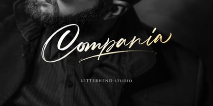 Compania is a luxury signature script. The natural hand writing feel make this font stand out. This font is perfect for logos, magazines, books, greeting / wedding cards, packaging, fashion, make up, stationery, novels, labels or any type of advertising purpose. Features : uppercase & lowercase numbers and punctuation multilingual support ligatures alternates PUA encoded We highly recommend using a program that supports OpenType features and Glyphs panels like many of Adobe apps and Corel Draw, so you can see and access all Glyph variations. Email us to letterhend@gmail.com if you need something! Happy Designing!
 - Super Ultra Supra by Putracetol,
$24.00 Super Ultra Supra - Futuristic Font is a bold, rigid, and thick typeface that exudes a distinct sci-fi or futuristic vibe. Its ultra-modern appearance carries a powerful impact, making a bold statement in design. With three versatile font versions at your disposal, you can easily adapt this font to suit your specific design or thematic needs. Additionally, the inclusion of ligatures adds an extra layer of uniqueness and versatility to this font. Ideal for logos, branding, posters, titles, magazine layouts, sports-related designs, and any projects that demand a strong and modern font.
 - Enjoika by Fontiko,
$10.99 Enjoika serif font family Enjoika is an elegant and neat font inspired by the Petrykivka painting (traditional Ukrainian decorative painting style) distinctive features of this folk art style are its flower patterns and Art Nuevo style by Alphonse Mucha with the floral and nature thematic and the swirls. This font looks luxury, stylish, elegant and clean and . This font is great for logo branding & invitations, photography, quotes, wedding design, business cards, posters, watermark, holiday cards, special events and much more.
 - Cherry Rush by D&K Project,
$15.00 Cherry Rush - It's fun, it's cute, it's smooth, and it's mighty splash. A mixed-case font (Uppercase and lowercase) with lots of combination possibilities, make greats fun display! It's good to make a logotype, sticker, fun kids sign, and other lettering project. This fun is perfect combination uppercase and lowercase. This font contains all uppercase, lowercase, numbers and basic punctuation also a fun 40 ligatures. (If you're having trouble finding the basic punctuation, you can access it in the Glyphs panel) Please let me know in the comments what you think or if you have any issues or queries , If you have any questions about licensing, need help with a typeface, or would like to request a new feature, drop me a message.
 - Cub Reporter JNL by Jeff Levine,
$29.00 In the 1934 edition of the American Type Foundry’s “Book of American Type” is a selection of letterpress fonts which emulate typewriter faces. One design named “Bulletin Typewriter” served at the model for Cub Reporter JNL, and is available in both regular and oblique versions. The font has been monospaced in order to add a more traditional typewriter look to any project.
 - Libran by Bean & Morris,
$35.00 The Libran font family consists of Libran Regular, Libran Italic, Libran Antique and Libran Small Caps. The broad open counters make for easy reading with a touch of classic roman clarity. The diminutive serifs add a suggestion of the hand crafted origins without obstructing Its clean, contemporary lines. Libran’s generous x-height and short ascenders have been carefully proportioned to maximise reproduction qualities.
 - Eurydome by Emboss,
$30.00 Eurydome is one of Jupiter's many moons, and was named after Eurydome, the mother of the Graces in Greek mythology. Eurydome was inspired by the Grotesque face Venus, with an additional flair added to the lowercase a, b, d and g. Eurydome was designed to complement any display face that may be used in your project. Add grace to your layout, with Eurydome.
 - Wolfhagen Blackletter by Mofr24,
$13.00 Introducing Wolfhagen Blackletter, an extraordinary font that embodies the perfect blend of medieval-modern elegance. With its strikingly bold and stylish appearance, this typeface effortlessly merges timeless aesthetics with contemporary flair. What sets Wolfhagen Blackletter apart is its ability to seamlessly transcend borders, thanks to its extensive multilingual support, empowering your creative endeavors on a global scale. This font is a true embodiment of sophistication, making it ideal for headlines, art crafts, logotypes, and beyond. Its unique charm and exquisite design concept bring an unparalleled allure to any project it graces. The intricate details and intricate strokes of Wolfhagen Blackletter capture the essence of medieval craftsmanship while infusing it with a modern twist, resulting in a truly captivating and versatile typeface. We created Wolfhagen Blackletter with a vision to offer designers a font that would stand out from the crowd and leave a lasting impression. The marriage of medieval inspiration with contemporary design was a deliberate choice, as we sought to evoke a sense of timeless elegance while meeting the demands of the modern creative landscape. Unleash the power of Wolfhagen Blackletter, and witness the transformation of your projects into works of art. This font embodies the harmonious convergence of past and present, enabling you to communicate your ideas with a touch of history and a dash of contemporary sophistication. Discover the uniqueness of Wolfhagen Blackletter and embark on a creative journey that is both captivating and unforgettable.
 - Univers by Linotype,
$42.99 The font family Univers? is one of the greatest typographic achievements of the second half of the 20th century. The family has the advantage of having a variety of weights and styles, which, even when combined, give an impression of steadiness and homogeneity. The clear, objective forms of Univers make this a legible font suitable for almost any typographic need. In 1954 the French type foundry Deberny & Peignot wanted to add a linear sans serif type in several weights to the range of the Lumitype fonts. Adrian Frutiger, the foundry's art director, suggested refraining from adapting an existing alphabet. He wanted to instead make a new font that would, above all, be suitable for the typesetting of longer texts - quite an exciting challenge for a sans-serif font at that time. Starting with his old sketches from his student days at the School for the Applied Arts in Zurich, he created the Univers type family. In 1957, the family was released by Deberny & Piegnot, and afterwards, it was produced by Linotype. The Deberny & Peignot type library was acquired in 1972 by Haas, and the Haas'sche Schriftgiesserei (Haas Type Foundry) was folded into the D. Stempel AG/Linotype collection in 1985/1989. Adrian Frutiger continues to do design work with Linotype right up to the present day. In 1997, Frutiger and the design staff at Linotype completed a large joint project of completely re-designing and updating the Univers family. The result: Univers Next - available with 59 weights and 4 Linotype Univers Typewriter weights. With its sturdy, clean forms Univers can facilitate an expression of cool elegance and rational competence. Univers has the uncanny ability to combine well with fonts of many different styles and origins: Old style fonts such as: Janson Text, Meridien, Sabon, Wilke. Modern-stressed fonts such as: Linotype Centennial, Walbaum. Slab serif fonts such as Egyptienne F, Serifa. Script and brush fonts such as: Brush Script, Mistral, Ruling Script. Blackletter fonts such as: Duc De Berry, Grace, San Marco. Even fun fonts such as F2F OCRAlexczyk, Linotype Red Babe, Linotype Seven."
 - Margate JNL by Jeff Levine,
$29.00 A set of water-applied decals manufactured in 1962 by the American Decalcomania Company for Goodyear serves as the basis for Margate JNL. This block-style letter (with a hint of the Art Deco era) is bold, uniform in weight and commands attention in any titling application.
 - Reveler JNL by Jeff Levine,
$29.00 The sheet music for "Good Night Angel" from the 1937 motion picture "Radio City Revels", had the movie's title hand lettered in a free form Art Deco sans serif design. This has been recreated digitally as Reveler JNL, which is available in both regular and oblique versions.
 - Chewy Camel by Bogstav,
$16.00 Originally I wanted to call this font Chewy Caramel, because I love caramel. But that name was already taken, so I deleted two letters in the name and ended up with Chewy Camel instead. I know that the designer of Chewy Caramel don’t mind - because that is my good friend, David, who made that one! :) Chewy Camel was made with a slightly blurry and inky pen, and is suitable for most things that need a true organic hand lettered font. I have added 6 slightly different versions of each letter, and there is multilingual support as well
 - River Stone by Yumna Type,
$16.00 It may be difficult to find a font with characters and legibility rates when creating impactful visual designs. Amid the abundance of ordinary font options, the branding and marketing processes can remain stagnant because the absence of unique fonts will increase the risk of your visual designs getting blended with other people’s designs and be left forgotten. For that reason, we would be glad to introduce you to River Stone, a font to give you assistance to create prominent visual designs quickly and easily. River Stone is an uppercased display font in textured letter shapes with which it shows firm, eye-catchy impressions. The font’s textures can add dimensions to the letters’ displays and live up the design nuances. With the use of uppercases, this font is capable of protruding the desired messages and make the design displays more attractive. Its unique shapes will affect the legibility rate of the font, therefore, you need to use this font for big text sizes for a better legibility reason. In addition, this font provides you a clipart as a bonus and you can make use of the available features here as well. Features: Multilingual Supports PUA Encoded Numerals and Punctuations River Stone fits best for various design projects, such as brandings, posters, banners, headings, magazine covers, quotes, printed products, merchandise, social media, etc. Find out more ways to use this font by taking a look at the font preview. Thanks for purchasing our fonts. Hopefully, you have a great time using our font. Feel free to contact us anytime for further information or when you have trouble with the font. Thanks a lot and happy designing.
 - Rebuffed - Personal use only

- Bodihel by Sealoung,
$15.00 Bodihel is a cute and chunky charactered display font. Add this colorful and bold display font to each of your creative ideas and notice how it makes them come alive! Get inspired by its authentic feel and use it to create gorgeous wedding invitations, beautiful stationary art, eye-catching social media posts, and cute greeting cards. I highly recommend using a program that supports OpenType features and Glyphs panels such as Adobe Illustrator, Adobe Photoshop CC, Adobe InDesign, or CorelDraw, so you can see and access all Glyph variations. FEATURE: ALL CAPS We hope you enjoy the font, please feel free to comment if you have any thoughts or feedback. Or simply send me a PM or email me. Thank you!
 - Miss Demeanor by Typadelic,
$19.95 Miss Demeanor has a tendency to create her own rules due to her free-spirited nature. She conforms to every day typographic expectations but she wouldn’t like you to think so. She has unusual yet casual and eye catching shapes and makes the best of any situation. I hope you enjoy her pretty style! My inspiration for Miss Demeanor came from a specimen sheet of an american type style from the early 1930’s.
 - Vendetta by Emigre,
$69.00 The famous roman type cut in Venice by Nicolas Jenson, and used in 1470 for his printing of the tract, De Evangelica Praeparatione, Eusebius, has usually been declared the seminal and definitive representative of a class of types known as Venetian Old Style. The Jenson type is thought to have been the primary model for types that immediately followed. Subsequent 15th-century Venetian Old Style types, cut by other punchcutters in Venice and elsewhere in Italy, are also worthy of study, but have been largely neglected by 20th-century type designers. There were many versions of Venetian Old Style types produced in the final quarter of the quattrocento. The exact number is unknown, but numerous printed examples survive, though the actual types, matrices, and punches are long gone. All these types are not, however, conspicuously Jensonian in character. Each shows a liberal amount of individuality, inconsistency, and eccentricity. My fascination with these historical types began in the 1970s and eventually led to the production of my first text typeface, Iowan Old Style (Bitstream, 1991). Sometime in the early 1990s, I started doodling letters for another Venetian typeface. The letters were pieced together from sections of circles and squares. The n, a standard lowercase control character in a text typeface, came first. Its most unusual feature was its head serif, a bisected quadrant of a circle. My aim was to see if its sharp beak would work with blunt, rectangular, foot serifs. Next, I wanted to see if I could construct a set of capital letters by following a similar design system. Rectangular serifs, or what we today call "slab serifs," were common in early roman printing types, particularly text types cut in Italy before 1500. Slab serifs are evident on both lowercase and uppercase characters in roman types of the Incunabula period, but they are seen mainly at the feet of the lowercase letters. The head serifs on lowercase letters of early roman types were usually angled. They were not arched, like mine. Oddly, there seems to be no actual historical precedent for my approach. Another characteristic of my arched serif is that the side opposite the arch is flat, not concave. Arched, concave serifs were used extensively in early italic types, a genre which first appeared more than a quarter century after roman types. Their forms followed humanistic cursive writing, common in Italy since before movable type was used there. Initially, italic characters were all lowercase, set with upright capitals (a practice I much admire and would like to see revived). Sloped italic capitals were not introduced until the middle of the sixteenth century, and they have very little to do with the evolution of humanist scripts. In contrast to the cursive writing on which italic types were based, formal book hands used by humanist scholars to transcribe classical texts served as a source of inspiration for the lowercase letters of the first roman types cut in Italy. While book hands were not as informal as cursive scripts, they still had features which could be said to be more calligraphic than geometric in detail. Over time, though, the copied vestiges of calligraphy virtually disappeared from roman fonts, and type became more rational. This profound change in the way type developed was also due in part to popular interest in the classical inscriptions of Roman antiquity. Imperial Roman letters, or majuscules, became models for the capital letters in nearly all early roman printing types. So it was, that the first letters in my typeface arose from pondering how shapes of lowercase letters and capital letters relate to one another in terms of classical ideals and geometric proportions, two pinnacles in a range of artistic notions which emerged during the Italian Renaissance. Indeed, such ideas are interesting to explore, but in the field of type design they often lead to dead ends. It is generally acknowledged, for instance, that pure geometry, as a strict approach to type design, has limitations. No roman alphabet, based solely on the circle and square, has ever been ideal for continuous reading. This much, I knew from the start. In the course of developing my typeface for text, innumerable compromises were made. Even though the finished letterforms retain a measure of geometric structure, they were modified again and again to improve their performance en masse. Each modification caused further deviation from my original scheme, and gave every font a slightly different direction. In the lower case letters especially, I made countless variations, and diverged significantly from my original plan. For example, not all the arcs remained radial, and they were designed to vary from font to font. Such variety added to the individuality of each style. The counters of many letters are described by intersecting arcs or angled facets, and the bowls are not round. In the capitals, angular bracketing was used practically everywhere stems and serifs meet, accentuating the terseness of the characters. As a result of all my tinkering, the entire family took on a kind of rich, familiar, coarseness - akin to roman types of the late 1400s. In his book, Printing Types D. B. Updike wrote: "Almost all Italian roman fonts in the last half of the fifteenth century had an air of "security" and generous ease extremely agreeable to the eye. Indeed, there is nothing better than fine Italian roman type in the whole history of typography." It does seem a shame that only in the 20th century have revivals of these beautiful types found acceptance in the English language. For four centuries (circa 1500 - circa 1900) Venetian Old Style faces were definitely not in favor in any living language. Recently, though, reinterpretations of early Italian printing types have been returning with a vengeance. The name Vendetta, which as an Italian sound I like, struck me as being a word that could be taken to signifiy a comeback of types designed in the Venetian style. In closing, I should add that a large measure of Vendetta's overall character comes from a synthesis of ideas, old and new. Hallmarks of roman type design from the Incunabula period are blended with contemporary concerns for the optimal display of letterforms on computer screens. Vendetta is thus not a historical revival. It is instead an indirect but personal digital homage to the roman types of punchcutters whose work was influenced by the example Jenson set in 1470. John Downer.
 - Kobely by Partnrz,
$15.00 Kobely is a reproduction of a local broadcaster's real handwriting. My daughter thought her boss's handwriting was so neat and uniform, it would make a great font and asked if I would be willing to create it. I agreed. She had him write out all the basic characters, which he gladly did with both a standard ink pen and a Sharpie¨ marker. I then turned it into a three weight family, perfect for use on post-it notes, shopping and to-do lists - anywhere you need the natural feel of real handwriting. I created it in various weights to spare you from adding a stroke to make it bolder. Adding a stroke can often compromise the small details of a font. Kobely is designed to be readable in even the boldest weight!
 - Uranus by Supremat,
$12.00 Uranus is a futuristic font inspired by space and extraterrestrial civilizations. The proportions of the letters are wide, the elements of the letters have organic curves, reminiscent of the design of streamlined spaceships. What gives the font a special character is the excessive contrast between the upper element and the crossbar in letters such as A, B, E, F, K, P, R. In these letters, there is a barely noticeable intra-letter gap in the form of a line. Due to this contrast and rounded elements in these letters, a negative space of a triangular shape also turned out. Particular attention should be paid to the broad language support for the font. The font has support for Latin, extended Cyrillic, and Korean (2780 base syllables). Total glyphs: 3562. Uranus is well-suited for large typography, logos, and any other design related to futurism and space.
 - Augmento by R9 Type+Design,
$35.00 Augmento™ is a large contemporary font family from R9 Type+Design. We designed this typeface right smack on the sweet spot between formal and casual. The rounded rectangular structure gives Augmento the corporate, trustworthy look while the quirky stems add the fun, playful feel. This unique, versatile type family is excellent for a variety of applications such as posters, packaging, editorials, and web design. The completed Augmento™ family consists of 3 widths, 6 weights, 36 styles, and over 550 glyphs each, and packs with OpenType features such as stylistic alternates, case-sensitive punctuations, and date vs fraction recognitions. It also comes with 3 sets of figures (Proportional lining, Proportional Oldstyle and Tabular lining), and supports most Latin-based languages. With all these features in your toolbox, you can make your design sing as loud (or soft) as you’d like. To find out more about Augmento™ Opentype features and type specimen, please visit www.r9typedesign.com
 - Winter Tales by Hart Foundry,
$12.00 Introducing Winter Tales Font Pack Winter Tales is a new handwritten font pack from us, this font is really new and fresh. With four different font characters, you can play your imagination in designing. This font is very easy to use and really playful. New Monday perfect for logos, printed quotes, invitations, cards, product packaging and another project design. What Inside The Pack -Winter Tales Script -Winter Tales Monoline -Winter Tales Sherif Winter Tales • This fonts have uppercase, lowercase, alternate And Support Multi language characters so you can play around with all of these fonts and create something funny and awesome. To use the alternate or the ligatures, you have to use the aplication who support Open Type features I really hope you enjoy using New Monday, please don't hesitate to drop me a message if you have any question :) -Hart
 - Lil Baby by Nantia.co,
$16.00 Lil’Baby Script Font is a romantic, modern calligraphy typeface, which supports Extended Latin and Greek characters. This font does not only contain a complete set of lower and uppercase letters, punctuation, numbers, but also a set of ligatures. Equally important is the fact that the font has diacritics for multilingual support. Of course, with this typeface, you have access to a complete Greek set of characters, with diacritics and Greek ligatures. Lil’Baby Script is a high-quality calligraphy font that can infuse any project with romantic vibes. Lil’ Baby Script is the perfect wedding font if you want to achieve a dreamy style on your wedding invitation. For a soft, elegant style, you can pair the font with a pastel color palette and creamy papers. Of course, this modern script font is perfect for your graphic design needs like social media quotes, blog headers, posters, stationery, and why not branding, packaging, and logotypes. In addition, this calligraphy font is ideal for the fashion and apparel industry, if you want to achieve a classic chic, yet modern style.
 - Thrasher Head by IKIIKOWRK,
$17.00 Proudly Present Thrasher Head - Raw Type, created by ikiiko Thrasher Head is distinctive handwriting and encapsulates the essence of street style. It gives every design project an urban vibe with its rugged and raw characteristics. This font is the perfect choice for people looking for a strong and influential typeface inspired by the rebellious spirit of street culture and graffiti. This font is designed to be versatile, making it suitable for a wide range of creative projects. Whether you're working on a skateboard deck design, streetwear stuff, or a poster for an underground event, this font will infuse your work with an urban attitude and a raw, handcrafted feel. The uppercase characters in Thrasher Head are bold and impactful, while the lowercase letters exhibit a slightly more refined style, providing a balanced mix of legibility and street-inspired aesthetics. This typeface is perfect for a poster event, movie title, streetwear stuff, magazine layout, fashion brand, quotes, or simply as a stylish text overlay to any background image. What's Included? Uppercase & Lowercase Numbers & Punctuation Bonus: Swashes & Ligature Multilingual Support Works on PC & Mac
 - Soothsayer by Comicraft,
$39.00 A soft spoken sorceress whispers sweet somethings in your shell-like ear. Her words excite and enthrall, tantalize and tease, they soothe and seduce, stimulate and sustain you, they awaken and arouse you, they entice and engorge you, they -- oh, I'm sorry, what was I supposed to be saying? Oh yeah, from the pages of DC Comics' Vertigo title, THE WITCHING HOUR, and Joe Kelly and Chris Bachalo's STEAMPUNK, Comicraft is happy to make available one of our most requested fonts... Hey, what happened to that cute girl with the white hair? And, Hey, Where's my wallet?!?
 - Fragtude by Letterhend,
$20.00 "Old is Gold".. Perhaps that's the best words to represent this typeface called Fragtude - a pair of vintage display typeface consist of bold script and serif. One of our finest typeface, crafted carefully to make sure its quality. Inspired by 40s 50s lettering and signage, the nostalgic feels will bring you back to the good ol' days. This typeface is perfectly made to be applied especially in logo, and the other various formal forms such as invitations, labels, logos, magazines, books, greeting / wedding cards, packaging, fashion, make up, stationery, novels, labels or any type of advertising purpose. Features : uppercase & lowercase numbers and punctuation multilingual swash and ligatures alternates PUA encoded We highly recommend using a program that supports OpenType features and Glyphs panels like many of Adobe apps and Corel Draw, so you can see and access all Glyph variations. How to access opentype feature : letterhend.com/tutorials/using-opentype-feature-in-any-software/ Email us to letterhend@gmail.com if you need something! Happy Designing!
 - Protest by Society of Fonts,
$29.00 Protest is inspired by protest posters and the power of the people! Each glyph is written by hand with a Sharpie® Magnum marker on big sheets of paper. It is designed to fit more into the poster and still be legible for the media from a block away. It's bold, slightly condensed, and neatly drawn with love and conviction, with the warm imperfection that comes from being hand drawn. Protest consists of over 1,430 glyphs. This includes 300 alphanumeric glyphs with 3 contextual alternates each, 20 stylistic alternate glyphs, and 20 protest themed dingbats. Contextual alternates will rotate through automatically when OpenType features are enabled, giving it more human irregularity. Protest supports 219 latin-based languages, using Underware’s Latin Plus glyph set.
 - HandMade by Misprinted Type,
$39.00 Handmade is based on my own handmade lettering, which is inspired by vernacular and ornamental type. It has the naive personality from street hand-painted signs from Brazil and that charm and elegance of vintage ornamental fonts. Each letter has its own style and the font comes with 2 uppercase variations, meaning you can mix them in order to write words without repeating the same character. The font has a handmade warmth feel to it, which is ideal for projects that demand the craftsmanship look or just that modern, grunge, fun type that goes well with tons of different styles. If that was not all, Handmade also comes with an EPS vector set with 16 vector and hand-drawn ornaments! Enjoy!
 - Fabiola by Lián Types,
$49.00 -Fabulous, beautiful, friendly, talkative, sweet, caring, a little on the odd side, very desirable by many, good at almost everything- That's the definition of Fabiola according to the slang dictionary of americans. If you were you looking for something delicious, a font that covers a really wide range of uses and always looks amazing, Fabiola should be your choice. Although it may look as another of my scripts with juicy swashes, this time I explored in depth the pairing and interaction with capital letters for more unique results. Why? We are going through some crazy days where the number of people interested in letters is only growing. We see lettering everywhere: I can say that finally our field is shouting out loud; letters are THE protagonist more than ever. Hence the need of combining and pairing different styles is booming. Fabiola Script and Fabiola Caps were done in a way that they seem to need each other. There's nothing better than the above images to prove this. But, how does it work? The big swashes of the Script style were designed so they can surround, wrap and mingle with the Caps styles. The smaller swashes are meant to be used when the Script is alone. Simple, right? I hope you find Fabiola useful on your projects and enjoy using it like I did when making the posters! Have a super fabulous day!
 - Getoik by Twinletter,
$18.00 Introducing Getoik, the Retro Condensed Font that will take your designs to the next level. With its clean and smooth edges, this font is perfect for any design project. Getoik features multiple ligatures and alternates, giving you even more design options to choose from. Whether you’re creating a logo, branding materials, or any other design project, Getoik will add a touch of elegance and sophistication to your work. Its condensed shape allows for maximum impact while taking up minimal space, making it perfect for headlines, titles, and subheadings. With its versatility and attention to detail, Getoik is a must-have for any designer looking to elevate their work to the next level. So why settle for less when you can have the best? Get Getoik and take your designs to new heights! What’s Included : - File font - All glyphs Iso Latin 1 - Alternate, Ligature - Simple installations - We highly recommend using a program that supports OpenType features and Glyphs panels like many Adobe apps and Corel Draw so that you can see and access all Glyph variations. - PUA Encoded Characters – Fully accessible without additional design software. - Fonts include Multilingual support
 - Malden Sans by Monotype,
$49.00 Malden Sans is a mischievous grotesque sans serif with charming details that gives designers a solid typographic voice. It was created by Michele Patanè with regular and condensed widths, as a utilitarian typeface family for print and digital environments. It was originally designed as part of a type system for cinema magazines, and embodies the devil-may care attitude of the silver screen. Designer Michele Patanè looked back to an earlier era of typography to create the typeface, embracing unusual details, rather than ironing them out. “There is a very naive way of using typography in the 30s and 40s, something not as clean as how it’s used in the late 50s and 60s when everything passed through a rationalisation of the typographic palette,” he explains. “In film magazines you can still see a bit of roughness, and I like that.” This is a design that’s desperate to be used in editorial environments, and has been created to stand up to lower quality paper. It would be equally at home on posters, packaging, and even in digital environments where designers are looking for something more expressive than another geometric sans serif. Malden Sans includes a Normal and Condensed range, with 7 weights in the normal and 6 in the Condensed, both including italics.
 - F2F Mekkaso Tomanik by Linotype,
$29.99The techno sound of the 1990s, a personal computer, font creation software, and some inspiration all came together to inspire the F2F (Face2Face) font series. Alessio Leonardi and his friends had the demand to create new unusual typefaces, which would be used in the leading German techno magazine of the day, Frontpage. Even typeset as small as 6-points, in nearly undecipherable layouts, it was a pleasure for the kids to read and try to decrypt the messages. F2F Mekkaso Tomanik is a font whose letters have had diamond holes punched into them. In fact, so many holes have been punched into the letters that one could ask whether this font is more letterforms, or more holes! - Fancy Pants by Comicraft,
$19.00 We call this font Fancy Pants and if you give it a glance, it WILL just dance, dance, dance! In tall high heels and pretty toes, this slick chick font is ready to pose for invitations, party plans or high society soirées and forays into the boom boom rooms and pubs and clubs where fancy meets schmancy, and your pants will make YOU get up and dance and your face want to grin. It's all win-win!
 - Sabbatical by Fontforecast,
$17.00 Sabbatical is a no nonsense brush font family with lots of character. The family contains 3 hand-lettered fonts, Regular, Bold and Basic. This dry textured script font is inspired by travel journals written by adventurous souls, hence the name. The design is perfect for any type-based creations, quotes, invites, packaging, branding and much more! Sabbatical Basic has his own unique form which complements Sabbatical Regular and Bold. It consists of a fun caps font with an even more playful variation. All Sabbatical fonts have alternate glyphs that can either be accessed by the swashes feature, stylistic sets, or glyphs panel, depending on the application you are using. There are lots of discretionary ligatures that offer more variation. With over 880 glyphs the design options are unlimited.
 - LFT Etica by TypeTogether,
$35.00 LFT Etica, the-moralist-typefamily-project, was born at the end of 2000, but its development is ongoing, overcoming many hurdles and diversions. The starting point for the designers at Leftloft were the common "cold" grotesk sans serifs, ubiquitous and often badly applied in their everyday visual environment. The challenge was to obtain the same force, versatility and color, but with a much warmer feel. The resulting design has soft strokes, open counters and terminals; aesthetically resting somewhere between a grotesque and humanist sans serif. It successfully combines masculine force with female delicacy. LFT Etica’s wide range of styles, together with a large character set and OpenType features, such as 4 sets of numerals, fractions, several stylistic alternates and a set of arrows and dingbats, allows for a vast variety of applications, be they editorial or corporate.
 - Rama Gothic Rounded by Dharma Type,
$19.99 Rama Gothic Rounded is an antiqued sans serif designed inspired by 1800s-style wood type. All glyphs had been designed carefully to be retro-looking of the old time and to fill all with nostalgia. This condensed font family with 42 styles will be the best solution for posters, titles and anywhere you need impact. To complete your work perfectly, Gothic Extras family is ready for free. They include borders, ornaments and frames designed using vintage catalog of Hamilton in 1800's as a model. Be sure to check out the slab serif style of this Rama series named Rama Slab.
 - Alisal by Monotype,
$29.99 Matthew Carter has been refining his design for Alisal for so long, he says, that when he was asked to complete the design for the Monotype Library, it was almost as if he were doing a historical revival of his own typeface. The illusion even extended to changes in his work process: although he now does all his preliminary and final drawing on screen, the first trial renderings of Alisal were done as pencil renderings. Alisal is best classified as an Italian old style design. Originally created between the late 15th and mid-16th centuries in northern Italy, the true Italian old styles were some of the first roman types. They tend to be the most calligraphic of serifed faces, with the axis of their curved strokes inclined to the left, as if drawn with a flat-tipped pen or brush. These designs offer sturdy, free-flowing and heavily bracketed serifs, short descenders, and a modest contrast in stroke weight. Alisal has nearly all the classic Italian old style character traits, plus a few quirks of its own. It is calligraphic in nature, with more of a pen-drawn quality than faces like Palatino or Goudy Old Style. It is more rough-hewn than either Goudy's Kennerley or Benton's Cloister, and is generally heavier in weight than most of the other Italian old style designs. One place where Alisal makes a clean break with traditional old style designs is in the serifs. While sturdy and clearly reflecting pen-drawn strokes, Alisal's serifs have no bracketing and appear to be straight strokes crossing the main vertical. Like Caslon or Trajanus, Alisal is a handsome design when viewed as a block of copy. Ascenders are tall and elegant, and serve as a counterpoint to the robust strength of the rest of the design. Alisal is available as a small family of roman and bold with a complementary italic for the basic roman weight, providing all that is needed for the majority of text typography. Alisal is not as well-known as some of Carter's other typefaces, but this lovely and long-incubated design was certainly worth the wait.
 - Sundash by Jehoo Creative,
$16.00 Sundash versatile typeface with wide allternate allcaps. This bold modern font explores the style of Allcaps, we add a wide character to make it look more flexible. based on forms inspired by free urban culture, Sundash has a modern and vibrant spirit. Sundash explores how the shapes and curves of letters change their Focus. This font has a variable weight of 5 Light, regular, medium, bold, extrabold to make the sundash more solid. Sundash has 247 glypghs with a unique and bold character perfectly suited for a wide variety of applications from editorial design to branding, advertising, publications and digital.
 - Bellefonte by Gunjan,
$42.00 Introducing Bellefonte Typeface: Where Elegance Meets Versatility Unleash the power of elegance and versatility with Bellefonte, a captivating typeface that breathes life into your creative endeavors. Whether you're a designer, artist, or entrepreneur, Bellefonte is the perfect companion to elevate your projects and leave a lasting impression. Discover the Beauty of Bellefonte: Timeless Elegance: Inspired by the beauty of classic typography, Bellefonte exudes a timeless charm that effortlessly elevates your designs. Its graceful curves and carefully crafted letterforms add a touch of sophistication to any project, from branding and packaging to editorial layouts and invitations. Endless Versatility: Bellefonte's adaptable design seamlessly transitions across various design contexts. From captivating headlines to legible body text, this typeface ensures your message is delivered with clarity and impact, making it a versatile choice for any creative endeavor. Crafted with Precision: Meticulously designed by skilled typographers, Bellefonte boasts an exceptional level of detail and craftsmanship. Each character is thoughtfully created to ensure a flawless and professional finish, allowing your designs to stand out from the crowd. Multilingual Support: Embrace a global audience with ease as Bellefonte offers comprehensive Latin language support. Break language barriers and connect with diverse communities worldwide, enhancing the reach and impact of your projects.
 - Nudista by Suitcase Type Foundry,
$39.00 Nudista is a monolinear, geometric sans-serif based on the proportions of the Purista typeface, released in 2007. The forms are not based strictly on square shape, but rather on a pleasant oval, round shape. The letter outlines are smooth, even technicist, the geometric precision is however compensated in places where it would get in the way of legibility and compromise the desired visual impact. Nudista was originally conceived as a display type, but it is sufficiently legible even in text sizes. Thus, it suits short texts in corporate prints. Carefully chiselled letter curves are sturdy and well suited for the harsh conditions of low-resolution printing devices, they work well on computer screens and mobile phone displays. However, Nudista works best in corporate systems, navigation and orientation systems, where it may be, also thanks to the sufficient range of weights, a good alternative to the well-known and thus a little overused DIN. Naked typeface with no needless decorations humbly serves in all places where too expressive types could be disturbing.
 - St Croce Pro by Storm Type Foundry,
$29.00 Our eye is able to join missing parts of worn letters back into undisturbed shapes. We tend to see things better than they really are. Thanks to this ability we ignore faults of those close to us as we can’t accept the fact that every once in a while we convene with an impaired entity. Typography is merely a man’s invention, hence imperfection and transience, albeit overlooked, are its key features. This typeface is based on worn-out letterings on tombstones in the St. Croce basilica in Florence. For hundreds of years, microscopic particles of marble are being taken away on the soles of visitors: the embossed figures become fossilised white clouds, fragments of inscriptions are nearing the limits of legibility. First missing are thin joins and serifs, then the main strokes finally slowly diminish into nothingness over time. Unlike an archaeologist, for whom even completely featureless stele is valuable, the typographer must capture the proper moment of wear, when the type is not too “new” but also not too much decimated. Such typeface is usable for catalogue jackets, invitations and posters. Calligraphy is a natural human trait. To write is to create characters of reasonable beauty and content, according to the nature of the writer. A natural characteristic of architecture is to create an aesthetic message very similar to the alphabet. A doric column, the gabled roof, the circle of the well plan: these are the basic shapes from which all text typeface is derived.
