10,000 search results
(0.061 seconds)
- Fieldstones by UICreative,
$23.00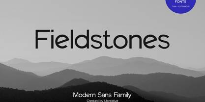 Introducing our new product the name Fieldstones Sans Serif Font Family comes with 9 different weights. Modern Sans Serif font that beautiful classy, elegant, and modern. This font is perfectly suited for a wide variety of projects, such as signature, stationery, logo, wedding, typography quotes, magazine or book covers, website headers, clothing, branding, packaging design, and more. Also for fashion-related branding or editorial design and displays both masculine and feminine qualities.
 - Monotype News Gothic Paneuropean by Monotype,
$92.99Similar in design to Franklin Gothic, News Gothic was one of a number of sans serif faces manufactured by American Type Founders in the early years of the twentieth century. Initially cut as a light sans, heavier versions were made in the 1940s and 50s along with some condensed weights. The News Gothic font family offers an uncomplicated design that is well suited for use in newspapers and magazines for headlines and in advertisements. - Rydero by Maulana Creative,
$14.00 Rydero is softest sans serif font ever character with a bit of ligatures and alternates. To give you an extra creative work. Rydero font support multilingual more than 100+ language. This font is good for logo design, Social media, Movie Titles, Books Titles, a short text even a long text letter and good for your secondary text font with sans or serif. Make a stunning work with Rydero font. Cheers, Maulana Creative
 - Quicklime by UICreative,
$23.00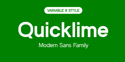 Introducing our new product the name Quicklime Modern Sans Serif Font Family comes with 9 different weights. Modern Sans Serif font that feels beautiful classy, elegant, and modern. This font is perfectly suited for a wide variety of projects, such as signature, stationery, logo, wedding, typography quotes, magazine or book covers, website headers, clothing, branding, packaging design, and more. Also for fashion-related branding or editorial design and displays both masculine and feminine qualities.
 - Korto by Talbot Type,
$19.50 Korto is a highly legible, geometric text and display font. Inspired by classic sans-serifs Futura and Avant Garde, this elegantly minimal typeface is available in a comprehensive family of seven weights. It includes old style non-aligning (lower case) numbers, both proportional and tabular, as well as accented characters for Central European languages. A highly versatile, contemporary sans-serif, Korto is suitable for more-or-less any text or display purpose.
 - Junior Clerk JNL by Jeff Levine,
$29.00 Junior Clerk JNL is the plain sans serif version of the lettering found on the cover of the sheet music for 1919's "The World is Waiting for the Sunrise". The song title was originally set in a decorative sans serif with an engraved line adorning each character. This version of the more fanciful design is available as the companion font Legal Eagle JNL. Junior Clerk JNL is available in both regular and oblique versions.
 - Black Crow by Fractal Font Factory,
$12.00 Black Crow is a display sans-serif type family includes eight weights. It is influenced by the geometric-style sans-serif faces that were popular during the 1920s and 30s. The styles are based on geometric forms that have been optically corrected for better legibility. Black Crow has a functional look with a hard touch. It is manually hinted and optimized for screens, so it will be a good choice for Websites, eBooks or Apps.
 - EXPATRIATE by UICreative,
$23.00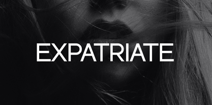 Introducing our new product the name Expatriate Sans Serif Font Family comes with 12 different weights. Modern Sans Serif font that beautiful classy, elegant, and modern. This font is perfectly suited for a wide variety of projects, such as signature, stationery, logo, wedding, typography quotes, magazine or book covers, website headers, clothing, branding, packaging design, and more. Also for fashion-related branding or editorial design and displays both masculine and feminine qualities.
 - MC Poseface by Maulana Creative,
$13.00 Poseface is an experimental display sans serif fat font. With heavy stroke and fun character. To give you an extra creative work. Poseface font support multilingual more than 100+ language. This font is good for logo design, Social media, Movie Titles, Books Titles, a short text even a long text letter and good for your secondary text font with sans or serif. Make a stunning work with Poseface font. Cheers, Maulana Creative
 - Sorbet by Adriprints,
$5.00 Sorbet was designed with freshness and youth in mind. Sorbet is a casual, sans-serif font perfect for scrapbooking, teaching, and everyday notes in mind. It is a modest type with lots of potential. What was the inspiration for designing the font? Sorbet was inspired by fresh, casual, handwriting. What are its main characteristics and features? It is legible, sans serif, includes standard encoding (umlauts, etc) Usage recommendations - teaching, everyday, invitations, novelty, scrapbooking
 - Avoidance Genevra by UICreative,
$23.00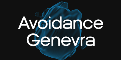 Introducing our new product the name is Avoidance Genevra Sans Serif Font Family comes with 9 different weights. Modern Sans Serif font that feels beautiful classy, elegant, and modern. This font is perfectly suited for a wide variety of projects, such as signature, stationery, logo, wedding, typography quotes, magazine or book cover, website header, clothing, branding, packaging design, and more. Also for fashion-related branding or editorial design and displays both masculine and feminine qualities.
 - Olimpos by Gatype,
$8.00 Olimpos is a Display sans font that is absolutely perfect for editorial headlines. Her large, bold and slender figure is perfect for posters, t-shirts, and magazine covers. Reserved for capital letters only, this calm and bold typeface is a content creator's best friend. font files Uppercase, Numbers, Punctuation & Symbols. Diacritic for Multilingual Support This Olimpos is a modern sans-serif font that includes 4 weights of the normal style and the Italic style.
 - Bobik by Lewis McGuffie Type,
$35.00 Bobik is a display type family with three faces – sans, serif and slab. The family was drawn initially on basic principles described in Jean Alessandrini’s Codex 80 and then further developed, including adding a lowercase and ligatures. With a clean sans, robust slab and dramatic serif, Bobik has a contemporary European feel and is ideal for headlines, editorial and short copy. Each face contains upper and lowercase plus West, Central and East European language support.
 - Mondapick by UICreative,
$23.00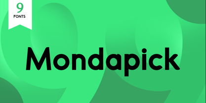 Introducing of our new product the name is Mondapick Sans Serif Font Family comes with 9 different weights. Modern Sans Serif font that feels beautiful classy, elegant, and modern .This font is perfect suited for a wide variety of projects, as to signature, stationery, logo, wedding, typography quotes, magazine or book cover, website header, clothing, branding, packaging design and more. Also for fashion related branding or editorial design and displays both masculine and feminine qualities.
 - Quintaras Signature Script by Maulana Creative,
$14.00 Quintaras is a complete script and sans font duo. With expressive signature mono-line stroke and condensed sans solid and outline stroke, fun character with some of ligatures. To give you an extra creative work. Quintaras font support multilingual more than 100+ language. This font is good for logo design, Social media, Movie Titles, Books Titles, a short text even a long text letter. Make a stunning work with Quintaras font. Cheers, MaulanaCreative
 - Chaline by Flawlessandco,
$9.00 Introducing "Chaline" - A Modern Elegant Sans Serif Font. Chaline is a refined and contemporary sans serif font that seamlessly blends sophistication with versatility. There's some connected letters and some alternates that suitable for any graphic designs. This font support for some multilingual. Also contains uppercase A-Z and lowercase a-z, alternate character, numbers 0-9, and some punctuation. If you need help, just write me! Thanks so much for checking out my shop!
 - Cogney by Maulana Creative,
$13.00 Cogney is an all caps modern sans serif font. With sharp bold stroke, fun character. To give you an extra creative work. Cogney font support multilingual more than 100+ language. This font is good for logo design, Social media, Movie Titles, Books Titles, a short text even a long text letter and good for your secondary text font with sans or serif. Make a stunning work with Cogney font. Cheers, Maulana Creative
 - Virsace Bigiora by Mchcrafter,
$18.00 Virsace Bigiora is a Modern Stylistic Sans Serif A new Sans serif that we created special for branding needs, with extra ligature in unique shape add value of your brand. It so nice to leverage designer or product owner that need solutions to make their design look more stylish and modern. And specially for Virsace Bigiora font, We prepared any ligatures, and any alternate characters to help you create unlimited variations for your creative needs.
 - Gussian by Flawlessandco,
$9.00 Introducing "Gussian" - A Modern Sans Serif Font. Gussian is a contemporary sans serif font that effortlessly combines modern aesthetics with clean simplicity. There's some connected letters and some alternates that suitable for any graphic designs. This font support for some multilingual. Also contains uppercase A-Z and lowercase a-z, alternate character, numbers 0-9, and some punctuation. If you need help, just write me! Thanks so much for checking out my shop!
 - Playful Runway by UICreative,
$23.00 Introducing our new product the name Playful Runway Sans Serif Font Family comes with 12 different weights. Modern Sans Serif font that beautiful classy, elegant, and modern. This font is perfectly suited for a wide variety of projects, such as signature, stationery, logo, wedding, typography quotes, magazine or book covers, website headers, clothing, branding, packaging design, and more. Also for fashion-related branding or editorial design and displays both masculine and feminine qualities.
 - Nautica Rounded by UICreative,
$23.00 Introducing our new product the name Nautica Rounded Geometric Sans Serif Family Font Family comes with 9 different weights. Modern Sans Serif font that beautiful classy, elegant, and modern. This font is perfectly suited for a wide variety of projects, such as signature, stationery, logo, wedding, typography quotes, magazine or book covers, website headers, clothing, branding, packaging design, and more. Also for fashion-related branding or editorial design and displays both masculine and feminine qualities.
 - Sunny Sumo by Mix Fonts,
$13.00 Meet the MIX SUNNY SUMO, the perfect blend of playful and bold that’s sure to make your designs stand out. This three-piece font family includes SUNNY SUMO, SUNNY SUMO LINE, and SUNNY SUMO XOs, each with their own unique style. SUNNY SUMO and SUNNY SUMO LINE are layering fonts, which means you can use them separately or stack them to create dynamic designs. And for those fun finishing touches, SUNNY SUMO XOs offers a variety of doodles including X marks, circles, erase marks, and cross-offs that can be used alongside any graphic work. Designed as a bold handwritten sans serif, SUNNY SUMO is ideal for display fonts and headlines that require attention. This versatile font can be used by designers for logos, book covers, greeting cards, posters, packaging, and so much more. As a multilingual font, SUNNY SUMO supports multiple languages, including all the characters, glyphs, and accent marks needed for specific languages. With SUNNY SUMO, you can strike the perfect balance between relatable and professional, making it a great choice for anyone seeking a playful, bold, and fun layering font. MIX SUNNY SUMO and MIX SUNNY SUMO LINE come with the following glyphs: ABCDEFGHIJKLMNOPQRSTUVWXYZ abcdefghijklmnopqrstuvwxyz 0123456789 !@#$%^&*()`~♥✿•· .,:;'”\|/?{}[]<>“”‘’-–—_÷×+−±≈=≠≥≤ …‚„©®™‹›«»°¹²³¡¿₱¢€£¥½¼¾¶§№† ÁÀÂÃÄȦÅĂĀĄÆĆĈČĊÇÐĐĎÉÈÊĚËĖĒĘḞǴĜǦĠḠĤȞḦḢIÍÌÎÏĪĮĴḰǨĹĽŁḾṀŃŇÑ ÓÒÔÕÖŌŐØŒṔṖŔŘṘŚŜŠŞȘŤṪŢȚÚÙÛŨÜŮŬŪŰŲẂẀŴẄẆÝŶŸŹẐŽŻƵ áàâãäȧåăāąæćĉčċçðđďéèêěëėēęḟǵĝǧġḡĥȟḧḣıíìîïīįĵḱǩĺľłḿṁńňñ óòôõöōőøœṕṗŕřṙśŝšşșťṫţțúùûũüůŭūűųẃẁŵẅẇýŷÿźẑžżƶ MIX SUNNY SUMO XOs comes with the following glyphs: ABCDEFGHIJKLMNOPQRSTUVWXYZ
 - Dominant Youth by Fikryal,
$25.00 Introducing Dominant Youth, a bold and impactful display serif font that exudes confidence and strength. With its commanding presence, Dominant Youth is designed to make a lasting impression on any creative project. The font’s robust and assertive letterforms showcase a unique blend of classic elegance and contemporary style. Its tall and slender structure adds a touch of sophistication, while the sharp serifs give it a distinctive edge. Dominant Youth is carefully crafted to capture attention and evoke a sense of boldness and youthfulness. Whether you’re working on branding, editorial design, headlines, posters, or any other project that demands attention, Dominant Youth is the perfect choice. Its versatile nature allows it to excel in both digital and print mediums, ensuring your message stands out in a captivating manner. The well-defined characters of Dominant Youth provide excellent legibility, even at smaller sizes. The font’s wide range of weights and styles offers flexibility, allowing you to experiment and find the perfect balance for your design needs. From light and elegant variations to bold and impactful options, Dominant Youth empowers you to create visually striking compositions that leave a lasting impression. Don’t settle for ordinary typography when you can make a statement with Dominant Youth. Embrace its commanding presence, embrace its youthful energy, and elevate your designs to a new level of distinction. Features: Dominant Youth Multilingual Support Thank you
 - Reality Goals by Fikryal,
$22.00 Reality Goals is a beautiful and stylish handwritten display font that exudes creativity and inspiration. This font is perfect for a variety of projects, including branding, marketing materials, social media graphics, quotes, invitations, and more. The font features unique and eye-catching letterforms that are carefully crafted to convey a sense of playfulness and sophistication. The characters are designed to appear as if they were hand-drawn, with irregular lines and strokes that add a personal touch to any design. With a bold and modern look, “Reality Goals” is sure to catch the attention of your audience and make a lasting impression. It is versatile and easy to use, and can be paired with a variety of other fonts to create a unique and cohesive look. Reality Goals Multilingual Support Thank you
 - Staying Passionate by Nathatype,
$29.00 Are you trying to make an elegant, modern, and stylish statement with your invitations, social media, website, or printed materials? Ready to enchant your audience and enhance your branding? Staying Passionate-A Script Font Staying Passionate is a gorgeous handcrafted script font that will whisk you away to a place of style! We are hoping that through this elegance and passion edged font, you can maximize your designs, reign in sales or make lasting impressions. The ideal font for social media banners; posts, and ads, printed quotes, t-shirt designs, packaging, or even as a modern text overlay to any background image. Staying Passionate includes Multilingual Options to make your branding globally acceptable. Features: Standard Ligatures Ligatures PUA Encoded Numerals and Punctuation Thank you for downloading premium fonts from Nathatype
 - DF Pigtail by Dutchfonts,
$33.00 DF Pigtail is the result of a curious marriage of the 'free'-form of writing with the fixed (mono) space for each character of the typewriter typeface. In the early sixties of the last century, typewriter typography became popular as a Fluxus vocabulary. The Fluxus art movement (in fact a Dada like follow up) which encouraged a do it yourself aesthetic, and valued simplicity over complexity and anti commercialism over the conventional market-driven approach. I was educated in the mid seventies when this form of typography was still very popular and was even applied in corporate design. This particular letter has been used by my teacher Jan Begeer to compose his design assignments. Recently I rediscovered this type and was struck by its pigtail similarity and drew it my way.
 - Augsburg Initials by Kaer,
$18.00 Hey! I'm happy to introduce to you my new initial's set. These drop caps I found in the "Introductorium in astronomiam" manuscript. It was printed in Augsburg in 1489 by Erhard Ratdolt. I've added some lost letters and assembled a full alphabet. Augsburg is a medieval gothic style font. Set of dim colored and monochrome grunge style emblems. Engraved initial drop caps. Perfect for vintage premium identity, Middle Ages posters, luxury packaging. If you want dark and strong medieval style concepts, please try it. --- *You can use color fonts in PS since CC 2017, AI since CC 2018, ID since CC 2019, macOS 10.14 Mojave* *Please note that the Canva & Corel doesn't support color fonts!* --- Please feel free to request any help you need: kaer.pro@gmail.com Best, Roman. Thank you!
 - M XiangHe Hei SC Pro Variable by Monotype,
$1,049.99The M XiangHe Hei Simplified Chinese typeface merges traditional brush strokes with modern letterforms to carefully balance traditional calligraphy with humanist design. Named for the smooth movements of a flying crane, the M XiangHe Hei typeface is designed to glide across the page, and features strokes that are partly derived from the Kaishu calligraphic style – an everyday script which dates back hundreds of years. Seol Sans features Neue Frutiger for its Latin glyphs, and works harmoniously with Neue Frutiger World and Monotype’s CJK typefaces Tazugane Info (Japanese) and Seol Sans (Korean). M XiangHe Hei is a great choice for global brands using sans serif Latin typefaces looking to maintain their visual identity, and communicate with a consistent tone of voice with Simplified Chinese. - Clean and Glam by Pixel Colours,
$22.00 Clean and Glam is a sweet handwritten font duo that has a sassy modern style to create the most beautiful design projects. ❤️ Includes a light monoline script font that is so chic and clean, and it combines perfectly with the uppercase sans to create amazing text combinations. Works great for Logos & branding, product packaging, product design, labelling, wedding design, social media posts, advertisement, editorial design, etc. Includes: Clean and Glam: A light modern script font. Includes numerals, uppercase and lowercase characters, punctuation and some cute hearts. Clean and Glam Sans: A modern uppercase sans font that is the perfect match of the script, great for descriptions, taglines, ingredients, etc. Includes numerals, uppercase and lowercase characters, punctuation and more cute hearts. Language support
 - Raj JY by JY&A,
$39.00JY Raj has had a lengthy gestation. The original one was a sans serif adaptation of a slab serif typeface design by Jure Stojan. Raj looked instantly better as a sans serif. After refining it further one lengthy night in 2001, he showed the drafts to Jack Yan, who completed the character sets and finished the kerning. A characterful sans serif, JY Raj pushes the boundaries of what is possible with various geometric shapes, combining legibility and tradition with sharp, unexpected angles. As with Stojan's earlier JY Koliba, it possesses a delightful balance, thanks to the designer's eye for detail and typographic harmony. The name has little to do with the Asian subcontinent: it translates to paradise in Stojan's mother tongue, Slovenian. - Possible by K-Type,
$20.00 POSSIBLE is both sans and serif, either is possible. The typeface is a sans-serif impersonating a spur serif, or it’s a glyphic with the look and feel of a sans. This clean, contemporary family is inspired by Percy J Smith’s ’Petit Serif’ from 1928, and similarly takes inspiration from Johnston’s Underground, though more recent influences provide geometric and humanist elements that, together with the tiny micro-serifs, improve clarity and legibility. Spur serifs such as Petit Serif, Copperplate and Liberty are often caps-only fonts, but Possible contains a lowercase, as well as a full Latin Extended-A character set. Possible is available in five weights – Thin, Light, Regular, Medium and Bold – each supplied with a corresponding, optically-corrected italic.
 - Clean Fragile by Nathatype,
$29.00 Have you been looking for a sans serif font? Do you dream of creating headings that stand out and inspire modern and artistic? Wait no more, we will give you the best choice. Clean Fragile-A Sans Serif Font Clean Fragile is a gorgeous sans serif font, designed with the modern vibe. This font is perfect for anything adventurous, and direct. Every stroke, and curve was created to entice happiness and elegance. A real head-turner for your presentation, designs, website illustrations, and much more. Clean Fragile includes Multilingual Support to make your branding reach a global audience. Inspire your audience, clients, or guests with this beautiful, statement font. Features: Ligatures Stylistic Sets Swashes PUA Encoded Numerals and Punctuation Thank you for downloading premium fonts from Nathatype
 - M XiangHe Hei SC Std Variable by Monotype,
$1,049.99The M XiangHe Hei Simplified Chinese typeface merges traditional brush strokes with modern letterforms to carefully balance traditional calligraphy with humanist design. Named for the smooth movements of a flying crane, the M XiangHe Hei typeface is designed to glide across the page, and features strokes that are partly derived from the Kaishu calligraphic style – an everyday script which dates back hundreds of years. Seol Sans features Neue Frutiger for its Latin glyphs, and works harmoniously with Neue Frutiger World and Monotype’s CJK typefaces Tazugane Info (Japanese) and Seol Sans (Korean). M XiangHe Hei is a great choice for global brands using sans serif Latin typefaces looking to maintain their visual identity, and communicate with a consistent tone of voice with Simplified Chinese. - Mangrove by Set Sail Studios,
$18.00 Bring your letters to life with the Mangrove Font Duo! A delightfully playful pairing of Sans and Script fonts. These perfectly balanced typefaces have been carefully designed to work not only as standalone fonts, but also to pair together effortlessly—delivering undeniably eye-catching typography bursting with character. Throw a script letter in the middle of the sans font, try the swooping sans ligatures or it’s uplifting small-caps, the possibilities are numerous. It’ll work in lowercase or uppercase, and with a choice of 3 weights per font, that’s six fonts in total for you to experiment with! Language Support • English, French, Italian, Spanish, Portuguese, German, Swedish, Norwegian, Danish, Dutch, Finnish, Indonesian, Malay, Hungarian, Polish, Croatian, Turkish, Romanian, Czech, Latvian, Lithuanian, Slovak, Slovenian.
 - M XiangHe Hei TC Variable by Monotype,
$1,049.99The M XiangHe Hei Traditional Chinese typeface merges traditional brush strokes with modern letterforms to carefully balance traditional calligraphy with humanist design. Named for the smooth movements of a flying crane, the M XiangHe Hei typeface is designed to glide across the page, and features strokes that are partly derived from the Kaishu calligraphic style – an everyday script which dates back hundreds of years. Seol Sans features Neue Frutiger for its Latin glyphs, and works harmoniously with Neue Frutiger World and Monotype’s CJK typefaces Tazugane Info (Japanese) and Seol Sans (Korean). M XiangHe Hei is a great choice for global brands using sans serif Latin typefaces looking to maintain their visual identity, and communicate with a consistent tone of voice with Traditional Chinese.¶ - Romelio by Arterfak Project,
$14.00 Beautify your design with Romelio Font Duo, a classic combination of minimalist sans serif and attractive handwritten. Inspired by modern fashion and traveling culture, Romelio offers an elegant font pair that ease you to maximize your design, also get clean and luxurious looks. Romelio Sans : The minimalist sans serif perfect for headline and shot body text. Equipped with lots of classy ligatures and alternates. The high contrast of letterform that suitable for minimalist design. Romelio Handwritten : A beautiful handwritten created by manual sketch, carefully traced, and keep the minimalist touch that allows you to use this one for the display. Complete with extra swashes to give you more various designs. That's it! What a wonderful experience creating these fonts. Hope you enjoy it. Ramz
 - The Ruby by Vintage Voyage Design Supply,
$15.00 The Ruby Duo - a retro inspired font duo with a wide range of sans and script styles. Rugged and simple sans with a cool pair of mono line script. The main thing is the possibility of various combinations of using - from Condensed to Extra Expanded and from Light to Black. You will definitely find the best way to use in your projects with more than 50 styles. The sans has underline small caps alternates to use it with conjunctions. The script also has some alternates to change the script mood. Also, you will find a five graphic fonts with 130 elements total! A lot of vintage badge shapes and more than 100 vector vintage mood icons to use it in your badges or logos. PDF graphic navigation
 - M XiangHe Hei SC Pro by Monotype,
$187.99The M XiangHe Hei Simplified Chinese typeface merges traditional brush strokes with modern letterforms to carefully balance traditional calligraphy with humanist design. Named for the smooth movements of a flying crane, the M XiangHe Hei typeface is designed to glide across the page, and features strokes that are partly derived from the Kaishu calligraphic style – an everyday script which dates back hundreds of years. Seol Sans features Neue Frutiger for its Latin glyphs, and works harmoniously with Neue Frutiger World and Monotype’s CJK typefaces Tazugane Info (Japanese) and Seol Sans (Korean). M XiangHe Hei is a great choice for global brands using sans serif Latin typefaces looking to maintain their visual identity, and communicate with a consistent tone of voice with Simplified Chinese. - Mastadoni by Eclectotype,
$40.00 Mastadoni is a bold headliner/masthead typeface, with high vertical contrast in a Didone style. That's the starting point at least. There's much more to this font than another modern clone. It is a specialized (only one weight) typeface that comes in five optical grades. Use G1 at very large sizes and G5 at smaller sizes. The grades can be combined so that the thins of type set at different point sizes appear the same thickness - a very useful feature for magazine layouts. Optical grades could also be used in circumstances where a logo needs to be size-specific; the text on your bistro sign can afford to be more delicate than that on your coffee cups. This is a typeface with a big x-height, small cap-height and stubby ascenders and descenders, which contribute to an overall appearance somewhat different from must Didones, and make for some interesting layout possibilities in tight spaces. Mastadoni features a number of useful OpenType features. All fonts include standard ligatures and automatic fractions. In the discretionary ligature feature, you'll find the esoteric "percent off" glyph. Just type '%ff' with dlig engaged and there it is! Case-sensitive forms are available in all the fonts. The contextual alternates feature performs a subtle trick that resolves an optical illusion whereby two ascenders next to each other appear to be different heights. The Roman and Italic styles have a different group of stylistic sets as follows: Roman: SS01 substitutes a less decorative 4; SS02 is a different eszett; SS03 substitues the # with an attractive numero glyph; and SS04 gives an alternate K. Italic: SS01 and SS03 are the same as in the Romans; SS02 gives you more bulbous variants of v, w, and y letters; SS04 is a single storey g; SS05 changes C, G and S to non-ball-terminal varieties; and SS06 changes the swash versions of E, L, N and Q (when the swash feature is engaged). Speaking of the swash feature, the italic fonts feature swash capitals from A to Z, and swash variations for lower case h k m n v w and z. Lastly, the discretionary ligature feature in the italic fonts has vi, wi, KA and RA ligatures. Mastadoni is a typeface that would find itself immediately at home in glossy magazines, while offering a different aesthetic palette from the more standard choices of Didones.
 - Desphalia Pro by Ingo,
$42.00 A classic “American” sans serif with a kink Desphalia belongs to the kind of sans serif fonts that were created in the 19th century. You could also name it “American Gothic”, a sans serif in the style of fonts like Franklin Gothic, News Gothic and similar. Above all, the high x-height characterizes this typeface style, as do the identical heights of uppercase and ascenders. However, I allowed myself a few peculiarities ;-) On the one hand, there is the gently sloping horizontal middle line on letters such as H, E, F, A and e. The M also got gently slanted sides. Some of the lower-case letters have an up- or down-stroke: a d m n p u. This "kink" on the shaft also serves to better distinguish the small l from the capital I — as can be seen clearly with the term »Illinois«. In keeping with the tradition of American typefaces, Desphalia does not have a true italic. Rather, the letters of the “Italic” have the same character forms as the normal upright variant, but in oblique — and so it is not called “Italic” but “Oblique”. Style Set 01: Another American peculiarity is the capital I with dashes above and below. It is included in the Desphalia as an alternate character form. An alternative small l with the “kink” in the ascender is also included — as is a y with the “kink” in the descender. Style Set 02: The corresponding “straight” forms a d l m n p u without the break are included as alternatives in a separate style set. Small caps are uppercase letters that are optically the same size as lowercase letters. They offer a very classy way of emphasis. Desphalia is available in the widths Condensed, Normal and Expanded, the weights include Thin, Light, Book, Bold, Black. Using the variable font, all intermediate levels can be freely selected. The figures are optionally available as tabular figures, proportional lining figures or old style figures.