10,000 search results
(0.044 seconds)
- Cosmic Dream Sans by Carpiola Studio,
$10.00 Cosmic Dream consists of two fonts designed to complement each other perfectly. Together or apart, these fonts are ideal for adding a chic and cheery touch to your crafts. This font is PUA encoded which means you can access all glyphs and swashes with ease!
 - Ink Flow by Gleb Guralnyk,
$13.00 Hi, presenting a graffiti style font - Ink Flow. It's a handcrafted all caps font with unique brush stroke shape. This font supports most of the European languages, please check out the screenshot with all available characters. Thank you and wish you a peaceful sky!
 - Pencilla by Good Java Studio,
$18.00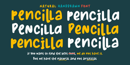 Pencilla - Natural Handwritten font is a natural & modern handwritten font. I'ts Perfect for logo, invitation, stationery, wedding designs, social media posts, advertisements, product packaging, product designs, label, photography, watermark, special events or anything. This font include : Pencilla OTF-TTF-WOFF, Ligatures, and also Multilingual support.
 - Street Eagle Graffiti by Sipanji21,
$14.00 Street Eagle is a unique display font with a graffiti-like appearance. Use this font for any crafting project, apparel design, logotype, advertising, wall decoration, and pretty much anything that requires a personalized look. Take your designs to the next level with this stunning font!
 - Qosydu by Twinletter,
$15.00 Create an elegant and exotic feel with our Arabic-style font, Qosydu. Bold fonts and extended spacing give your designs a middle eastern feel, make all your projects elegant with this font. Qosydu is the perfect choice for Arabic-themed packaging, advertising, or invitations.
 - Brimtown by Authentype,
$12.00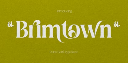 Brimtown - Retro serif font is a beauty font with a full set of uppercase and lowercase letters, multilingual symbols, numbers, punctuation, and ligatures. Brimtown Retro serif font style for poster, magazine, beauty brand design with swash glyph suitable for your beautiful elegant design concept.
 - Aviation Cocktail by Vozzy,
$5.00 Introducing a vintage look label font named "Aviation Cocktail". All available characters you can see at the screenshot. This font have 6 styles (including layered shadow effect style). This font will good viewed on any retro design like poster, t-shirt, label, logo etc.
 - Hiladous by ahweproject,
$10.00 Hiladous is a bold and retro-styled handwritten font. This font reads as strong, confident, and dynamic, and can add tons of nostalgic character to your designs. This font is PUA encoded, which means you can access all of the glyphs and swashes with ease!
 - Cocomber by 4RM Font,
$15.00 Inspired by a unique food, Cocomber font is made with a unique and distinctive shape. Combining authenticity and unique form, this font looks casual and gives off a fun feel. This font will be suitable for use in graphic designs with a casual theme.
 - Pantera by Lián Types,
$39.00 ROARRR! THE STYLES -Pantera Pro is the most complete style, and although its default look is mono-rhythmic it gets really playful and crazy like the examples of the posters by just activating the Decorative Ligatures button in the Open-type Panel of Adobe Illustrator. However, I recommend using also the Glyphs Panel because there you'll find much more variants per letter. Pantera Pro is in fact, coded in a way the combination of thicknesses will always look fantastic. -Pantera Black Left, and Pantera Black Right are actually “lite” versions of Pantera Pro: They have very little Open-Type code, so what you see here is what you get. Pantera Black Left has its left strokes thick, while Pantera Black Right has its right strokes thick. -Pantera White is a lovely member in this family that looks lighter and airy, hence its name. With the feature Standard Ligatures activated (liga) the font gets very playful. -Pantera Caps is based on sign painters lettering and since it follows the same pointed brush rules as the other styles, it matches perfectly. -Pantera Claws like its name suggests, is a set of icons that were done by our dear panther. THE STORY It is said that typography can never be as expressive as calligraphy, but sometimes it can get close enough. I tend to think that calligraphic trials, in order to work well as potential fonts, need first to go through very strict filters before going digital: While calligraphy is synonym of freedom (once its rules are mastered), type-design, in the other hand, has its battlefield a little tighter and tougher. When I practice pointed brush lettering, there are so many things happening on the paper. And most of them are delicious. The ones who know my work may see that although many of my fonts are very expressive, my handmade brush trials are much more lively than them. With that in mind, this time I tried to go further and rescue more of those things that are lost in the process of thinking type when first sketches are calligraphic. I wondered if I could create something wild, hence its name Panther, by understanding the randomness that sometimes calligraphy conveys and turning it to something systemic: With Pantera, I created an ordered disorder. Like it happens a lot in many kinds of lettering styles, in order to enrich the written word the scribe mixes the thickness of the strokes and the width of the letters. Like one of my favorite mentors say (1), they make thoughtful gestures Some lively strokes go down with a thick, while some do that with a thin. Some letters are very narrow, meaning some of them will need to be very wide to compensate. Why not?. The calligrapher is always thinking on the following letters, and he/she designs in his head the combination of thicks and thins before he/she executes them. He/she knows the playful rhythm the words will have before writing them. It takes time and skill to master this and achieve graceful results. Going back to the font, in Pantera, this combination of varying thicknesses and widths of letters were Open-Type coded so the user will see satisfactory results by just enabling or disabling some buttons on the glyphs panel. I'm very pleased with the result since it’s not very easy to find fonts which play with the words' rhythm like Pantera does, following of course, a strong calligraphic base. I believe that if you were on the prowl for innovative fonts, this is your chance to go wild and get Pantera! NOTES (1) Phrase by Yves Leterme. In fact, it’s the title of a book by him. EPILOGUE Esta fuente está dedicada a mi panterita
 - Master Rumble by Alit Design,
$24.00 Introducing "Master Rumble" - an exquisite font that embodies the timeless elegance of the Victorian era. With its ornate details and refined aesthetics, this font exudes a sense of grandeur and sophistication. "Master Rumble" offers two distinct versions: the regular and expanded. The regular version maintains the classic proportions and delicate details, perfect for creating elegant headlines and body text. The expanded version, on the other hand, provides a more dramatic and impactful look, making it ideal for titles and display purposes. These two variants offer versatility and flexibility to suit different design needs. With an impressive collection of 646 glyphs, "Master Rumble" empowers you to craft captivating typographic compositions. The font boasts an extensive range of alternative characters, allowing you to experiment with different letterforms and create unique combinations. This abundance of options gives you the freedom to customize and tailor the font to perfectly match your creative vision. Enhancing the font's allure, "Master Rumble" comes with an additional 146 ornamental elements. These ornaments beautifully complement the Victorian style, enabling you to adorn your designs with decorative flourishes, frames, and borders. These intricate details add a touch of opulence and bring a sense of refinement to your typographic creations. In conclusion, "Master Rumble" is a font that epitomizes the Victorian elegance, offering a perfect balance between classic charm and contemporary design. With its regular and expanded versions, extensive glyph set, alternative characters, ornamental elements, and multilingual support, this font empowers designers to create captivating and sophisticated typographic designs that leave a lasting impression. Elevate your creative projects and embrace the timeless beauty of "Master Rumble".
 - Mono Spec Stencil by Halbfett,
$30.00 Mono-Spec Stencil is a monospaced family of sans-serif type. At least in default settings, all characters across the typeface share a common width, which is immediately noticeable for its condensed nature. Mono-Spec Stencil is a sibling of a non-stencil family, simply named Mono-Spec. Characters in each are just as wide, allowing Mono-Spec Stencil to be used together with Mono-Spec, as a secondary typeface. As a typeface whose characters are stencil-shaped, this design channels the spirit of resistance and street culture. When you look at the family, remember that it ships in two different formats. Depending on your preference, you can install the typeface as a single Variable Font or use the family’s five static OpenType font files instead. Those weights run from Light through Bold. While the static-format fonts offer a good intermediary-step selection, users who install the Variable Font have vastly greater control over their text’s stroke width. The Mono-Spec Stencil Variable Font’s weight axis allows users to differentiate between almost 1,000 possible font weights. That enables you to fine-tune your text’s exact appearance on-screen or in print. Whatever format you choose, the Mono-Spec Stencil fonts are equipped with several OpenType features. The most striking of these can be activated via a Stylistic Set. That will replace several letters – like “B”, “E”, “F”, “H”, and “I” with double-width alternates. Those alternates take up as much space as two characters placed next to each other otherwise word. The effect of Mono-Spec Stencil’s double-width alternates is striking, and their use strikes a strong chord in any display typography applying them.
 - Bubble Brown by Alit Design,
$20.00 Introducing Bubble Brown, an exciting and playful bubble display font that will add a touch of whimsy to your designs. This font features a unique alternate ligature style that combines bubbles and letters, creating a fun and engaging visual experience. With its lively appearance, Bubble Brown is perfect for various design projects, especially those aimed at children, toys, games, or anything that requires a cheerful and vibrant aesthetic. This font is carefully crafted with 710 characters, ensuring versatility and multilingual support. Whether you're designing in English, French, Spanish, German, or any other language, Bubble Brown has got you covered. The font includes special characters, punctuation marks, numerals, and a wide range of glyphs, allowing you to express your creativity without limitations. One of the standout features of Bubble Brown is its support for PUA Unicode. This means that you can access the font's extensive character set through private use area codes, giving you even more freedom to customize and personalize your designs. Let your imagination run wild as you combine different characters and ligatures to create captivating typographic compositions. Bubble Brown will bring joy and excitement to any project it graces. Whether you're designing posters, logos, packaging, websites, or any other creative endeavor, this bubble display font is bound to make a lasting impression. Its alternate ligature style adds a touch of uniqueness and flair, setting your designs apart from the crowd. So why wait? Get your hands on Bubble Brown today and unlock a world of creativity, fun, and boundless possibilities. Let this font take your designs to new heights and bring smiles to the faces of your audience.
 - Temet Nosce by Artisticandunique,
$25.00 Temet Nosce - Serif font family - Multilingual - 6 Styles Temet Nosce Serif font family help you develop your creative projects with its 6 styles and multilingual supports. It was inspired by the famous saying from ancient Greek mythology. The characters that make up its structure were influenced by the carved letters in the old stone inscriptions. According to ancient Greek and Roman authors, there were three maxims prominently inscribed upon the Temple of Apollo at Delphi: "know thyself", "nothing too much" and "give a pledge and trouble is at hand". Their exact location is uncertain; they are variously stated to have been on the wall of the pronaos (forecourt), on a column, on a doorpost, on the temple front, or on the propylaea (gateway). The date of their inscription is also unknown, but they were present at least as early as the 5th century BC. Although the temple was destroyed and rebuilt several times over the years, the maxims appear to have persisted into the Roman era (1st century AD), at which time, according to Pliny the Elder, they were written in letters of gold. This font comes with uppercase, lowercase, punctuation, symbols and numbers, ligatures and multilingual supports. Ideal for books and magazines, editorials, headlines, websites, logos, branding, advertising and more. This font family can meet your needs in all creative projects, modern and classic. With this font you can create your unique designs. Have a good time.
 - Citrus Shore by SilverStag,
$19.00 Introducing "Citrus Shore," a cool and chic modern handwritten marker font that embodies a refreshing and vibrant aesthetic. With its lively brush strokes and contemporary style, Citrus Shore brings a burst of energy to any design project. Whether you're creating invitations, branding materials, or social media graphics, this font's playful and dynamic character adds a delightful touch of modernity. Its versatility and undeniable charm make Citrus Shore the perfect choice for those seeking a trendy and captivating typeface that leaves a lasting impression. With its expressive and authentic appeal, Citrus Shore ensures flawless communication across borders. Supporting a wide range of languages, from English to Spanish, French, and more, this font guarantees your message is effectively conveyed. What sets Citrus Shore apart is its inclusion of over 400 alternate letters and ligatures, offering endless creative possibilities for stunning and original typography. From captivating logos to distinctive headlines, this font breaks free from the ordinary, infusing your designs with a touch of individuality. If you end up publishing your designs on Instagram, tag me - @silverstagco and I will make sure to showcase your design and work to my audience as well! Citrus Shore - Playful Marker Font Includes: Over 400 ligatures and alternate letters Numerals & Punctuation Language Support Web Font Kit is included as well Detailed instructions on how to use alternates in most of the apps on your computer as well for Canva Happy creating everyone!
 - Andhibath by Sabrcreative,
$17.00 Introducing Andhibath Bold Script Font, a captivating script typeface that exudes elegance and versatility. With its bold strokes and graceful curves, this font is perfect for adding a touch of sophistication to your design projects. Whether you're creating invitations, branding materials, packaging, or any other creative work, Andhibath will elevate your designs with its unique charm. The Andhibath font features both uppercase and lowercase letters, allowing you to mix and match different letterforms for a customized look. It also includes numbers and punctuation, ensuring that your compositions are comprehensive and well-rounded. With multilingual support, you can effortlessly incorporate various languages into your designs, making it suitable for projects with a global reach. One of the standout features of Andhibath is its PUA encoding. This means that accessing the font's special ligatures and glyphs is a breeze, giving you even more creative possibilities. The ligatures add a natural and handcrafted feel to your text, enhancing its visual appeal. With its script style, Andhibath captures the essence of handwritten elegance. It is ideal for a wide range of design applications, from wedding stationery and logos to social media graphics and advertising materials. The versatility of this font allows you to adapt it to different themes and moods, whether you're aiming for a classic, modern, or whimsical look. Experience the beauty and versatility of Andhibath Bold Script Font. Let its graceful curves and bold presence make a lasting impression in your designs.
 - Sigmund Freud Typeface by Harald Geisler,
$29.00 “For those who regret what keyboards and touch screens have done to their penmanship, typographer Harald Geisler has an answer: Sigmund Freud.” — The Wall Street Journal Sigmund Freud was a neurologist who lived from 1856 to 1939. His research and studies led to the foundation of ‘Psychoanalysis’. When I first saw Freud’s century old letters, I was fascinated by the beauty of these historic manuscripts. It made me smile to imagine a person writing his or her shrink a letter set in Freud’s handwriting. I started to plan creating a font based on his manuscripts. I contacted the Sigmund Freud Museum Vienna and Freud Museum London. To start the creation I selected eight handwritten documents from the archive in Vienna – This selection of specimen was my orientation during the design process. The Samples were created between 1883 to 1938 and are of various character such as handwritten scientific papers, personal letters, notes and a telegram. A successful Kickstarter Campaign "The Sigmund Freud Typeface - A Letter to your Shrink" with over 1400 Backers enabled me to visit the archive in Vienna and study the original manuscripts of Sigmund Freud. After a year of preparation and design work, I finished four alphabets based on Freud’s handwriting. What are the different Versions PRO, Kurrent, #1, #2, #3 and #4 about? “This project gives people the convenience afforded by the computer while maintaining the romantic nostalgia, beauty, and character of letter writing with real handwriting.” — Daniel Vahab, The Huffington Post When you write with your hand, every letter looks a little different. When you write a text on your computer every letter looks exactly the same. In order to make type look like handwriting, I chose four different variations of each letter from Freud’s manuscripts, drew and stored them in the font. The font is then programmed to exchange letters while you are typing. This makes the rendered result on your screen or print look like unique handwriting. PRO While you are typing… the PRO Version actively combines all four alphabets and exchanges them automatically. Through this mechanism never the same two o’s will stand next to each other. With every touch a unique look is generated. This works in certain applications i.e. Word 2010(or newer), Pages, TextEdit, Editor(Pre-installed on Windows 7 or newer), InDesign, Illustrator… →Here you can see an animation of what this effect looks like in action. (Please Note: some applications like LibreOffice, OpenOffice do currently not support this feature. Date: December 2013) #1 #2 #3 and #4 The Sigmund Freud Typeface #1, #2, #3 and #4 each hold one individual lowercase alphabet based on Freud’s handwriting. Kurrent Most of Freud’s correspondence was written in German. Until the 1950′s a different handwriting was taught throughout German speaking countries (Switzerland, Austria, Germany). This style is called Kurrent. The name Kurrent and Cursive derive from the Latin word currere - to run, hurry - both styles were designed to write fast. As you can see in the samples above, Freud practiced both Kurrent and when writing english Cursive (Latin script or Joined-up). Kurrent has three significantly different letters (s,h,e). Use Kurrent to render the authentic look of an historic Sigmund Freud letter in German. Bundle On the Top of this page you can get all six fonts of the Sigmund Freud Typeface Family in a bundle. International Typeface All styles of the Sigmund Freud Typeface feature a wide range of accented letters so you can write to all your friends in Sweden (Bjørn) France (Chloé & Zoë), Ireland (Dáirine), Poland (Łucja), Germany (Jörg) and almost everywhere around the globe (Find a complete list in the tech specs). Usage recommendations I hope that this design will be valuable to you and most of all that you have fun with this typeface! 1. Point Size — To reproduce the size of Sigmund Freud’s handwriting adjust the type size between 18-24 point in your word processor. If you are using an imaging software like Photoshop set the resolution to 300dpi and adjust the point size between 18-24. 2. Line Spacing — Narrow the line hight until swashes of capital letters touch the baseline above. This also happens when you write a letter and gives the document a unique handwritten look. 3. Right Aligned — Freud had the habit to write towards the right edge of the page and start loosely on the left. Set your text alignment to ‘right’ to incorporate this dramatic expression also to your documents. What do other People say about the Sigmund Freud Typeface? “Wouldn’t you love to write a letter to your shrink using the Sigmund Freud typeface?” — Dorothy Tan, Design TAXI ''“JUST DON’T WRITE A LETTER TO YOUR MOTHER WITH IT… …until the reader looks a bit closer, and they see 70+ years of modern science weighing in on turn-of-the-century pop psychology."'' — Mark Willson, Fast Company “Doctor, what does it mean if you dream of creating a font of Freud’s handwriting?” — Ayun Halliday, Open Culture “…geekily romantic, at once artistic and scientific” — Edie Jarolim, Freud’s Butcher “…sympathisch” — Jürgen Siebert, Fontblog !WOW! Thank you for reading the complete font description! You are awesome! If you still have a question please contact me through MyFonts or my website haraldgeisler.com. Credits This project was made possible by the help of 1481 Backers on Kickstarter and the kind support of the Sigmund Freud Museum Vienna and the Freud Museum London. Thank you. All of Freud’s Manuscripts shown are © Sigmund Freud Museum Vienna. Poster Image: IN17 - Sigmund Freud, Germany 1932. © Freud Museum London. Flag Image: IN19 - Sigmund Freud 1930’s. © Freud Museum London.
 - Nemo - Unknown license

- Superstar DJ - Personal use only

- Rudelsberg - Unknown license

- Smartie CAPS - Personal use only

- Groovalicious Tweak - Personal use only

- Lounge Bait - Personal use only

- Jabbie Junior - Personal use only

- Alpha CLOWN - Personal use only

- Olivia Brush - 100% free

- Mister Easy - Personal use only

- Populuxe - Personal use only

- Illustrate IT - Unknown license

- Mikey Jax - Personal use only

- Jenkins v2.0 - Personal use only

- Disco Inferno - Personal use only

- Deejay Supreme - Personal use only

- Ultra Supervixen - Personal use only

- Spiraling - Unknown license

- Money Shot - Personal use only

- The Kids - Personal use only

- AwlScrawl - Unknown license

- Androganonamous - Unknown license

- Mister Dope - Personal use only


