8,920 search results
(0.012 seconds)
- Hurstmonceux by Anthony Prudente,
$20.00 Hurstmonceux is a distressed, antique Victorian-esque typeface. The eroded style is based on the aged quality of printed books from the Victorian time. Capitals are ornately decorated, with lowercase set in small caps.
 - Lampoon Brush by Rocket Type,
$19.95 Lampoon Brush originates from a film strip of paint brush lettering. It has crisp deliberate brush strokes and is perfect for use in many different applications namely when you’re seeking that retro/vintage feel.
 - Mess Hall JNL by Jeff Levine,
$29.00Modeled from a set of individual painting stencils, Mess Hall JNL is named for the armed services cafeteria where thousands of enlisted men endured bland, boring meals day in and day out for years. - HV Argentine by Harmonais Visual,
$15.00 l’Argentine - a display sans with beautiful contrast & a hint of nostalgia. Specially designed for vintage, retro, elegant projects, l’Argentine is perfectly suitable for creating simple, lifestyle designs such as logos, title, packaging, and more.
 - Summer Splendor by Seemly Fonts,
$14.00 Summer Splendor is a brand new handwritten font. Summer Splendor is perfectly suited for stationery, logos, t-shirt, paper, print design, website header, photo frame, flyer, music cover, poster, image slider, and much more.
 - Backstay by Ali Hamidi,
$14.00 Backstay is a casual and relaxed single line script font. It matches any branding project such as logos, t-shirt printing, creative products, and more. It will look extraordinary in a variety of contexts.
 - Fearful House by Seemly Fonts,
$14.00 Fearful House is a brand new display font. Fearful House is perfectly suited for stationery, logos, t-shirt, paper, print design, website headers, photo frames, flyers, music covers, posters, image sliders, and much more.
 - Instinct Question by Seemly Fonts,
$14.00 Instinct Question is a brand new display font. Instinct Question is perfectly suited for stationery, logos, t-shirt, paper, print design, website headers, photo frames, flyers, music covers, posters, image sliders, and much more.
 - Sketchwriter by Baseline Fonts,
$24.00 Sketchwriter™ is a terribly fun hand-drawn typeface designed with many uses in mind. At small point sizes, it's a little grungy. The larger the display, the more interesting the stroked glyphs become.
 - Cute Rabbit by Seemly Fonts,
$14.00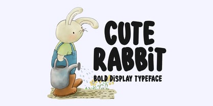 Cute Rabbit is a friendly and sweet display font. It is perfectly suited for stationery, logos, t-shirt, paper, print design, website header, photo frame, flyer, music cover, poster, image slider, and much more.
 - Striking Rainbow by Seemly Fonts,
$14.00 Striking Rainbow is a brand new display font. Striking Rainbow is perfectly suited for stationery, logos, t-shirt, paper, print design, website header, photo frame, flyer, music cover, poster, image slider, and much more.
 - Gladsome Morning by Seemly Fonts,
$14.00 Gladsome Morning is a cool, clean, and simple display font. It will look stunning on any food packaging design, poster, flyer, or print. Use this font for your designs and explore its endless possibilities.
 - Coldfield JNL by Jeff Levine,
$29.00Coldfield JNL is the revival of an old wood type font from Jeff Levine. Clean and easily readable at different point sizes, it is an excellent companion to Twelve Oaks JNL and Ingomar JNL. - Shy Darling by Seemly Fonts,
$14.00 Shy Darling is a cool and romantic display font. It is perfectly suited for stationery, logos, t-shirt, paper, print design, website header, photo frame, flyer, music cover, poster, image slider, and much more.
 - Sweet Daydream by Seemly Fonts,
$12.00 Sweet Daydream is a brand new display font. Sweet Daydream is perfectly suited for stationery, logos, t-shirt, paper, print design, website header, photo frame, flyer, music cover, poster, image slider, and much more.
 - Schoolblock by Wiescher Design,
$39.50 Schoolblock is the typeface German schoolchildren learn to imitate when they are taught the printed letters. I just had to do this one for use in a German schoolbook. Your education-designer, Gert Wiescher
 - Poozer by Cool Fonts,
$24.00 Poozer is a hand drawn stencil font that started out as a doodle and ended up on a custom skate deck. It has a nice organic, painted feel. Definitely not your usual stencil font.
 - Splinters JNL by Jeff Levine,
$29.00Splinters JNL is a fun, hand-drawn font emulating letters formed from pieces of wood. Use at larger point sizes for best results. Please note: There is no kerning and a limited character set. - Christmas Eve by Seemly Fonts,
$12.00 Christmas Eve is a brand new handwritten font. Christmas Eve is perfectly suited for stationery, logos, t-shirt, paper, print design, website header, photo frame, flyer, music cover, poster, image slider, and much more.
 - Slab Compact JNL by Jeff Levine,
$29.00 Slab Compact JNL was based on the printed title found on the box cover of a 1950s-era word games set called “Lex-O-Grams” and is available in both regular and oblique versions.
 - Expression Exchange by Seemly Fonts,
$14.00 Expression Exchange is a brand new handwritten font. Expression Exchange is perfectly suited for stationery, logos, t-shirt, paper, print design, website headers, photo frames, flyers, music covers, posters, image sliders, and much more.
 - Juicy Fruit by Seemly Fonts,
$14.00 Juicy Fruit is a bold and paint-brushed display font. No matter the topic, this font will be an incredible asset to your fonts’ library, as it has the potential to elevate any creation.
 - Summer Fable by Seemly Fonts,
$14.00 Summer Fable is a brand new display font. Summer Fable is perfectly suited for stationery, logos, t-shirt, paper, print design, website headers, photo frames, flyers, music covers, posters, image sliders, and much more.
 - Meilesha by Selvia Design,
$13.00 "Meilesha" is a unique and beautiful handwritten font. This font is equipped with uppercase, lowercase, numerals, punctuations, and multilingual support. It is suitable for invitations, weddings, ornaments, logos, banners, posters, prints, branding, and others.
 - Finalist Round Slab by Bülent Yüksel,
$19.00 The font was intended primarily to have a stronger body. It has a simple geometrical surface. This font has a strong personality, that makes it perfect for use in headline sizes but means it also works gracefully within text blocks. "Finalist Round Slab" is carefully crafted and a unique slab serif. Use for websites, print, motion graphics, logo design, packaging design, t-shirts and more. The designation “Finalist Round Slab Regular” forms the central point. The first figure of the number describes the stroke thickness: Thin to Black. "Finalist Round Slab" comes 7 weights and italics total 14 types. The family contains a set of 450+ characters. Case-Sensitive Forms, Classes and Features, Fractions, Superior, Inferior, Denominator, Numerator, Old Style Figures just one touch easy In all graphic programs. You can enjoy using it. UPDATES: - 30 December 2015 Opentype Feature (fractions) and some kerning. - 11 June 2018 Solving some UNICODE problems on the internet. - 12 March 2019 Some error has been fixed. - 19 November 2019 Some error has been fixed. - 16 August 2021 New Version - 2.0 Some error has been fixed.
 - Stanffords by Eurotypo,
$24.00 The early Twentieth Century was a golden age for cinema, and for the artists who lettered the iconic title sequences. Stanffords Family evokes the soul of this vintage brush lettering with a modern twist. Its main characteristics are bouncy baseline, round forms. These qualities give Stanffords its casual, friendly and handmade looks. The font family is characterized by excellent legibility in both - web & print design areas, well-finished calligraphic designs, optimized kerning etc. Stanffords Family include 5 fonts: Stanffords, Stanffords Bright, Stanffords Sans and Stanffords Ornaments and Stanffords Bright Ornaments (sets of 86 ornaments) to combine and give options to your typographic elements and designs. Stanffords is a very versatile script font: it includes initial forms, and a generous complement of alternate characters, ligatures and ornaments, creating a genuine connecting hand-painted look in dynamic OpenType format. You have a lot of options to customize it and that makes it perfect for logos, packages, titles, food packaging, t-shirts, blogs, photo books, wedding and invitation stationery and for everything you think necessary ... You get the idea!
 - Vernon by Giles Edwards,
$25.00 Vernon’s inspiration came while researching and investigating a 'legible' typeface design for tangible purpose. The main characteristics of ‘Vernon’ can be seen in the slightly modulated strokes that reference the natural and friendly humanist proportions of the humanist hand, with open interior letterspace characteristics. The subtle detailing and finishing of strokes and junctions – seen in the curved tail of the lowercase ‘l’ and the head serif of the lowercase ‘i’, create a smooth rhythm along the baseline. Utilizing the ‘contextual alternative’ feature of OpenType, Vernon substitutes select characters in words with word-shapes that may cause visual confusion to some readers. Vernon uses subtle character differentiation in the detailing of the inner-shape / counter space from similar letter shapes (for example: ‘p’, ‘d’, ‘g’ and ‘q’) to assist in creating the contextual alternate designs. Vernon is recommended for use as a text typeface, as it performs well at small text sizes (12 point size and below) intended for continuous reading of printed instructional and presentational information, especially where an inclusive audience demographic is required.
 - Brother 1816 by TipoType,
$24.00 This year we commemorate the 200th anniversary of the first sans-serif typeface. and what better way to celebrate, than to design our own sans-serif! Brother 1816 is a very flexible, multifaceted and solid typeface, mixing Geometric shapes with Humanistic strokes at the same time. You can choose between a pure geometric or humanistic style, or even mix the +20 alternate characters to create the feeling that you need for your projects. Its humanistic nature makes it easy to read, legible in small sizes; perfect for branding, editorial and signage. Its geometric nature works for bigger applications in need of more personality, like branding, headlines, posters, etc... This makes Brother an excellent tool for an incredible wide range of uses. It has a total of 32 fonts, which are divided into 2 groups: normal (16 weights) & printed (16 weights). Each weight has +460 characters, +20 alternates, angular and straight edges, swashes, fractions, ordinals and much more.... Brother has also been specially designed for web (using hinting instructions), making it work in small and large sizes on different types of screen resolutions.
 - Gilam by Fontfabric,
$39.00 Gilam is a sans serif font with semi-condensed proportions. The typeface was based on the famous DIN but combines its popular neo-grotesque look with characteristics, such as the pointed edges in the “W” and “M” as well as the outward cut terminals, which gives a distinctive look to the modern geometric typeface. The complete set of 9 weights plus italics gives to designers the absolute freedom to create anything. Perfect layouts with blocks of text, headlines, motion graphics, logos, apps, and websites are just part of the intended usage of this versatile typeface. Features: • 765 glyphs in 18 styles; • Extended Latin, Cyrillic and Greek; • Geometric forms and low contrast; • Prominent x-height which makes it legible in a text; • Perfect for headlines and logos; • Suitable for web, print, motion graphics etc. • Semi-condensed proportion; • Advanced typographical support and OpenType features including case-sensitive forms, fractions, superscript and subscript characters, and stylistic alternates; • Complete set of figures - old style and lining figures, which come with proportional and tabular variation; Gilam means “joy of people” so that you can enjoy it!
 - PF Centro Slab Press by Parachute,
$75.00 Centro Slab Press: Specimen Manual PDF Ever since its first release, Centro Slab has been particularly popular with corporate applications, branding and print media. The new Centro Slab Press version was redesigned with narrower proportions which are better suited for publications such as magazines and newspapers as well as web applications. Centro Slab Press is a very clean and legible typeface even at heavier weights, a characteristic which is not often seen among slab typefaces. This is part due to the fact that Centro Slab Press is not overpowered by clumsy serifs. Instead it incorporates semi-slabs which provide comfortable reading without compromising its modern profile. The italics are narrower than the romans and incorporate beautiful cursive characteristics. Each style consists of 659 glyphs with several opentype features and an extended set of characters which support more that 100 languages such as those based on the Latin, Greek and Cyrillic alphabet. The family is composed of 16 styles from ExtraThin to UltraBlack along with their italics. All weights were meticulously hinted for excellent display performance on the web.
 - Contenu by Hackberry Font Foundry,
$24.95 Because Contenu is designed for text use, it is spaced for body copy in the 9-12 point range. That is far too much spacing for heads, subheads, and the like. So I made the display version of Contenu Book to use for headers. In the process of tightening the spacing at the very large sizes, I also made some minor modifications to the glyph shapes to make this version a little more elegant. Contenu Opentype has two Opentype families for print design. Contenu Book has five fonts: Regular, Italic, Bold, Bold Italic, and Display. Contenu has Medium, Medium Italic, Black, and Black Italic. The name is French for content and this is what the family is designed for: text, body copy, and book layout. If it has a style, it is a modern take on oldstyle serif font using Jenson as a mask. There are no plans for display versions of the bolder weights or the italics. If you want them, use Contenu Medium, Book Bold, Contenu Black, or any of the four italics and tighten the tracking.
 - ITC Magnifico by ITC,
$29.99ITC Magnifico Daytime and ITC Magnifico Nighttime are inspired by nineteenth-century decorated types and letterings. “Although they are designed as display typefaces, their use is not limited to large headings. Usually three-dimensional types are employed in gigantic headings in large posters, but I thought it would be interesting if such decorative types were used as well in small sizes, say at 12 point,” says designer Akira Kobayashi. “There were a few examples of small three-dimensional types used in cards printed in the nineteenth-century. I studied their letterforms carefully and became more and more interested in those small three-dimensional types. The outlines of ITC Magnifico are robust enough to endure use at small sizes. Sometimes the angle or the shape of the 'shadow' had to be slightly modified or even illogical, because the letterforms ought to look as simple as possible. The resulting types are fairly easy to read at small sizes, and I hope that at large sizes those occasional oddities will appear charming.” - Rialto Piccolo dF by CAST,
$305.00 Rialto dF is a book face inspired by calligraphic tradition. Named after the famous bridge in Venice, it was conceived as a bridge between calligraphy and typography, roman and italic. It can also be thought of as an imaginary bridge between Italy and Austria, since it is the result of collaboration started in 1995 between the Austrian Lui Karner and Venetian Giovanni de Faccio. The letterforms of Rialto dF were drawn directly in digital format with a starting point deriving from humanistic letterforms memorized in the hearts, minds and the manual ability of its designers… As tradition demands, uppercase, numerals and punctuation are used in combination with italics – the same solution adopted by Francesco Griffo when he cut his first italic for the Virgil, the first of the octavo series printed and published in Venice by Aldus Manutius in 1501. Rialto dF comes in two optical weights: Piccolo, for up to 14 pt, and Grande for 16pt and above. Alternate characters and various dingbats are also provided and these are available through OpenType features developed by type designer and technician Karsten Luecke.
 - Bunaero by Buntype,
$24.50 Buntypes Bunaero™ combines classical and contemporary characteristics to a unique and distinctive font family with extravagant but also harmonious appearance. The characters are clear, open and sometimes bellied. Especially the caps have a very high waistline. The font was manually hinted and contains extensive handcrafted kerning tables to ensure flawless appearance in all media. It supports at least 99 languages incl. Vietnamese and provides ligatures, alternative glyphs, special localized forms and even more enjoyable OpenType® features. Feature Summary*: - 9 weights, 18 styles: Hair, Light, Thin, SemiLight, Regular, SemiBold, Bold, ExtraBold and Heavy and corresponding italics - Supports at least 99 Languages incl. eastern european and vietnamese languages - Overall width: Narrow or Space-Saving - Advanced f- ligature set including fb - Discretionary s- and c- ligatures - Alternative Characters: a, e, f, g, i, k, l, t, v, w, y, J, K, Q, R, and more - Capital German Eszett - Extra characters with Polish Kreska - Catalan Punt Volat - Extra characters with alternate minimalistic Cedille * Some features may only be available in OpenType®-savvy applications
 - Contenu Book by Hackberry Font Foundry,
$24.95Because Contenu is designed for text use, it is spaced for body copy in the 9-12 point range. That is far too much spacing for heads, subheads, and the like. So I made the display version of Contenu Book to use for headers. In the process of tightening the spacing at the very large sizes, I also made some minor modifications to the glyph shapes to make this version a little more elegant. Contenu Opentype has two Opentype families for print design. Contenu Book has five fonts: Regular, Italic, Bold, Bold Italic, and Display. Contenu has Medium, Medium Italic, Black, and Black Italic. The name is French for content and this is what the family is designed for: text, body copy, and book layout. If it has a style, it is a modern take on oldstyle serif font using Jenson as a mask. There are no plans for display versions of the bolder weights or the italics. If you want them, use Contenu Medium, Book Bold, Contenu Black, or any of the four italics and tighten the tracking. - Beach Please by Resistenza,
$39.00 Beach Please - Is a suite of handwritten fonts designed with pointed brush and watercolors. Beach Please Script is a relaxed and tender brush font, inspired by sign painting. The aim was to give a fun and fresh twist, exaggerating some curves and punctuation signs. There are also many alternates and swashes included accessible through opentype. Beach Please Caps & Wide have a bizarre look because of the reversed contrast on some letters, this particularity gives to the font a total new expression perfect for catchy headlines. Beach Please Wide works better when you need to use it in smaller sizes. It is full of ligatures to give to your text a realistic handwritten feeling. Beach Please works very will with our font family 'Aperó' We also present in this font family a slanted version for each font. To complete the Suite a set of tropical and fruity icons is also available. These sketchy vintage illustrations are perfect to create beautiful letterings and graphic layouts. Enjoy it! More about Opentype Features: https://bit.ly/opentype-rsz
 - Cedi by Typogama,
$25.99 The Cedi Typeface is a single weight display font that is based on the fluid handwritten style of a work colleague. This design is a fast flowing script that is both lively and original yet equally legible due to it's defined letterforms and open forms. Despite working well in a regular format, during the design process I started to look at ligatures as a solution for solving some problematic combinations. However, this small implementation soon got vastly expanded as I started to focus on the rythm of the letterforms and how best to convey the hand drawn feature in the design. A common problem in most script fonts is the repeating letterforms that would be particularily un-natural for this manual typeface, therefore hinting at it's digital source. The ligature concept soon evolved into over 2400 ligatures, trying to cover all repeating glyphs as well as finding more harmious combiations. This design was created for use in short text settings and use at large point sizes suiting titles, screen use or logo designs.
 - VLNL Kouseband by VetteLetters,
$30.00 The starting point for VLNL Kouseband was spotted by Donald DBXL Beekman on the Christian Reformed Church in the Dutch town of Naarden. The iron wire lettering contained a number of unusual characters and details, which eventually led to this five weight family. The Kouseband fonts mix elements of geometric sans serifs and upright unconnected scripts, with a hint of Dutch school writing. VLNL Kouseband is monolinear and has an very large cap height compared to the (lowercase) x-height, giving the capital letters an elongated condensed appearance. Kouseband is the Dutch word for ‘garter (belt)’ and also gave the name to a long tropical bean known as Yardlong bean. Kouseband beans are a common ingredient in Roti and other Surinamese dishes. As the Dutch Christian church is sometimes referred to as ‘Zwarte kousenkerk’ (Black stocking church), and stockings are held up by garter belts, we have come full circle and VLNL Kouseband has a name. VLNL Kouseband contains a set of oldstyle numbers matching the lowercase letters, and a couple of wider alternate capitals (HMNOQ) to enhance the liveliness of your designs.
 - Westblue by Ditatype,
$29.00 Westblue is a captivating sans-serif display font. Crafted in bold style and intricate brushwork, this font is a versatile choice for designers seeking a perfect combination of impact and creativity. The characters in Westblue command attention with their substantial size and clean, sans-serif lines. What sets this font apart is the meticulously added brushed details, which bring an organic and handcrafted touch to each letter. These details create a sense of dynamism, making Westblue ideal for projects that demand both modernity and a hint of artistic flair. In addition, enjoy the features here. Features: Multilingual Supports PUA Encoded Numerals and Punctuations Westblue fits in headlines, logos, posters, flyers, branding materials, greeting cards, print media, editorial layouts, and many more designs. Find out more ways to use this font by taking a look at the font preview. Thanks for purchasing our fonts. Hopefully, you have a great time using our font. Feel free to contact us anytime for further information or when you have trouble with the font. Thanks a lot and happy designing.
 - Fucked Plate - Unknown license

