3,598 search results
(0.011 seconds)
- Castelan Hispane by Ixipcalli,
$35.00 La tipografía Castelan Hispane es una tipografía inspirada en documentos y textos antiguos históricos españoles del siglo XVI. Los trazos semi-medievales - cursivos, le dan una apariencia antigua pero también moderna para los proyectos en los que se desee utilizar la tipografía. Cuenta con seis estilos y tres pesos, ligera, regular y negrita. Cada peso contiene también su forma “itálica”. The Castelan Hispane typeface is a typeface inspired by ancient Spanish historical documents and texts from the 16th century. The semi-medieval - cursive strokes give it an ancient but also modern appearance for projects in which you want to use typography. It has six styles and three weights, light, regular and bold. Each weight also contains its “italic” form.
 - Hyper Top by Bisou,
$12.00 Made in La Chaux-de-Fonds (Switzerland), Hyper Top is born while the designer (Bisou) watches "One from the Heart", a movie from Francis Coppola where Las Vegas is completely rebuilt in studio. The opening scene stages the signboard of the Dunes hotel and casino. This is the starting point of the most modern font ever designed by Bisou. Hyper Top is thought from ground up to give a strong impact. Dynamic, joyful, fast, this modern bold font is best suitable titles. It works perfectly with short texts for advertisement like candies, fireworks, protein bars or chewing gums. Just hang it over a prank and trap shop and see the coolest bad ass kids come in.
 - Gerolinda by RM&WD,
$95.00 Gerolinda has almost 1900 glyphs per weight; with its OpenType features it recreates the feeling of a mid-19th century Italian gentlewoman's handwriting. There are more than 1900 glyphs each weight with 250 variants covering all European accents and a broad choice of numbers: lined, tabular, ordinal, old style, etc. Also ligatures, discretional ligatures, contextual and stylistic alternates, smashes, contestual swashes, stylistic sets and ornaments. (la terminologia la do per buona!) This is a complete font for both editorial and graphic design. Gerolinda font is complemented by Gerolinda Design, dedicated exclusively to upper case letters: around 1,600 glyphs with all the accents. For best results, use of OpenType features is strongly recommend.
 - Le Tarot by Struvictory.art,
$16.00 Le Tarot is a modern serif font with celestial motives. The font is created in classic proportions and decorated with the moon and stars. Le tarot includes stylistic alternates and ligatures. The font is suitable for the design on the theme of astrology, mysticism, spirituality, witchcraft, magic, esotericism. Le Tarot has extensive language support, it includes English, French, German, Italian, Spanish, Portuguese, Danish, Norwegian, Swedish, Finnish, Estonian, Turkish. Le Tarot includes stylistic alternates for symbols: A, a, D, d, G, g, J, j, M, m, O, o, T, t, U, u, W, w. There are also ligatures: Ka, La, Ma, OO, Ra, aa, am, ka, ko, la, lo, ma, mm, mo, oo, ra, rm, ro, rr, tt, xa, za.
 - Tipo Metro CDMX by Ixipcalli,
$- La tipografía “Tipo Metro CDMX” fue desarrollada por Lance Wyman como parte del proyecto “Metro” desde los años setenta, y es uno de los elementos clave de la cultura visual del transporte del Sistema de Transporte Colectivo Metro (STC Metro). Este estilo se ha convertido en el icónico fundamental del trasporte público para los residentes de la Ciudad de México. En esta edición, los tipos minúsculas son una adaptación “no oficial” para el Tipo Metro CDMX, enriqueciendo la tipografía a un estilo visual de altas y bajas, por lo que se prescinde del diseño base como trabajo propio para enfatizar los tipos minúsculas exclusivamente, además de que se han añadido algunos caracteres de acentuación extendiendo su uso a otros lenguajes. Los tipos son una nueva propuesta por Ixipcalli en el presente año 2023. The “Tipo Metro CDMX” typeface was developed by Lance Wyman as part of the “Metro” project since the 1970s, and is one of the key elements of the visual culture of transportation of the Metro Collective Transportation System (STC Metro). This style has become the iconic fundamental of public transportation for the residents of Mexico City. In this edition, the lowercase types are an “unofficial” adaptation for the Tipo Metro CDMX, enriching the typography with a visual style of highs and lows, so the base design is dispensed with as my own work to emphasize the lowercase types exclusively, In addition, some accentuation characters have been added, extending their use to other languages. The types are a new proposal by Ixipcalli in the current year 2023.
 - Wonderbear PB by Pink Broccoli,
$14.00 From the title screens and comic books of the Hair Bear Bunch comes the fun and funky Wonderbear typeface. All that 70’s flavor packed into a Caps/Alt Caps typestyle reminiscent of a lovable limited run cartoon show. The Hair Bears miss you as much as you miss them. Relive the laughter.
 - Caligendings by Prioritype,
$15.00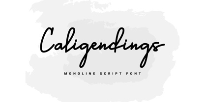 An elegant looking font that's perfect for your project and supports multilingualism. Can be applied to brochures, creative posts, boutiques and salons, women's jewelry, wedding invitations, business cards, photographer watermarks, clothing, and more. For reference, see preview. Features: -Uppercase -Lowercase -Numeral -Punctuation -Ligature -Multilingual
 - Lawson Vintage by Okaycat,
$29.00 Okaycat Font Foundry proudly presents “Lawson Vintage”! A retro classic style font, perhaps futuristic, with vintage textured edges. containing European accents. Beautifully connected cursive with high legibility and style for your design, great for web, print and publication. See original Lawson without texture. Salon
 - Discotheque JNL by Jeff Levine,
$29.00 A 1930s casual Art Deco type style with as much influence in 1970s graphic design as in its day was found within the pages of the 1930s French publication L'Art du Tracé Rationnel de la Lettre. Discotheque JNL is available in both regular and oblique versions.
 - Paradiso AOE by Astigmatic,
$19.95 Inspired by logotype of the Paris Resort and Casino in Las Vegas comes the Paradiso typeface, complete with an unusual array of leaning and unusually large capitals versus a petite lowercase that have a loosely drawn feel. Definitely a typeface with capitals to be used in moderation!
 - Garbancera by Rodrigo Navarro Bolado,
$30.00 Gothic fraktur inspired design, I wanted to resemble old german calligraphy but making it very geometric, so I used an isometric reticle during sketching. This is a display font, created for BIG sizes, non textual. I recommend it for branding, poster, logos or titles. Its very experimental -- it exists within the limits of legible and illegible reading. I choose the name “Garbancera” because gothic calligraphy has issues that are linked with dark, gloomy, lugubrious things or fear feelings, culturally in Mexico. I related this with death and for mexicans, death is something we celebrate and give us joy and happiness, annoying, the most representative Mexican characters, one of those is “La Calavera Garbancera” or better known as “La Catrina”, a clothes skeleton with only a hat. It was drawn this way to make a critic to all Mexicans at that time, that were poor but they wanted to represent a high lifestyle, “those that where to the bones, but with a French hat with ostrich feathers”. La Catrina was created by José Guadalupe Posada, a Mexican lithographer but also a newspaper illustrator. I think this is a beautiful font that can lead to great results, just use it wisely.
 - Big Sur by Mysterylab,
$11.00 Big Sur is a six-width slab serif font family with a unique look. At first glance, it is clearly in the tradition of old west style alphabets, with its chunky top and bottom strokes and serifs. But it also features a whimsical vibe in the curvy and pointed flourishes, the wavy baseline, and the swash terminals on many of the glyphs. It's a true standout with unique identifiers, and is bound to grab the eye as something new and different; yet it's traditional enough to establish a solid Western or vintage Americana style. Great for rodeo, county or state fairs, saloons, pubs & taverns, cowboy gear, and even vintage psychedelic posters.
 - Fancy Deco JNL by Jeff Levine,
$29.00 This decorative, scalloped thick-and-thin Art Deco type design is one of the many inspirations found within the pages of the 1934 French lettering book “L'Art du Tracé Rationnel de la Lettre”. Now in digital format, Fancy Deco JNL is available in both regular and oblique versions.
 - Havana Sunset by Set Sail Studios,
$16.00 Let your hair down and enjoy the ride with Havana Sunset! Analogue meets digital in this font duo, pairing a carefree & textured script font with a trendy all-caps sans-serif - creating the perfect typography contrast for fun, free & stylish design projects. This font duo is packed full of extra features; The script font includes a full alternate set of characters, and the sans font includes both a filled and an outlined version - giving you a variety of layout options. It's a lot of fun to experiment with! All fonts include language support for; English, French, Italian, Spanish, Portuguese, German, Swedish, Norwegian, Danish, Dutch, Finnish, Indonesian, Malay
 - Sabandija ffp - Personal use only

- f2 Tecnocratica - Personal use only

- Tabaiba wild ffp - Personal use only

- Mireille by TypeThis!Studio,
$54.00Mireille is a typographic homage to french culture. Your journey through gourmet food, classical music, opera and wine tours over 100 romantic alternates and ligatures that allow you to add outstanding elegance to your typography. Take care: you might have a crush on this typeface – La vie, c’est beau! www.typethis.studio - French Bistro JNL by Jeff Levine,
$29.00 The 1930s French publication L'Art du Tracé Rationnel de la Lettre was a treasure trove of font revival ideas from the Art Deco era. One example featured a serif typeface with a number of stylized characters. This is now available as French Bistro JNL, in both regular and oblique versions.
 - Kolker Brush by TypeSETit,
$24.95 Kolker is a brushy script style based on the use of a camel hair brush. It's easy on the eye!
 - Jigger Statz by Poole,
$32.00During the spring of 2006, while creating this typeface, I was reading Praying For Gil Hodges, by Tom Oliphant, who grew up a Brooklyn Dodgers fan. I grew up a Los Angeles Dodgers fan. My mother worked as secretary to the president of the old Triple A LA Angels Baseball Team. In 1952 when she was pregnant with me, she left the team. They gave her an autographed baseball and a puppy named Angel. That's the dog I grew up with. Toward the end of the book the author talks about Gil Hodges' favorite ballplayer, a slugger for the LA Angels, Jigger Statz. I thought, could it be? My mother died two years ago and I got the team baseball. Sure enough, the first name after the dedication to my mother was Jigger Statz. - Mowaq by Ixipcalli,
$27.00 Mowaq es una tipografía limpia, abstracta, moderna, minimalista y de trazos sencillos pero elegantes. Sus cuatro pesos hacen un juego visual de degradados muy marcados. La tipografía Mowaq fue inspirada a partir de los estilos mayúsculas sans-serif, como uso de encabezados y subtítulos en dos libros donde se necesitaba mostrar un aspecto limpio, moderno y minimalista. Los tipos minúsculas fueron adaptados posteriormente a la familia Mowaq. Mowaq is a clean, abstract, modern, minimalist typeface with simple but elegant lines. Its four weights make a visual game of very marked gradients. The Mowaq typeface was inspired by sans-serif uppercase styles, used for headings and subheadings in two books where a clean, modern and minimalist look was needed. The lowercase types were later adapted to the Mowaq family.
 - Wardrobe JNL by Jeff Levine,
$29.00 A 1938 issue of the Spanish language movie fan magazine Cine-Mundial (Movie World) had an article entitled "Lo Que Visten Las Estrellas" ("What Stars Wear"). The headline of the article was hand lettered in a lovely Art Deco monoline sans serif, which is now available as Wardrobe JNL in both regular and oblique versions.
 - French Slab Serif JNL by Jeff Levine,
$29.00 Another example of 1930s French Art Deco lettering from the 1934 publication L'Art du Tracé Rationnel de la Lettre (which roughly translates to “The Rational Path Art of the Letter”) resulted in the digital typeface French Slab Serif JNL. This bold and slightly eccentric slab serif design is available in both regular and oblique versions.
 - Alex Brush by TypeSETit,
$24.95 This Contemporary style reflects a modern hand-lettered feel. Modeled from a camel hair brush, it is a very legible flowing script.
 - Go West by FontMesa,
$25.00Go West is a spurred version of the FontMesa Red Dog Saloon font which is a revival of an old 1800s woodtype font. - Frankenberg Pro by RMU,
$35.00 A treasure trove of typographic rarity, found in an old print shop in the Saxon town of Frankenberg, now revived and carefully extended.
 - Meltinghones by Prioritype,
$15.00 An elegant and beautiful looking font that is perfect for your project and supports multilingualism. Can be applied to various kinds of print and digital media such as boutiques and salons, women's jewelry, wedding invitations, business cards, photographer watermarks, clothing, creative posts and more. For reference, see preview. Features: -Uppercase -Lowercase -Numeral -Punctuation -Ligature -Multilingual
 - DF Mercat by Dutchfonts,
$30.00 DF Mercat is a tribute to the famous marketplace situated at ‘La Rambla’ in Barcelona's historic centre. It is a picture font containing over 240 illustrations of fish, crustacean, clams, poultry, game, meat, sausages, herbs, vegetables, fruit, bread, butter, a variety of cheese, wines and spirits, small dishes, drinks (coffee, beer, soft drinks), ice cream, pastry, etc.
 - Cuba by Design is Culture,
$39.00 The inspiration for Cuba comes from a sign for the restaurant "La Flor de Cuba" on Bergenline Avenue in Union City, New Jersey. Its blocky, dimensional forms are reminiscent of letterforms seen in signs throughout Latin America from, Colombia, to Mexico, to Spain, to Union City. Its quirky forms are meant to evoke a sense of hand painted signage.
 - Discoteque by Ilya Chalyuk,
$20.00Discoteque Family is modern art-deco related fonts collection that found compromise between retro and futuristic style. They are geometrically straight, rhythmic, clean and elegant. They are perfect in upper-case for headings, posters, logos. Discoteque Hypnosis makes stylish modern look with air of disco of 70-80s. Discoteque Gold is highly recommended for making designs in steam-punk style or for luxury vintage feel. Over 2,660 kerning pairs has been manually gleaned for perfect look. - Jatheedo by Twinletter,
$14.00 Jatheedo is a typeface created with original handwriting that may anesthetize your eyes and give a wonderful and beautiful impression. This font is highly versatile in its use. Because of its strong character, this font is attractive when used alone, but it is also stunning when paired with sans or sans serif letters. So, what are you waiting for? Enjoy and give your project a unique appearance. This typeface was created with a natural touch of handwriting that has been developed to generate parts and compositions that meet your requirements. As a result, this typeface is ideal for crafts, children’s writing, adventure posters, food banner titles, wedding invitations, and logos for product packaging.
 - Volume by Cubo Fonts,
$29.00 Volume is a 3D font, with interlocked characters, inspired by vintage wooden block capitals! Superimposed weights bring light and shadow on the structure and allows many coloured combinations. Cubo est une fonte en volume dont les lettres s'imbriquent, inspirée d'anciens caractère d'imprimerie en bois. Les diiférentes graisses se superposent, créant des effets d'ombre et de lumière, et facilitant la colorisation des caractères.
 - Foreign Film JNL by Jeff Levine,
$29.00 The Art Deco hand lettered opening credits for the 1936 French drama “La Belle Équipe” [English title: “They Were Five”] provided the inspiration for Foreign Film JNL, which is available in both regular and oblique versions. According to Wikipedia, the film “…tells the story of five unemployed workers who win the jackpot in the national lottery but their solidarity then proves fragile.”
 - Latos Vocos by James White,
$12.00 This font style is commonly seen in traditional tattoo artist portfolios all over the world. Inspired by graffiti seen in bathroom stalls, taco stand tables, public transportation windows, and brick walls in the suburbs of East LA. This font will go great on a banner for a tattoo design, and even on a t-shirt design for all your urban clothing lines.
 - 1557 Civilité Granjon by GLC,
$42.00 Living from 1545 in Lyon, France, the famous punchcutter Robert Granjon created a typeface that looked like his own handwriting. The first book printed with this font, in 1557, was probably Dialogues de la vie et de la mort by Innocent Ringhier. We offer the complete typeface. It is a charming font with historical forms (long s, final s and others) and many ligatures, enriched with accented letters and other characters that did not exist in the original (thorn, eth, lslash and others), and a lot of alternates that permit rich and varying typography. Warning: all characters appear with the 1500s manual blackletter old style, especially letters “e” “r” or “h” alternate and some ending forms, and may be difficult to read at first, but it quickly becomes very easy. The font contains all characters for Baltic, Western European (Including Celtic), Eastern European, Northern European, and Turkish languages.
 - Liesel by Magpie Paper Works,
$26.00 What happens when historical calligraphy and modern lettering kiss? Liesel! This six-font, hand-lettered family is loosely based on traditional letterforms. Used alone, Liesel Regular reflects a warm, antique aesthetic. But when you pair her with Brush, Pencil, and Shadow - all of which were designed for layering - a modern, artistic look emerges! Experiment with textures, overlays and blending modes to create realistic water colored text. Both Liesel Printed & Liesel Shadow Printed are highly detailed, distressed versions of their solid counterparts, and can be layered to recreate an authentic letterpress or screen printed effect. Opentype features programmed into each text font include contextual alternates, stylistic alternates, swashes, true fractions, and old style numerals. Each Liesel font features PUA coding so all characters, including swashes and alternates, can be accessed with Character Viewer (Mac), Character Map (PC) or PopChar. For more information, including a complete PUA code listing, please review our user guide. We recommend pairing Liesel with Quimbly. Please note: because its outlines are complex & highly detailed, Liesel Printed and Liesel Printed Shadow may process slowly in some applications.
 - A10 STAR Black by Mogtahid,
$90.00 As a former typographer / lino and calligrapher, Abdallah NASRI had recourse to the nature of the idea of an "INTERCHANGEABLE" collection for types who in reality offer a police collar parallel to the complex typeface of the variable. Our fashion is outlined by a simple calculation defined by superimposed geometric circles where we used only its ¼ to fill the need for the angles of each of our letters. Always with the idea of having in the same allocated space, the same letter nested as many times as fat example from Hairline to Ultrabold. It was in this way that I was able to obtain a large number of styles, with a very interesting kerning which prompted me to extend the font to other languages with +1000 characters and +600 glyphs. I have always been treasured by the all in "1". I assure you that I sought to obtain the maximum of Visibility for a use S / Titling TV, WEB Pages and Typography Typo; once the difficult thing was done, I was rewarded by a font that has countless typographic openings for the world of graphics with 10 styles of weights in hand, and again I am happy to have personalized the charm of each letter by new details; I do not regret the time spent on thinking about it so that it is useful and at the same time pleasant as a working tool, finally profitable in all sectors and more multilingual, without forgetting that it is a family of inter change c ' is to say: All the types occupy the same height of the body and it is their fats which differs in the same space width of each of the letters, therefore no interference in spacing. Here, an additional alternative, a participation of a septuagenarian in the service of the love of modern digital typography. • TEST: At 50% screen in a body of 12 pixels, the A10 STAR Alphabet subjected to a test, has a clear Readability / Visibility. • P.S: A10 STAR integrates Diacriticism in all its forms. Texte d'origine : Abdallah NASRI a eu recours en étant ancien typographe/lino et calligraphe à la nature de l'idée d'une collection "INTERCHANGEABLE" pour les types qui en réalité offre un collier de police parallèle à la fonte complexe du variable. Notre mode est esquissé par un calcul simple défini par des ronds géométrique superposés où on a utilisé seulement son ¼ pour garnir le besoin des angles de chacune de nos lettres. Toujours dans l’idée à avoir dans le même espacement alloué, la même lettre imbriquée autant de fois de graisse exemple du Hairline à Ultrabold. C’est de cette manière que j’ai pu obtenir un grand nombre de styles, avec un crénage très intéressant ce qui m’a incité à étendre la police à d’autres langues avec +1000 caractères et +600 glyphes. J’ai toujours été prisé par le tout en « 1 ». Je vous assure que j’ai cherché à obtenir le maximum de Visibilité pour une utilisation S/Titrage TV, Pages WEB et Maquette typo ; une fois le difficile fait, j’ai été récompensé par une police qui possède d’innombrable ouverture typographique pour le monde du Graphisme avec comme atout en main 10 styles de graisses, et encore je suis content pour avoir personnalisé le charme de chaque lettre par des détails nouveaux ; je ne regrette pas le temps passé dessus à réfléchir pour qu’il soit utile et à la fois agréable comme outil de travail, enfin profitable tous secteurs confondus et en plus multilingue, sans oublié que c’est une famille d’inter change c’est-à-dire : Tous les types occupent la même hauteur du corps et c'est leurs graisses qui diffère dans un même espace largeur de chacune des lettres, donc aucune interférence dans l’espacement. Voilà, une alternative supplémentaire, une participation d’un septuagénaire au service de l’amour de la typographie numérique moderne. • TEST : A 50% d'écran dans un corps de 12 pixels, l'Alphabet A10 STAR soumise a un test, présente une nette Lisibilité / Visibilité. • P.S : A10 STAR intégre la Diacritique dans toutes ses formes.
 - Millenium Pro Var by TypoStudio Pro,
$200.00 La famille Millenium est composée de modèles dont le poids varie progressivement. Elle est très étendue. Elle va de "Super Thin" à "Extra Black". Unique au monde, sa finesse permet de concevoir un style très léger même pour l'impression d'affiches et d'autres grands formats. Conçu dès l'origine comme un caractère variable, le Millenium offre une gamme de 900 variations possibles et une infinité de créations...
 - Linotype Didot by Linotype,
$29.00 Linotype Didot™ was drawn by Adrian Frutiger in 1991, and is based on the fonts cut by Firmin Didot between 1799 and 1811. Frutiger also studied the Didot types in a book printed by the Didots in 1818, "La Henriade" by Voltaire. This beautifully drawn family is the right choice for elegant book and magazine designs, as well as advertising with a classic touch.


