4,045 search results
(0.012 seconds)
- Vogue Sans by Fenotype,
$20.00 Vogue Sans is a luxurious high contrast sans serif well suited for fashion and haute couture design or glamorous headlines. Try typing any word or name with Vogue Sans and it'll look great. Vogue Sans is equipped with several interlocking ligatures - CC, CO, LA, LC, LL, LE, OO & TT. Vogue Sans also has Swash & Titling Alternates for letters A K L T X Q R and Stylistic Alternates for letters K and R. Go chic!
 - Vincenzo by CastleType,
$29.00 Vincenzo is based on a beautiful condensed typeface from the 1920s or earlier; original designer unknown. This is a "Modern" style with fine slab serifs, vertical stress between thick and thins, and high contrast. What is unique about this design is that the triangular serifs (e.g., E, F, L, T, etc.) do not gradually taper as they join the rest of the letter, as would be the case in Bodoni and similar designs. Uppercase only.
 - Arnold Böcklin by URW Type Foundry,
$35.00 Arnold Boecklin is a true Art Nouveau font, evocative of outdoor cafes in the years prior to World War l. Arnold Boecklin seems to be telling a story, with its decorative curves and varying emphasis of strokes. The Arnold Boecklin font should be used for specific copy as in headlines or advertisements, bearing in mind its strong design. Arnold Boecklin is a trademark of Linotype GmbH and may be registered in certain jurisdictions.
 - Herkimer Bunrab NF by Nick's Fonts,
$10.00Eh, what's up, Doc? This cuddly little oddball of a typeface was originally released under the rather unlikely name of Hercules by the Amsterdam Typefoundry in 1926. This face includes OpenType Stylistic Alternates for b, h, h, k and l, which feature very tall ascenders with a "bunny ear" vibe. Both versions include the complete Latin 1252, Central European 1250 and Turkish 1254 character sets, as well as localization for Moldovan and Romanian. - Backover by Alit Design,
$19.00 Introducing “Backover Typeface” – Unleash the Power of Words with a Heroic Twist! 🔥 Immerse yourself in the epic realm of typography with our latest creation, the “Backover Typeface.” Inspired by the valor of superheroes and the chivalry of knights, this font is a visual journey into the heart of heroic tales. 🗡️ Strike with Power: Channel the strength of legendary warriors as each letter in “Backover Typeface” is meticulously crafted to embody the essence of a hero’s decisive strike. The sharp angles and bold lines evoke the precision of a superhero’s punch or a knight’s swordplay. 🛡️ Defend with Style: The font doesn’t just pack a punch; it defends with flair! Each curve and contour replicate the resilience of a shield, offering a typographic fortress that stands strong against the ordinary. Let your words be the armor that shields your message with distinction. 👤 Unleash Your Inner Hero: “Backover Typeface” isn’t just a font; it’s a transformation. Feel the power surge as you type words that resonate with the bravery of classic heroes. This font empowers your message to become a beacon of courage, ready to take on any adventure. ⚔️ Warrior’s Arsenal: Immerse your audience in the visual feast of classic warrior illustrations included with “Backover Typeface.” Swords clash, shields protect, and helmets gleam with the promise of valor. These meticulously designed elements seamlessly integrate into your typography, allowing you to create a visual narrative that echoes the grandeur of heroism. 🎮** Level Up Your Designs:** Whether you’re working on a superhero movie poster, a knight-themed game interface, or any project that demands a touch of legendary charm, “Backover Typeface” is your ultimate companion. Elevate your designs, captivate your audience, and let the font be the hero of your creative journey. 🌟 Key Features: Heroic Typography Superhero and Knight Theme Sword, Shield, and Helmet Illustrations Perfect for Movie Posters, Game Graphics, and more 🚀 Elevate your design game with “Backover Typeface” – where every word becomes a heroic adventure! Download now and embark on a typographic journey like never before. Unleash the hero within your words! ⚡️
 - Bayside Tavern by FontMesa,
$25.00 Bayside Tavern is a weathered version of our Tavern Alt font family. With its straight sides Bayside Tavern fits better in tight spaces and reads better at smaller point sizes than the regular Bay Tavern version. With three weights, open faced and outline versions to choose from you're sure to find the right style for your new project, restaurant menu, logo, t-shirt design or Pirate costume party. While our original Tavern Alt font has been increased to include five weights additional weights for Bay Tavern will have to wait for now, adding the notched cut in's were all done by hand which causes a lot of cramping so a long break is needed before creating the extra weights. The Fill fonts in the Bayside Tavern family are meant to be layered behind the Bayside Open fonts, if you're using Bayside Open select Bayside Fill, if you're using Bayside Open L select Bayside Fill L, if you're using Bayside Open S select Bayside Fill S and so on.
 - Bellwood Gothic by Breauhare,
$19.99 Bellwood Gothic™ is an unorthodox but happy pairing of upper and lowercases that breaks typographic rules: its capitals evoke traditional early 20th century styling and strength. Lowercase displays a softer, more warm and friendly flavor that points to a Bauhaus aesthetic. But for some strange reason they work so well together! Therein lies the mystique of this font. Overall it isn’t strictly uniform in stroke but shows some variation of color. The sofa poster includes a cameo appearance by breauhare’s own popular Daddy’s Hand™ font. Bellwood Gothic’s nostalgic flavor of the 1960s & 1970s still conveys a modern look that lends itself to sports, fashion, lifestyle and more. The wide track of the lettering helps short words easily fill spaces. Includes stylistic alternates for the lowercase a, e, & l (L), plus 13 uppercase letters! Among OpenType features are Stylistic Alternates, Stylistic Sets, Ligatures, Fractions, & Case-sensitive forms. Extended support for Western, Central, and Eastern European languages is included. Use it for headlines, subheads, branding, editorial, packaging, and logos!
 - Panther Fighter by Yoga Letter,
$17.00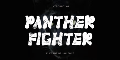 "Panther Fighter" is a modern and elegant brush font. This font is equipped with uppercase, lowercase, numerals, punctuations and multilingual support. It is suitable for logos, movie titles, Halloween, Christmas, business branding, ornaments, mock ups and others.
 - DS_Cosmo - Unknown license

- Burin by Monotype,
$29.99The Burin family of typefaces consists of Roman and Sans variations. Burin Roman has very distinct lowercase characters b, c, d, g and y with a quirky use of tapered strokes and hairlines. Burin Sans is a light display face with an extended tail on the lowercase y. - Burin Sans by Monotype,
$29.99The Burin family of typefaces consists of Roman and Sans variations. Burin Roman has very distinct lowercase characters b, c, d, g and y with a quirky use of tapered strokes and hairlines. Burin Sans is a light display face with an extended tail on the lowercase y. - Stempel Elan by Linotype,
$29.99 Stempel Elan is Frank Griesshammer's revival of Elan, a script typeface released by D. Stempel AG in 1937. That Elan was originally created by Hans Möhring. The first digital release of the design, Stempel Elan includes a number of OpenType features, including alternate versions of certain glyphs, etc.
 - Greenaway Mignonettes by Wiescher Design,
$29.50 Kate Greenaway was a very famous British (1846-1901) author and illustrator of childrens books. Her books were an outstanding success in English publishing during the Victorian period. Recently I found these sweet Mignonettes in an old foundry specimen book. Mignonettes is derived from the French word "mignon" which stands for lovely, charming, sweet, delightful, pleasant and that does exactly describe these little drawings. I already published a Kate Greenaway's Alphabet a couple of years ago. So here is my second installment. Yours, Kate Greenaway fan Gert Wiescher
 - Primeform Pro by Punchform,
$29.00 The most versatile geometric font ever is here. With 421 alternative characters and 19 stylistic sets, you get unlimited power to take your creativity to the next level. The first typeface of its kind, Primeform Pro is meticulously designed to adapt its personality to any project. Primeform Pro is the smartest choice for any creative project. With a single click, you can change its typographic personality and adapt it to your desired style. Choose between 3 predefined styles or create your own style by combining the hundreds of alternate characters available. OpenType Features Access All Alternates (aalt) Stylistic Alternates (salt) 19 Stylistic Sets (ss01 – ss19) Localized Forms (locl) Case-Sensitive Forms (case) Standard Ligatures (liga) & Discretionary Ligatures (dlig) Slashed Zero (zero) Proportional Figures (pnum) Tabular Figures (tnum) Subscript (subs) & Superscript (sups) Numerators (numr) & Denominators (dnom) Fractions (frac) Ordinals (ordn) Glyph Composition/Decomposition (ccmp) Language Support 317 Latin Languages 2 Greek Languages 15 Cyrillic Languages Tech Specs Glyph Count: 1185 Format: OpenType CFF
 - Alt Juk01 by ALT,
$30.00 Yet another experimental typeface. I love trying different things I’m very happy with the results here. See the whole presentation here: Behance,net
 - Cow Palace JNL by Jeff Levine,
$29.00 During the 1960s Hippie movement, a large amount of the rock and roll poster art was strongly influenced by the Art Nouveau period of the early 1900s. A poster for an appearance by The Doors at San Francisco’s Cow Palace Exposition Center (presented by Fillmore East and West owner Bill Graham) featured some wonderfully eclectic Nouveau-styled serif hand lettering. Now recreated as a digital type face called Cow Palace JNL (and named for the performance venue), the font is available in both regular and oblique versions.
 - Killuminati by IKIIKOWRK,
$17.00 Introducing Killuminati - Gothic Type, created by ikiiko. Killuminati is a simple english old type with modern blackletter style. This typeface is inspired by gothic & classic rock band logo. killuminati has a bold font with a combination of sharp and curved corners. This font is perfect for an poster event, stencil, logotype, magazine layout, fashion stuff, quotes, and so much more. What's included? Uppercase & Lowercase Number & Punctuation Alternates Multilingual Support Enjoy our font and if you have any questions, you can contact us by email : ikiikowrk@gmail.com
 - Nouveau Hippie JNL by Jeff Levine,
$29.00 The cover of the 1907 sheet music for "I'd Rather Twostep Than Waltz, Bill" was hand lettered in an Art Nouveau sans serif alphabet. During the hippie counter-culture movement of the 1960s, rock posters, album covers and other printed ephemera of the time embraced the styles of lettering and art made popular during the early 1900s. It seemed only fitting to name this type design Nouveau Hippie JNL as an homage to both eras. The font is available in both regular and oblique versions.
 - Ebony by TypeTogether,
$35.00 Some typefaces need time to ripen; Burian and Scaglione made the first sketches for Ebony back in 2008, but it took a few years of maturing in a drawer to be developed into a multi-functional type family. While keeping in tune with TypeTogether’s focus on complex typographic structures needed for magazine, newspapers and books —whether printed or digital—, Ebony goes far beyond editorial use and promises great performance in branding and advertising. The range of dark weights with taut and powerful curves can boost any headline, while the lighter styles create an approachable and clean feel in blocks of continuous text. Ebony does not fall short on aiding legibility either; letterforms have a distinct direction of ductus and features like the top serif on ‘l’ help making them clearly distinguishable from each other. It is a type family that cleverly seeks a balance between the openness and legibility of humanist sans serifs and the striking and more regularised character of grotesques. The letter-shapes feature generous counters and open terminals with crisp angles, and daringly grow both in colour and width as the fonts get bolder. Infused with this strength, Ebony also shows a quirky side in some of her shapes; the vertical fractions, the at-symbol, the old-style numbers, … The predominantly slanted style of the italics is broken up in some letterforms, such as ‘a e f l’, that are more in line with a classic cursive appearance. This, together with a forceful italic angle, ensure a change in texture within a block of text, despite sharing the same letter weight and width with the uprights. With 18 styles, tending towards the heavier part of the weight-spectrum, this face has a powerful quality!
 - Baroniene ML by HiH,
$12.00 Genovaite Baroniene is former school teacher and a native of Lithuania who loves fancy letters. When she writes, she likes to add extra flourishes to her handwriting and printing. It simply appeals to her to do so. While living in the United States a few years ago and working in the health care field, she put pen to paper to provide a specimen of her writing from which a font could be developed. The process has taken longer than either of us expected. Now we are finally able to present Baroniene ML, a stylishly unique example of what we call Lithuanian Folk Baroque. Baroniene ML has a total of 362 glyphs, including the Unicode Latin Extended-A glyphs (0100 to 017F), covering the more widely-used Central European languages. To resolve the cedilla/undercomma conundrum, we have chosen to design a hybrid disconnected accent for use with C, G, K, L, N, R, S & T. We hope this solution is acceptable to users of Albanian, Catalan, French, Latvian, Portuguese, Romanian and Turkish. Baroniene ML also comes with four ligatures: gh, Th, th and Ch (167, 172, 177 and 181). Baroniene ML is certainly not the polished script of a professional calligrapher. It is very personal. The human source is still visible in its form. The letter spacing is uneven. Some of the curves are not quite perfect. In sum, the individuality has not been refined out of it. That is why it is so charming. If you want for a font that has a very different look, perhaps Baroniene ML is what you need.
 - Rigid Square by Dharma Type,
$19.99 Rigid Square There is a rule, Octagonal shape and 45 degree cuts. Very geometric shape but designed especially for body text, long sentence such like a mechanical instructions. Capital I and lower l have distinguishable shape. Neo-humanist shape on lowercase b.d.g.p.q is for further smooth readability. However, Also useful for display, titling, captions by their sophisticated glyph shapes and their eye-catching geometry. Consists of seven weights and their matching italics. Supporting almost all latin languages.
 - 1955 by Alan Smithee Studio,
$9.00 1955 Is a fresh grotesque interpretation. Any detail too historically referenced is replaced by strong geometry and idiosyncratic features. Round dots and punctuation, curved “l” foot, single storey “g” etc. all these details make 1955 a very contemporary typeface (unlike the name suggests!). With a range of weights going from Thin to Black including Italics, OpenType Features, extended character-set, tailored for print and digital, 1955 has everything to become your new go-to typeface for every project!
 - Disgrunged ABCD by Aah Yes,
$12.00Disgrunged is a distressed grunge font, as you might guess, and industrial sans-serif in feel. The Disgrunged ABCD family resembles bad printing with rubber stamps, with corners showing, along with misprinted letters, and the typeface has four versions (A, B, C, D) giving increasing amounts of chaos, jumbledness and irregularities. - Holiday Nouveau JNL by Jeff Levine,
$29.00 A holiday issue for the then-weekly women’s fashion newspaper “Harper’s Bazar - Easter A. D. 1896” features the cover information in a beautiful condensed spurred serif type face with many flourishes to some of the letter forms. This is now available as Holiday Nouveau JNL in both regular and oblique versions.
 - Glypha by Linotype,
$29.99 Glypha was designed by Adrian Frutiger and appeared with D. Stempel AG in 1977. The font consists of ten cuts and is formally based on its predecessor, Serifa, although its lower case letters are a bit larger. Like Serifa, Glypha is also based on the general scheme used to design Univers.
 - Balistine by Owl king project,
$39.00 The Balistine font, a combination of modern and slightly taking elements of 80s era in some lowercase curves such as "a b d q w and there are several alternative letters found in Balistine. By carrying a weight of 20 Balistine can easily be used for wider exploration. Let's start design.
 - Amys Hand by Kustomtype,
$15.00 "The Amy Winehouse Script" unveils a unique window into the artistic and personal world of the iconic British singer and songwriter, Amy Winehouse. Renowned for her soulful voice and heartfelt lyrics, Amy's handwriting, a lesser-known facet of her life, offers a captivating story. Amy's script mirrors her artistic and unconventional spirit, marked by artistic flourishes and cursive elegance, echoing her expressive personality. Her cursive style, chosen for its fluidity, mirrors her singing, creating a deep connection between her music and script. Her individualistic script is characterized by varied letter sizes and shapes, reflecting her nonconformist nature and her desire to stand out. It can be messy, much like her turbulent life, representing her emotional journey, marked by highs and lows. Amy's handwriting evolved with her emotional state, sometimes appearing chaotic during difficult times. It's important to note the limited public samples, making it challenging to draw definitive conclusions. "The Amy Winehouse Script" invites you to explore uncharted territories of her life and artistry, offering fresh insights into her unspoken expressions and enduring intrigue. In every line, you can hear the music of her words and the story of her script, reminding us how art transcends boundaries, leaving an indelible mark.
 - Freich by Nasir Udin,
$15.00 Freich is a mighty bold typeface with a vintage vibe and rebellious feeling. Perfect choice for posters with super hero or propaganda themes. Its sharp and strong letter forms will make any statements more powerful.
 - Rocket Man by Comicraft,
$19.00 Don your Flying Suit and tighten up your Atomic Powered Jet Pack buckle! Pencil in your pencil-thin moustache and stick your head into that Rocketeering Helmet! It's Zero Hour, 9am, 1949! Five Days a Week, you ARE the King of the Rocket Men, ready to Burn out your Fuse on a Timeless Flight into Outer Space Alone! Mission Control has advised our Space Race Typeface that Mars is not the kind of place to raise your kids and, furthermore, it's gonna be a long, long time until touchdown brings you round again to find you're not the man they think you are at home. You are in fact a ROCKET MAN; not a postman or a milkman, you're a modern man, a higher-than-a kite flying masked hero on your first manned flight to Infinity and Beyond!
 - Quintton by TypoBureau Studio,
$15.00 Quintton script is a casual clean brush stroke font, perfect for logo design, branding, invitations, t-shirts print, mock up, magazines, signage and so much more. With its handmade feel, Quintton is perfect for your upcoming projects so don't miss out.
 - Cranberry Cyr - Unknown license

- DS Sofachrome - Unknown license

- DS Ayaks - Unknown license

- Textan - Piple - Unknown license

- Kleukens Kursiv NF by Nick's Fonts,
$10.00This classic face is based on Kleukens Scriptura, designed by Friedrich Wilhelm Kleukens in 1926 for D Stempel AG. It served as an alternative to Lucien Bernhard's Cursive and an inspiration for Oswald Cooper's Pompeian Script. Both versions of the font contain the complete Unicode Latin 1252 and Central European 1250 character sets. - And So Forth JNL by Jeff Levine,
$29.00 Barbara D. Berney (a graphic artist and friend of Jeff Levine) had suggested making a font featuring many of the ampersands from Jeff's large library of type, noting their popularity as decorative embellishments. And So Forth JNL is the finished font - loaded with hundreds of ampersands in a wide variety of styles.
 - Blackrocky by Letterara,
$18.00 Blackrocky is a natural dry brush font. a tough-looking font with natural strong brush touch ready to rock every design you make. this font has a striking look and a good flow font that can add a stylish to your designs. It’s perfect for logos, quotes, posters, packaging, movie title, youtube banner, clothing, and every other design which needs a strong touch. It is PUA encoded which means you can access all of the glyphs with ease! Add it confidently to your projects, and you will love the results.
 - Diorite by Three Islands Press,
$24.00Diorite is modern face built on classical letterforms -- but left with a bit of residual roughness. Some might call Diorite forthright, others brutal. (It reminded the designer of the dark, hard igneous rock of the same name, treasured by the ancient Egyptians for statuary.) The typeface has a relatively chunky, four-style family; the italics are true cancellaresca corsiva, also writ heavy. "The cancellaresca is of course a Gothic design," notes the designer. "Just use a broader pen, and you'll see!" Has four styles: regular, bold, cursive, and cursive bold. - Old Time Nouveau JNL by Jeff Levine,
$29.00 The 1914 sign lettering instruction book “Art Alphabets and Lettering” by J. M. Bergling showcased many hand lettered alphabets as an inspiration to both up-and-coming and established sign painters. One page in particular featured a classic free-form Art Nouveau style with rounded shapes. This style of lettering was emulated in the 1960s by designers of rock concert posters, so the style is reminiscent of the Art Nouveau period as well as the 1960s. Old Time Nouveau JNL is available in both regular and oblique versions.
 - Black Stones by Illushvara,
$14.00 Hello, Black Stones is a display brush script font with rock music concept. The strokes alternates make this font outstanding and looks like handwritten grunge line very great for logotype. This type of font perfectly made to be applied especially in headline, esport logo, food packaging, fashion magazine, labels or any type of advertising purpose. This font support Multilingual Languages. FEATURES : -Uppercase -Lowercase -Number -Punctuation -Multilingual -PUA Encode -Opentype -Alternates -Ligatures FILES INCLUDED If you have any question, don’t hesitate to contact me. Happy Designing !!! Thank You, Illushvara Design


