10,000 search results
(0.054 seconds)
- Utusi Star - Unknown license

- Sláine - Unknown license

- Friedhof by Storm Type Foundry,
$25.00Friedhof family is inspired by a tombstone lettering dated from about 1900. Beside the solid, fat style, it contains handtooled and shadowed (Geist + Deko) variations, as well as narrowed & lowercase styles. Note: Very complex, shadowed fonts may not work on slow machines! - Winchester by Maulana Creative,
$22.00 Introducing Winchester Blackletter Vintage Winchester Blackletter Vintage is a handmade Modern Victorian handlettering, which is combining modern and classic typography with some awesome alternates. Yes we back to early 1800s, bring classic touch on this decade. Thanks for use this font. MaulanaCreative.
 - Behrens Schrift by Solotype,
$19.95A simplified blackletter designed by Peter Behrens, architect and graphic artist who came into prominence around 1900. Issued by Rudhard's Typefoundry, Offenbach A. M., this face was typical of many in the Jugendstil period. Its squarish look works well in Craftsman period layouts. - Chamfer Engraved JNL by Jeff Levine,
$29.00 An eccentric chamfered sans serif wood type design with a right side engraving line from the 1800s was found within the pages of the Thorowgood foundry of London, England. This font is now available as Chamfer Engraved JNL in regular and oblique versions.
 - Almost Heaven NF by Nick's Fonts,
$10.00This charming little number is based on a rubber-stamp alphabet set, sold in the early 1900s under the name "Perfection", which suits it well. Both versions of this font include the complete Unicode 1252 Latin and Unicode 1250 Central European character sets. - Abi Nouveau JNL by Jeff Levine,
$29.00Inspired by the images on some EBay auctions, Jeff Levine sketched out and revived this early 1900s serif design used on some French sign letters. Named for a friend in the graphics industry, this font captures the charm of the Art Nouveau period. - Pollyester by Maulana Creative,
$22.00 Introducing Winchester Blackletter Vintage Winchester Blackletter Vintage is a handmade Modern Victorian handlettering, which is combining modern and classic typography with some awesome alternates. Yes we back to early 1800s, bring classic touch on this decade. Thanks for use this font. MaulanaCreative.
 - So Nouveau JNL by Jeff Levine,
$29.00 Three of the four letters of the name “Jane” on the cover of a vintage piece of sheet music inspired So Nouveau JNL. The free-form swoops emulating the pen lettering of the early 1900s adds a nostalgic charm to this typeface.
 - Selectric by Indian Summer Studio,
$55.00 Selectric typewriter font. The part of the large, many years project on revival and further development (over 1000 glyphs) of the 20th century’s most famous typewriter Selectric golfball fonts, lost for many decades, not being created since then in digital vector form.
 - LHF Spencer by Letterhead Fonts,
$42.00 LHF Spencer exemplifies the quirkiness of late 1800's lettering. Uppercase is set below the baseline, adding a hand drawn look. Curved swashes juxtaposed with traditional thick and thin strokes make Spencer's letters stand out in a design. Includes 29 OpenType alternates.
 - Vendetta by Emigre,
$69.00 The famous roman type cut in Venice by Nicolas Jenson, and used in 1470 for his printing of the tract, De Evangelica Praeparatione, Eusebius, has usually been declared the seminal and definitive representative of a class of types known as Venetian Old Style. The Jenson type is thought to have been the primary model for types that immediately followed. Subsequent 15th-century Venetian Old Style types, cut by other punchcutters in Venice and elsewhere in Italy, are also worthy of study, but have been largely neglected by 20th-century type designers. There were many versions of Venetian Old Style types produced in the final quarter of the quattrocento. The exact number is unknown, but numerous printed examples survive, though the actual types, matrices, and punches are long gone. All these types are not, however, conspicuously Jensonian in character. Each shows a liberal amount of individuality, inconsistency, and eccentricity. My fascination with these historical types began in the 1970s and eventually led to the production of my first text typeface, Iowan Old Style (Bitstream, 1991). Sometime in the early 1990s, I started doodling letters for another Venetian typeface. The letters were pieced together from sections of circles and squares. The n, a standard lowercase control character in a text typeface, came first. Its most unusual feature was its head serif, a bisected quadrant of a circle. My aim was to see if its sharp beak would work with blunt, rectangular, foot serifs. Next, I wanted to see if I could construct a set of capital letters by following a similar design system. Rectangular serifs, or what we today call "slab serifs," were common in early roman printing types, particularly text types cut in Italy before 1500. Slab serifs are evident on both lowercase and uppercase characters in roman types of the Incunabula period, but they are seen mainly at the feet of the lowercase letters. The head serifs on lowercase letters of early roman types were usually angled. They were not arched, like mine. Oddly, there seems to be no actual historical precedent for my approach. Another characteristic of my arched serif is that the side opposite the arch is flat, not concave. Arched, concave serifs were used extensively in early italic types, a genre which first appeared more than a quarter century after roman types. Their forms followed humanistic cursive writing, common in Italy since before movable type was used there. Initially, italic characters were all lowercase, set with upright capitals (a practice I much admire and would like to see revived). Sloped italic capitals were not introduced until the middle of the sixteenth century, and they have very little to do with the evolution of humanist scripts. In contrast to the cursive writing on which italic types were based, formal book hands used by humanist scholars to transcribe classical texts served as a source of inspiration for the lowercase letters of the first roman types cut in Italy. While book hands were not as informal as cursive scripts, they still had features which could be said to be more calligraphic than geometric in detail. Over time, though, the copied vestiges of calligraphy virtually disappeared from roman fonts, and type became more rational. This profound change in the way type developed was also due in part to popular interest in the classical inscriptions of Roman antiquity. Imperial Roman letters, or majuscules, became models for the capital letters in nearly all early roman printing types. So it was, that the first letters in my typeface arose from pondering how shapes of lowercase letters and capital letters relate to one another in terms of classical ideals and geometric proportions, two pinnacles in a range of artistic notions which emerged during the Italian Renaissance. Indeed, such ideas are interesting to explore, but in the field of type design they often lead to dead ends. It is generally acknowledged, for instance, that pure geometry, as a strict approach to type design, has limitations. No roman alphabet, based solely on the circle and square, has ever been ideal for continuous reading. This much, I knew from the start. In the course of developing my typeface for text, innumerable compromises were made. Even though the finished letterforms retain a measure of geometric structure, they were modified again and again to improve their performance en masse. Each modification caused further deviation from my original scheme, and gave every font a slightly different direction. In the lower case letters especially, I made countless variations, and diverged significantly from my original plan. For example, not all the arcs remained radial, and they were designed to vary from font to font. Such variety added to the individuality of each style. The counters of many letters are described by intersecting arcs or angled facets, and the bowls are not round. In the capitals, angular bracketing was used practically everywhere stems and serifs meet, accentuating the terseness of the characters. As a result of all my tinkering, the entire family took on a kind of rich, familiar, coarseness - akin to roman types of the late 1400s. In his book, Printing Types D. B. Updike wrote: "Almost all Italian roman fonts in the last half of the fifteenth century had an air of "security" and generous ease extremely agreeable to the eye. Indeed, there is nothing better than fine Italian roman type in the whole history of typography." It does seem a shame that only in the 20th century have revivals of these beautiful types found acceptance in the English language. For four centuries (circa 1500 - circa 1900) Venetian Old Style faces were definitely not in favor in any living language. Recently, though, reinterpretations of early Italian printing types have been returning with a vengeance. The name Vendetta, which as an Italian sound I like, struck me as being a word that could be taken to signifiy a comeback of types designed in the Venetian style. In closing, I should add that a large measure of Vendetta's overall character comes from a synthesis of ideas, old and new. Hallmarks of roman type design from the Incunabula period are blended with contemporary concerns for the optimal display of letterforms on computer screens. Vendetta is thus not a historical revival. It is instead an indirect but personal digital homage to the roman types of punchcutters whose work was influenced by the example Jenson set in 1470. John Downer.
 - Black Street by Jehansyah,
$9.00 Black Street This is a large and bold font, it is very suitable for all design work, it looks elegant and clear and dares to display a unique impression in it for magazines, clothing posters and others.
 - Reload Alt by Reserves,
$49.00 Reload Alt is a rounded industrial geometric display typeface available in four flexible and distinct weights. Features include: Slashed zero Romanian s accent language feature Extended language support *Requires an application with OpenType and/or Unicode support.
 - Dizzy Boy by Mchcrafter,
$14.00 Dizzy Boy is a cool and thin lettered display font. It can easily be matched to an incredibly large set of projects, so add it to your creative ideas and notice how it makes them stand out!
 - Glorita by Gerald Gallo,
$20.00 Glorita is an original, clean and crisp, sans serif condensed font, excellent for text and at large sizes an effective display font. The font includes upper and lowercase alphabets, numbers, punctuation, accented characters, symbols, and miscellaneous characters.
 - Lovelys by Sealoung,
$15.00 Lovelys is a superb display font with a romantic theme. Fall in love with its incredibly versatile style and use it to create gorgeous wedding invitations, beautiful stationary art, eye-catching social media posts, and much more!
 - Grozel by Krakenbox Studio,
$17.00 Grozel is Gaming display font. It has fancy, playful, and Cool. It’s a great font for gaming, product, fashion, apparel projects, signature, album cover, logo, branding, magazine, social media, & advertisements, but also works great for other projects.
 - Marithin by DYSA Studio,
$19.00 Marithin is a New Modern Display Typeface. This another collection of Serif is perfect for your next branding project, excellent for your business. Marithin have a smooth edges, so this font gives an authentic handcrafted feel style.
 - MTC Agrinaya by Martype co,
$22.00 Agrinaya is a condensed display font with high contrast and feels like a serif style to make it more stylish and modern, this font is made for logotypes, branding, editorial designs, and more. Thank You & Happy Designing!
 - Solfeggio by Ayca Atalay,
$22.00 Solfeggio is a geometric display typeface with high contrast and odd but striking forms. Its calculated quirks make it an excellent, attention grabbing, eccentric typeface ideal for logos & branding as well as posters, headlines, packaging, websites, etc.
 - Sharquefin by Linotype,
$29.99Sharquefin is a round, constructed display face, which contains shark fin-like elements that rise out from part of its letterforms. Gary Tennant, a designer from the UK, designed Sharquefin especially for fun uses, like party flyers. - Zombie by FontHaus,
$15.00 Zombie™ is a cute and playful whimsical font unlike a real Zombie. This monoline display face does not take itself too seriously and is at home in children's books, invitations, headlines or other decorative design projects.
 - Gothic Special Medium Italic by Wooden Type Fonts,
$15.00 A revival of one of the popular wooden type fonts of the 19th century, suitable for text or display, short descenders, tall ascenders, the narrow, italic version, completing the family of 6 fonts in total, sans serif.
 - Shockproof by Haiku Monkey,
$19.00 Shockproof takes its inspiration from 1940s hand lettering. It's a display font that mixes elegance with a touch of informality. Great for use in identity, signage, posters, and anywhere that tall, cool typographic drink would be refreshing.
 - Lowndes by Greater Albion Typefounders,
$8.50 Lowndes is designed as a Blackletter display face with a spirit of fun rather than historical accuracy, and with an emphasis on legibility and clarity. It's ideal for festive design such as cards, posters etc... Have fun!
 - Tropical Drink by Sronstudio,
$23.00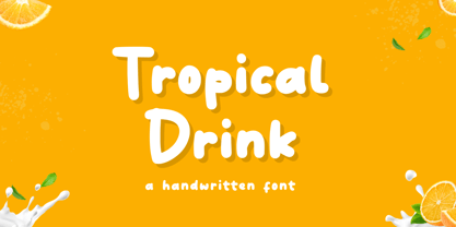 Tropical Drink – Handwritten Font is a fun display Font font, this font Is perfect for product packaging, product designs, label, photography, watermark, special events, or anything. Features: Uppercase and lowercase letters Multilingual, numerals, and punctuation Thank You!
 - Blue Creek by ActiveSphere,
$30.00 BlueCreek is a extra condensed geometric typeface, and works best in text and display applications, such as headline, posters, signage, magazine, print, product branding, corporate branding, logos and titles. Several alternate characters are included in this typeface.
 - FT Digital Kauno by Fenotype,
$19.95 Digital Kauno is a soft geometric script type. It is recommended for headlines and display use. Digital Kauno was originally designed in 2002 and it has now been redesigned with full character set and more distinctive letters.
 - Peas In A Pod by The Arborie,
$11.00 Peas In A Pod may be a cute font, but this type has a plethora of uses. Its use of thick and thin lines makes it a wonderful display font or an easy-to-read body font.
 - Ghostly Whispers by Seemly Fonts,
$12.00 A creepy and gloomy display typeface is called Ghostly Whispers. This typeface is perfect for use in stationary, logos, t-shirts, paper, print design, website headers, picture frames, flyers, album covers, posters, image sliders, and other items.
 - Funny munk by Sipanji21,
$15.00 Funny Munk - Cute and Thick display Font, Its friendly for design, kid store, seasonal party or banner, fitting a wide range of contexts. Add it to your creative ideas and notice how it makes them stand out!
 - Cute Lime by Sipanji21,
$10.00 Cute Lime is a bold and colorful display font. Its friendly feel makes this font incredibly versatile, fitting a wide range of contexts. Add it to your creative ideas and notice how it makes them stand out!
 - Aneska Kids by Ditatype,
$29.00 Aneska Kids is a display font. Made with a playful style, it brings a fun and chic typeface. Chalk Brush is best used for card, branding, logotype, and quotes. Features: - PUA Encoded - Multilingual Support - Numerals and Punctuation
 - Take Note by wearecolt,
$9.00 Take Note Craft Handwritten Display Introducing Take Note, a beautiful and playful handwritten font. Using ligatures and stylistic alternatives for a natural flow and feel. A cute handwritten font for logotype, blog heading or even Instagram quotes.
 - Summer Squash by Yoga Letter,
$15.00 "Summer Squash" is a display font with a floral pattern. This font is equipped with uppercase, lowercase, numerals, punctuation, and multilingual support. It is very suitable for summer, vacation, holidays, camping, natural moments, Father's Day, and others.
 - Keynsia by Greater Albion Typefounders,
$7.95 The Keynsia family revives the spirit of the 1950s. Its simple and elegant lines make for an eye-catching set of display faces. A range of different styles are on offer, all with an extensive character set.
 - Delphian by Monotype,
$29.99Designed by Robert Hunter Middleton in 1928, Delphian is one of Middleton's most handsome display typefaces. The Delphian face has many uses, from book titles to corporate identity material, where a modern, yet classic look is desired. - Think Big by Seemly Fonts,
$14.00 Think Big is a unique display font. Whether you’re using it for crafting, digital designing, presentations, or greeting card making, it’s perfect! Fall in love with its incredibly versatile style and use it to create spectacular designs!

