10,000 search results
(0.034 seconds)
- SoulMission - Unknown license

- Rickles - Personal use only

- Jonny Quest Classic - Unknown license

- Safrole - Unknown license

- Edhiron Asdhúriel v. 1.2 - Unknown license

- Addict - Unknown license

- PR8 London Ads - Unknown license

- Florimel™ - Unknown license

- Burdigala X Serif by Asgeir Pedersen,
$24.99 Burdigala X Serif is an open and spacious typeface inspired by the classic Didones. The X Serif is ideal for larger amounts of (printed) texts in brochures, magazines and books. Being wider than usual, it works especially well in media intended for on-screen reading, such as in Pdf-documents and e-books etc. Burdigala is the ancient Roman name of the city of Bordeaux France.
 - Planet Gamers by Sarid Ezra,
$17.00 Introducing, Planet Gamers, a serif logo font with unique ligatures! Planet Gamers is a serif based font with unique and carefully crafted ligatures that will make your logo stand out clean and modern. You can use this font for any purpose, especially to make logotype. This font is suitable for e-sport logo, game, or hi-tech company logo. This font also support multilingual.
 - Art Museum JNL by Jeff Levine,
$29.00 Art Museum JNL is yet another take on the classic Art Deco "solid letter" fonts that emulate the style of Futura Black. This version comes to you through the courtesy of a vintage WPA (Works Progress Administration) poster promoting national parks and Winter sports. Take note of the unusual inverted middle crossbar on the 'E' and 'F' as inspired by the poster's hand lettering.
 - Hellobello by Fargun Studio,
$12.00 Hellobello! is a marker font with regular, alternate, and swashes. Hellobello! characters are perfect for logos, name tags, handwritten quotes, product packaging, merchandise, social media, greeting cards and much more. Features Uppercase & lowercase Punctuation & numerals Multi-language characters Designed by Fargun Studio 2017 © Need help? If you need help or advice, please contact me by e-mail "fargunstudio@gmail.com" Thank you for your purchase!
 - Kiti Cuties by Dikas Studio,
$15.00 Hi, i want to introduce my newest font Kiti Cuties. Kiti Cuties is a playful sans serif font, Kiti Cuties is a allcaps font with 4 variations letter in lowercase e,h,o,u that makes your design looks more cheerfull. Kiti cuties is made to help you create a kids and fun theme design such as birthday card, baby shower card, greeting card and many more.
 - Bintaro by Rhd Studio,
$24.00 BINTARO is a clean and powerful serif font with a bold, rounded shape. It comes with two regular styles, and outline. BINTARO is a good choice for a variety of projects such as logos & branding, invitations, stationery, social media posts, clothing, advertising, product packaging, product design, labels, photography, watermarks, special events or whatever. WHAT IS INCLUDED: Multilingual support Alternatives A, B, E, F, P, R PUA Encoded
 - Schreibmeister by RMU,
$30.00 Schreibmeister is my interpretation of Arno Drescher’s design for Ludwig Wagner, Leipzig, completed in 1958. The letters X and x were improved as well as some ligatures. The letter E has an alternative, and the small d comes with two alternatives, of which one form can be reached by typing the partial different key. Generally it is recommended to activate both Standard and Discretionary ligatures.
 - Esencia by CastleType,
$59.00 Esencia, a CastleType original, was inspired by a Spanish stock certificate from 1941 with 11 beautiful art deco style letters for the words "PERFUMES y ESENCIAS". Slender, elegant, with a Spanish flare. Uppercase only with numerals and punctuation. Supports all European languages that use the Latin alphabet, as well as modern Greek and most languages that use the Cyrillic alphabet. Includes alternate E, F, and S.
 - Geonica by Struvictory.art,
$16.00 Geonica is minimalistic geometric sans serif font with different line width. Geonica is suitable for the design on the theme of architecture, game industry, minimalism ect. Geonica includes stylistic alternates for symbols: A, E, K, M, O, Q, T, V, W, g. There are also ligatures: AA, AJ, AM, LA, LM, MA, MM, OO, VV, fi, gg, gi, gj, oo, ri, rr, ti, vv, yy.
 - Cabarga Cursiva by ITC,
$29.00Cabarga Cursiva is the work of the father and son team of Demetrio E. Cabarga and Leslie Cabarga, both New York designers. The details of the sharp strokes almost give the impression of a knife blade, whether straight or curved like a scimitar. The capitals should be used only as initials and are complemented by a robust lower case alphabet as well as alternate forms and ligatures. - Retroyal by Mega Type,
$13.00 Retroyal is an sans serif typeface that boasts beautiful lines & minimalis style. With 7 weights plus matching italics. Simple geometry and with humanist nuance that adds warmth. t’s a perfect choice for branding, magazines, posters, advertising, packaging, headlines, logos, web, print etc. If you need help or have any questions, please contact me by e-mail "megatype04@gmail.com" I'm happy to help :) Thanks & Happy Designing!
 - Duffy’s Tavern NF by Nick's Fonts,
$10.00Originally presented as an alphabet suitable for movie title cards, this font is based on a 1920 work by showcard artist E. C. Matthews, and named after the eponymous 1940s radio show about a local saloon and its never-present owner. Both versions of this font contain the Unicode 1252 (Latin) and Unicode 1250 (Central European) character sets, with localization for Romanian and Moldovan. - Tme by bb-bureau,
$65.00 Tme, new lineal — Tme is an update of Sl (T = S + 1, m = l + 1 and e for natural logarithm), drawn in 2006 for the University of Arts Saint-Luc de Tournai. Its geometrical drawing is based on the directions of the hexagon, a scrupulously followed constraint which confers on some glyphs a very particular drawing. in light, regular and bold language: all latin glyphs
 - Paella by Wilton Foundry,
$29.00I finally designed this simplified brush style script after years of frustration trying to find a font that can fit a need for short descriptors especially for packaging design. While this script does not replace custom script, it comes close - it even includes the underscore as in the sample type. - Louise Walker by Sarid Ezra,
$15.00 Introducing, Louise Walker - Font Duo | Organic Serif & Script Louise Walker is perfect combination between serif with script font. Contain two fonts, the organic serif and a free handwritten signature script. This font duo also support multilingual, number and symbol, contextual alternates and many ligatures. Also this fonts already PUA Encoded.
 - MC Sero Aromad by Maulana Creative,
$14.00 Sero Aromad brush script font. This font is good for logo design, Social media, Movie Titles, Books Titles, a short text even a long text letter and good for your secondary text font with signature or script typeface. Make a stunning work with Sero Aromad brush script font. Cheers, Maulana Creative
 - Bridgera by Akrtype Studio,
$15.00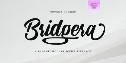 Bridgera script font is a magical script font carefully created with a touch of elegance. This is a beautiful combination of timeless elegance and authentic calligraphy. It features an incredibly classic style, while still keeping a friendly feel. Bridgera script font is the perfect font for making original and outstanding designs.
 - MC Megie Ceyal by Maulana Creative,
$14.00 Megie Ceyal bold script font. This font is good for logo design, Social media, Movie Titles, Books Titles, a short text even a long text letter and good for your secondary text font with signature or script typeface. Make a stunning work with Megie Ceyal bold script font. Cheers, Maulana Creative
 - Redoura by Letterhend,
$16.00 Redoura Font is a script typeface inspired by 70's font style and Script Sports font style which is absolutely awesome for logotype / wordmark, especially for sports theme logos. Redoura Script font includes upper & lowercase characters, punctuation, numerals, and multilingual support. It also has many open type alternates and ligatures.
 - Asterikats by Maulana Creative,
$11.00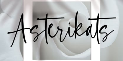 Asterikats Beauty Feminine Script Font is beautiful script made by love. Asterikats Beauty Feminine Script Font with natural handwriting touch is suitable for you who needs a typeface for Headline, Apparel, Invitation, Branding, Wedding, Logo Design, Lettering, Logotype, Clothing, Poster, Magazine and other design project. Thanks for use MaulanaCreative font.
 - Goldbrick by Sarid Ezra,
$15.00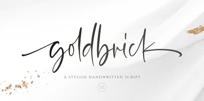 Goldbrick Script is a natural handwritten script that contains lowercase, uppercase, symbol, and also multi-lingual support. Comes with ligature, contextual alternates, stylistic alternates, also initial and terminal swash. Goldbrick Script is suitable for logo branding, beautiful fashion design, suitable for wedding invitation, or handwritten quote. It is already PUA Encoded.
 - HT Maison by Dharma Type,
$19.99 HT Mason is bold and hand painting font. This font is retrospective and decent, but it is also funny and cute. Holiday Type Project offers retro hand drawing scripts. Inspired by retro script on shopfront lettering, wall paint advertisements in Italy around 1950s. Check out the script fonts from Holiday Type!
 - Opkrop by Jipatype,
$25.00 Opkrom is Thai language mean Crispy or Crunchy. With informal sans serif style look like semi handwriting give feel friendly and warm . It support major Latin scripts and Thai scripts. It have stylistic set for Thai script. Opkrop is suited for headline on packaging, print ad and various graphic work.
 - Garash by Dharma Type,
$14.99 Very decorative script inspired by old lettering in Eastern Europe. Eye-catching for picture books, toys for children. There is another font which called Garash Script.
 - Rosie by AVP,
$29.00 Rosie is a chunky but elegant pen script with useful OpenType features. In non OpenType-savvy applications it still works beautifully as a fully joined script.
 - NataliScript by ParaType,
$30.00PT Natali Script™ was designed by Natalia Vasilyeva and licensed by ParaType in 2002. An original calligraphic script. For use in advertising and display typography. - Classyloop by Maulana Creative,
$13.00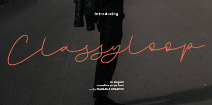 Classyloop Elegant Monoline Script Font Give your designs an authentic handcrafted feel. "Classyloop Elegant Monoline Script Font" is perfectly suited to stationery, logos and much more.
 - YD Winter by Yoon Design,
$400.00YD Winter is a casual script typeface consisting of 3 weights. It supports up to 13 different languages such as English in Latin and other scripts. - Bodoni Classic Free Style by Wiescher Design,
$39.50 Bodoni Classic Free Style is my really fat, high contrast free flowing, liberated designed, script-like non-script extension to my ever expanding Bodoni Classic family.
 - Sickle by Eclectotype,
$20.00 The Wild West meets Russia and India in this heavy duty display face. Although it's uppercase only, most of the characters vary between the uppercase and lowercase alphabets, so it's easy to give your text a hand-made feel by mixing up your cases. OpenType savvy applications can really exploit the extra features of this font. Engage contextual alternates, and G, C, L and alternate form of E will change when placed before a letter with a crossbar to create some cool effects (see the CK and LE combinations in the poster). There are standard ligatures for ff and FF combinations, and discretionary ligatures for 'and', 'the', 'No', 'Mc' and 'Co'. Engage stylistic alternates for a reversed 3 version of E, and the obligatory backwards R for that faux-Russian effect. Also included in the font is a host of ornaments. This font is perfect for wanted posters, heavy metal band logos, Communist propaganda leaflets and no doubt a load of other things too.
 - Absentia Slab by DR Fonts,
$19.00 Conceived as a slab serif companion to the Absentia Sans family, this typeface complements its sibling with charisma and style. Built on the same geometric framework, they combine and harmonize gracefully. Yet Absentia Slab stands on its own as a novel alternative to conventional options. Anchored by blocky serifs, it presents an appearance of stability and steadiness. Its audacious design integrates unique features such as vertical terminals in glyphs ‘a’, ‘e’ and ‘6’. To make optimal use of available space, one-sided serifs (and in some cases, simple strokes without any serifs) help maintain an airy, uncluttered footprint as seen in letters ‘m’, ‘E’ and ‘N’. This forward-looking typeface is well suited for a variety of projects: understated yet spirited, technical yet welcoming. It has a modernist appeal, while reminiscent of XIXth Century woodblock lettering. Designed by Daniel Robichaud, Absentia Slab is available in ten weights with matching italics and two variable fonts.
 - Worthington Arcade by Device,
$39.00 Worthington Arcade is a classically-proportioned capitals-only type incorporating a selection of ligatures and alternates. It loosely resembles the hand-painted architectural lettering of the 30s to the 50s, exemplified by the likes of Percy Smith’s interior signage for the BBC or George Mansell’s lettering for the University of London and the signs found on London’s bridges. However, rather than a slavish copy of any historical model, it is more an examination and evocation of certain idiosyncratic quirks of civic lettering of the period, and an attempt to create a peculiarly English titling typeface. The round letters, for example the O, Q and C, are wider than the perfect circle usually found in such designs, while the straight-sided characters, usually drawn on a square, are narrower. This lends the whole a subtle elegance that is also emphasized by the raised crossbars on the H, E and F and extended lower leg of the E. Includes old-style numerals.


