7,873 search results
(0.034 seconds)
- MVB Fantabular Sans by MVB,
$39.00MVB Fantabular proves that monospaced faces needn’t be formal or bland. Inspired by the letterforms of older typewriters, Akemi Aoki designed a playful family of three weights with italics. With every character the same width MVB Fantabular works wherever a monospaced font is needed, but the face is so loose and carefree it hides its fixed pitch construction well, allowing it to be used in other settings too. MVB Fantabular Sans is the sans serif version of MVB Fantabular. - Hip Pop NF by Nick's Fonts,
$10.00Type designer Friedrich Poppl is perhaps best known for his classic text faces and elegant scripts, but it seems he had a playful side as well. This frisky face is based on Dynamische Antiqua, which Poppl did for the Stempel foundry in 1960, but which was never released. Bright, bold and bouncy, it’s the perfect choice for headlines with impish impact. Both versions of this font include the complete Unicode Latin 1252 and Central European 1250 character sets. - French Stencil Serif JNL by Jeff Levine,
$29.00 Spotted for sale online, a partial set of antique tin stencils from France had a distinctively handmade look about them. Many of the characters were inconsistently wider than others, some characters were missing and one was damaged. Despite the obvious flaws, the image of these stencils served as the model for a digital font revival once the characters took on a more uniform appearance. French Stencil Serif JNL is available in both regular and oblique versions.
 - Maisee by AVP,
$29.00Maisee is a smiling sans serif face for many occasions and has proved itself in art catalogues, wine lists, websites and many other situations. Full of retro influences, it sits elegantly on today's page or screen. A useful modern font which doesn't sacrifice form and charm for space, Maisee is characterised by a generous x-height and a roundness of form based on gentle spirals. Numerals and math characters are tabular from ExtraLight through to SemiBold. - Carte Blanche by Hanoded,
$20.00 Carte Blanche literally means 'Blank Ticket'. Yeah, yeah, it is also a very 007-ish catchphrase, but I wanted to give this elegant font a 'stylish' name and Carte Blanche popped up. All glyphs were hand drawn on a rather expensive piece of heavy-weight paper and were put into the font in between changing nappies, bouts of the flu and the subsequent wiping of snotty noses. Carte Blanche speaks most Roman-based languages - albeit nasally…
 - Kanyon by Hurufatfont,
$19.00 Kanyon is a family of typefaces created from basic geometric forms based on the equal width system. Its clean and neutral structure and 3 different widths provide ease of use in different design channels. With its rich OpenType features, multi-language support and small capital characters, it has a wider usage area than its counterparts. Ideal for packaging, labels, routing designs, mobile applications, brand designs, logos, all kinds of presentation and editorial designs, indoor and outdoor printing works.
 - Snow Job JNL by Jeff Levine,
$29.00 Snow Job JNL was inspired by the hand lettered titles for the 1964 Rankin-Bass animated holiday classic "Rudolph the Red Nosed Reindeer". Because of the variable heights of the characters they float about the baseline in a free-form design. Available in both regular and oblique versions, the typeface gets its name from both the winter theme of the TV special along with the old term for deceiving someone with compliments while hiding one's true intent.
 - Chicle Pro by Sudtipos,
$19.00 In a much needed break from complex scripts and polished packaging fonts, Koziupa and Paul decide to show their playful side. Chicle is bold, stretchable, kid-proof, pet-resistant letters. This font is made to take the abuse of software used to put together the elaborate, attention-scrambling artwork of candy, cereal, and toy packaging, or whatever boxed obscenity contains cat and dog treats. Chicle is Spanish for bubble gum. It's a definite sugar fix — no substitutes.
 - DEATHE MAACH by The Fontry,
$15.00 There's a war starting; you just didn't notice because you were too busy fighting to realize what was happening. Take your sides. Pick your battles. Choose a face that stands ready to defend, enforce and police. All who are ready to serve, please step forward. Deathe Maach is a six-font family of descending weights with the strength and stamina to face all comers in the approaching conflict. Armor on. Pistols out. Barrels forward. Enforce and serve.
 - Original Surfer Pro by Stiggy & Sands,
$29.00 Our Original Surfer Pro is an offbeat sans serif font bursting at the seams with lively personality. Inspired by a vintage advertisement for the "California Cliffs Caravan Park", this font exudes all of the fun of a summer vacation anytime of the year. The letterforms are clear and cleanly legible, while nothing is formal or uptight about this font. The SmallCaps and extensive figure sets offer Original Surfer Pro an even wider range of design options.
 - Neumonopolar by Owl king project,
$39.00 Neumonopolar is designed a little more smoothly, with perfectly curved edges, in this version the Neumonopolar looks more relaxed in shape and even more beautiful if rearranged in short paragraphs. Neumonopolar is still designed in a mono font style, with 20 styles including italics. Neumonopolar in addition to text headers, also works well for body text. Hopefully, Neumonopolar further complements the style and provides a wider exploration of fonts with a futuristic style. Enjoy Happy designing __
 - Matogrosso Script by Sudtipos,
$59.00 Matogrosso is another rough script from Argentine calligraphy team Koziupa and Paul. With its expressive urge at the importance of discovery, it is ideal to use on wine labels or organic food packaging, stationery and old maps. It also makes a great choice for designs relating to outdoor activities and rugged travel, where the concept of the wild is to be accentuated. Matogrosso's OpenType programming combines several alternate lowercase characters to generate perfectly fit and more natural textures.
 - Antea by Wiescher Design,
$39.50 Antea is named after "Antaeus" the giant of Libya in Greek mythology, son of Poseidon and Gaia (mother earth), whose wife was Tinjis. He was extremely strong if he stayed in contact with the earth, but once lifted into the air he became weak and liquid. So is this font, strong if grounded and weak if floating in the air. I will in due course add different weights for different purposes. Your designer of very mysterious fonts, Gert Wiescher
 - Config by Adam Ladd,
$25.00 Config was influenced by geometric sans with circular forms but the proportions have been condensed by incorporating straight sides for a design that is sturdy and efficient yet friendly. The neutral design with subtle details makes it functional for type setting in small and large sizes. Its clean nature makes it readable at small sizes but the touch of character—as seen in the notched joints, rounded details, and horizontal/vertical terminals—make it interesting at large sizes.
 - Kiddo by EPtackArts,
$3.00 Kiddo is a whimsical, handwritten font family created for use along side children's media. It pairs nicely with Monterrat and other neat, rounded sans serif fonts. It looks great with brightly colored, soft illustrations to create lively layouts full of movement. The characters are simple and easy to read as to not compete with the semi-inconsistent baselines and stroke weights. The line variations add a lot of character to the typeface that really compliments a good story.
 - Belgia by HansCo,
$15.00 Here come our latest product with sans serif typeface called Belgia. This font has the characteristics of a rounded shape on each side. Besides this font is perfect for those of you who are looking for font with bold and rounded but still look classy. You can use it on corporate branding, logo, document, social media design, presentation, print design, web, etc. This typeface is comes in uppercase, lowercase, punctuation, symbols, numerals, etc also support multilingual.
 - Vinice by Illuminaut Designs,
$15.00 This typeface was created as a personal project. Inspired by places like Chattanooga and Berkley, I wanted to create a bespoke typeface family for the US Virgin Islands. I noticed that the typeface Berlin Sans was in use all over the islands, in signs, logos, even on the side of police cars. So I built this typeface from the ground up with the goal of updating an old tried-and-true font into a family with versatile potential.
 - Aloha Brush by Nirmana Visual,
$22.00 Aloha Brush This font is a supercharged, street-wise brush font bursting with energy. With extra feel as a real brush would! Letters are made with brushes on paper. Then scanned and carefully drawn into vector format. Thas 2 styles of regular and italic variations with a more natural look to your text. Aloha Brush is very suitable for use in various media such as; packaging, logos, labels, posters, shirt designs, bulletins, typography, and many other media.
 - Kento by Graphicfresh,
$18.00 This time we present a font with a bit of a classic touch. The font is slightly stretched to the sides. The font is simple and luxurious, so it leaves a deep memory impression when used on a brand. Simple and powerful. This is an overview of the font as a whole. Kento will be perfect for many projects: fashion, magazines, logos, branding, photography, invitations, wedding invitation, quotes, blog headers, posters, advertisements, postcards, books, websites, etc.
 - Doubledecker by Hanoded,
$15.00 I love riding English double decker buses! I haven’t been on one lately, but for some reason I had an image of a red double decker bus in my head when I made this font. Doubledecker is a bold, cartoon-like, handmade font. It comes in regular and dots, plus a bonus doodle font called Doubledecker Stuff. Use it for any design that needs a tad of loud, a pinch of unusual and a wee bit of polka.
 - Rose Malow by Attype Studio,
$15.00 Introducing Rose Malow, a Modern Script Font. Rose Malow is a lovely font: it is perfect for branding, logos, invitations, stationery, wedding designs, social media posts, handwritten quotes, product packaging, merchandise, blog design, Book/Cover Title and more. What's Included : - Rose Malow (.otf/.ttf) - Multilingual Support - More than 50 ligatures - Works on PC & Mac - Simple installations - Accessible in the Adobe Illustrator, Adobe Photoshop, Adobe InDesign Thank you for your purchase! Hope you enjoy with our font!
 - Empire Display by Bean & Morris,
$27.50 Empire Display is a sans serif italic display face which references the styling of the 30s through to the 50s. It has a large x height and with its condensed proportions makes it ideal for headlines, posters or where large size settings are required. It has the unique feature of having the stems and cross bars slightly angled top and bottom. This also helps to create the art deco/modern feel that sets it apart from standard condensed typefaces.
 - Retro Packaging JNL by Jeff Levine,
$29.00 A vintage rubber stamp alphabet and star printing set had a package header with Art Deco-inspired lettering describing the product. Sold by a company called Elvin [circa late 50's-early 1960s], these Japanese-made sets were one of many distributed by independent toy importers and made in various configurations including [at times] tiny animal stamps. The type design on this particular item was the model for Retro Packaging JNL, available in both regular and oblique versions.
 - Ashford by Fenotype,
$20.00 Ashford is a bold serif type and its matching Italic. Ashford packs plenty of timeless charm and elegance. As a display style it works best in headlines, posters and as a logotype. Ashford conveys a message of style and inner knowledge. Ashford is equipped with several OpenType features: Keep Standard Ligatures and Contextual Alternates on to prevent certain characters from colliding and spice up with Swash, Stylistic or Titling Alternates. Both styles come with more than 50 alternate characters.
 - Kalli Sketch by Posterizer KG,
$19.00 Basicly, Kalli Sketch is humanistic cursive drawn with pen. Inside the font you'll find a host of Opentype features, alternate characters, including a full set of alternate ampersand characters (stylistic alternates), standard ligatures that automatically connect as you type and discretionary ligatures. Also, font contains basic and alternative Cyrillic characters, and more than 50 floral ornaments. Because of lightness and transparency, Kalli Sketch is looking good in combination with serif and sans serif (particularly bold) fonts.
 - Alfrere Sans by Greater Albion Typefounders,
$12.50 Alfrere Sans is a clean Sans Serif display family inspired by a well-known 1950s television caption. The family of seven faces have been designed for independent use, but they also have an extra feature. All faces have identical metrics and can be overlaid with each other, to yield an unending range of multi-colored lettering effects. Bring a touch of the 50's to your next poster design. Better yet, explore the world of multi-colored overlaid typefaces....
 - MC Krague by Maulana Creative,
$17.00 Krague is a a 50's revival sans serif font. Bold stroke, fun character with a bit of ligatures and alternates. To give you an extra creative work. Krague font support multilingual more than 100+ language. This font is good for logo design, Social media, Movie Titles, Books Titles, a short text even a long text letter and good for your secondary text font with script or serif. Make a stunning work with Krague font. Cheers, Maulana Creative
 - Kooja Luigh by madeDeduk,
$10.00 Kooja Luigh is a simple casual handwritten font. Kooja Luigh font includes more than 50 ligatures to make everything look natural handmade handwritten. This font perfect for poster design, book covers, merchandise, fashion campaigns, newsletters, branding, advertising, magazines, greeting cards, album covers, and quote designs and more. Feature Uppercase & Lowercase Number & Symbol International Glyphs Multilingual support Ligature Feel free to drop us a message any time and follow my shop for upcoming updates Hope you enjoy it.
 - Rockport BF by Bomparte's Fonts,
$39.00 The roots of Rockport BF run deep. 19th century woodtypes, display gothics of the 40s and 50s, are inspiration for this distinctive font style. Its OpenType programming features automatic fractions, stylistic sets and alternates for a, b, q, r, t, u, y, M, N, U, Y, and dollar symbol. Tempered by somewhat humanistic elements, these condensed, geometrically-structured letterforms bring a strong but friendly presence to posters, logos, bookjackets, signage headlines, and many other typographic environments.
 - MC Calpita by Maulana Creative,
$13.00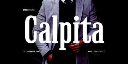 Calpita is a classic inspired by historical 50s serif font. Bold stroke, fun character with a bit of ligatures and alternates. To give you an extra creative work. Calpita font support multilingual more than 100+ language. This font is good for logo design, Social media, Movie Titles, Books Titles, a short text even a long text letter and good for your secondary text font with script or serif. Make a stunning work with Calpita font. Cheers, Maulana Creative
 - LTC Goudy Extras by Lanston Type Co.,
$24.95 A set of over 50 ornaments, connecting borders, flourishes and decorative motifs originally designed by Frederic Goudy throughout his career. Many of these designs were used by Goudy at his Village Press and offered by his Village Foundry in the 1920s. The styles range from complex title page illustrations to simple linking borders, but all have the unique Goudy style. This set is completely different from the Goudy Ornaments found in the P22 Goudy Aries Set.
 - Ultra Brush by Garisman Studio,
$15.00 Ultra Brush was born from the interest of the maker of display fonts that are currently present. By using a natural dry brush, Ultra Brush was born to meet the needs of designers to make posters, tshirt, quotes, branding, packaging, logos, advertise, and etc. What will you get? - Support 20 languages and Multilanguage - More +50 swash styles - Simple Installation - Ligature Support We hope you can experiment and explore with Ultra Brush. Thank you very much for visiting
 - Bianca by Laura Worthington,
$25.00 Bianca is a semi-connected script whose slim strokes, gently curving verticals, and big, beautiful capitals convey a fashionable, feminine style. Customize with over 50 alternate glyphs to add variation to your design. See what’s included! http://bit.ly/2cdTMIe *NOTE* Basic versions DO NOT include swashes, alternates or ornaments This font has been specially coded for access of all the swashes, alternates and ornaments without the need for professional design software! Info and instructions here: http://lauraworthingtontype.com/faqs/
 - Virtuosa Classic by Linotype,
$29.99 Virtuosa Classicis the 21st century OpenType re-release of a classic Hermann Zapf design, his very first script typeface, Virtuosa. Based on the same sketches that would inspire Zapfino 50 years later, Hermann Zapf developed Virtuosa in 1948-49. It was originally released in metal in 1952. Virtuosa nova is an English copperplate script with character. The font includes two form variants for each capital letter, and there are a number of lowercase alternates and ligatures, too.
 - Phaserwave by Mysterylab,
$22.00 Part of the wave of modern explorations expanding on the 50+ year-old traditions of groovy psychedelic typography, Mysterylab brings you Phaserwave. With an intriguing fusion of pillowy shapes and sharp stroke ends, this font cooks up a heady mélange of whimsical flow and high precision. We've applied our usual meticulous attention to great kerning, extensive character set, and seamless functionality, so this font's ready to rock your designs any way you might want to do it.
 - Sweet Girls by Haksen,
$12.00 Hello all, I will introduce my new font with the name “Sweet Girls” “Sweet Girls” is the form of letters that many variation and look very beautiful. available over than 50 glyphs for alternative letters that will make this font look so cute, funny, beautiful and fascinating. What's Included : Sweet Girls OTF Sweet Girls Slant OTF Sweet Girls Icons OTF Thanks so much for checking out my shop! Hope You enjoy it so much All the best, Haksen
 - Martin Luther by Harald Geisler,
$59.00 ❧ Useful links: Luther’s Manuscripts at the UNESCO Memory of the World at Google Arts and Culture Martin Luther font on Kickstarter (with Film about the creation) Each letter of the Martin Luther font is strictly based on original samples found in Martin Luther’s 500 year old handwritten manuscripts. Letters that occur more often for example vowels have two or more different versions stored in the font. (➶ Figure 4) These alternative forms are exchanged automatically by the font as you type, and create a vivid look that comes close to actual handwriting. The font avoids that two identical letters are placed next to each other like, for example the two “o” in the word “look”. ➸ What Historic Sources is the Font based on? Two historic documents were used to base the font on. The notes Luther took before giving his speech in Worms in 1521 and a 6 page letter he wrote immediately after to Emperor Charles V., summarising his speech (➶ Figure 2). Both documents have been added to the UNESCO “Memory of the World” and can be seen at the Google Arts and Culture website. ➸ The Creation of a Handwriting Font The creation of a handwriting font is very different from the creation of a regular font. Harald Geisler has specialised in recreating handwriting in preceding projects with Albert Einstein’s, Sigmund Freud’s and his own handwriting. His experience working with Archives and Museums has gone into this project. First Geisler analyses the movement in the writing to understand how each letter is drawn. This involves partially learning how to write like a person. In this process not the outlines of the sample are reproduced but the original movement path of the handwriting (➶ Figure 3). In a second step width and contrast is added to reproduce Martin Luther’s characteristic impetus and the writing tools used at the time. (Link: Youtube Playlist showcasing the creation of individual letters) How about signs that can’t be found in archives? Some Glyphs can not be found in 500 year old manuscripts, for example the @-sign. Towards the end of the creation one collects a profund amount of details about how a writer moves on paper and addresses certain tasks moving the pen. Keeping this knowledge in mind an improvisation can be based on similar letter forms. For example the @ sign is based on of the movement of a lowercase a and parenthesis. ➸ Features of the Martin Luther font ❶ Extensive Documentation of the creation of the font, including high quality reproduction of the used manuscripts. ❷ Additional texts from Historian Dr. Henning Jürgens and Palaeographer (and Luther handwriting expert) Prof. Ulrich Bubenheimer ❸ Alternating Letters - in handwriting every word looks a bit different. To avoid that two identical letterforms are placed next to each other (for example in the word look) the font actively changes between different versions of letters as you type. ❹ Ligatures - characteristic writing forms when two letters are combined (for example “ct”) (➶ Figure 5) ❺ Terminal Letterforms - renders a special letterform when letter is at the end of a word. (➶ Figure 8) ❻ ‘’’Initial and Medial Letterforms''' - some letterforms are different when placed in the beginning or middle of a word, for example the lowercase s. ❼ Luther Rose - is a seal Luther used to authorise his correspondence. Today it is a widely recognized symbol for Luther. When you enter the numbers of Luthers year of birth and death 14831546 using the Martin Luther PRO font, it will render a stylised version of the Luther Rose. (➶ Figure 7) ❽ Historic letter-forms - letter-forms that are specific to medieval writing around 1500. For example the long-s or h with a loop at the bottom. (➶ Figure 6) ⚑ Multi language support - see the technical information tab for a full list of supported languages. (➶ Figure 11) ➸ The different Styles explained ❋ Martin Luther PRO - this includes all features listed above and is geared towards writing texts that are more readable today. It features alternating letters to create a natural handwriting look as well as two stylistic sets accessible through the OpenType menu. Historic forms are available through the glyph picker. ❋ Martin Luther Historic - this font creates a historically correct reproduction (i.e. with long-s) of Luther’s medieval latin handwriting. It features alternating letters to create a natural handwriting look as well as two stylistic sets accessible through the OpenType menu. ❋ Martin Luther Expert-1 - Dedicated access to the first set of letters only. ❋ Martin Luther Expert-2 - Dedicated access to the second set of letters only. ❈❈❈ Family Pack - recieve all fonts at a discounted price. ❈❈❈ ➸ Kickstarter The creation and development of the Martin Luther font was financed by 500 supporters on ➸Kickstarter.
 - Adelphi PE by Rosetta,
$70.00 Adelphi is a geometric sans, redefined for the northern side of the English Channel. Typographic modernism was a late arrival in Britain — due partly to the Second World War and to the strong local type tradition. This delay provided for fruitful divergence, thus modernism was not adored in quite the same way as it had been in Germany and central Europe. It was instead rethought and repurposed against the backdrop of the bleak British weather and postwar social reform – a continental fashion statement reshaped into a more humanist variant. Likewise, when crafting Adelphi, Nick Job reimagined the constraints that defined the geometric sans as a genre. Whereas other typefaces seem overly bound by the rules, Adelphi feels relaxed and approachable. Elementary square and circular shapes are merely implied. A keen observer may notice that the uncomplicated letterforms occasionally reveal a subtle naïveté associated with early Grotesques. Brunel’s bridges and Harry Beck’s tube map spring to mind alongside the Bauhaus and Futura. But Adelphi is by no means nostalgic! It is a contemporary, comprehensive, and durable system with a pragmatic set of features. These include a wide array of weights, ‘uniwidth italics’, and variable extenders that go from tall and flat in Adelphi Text to short and sharp in Adelphi Display, with default Adelphi standing midway between these two extremes. You can set the extenders to your preference in the all-inclusive variable font or use one of the three static fonts that come packed together, priced as a single font. The pan-European support for Latin, Cyrillic and Greek scripts already makes for a vast character set, but Adelphi takes things a step further by including alternate glyphs to satisfy the DIN1450 legibility norm, a range of ordinals that can be used to create specialist compositions in all three scripts and two kinds of fractions and arrows. Play with the alternates or use it as-is. Either way, this understated beauty will carry you through.
 - Laurentian by Monotype,
$29.99 Maclean's is a weekly Canadian newsmagazine with a broad editorial mission. A typical issue covers everything from violence on the other side of the globe to the largest pumpkin grown in a local county. In 2001, Maclean's invited Rod McDonald to become part of the design team to renovate" the 96-year-old publication. The magazine wanted to offer its readers a typographic voice that was professional, clean, and easy to read. Above all, the typeface had to be able to speak about the hundreds of unrelated subjects addressed in each issue while remaining believable and uncontrived. A tall order, perhaps? Now add in that this would be the first text typeface ever commissioned by a Canadian magazine. McDonald, who some have called Canada's unofficial "typographer laureate," took on the challenge. McDonald used two historic models as the basis for Laurentian's design: the work of French type designer Claude Garamond, and that of the English printer and type founder, William Caslon. From Garamond Laurentian acquired its humanist axis, crisp serifs and terminals that mimic pen strokes. Caslon's letters are less humanistic, with a more marked contrast in stroke weight and serifs that appear constructed rather than drawn. These traits also made their mark on Laurentian. Using these two designs as a foundation, McDonald drew Laurentian with the narrow text columns and small type sizes of magazine composition in mind. He gave his letters strong vertical strokes and sturdy serifs, a robust x-height and a slightly compressed character width A tall order, per McDonald's genius is evident in the face's legibility, quiet liveliness and in the openness of the letters. The result is a typeface that not only met Maclean's demanding design brief, but also provides exceptional service in a wide variety of other applications. Laurentian is available in three weights of Regular, Semi Bold and Bold, with complementary italics for the Regular and Semi Bold, and a suite of titling caps."
 - FS Albert by Fontsmith,
$80.00 The x factor How do you make a font like FS Albert unique, distinctive? “When designing a font I try to question every letter,” says Jason Smith, “but all you need is a few that have an x factor. With FS Albert, they’re the lowercase ‘a’ and ‘g’ and the uppercase ‘I’ and ‘J’. “I remember a friend saying, ‘Why on earth have you designed the ‘a’ like that? Isn’t it too friendly for this kind of font?’ And, in a way, that’s what I wanted – honesty and warmth, because a lot of big brands at the time really needed to show a more human side.” Range of weights and styles FS Albert is a charismatic type: a warm, friendly sans serif face with a big personality. Open, strong and amenable, and available in a wide range of weights and styles, FS Albert suits almost every task you put it to. Fontsmith has crafted five finely-tuned upright Roman weights and four italic weights, as well as a special Narrow version to provide the best coverage and give headlines and text an easy-going character. The chunky kid “FS Albert was inspired by – and named after – my son, who was a bit of a chunky kid,” says Jason Smith. “I designed an extra bold weight because I always felt that the really big font heavy weights had the most personality. “I recently told Albert this story. He laughed, and forgave me for thinking he was a fat baby. He liked the big personality bit, though.” 1000s of glyphs Not content with a character set that covered Europe and the whole of the Western world, the studio decided to go further afield. There are now FS Albert character sets that cover western and eastern European languages, including those of Russia, as well as Cyrillic, Arabic and Greek scripts. In fact, the font now covers more than 100 languages, making it ideal for bringing a consistent typographic style to the communications of global brands.