656 search results
(0.026 seconds)
- BLT Heirloom by Black Lab Type,
$19.00 Heirloom grew from an interest of soft and friendly forms from the 1970s, with respect to the time's chill vibes and natural earthy roots. Its refined approachable characteristics allow it to be very readable carry a modern relaxed attitude. Available in 3 weights: Light, Regular and Bold. Any weight can be used as a display type, logotype and/or headlines, and lighter weights would work in bodies of text. The font pairs well with natural, historical or vintage graphic elements.
 - Q-bo - Personal use only

- Creative Thinking by Java Pep,
$17.00 Proudly present a new font that fresh from the oven Creative Thinking font, an elegant font family that has 4 weight styles regular, italic, bold, and bold-italic. It's so perfect to combining and mixing the weight styles to make outstanding and beautiful design project. Don't worry this font already with multilingual support more than 30 languages.
 - Waikiki Doodles by Outside the Line,
$19.00 Take a little trip to the land of sun and sand with Waikiki Doodles. 30 resort drawings that can be used for Waikiki and other warm weather destinations. From generic tourist icons like palm trees and a camera to the specific like Diamond Head and hula dancer. 29 drawings and the word Aloha lettered in script.
 - Day Tripper NF by Nick's Fonts,
$10.00An undeniably Art Deco font with some unexpected twists and turns, this typeface is based on a design originally called "Dignity Roman", a product of the fevered imagination of the rather unconventional 30s lettering artist Alphonse E. Tripp. Both versions of the font include the 1252 Latin and 1250 CE character sets (with localization for Romanian and Moldovan). - Zenia by Greater Albion Typefounders,
$9.50 Zenia, offered in regular and bold weights is a homage to the streamline era of the later 1930s. It's a distinctive display family, glyphic yet still intuitive and easy to read. Use it anywhere you want that 30's streamlined feel, or perhaps in science fiction inspired work particularly those that have a 'past inspired future' feel...
 - Gexo Sans by Java Pep,
$19.00 Proudly present newest elegant sans serif font, Gexo Sans font is the family font that has 5 weights and 5 italics. Gexo Sans designed for elegant and outstanding purposes for your project. This font is perfect for logotype, advertising poster, title, headline, publishing, text font, and etc. Gexo Sans is supporting multilingual more than 30 languages.
 - Netra by Sign Studio,
$15.00 Netra Slab is a minimalist and modern font. Having 9 thicknesses from Thin to Black will provide an easy choice as needed. With 390+ characters it can support more than 30 languages. If you want typography that looks smooth then choose the Rounded version. This font is suitable for writing general text, titles, even for brand logos.
 - Coluna by Dominik Krotscheck,
$12.00 Coluna is a friendly, handdrawn all caps font. Due to its playful, organic shapes it makes you think of cocktails on the beach and the earthy smell of the woods in the morning. It offers vast support for languages using the latin alphabet and comes with a couple of icons to make it even easier to complete the handmade look of your designs. Coluna is perfectly all sort of different use cases, such as birthday cards, packaging, children's books, branding, posters, menus and many more.
 - Samsheriff by Ingrimayne Type,
$5.00 Samsheriff is a large sans-serif family with a touch of quirkiness. It contains an eclectic mix of letter styles but is very legible. The origin of this typeface was in the caps-only letters used for the novelty font Coffinated. Adding lower-case letters, additional widths, additional weights, and italics resulted in the 30 styles that make up the Samsheriff family.
 - Vinea by Greater Albion Typefounders,
$12.00 Vinea is a family of ten display faces that take us on an enjoyable excursion into the world of the retro-futuristic. Ideal for posters, book covers, and anything that needs the sort of futuristic feel that abounded in designs from the 30s to the fifties. The en faces have been designed with uniform metrics, to facilitate multi-coloured overlay effects.
 - Arial by Monotype,
$45.99 Arial is one of the most widely used designs of the last 30 years. Drawn in 1982 by Robin Nicholas and Patricia Saunders for use in an early IBM® laser printer, Arial has become a staple for textual content. While it is widely believed that Arial's design was based on Helvetica, it is more accurate to consider Monotype Grotesque as its ancestor.
 - Jazz by ITC,
$29.00Jazz font is the work of British designer Alan Meeks and brilliantly captures the sophisticated elegance of the 1920s and 30s. The bold roman style is enhanced with an interior design almost like a piano keyboard or the lit windows of a skyscraper. Jazz font is a good choice for any headline or display which should have a refined, Art Deco look. - Cursive Signa Script by Pedro Teixeira,
$8.00 One of the rare, huge script, true cursive and signature family. It has 30 styles, that range between weight and slant, and with alternates. It can be use in a lot of projects, like logos, end of a statement, pairing with a beautiful sans serif like Aleante, in a title, invites and so on. Check how it work: https://youtu.be/HinnXZo5tzw
 - Friday Jeans by PizzaDude.dk,
$19.00 Got a favourite pair of jeans? I do, and I wear them every Friday when it's time to PAAAARTYYYY! Well, that was 30-something years ago, but the memory of those jeans lives happily in my mind :) The font, Friday Jeans is a happy-go-lucky sans font with inky edges and lively lines. Playful as a Friday night out!
 - Rogue Sans Nova by Device,
$39.00 Originally commissioned by magazine publisher IPC, Rogue has proved to be one of the most popular Device releases. Now extended and updated as Rogue Nova, it sports additional weights, East European language support and reengineered spacing and kerning. It is now a versatile 30-font family, with five weights and three widths, all with italics. Powerful and authoritative, sharp-edged and contemporary.
 - Casual Friday JNL by Jeff Levine,
$29.00An old rubber stamp printing set called the Aristocrat Sign Marker was the inspiration for this font from Jeff Levine. The letter shapes are truly reminiscent of the 1920s and early 30s with their casual playfulness, hence the font's name of Casual Friday JNL. To add a more nostalgic touch, the characters show slight imperfection of shape, as if hand-lettered. - Hat Doodles by Outside the Line,
$19.00 Hat Doodles… from silly to sophisticated, a collection of 30 women’s hats. From a Summer Garden Party to the Kentucky Derby there is a hat for all occasions. Hat Doodles is another clip art doodle font in the Outside the Line picture font collection. Also take a peek at Diva Doodles for more women’s fashions in the same casual style.
 - Caslon1821 by Apostrof,
$50.00 Caslon1821 is a revived "Italian" typeface of foundry Caslon & Livermore, 1821. The typeface quickly extended across Europe and America. It came to Russia and became very popular from France in the 30s of the XIX century. It's Cyrillic versions were offered by typefoundries of Revillion and Co., Pluchard, Semen, etc. In our version we also added support for Hebrew (with vowels).
 - London Bridge by Fype Co,
$23.00 London Bridge is a Modern Sans Serif with a clean and geometric touch. It comes in 7 weights. Each weight includes extended language support, fractions, ordinal, superscript, and more than 30 ligatures. Designed with powerful OpenType features in mind it perfectly suited for graphic design and any display use. London Bridge is a fine balance of functionality and contemporary characteristics.
 - Deco Metro by Greater Albion Typefounders,
$20.00 Deco Metro is a 1920s and 30s inspired display family, ideal for posters, banners, book covers and other promotional work. Two weights, regular (with an incised centre line) and bold (without the centre line) are offered. The family has an extensive range of features including discretionary ligatures, old-style numerals, Swash Letter and numeral forms, small capitals, Roman numerals and fractions.
 - Trade Gothic by Linotype,
$42.99 The first cuts of Trade Gothic were designed by Jackson Burke in 1948. He continued to work on further weights and styles until 1960 while he was director of type development for Mergenthaler-Linotype in the USA. Trade Gothic does not display as much unifying family structure as other popular sans serif font families, but this dissonance adds a bit of earthy naturalism to its appeal. Trade Gothic is often seen in advertising and multimedia in combination with roman text fonts, and the condensed versions are popular in the newspaper industry for headlines.
 - Trade Gothic Paneuropean by Linotype,
$42.99The first cuts of Trade Gothic were designed by Jackson Burke in 1948. He continued to work on further weights and styles until 1960 while he was director of type development for Mergenthaler-Linotype in the USA. Trade Gothic does not display as much unifying family structure as other popular sans serif font families, but this dissonance adds a bit of earthy naturalism to its appeal. Trade Gothic is often seen in advertising and multimedia in combination with roman text fonts, and the condensed versions are popular in the newspaper industry for headlines. - Linotype Devanagari by Monotype,
$103.99 The new Linotype® Devanagari typeface is a traditional text face now available in five weights (from Light to Black) and suitable for a wide variety of print and digital uses. A compact design, Linotype Devanagari also provides economy of space where textual real estate is at a premium. In addition, its large character set enables the setting of Hindi, Marathi, Nepali and is suitable for Sanskrit passages. The design’s open counters ensure high levels of legibility at small sizes and at modest resolution. The history of Linotype Devanagari is quite extensive. Inspired by the late 19th and early 20th century Nirnaya Sagar designs, it was originally designed in 1977 by Mathew Carter for phototypesetting systems. It was then revised and expanded for digital typesetting by the Linotype letter-drawing studio headed by Georgie Surman under the art direction of Fiona Ross. This new, enhanced revival was designed by Lisa Timpi and Gunnar Vilhjálmsson with Fiona Ross as a consultant. This new Linotype Devanagari is part of a project to refresh the pivotal Linotype Bengali and Linotype Gujarati typefaces and make them available for the first time in the popular OpenType font format.
 - Djs symbols - Personal use only

- Capital regular - Personal use only

- Barbies Jalous Sisters - Unknown license

- Calendar Blocks JNL by Jeff Levine,
$29.00Calendar Blocks JNL was inspired by old-fashioned wood type used to assemble calendar pages in the days of letterpress printing. The A-Z keystrokes contain the dates 1-26. The lower case a-z keystrokes have the remaining dates 27-31, along with the split dates 23/30 and 24/31 and blank boxes. The days of the week are located on the 1-7 keys. - Silent Cinema JNL by Jeff Levine,
$29.00 “The Film Daily” issue for August 30, 1927 ran an ad for Tiffany Pictures in which all of the main text was hand lettered in a sans serif style displaying the beginnings of the Art Deco movement. With their rounded terminals, the characters were designed using a round nib lettering pen. Redrawn digitally as Silent Cinema JNL, it is now available in both regular and oblique versions.
 - Mrs Grey by Hipopotam Studio,
$20.00 Stylish and elegant typeface written with a wide, broad-edge nib. Over 40 standard ligatures and over 150 alternate and swash characters. Use OpenType features (Swash and Stylistic sets) to change the endings of lowercase letters or select most suitable characters from glyphs panel or character map. As an extra we added a free set of over 30 ornaments for even more design possibilities.
 - ITC Liverpool by ITC,
$29.99Fat, bold, and comfortably bulbous; that's ITC Liverpool, designed by Kevin Bailey. The letterforms are soft and mildly eccentric, characterized by tiny counters that shift around from letter to letter like the highlights on cartoon eyeballs. Some of Liverpool's letters are reminiscent of display lettering from the '30s, yet this exuberant face would also be right at home in the '60s. Not for the typographically timid. - Rusulica by Type Fleet,
$12.00 Rusulica pure luxury Rusulica script is designed to express handwriting in a modern and glamorous fashion. Its letter construction is pure and fluid. Because of its ornamental and playful design, it offers plenty of possibilities. Rusulica has a high contrast and there is an alternate for almost every capital letter. The typeface’s x-height is bigger than usual and it is constructed at a 30° angle.
 - Cambalache by JVB Fonts,
$35.00 The idea for Cambalache was conceived back in 2008 and was to create a geometrical font based on tangential modules into structure. The serif would be arranged, looking to approach to the lettering shapes. The creative concept has a feel from the mid-30s of last century, reaching a taste of retro and vintage style. Includes oldstyle numbers, slashed zero, standard and discretional ligatures.
 - Cold Cuts by Good Gravy Type Co,
$12.00 Cold Cuts is an assorted spread of delicious fonts pre cooked to perfection. This 10 weight font family is $30 for a limited time it is the perfect way to stock your font fridge. Cold Cuts a lean upright font family with a lowercase caps option to give you bonus typesetting choices. A sleek modern vintage style which has a wide variety of display uses. Bon Appétit!
 - Pittsburgh by Greater Albion Typefounders,
$18.00 Pittsburgh is the latest (as at August 2011) in a range of inter-war American inspired commercial faces, and takes its place alongside the popular Bettendorff and the Spargo family. These shaded stab-serif capitals speak of the heyday of heavy manufacture and engineering and bring a gritty feel of the 20s and 30s to any project. Why not indulge in a little heavy engineering today?
 - Challista by madeDeduk,
$15.00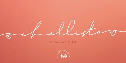 Challista is a luxurious handmade signature font. Challista Signature includes more than 30 ligatures to make everything look like a natural handmade signature.This font is perfect for poster design, book covers, merchandise, fashion campaigns, newsletters, branding, advertising, magazines, greeting cards, album covers, and quote designs and more. Features - Uppercase - lowercase - Numbers and Symbols - International Glyphs - Ligatures If you need anything else please contact me by dedukvic@gmail.com
 - KK3045 Pro by HS Fonts,
$39.00 The font family KK30/45 is available in 3 weights: Light, Regular, and Bold. Type Designer: Kuncho Kunev The name of family - KK30/45 is from the first letters of the designer's name (K)uncho (K)unev and from the main angles of the slanted stems - 30° and 45°. Release date: December, 2001 HermesSOFT Ltd. The design of КК30/45 incorporates a geometric variety of shapes, and have been originally designed in such a way that all slanted stems are 30° and 45°, The very high x-height and low bottom parts allow typesetting with almost 100% leading. КК30/45 is a display face suited best to sizes 16-18 point and above. There are included also all Cyrillic vowels with accents that are really necessary for the professional typesetting in Cyrillic languages. Supported Languages: Western Europe (Greek not included), Central/Eastern Europe, Baltic, Turkish, Romanian, Cyrillic. Supported Code Pages: Macintosh and Windows, any for above languages. Opentype features includes kern, fractions, ordinals, superscripts.
 - The College Block II font is a Display Slab-Serif typeface that is inherently associated with collegiate and sports themes, making it perfect for university sweaters or ...
- Hoffers by Konstantine Studio,
$17.00 Say hello to Hoffers. A bold and casual script typeface with implementation of markers handwriting vibes. Some are connected and the others aren't. Perfectly fit for casual logotype, food and beverage branding, book covers, anytime you need to tell fun stories, Hoffers is the answer. Packed up with 30 ligatures to make it look seamlessly handwritten. Carefully crafted click by click to keep it clean in every strokes.
 - Farm Doodles by Outside the Line,
$19.00 Farm Doodles... perfect collection of illustrations to be used for everything from the farm to table movement to the current weddings on a farm trend. 30 illustrations of farm animals... beehive, fish, bunny, chickens, cows, goat, sheep, pig and horse. Farm buildings, weather vane, windmill, tractor, milk can, hay bale, trees. And food... tomato, carrots, peas, spinach, apples, beets. Mix and match with other Outside the Line illustration fonts.


