10,000 search results
(0.038 seconds)
- Guhly by Ingo,
$35.00 A modern Sans Serif — prosaic, designed geometrically, beautiful in large sizes All the dimensions of the font are based on Factor 10. The general principle of construction leads to slim forms and nearly equally wide characters. So the font appears very solid but is actually difficult to decipher in longer texts. Along with the ”normal“ Guhly Regular there are also the two versions Guhly Light and Guhly Bold, whereas in each only the vertical strokes [Guhly Light] or horizontal [Guhly Bold] have been changed in strength. The result is a very individual decorative effect which slightly reflects old circus and western scripts. The lower case characters in the version Guhly Book are, therefore, optimized to be suitable for longer texts in smaller font sizes — because after all, sometimes you should read a bit more than just the headline… The design of a shampoo bottle stands behind the creation of this sans serif display font. Prominent, clearly constructed forms with circular arcs define its appearance. This is a font primarily designed for use with capital letters — for all sorts of advertising purposes, headlines and titles. But lower case letters also belong to a good functional font; so, of course, Guhly includes them and ligatures for the more ”critical“ letter combinations as well as stylistic alternates for the letters K (or k), V (v) and o. As a decorative “encore”, the Guhly family also contains the “normal” weight in two variants: on the one hand the Guhly Cutout – these are letters without counter, as if the letters were cut out and the internal surfaces fell out; and on the other hand the Guhly stencil – as the name suggests, a stencil font with the typical bars that give a stencil the necessary cohesion.
 - Nawin Arabic by Letterjuice,
$43.00 Nawin is an informal Arabic typeface inspired by handwriting. The idea behind this design is to create a type family attractive and ownable for children but at the same time a design that keeps excellent letter recognition for reading. Handwriting has been a great source of inspiration in this particular typeface. By emulating the movements of the pen, we have obtained letter shapes that express spontaneity. A bright group of letters create a lively and beautiful paragraph of text. To get closer to handwriting and the variety of letter shapes that we draw while writing, this typeface offers a large number of alternative characters, which differ slightly from the default ones. Because we have programed the «Contextual Alternate» feature in the fonts, these alternate characters appear automatically as you set a text on your computer. The proportions and letter shapes are flexible, escaping from tradition to increase expressivity and personality in the design. For instance, variability on vertical proportions between letters Alef and initial Lam, create movement in text and avoid the cold mechanical feel of repetition. Nawin is quirky and elegant at the same time. Letter recognition is relevant when reading continuous text. For this reason, we have added another contextual alternate feature with alternate characters that help to avoid confusion when letters with similar or the same shape repeat inside one word. For instance, this is the case of medial «beh and Yeh» repeated three times continuously in the same word. The alternate characters change in shape and length, facilitating distinction to the reader. Since this typeface is inspired by handwriting and the free movement of the hand while writing, we considered ligatures a good asset for this design. The typeface has a wide range of ligatures that enhance movement and fluidity in text making look text alive.
 - URW Geometric Condensed by URW Type Foundry,
$35.99 URW Geometric Condensed is the matching complement for the URW Geometric. Including 20 additional condensed styles the URW Geometric Condensed is the space-saving alternative in the URW Geometric family. URW Geometric is a sans serif typeface inspired by the German geometric typefaces of the 1920s but designed for modern usability. The character shapes have optimized proportions and an improved balance, the x-height is increased, ascenders and descenders are decreased. Special glyphs, which are often designed afterwards for the original geometric typefaces from the 1920s, are perfectly integrated in the URW Geometric. These design characteristics increase the usability and legibility tremendously. With its 10 weights ranging from Thin to Black, plus 10 additional oblique styles, it has a great versatility in mind. The extreme light styles shine bright in large sizes, the middle weights are perfect for body copy and the bolder variants for the use of emphasis information or bring a strong impact to headlines and information. The optically balanced styles are designed to work in perfect harmony together. URW Geometric is functional, strong, simple and harmonized in form, and at a glance appears as a modern variant of its predecessors. Apart from the basic characters the design has an extra focus on the special glyphs. These are designed for today’s needs. For example: the email glyph looks modern and unique, including a perfectly balanced spacing. The number sign, in modern use called “hashtag”, is space saving and optically balanced for body text. Additionally, various extra and alternate glyphs are designed to provide a friendly usability. Including a wide Latin language support and character sets, URW Geometric is perfectly designed for today’s requirements. Please have a look at the URW Geometric Type Specimen (PDF) for further information.
 - Fractus by Eurotypo,
$36.00 The requirements of Middle Ages scribes who copied and produced books in monasteries were fundamentally to preserve space, due to the high cost of the writing surface. During this long period of the development of Gothic forms, many other variations of the style of black letters appear: Textur or “Gothic-antique”, another group called Rotunda preferred by Italian and Spanish scribes. In 1490, the style "Bâtarde" (according to the the French classification) began to be widely used in Germany with more rounded shapes and named Scwabacher (probably derived from the city of Schwabach, but not certified) Fractur is a more condensed and narrower form than Schwabacher. This style is attributed to Johann Neudörfer of Nuremberg, cut in 1513; it was quickly imitated, therefore a few years later became to be a German national identity that extended over the next four centuries. The shape of its characters can be considered as a fusion of Texture and Schwabacher: the lowercase actually has medium strictly vertical and half curved strokes. The first expressions of the baroque influence this writing whose appearance of movement is due to the ornaments applied to the uppercase letters and the ascending and descending features of the lowercase. Despite having spent so many years and being a typeface not suitable for extensive reading texts, the Gothic Fractur has endured over time for possessing a strong and solid characteristic, as well as being closely linked to the spirit of gothic cathedrals of countries in northen Europe. In fact, it is probably that this expressive feature leads them to be chosen in the most varied graphic communication needs, which run from from banks and financial companies, insurers, law offices, publishers, newspapers and TV networks, till alcoholic drinks, funeral tombstones, packaging and even tattoos.
 - Parma by Monotype,
$29.99Giambattista Bodoni (1740-1813) was called the King of Printers; he was a prolific type designer, a masterful engraver of punches and the most widely admired printer of his time. His books and typefaces were created during the 45 years he was the director of the fine press and publishing house of the Duke of Parma in Italy. He produced the best of what are known as modern" style types, basing them on the finest writing of his time. Modern types represented the ultimate typographic development of the late eighteenth and early nineteenth centuries. They have characteristics quite different from the types that preceded them; such as extreme vertical stress, fine hairlines contrasted by bold main strokes, and very subtle, almost non-existent bracketing of sharply defined hairline serifs. Bodoni saw this style as beautiful and harmonious-the natural result of writing done with a well-cut pen, and the look was fashionable and admired. Other punchcutters, such as the Didot family (1689-1853) in France, and J. E. Walbaum (1768-1839) in Germany made their own versions of the modern faces. Even though some nineteenth century critics turned up their noses and called such types shattering and chilly, today the Bodoni moderns are seen in much the same light as they were in his own time. When used with care, the Bodoni types are both romantic and elegant, with a presence that adds tasteful sparkle to headlines and advertising. Parma was designed by the monotype Design Team after studying Bodoni's steel punches at the Museo Bodoniana in Parma, Italy. They also referred to specimens from the "Manuale Tipografico," a monumental collection of Bodoni's work published by his widow in 1818. - dearJoe 7 by JOEBOB graphics,
$39.00 The dearJoe series of fonts came to life around the year 1999, when I created dearJoe 1, which was a first (and half-assed) attempt to convert my own handwriting into a working font. Being able to type in my own hand had always been a childhood fantasy, and even though I only partly understood the software, a working font was generated and I decided to put it on the internet for people to use in their own personal projects. Which they did: at this moment the dearJoe 1 font has been downloaded millions of times and can be found on Vietnamese riksjas, Tasmanian gyms and chocolate stores on 5th Avenue for instance. The font is not something I am particularly proud of, but it started me of in building what's now the JOEBOB graphics foundry. Inbetween creating other fonts, the dearJoe series has become a theme I revisit every once in a while, trying to create an update on how my handwriting has evolved, along with my abilities in creating fonts that mimic actual handwriting. In the last decade or so I started implementing ligatures and alternate characters, which helped a lot in coming to a result that can almost pass for actual handwriting. The 2019 dearJoe 7 font is the latest addition to this font family. All characters were scanned from handwritten notes, cherrypicking the characters and letter-combinations I liked best. They were written with a Lamy M66 B pen and only minor adjustments were made to the original scans, leaving most little flaws and rough edges as they were for a convincing ball-point on paper result. The font comes with over 150 ligatures, making sure the font has a variated and credible overall look and feel.
 - City Streetwear by Cultivated Mind,
$14.00 City Streetwear is a sophisticated signature collection that includes four script weights and plenty of ligatures. City Streetwear scripts includes 102 ligatures and 6 alternates. Ligature programming has been added to the fonts to give the scripts a more handwritten and luxurious appeal. Try the City Streetwear free font for fashion marketing and social media. It is a great starting point for finding appealing modern catchwords. Use City Streetwear for sophisticated designing. Fonts and posters designed by Cindy Kinash. See font details below. SCRIPT FEATURES: Signature style OpenType Common ff fi fl ffi ffl ligatures Available in Extended Latin Pro (Standard) or American (US) version. 102 ligatures and 6 alternates. Programmed ligature feature for optimization. Every time you type specific pairs, ligatures are programmed to pop up to avoid letter pair collisions. Programming ligatures gives the script a more sophisticated flow. Make sure to turn on the feature in your preferred program that supports ligatures. FREE WORDS FEATURES: 68 free words useful for fashion, marketing and social media promoting. Keyword examples include fashion, exclusive, and style. Intended use for fashion, apparel, beauty, marketing, social media, websites, magazines, sales, film and packaging. VERSIONS: American (US) and Extended Latin Pro (Standard) AMERICAN (US) Shorter version 102 ligatures and 6 alternates Common ff fi fl ffi ffl ligatures OpenType Includes the common alphabet, numbers, American symbols and punctuation. EXTENDED LATIN PRO (Standard) Extended version of the American (US) version. 102 ligatures and 6 alternate Common ff fi fl ffi ffl ligatures OpenType Includes characters for Albanian, Basque, Catalan, Cornish, Croatian, Czech, Danish, Dutch, English, Esperanto, Estonian, Feroese, Finnish Scots, French, Gaelic, Galician, German, Greek Transliterated, Hawaiian, Hungarian, Icelandic, Indonesian, Irish, Italian, Latvian, Lithuanian, Maltese, Nynorsk Bokmal Norwegian, Polish, Portuguese, Romanian, Slovak, Slovenian, Spanish, Swedish, Turkish, Welsh. TIPS: Try the OpenType ligatures by turning on the feature in your preferred program that supports ligatures. DISPLAY- The City Streetwear fonts work best as large headline text for optimization. FONT USE- Use City Streetwear for fashion, apparel, beauty, marketing, social media, websites, magazines, sales, film and packaging.
 - Birthday by Canada Type,
$34.95What do you imagine the ideal casual invitation font would look like? It has to be cheerful, inviting, legible, creative, and loads of fun. But first and foremost, it has to look like real handwriting. Fonts seeming like real handwriting are always a major task, and although Canada Type already has plenty of fonts that solve the “looks like handwriting” issue in a variety of ways, we're once again raising the bar a little higher with this one. Birthday is a massive package that crosses the traditional font/handwriting solution of 2-letter ligatures and waltzes into the land of 3-letter combinations. Plenty of them, too! The complete Postscript and True Type versions of Birthday ship with no less than five separate fonts full of nothing but ligatures. And for even more realism, an alternates font is also included in the package, for a total of seven fonts of happy handwriting that can be used anywhere and everywhere personalization is of importance to a layout. For layout artists with advanced typography tools that take advantage of the power of OpenType, Birthday Pro is a wunderkind. All the individual letter alternates are accessible through the Stylistic Alternates feature, the 2-letter ligatures through the standard Ligatures feature, and the 3-letter ligatures via the Discretionary Ligatures feature (for the technically inclined: this includes a nice liga-to-dlig crossover, where the maximum number of possible ligated letters is automatically chosen at the push of a button). If you enjoy using OpenType, Birthday Pro is definitely for you. If on the other hand you like your fonts in Postsript or True Type, it is advisable to keep a character map handy while using Birthday. You will need it to take advantage of the many, many alternates and ligatures distributed over the fonts. The next time someone asks you for the perfect casual invitation font is, look no further. And as usually is with Canada Type, quality fonts are more affordable than ever. - Maestro by Canada Type,
$24.95 Out of a lifelong inner struggle, Philip Bouwsma unleashes a masterpiece that reconciles classic calligraphy with type in a way never before attempted. Maestro takes its cue from the Italian chancery cursive of the early sixteenth century. By this time type ruled the publishing world, but official court documents were still presented in calligraphy, in a new formal style of the high Renaissance that was integrated with Roman letters and matched the refined order of type. The copybooks of Arrighi and others, printed from engraved wood blocks, spread the Italian cancellaresca across Europe, but the medium was too clumsy and the size too small to show what was really happening in the stroke. Arrighi and others also made metal fonts that pushed type in the direction of calligraphy, but again the medium did not support the superb artistry of these masters or sustain the vitality in their work. As the elegant sensitive moving stroke of the broad pen was reduced to a static outline, the human quality, the variety and the excitement of a living act were lost. Because the high level of skill could not be reproduced, the broad pen was largely replaced by the pointed tool. The modern italic handwriting revival is based on a simplified model and does not approach the level of this formal calligraphy with its relationship to the Roman forms. Maestro is the font that Arrighi and his colleagues would have made if they had had digital technology. Like the calligraphic system of the papal chancery on which it is modelled, it was not drawn as a single finished alphabet, but evolved from a confluence of script and Roman; the script is formalized by the Roman to stand proudly in a world of type. Maestro came together on screen over the course of several years, through many versions ranging widely in style, formality, width, slant, weight and other parameters. On one end of the spectrum, looking back to tradition it embodies the formal harmony of the Roman capitals and the minuscule which became the lower case. On the other it is a flowing script letter drawing on the spirit of later pointed pen and engravers scripts. As its original designers intended, it works with simple Roman capitals and serifs or swash capitals and baroque flourishes. The broad pen supplies weight and substance to the stroke which carries energy through tension in balanced s-curves. Above all it is meant to convey the life and motion of formal calligraphy as a worthy counterbalance to the stolid gravity of metal type. The Maestro family consists of forty fonts distributed over two weights. The OpenType version compresses the family considerably down to two fonts, regular and bold, each containing the entire character set of twenty fonts, for a total of more than 3350 characters per font. These include a wide variety of stylistic alternates, ligatures, beginning and ending letters, flourishes, borders, rules, and other extras. The Pro version also includes extended linguistic support for Latin-based scripts (Western, Central and Eastern European, Baltic, Turkish, Welsh/Celtic, Maltese) as well as Greek. For more thoughts on Maestro, its background and character sets, please read the PDF accompanying the family.
 - Black Orchestra by 38-lineart,
$16.00 ‘Black Orchestra’ is a black letter font inspired by heavy metal. This font consists of uppercase and lowercase and is supported by ‘Latin extended’ which allows wider use of this font. This font will turn any horror project into a standout!
 - Brokkie by I Can Letter,
$14.99 Brokkie is a handwritten calligraphy script font with a modern twist! This font adds a relatable and imperfect side to your designs; which makes it great for logos, branding, blogs, social media, wedding stationery, websites, signs, business cards, and more.
 - Public Transportation JNL by Jeff Levine,
$29.00On the sides of freight cars, passenger trains, trolleys, buses and cable cars was once found identifying letters and numbers with a bold, yet quaint hand-painted look. Public Transportation JNL emulates the old-style look of those bygone years. - MPI No. 510 by mpressInteractive,
$5.00 No. 510 is a friendly, slim gothic face. Strokes have a gentle inward curve at the median with the tops and bottoms of the letters slightly wider and thicker. The design was first introduced by William H. Page & Company around 1887.
 - Sun Type by VP Creative Shop,
$29.00 Introducing Sun Type, a delightful and versatile serif logo font that exudes creativity and charm. With over 150 ligature glyphs and alternate characters, this font offers a wide range of design possibilities, allowing you to craft unique and visually stunning logos and brand identities. Sun Type goes above and beyond with its extensive collection of 52 swashes, offering you the opportunity to add elegant and decorative elements to your text. These swashes effortlessly elevate your designs, giving them a touch of sophistication and individuality. Not only does Sun Type excel in its aesthetic appeal, but it also showcases its practicality by supporting a staggering 87 languages. No matter where your audience is located or what language they speak, you can confidently communicate your message with this font. Language Support : Afrikaans, Albanian, Asu, Basque, Bemba, Bena, Breton, Chiga, Colognian, Cornish, Czech, Danish, Dutch, Embu, English, Estonian, Faroese, Filipino, Finnish, French, Friulian, Galician, Ganda, German, Gusi,i Hungarian, Indonesian, Irish, Italian, Jola-Fonyi, Kabuverdianu, Kalenjin, Kamba, Kikuyu, Kinyarwanda, Latvian, Lithuanian, Lower Sorbian, Luo, Luxembourgish, Luyia, Machame, Makhuwa-Meetto, Makonde, Malagasy, Maltese, Manx, Meru, Morisyen, North Ndebele, Norwegian, Bokmål, Norwegian, Nynorsk, Nyankole, Oromo, Polish, Portuguese, Quechua, Romanian, Romansh, Rombo, Rundi, Rwa, Samburu, Sango, Sangu, Scottish, Gaelic, Sena, Shambala, Shona, Slovak, Soga, Somali, Spanish, Swahili, Swedish, Swiss, German, Taita, Teso, Turkish, Upper, Sorbian, Uzbek (Latin), Volapük, Vunjo, Walser, Welsh, Western Frisian, Zulu LigaturesAB,AC,AD,AF,AG,AI,AK,AL,AM,AN,AP,AR,AT,AU,AV,AW,AY,BA,BE,BI,BL,BO,BU,CA,CC,CE,CH,CI,CK,CL,CO, CR,CT,CU,DA,DD,DE,DI,DO,DS,DY,EA,EC,ED,EE,EF,EG,EI,EL,EM,EN,EP,ER,ES,ET,EV,EW,EX,EY,FA,FE,FF,FI, FO,FR,GA,GE,GH,GO,GS,HA,HE,HI,HO,HT,IK,IL,IM,IN,IT,IH,KE,KI,KN,KO,LA,LE,LF,LI,LK,LL,LO,LT,LY,MA,ME, MM,MO,MP,MS,MU,NC,ND,NE,NG,NK,NL,NN,NO,NS,NT,OA,OB,OC,OD,OF,OG,OI,OK,OL,OM,ON,OO,OP, OR,OS,OT,OU,OV,OW,PE,RA,RE,RF,RK,RM,RN,RO,RR,RS,SA,SC,SE,SH,SK,SS,ST,TC,TE,TH,TI,TL,TO,ST,TT,TU, TW,TY,UC,UE,UL,UM,UN,UR,US,UT,VA,VE,VO,WA,WE,WH,WN,WO,YE,YO,YS,MEN,FRO,RON,ROM,THE, AND,ING,HER,HAT,HIS,THA,ERE,FOR,ENT,TER,WAS,YOU,ITH,VER,ALL,THI,OUL,GHT,AVE,HAV,HIN,ATI, EVE,HING,WERE,FROM,THAT,THER,HAVE,THIS,MENT How to access alternate glyphs? To access alternate glyphs in Adobe InDesign or Illustrator, choose Window Type & Tables Glyphs In Photoshop, choose Window Glyphs. In the panel that opens, click the Show menu and choose Alternates for Selection. Double-click an alternate's thumbnail to swap them out. Mock ups and backgrounds used are not included. Thank you! Enjoy!
 - Eilysa Luise by Essentials Studio,
$16.00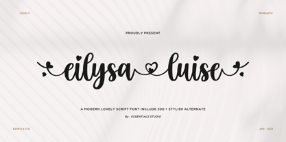 Introducing by Essentials Studio Proudly Present, Eilysia luise Eylisia Luise Is a Modern monoline Font Include 50+ stylish Alternate minadine is perfect for product packaging, branding project, megazine, social media, wedding, or just used to express words above the background.
 - Typewriter Olympia SM8 by Simeon out West,
$25.00 This font, based on old Olympia SM and SF typewriters from the 50’s and 60’s provides a nice clean, yet quirky look for your documents. Being a reproduction inspired by a typewriter, it works better at smaller sizes.
 - BLT Portage by Black Lab Type,
$12.00 PORTAGE is a slab serif that carries its own weight. Adventurous and rugged, this typeface that evokes the wild country and makes headlines stand out. The typeface was built from a land and forest journal from the mid-50's.
 - Gildane Hyme by Essentials Studio,
$16.00 Introducing by Essentials Studio Proudly Present, Gildane Hyme Gildane Hyme Is a Modern monoline Font Include 50+ stylish Alternate Gildane Hyme is perfect for product packaging, branding project, megazine, social media, wedding, or just used to express words above the background.
 - Dienstag Variable by insigne,
$100.00 Introducing Dienstag Variable, the latest addition to insigne's popular Montag family of fonts! With its extended sans-serif style, Dienstag boasts a sleek and sophisticated look that's perfect for a wide range of projects. Whether you're designing a website, creating branding materials, or producing print publications, Dienstag's refined elegance is sure to make a lasting impression. Compared to Montag, Dienstag has a slightly more formal feel, thanks to its lack of rounded terminators. But that doesn't mean it's any less versatile – in fact, Dienstag's four original weights have now been expanded to ten, giving you even more flexibility in your designs. With OpenType features that include simplified versions of many characters, you can easily create unique and eye-catching titles that stand out from the crowd. But Dienstag is just one part of the larger Montag superfamily, which also includes Mittwoch, and Donnerstag. Each font in this collection offers its own unique style and flair, giving you a wealth of options to choose from when it comes to your next project. Whether you're looking for a bold and dynamic font or a more refined and understated style, you're sure to find the perfect fit in the Montag family. So why wait? Check out Dienstag and the rest of the Montag superfamily today, and start creating designs that are sure to captivate and inspire! With its elegant style and versatile functionality, Dienstag is the perfect choice for designers who demand the best.
 - PF Stamps Pro by Parachute,
$79.00 PF Stamps covers a wide range of applications which require the stamp effect. This is a form of lettering which was very popular in the mid-twentieth century for product labeling. Special machinery was developed by mainly two companies, one in the United States and the other in Germany. This machinery produced paper die cuts which were later used as a base for the marking with a paintbrush. PF Stamps Paint was developed to simulate this type of lettering. Two other styles, Metal and Flex, have been very popular since its original release. The first one was developed from a metallic stamp imprint, whereas the second one with its slight 3-D look simulates letters stamped on plastic. To insure realistic results, uppercase letters are different from lowercase. This is very useful when two similar letters sit next to each other. There 3 more styles: Solid (the stencil in its regular clean form), Rough and the very interesting Blur. The all new “Pro” version comes to complete this series with what was missing: 93 matching frames and frames parts which will satisfy the most demanding designer. This is a bonus font which is available only with the purchase of the whole family. Use these frames “as is” at any size, or connect the frame parts to each other to create longer frames. Finally, this series supports more than hundred languages which are based on the Latin, Greek or Cyrillic scripts.
 - Monaz by Craft Supply Co,
$20.00 Introduction to Monaz – Bubble Font Monaz – Bubble Font, a playful and airy display font, is inspired by the lightness and roundness of bubbles and balloons. Perfect for creating eye-catching headings, logos, and children’s books, this font not only grabs attention but also serves as an ideal choice for fun and whimsical projects. Design and Aesthetics In its design, Monaz – Bubble Font features characters that resemble bubbles, with rounded edges and a bouncy feel. Furthermore, the letters mimic the floating appearance of balloons, thus adding a cheerful and lighthearted touch to any design. Additionally, its rounded forms are easy on the eyes, ensuring readability while preserving its playful charm. Versatility and Usage Monaz – Bubble Font boasts high versatility, fitting a variety of design needs effortlessly. Not only does it shine in party invitations and product packaging, but it also excels in promotional materials. Moreover, its effectiveness extends to educational materials for children, making learning engaging with its friendly appearance. As a result, its readability and unique style make it a top choice for designers seeking to add a fun element to their projects. Accessibility and Appeal Designed for a wide audience, Monaz – Bubble Font features a simple and clear style that is easy to read. It appeals to all ages, capturing the whimsy of childhood while still being sophisticated enough for adult projects. In summary, this font brings a unique joy and playfulness to any design, making it a valuable addition to any font collection.
 - PGF Now by PeGGO Fonts,
$24.00 Geometric Sans with Humanistic proportions Typeface (Roman a.k.a. ‘Capitalis Monumentalis’), Inspired on vintage minimalism, with a subtle Art Déco air, where the configuration of the basic and open shape (long ascenders/descenders and a moderate ‘x’ height) star a crisp and luminous look, manufactured under an analytical and handmade process as used to be in ancient times. Among its graphic virtues are a special focus on relaxed and fluid reading rhythm while looking clear and sophisticated, an upright version representing a formal voice paired with an Italic with a more expressive vocal tone, easily distinguished as a second quoted content in Editorial and Branding communicational contexts. Equipped with generous stylistic options controlled by OpenType features as: 17 glyphs variations stored as stylistic sets Standard and Discretionary Ligatures Lining and Old Style Numeral forms Tabular forms Superior and Inferior Scientific Numeric Notation Numerators and Denominators for fractional compositions Pre-Composed Fractions, ordinals Dotted Zero for alphanumeric contexts Circled numbers An Art Déco style Border Set Bullets set for multiple levels ordered list Arrow set Monetary Symbols Mathematical Operators Publishing and Social Media Markers Wide range of Diacritics allowing you to set contents in more than 200 Latin base languages. The access to all these options is also possible via character set panel. With no hesitation, PGF Now is a highly valuable publishing and Branding tool that deserves to flaunt in the more elegant contexts but also daily situations that need a clear and modern voice.
 - Madera Variable by Monotype,
$229.99Malou Verlomme’s Madera is a typeface made strictly for graphic designers, created as an indispensable type toolbox that can meet the needs of both print and digital environments. Verlomme has drawn on his extensive experience creating bespoke type for major brands, and Madera is a “typographic synthesis” of this work. Although designed as a restrained sans serif, the typeface has some punchy personality – with sharpened apexes that inject flavour into the design, particularly in the darker weights and when set at all caps. Madera sits alongside fellow geometric designs such as Proxima Nova, Gotham or Avenir, offering a straight-talking tone of voice but with some extra bite. If you’re a large corporation, with a typeface being used in many different environments you want something that's just the right balance of visibility and legibility to sustain an extensive amount of communication.” “The design is very solid but it doesn’t go out of its way to attract attention,” explains Verlomme. “It still has a fair amount of warmth and personality, in a very understated manner. The Madera typeface family has 32 fonts: Upright, Condensed and Italics. It is available in OpenType CFF and TTF fonts formats. Each typeface contains over 650 glyphs with extensive Western, Central and Eastern European language support. It also supports OpenType typographic features like alternatives, ligatures and fractions. Madera Variables are font files which are featuring two axis and have a preset instance from Hairline to Extra Black. - Capitolium 2 by TypeTogether,
$58.00 Capitolium was designed in 1998 at the request of the Agenzia romana per la preparatione del Giubileo for the Jubilee of the Roman Catholic Church in 2000. This type design was the central part of the project for a wayfinding and information system to guide pilgrims and tourists through Rome. Capitolium also continues Rome’s almost uninterrupted two-thousand-year-old tradition of public lettering . It is a modern typeface for the twenty-first century and strongly related to the traditions of Rome. Soon after the completion of this project Unger began contemplating the possibility of bringing the atmosphere of this design to newspapers. Though Capitolium works well in most modern production processes and also on screens, it is too fragile for newsprint. For newspapers sturdier shapes were required as well as more characters to a line of text, and Capitolium News has a bigger x-height than Capitolium. Capitolium News is a thoroughly modern newsface, with classic letterforms linked to a strong tradition. Capitolium News for running text comes in the variations regular, italic, semibold, semibold italic, bold and bold italic. As is possible with most of Unger’s type designs, Capitolium News can be condensed and expanded without any harm to the letterforms. The update to this beautiful font family, Capitolium News, includes the addition of over 250 glyphs featuring full Latin A language support, new ligatures, 4 sets of numerals, arbitrary fractions and superiors/inferiors. Furthermore, kerning was added and fine tuned for better performance.
 - Parfait Script by Lián Types,
$37.00Parfait Script Pro takes its inspiration from Spencerian script and pointed brush lettering. Technical Parfait Script has more than 850 glyphs. It’s up to you to choose, it’s up to you to have fun. Parfait would love to play. The font has lots of alternates. They'll certainly either embellish your words or provide more legibility. The alternates are: Standard Ligatures; Contextual Alternates; Discretionary Ligatures; Swashes; Stylistic Alternates; Titling Alternates; Terminal Forms; Historical Alternates * ; Stylistic Ligatures; Stylistic Set 1 and 2 * ; Ornaments. (* These Alternates are only included in Parfait Script Pro). Parfait Script Pro contains everything. Advice: Use designing programs that support the OpenType features named above, so you can easily alternate glyphs. However, for those who don't have this kind of program, or for those who don't want the entire font, we offer Parfait Script Pro as several separate fonts: Parfait Script Standard (the best for text); Parfait Script Contextual (decorative); Parfait Script Stylistic (decorative); Parfait Script Swashes (for giving the last letter a nice touch); Parfait Script Titling (both decorative and more Roman); Parfait Script Endings (for giving the word the look of a signature); and Parfait Script Ornaments (a set of swirls). These versions of Parfait Script Pro are Open-Type programmed too, in order to include the Standard, Discretional and Stylistic Ligatures. Pssst!... Take a look at Parfait Script Pro’s Guide in the gallery section in order to discover this beauty! - ITC Chivalry by ITC,
$29.99ITC Chivalry is a calligraphic hybrid that honors the tradition of combining Roman capitals with italic lowercase letters. Drawn by Missouri lettering artist Rob Leuschke, who used a flat-nib pen on textured watercolor stock and then converted the drawings into a digital font, the design combines an old world" feel with "new world" legibility. A companion set of black letter caps completes the suite of characters. "I've loved drawing letters for as long as I can remember," says Leuschke. "Even in kindergarten, I tried to draw letters like my teacher." After graduating from college, Leuschke worked for a short time at a sign company in St. Louis, and in the early 1980s began working at Hallmark Cards in Kansas City. His talent as a calligrapher and lettering artist eventually brought him back to St. Louis to begin a freelance career. Since then Leuschke has created over 250 fonts, primarily for the greeting card industry, that are now being used on work for his clients all over the world. Leuschke first conceived of the face as just the black letter caps; he later added the Roman letters to give the design more versatility. The Roman caps of ITC Chivalry combined with the lowercase are well suited to blocks of copy, while the more decorative black letter caps are ideal for showcasing short text of just a few words. Both sets of capitals also make great initial letters." - Neuropolitical by Typodermic,
$11.95 The world of graphic design is a vast and diverse space, with an array of tools, techniques, and resources at the disposal of a designer. However, one crucial aspect of any designer’s arsenal is their choice of typography. The right typeface can elevate a design from mediocre to magnificent, and Neuropolitical is a prime example of just that. Neuropolitical is an ultramodern display typeface that exudes a technical appearance, making it the perfect choice for designs that require an industrial edge. The wide, square curves and sharp ends of the letterforms give your message a voice of efficiency, making it ideal for conveying complex concepts and ideas. Inspired by the iconic 1990s techno typeface, Neuropol, Neuropolitical takes things to the next level. With seven weights and italics, this typeface offers a versatile range of options to fit a multitude of design scenarios. The typeface’s wider design allows for a greater emphasis on the individual characters and the space they occupy, enabling designers to create impactful and memorable designs with ease. But Neuropolitical is not just a tool for the masses, it is a statement of its own. Its wider design embodies the spirit of industrialism and precision, giving designers a new level of control over their designs. The carefully crafted letterforms of Neuropolitical are a testament to the dedication and skill of its designers, resulting in a typeface that is both visually stunning and highly functional. So, whether you’re looking to create a poster, a logo, or a website, Neuropolitical is the typeface for you. It will give your message the power and presence it deserves, leaving a lasting impression on your audience. In a world where first impressions are everything, Neuropolitical is the perfect choice for designers looking to make an impact. Most Latin-based European writing systems are supported, including the following languages. Afaan Oromo, Afar, Afrikaans, Albanian, Alsatian, Aromanian, Aymara, Bashkir (Latin), Basque, Belarusian (Latin), Bemba, Bikol, Bosnian, Breton, Cape Verdean, Creole, Catalan, Cebuano, Chamorro, Chavacano, Chichewa, Crimean Tatar (Latin), Croatian, Czech, Danish, Dawan, Dholuo, Dutch, English, Estonian, Faroese, Fijian, Filipino, Finnish, French, Frisian, Friulian, Gagauz (Latin), Galician, Ganda, Genoese, German, Greenlandic, Guadeloupean Creole, Haitian Creole, Hawaiian, Hiligaynon, Hungarian, Icelandic, Ilocano, Indonesian, Irish, Italian, Jamaican, Kaqchikel, Karakalpak (Latin), Kashubian, Kikongo, Kinyarwanda, Kirundi, Kurdish (Latin), Latvian, Lithuanian, Lombard, Low Saxon, Luxembourgish, Maasai, Makhuwa, Malay, Maltese, Māori, Moldovan, Montenegrin, Ndebele, Neapolitan, Norwegian, Novial, Occitan, Ossetian (Latin), Papiamento, Piedmontese, Polish, Portuguese, Quechua, Rarotongan, Romanian, Romansh, Sami, Sango, Saramaccan, Sardinian, Scottish Gaelic, Serbian (Latin), Shona, Sicilian, Silesian, Slovak, Slovenian, Somali, Sorbian, Sotho, Spanish, Swahili, Swazi, Swedish, Tagalog, Tahitian, Tetum, Tongan, Tshiluba, Tsonga, Tswana, Tumbuka, Turkish, Turkmen (Latin), Tuvaluan, Uzbek (Latin), Venetian, Vepsian, Võro, Walloon, Waray-Waray, Wayuu, Welsh, Wolof, Xhosa, Yapese, Zapotec Zulu and Zuni.
 - Xbka by Andfonts,
$17.00 Introducing Xbka, the new must-have font for anyone looking for a vintage-modern, futuristic, cool, and sporty font. This display font is perfect for those looking to make a statement with their headlines or branding. With its unique blend of modern and vintage styles, Xbka is the perfect choice for anyone looking to give their designs a fresh and youthful feel. Its italic style adds an extra touch of elegance and creativity to any project. Whether you're designing a logo for a new sports brand, creating eye-catching headlines for a magazine or website, or adding a touch of urban style to your marketing materials, Xbka is the perfect choice. This font is great for use in a wide range of applications, including advertising, branding, web design, and print design. It's a versatile font that can be used in a variety of contexts, from sports and fitness to streetwear and fashion. Overall, Xbka is a unique and eye-catching font that is sure to make your designs stand out. So why not add it to your collection today and start creating something truly special?
 - PF Scandal Pro by Parachute,
$79.00 “A couple of years ago, when I was designing a package for a marmalade range, I started having a go at creating a typeface that would suit the package I had in mind. The whole process was intensely appealing to me: from merely using typefaces as an intricate part of my work as an art director, I started exploring the function of each and every element that a typeface consists of. The two things on my mind in designing a typeface for a marmalade brand were firstly, that I wanted it to have a hand-written feel, so as to exude that old-fashioned, homemade quality, and secondly, that it ought to have a certain sweetness and gentleness that would match the product. However, PF Scandal managed to outgrow its original inspiration. As I continued working on it, I toned down some of its elements to make it more versatile. And so, PF Scandal evolved into a typeface that has a contemporary, and yet handwritten look, which makes it suitable for a wide range of uses. The ‘Pro’ version comes with the full array of European characters including Latin, Greek and Cyrillic as well as 120 matching pictograms". -A.S.
 - Nerine by Studioways,
$33.00 Nerine is a modern brush lettering and handwritten font duo designed by hand lettering artist Eliza Gwendalyn. Both scripts were drawn completely by hand and digitally perfected to bring you these unique script fonts. Nerine is a bold, connecting brush script, with lots of swashes and loops, while Nerine Deux is a lighter, straight stroke semi-connecting script, with a little less flair. Both scripts are ideal for use in a wide range of projects, from branding & advertising to wedding stationery & birth announcements! They also pair well with sans serif and serif typefaces! Each font is packed with ligatures and some alternate letterforms that help text runs appear more natural. The OpenType ligature feature will automatically insert ligatures when certain glyph combinations are typed, and the swash feature in Nerine will replace some beginning and ending letters with nice gentle swash alternatives. Nerinet also boasts five Style Sets that let you swap out groups of letters with interesting alternatives. Both fonts support the extended European character set so language support is extensive. Pick up Nerine or Nerine Deux, or the Nerine Duo Family today, and watch your creativity blossom!
 - Ulga Grid Rounded by ULGA Type,
$19.00 ULGA Grid Rounded is the smooth, rounded sibling of ULGA Grid and ULGA Grid Solid. The typeface consists of three weights, regular, medium and bold, with corresponding oblique styles. Every character in the extended ULGA Grid family shares the same width. ULGA Grid Rounded features a rounded square design, giving this typeface a soft, yet sturdy appearance. A contradictory mix of stiffness and suppleness, characters slide around like lead-filled snakes trying to find their way through a maze. If this typeface were a snack, it would be a smooth, chocolatey treat - too much of it and you’ll feel dizzy and a bit sick. But, hey, I’m not your dad, do what you want. Learn from your mistakes, that’s what I say. A versatile display typeface that can be used for a wide range of purposes including CD covers, posters, packaging, advertising, name badges for robots, brochures and film titles. Mix and match with ULGA Grid and ULGA Grid Solid, use the alternatives, sneak in an oblique style to spice things up, but most of all this is a fun typeface family. The character set supports Western Europe, Vietnamese, Central/Eastern Europe, Baltic, Turkish and Romanian.
 - Advertising Script by Zetafonts,
$39.00 Advertising Script is a brush script typeface inspired by a handmade sample drawn by the calligrapher Ross Frederic George and depicted in Speedball 1947 Textbook Manual. Advertising Script has a vintage brush script look, perfect for food packaging, display and logo design and period advertising. The original design has been completely reworked and extended by the Zetafonts Masterclass 2016 Team to provide three lighter weights, a rough and a monoline variant, and to produce an extended character set with open type support for ligatures, alternates, European languages and ending swashes. Advertising Script covers over 40 languages that use the Latin alphabet, with a full range of accents and diacritics. It comes in four weights plus a special monoline weight. Advertising Script makes full use of Open Type ligatures to provide swashes, alternates and a wide array of ligature characters for a more handmade, natural look. Swashes can be accessed through glyph palette or by typing one to six underscores after the letter. Take care: open type features are developed using open type technology, fully compatible with Adobe software and major design softwares and OS, but not supported by every software. Check before buying!
 - Henrician by Greater Albion Typefounders,
$16.50 Henrician can claim two sources of inspiration. One of these was a set of beautiful capital letterforms seen on the cover of a 19th century album of engravings. The engravings contained therein depicted lovely examples of half-timbered Tudor architecture and there was a clear 'Tudor' intent behind the letterforms. The second source of inspiration is more conceptual-the title lettering of period films from the 30's to the 60's…think if the opening text when Errol Flynn plays Robin Hood, or think of Richard the Lionheart, or even that great comedy Classic 'Carry on Henry', and it's discussion of Sir Thomas de Cobbler….but we digress! Henrician is a set of eight display and text (but perhaps not Body Text) faces in a 'Tudor Revival' spirit. Like any good revival design they are somehow at home with a wide range period themed design work, covering the medieval until, perhaps, the 18th century, just so long as we're more concerned with fun and appearance than strict historical accuracy. The family will be at home in the realms of advertising, posters, cover design and web design. Try Henrician out today!
 - Afire Love by Twinletter,
$11.00 Introducing our newest Afire Love Font. This font is created with original hand drawn strokes for a relaxed, beautiful and elegant impression. This font also offers beautiful abstract typographic harmony for a wide variety of design projects, including natural handwriting in digital form for designs, quote designs, for social media business designs, advertisements, trademarks, promotional banners, posts, posters, signatures, and all designs require handwriting or whatever design you want. This font is equipped with uppercase, lowercase, numbers, punctuation marks, swhases and several variations on each character including multi-language. In this font purchase package you will also get a special bonus package from us, namely: 1. 10 vector landing page design packages 2. cute monsters cartoon kit with vector format 3. Premium banner ad template with ppt format 4. cartoon animal ice cream pack with vector format 5. EDITABLE ESPORT logo design This font is best suited for open type friendly applications. How to get alternative glyphs from open type fonts: http://adobe.ly/1m1fn4Y PUA Character Code - Fully accessible without additional design software. we hope you enjoy this font. Feel free to send whatever message you want to convey. thank you Regards Twinletter
 - Petala Pro by Typefolio,
$39.00 Pétala Pro took its first steps almost ten years ago. Since then, the quest for perfection has forced several interruptions. It was necessary recalculate the route, tread other ways, discover new maps, and make easy curves. In the end, a new milestone on typeface design was reached. Pétala Pro combines readability with a gentle but strong personality. The smooth and balanced forms shares space with expressive ink traps. The 18 styles of the family – from Thin to Black – allow the flexibility needed to complex design briefs. When designing the different weights, rather than automated solutions, subtle adjustments were made to value the optical qualities of each style. Such care makes all the difference under extreme conditions. The wide variety of alternates makes Pétala Pro even more versatile. All the styles come with a lot of advanced OpenType features such as stylistics sets, localized forms, contextual alternates, ligatures, small caps, numbers, fractions and more. Pétala Pro brings your message with efficiency and personality for a multi-language environment and in any medium or support, such as video, mobile and computers screens. Pétala Pro is the ideal choice for editorial, advertising, branding and corporate identity.
 - Galeiya by Craft Supply Co,
$20.00 Introducing Galeiya – Cute Script Font Adorable Playfulness Step into the enchanting world of Galeiya – Cute Script Font, where adorable playfulness takes center stage. This font is the embodiment of girly charm and fun. Joyful Whimsy Galeiya’s joyful whimsy adds a delightful and whimsical touch to your projects, making it the perfect choice for a wide range of creative endeavors. Versatile Delight Beyond its cute appearance, this font is exceptionally versatile. It effortlessly adapts to various design contexts, from invitations to branding, infusing each project with a joyful spirit. Expressive Typography Galeiya is more than just cute; it’s incredibly expressive. Its lovely script style injects character and a sense of fun into your content, ensuring it leaves a memorable impression. In Conclusion In summary, Galeiya – Cute Script Font is the font that seamlessly combines girly charm with a sense of playfulness. Its versatility and expressive nature ensure your content is not only cute but also highly engaging. Whether it’s invitations, branding, or an array of creative projects, Galeiya brings a unique, expressive touch that appeals to a broad audience, leaving behind a lasting and delightful impression.
 - Antonietta by Latinotype,
$59.00 Antonietta is Mauricio Astete Brito's first typeface, which is inspired by the eccentricity of the rococo style and Queen Marie Antoinette's wild personality. This project, supervised by Latinotype Team, was born from the idea of turning lettering into a digital typeface. Antonietta is based on the Copperplate style and inspired by the works of, among others, Hermann Zapf, Ricardo Rousselot and Herb Lubalin. The font comes in the following variants: Antonietta Script, Antonietta Caps, Antonietta Caps Illuminated, Antonietta Caps Shadow, Antonietta Caps Inline and Antonietta Ornaments. Antonietta Script is characterised by a big x-height, condensed proportions, and short ascenders and descenders, which can be modified by using the contextual alternates included in the set. Antonietta Caps, a companion font to the Script, is an all-caps typeface with rational structure and high contrast between thin and thick strokes. Antonietta is a 7-weight typeface well-suited for logotypes, labelling, headlines and short text. The Script variant contains a set of 878 characters that provide a wide range of contextual alternates to fit any project. The typeface also comes with an 'Ornaments' variant, which includes dingbats, borders and catchwords that complement the rest of the fonts.
 - Qonihy by Twinletter,
$17.00 Qonihy is a modern serif typeface that is ideal for projects that require a classic yet contemporary look. Its characteristics allow you to express your creativity. Every character in Qonihy is meticulously designed, with precise and elegant lines that give the impression of luxury and professionalism. This font is appropriate for a wide range of design demands, including book designs, logos, and product packaging. Qonihy’s combination of narrow and bold serifs creates a strong and dominant impression while remaining easy to read. With the available character alternatives, you can easily customize the appearance of your text and make your projects more creative and unique. Qonihy’s multilingual support allows you to easily reach a worldwide audience and deliver your content in many languages. So, if you want to create visually appealing and elegant projects, Qonihy is the way to go. What’s Included : - File font - All glyphs Iso Latin 1 - Alternate, Ligature - Simple installations - We highly recommend using a program that supports OpenType features and Glyphs panels like many Adobe apps and Corel Draw so that you can see and access all Glyph variations. - PUA Encoded Characters – Fully accessible without additional design software. - Fonts include Multilingual support
 - Renouveau by Intellecta Design,
$25.00 Intellecta in partnership with Monocracy Types (Paulo W) presents “Renouveau”. Renouveau : taste the feeling of vintage typography. Inspired by the old letters at classic Victorian Era into the first decades of the XX century. This is a multi use typeface with over 600 glyphs which comes with wide variation of letters, accessible via OpenType features. A display typography in addition to your design arsenal. Suits for any project : labels, t-shirt design, typographic quotes, posters, packaging, wedding invitations, headlines, logo and branding, web, magazine covers, editorial design, print posters, signage, window shop design. It works beautifully for branding and advertising. Using the many ornamental forms and alternates you can create realistic headers. This display font has all standard character letters such as capital letters and lowercase letters, currency figures, numerals, punctuation. As well a complete multi-lingual support, to another languase systems from Europe and Asia countries. Althought a victorian style typeface, we keep simple the shape of the letters, to avoid the extravaganza from that epoch. You will get special capital letters and lowercases when you activate the alternate features or can choose alternatively manually on your software feature, like adobe illustrator, corel and others.
 - Nsai by AukimVisuel,
$15.00 Nsai is a modern sans serif font family with a geometric twist, created in 2021 by a Congolese type designer, Audry Kitoko Makelele. It is available in two versions (normal and extended) making a total of 36 fonts. There are 9 weights with their true italics. Over 600 glyphs per font provide a wide range of language support, from Latin to Cyrillic, as well as powerful Opentype features such as professional kerning, stylistic variations, very special ligatures, old-fashioned tabular figures, Fractions, denominators, exponents, unlimited indices, arrows and more to satisfy the most demanding professionals. On the one hand, it features rounded curves with very open terminals that make this font family elegant, user-friendly and contemporary and on the other hand very useful for writing titles on any medium. Perfectly suited for graphic design and any display use. It could easily work for web, signage, corporate as well as editorial design. It’s a wonderful, bold and elegant font. This font is guaranteed to make your design stand out from the crowd and leave a lasting impression, as it has the potential to enhance any creation.