10,000 search results
(0.025 seconds)
- Smarty Pants by Burghal Design,
$29.00Remember that kid in your class who always knew the right answer, who always had their hand raised? The first kid to finish the test, the kid who LIKED the pop quiz, the kid who did the homework five seconds after the teacher wrote the assignment on the board and was guaranteed to get an an A+, even though they NEVER studied? THAT kid? Burghal Design has a font that both remembers and salutes that kid, that teacher's pet, that know-it-all: SmartyPants. SmartyPants comes in regular, bold, and because bold just isn't bold enough for SmartyPants, super bold. There's also SmartyPants Doodles, with 90 pictures of SmartyPants stuff (such as a safety pin, a doghouse, an inkwell, and even a couple of cooties), and SmartyPants Snowflakes, with a whopping 182 dingbats to choose from. - F6 Grand Prix by Ortho,
$19.99 It's here! Designed with the future in mind, while paying tribute to a rose-tinted past we all deeply cherish. As usual for Ortho's fonts, F6 Grand Prix is a display type meant to engender a feeling of freedom and potential in any designer's hands. Although it comes ready for any occasion, it's also incredibly malleable and quickly-transformed for even the most specific projects. Inspired by the classic Y2K styles seen in series such as Wipeout and SSX, nothing will quench the need for speed quite like F6 Grand Prix! This stylish font sports a comprehensive Western Latin glyph set of 192 glyphs (per typeface!) as well as meticulously-tuned kerning pairs. Whether it be for titles, body copy, or logotype design, F6 Grand Prix is sure to be a powerful tool in any modern-day designer's belt!
 - Bayer Sans by Victory Type,
$20.00Bayer Sans, is based on the typography of the Austrian-born artist Herbert Bayer. Bayer worked as a teacher and graphic designer at the Bauhaus, a revolutionary German art school, during the 20's. His specialty was commercial art and he had many "radical" views on typography and its interaction with society. Bayer felt that written language should be merely a graphic version of spoken language. Thus, he advocated a single alphabet without majuscules and miniscules. Bayer's designs are simple, geometric letterforms that lend themselves to lowercase form. This font, based on the typography of Bayer and his students at the Bauhaus Werkstatt (studio), was digitally modeled by Noah Rothschild. Bayer Sans features a complete character set including European characters, alternate letters with adjusted widths and designs and ligatures. Included are the "f" characters and a special linked double-o. - MotionBats by Victor Garcia,
$28.00 MotionBats are a sort of movable type otherwise. It is a symbol font type family integrated by 9 styles. The idea behind designs is to give to typographic pictograms –static for definition– the dimension of motion. In pursue of this spirit, each font shows a complete motion sequence. MotionBats are inspired on the photographic work of Eadweard J. Muybridge [1830-1904] –a talented multi-faceted Englishman– who worked in USA by the second half of the 19th century. In those early times of photography, he started –almost by chance– taking a comprehensive and impressive photographic sequential series of human and animal locomotion. This way, he placed himself more than a decade ahead from the beginning of cinematography. This type design family points to pay a humble and certainly incomplete homage to such a pioneering and amazing Muybridge's work.
 - Ukiyo Mind by Kitchen Table Type Foundry,
$15.00 By chance I stumbled upon an unfinished font in my fonts folder (while looking for something else). It had a stupid working name, but when I opened it, the font looked really nice! I have no idea why I never finished it. I renamed it Ukiyo Mind, because the font looked a bit like Japanese brush strokes. Ukiyo is a Japanese term which roughly translates as ‘the fleeting/transient world’. In mediaval Japan, the word was associated with Buddhism, but later it was used to describe the urban lifestyle and the pleasure seeking aspects of it. Nowadays it refers to a ‘living in the moment’ state of mind. Ukiyo Mind is a really nice brush font, which I probably made using Chinese ink and a brush. It comes with extensive language support and a set of alternates for the lower case glyphs.
 - Larks Tongues by Hanoded,
$15.00 Larks' Tongues in Aspic is the fifth studio album (released in 1973) by the English progressive rock group King Crimson. I have always liked this name, as it reminded me of old stories in which witches threw all kinds of weird ingredients (larks’ tongues, bat wings and petrified dragon dung) into a big cauldron. When I created this font, it looked like the writing in an old book of spells, so I just had to call it Larks’ Tongues. Larks’ Tongues is a very lively headline font which would look good on (children’s) book covers, posters and product packaging. So, if you are about to write a book about witches, want to throw a halloween party or want to market your Larks’ Tongues in Aspic, then by all means, use this font! Comes with a magical amount of diacritics.
 - Garamond Classico by Linotype,
$29.99Opinion varies regarding the role of Claude Garamond (ca. 1480–1561) in the development of the Old Face font Garamond. What is accepted is the influence this font had on other typeface developments from the time of its creation to the present. Garamond, or Garamont, is related to the alphabet of Claude Garamond (1480–1561) as well as to the work of Jean Jannon (1580–1635 or 1658), much of which was attributed to Garamond. In comparison to the earlier Italian font forms, Garamond has finer serifs and a generally more elegant image. The Garamond of Jean Jannon was introduced at the Paris World’s Fair in 1900 as Original Garamond, whereafter many font foundries began to cast similar types. Garamond Classico is based on the forms of Jean Jannon, which already displayed characteristics of the Transitional style. - Toy Decals JNL by Jeff Levine,
$29.00 For decades, cereal companies have included premiums [promotional gifts] inside their packages, printed on the cartons or to send for with a special coupon and redemption instructions. During the 1940s, Pep cereal [a long-discontinued Kellogg's brand] offered a series of water-applied decals within its boxes. Most likely made by the Meyercord Company (one of America's largest transfer decal manufacturers at the time), one decal in particular had an alphabet in gold letters with black outlines. (One can only presume the marketing strategy was to have kids bug their parents to buy more Pep cereal if the child needed more than one letter of the alphabet for his or her initials!) Those decal letters have inspired a digital version as the outline character font Toy Decals JNL, which is available in regular oblique, solid and solid oblique styles.
 - Architype Stedelijk by The Foundry,
$99.00 Architype Crouwel is a collection of typefaces created in collaboration with Wim Crouwel, following his agreement with The Foundry, to recreate his experimental alphabets as digital fonts. Crouwel's most recognized work was for the Van Abbe and Stedelijk museums (1954 –72) where he established his reputation for radical, grid-based design. Stedelijk first appeared in the seminal Vormgevers poster, commissioned by the Stedelijk Museum, Amsterdam in 1968. Crouwel created a rigid grid system across the poster of 57 vertical by 41 horizontal lines, also forming the basis for the construction of the letterforms. Although all hand drawn, the resulting typeface had a machine-made appearance. This striking black and white poster with its visible grid became one of Crouwel's most iconic designs. Architype Stedelijk now re-creates these letterforms as a single alphabet typeface in a digital font.
 - Yada Yada Yada by Comicraft,
$49.00 Y'know the real trouble with Spider-man, Superman and the rest of the soulful superheroes, gloating supervillains and musing muckmonsters is They Just Don't Shut Up! For Crying Out Loud, give those iron jaws a REST willya?!? Yak Yak Yak! Blah Blah Blah! Yada Yada Yada... "With Great Power Comes Great Responsibility!" "You won't get away with this, Luthor!" "I'm the best there is at what I do!" SHUT UP!!! Letterers don't get paid by the WORD you know! QUIT YER WHINING! Yeah, yeah, yeah this font IS the much requested typeset -- featuring upper AND lower case characters -- created by Starkings & Roshell for the X-Men back in the Age of Apocalypse. Hell's Squakkin' Teeth -- The X-MEN... don't even get me started on THOSE guys! What THEY need is the mutant ability to put a freakin' sock in it!
 - Market Square by Hanoded,
$12.00 I love markets, especially the farmer’s markets with fresh produce and home made cheese. Too bad I need to travel a long way to get to one, as there is only a ‘regular’ market in my hometown - you know, with cheap duvets, ‘local’ fruit like bananas and a guy selling books about the end of times. I thought it would be great to create a font family you could actually use on a market. Hence Market Square. Market Square consists of 4 different fonts (each with its own Italic style), ranging from a fat marker font to a thin, squarish font. Each of them oozes freshness and authenticity and they were designed to complement each other. The cherry on top is the cute doodle font, loaded with fresh produce and seafood - just like you’d see on a Market Square.
 - Type Ultimate by VP Creative Shop,
$39.00 Type Ultimate is an exquisite serif font that combines elegance and sophistication. It comes in regular and italic versions, each containing a stunning collection of 383 ligature glyphs and alternate glyphs, as well as 26 swashes for both regular and italic versions. With its extensive character set, Type Ultimate supports a wide range of languages, making it a versatile choice for various projects. This font is perfect for creating a memorable logo, establishing a strong brand identity, and making headlines that stand out. Its timeless and refined design also makes it an excellent choice for elegant wedding invitations and other formal occasions. Overall, Type Ultimate is a font that exudes beauty and refinement, adding a touch of sophistication to any project it's used in. Language Support : Afrikaans, Albanian, Asu, Basque, Bemba, Bena, Breton, Chiga, Colognian, Cornish, Czech, Danish, Dutch, Embu, English, Estonian, Faroese, Filipino, Finnish, French, Friulian, Galician, Ganda, German, Gusi,i Hungarian, Indonesian, Irish, Italian, Jola-Fonyi, Kabuverdianu, Kalenjin, Kamba, Kikuyu, Kinyarwanda, Latvian, Lithuanian, Lower Sorbian, Luo, Luxembourgish, Luyia, Machame, Makhuwa-Meetto, Makonde, Malagasy, Maltese, Manx, Meru, Morisyen, North Ndebele, Norwegian, Bokmål, Norwegian, Nynorsk, Nyankole, Oromo, Polish, Portuguese, Quechua, Romanian, Romansh, Rombo, Rundi, Rwa, Samburu, Sango, Sangu, Scottish, Gaelic, Sena, Shambala, Shona, Slovak, Soga, Somali, Spanish, Swahili, Swedish, Swiss, German, Taita, Teso, Turkish, Upper, Sorbian, Uzbek (Latin), Volapük, Vunjo, Walser, Welsh, Western Frisian, Zulu Ligatures Uppercase - AB,AC,AD,AG,AK,AL,AM,AN,AP,AR,AS,AT,AV,AY,BE,BL,BO,BU,CE,CH,CK,CO,CT,DE,DI,DO,EA,ED, EE,EF,EI,EL,EM,EN,EP,ER,ES,ET,EV,EX,EY,FA,FE,FF,FI,FO,FR,FT,FU,GA,GE,GH,GO,GR,HA,HE,HI, HO,HT,KE,KI,KN,LA,LD,LE,LF,LI,LL,LO,MA,ME,MI,MM,MO,MP,MU,NA,NC,ND,NE,NG,NK,NO,NS,NT, NY,OA,OD,OK,OL,OM,ON,OO,OP,OR,OS,OT,OU,OW,PA,PE,PL,PO,PP,PR,RA,RD,RE,RI,RO,RR,RS,RT, RY,SA,SE,SH,SO,ST,SU,TA,TE,TH,TI,TL,TO,TR,TS,TT,TU,UG,UL,UN,UR,US,UT,VE,VI,WE,WH,WI,WO,YO, YS,MEN,WER,FRO,RON,ROM,THE,AND,ING,HER,HAT,HIS,THA,ERE,FOR,ENT,ION,TER,WAS,YOU,ITH, VER,ALL,THI,TIO,OUL,ULD,IGH,GHT,AVE,HAV,ICH,HIC,HIN,HEY,ATI,EVE,HING,WERE,FROM,THAT,THER, TION,OULD,IGHT,HAVE,THIS,THIN,THEY, ATIO,EVER,MENT Lowercase - ab,ad,ag,ai,ak,al,am,an,ap,as,at,av,ay,ba,be,bl,bo,bu,ca,ce,ch,ck,co,ct,de,di,do,ea,ec,ed,ee,ef,eg,ei,ej,el,en,ep,es,et,ev,ew,ey,fa,fe,fi,fo,fr,fu,ga,ge,gh,gi,gr,ha,he,hi,ho,ht,ic,id,ie,ik,il,im,in,io,ir,is,it,iv,ke,ki,kn,la,ld,le,lf,li,lo,ly,ma,me,mi,na,nc,nd,ne,ng,ni,nk,nl,no,nt,ny,oa,oc,od,of,oi,ok,ol,om,on,oo,op,ot,ou,ov, ow,pa,pe,pi,pl,po,pp,qu,ra,rd,re,ri,rm,rn,ro,rr,rs,rt,ru,ry,sa,se,sh,si,so,sp,ss,st,su,ta,te,th,ti,tl,to,ts,tt, tu,uc,ug,um,un,up,ur,us,ut,va,ve,wa,we,wo,xp,ye,yo,ys,men,wer,fro,rom,ron,the,and,ing,her,hat,tha, ere,for,ent,ion,ter,you,ver,thi,ght,ave,hey How to access alternate glyphs? To access alternate glyphs in Adobe InDesign or Illustrator, choose Window Type & Tables Glyphs In Photoshop, choose Window Glyphs. In the panel that opens, click the Show menu and choose Alternates for Selection. Double-click an alternate's thumbnail to swap them out. Mock ups and backgrounds used are not included. Thank you! Enjoy!
 - Rolphie by Aah Yes,
$9.95 Rolphie can be your go-to sans-serif, with 16 easy-to-read weights and 10 versions for each weight, and the subtlety of choice that represents. The versions contained in each weight are: Regular; Condensed; Half-Condensed; Expanded; Small Capitals: and their italic counterparts. (At heavier weights particularly it seemed to be justified to have two Condensed versions). Plus there's 20 funky versions with the letters all shook up (that would make a good title for a song), or jumbled around, plus some Shadow, Doubled-Up, College, and other FX versions. In total there's 180 variations, giving a comprehensive selection of both standard and funky fonts, and that subtle degree of choice of weight. To make things easier, the weights are put in ascending numerical order from 01 to 16, and the FX versions have been stuck in the 80s and 90s, (like two musicians I know). There are grouped packages available for certain weights (which have 10 fonts in them) and the complete family package (180 fonts) which represent better value than the individual fonts, and there's a basic package containing the Normal and Italic versions of all 16 weights (32 fonts). A limit of 5 sub-family packages has been imposed, unfortunately, which precludes a more comprehensive selection. To let you know what's in the font that you might otherwise never know about . . . With Discretionary Ligatures on, you get special characters if you type Mc St. Rd. Bd. Ave. c/o No. (p) (P) - include the full-stop/period. With Stylistic Alternates switched on, you get plenty of extra characters - including a WiFi symbol (type Wifi or WiFi) / bullet numbers instead of ordinary numbers / that different U-dieresis / special characters for c/o No. Mc / an upside down ~ / a huge bullet, and different forms for cent, dollar, percent, per-thousand. As you'd expect, there's all the accented characters for all Western European scripts using Latin letters, and standard ligatures, plus other Open Type features including Class Kerning, Slashed-Zero, Historical Forms, Sub- and Superscript numbers, fractions for halves, thirds and quarters, Ornamental forms giving bullet numbers, etc. There's also the main mathematical operators, symbols like card-suits and male/female signs and so on, and some more obscure stuff like schwa and O-horn, U-horn - and there's lots more if you can Access All Alternates. Much will depend on what your software recognises. The Small Caps versions have (intentionally) lost the ligatures for lower case ff, fi, fj, fl, fr, fu, ffi, ffj, ffl, ffr, ffu. The names for the weights are not absolute - we had to make up some names to make them stretch out to sixteen - so rather - see them as relative to each other, being in ascending numerical order by weight.
 - BD Gitalona Moxa by Balibilly Design,
$19.00 This is an Experimental typeface, a direct descendant of the BD Gitalona font family, which has a supermassive family with Variable technology. However, this version is more on the aesthetic aspect, which is experimental and exploratory. It complements the beauty of the primary typeface that we released separately. If you are a fan of Effectiveness and flexibility, please learn more about BD Gitalona and BD Gitalona Variable! Inspiration The world of entertainment moves non-stop. One by one, figures appeared and left. We expect to create something to entertain previous trends with packaging more relevant to the present. More specifically, we admire and are inspired by some of the world's leading and top singers with a segmented nature. We imagine so many figures that can affect every viewer. However, each artist or singer has a segment because almost all of them have characteristics. The Design The basic design of this typeface begins with a transitional serif shape with sharp, shapeless corners. Then in the middle of the invention, there was an opportunity to explore it further from the readability side by adding an optical variable that can adjust the serif thickness when used together between large, medium to paragraph text sizes for editorials. The shift from serif to sans-serif with the contrast initiated by the shift of the serif family form as a different variable also makes this font richer in terms of the features it contains. Parts are expected to add to the user satisfaction with the complexity of this font. The Features BD Gitalona consists of one sub-family intended for body text with nine weights from Thin(100) to Black(900) and four other display sub-families such as Display serif, Flick, Harmony Sans and Contrast Sans. Each consists of four weights Thin(100), Regular Weight(400), Bold(700), and Black(900). And again, there are also retailed separately; the BD Gitalona Variable font, which is designed to accommodate all Subfamily in 1 font file, and BD Gitalona Moxa, an experimental typeface. A total of 700+ glyphs in each style. Advanced OpenType features functionally and aesthetically, such as Case-sensitive forms, small caps, standard and discretionary ligatures, stylistic alternates, ordinals, fractions, numerator, denominator, superscript, subscript, circled number, slashed zero, old-style figure, tabular and lining figure. Supports multi-languages including Western Europe, Central Europe, Southeast Europe, South America, and Oceania.
 - SCR-N by URW Type Foundry,
$39.99 SCR fonts are screen optimized (also called 'pixel fonts'). Unlike standard fonts (and like the few well-hinted fonts like Verdana or Arial), they give a crisp look on screen at very small sizes, thus increasing legibility. The perfect applications for those fonts are web pages and software user interfaces (computer, cellular phones, console games and any other system that uses a screen interface). Unlike most pixel fonts, SCR fonts contain kerning information. Kerning is the adjustment of space between certain pairs of characters (like 'AV') to make text look more fluid, thus increasing legibility and appeal. To benefit from this feature, auto-kerning must be activated in the application. In Photoshop, kerning must be set to 'Metrics'. Although SCR fonts are optimized for screen, they can be used for print (in Illustrator or Indesign for example) for a decorative 'computer text' effect. In this case, there is no constraint: they can be used as any other font. For screen use (in Photoshop, Fireworks, Flash... ), they have to keep aligned with the screen pixel grid not to look blurred or distorted. To achieve this, here are the guidelines to follow: RESOLUTION If the application permits it (Photoshop, Fireworks), document resolution must be set to 72 pixels per inch. SIZE The font size must be set to 10 (or multiples of 10) points. POSITIONING & ALIGNMENT The reference points of text fields and text blocks (upper left corner for left aligned text, upper right for right aligned text) must be positioned at integer values of pixels. In Photoshop, text can be precisely moved with [Edit Free Transform]. In Flash, movie clips containing text fields must also be positioned at integer values on the stage. Text must be aligned to the left or right only. Center alignment can be simulated with left alignment by adding spaces at the begin of each line. To dispense with the positioning and alignment constraints, text anti-aliasing can be turned off if the application permits it (Photoshop, Flash MX 2004). OTHER SETTINGS Leading (line spacing), tracking (letter spacing), manual kerning and baseline shift must be set either to integer values of points or to multiples of 100 units (depending on the application). Vertical and horizontal scaling must be set to 100%. Faux bold or Faux italic must not be used. The document must neither be resized on export, nor allow resizing (Flash Movies).
 - SCR-I by URW Type Foundry,
$39.99 SCR fonts are screen optimized (also called 'pixel fonts'). Unlike standard fonts (and like the few well-hinted fonts like Verdana or Arial), they give a crisp look on screen at very small sizes, thus increasing legibility. The perfect applications for those fonts are web pages and software user interfaces (computer, cellular phones, console games and any other system that uses a screen interface). Unlike most pixel fonts, SCR fonts contain kerning information. Kerning is the adjustment of space between certain pairs of characters (like 'AV') to make text look more fluid, thus increasing legibility and appeal. To benefit from this feature, auto-kerning must be activated in the application. In Photoshop, kerning must be set to 'Metrics'. Although SCR fonts are optimized for screen, they can be used for print (in Illustrator or Indesign for example) for a decorative 'computer text' effect. In this case, there is no constraint: they can be used as any other font. For screen use (in Photoshop, Fireworks, Flash... ), they have to keep aligned with the screen pixel grid not to look blurred or distorted. To achieve this, here are the guidelines to follow: RESOLUTION If the application permits it (Photoshop, Fireworks), document resolution must be set to 72 pixels per inch. SIZE The font size must be set to 10 (or multiples of 10) points. POSITIONING & ALIGNMENT The reference points of text fields and text blocks (upper left corner for left aligned text, upper right for right aligned text) must be positioned at integer values of pixels. In Photoshop, text can be precisely moved with [Edit Free Transform]. In Flash, movie clips containing text fields must also be positioned at integer values on the stage. Text must be aligned to the left or right only. Center alignment can be simulated with left alignment by adding spaces at the begin of each line. To dispense with the positioning and alignment constraints, text anti-aliasing can be turned off if the application permits it (Photoshop, Flash MX 2004). OTHER SETTINGS Leading (line spacing), tracking (letter spacing), manual kerning and baseline shift must be set either to integer values of points or to multiples of 100 units (depending on the application). Vertical and horizontal scaling must be set to 100%. Faux bold or Faux italic must not be used. The document must neither be resized on export, nor allow resizing (Flash Movies).
 - Hellfire Flames by Ferry Ardana Putra,
$99.00 Are you ready to bring some dark and edgy vibes to your designs? Look no further than the Hellfire Flames | death metal font! With its black fire-inspired design and brutal form, this font is perfect for adding a touch of darkness to your work. Hellfire Flames is a death metal font that embodies the essence of infernal power and brutal energy. The font's letters take the shape of black flames, with a raw and aggressive design that will leave a lasting impression. The font includes both uppercase and lowercase letters, as well as a range of symbols, numerals, and foreign language support, making it a versatile tool for any project. Hellfire Flames also offers an array of extraordinary and unique death metal ornaments. These intricate designs are perfect for adding a touch of dark ambiance to your project, and are sure to impress any fans of the genre. Hellfire Flames is perfect for anyone looking to add a touch of darkness and aggression to their design projects. It's especially well-suited for projects related to death metal, black metal, gothic, horror, and other genres of heavy music. This font is also great for creating logos, album covers, merchandise, and other graphics that need a raw and intense look. Its unique death metal ornaments make it a great choice for adding an extra level of detail and flair to your designs. So why settle for boring fonts when you can unleash the power of darkness with the Hellfire Flames? Get ready to create designs that are truly unforgettable and take your work to the next level! ——— Hellfire Flames features: A full set of uppercase and lowercase Numbers and punctuation Multilingual language support PUA Encoded Characters OpenType Features +238 Total Glyphs +50 Death Metal Ornaments and Splatter included! ———
 - FS Albert by Fontsmith,
$80.00 The x factor How do you make a font like FS Albert unique, distinctive? “When designing a font I try to question every letter,” says Jason Smith, “but all you need is a few that have an x factor. With FS Albert, they’re the lowercase ‘a’ and ‘g’ and the uppercase ‘I’ and ‘J’. “I remember a friend saying, ‘Why on earth have you designed the ‘a’ like that? Isn’t it too friendly for this kind of font?’ And, in a way, that’s what I wanted – honesty and warmth, because a lot of big brands at the time really needed to show a more human side.” Range of weights and styles FS Albert is a charismatic type: a warm, friendly sans serif face with a big personality. Open, strong and amenable, and available in a wide range of weights and styles, FS Albert suits almost every task you put it to. Fontsmith has crafted five finely-tuned upright Roman weights and four italic weights, as well as a special Narrow version to provide the best coverage and give headlines and text an easy-going character. The chunky kid “FS Albert was inspired by – and named after – my son, who was a bit of a chunky kid,” says Jason Smith. “I designed an extra bold weight because I always felt that the really big font heavy weights had the most personality. “I recently told Albert this story. He laughed, and forgave me for thinking he was a fat baby. He liked the big personality bit, though.” 1000s of glyphs Not content with a character set that covered Europe and the whole of the Western world, the studio decided to go further afield. There are now FS Albert character sets that cover western and eastern European languages, including those of Russia, as well as Cyrillic, Arabic and Greek scripts. In fact, the font now covers more than 100 languages, making it ideal for bringing a consistent typographic style to the communications of global brands.
 - FS Albert Paneuropean by Fontsmith,
$90.00The x factor How do you make a font like FS Albert unique, distinctive? “When designing a font I try to question every letter,” says Jason Smith, “but all you need is a few that have an x factor. With FS Albert, they’re the lowercase ‘a’ and ‘g’ and the uppercase ‘I’ and ‘J’. “I remember a friend saying, ‘Why on earth have you designed the ‘a’ like that? Isn’t it too friendly for this kind of font?’ And, in a way, that’s what I wanted – honesty and warmth, because a lot of big brands at the time really needed to show a more human side.” Range of weights and styles FS Albert is a charismatic type: a warm, friendly sans serif face with a big personality. Open, strong and amenable, and available in a wide range of weights and styles, FS Albert suits almost every task you put it to. Fontsmith has crafted five finely-tuned upright Roman weights and four italic weights, as well as a special Narrow version to provide the best coverage and give headlines and text an easy-going character. The chunky kid “FS Albert was inspired by – and named after – my son, who was a bit of a chunky kid,” says Jason Smith. “I designed an extra bold weight because I always felt that the really big font heavy weights had the most personality. “I recently told Albert this story. He laughed, and forgave me for thinking he was a fat baby. He liked the big personality bit, though.” 1000s of glyphs Not content with a character set that covered Europe and the whole of the Western world, the studio decided to go further afield. There are now FS Albert character sets that cover western and eastern European languages, including those of Russia, as well as Cyrillic, Arabic and Greek scripts. In fact, the font now covers more than 100 languages, making it ideal for bringing a consistent typographic style to the communications of global brands. - Imagine if a bunch of rebellious pixels had a wild party on your screen, and the next morning, you find them trying to form letters with a throbbing headache. That, my friends, is the essence of "Hea...
- Picture it: a font that stalks the night, looming from the shadowy corners of design like the legendary vampire it's named after. "Nosferatu," conjured into being by the creative blood magicians at K...
- As of my last update, the font named "Badgery" doesn't appear to be a widely recognized or specific typeface in the vast collection of commercial and free fonts available in the graphic design world....
- Ah, Argillites by RockboyStudio - the font that sounds like it could be a long-lost dinosaur species or an ancient mineral coveted by trendy interior designers! But no, it’s neither. It’s something f...
- Ah, the Zodiastic font by the whimsical artists of alphabets at Fontalicious—a name that sounds like a cross between a zodiac enthusiast and a plastic material, doesn't it? If fonts could dance, Zodi...
- Neue Haas Unica Paneuropean by Linotype,
$65.00Neue Haas Unica by Toshi Omagari: The original purpose behind the creation of the typeface Haas Unica was to provide a sympathetic update of Helvetica. But now the font designer Toshi Omagari has decided to make this typeface his own and has thus significantly supplemented and extended it. In the late 1970s, at the same time at which hot metal typesetting was being replaced by phototypesetting, the Haas Type Foundry commissioned a group of specialists known as "Team '77" consists of Andre Gurtler, Christian Mengelt and Erich Gschwind to adapt Max Miedinger's font The characters of Haas Unica are somewhat narrower than those of Helvetica so that the larger bowls, such as those of the "b" and "d", appear more delicate and have a slightly more pleasing effect. In general, the spacing of Haas Unica was increased to provide for improved kerning and thus enhance the legibility of the typeface in smaller point sizes. Major changes were made to the lowercase "a", in that the curve of the upper bowl became rounder and its spur was eliminated. The form of the "k" was additionally modified to remove the offset leg so that both diagonals originate from the main stem. The outstroke of the uppercase "J" was also significantly curtailed. In addition to many minor alterations, such as to the length of the horizontal bars of the "E", "F" and "G" and to the angle of the tail of the "Q", the leg of the "R" was extended and made more diagonal. In the case of the numerals, the upper curve of the "2" was reduced and the lower loops of the "5" and "6" were correspondingly adapted. The sweep of the diagonal of the "7" was also reduced. Several decades later, Toshi Omagari returned to the original sketches with the objective of reinvigorating this almost totally forgotten typeface. First, however, he needed to revise the drafts prepared by Team '77 to adapt them for digital typesetting. So Omagari carefully adjusted the proportions of the glyphs, achieving a more uniform overall effect across all line weights and removed details that had become redundant for contemporary typefaces. It was also apparent from the old drafts that it had been the case that the original plan was to create more than the four weights that were published. Omagari has added five additional styles, giving his Neue Haas Unica? a total of nine weights, from Ultra Light to Extra Black. He has also greatly extended the range of glyphs. Providing as it does typographic support for Central and European languages, Greek and Cyrillic texts, Neue Haas Unica is now ready to be used for major international projects. In addition, it has been supplied with small caps and various sets of numerals. With its resolute clarity and excellent typographic support, Neue Haas Unica is suitable for use in a wide range of new contexts. The light and elegant characters can be employed in the large point sizes to create, for example, titling and logos while the very bold styles come into their own where the typography needs to be powerful and expressive. The medium weights can be used anywhere, for setting block text and headlines. - Hanah Hebrew by Jonahfonts,
$42.00 Hanah Hebrew without cantillation marks, very much used in everyday modern Hebrew. I have added Alternate Stylistics with just some additional cantillation marks which in some cases may be necessary. Use the Character Map (Windows) or Character Viewer (Mac) to access these characters. Unlimited Fractions can be obtained. You may be interested in these Hebrew fonts as well, NEWMARK HEBREW, HEBRON HEBREW,YOM TOV HEBREW, KOMUNIDAD HEBREW SCRIPT and PAGEANTRY HEBREW. Check them out! These fonts require OpenType-aware software.
 - Saturday Script by Nicky Laatz,
$16.00 Say hello to Saturday Script! A a care-free, casual, handwritten script with authentic tell-tale dry brush imperfections. Saturday Script has the added bonus of having 'multiple personalities'! Saturday Script has 2 sets of lowercase stylistic sets, allowing you to make each word look completely unique to the next. Whether you need "flaunty & loud" or "soft & romantic" Saturday Script has the look for you. There are 2 variants of Saturday Script, to add even more flexibility to your designs: Regular, and Oblique
 - Biscuits Delight by Balpirick,
$15.00 Biscuits Delight is a monoline handdrawn font that's perfect for adding a personal touch to your design projects! With its natural, organic feel and unique character. Crafted with care and attention to detail, this font is incredibly versatile and can be used for a range of design projects, including logos, branding, invitations, and more. Its modern, handwritten style gives it a unique character that's sure to make an impact. - also multilingual support Enjoy the font! Feel free to comment or feedback! Thank you!
 - Orange Garden by Balpirick,
$15.00 Orange Garden is a Modern handwritten typeface that's perfect for adding a touch to your design projects! With its natural, organic feel and unique character. Crafted with care and attention to detail, this font is incredibly versatile and can be used for a range of design projects, including logos, branding, invitations, and more. Its modern, handwritten style gives it a unique character that's sure to make an impact. - also multilingual support - Ligatures Enjoy the font! Feel free to comment or feedback! Thank you!
 - The American Family by Ake,
$18.00 The American Family Font is a bold and thick lettered display font that exudes strength and versatility. With its robust and confident character, this font is perfect for various branding projects, including logos, t-shirt printing, creative products, and much more. The American Family Font makes a powerful statement, adding a touch of boldness and impact to your designs. Its carefully crafted letterforms ensure readability while making a lasting impression. Unleash your creativity and elevate your projects with The American Family Font.
 - P22 Hieroglyphic by P22 Type Foundry,
$24.95Hieroglyphs were a pictorial alphabet used in Ancient Egypt from 3100 BC to approximately 300 AD. This font set features over 250 different phonetic and decorative hieroglyphics, complete with an extensive translation chart. P22’s Hieroglyphic font adapts one of the world’s most ancient forms of art and communication for today’s technology. Note: This is not an automatic word translator. It is a font set. It is used just like any other font and does not require special software skills. - Bell Centennial by Bitstream,
$29.99 Designed specifically for AT&T by Matthew Carter at Mergenthaler to replace Bell Gothic with a typeface that made effective use of digital typesetting technology, Bell Centennial gets several more lines per page than Bell Gothic, reduces calls to information because of its significantly higher legibility under adverse printing conditions, saving AT&T many millions of dollars per year. Although intended for use at small sizes, Mazda UK used Bell Centennial at huge sizes to striking effect in a mid-1990s ad campaign.
 - Brado by Gatype,
$12.00 Still warm Brado is a Display font, with the highest contrast style. This font is inspired by the typography of logo snippets that are complicated in creating products, this is where we provide a font that is easy to mix to create logos and other products, and you can get a modern feel by removing unnecessary details and adding stencil elements to it. Perfect for branding, packaging, headlines, posters, presentations, short texts. Don't hesitate to contact me if you need anything.
 - Bear Club by Pink Broccoli,
$19.00 Another offbeat typeface inspired by the lettering on a design by Patrick Owsley for the Chicago Bears. There's nothing more lively than animated text, and Bear Club has that flavor in two ways. With counter inspirations drawn from fonts like Ad Lib and Nightclub, an automatic alternating caps and alternate caps feature, as well as a contextual alternates set that creates a true animated bounce, just like Hip Hopper. Let the fun begin with this spunky, lighthearted and heavy-weighted comic typeface.
 - United White by Balpirick,
$15.00 United White is a modern handwritten typeface that's perfect for adding a personal touch to your design projects! With its natural, organic feel and unique character. Crafted with care and attention to detail, this font is incredibly versatile and can be used for a range of design projects, including logos, branding, invitations, and more. Its modern, handwritten style gives it a unique character that's sure to make an impact. - also multilingual support Enjoy the font! Feel free to comment or feedback! Thank you!
 - Rainquote by Balpirick,
$15.00 Rainquote is a Modern Calligraphy Font that's perfect for adding a personal touch to your design projects! With its natural, organic feel and unique character. Crafted with care and attention to detail, this font is incredibly versatile and can be used for a range of design projects, including logos, branding, invitations, and more. Its modern, handwritten style gives it a unique character that's sure to make an impact. - also multilingual support Enjoy the font! Feel free to comment or feedback!
 - Loreto by Tipo,
$69.00This font gets its inspiration from the typography of the Manuale ad Usum (1721), printed by Jesuit missionaries who worked at the beginning of the XVIII century with communities of "Guarani" native indians from the Northeast region of Argentina. It is a manual of sacraments published by Paulo Restivo and some collaborators among the native population. This manual features the peculiarity of being the first printed piece where there is a record of the place where it was printed: at the Loreto mission. - Jokelyn Display by FoxType,
$35.00 Introducing Jokelyn Display new generation Decorative Typeface. Jokelyn Typeface created with the vision of to attract the audience to your brand. The finest details of this typeface are methodically and mathematically created. Jokelyn is created with all the tasks of a corporate font and also for the usage in a variety of projects, including branding, logos, titles, headlines, posters, screens, display, digital ads, and everything else. We are putting a lot of effort on this font as a long-term project.
 - Picky Action by PizzaDude.dk,
$17.00 Sometimes you may be picky about your choices: What’s for dinner? Where are we going for vacation? Vanilla or chocolate? Which font suits this product the best? The answers are many, but on that last question, the answer could be Picky Action - because of the super clean and smooth letters, that goes well with anything that needs a fresh, legible and loose look (without being to loose!) I have added a Regular, Italic and rounded versions of these two. Enjoy!
 - Monster Sprinkle by Balpirick,
$15.00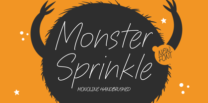 Monster Sprinkle is a monoline handbrushed font that's perfect for adding a personal touch to your design projects! With its natural, organic feel and unique character. Crafted with care and attention to detail, this font is incredibly versatile and can be used for a range of design projects, including logos, branding, invitations, and more. Its modern, handwritten style gives it a unique character that's sure to make an impact. - also multilingual support Enjoy the font! Feel free to comment or feedback! Thank you!