10,000 search results (0.025 seconds)
  1. Our Pal Hal NF by Nick's Fonts, $10.00
    Of the many lettering gurus who published chapbooks on handlettering during its heyday, one of the most prolific was H. C. Martin. This quirky poster face was offered in one of his many Idea Books, and it remains as fresh and frolicsome today, some seventy years later, as when it first appeared. Both versions of this font include the complete Unicode Latin 1252 and Central European 1250 character sets.
  2. Peas In A Pod by The Arborie, $11.00
    Peas In A Pod may be a cute font, but this type has a plethora of uses. Its use of thick and thin lines makes it a wonderful display font or an easy-to-read body font.
  3. Tin Pan Alley JNL by Jeff Levine, $29.00
    According to Wikipedia, Tin Pan Alley is the name given to the collection of New York City music publishers and songwriters who dominated the popular music of the United States in the late 19th century and early 20th century. The name originally referred to a specific place: West 28th Street, between Fifth and Sixth Avenues in Manhattan. With this in mind, Tin Pan Alley JNL, a typeface based on the bold hand lettering from a vintage piece of sheet music is aptly named.
  4. Avnei Gad Hakuk MF by Masterfont, $59.00
    Carved in stone or wood? this old looking typeface will be great for signage, posters and short texts too.
  5. Dear Rae, Love Dad by Outside the Line, $19.00
    Dear Rae, Love Dad is a modern calligraphy font drawn by hand using ink and a folded nib dip pen on rough watercolor paper. Best used in Open Type apps, it has automatically changing alternates. It is upright, dramatic, and personal. It is named Dear Rae, Love Dad because who wouldn't like to get a letter signed, Love Dad. There is also a freebie font of several blobs and some hearts. Because it just seems right.
  6. Antique Borders & Corners 2 by Aerotype, $29.00
    Hand selected from multiple sources, the 60+ glyphs of Antique Borders & Corners 2 can be mixed and matched to make authentic 18th and 19th century borders of any length. Flip the orientation for 'bottom' borders with the shift key.
  7. MFC Bruce Corners One by Monogram Fonts Co., $19.95
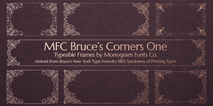
  8. MFC Franklin Corners Four by Monogram Fonts Co., $19.95
  9. Just Around The Corner by Armandop, $10.00
  10. MFC Franklin Corners Two by Monogram Fonts Co., $19.95
  11. Antique Borders & Corners 1 by Aerotype, $29.00
    Hand selected from multiple sources, the 60+ glyphs of Antique Borders & Corners 1 can be mixed and matched to make authentic 18th and 19th century borders of any length. Flip the orientation for 'bottom' borders with the shift key.
  12. MFC Franklin Corners One by Monogram Fonts Co., $19.95
  13. MFC Franklin Corners Five by Monogram Fonts Co., $19.95
  14. MFC Bruce Corners Three by Monogram Fonts Co., $19.95
  15. MFC Bruce Corners Two by Monogram Fonts Co., $19.95
  16. MFC Franklin Corners Six by Monogram Fonts Co., $19.95
  17. MFC Franklin Corners Three by Monogram Fonts Co., $19.95
  18. PR8 London Ads - Unknown license
  19. Bodoni Classic Ad by Wiescher Design, $55.00
    I became interested in designing Bodoni Classic because of a lazy graphic designer at Jacques Damase publishing house. He had to change a single letter on a bookcover about J. B. BODONI. The French call him Jean Baptiste instead of Giambattista! And that unknown graphic designer just took any old “J” from some newly cut Bodoni. All the new Bodoni cuts have square serifs, whereas the originals had rounded serifs and slightly concave feet. The single letter “J” with the squared off serif was for me like a road sign to start redesigning the entire Bodoni family. That’s exactly what I started in 1993 and a dozen years later I am finished. Okay, I am still adding new Bodoni Classics, but those are my personal additions. Yours very retro, Gert Wiescher
  20. DR Ad Astra by Darumo, $15.00
    Enjoy this sophisticated serif font. Modern trends finally meet timeless classics here. This typeface, wherever it's used, will give a sense of refinement in detail, and at the same time, a touch of relaxed elegance. If you are looking for a trendy font that could give you these feelings of modern grace and classic elegance, you've already found it. This font is quite versatile and can be used in both classic and modern designs. Whether it's a sensuous Jane Austen-inspired love letter or a trendy acid-jazz concert poster, this font will give your design a finished look and a touch of sophistication.
  21. Ad Lib WGL by Bitstream, $50.99
  22. Faux Pas JNL by Jeff Levine, $29.00
    The lettering found on an 1878 Salt Lake City advertisement for the Forepaugh’s Circus inspired Faux Pas JNL, which is a bit of a pun on the circus’ name and also a commentary on how this unusual lettering style seems to break all of the rules on stroke width and balance. According to Wikipedia: “Adam John Forepaugh (February 28, 1831 - January 22, 1890) was an American entrepreneur, businessman, and circus owner. Forepaugh owned and operated a circus from 1865 through 1890 under various names including Forepaugh's Circus, The Great Forepaugh Show, The Adam Forepaugh Circus, and Forepaugh & The Wild West. In 1889, Forepaugh sold his circus acts to James Anthony Bailey and James E. Cooper and he sold his railroad cars to the Ringling Brothers. The Ringlings used the equipment to transform their circus from a small animal-powered production to a huge rail-powered behemoth, which later purchased the Barnum & Bailey Circus. Thus, in liquidating his circus assets, he indirectly contributed to the demise of his arch-rival.” Faux Pas JNL is available in both regular and oblique versions.
  23. Architype AD 2014 by DePlictis Types, $31.00
    Inspired from archaic slavonic calligraphy, with a modern, fresh and spontaneous look, Architype AD-2014 is a display font designed for impactful and original headlines that has somehow to do with historical or religious content.
  24. Gothic 16 CG Decorative by Intellecta Design, $17.90
    a gothic drop caps font
  25. VTC-Bad Tattoo Hand One - Personal use only
  26. KG Corner Of The Sky by Kimberly Geswein, $5.00
    A fatter, more kid-friendly version of KG Lego House, this font is designed specifically for elementary teachers who requested a neat, legible font with a thicker outline.
  27. ADs Comics For All by Letters by Amal Desai, $10.00
    AD's Comics For All has everything you need from a professional comic book font but with a light, accessible price tag. The key to digitally lettering comics is mimicking the style and natural imperfections of hand lettering. This font was handmade and programmed (with nifty tricks) keeping exactly that in mind. The functionality of hand lettered comic book fonts definitely doesn't end at comic books. It can give an energetic and natural feel to just about any design. They can be especially handy when a bit of contrast is needed in a type-heavy layout. If you need an exceptional and affordable font to letter your indie comic book/manga/graphic novel, AD's Comics For All is an excellent choice. If you're a seasoned letterer, this versatile font is worth adding to your dialogue arsenal. If you're a designer and have never looked twice at a comic book, you'll find that comic book fonts are a category of their own and a useful tool in your utility belt.
  28. Deco Film Ad JNL by Jeff Levine, $29.00
    A ìthick and thinî Art Deco sans lettering design was found within the pages of the May, 1936 issue of Modern Screen magazine. This condensed typeface has rounded terminals, similar to that made by a round nib lettering pen. This is now available as Deco Film Ad JNL in both regular and oblique versions.
  29. Movie Ad Deco JNL by Jeff Levine, $29.00
    An extra-bold, hand lettered type design with a casual feel was used for the 1942 movie poster “Tortilla Flat”. This served as the inspirational model for Movie Ad Deco JNL, and is available in both regular and oblique versions.
  30. Music Ad Stencil JNL by Jeff Levine, $29.00
    An ad appearing in the January 5, 1952 edition of Billboard Magazine promoted the then-new releases from Capitol Records. The headline copy was set in a bold, condensed sans serif stencil typeface. This inspired Music Ad Stencil JNL, which is available in both regular and oblique versions.
  31. Heavy Heap - Unknown license
  32. Aminta by Alias Collection, $60.00
    Aminta is an eclectic and expressive take on the Courier aesthetic. Aminta mixes the utility aesthetic of Courier, the default computer typeface and subversive piece of non-design graphic designers are presented with in the top left hand corner of Quark documents, and eclectic and expressive letterforms derived from drawing and handwriting.
  33. Green Fuz - Unknown license
  34. Manometer by Fontador, $18.99
    Manometer is a pneumatic ultra-black slab serif typeface with soft corners and fine counters.
  35. Afrobeat by Resistenza, $39.00
    Inspiration The pounding tribal rhythms of Afrobeat music is expressed through this psychedelic brand new font, Afrobeat. Every letter becomes art as every letter is elegantly placed side by side, like music notes, creating music for the eyes. Afrobeat is a musical style performed by many African artists such as Fela Kuti, Femi Kuti, Antibalas and many more, which is a fusion of jazz,funk, and psychedelic rock, originating from the 60s and was based on the political movements of Nigeria. The Font This font is perfect for when you want to use eye-catching big texts for anything from posters and flyers for concerts, events, parties, to CD covers, advertisements, and art, but it’s especially striking for printed projects. Check out also ‘Afrobeat light’
  36. Marketing Stencil by Jeff Levine, $29.00
    Vintage (circa 1960s) packaging for Parker Cartridge Pen Erasers had the product description printed in bold stencil lettering featuring a squared look with rounded corners. This design has been recreated digitally as Marketing Stencil JNL, which is available in both regular and oblique versions.
  37. Mexcellent - Unknown license
  38. Eksperiment by PizzaDude.dk, $18.00
    Eksperiment is danish for experiment. Without much guessing or knowledge to danish, you probably already knew that! I like those danish words containing a "k" - is it because my name is spelled with a "k"? I don't know - maybe it's because it kind of represents the danish language, which is full of words with "k"s. Anyway, the reason for the name is that I wanted a font looking like it had gone through tough times, a bad copy machine and perhaps even crumpled paper...but the experiment is that the font is 100% made using digital media. I used my MacBook and my iPad creating this font. I find it quite amusing, that something 100% digital looks like something organic. I've added 5 different versions of each letter, which is really helpful when working with grunge fonts. It looks more natural, when the same letter rarely repeats itself.
  39. Ascender Sans Mono by Ascender, $92.99
    The Ascender Sans Mono font family was designed by Steve Matteson as an innovative, refreshing sans serif design that is metrically compatible with Courier New. Ascender Sans Mono offers improved on-screen readability characteristics and the pan-European WGL character set. The Ascender Sans Mono Family (4 fonts) solves the needs of developers looking for width-compatible fonts to address document portability across platforms. Character Set: Latin-1, WGL Pan-European (Eastern Europe, Cyrillic, Greek and Turkish).
Looking for more fonts? Check out our New, Sans, Script, Handwriting fonts or Categories
abstract fontscontact usprivacy policyweb font generator
Processing