10,000 search results
(0.05 seconds)
- SF Intermosaic - Unknown license

- Action Man Extended - Unknown license

- Futurex Distro - Protection - Unknown license

- SF Chaerilidae - Unknown license

- Futurex Distro - Survival - Unknown license

- Futurex Distro - Numb - Unknown license

- UltraBlack Initials - Unknown license

- SF Chaerilidae - Unknown license

- MicroMieps Diet - Unknown license

- Kingsroads by Essentials Studio,
$18.00 Introducing by Essentials Studio Proudly Present, Kingsroad Kingsroad Is a A Modern Retro Script Font With 100+ Alternate Kingsroad is perfect for product packaging, branding project, megazine, social media, wedding, or just used to express words above the background.
 - Fairport by Ryan Corey,
$10.00 Fairport is a fully functioning display font based on the lettering from the 1960s folk band Fairport Convention’s debut album. In lieu of lowercase letters, Fairport features a full array of stylistic alternates to add variety to any text.
 - Page Ephesian NF by Nick's Fonts,
$10.00 A clean, classic woodtype face from the William H. Page Company, as fresh today as it was over 120 years ago. Both versions of this font support the Latin 1262, Central European 1250, Turkish 1254 and Baltic 1257 codepages.
 - Dutchly by Good Java Studio,
$20.00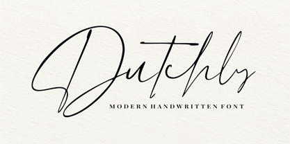 Dutchly is a modern, handwritten, signature font. It is perfect for logos, invitations, stationery, wedding designs, social media posts, advertisements, product packaging, product designs, labels, photography, watermarks, special events and more. Dutchly includes 140+ Ligatures and multi-lingual support.
 - RM New Albion by Ray Meadows,
$19.00 A classic blackletter Which looks best at 16pt and above. Due to the modular nature of this design there may be a slight lack of smoothness to the curves at very large point sizes (around 100 pt and above).
 - Occidental Tourist NF by Nick's Fonts,
$10.00Dave West's eponymous Futura Casual, designed for Photo-Lettering, Inc. in the 1960s, inspired this loosy-goosy take on a classic face. Both versions of the font contain the complete Unicode Latin 1252 and Central European 1250 character sets. - Tokyo Olive by Dharma Type,
$14.99 Tokyo Olive was designed as an homage to nostalgic display types and advertisements in the mid-late 80s. The mid-late 80s was the era of the post-modernism and fancy-decorative design especially in Japan In other words, it was the mixture of superficial form-operation and girly taste. This curious design movement vanished without a trace in the 90s, but it had its moments. Tokyo Olive has voluminous and simple geometric skeleton (for post-modern) with rounded and craft-style stencil joints (for fancy decoration). We added a classic open style as a little spice. The mixture of those essences makes new impression we have never seen before. Tokyo Olive family consists of 5 styles for stacking color font. Please use Photoshop or Illustrator, or your favorite graphic design apps that can handle layers. Layers are the printing plates of wood type. You should be able to change text color for each layer. Tokyo Olive "Standard" style is the base of this font family. You can add open effect by stacking "Fill" layers over the Standard layer. Instruction 1. Type your text as you like. 2. Set font-name "Tokyo Olive" and font-style "Standard". 3. Set color of "Standard" layer. 4. Duplicate the "Standard" layer to make "Fill" layer. 5. Set font-style "Half Fill" or "Full Fill" and new color of upper layer. Tokyo Olive Standard, Half Open, and Full Open style can be used solely.
 - Technotyp by URW Type Foundry,
$39.99 The digital font Technotyp is based on the hot metal typeface created by the German typographer and type designer Herbert Thannhaeuser (1898-1963) for the former East German type foundry Typoart in Dresden. In the typography book ‘Der Schriftsetzer’ (Fachbuchverlag, Leipzig, 1952), by Paul Fritzsche, this absolutely beautiful slab serif design is presented in all its variations. Fritzsche remarked that – because of its rather condensed form and its relatively long ascenders – the 'Werkschrift' of the Technotyp (comparable with our 'Regular') seemed to be very well suited to serve as a text face, and recommended for this purpose that the face be cut for the composing machine. However, this never happened and the entire Technotyp family was made available for hand composition only. This is finally changing and being remedied for good now: URW++ proudly presents the new digital version of this really charming font family with its distinct flavor of the 1950s, adding it to the other digital renditions of Herbert Thannhaeuser fonts at URW++, namely Garamond No. 4 and Magna. The original Typoart family had an italic style for the light version only. The new digital version of Technotyp includes italic styles for the regular, medium and bold weights as well, enhancing the family to meet today’s standards and requirements for professional type setting. To further increase its usefulness, Cyrillic faces were created, too. True to the standard for all digital fonts at URW++, the character set for Technotyp covers all West- and East European languages.
 - Sánchez Niu by Latinotype,
$- Sánchez Niu is a redesign of Sánchez—one of the first font families by Latinotype designed in 2011. In the typedesign industry the terms ‘nova’, ‘neue’, ‘next’, ‘new’ are often used to refer to a typeface that has been modified in different ways: redesign, technical readjustments, greater number of characters, etc. At Latinotype we are now starting to use the word ‘niu’ to refer to these kinds of typefaces. Niu is an adaptation of the original word ‘new’, i.e., we have adapted this English word to the phonology and spelling of our own language but keeping the original meaning. Race mixing, diversity, change and adaptation are part of the essence of Latin American culture and, at Latinotype, we are all constantly expressing these elements in everything we do. Latin Power! This new version includes improvements that make it work well with longer text. Such improvements have not had a major effect on the look of the font, though. We have adjusted the original proportions and added a number of new characters as well as OpenType features such as small caps, oldstyle figures, tabular numbers and stylistic alternates. Sánchez Niu contains a set of 720 characters that support 219 languages. The font is well-suited for long text, headlines and logotypes, and it has been optimised for web usage. Sánchez Niu comes with two free fonts—Regular and Regular Italic! Corrections, digital editing and review by César Araya, Rodrigo Fuenzalida and Alfonso García.
 - Lust by Positype,
$49.00 Lust’s original masters were completely redrawn, expanded, with a new optical size added based on customer requests. Lust now sports 6 fonts, instead of the original 4: Standard, Display, Fine, and complementing Italics. The character set has been expanded as well to include more OpenType features and more swashes. The Lust Collection is the culmination of 5 years of exploration and development, and I am very excited to share it with everyone. When the original Lust was first conceived in 2010 and released a year and half later, I had planned for a Script and a Sans to accompany it. The Script was released about a year later, but I paused the Sans. The primary reason was the amount of feedback and requests I was receiving for alternate versions, expansions, and ‘hey, have you considered making?’ and so on. I listen to my customers and what they are needing… and besides, I was stalling with the Sans. Like Optima and other earlier high-contrast sans, they are difficult to deliver responsibly without suffering from ill-conceived excess or timidity. The new Lust Collection aggregates all of that past customer feedback and distills it into 6 separate families, each adhering to the original Lust precept of exercises in indulgence and each based in large part on the original 2010 exemplars produced for Lust. I just hate that it took so long to deliver, but better right, than rushed, I imagine.
 - Jazayeri Kufic Shoushtar by Arabetics,
$79.00 The Jazayeri Kufic Shoushtar font is a beautiful typographic implementation of the decorative Kufic calligraphy inscribed on the walls of the historic Grand Mosque of Shoushtar in southwestern Iran. This mosque contains many other inscriptions added over time for documentary purposes but its four monumental Kufic inscriptions which are revived in this font are the most essential ones to understand its design and meaning. Built in the ninth century CE, this mosque is one of the earliest hypostyle mosques in Iran. It was built in “the city of scholars” when its residents included two great Sufis, Sahl Ibn Abdullah Tostari and Mansur Hallaj. The designer and producer of the font is Seyed Mohammad Vahid Mousavi Jazayeri, a well-known Iranian master calligrapher, designer, scholar, and author. Mousavi Jazayeri has taken a personal interest in the Kufic script and devoted years to independent research, visiting archaeological locations, historic buildings and cemeteries, mosques, libraries and museums to study the script through direct contact. He has developed a systematic research methodology and published his findings in several books. His professional interest in script and calligraphy stimulated his discovery of the historic method for cutting the Kufic pen, which has had a direct impact on his own work, as seen in several well-received exhibitions and workshops. The historical research and achievements of Mousavi Jazayeri brought together the first international group dedicated to the study and revival of the historic Kufic script operation through kuficpedia.com.
 - Hiragino Sans by SCREEN Graphic Solutions,
$210.00 Mindful that Hiragino Sans (Kaku Gothic) would be used in conjunction with Hiragino Serif (Mincho), SCREEN developed a font that anticipated today’s world where most people do their reading on displays and yet still has an orthodox letterform that does not blur when printed on paper. In short, our goal with this font was to create a new concept that responds to the demands of today’s times. This font offers weight variations from W0 to W9 and is extremely versatile. This makes it well-suited to all visual expression media including paper, metallic textures, resins, cloth, television, movies, broadcasting, websites, and electronic displays. One of the design’s strongpoints is that it elides serif on the right side of each stroke, thus delivering more spacious counters and a comfortable appearance. Thanks to this, the typeface not only delivers a contemporary, lively impression same as Latin sans serif typefaces, but also heightens the natural continuity and readability of text whether it is set vertically or horizontally. As a result, it makes it possible to bring a strong appealing power to text. Without a doubt, this is typeface that above else embodies the role of Sans Serif.
 - Mofid Mahdi by Linotype,
$187.99Mofid Mahdi is a distinctive, bold Arabic display face, suitable for heading and titling work in Arabic newspaper and magazine composition. In this typeface the rounded internal counters and dots contrast with the angular and more robust outlines of the letterforms to give a decorative, harlequin-like appearance. The design was originally developed for use in dry-transfer format, and was first produced as a digital font by Linotype-Hell Ltd. in the early 1980s. Initially a simplified face, with its inherent limited range of letterforms, Mofid Mahdi was enhanced during the late 1980s by the introduction of medial letterforms to improve character spacing and balance. The recent advent of OpenType has led to the release of Mofid Mahdi. This OpenType font includes Latin glyphs from Memphis Extra Bold, allowing users to set text in both most Western European and Arabic languages without switching between fonts. Mofid Mahdi incorporates the Basic Latin character set and the Arabic character set, which supports Arabic, Persian, and Urdu. The font also includes tabular and proportional Arabic, Persian, and Urdu numerals, as well as a set of tabular European (Latin) numerals. - Soleil by TypeTogether,
$49.00 Soleil, designed by Wolfgang Homola, is a geometric sans serif typeface. Unlike most existing geometric sans serif typefaces, it has asymmetrical counters, making it look fresher, more dynamic and more contemporary. Simple geometric forms – such as the circle or the square – played a certain role in the design of the letterforms, but in order to introduce more fluidity into the rather stiff and rigid concept of geometric sans serif typefaces, a lot of optical corrections were necessary. Soleil is based on the modernist ideas of simplicity, clarity and reduction to essential forms. Yet its letter shapes are not the result of geometric construction, but of a design process that brings together simplicity and fluidity, clarity and rhythm. Soleil has a rather large x-height, making it legible also in small sizes or from a bigger distance. The typeface family consists of six weights. The Opentype version also allows for the implementation of typographic features such as Small Caps, lining and old-style figures, both tabular and proportional, ligatures, alternate characters, case-sensitive variants and fractions. Soleil offers a wide range of potential applications: signage and wayfinding systems, book and magazine design, branding and corporate publications.
 - Le Monde Journal Std by Typofonderie,
$59.00 A highly legible typeface in 4 series Le Monde Journal by definition is intended for newspaper use & at small sizes. It’s an economical and workshorse typeface adapted to any extrem condition of uses. Even though it has the same colour as Times, it appears more open. The reading flow has been made more fluent & less abrupt. The glyphs counters are bigger, as if they were “alluminating the interior.” The form, characterized by its serifs, remains embedded in our visual memory. Intermediate weights like Book can be considered as a grade supplement of the Regular. Italics accompany Le Monde Journal. With a more delicate design & a distinctive rhythm, they remain noticeable when used with the romans. Its companion, Le Monde Sans can extend your typographic palette. For beautiful page layout, use it in conjunction with Le Monde Livre for titling sizes. The verticals metrics and proportions of Le Monde Journal are calibrated to match perfectly others Typofonderie families. This family was designed in 1994 as bespoke typeface family for the French newspaper Le Monde. The family is not used any more by this newspaper from November 2005. Bukva:raz 2001 Type Directors Club .44 1998 European Design Awards 1998
 - Audacious by Monotype,
$40.00 Audacious is a quirky, confident and adorable serif type family across five weights in both text and display styles. This attention-grabbing retro typeface has an imperfect nature that embraces its quirks and irregularities, giving each font a distinctive and somewhat oddball personality. Its defining characteristics include large open counters, awkward stresses, large exaggerated wedge serifs, and voluptuous teardrop terminals. Whatever typographic compositions you create, Audacious will demand attention, making it perfect for titling, headlines, logotype, and branding projects. Take advantage of the 182 stylistic alternates to embellish your type and add that touch of class to titles and logos. Display weights work really well with close line spacing and stunning headlines are a breeze to create. Text weights make for a pleasant reading experience while packing all the punch and versatility found in the display variants. There are 20 fonts altogether, in Text and Display styles with weights from Regular to Black in both roman and italic. Audacious has an extensive character set that covers all Latin European languages. Key features: 2 Styles in Roman and Italic 5 weights: Regular, Medium, SemiBold, Bold, & Black 182 Alternates Full European character set (Latin only) 1100+ glyphs per font.
 - Cresta by James Todd,
$40.00 Loaded with personality and functionality, Cresta is built to look good while surviving the worst conditions. It is at home on screen and in a magazine. Its six weights are intended to be used everywhere. Unlike most typefaces, Cresta was built without a reference. For this project, everything design choice was based on what worked best for a workhorse sans serif family. Cresta was originally created as the primary typeface for this website. This meant it needed to work in copy, headlines, and navigation across all devices, browsers and operating systems. This meant it needed to be sturdy and have enough character to make it stand out from other UI typefaces. With its large x-height, ample counters, and giant apertures, Cresta is meant for easy utility in rough conditions. Even with all of this, that doesnít mean that its dull; as the weights increase, the style of Cresta becomes more appearant. This style is defined most apparently by the terminals on the lowercase r and the angle of the joins between the curved and straight strokes (such as in the connection on the n).
 - Edgar No 9 by Type Innovations,
$39.00 Edgar No. 9 is an original design by Alex Kaczun. Edgar No. 9 is a derivative work based on his Big Boy typeface series. It was designed specifically for display headlines, logotype, branding and similar applications. Primarily a display, this extremely versatile font has generous proportions, large counters and loose fitting which also allow the font to work well across a wide range of text sizes. Edgar No. 9 is a heavy baroque slab serif and although it shares the underling skeleton of 'Big Boy', it is a much more compact in overall proportions and spacing. A handsome bold headline font that works well in text as well as display sizes—ideally suited for publications and advertising. Alex plans to expand the font series to include a large range of weights along with corresponding italics numbering 1 thru 9, as well as, true small capitals and old style figures. Distressed version(s) will also be available in upcoming releases. Stay tuned, more to come soon. The large Pro font character set supports most Central European and many Eastern European languages.variations to expand this 'hip' new font series. Groovin' baby.
 - Hiragino Serif by SCREEN Graphic Solutions,
$210.00 Hiragino Serif (Mincho) is a font adapted for the digital age. It was designed to permit finely detailed tuning that allows the sizes of both kanji and kana to be adjusted for greatest visibility. It also broadly satisfies the needs of modern graphic design in advertising, posters, pamphlets, magazines, and other such uses. The font makes the counters comfortably wide while gracefully raising the text's center of balance, ensuring that the typeset characters will be smooth and well-defined. It gives each line a modern impression thanks to a judicious balance of light and shade and draws out a vivid readability that makes it possible to comfortable push forward with one’s reading. Latin alphabet and numbers have all been originally designed so that the weights of typeface and the flow of the baseline between Japanese and Latin characters are extremely consistent. Of particular note, vertically formatted text that mixes both Japanese and Latin characters can be beautifully rendered using only this typeface. Thanks to the use of authentic and sophisticated basic design , it creates a different atmosphere by combination of optional unique kana typefaces.
 - ITC Avant Garde Gothic Paneuropean by ITC,
$49.00ITC Avant Garde Gothic¿ was designed by Herb Lubalin and Tom Carnase in 1970. They based it on Lubalin¿s logo for Avant Garde Magazine - an exciting construction of overlapping and tightly-set geometric capitals. ITC Avant Garde is a geometric sans serif; meaning the basic shapes are constructed from circles and straight lines, much like the work from the 1920s German Bauhaus movement. The early versions of ITC Avant Garde became well-known for their many unique alternates and ligatures that still conjure up the typographic aura of the 1970s. These fonts contain the basic alphabets (without the old unusual ligatures). Still strong and modern looking, ITC Avant Garde has become a solid staple in the repertoire of today's graphic designer. The large, open counters and tall x-heights seem friendly, and help to make this family work well for short texts and headlines. The condensed weights were drawn by Ed Benguiat in 1974, and the obliques were designed by Andr¿ G¿rtler, Erich Gschwind and Christian Mengelt in 1977. ITC Avant Garde¿ Mono is a monospaced version done by Ned Bunnel in 1983. - FF Nort by FontFont,
$72.99 FF Nort™ has all the design attributes that make for an exceptionally versatile print and web typeface – and it benefits from a distinct personality. Equally at home in long-form text copy or billboard size headlines, the family knows few boundaries. There is also a handcrafted neo-grotesque quality to the design, giving FF Nort a friendly mien and separating it from other industrial strength sans serif typefaces. Terminals are clipped at 90° angles to the stroke and counters are slightly condensed, saving space with no loss of legibility. The light weights have a subtle elegance, while the bold are commanding. All eight weights, and their italic companions, enjoy a large character set, with support for most Central and several Eastern European languages – including Cyrillic and Greek. Drawn by Jörg Hemker, the inspiration for FF Nort came from Transport, the typeface designed for Britain’s highway signage. Transport is formal, intellectual, and a model for modern street signage, but it was not intended for small sizes or continuous reading. Hemker took the basic structure of Transport and rebuilt it into a design that’s perfect for a wide range of contemporary hardcopy and digital imaging projects.
 - Aeris by Linotype,
$29.99 Aeris™ typeface is a contemporary book face created by the American designer Tom Grace. It combines the proportions and rhythm of a sans serif font with the high contrasts and flexed strokes of script faces, while the open counters also ensure optimal legibility. Tom Grace focuses on providing subtle differentiations in his cuts and, as a consequence, this font family has its own individual structure: there are A and B variants of the basic forms regular, italic, bold and bold italic, and a display version for use in titles that also comes in A and B variants. It is advisable to use the A variant for larger font sizes, while the slightly more emphasized B variant can be recommended for smaller font sizes. Where the basic forms are to be mixed together in a work, it is important to use the corresponding A/B variants throughout as their designs have been carefully coordinated. Aeris is available in the OpenType Pro format and thus includes a wide range of different glyphs. The font family can be used in various environments, such as books, magazines, advertisements and promotional materials, but it is also the perfect choice for printed corporate documentation.
 - Sqwared by Monotype,
$25.00 Sqwared is a square sans serif type family... with flares! This typeface has a retro, hand-painted quality – the slight flaring of its verticals evoke the steady brush of a signwriter. Sqwared benefits from large, open counters and a generous x-height that aids clarity and legibility, while a wide footprint gives these fonts a degree of stature and an air of confidence. Each character was drawn while immersed in a late sixties/early seventies vibe, but there’s no reason why Sqwared can’t be used for your contemporary designs. There are 16 fonts altogether, ranging from Thin to Ultra weights in both roman and italic. It has a Latin character set that covers all Latin European languages. Sqwared will dazzle in headlines, add flair and distinction to your logo designs, bring flamboyance to your branding material, and your body text will most definitely be unique! Variable fonts are included in this family, so you can tune the weight of each font to your exact preference. Key features: 8 weights in Roman and Italic Old Style Figures included Full European character set (Latin only) 440 glyphs per font.
 - Urbani by W Type Foundry,
$25.00 URBANI is the result of a mix between Neohumanist and Neogrotesque types. The subtle narrowness of its proportions makes it ideal for composing extensive blocks of text. The slightly superior height of its ascenders, the wider proportions of its counter-forms, the addition of ink traps at certain stroke intersections; every aspect of URBANI’s design was conceived with reading in mind. The Opentype tool Alternative Glyphs is especially important, since its use is fundamental in achieving a universal and geometrical visual language through the rationalization of the font family. URBANI is inspired upon the works of Adrian Frutiger and Paul Renner, a constant source of admiration and inspiration to W. This type family comes fully equipped with Opentype tools, a huge range of alternate glyphs, fractions, modern and old style numbers, superiors and inferiors, ligatures and smallcaps. Universality is a major goal when it comes to creating our fonts. URBANI is ideally suited for general graphic design, print and digital publications, motion graphics, web design, branding and interaction design. Learn about upcoming releases, work in progress and get to know us better! On Instagram W Foundry On facebook W Foundry wtypefoundry.com
 - Praxis by Linotype,
$29.99 Praxis™ was designed in 1976 by Gerard Unger for the German technology corporation Dr.-Ing Rudolf Hell. Praxis is the sans serif counterpart to Demos, another early digital type designed by Unger, who is an accomplished Dutch typographer and teacher. Praxis and Demos share important characteristics, such as open counters, a tall x-height, and blunt stroke terminations. Both faces have very little thick/thin variation, which facilitates smooth linear enlargement and reduction. And like Demos, Praxis is a flexible and legible typeface that works well in small point sizes and on low-quality paper (office documents, newsletters, newspapers, etc.). The word "Praxis" comes from Greek, and means "a practical application." In the late 1990s, Demos and Praxis, along with Univers 57, were selected as the official typefaces of the German Government. More info. In 1990, Linotype AG merged with Dr.-Ing Rudolf Hell GmbH, forming the Linotype-Hell AG (today Linotype GmbH). Since then, Linotype has been the official source of all fonts that were originally designed for the Hell Corporation. Linotype has also improved the typefaces using new technologies, including OpenType."
 - Perfora by In-House International,
$15.00 Perfora is the typographic antidote to our relentlessly anxious and uncertain times. On one hand, Perfora is heavy, monospaced and brick-like. It feels secure, permanent, reliable. On the other, Perfora is extra variable—stretching taller or growing wider as needed—so all your words can fit perfectly together. And this seeming contradiction is the sweet spot we’ve all been missing: sturdy but not rigid. Named for its punch-hole shaped counters and eyes, Perfora is a flexible powerhouse that’s easy to use, stack, and click into any shape. Use it to assemble everything from dynamic logos to posters and festival lineups, from seamlessly responsive titles to instantly recognizable product lines. Perfora features two uppercase styles—rounded and angular—punctuation, numbers, latin diacritics, and stylistic alternates for a subset of characters. It also includes 19 ornamental glyphs to compose with flair and add some rhythm to your copy. It’s available (and recommended) as a variable type (.ttf) for designers using compatible platforms. It’s also available in opentype format (.otf) as a set of 25 static fonts, spanning 5 widths and 5 heights. Perfora was created by In-House International, designed by Alexander Wright and developed by Rodrigo Fuenzalida.
 - Amitale by Hackberry Font Foundry,
$24.95 Amitale (A-mi-tah'-lay) is the union of Amitale Book and Amitale Wide into a new 8-font book family in my continuing objective of designing a better font family for readability in booklets. My goal here is for a full range of styles from light, regular, bold, and black without the plugged counters and clunky feel of most bold fonts. In my use, personally. I do not use Amitale Book Bold. I use Wide for the bold and Wide-Bold for the black style. In many ways, Amitale is Brinar with bracketed serifs. Many people find Brinar to be an exceptionally readable and beautiful humanist sans. This new serif font family has many of the same characteristics. This is also the debut of my new OpenType features set for 2009. There are more and more ligatures for your fun and enjoyment: bb gg ff fi fl ffi ffl ffy fj ft tt ty Wh Th and more. Like all of my fonts, there are: caps, lowercase, small caps, proportional lining figures, proportional oldstyle figures, & small cap figures, plus numerators, denominators, superiors, inferiors, and a complete set of ordinals 1st through infinity.
 - Milk Drops by Duck Soup Design,
$12.00 Milk Drops is a semi-casual-feeling cross between a didone and slab serif display font. Elegant, flourishy, whimsical and bold, as much as one font can be any or all of those things! It has highly contrasting weights, but not so much to take itself too seriously or risk legibility. Playfully, it entertains the teardrop motif wherever it can – in expected areas like the descender of a "y" and the ascender of an "f", but also in some whimsical flourishes. Many of the uses of the teardrop motif are implemented on the terminals and ears where many old prints may have suffered from bleed of ink – answering a "what if" question like "what if those accidental bleeds were designed on purpose?" or "what if a font were designed as though it was already seen through blurry eyes?" Milk Drops also features stencil-like open counters and lots of ligatures (32). Note also, it has some super-nerdy additions like symbols for Bitcoin, Pilcrow, Interrobang and Irony Mark. Language Support Milk Drops is highly versatile – with an impressive count of 470 glyphs, it can accommodate up to 78 latin-based languages.
 - Linotype Devanagari by Monotype,
$103.99 The new Linotype® Devanagari typeface is a traditional text face now available in five weights (from Light to Black) and suitable for a wide variety of print and digital uses. A compact design, Linotype Devanagari also provides economy of space where textual real estate is at a premium. In addition, its large character set enables the setting of Hindi, Marathi, Nepali and is suitable for Sanskrit passages. The design’s open counters ensure high levels of legibility at small sizes and at modest resolution. The history of Linotype Devanagari is quite extensive. Inspired by the late 19th and early 20th century Nirnaya Sagar designs, it was originally designed in 1977 by Mathew Carter for phototypesetting systems. It was then revised and expanded for digital typesetting by the Linotype letter-drawing studio headed by Georgie Surman under the art direction of Fiona Ross. This new, enhanced revival was designed by Lisa Timpi and Gunnar Vilhjálmsson with Fiona Ross as a consultant. This new Linotype Devanagari is part of a project to refresh the pivotal Linotype Bengali and Linotype Gujarati typefaces and make them available for the first time in the popular OpenType font format.
 - PF Benchmark Pro by Parachute,
$79.00 Benchmark Pro is a carefully structured geometric typeface which works amazingly well in body text due to its simplistic nature and large x-height. The design of Benchmark Pro started out as an attempt to convert the minimalistic structure of a technical and purely geometric design into a readable modern and friendly sans serif. This was achieved by selectively changing and turning the straight lines of the initial drawings into curves and applying legibility techniques to the transformed letterforms. These letterforms have a distinct personality which is bolstered by its angular curves and open counter terminals. The result is a contemporary text typeface that looks quite fashionable. Benchmark Pro gets away from the ultra modern and mechanical structure but keeps its display nature, it gets away from the classical but still remains legible. This robust san serif type family offers an extended character set which supports simultaneously Latin, Cyrillic and Greek. All Benchmark Pro font variants have a companion italic, rounding the total family members at 14 fonts. Each font includes more than 750 glyphs and is powered with 17 opentype features. PDF Specimen Benchmark on Behance
 - Ambulance Shotgun Pro by CheapProFonts,
$10.00 Another grungy masterpiece from Guillaume - this one with a woodprint touch. I have made the lowercase letters different from the uppercase by removing the cross-shaped counters and flipping where possible. Even the numbers have solid variants - available as OpenType "Stylistic Alts". Enjoy the new flexible possibilities! ALL fonts from CheapProFonts have very extensive language support: They contain some unusual diacritic letters (some of which are contained in the Latin Extended-B Unicode block) supporting: Cornish, Filipino (Tagalog), Guarani, Luxembourgian, Malagasy, Romanian, Ulithian and Welsh. They also contain all glyphs in the Latin Extended-A Unicode block (which among others cover the Central European and Baltic areas) supporting: Afrikaans, Belarusian (Lacinka), Bosnian, Catalan, Chichewa, Croatian, Czech, Dutch, Esperanto, Greenlandic, Hungarian, Kashubian, Kurdish (Kurmanji), Latvian, Lithuanian, Maltese, Maori, Polish, Saami (Inari), Saami (North), Serbian (latin), Slovak(ian), Slovene, Sorbian (Lower), Sorbian (Upper), Turkish and Turkmen. And they of course contain all the usual "western" glyphs supporting: Albanian, Basque, Breton, Chamorro, Danish, Estonian, Faroese, Finnish, French, Frisian, Galican, German, Icelandic, Indonesian, Irish (Gaelic), Italian, Northern Sotho, Norwegian, Occitan, Portuguese, Rhaeto-Romance, Sami (Lule), Sami (South), Scots (Gaelic), Spanish, Swedish, Tswana, Walloon and Yapese.


