10,000 search results
(0.246 seconds)
- Beatgh by Skiiller Studio,
$20.00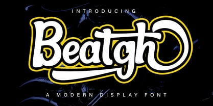 Beatgh is a modern, cool, beautiful, and very suitable display font to support your presentation and support in marketing your products and business
 - Peerless by Wooden Type Fonts,
$15.00 A revival of one of the popular wooden type fonts of the 19th century, suitable for display, or text, closely related to Latin.
 - Antique Sans by Wooden Type Fonts,
$15.00A modified remake of one of the popular wooden type fonts of the 19th century. An extra bold sans serif suitable for display. - Almarena by Almarena,
$29.00 Almarena® is a family of modern sans serif fonts. It has 2 styles (Classic & Display), 6 font weights and many alternative characters.
 - Merrant by Max Prive,
$28.00 Merrant® is a lithe geometric display typeface designed by Max Prive. The Merrant® family has 3 weights – Lithe, Regular, and Bold.
 - Zamaica by WNGSTD,
$5.00 Zamaica is a thin and modern display font. Add it to your most creative ideas and notice how it makes them come alive!
 - Sketchetik by Hiekka Graphics,
$19.00 Sketchetik is a hand-drawn font in four styles: light, regular, bold and black. It is recommended for use as a display typeface.
 - Tuscan Italian Round by Wooden Type Fonts,
$20.00A revival of one of the popular wooden type fonts of the 19th century, for large display. Lowercase not designed for this type. - eSpectrum by Jonahfonts,
$29.00 A text and display font suitable for various applications, many of which include, letterheads, packaging and logos. Excellent for very large typographic layouts
 - Jacoby Modular by Jacoby Type Co,
$12.00 Jacoby Modular is a geometric sans serif display typeface with six styles. Jacoby Modular is a dynamic, bold typeface with a sculptural feel.
 - Fix Sys by ParaType,
$25.00Developed for ParaType (ParaGraph) in 1995 by Alexander Tarbeev, based on letterforms of various screen fonts. For use in advertising and display typography. - Merry santa by Sealoung,
$12.00 Merry Santa is a friendly and festive display font. Fall in love with its sweet and unique style and create amazing Holiday designs.
 - Rocklogo by Gaslight,
$25.00 Rock Logo is an all caps, display typeface, inspired by old cool rock/metal band logos. It has many alternates, swashes and ligatures.
 - Ellen by Lebbad Design,
$29.95 Ellen is a charming elegant serif face. Great for headline display and text use. Many alternates and ligatures are included with this font.
 - Cicero Series by Alphabet Agency,
$15.00 Cicero Series is a bold decorative serif display font that exudes power, strength, magnificence, prestige. Add this grandiose piece to your font collection.
 - Shunsine by Portograph Studio,
$19.00 Shunsine is a distinct and elegant display serif font. Its stylish alternates and ligatures make this font the perfect match for any project.
 - Purple Sigh by Clevus,
$16.00 Proudly present Purple Sigh Typeface. Purple Sigh equipped with several OpenType. Have 40+unique alternates and ligatures. Comes with alternatives and ligatures, and helps to create stunning logos, quotes, posts, blog posts, branding projects, magazine imagery, wedding invitations, poster and much more. Font Features : Lettres, numbers, symbols, and punctuation 40+ alternates and ligatures No special software required they may be used even in canva, any basic program /website apps that allows standard fonts That's it folks! Multilingual Support Language Support: Danish, English, Estonian, Filipino, Finnish, French, Friulian, Galician, German, Gusii, Indonesian, Irish, Italian, Luxembourgish, Norwegian Bokmål, Norwegian Nynorsk, Nyankole, Oromo, Portuguese, Romansh, Rombo, Spanish, Swedish, Swiss-German, Uzbek (Latin) Follow My Shop For Upcoming Updates Including Additional Glyphs And Language Support. And Please Message Me If You Want Your Language Included or If There Are Any Features or Glyph Requests, Feel Free to Send me A Message. Have a Good Day !
 - Indecise by Tipo Pèpel,
$22.00 Even though the name seems not to tell much, Indecise shows a clean and coherent design. The shapes of the characters reference the Latin typefaces that were promoted by great figures like Enric Crous-Vidal and José Mendoza y Almeida in the 50s. Indecise uses the body of incise typefaces and gets rid of the subtle terminals for the strokes. It is a high-contrast sans divided into 5 elegant subfamilies, which use different widths. From the condensed version to the extended one, the family includes 50 fonts counting upright and italic. This collection of widths make for many possible combinations of styles. Indecise is a humanist typeface, it puts geometry apart and embraces the calligraphic gesture. This helps to suggest the movement of the strokes while avoiding to create text with a static appearance. Thin and thick strokes come together and define a smooth rhythm for reading.
 - Abril by TypeTogether,
$39.00 Conceived specifically for intensive editorial use, whether it is in newspapers, magazines or digital media, Abril is a font family of two worlds. The titling weights, based on a contemporary revamp of classic Didone styles, display both neutrality and strong presence on the page, attracting the reader’s attention with measured tension in its curves, good color and high contrast. It also features typographic niceties such as ornaments, borders, special dingbats and alternate letters and numbers that propose a broad palette of tools to the designer. The text weights are more closely inspired by both, 19th century slab serifs and scotch roman types. They maintain consistency with the headline styles, and at first glance may appear to have the same shapes only with lower contrast. However, in reality the letter forms of Abril Text were engineered from scratch to achieve a color, texture and overall width that allow using the font comfortably in the most challenging environments for continuous reading, such as newspapers. This also makes it a great font family for pocketbooks and magazines. Abril competes, in terms of economy of space, head to head with some newspaper classics such as Utopia or Nimrod, but featuring a more contemporary look and feel; and unlike them, includes a full set of small caps with numbers and punctuation. The four main text weights of Abril Text were also manually hinted which grants the possibility of a smooth transition from printed media to web platform. Abril consists of 8 text styles and 12 display styles, all of them containing the standard TypeTogether character set that supports over 50 languages including those from Central and Northern Europe.
 - Advertising Script by Zetafonts,
$39.00 Advertising Script is a brush script typeface inspired by a handmade sample drawn by the calligrapher Ross Frederic George and depicted in Speedball 1947 Textbook Manual. Advertising Script has a vintage brush script look, perfect for food packaging, display and logo design and period advertising. The original design has been completely reworked and extended by the Zetafonts Masterclass 2016 Team to provide three lighter weights, a rough and a monoline variant, and to produce an extended character set with open type support for ligatures, alternates, European languages and ending swashes. Advertising Script covers over 40 languages that use the Latin alphabet, with a full range of accents and diacritics. It comes in four weights plus a special monoline weight. Advertising Script makes full use of Open Type ligatures to provide swashes, alternates and a wide array of ligature characters for a more handmade, natural look. Swashes can be accessed through glyph palette or by typing one to six underscores after the letter. Take care: open type features are developed using open type technology, fully compatible with Adobe software and major design softwares and OS, but not supported by every software. Check before buying!
 - Bosphorus by Bülent Yüksel,
$19.00 Ideally suited for advertising and packaging, editorial and publishing, logo, branding and creative industries, poster and billboards, small text, wayfinding and signage as well as web and screen design. Optimized for web, tablet and smartphone applications. Also “Bosphorus” is a perfect screen display font. Technical information: “Bosphorus” provides advanced typographical support for Latin-based languages. An extended character set, supporting Central, Western and Eastern European languages, rounds up the family. The designation “Bosphorus 50 Normal 53 Regular” forms the central point. The first figure of the number describes the stroke thickness: 51 Thin to 56 Black. 5 Width / 6 Weights and italics also “Bosphorus” total 60 types. The family contains a set of 530 characters. Case-Sensitive Forms, Classes and Features, Fractions, Superior, Inferior, Denominator, Numerator, Old Style Figures just one touch easy In all graphic programs. You can contact me at buyuksel@hotmail.com, pre-purchase and post-purchase with questions and for technical support. UPDATE: 1- Some glyph unicode error correction / 04-06-2018 - Euro Unicode - Idottacent Unicode - Oganec Unicode - Middot Unicode 2- New Version 2.0 / 25-06-2021 You can enjoy using it.
 - Magritte by Molly Suber Thorpe,
$17.99 Magritte is a serif display font with surrealist sensibilities. This is an ideal font for dreamy, unexpected branding, advertising, and merch. It has uppercase and lowercase alphabets, dozens of beautiful ligatures and dingbats, and even includes support for Modern Greek. Magritte has 600 glyphs in Latin and Greek consisting of: the complete Latin alphabet (with all accent marks), the complete Modern Greek alphabet (with all accent marks), 50 ligatures and stylistic alternates, 24 fun dingbats and arrows, numerals including oldstyle figures and fractions, extensive symbols, punctuation, and diacritical markings. The OpenType ligatures are the fun part. To get the most out of Magritte, use software that supports Open Type fonts (Adobe programs, Corel Draw, Affinity Designer, etc). This type family has tons of built-in OpenType ligatures and alternates, which are what make it so customizable and decorative. You can always access the ligatures, alternates, and dingbats through your software's glyphs panel. Languages Magritte includes the Latin and Greek alphabets with all accent markings. The most common languages it supports are: English, Catalan, Danish, Dutch, French, German, Greek, Italian, Norwegian, Portuguese, Spanish, and Swedish.
 - Bosphorus Variable by Bülent Yüksel,
$149.00 Ideally suited for advertising and packaging, editorial and publishing, logo, branding and creative industries, poster and billboards, small text, wayfinding and signage as well as web and screen design. Optimized for web, tablet and smartphone applications. Also “Bosphorus” is a perfect screen display font. Technical information: “Bosphorus” provides advanced typographical support for Latin-based languages. An extended character set, supporting Central, Western and Eastern European languages, rounds up the family. The designation “Bosphorus 50 Normal 53 Regular” forms the central point. The first figure of the number describes the stroke thickness: 51 Thin to 56 Black. 5 Width / 6 Weights and italics also “Bosphorus” total 60 types. The family contains a set of 530 characters. Case-Sensitive Forms, Classes and Features, Fractions, Superior, Inferior, Denominator, Numerator, Old Style Figures just one touch easy In all graphic programs. You can contact me at buyuksel@hotmail.com, pre-purchase and post-purchase with questions and for technical support. UPDATE: 1- Some glyph unicode error correction / 04-06-2018 - Euro Unicode - Idottacent Unicode - Oganec Unicode - Middot Unicode 2- New Version 2.0 / 25-06-2021 3- Variable / 18-02-2022 You can enjoy using it.
 - Fry Pro by omtype,
$37.00 The typeface Fry was developed in 2008 specially for the Sky-Fish company (fish and seafood dealer). This type is designed for small texts and has a friendly and a fairytale historic flavor. Fry takes the openness and dynamism of humanistic sans serif, the simple and softness of lubok’s letters (primitive style) and the fluidity of shallow marine fry. Despite its funny style, Fry works well even in the 5 point size. In large sizes Fry demonstrates its originality, vivacity and softness, in the small characteristics become less visible, and Fry’s readability becomes more important. This makes the typeface suitable for many tasks of typography. The typeface includes extended set of Latin, Cyrillic and Greek, old style and lining figures, historical alternates and special local features. The combination of lubok’s aesthetics and funny dynamic forms make a nature of Fry. Fry was exhibited on Svjato Cyrillic (Kharkov, Ukraine) festival in 2008. It was awarded for excellence in type and graphic design at Modern Cyrillic 2009 competition. Also it received the second prize in display category at Granshan 2011. Fry was selected among 50 typefaces for the Call for type exhibition in the Gutenberg museum (2013).
 - Neue Frutiger Paneuropean by Linotype,
$79.00During planning for the new Roissy Charles de Gaulle airport in Paris at the beginning of the 1970s, it was determined that the airport's signage system had to include the clearest and most legible lettering possible. The development of all signage was put into the hands of Adrian Frutiger and his studio. The team carried out their task so effectively that a huge demand for their typeface soon arose from customers who wanted to employ it in other signage systems, and in printed materials as well. The Frutiger® typeface not only established new standards for signage, but also for a range of other areas in which a clear and legible design would be required, especially for small point sizes and bread-and-butter type. The typeface family that which emerged as a result of this demand was added into the Linotype library as "Frutiger" in 1977. Frutiger Next, created in 1999, is a further development of Frutiger, not necessarily a rethinking of the design itself. It was based on a new concept, the most obvious visual characteristics of which is the larger x-height, as well as a more pronounced ascender height and descender depth for lower case letters in relation to capitals. This new design created a balanced image and included considerably narrower letterspacing. Frutiger Next meets the demand for a space-saving, modern humanist sans. 2009's Neue Frutiger is a rethink of the 1977 Frutiger family, now revised and improved by Akira Kobayashi in close collaboration with Adrian Frutiger. Despite the various changes, this "New Frutiger" still fits perfectly with the original Frutiger family, and serves to harmoniously enhance the weights and styles already in existence. The perfect mix, guaranteed Neue Frutiger has the same character height as Frutiger. As a result of this, already existing Frutiger styles can be mixed with Neue Frutiger where necessary. Likewise, Neue Frutiger is perfect for use alongside Frutiger Serif. Newly added are the "Neue Frutiger 1450" weights. Especially for the requirements of the newly released German DIN 1450 norm we have built together with Adrian Frutiger specific weights of the Neue Frutiger. The lowercase l" is curved at the baseline to better differentiate between the cap "I", additionally the number "0" has a dot inside to better differentiate between the cap "O", and the number "1" is now a serifed 1. The font contains additionally the origin letterforms from the regular Neue Frutiger font which can be accessed through an Opentype feature." - Neue Frutiger Cyrillic by Linotype,
$89.00During planning for the new Roissy Charles de Gaulle airport in Paris at the beginning of the 1970s, it was determined that the airport's signage system had to include the clearest and most legible lettering possible. The development of all signage was put into the hands of Adrian Frutiger and his studio. The team carried out their task so effectively that a huge demand for their typeface soon arose from customers who wanted to employ it in other signage systems, and in printed materials as well. The Frutiger® typeface not only established new standards for signage, but also for a range of other areas in which a clear and legible design would be required, especially for small point sizes and bread-and-butter type. The typeface family that which emerged as a result of this demand was added into the Linotype library as "Frutiger" in 1977. Frutiger Next, created in 1999, is a further development of Frutiger, not necessarily a rethinking of the design itself. It was based on a new concept, the most obvious visual characteristics of which is the larger x-height, as well as a more pronounced ascender height and descender depth for lower case letters in relation to capitals. This new design created a balanced image and included considerably narrower letterspacing. Frutiger Next meets the demand for a space-saving, modern humanist sans. 2009's Neue Frutiger is a rethink of the 1977 Frutiger family, now revised and improved by Akira Kobayashi in close collaboration with Adrian Frutiger. Despite the various changes, this "New Frutiger" still fits perfectly with the original Frutiger family, and serves to harmoniously enhance the weights and styles already in existence. The perfect mix, guaranteed Neue Frutiger has the same character height as Frutiger. As a result of this, already existing Frutiger styles can be mixed with Neue Frutiger where necessary. Likewise, Neue Frutiger is perfect for use alongside Frutiger Serif. Newly added are the "Neue Frutiger 1450" weights. Especially for the requirements of the newly released German DIN 1450 norm we have built together with Adrian Frutiger specific weights of the Neue Frutiger. The lowercase l" is curved at the baseline to better differentiate between the cap "I", additionally the number "0" has a dot inside to better differentiate between the cap "O", and the number "1" is now a serifed 1. The font contains additionally the origin letterforms from the regular Neue Frutiger font which can be accessed through an Opentype feature." - French Deco JNL by Jeff Levine,
$29.00 A wide and thin hand lettered Art Deco design from the vintage French lettering book "L'Art du Tracé Rationnel de la Lettre" was the inspiration for French Deco JNL; available in both regular and oblique versions.
 - Pexico Micro by Setup,
$- Pexico Micro is a pixel typeface that uses 5 by 7 grid (capital letter) in 8 styles: 4 basic styles for text setting — Regular, Bold, Narrow, and Mono and 4 stylistic variations of the Regular style for display setting — Outline, Dots, Round, and Inverse. It fits the display's pixel grid when used at 10pt size or its multiples. Pexico Micro supports Latin, Cyrillic, and Greek Monotonic scripts, all with thoroughly designed diacritics. Moreover, Pexico Micro makes use of advanced OpenType features, just as any other modern text typeface. Each style also has 9 sets of numbers, small capitals and is properly kerned. For more information go to For more information go to Urtd.
 - Benjoet by Forberas Club,
$16.00 Benjoet is a fun and whimsical paint brushed display font. This font is perfect for children themed designs, especially when combined with bright colors.
 - Leviatan by Saskara Type,
$15.00 leviatan is a spooky display font featuring horror & scary characters This font is inspired by blood Add this font to your most creative ideas
 - Antique Tuscan Condensed by Wooden Type Fonts,
$20.00A revival of one of the popular wooden type fonts of the 19th century, condensed, bold, curved serifs, a very useful design for display. - Exablock by Scannerlicker,
$22.00 Exablock is a display typeface based on a 6x6 grid, highly modular and geometric. Diacritics appear as negative space cut into the glyph form.
 - Hitormis by Forberas Club,
$16.00 Hitormis is handwritten font with uppercase style. Recommended to use for wall art, children theme, funny theme, comics, cartoon, simple write, poster and display.
 - Savu by Hiekka Graphics,
$18.00 Savu is a hand-lettering font in four styles: regular, bold, condensed and condensed bold. It is recommended for use as a display typeface.
 - Vmesr by Baqoos,
$25.00 Boktto is a preeminent noetic tech display apt for headline, editorial, branding, packaging, printed materials and typographic applications. 240+ glyphs with ligatures and fractions.
 - JulianaJoy by Lebbad Design,
$24.95 JulianaJoy is a condensed elegant sharp serif typeface for headline display and text use. Several alternate characters are included with this original font design.
 - TAN Aegean by TANTypeCo.,
$17.00 TAN AEGEAN is an elegant display serif. It's classic and versatile with a touch of playfulness, it's perfect for any of your design needs.
 - Drunk by ParaType,
$25.00Developed for ParaType (ParaGraph) in 1997 by Alexander Tarbeev, based on PT Pragmatica, 1989, by Vladimir Yefimov. For use in advertising and display typography. - Hotel by Parkinson,
$25.00 An inline gothic display font based in mid-twentieth century showcard and signpainting styles. All caps with some alternates in lower case keyboard positions.
 - Grecian Bold Expanded by Wooden Type Fonts,
$15.00 A revival of one of the popular wooden type fonts of the 19th century, suitable for display, geometric slab serifs unbracketed, short descenders,condensed.