10,000 search results
(0.031 seconds)
- M Zuo Hei PRC by Monotype HK,
$523.99 M Zuo Hei PRC is a graphic style Simplified Chinese typeface. Graphic font designs have strong personalities and visual impact. Graphic style Simplified Chinese fonts feature decorative elements and pronounced graphics characteristics, suitable for catching attention in display applications.
 - Strezed by Gholib Tammami,
$14.00 This font is for anyone who wants to give a touch of pain and horror to their project. This handwritten font is suitable for display use, titles, and some designs with the theme of sadness, fatigue, or anything alike.
 - Ristretto Slab Pro by Mint Type,
$- Ristretto Slab Pro is a slab-serif companion to Ristretto Pro. It’s an extremely narrow display slab-serif font family with asymmetrical serifs available in 8 weights. It features rich language support, 6 sets of figures and small caps.
 - Jelly Choco by Yoga Letter,
$18.00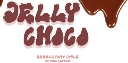 "Jelly Choco" is a very cute and unique bubble display font. This font is equipped with uppercase, lowercase, multilingual support, numerals, and punctuation. This font is very suitable for business branding, banners, posters, stickers, advertisements, product promotions, and more.
 - M Elite Hei HK by Monotype HK,
$523.99 M Elite Hei HK is a graphic style Traditional Chinese typeface. Graphic font designs have strong personalities and visual impact. Graphic style Traditional Chinese fonts feature decorative elements and pronounced graphics characteristics, suitable for catching attention in display applications.
 - GHEA Shooter by Edik Ghabuzyan,
$40.00 This UltraLight weight original Display font GHEA Shooter includes Basic Latin, Latin 1 Supplement, Latin extended A, Cyrillic + Bulgarian Cyrillic + Ukrainian Cyrillic, Armenian. May be used in titles, posters, labels, etc. The font looks very nice in large sizes.
 - Winter Claus by Yoga Letter,
$14.00 "Winter Claus" is a unique display font decorated with Christmas hats, Christmas trees and churches. This font is perfect for Christmas, winter, and more. Equipped with uppercase, lowercase, uppercase alternates, swash, titling, lowercase alternates, numeral, punctuation and multilingual support.
 - Synthetic by Gassstype,
$27.00 Hello Everyone, Introduce our new collection Syhthetic - Playful Typeface Font Fun All Caps Font and display for posters, packaging, branding, logotype and more, for your design needs, making your designs more modern and professional for kids,unique and sweety.
 - Stunning Christmas Monogram by AEN Creative Studio,
$15.00 Stunning Christmas Monogram is a stunning and comprehensive duo font (display and decorative), ideal for giving your projects a branded but friendly feel. The two included styles can be combined together perfectly but are also beautiful on their own.
 - Monstra Guthen by Essentials Studio,
$16.00 Introducing by Essentials Studio Proudly Present, Monstra Guthen Monstra Guthen Is a A Modern Groovy Display Font Monstra Guthen is perfect for product packaging, branding project, megazine, social media, wedding, or just used to express words above the background.
 - Kiks by David Engelby Foundry,
$25.00 Kiks is the Danish name for biscuit. Just like a biscuit this font throws its crums in every direction with curvy, bold letters. A display font made for headlines and everything else that needs to be visually loud. Enjoy!
 - Danity by Sesa Grafika,
$35.00 Danity is a gorgeous and retro styled display font. Add it confidently to your projects, and you will love the results. This font is PUA encoded which means you can access all of the glyphs and swashes with ease!
 - Raleigh by Bitstream,
$29.99Following the death of Carl Dair, David Anderson redrew Dair’s design, Cartier, for Typsettra, where it was renamed Raleigh. Adrian Williams at Fonts added three weights as a display series for Conways, while Robert Norton drew the text series. - Hello Almeida by Blankids,
$24.00 Introducing of our new product the name is Hello Almeida a Bold Handwritten Font. Hello Almeida inspired by modern calligraphy style this font is a fun theme very good for display, tshirt design, craft, quote sign, logotype and etc
 - Fairy Heart by Namara Creative Studio,
$9.00 Cute and lovely display font that comes with a unique style to make it suitable for any purpose, such as handicrafts, product packaging, quotes, product design, craftsmen, labels or any other projects which need a playful and lovely touch.
 - Geometos Soft by Graphite,
$17.00 Geometos Soft is a geometric sans-serif display typeface family. It is a rounded version of Geometos Neue. An all caps family of seven weights, Geometos Soft is especially suitable for headlines, headings, branding, posters, packaging, titles and logos.
 - Speedblur by Greater Albion Typefounders,
$12.00 Speedblur - the name says it all really! Want a display typeface that suggests speed and motion? Well this is it. Ideal for all those retro-future designs, anything streamlined or the boy (or girl) racer in all of us!
 - MBF Raveny by Moonbandit,
$19.00 Raveny is a high contrast modern display font by moonbandit, This typeface is a unicase font, meaning that the uppercase and lowercase has the same height. Raveny also comes with multilingual support and several alternates for you to explore.
 - M Zuo Hei HK by Monotype HK,
$523.99 M Zuo Hei HK is a graphic style Traditional Chinese typeface. Graphic font designs have strong personalities and visual impact. Graphic style Traditional Chinese fonts feature decorative elements and pronounced graphics characteristics, suitable for catching attention in display applications.
 - Single Tyne by Jonahfonts,
$35.00 A single top serif creates a modern look between serifs and a single weight font. SingleTyne contains short ascenders and descenders for tight line spacing designed as a display face that also works well for short sentences and paragraphs.
 - Halloween Devil by Yoga Letter,
$15.00 "Halloween Devil" is a unique and spooky display font. This font is perfect for Halloween moments, Halloween invitations, metal concerts, horror movie titles, and more. Equipped with uppercase, lowercase, ligatures, uppercase alternates, lowercase alternates, multilingual support, numerals, and punctuation.
 - Leshy by ParaType,
$25.00An original volume decorative typeface that imitates broken stones. It was inspired by graffiti letterforms. Solid and inverted styles are available. Designed by Fedor Saveliev and Olga Ryabihina in 2003 and licensed by ParaType. For use in display typography. - December Holidays by Good Java Studio,
$19.00 Introducing December Holidays December Holidays a playfully display font make from handdrawn ideas in typeface. This font includes full of Alphabetical glyphs, Numerals, and punctuation. This is so perfect for invitations, monograms, wedding, fashion, branding, label, handdrawn or logotype.
 - Moving Forward by Crumphand,
$20.00 Introducing, Moving Forward a Slab Serif Font. inspired by vintage and modern letterforms with alternate characters and full symbol sets. Moving Forward can be used for posters, web headers, and display text of all kinds. good kerning and readable.
 - M Bitmap Square HK by Monotype HK,
$523.99 M Bitmap Square HK is a graphic style Traditional Chinese typeface. Graphic font designs have strong personalities and visual impact. Graphic style Traditional Chinese fonts feature decorative elements and pronounced graphics characteristics, suitable for catching attention in display applications.
 - M J Ngai PRC by Monotype HK,
$523.99 M J Ngai PRC is a graphic style Simplified Chinese typeface. Graphic font designs have strong personalities and visual impact. Graphic style Simplified Chinese fonts feature decorative elements and pronounced graphics characteristics, suitable for catching attention in display applications.
 - Colmena by ParaType,
$25.00 Colmena (means Beehive in Spanish) features soft viscous shapes and high contrast that resemble bees and honey. The font was entered into TypeArt Contest in 2005 under the name "FD_Harvey". Suitable for display purposes especially in books for children.
 - Easter Gift by Sakha Design,
$14.00 Easter Gift is a fun and playful display font. It has a cute style and great readability. It’s perfect for cards, branding, stationery, blog design, custom art, quote, custom stamps, custom embossers, book, apparel, packaging, headline, or much more!
 - Delgos by Typebae,
$10.00 Delgos is a display font family. It is very suitable for logos, headlines, posters and various other designs that require an assertive touch. What's Included? 20 Font, 9 Weight Slanted & Outline All Caps, Numbers & Punctuation Multilingual Support PUA Encoded
 - Barbieri by Re-Type,
$45.00 Barbieri is a casual sans type family, based on a German lettering style from the 1960s. The original hand-drawn alphabet was used in a rather peculiar edition of Der Barbier von Bagdad, an opera composed by Peter Cornelius. Our efforts to identify the cover designer have been, so far, unsuccessful. As fans of informal typography and popular lettering styles, we thought these few thin letters deserved a re-incarnation as a complete type family. Andrés Torresi and Marta Sánchez Marco were in charge of the production work. Now Barbieri has 6 weights suitable for packaging, posters, and music covers. It resembles a certain 'Americana' spirit, though with a Germanic twist.
 - Mijas by Eurotypo,
$42.00 Mijas Ultra font was designed specially as a headlines and caption text for advertising, packaging and Publishing design. It has strong visual impact, a persuasive personality and seduction appeal throughout its organic shapes. This versatile typeface is quite useful for creating logotypes, a variety of alternates and swash tails in three different styles and length were drawn for most letters, plenty of vowel-focused ligatures, it covers all Latin-based languages. Please refer to quick reference manual included. Mijas is a little white town located at a mountainside above the blue Mediterranean Sea, in the heart of the Costa del Sol. It has high contrast, small counterforms and friendly climate.
 - HGBGalaxo Line by HGB fonts,
$23.00 HGB Galaxo is a tribute to Othmar Motter (1927–2010), the Vorarlberg graphic artist and typeface designer, who designed very individual and perfectly crafted typefaces in the 1970's and later. (Motter Ombra, Motter Tectura ...)From a Motter sketch of 5 letters for a logogram, I derived a simplified letterform and developed all the necessary characters. Working on these glyphs and delving deeper into Motter's letterforms, the respect for the accuracy with which he drew his letters (in ink) grew more and more. The spiral resembles the shape of a galaxy, hence the name Galaxo. The font is suitable for retro, poster and logo design.
 - FF Info Pict by FontFont,
$62.99 Erik Spiekermann, working in collaboration with Ole Schäfer, originally designed FF Info® Display for use in the context of wayfinding systems. The variants FF Info™ Text and FF Info™ Correspondence were developed later for text setting and office communication. FF Info Display The sober and clear forms of the sans serif FF Info Display have been deliberately molded to make them perfect for use on wayfinding systems. The font by Ole Schäfer and Erik Spiekermann not only takes the problem of lack of space into account - it is some 15% narrower than comparable typefaces - the characters have also been designed to ensure they remain legible even in adverse conditions for reading. As text on signs often contains words with which readers are unfamiliar and which are thus deciphered letter for letter rather than perceived as whole words, it is essential to provide for a clear differentiation between glyphs. Additional serifs on the lowercase "i" and uppercase "I" and a small arch on the terminal of the lowercase "l" ensure that it is possible to readily discriminate between these particularly problematic letters. Moreover, sharp corners on glyphs can also make it difficult to read signs with backlighting or when driving past. The rounded corners of FF Info Display counteract this effect and make sure that the character forms remain well defined.FF Info Display is available in five carefully coordinated weights, from Regular to Bold. In the corresponding italic variants, the letters appear overall more rounded while the lowercase "a" has a closed form and the "f" has a descender. Also included among the glyphs of FF Info Display are several ligatures and arrow symbols. Pictograms with different themes that complement the typeface are also available in four weights. FF Info Text Thanks to his know-how gained through designing other typefaces, Erik Spiekermann became aware that fonts created for use in problematic environments can be used in many different situations. In smaller point sizes, FF Info Display cuts a fine figure when used to set longer texts. So Spiekermann carefully reworked FF Info Display to produce FF Info Text, a font perfected for use in this context. Not only can the characters be more generously proportioned, certain features, such as additional serifs to aid with the differentiation of problematic letters, are also no longer necessary in textual surroundings. The upright styles have a double-story "g" while Spiekermann has added oldstyle figures and small caps. FF Info Correspondence FF Info Correspondence has also been designed for setting block text although it recalls the style of old typewriter characters and is specifically intended for use in office communication. The characters of this third member of the family are thus more formal, without rounded terminals but with rectangular punctuation marks. The narrower letters are provided with large serifs to give them more space although, at the same time, this reduces the differences in terms of letter width among the alphabet. In contrast with its two siblings, FF Info Correspondence has only three weights, each with corresponding italic.The three styles of the FF Info super family cover an extensive range of potential applications. If the different kerning is adjusted manually, the three styles harmonize happily with each other and can be readily used in combination to set, for example, headlines and texts and also creative display options.
 - FF Kievit Slab by FontFont,
$65.99FF Kievit Slab is an industrial strength, do anything, go anywhere, kind of design. Its exceptional legibility and straightforward strength contrasts with a friendly humanistic underpinning. Michael Abbink and Paul van der Laan carefully revised character shapes and stroke contrast of FF Kievit, when they adapted them to FF Kievit Slab. The result is that the striking and powerful FF Kievit Slab easily complements the other members of the FF Kievit super family, that also includes FF Kievit and FF Kievit Serif, and stands on its own in as a multi-talented design. Though created from the sans, FF Kievit Slab is not FF Kievit with slabs serifs tacked on. The family is the fruit of a four-year collaboration between Abbink and Van der Laan, to make the perfect companion to the FF Kievit family. Each glyph was painstakingly adjusted and to achieve proper density, contrast, and balance, while remaining a perfect companion to its sans serif and oldstyle cousins. Its nine weights and italics also harmonize perfectly with the original FF Kievit design. Each of the FF Kievit styles is a typographical all-rounder that is equally at home in headlines as it is in text copy. Together, the three designs of the FF Kievit super family span a wide and deep typographic universe in which they support one another perfectly. These fonts will help you achieve your typographic goals, no matter how lofty. Featured in: Best Fonts for Websites - TT Ricordi Allegria by TypeType,
$29.00 Please note! If you need OTF versions of the fonts, just email us at commercial@typetype.org TT Ricordi Allegria useful links: Specimen | Graphic presentation | Customization options TT Ricordi Allegria is a sleek and intelligent contemporary Florentine grotesque inspired by the half-erased lettering in Basilica di Santa Croce, Florence. TT Ricordi Allegria was drawn by Antonina Zhulkova and reflects in its graphics the transitional stage between the classic serif with varying proportions, gravitating towards the Roman capital type, and the Florentine sans serif. The font is characterized by variability in the proportions of characters, contrast between strokes, wedge-shaped triangular characters, and the absence of traditional serifs. The main visual feature of the typeface is its diversity and the ability, using different stylistic sets, to completely change the character and perception of the typeface. The drawing of the characters from the main set is strict, thanks to which the font looks stern, as if the inscription in the font was really carved out of stone. And with the help of another set, we can add roundness, or even smoothness, to the font. This is due to the fact that the letters (E R K Q J Y in Latin, and Л К Ж Э in Cyrillic) from the second set have either very noticeable "curls" or smooth, rounded "legs". In addition, the typeface includes a set of beautiful ligatures for use in display inscriptions, such as large headlines. An interesting moment when working on the typeface was the creation of the Cyrillic typeset, since the Cyrillic alphabet does not so easily fit into the concept of the Florentine grotesque and stressed semi-serif. The most difficult thing in working on the Cyrillic alphabet was to create a system of spacing for characters, as it was done in the Latin alphabet, and to make sure that when typing in Cyrillic, the drawing of the text remained beautiful. That is why the letters Д Л У Ы appearing in the font family are somewhat unusual to the eye, and the proportions of other characters in Cyrillic are not quite “classic” either. In general, the Cyrillic set looks more display than its Latin prototype, but at the same time it lacks the sense of historicity or legacy of the Soviet past, which often comes to the foreground when working on the design of the Cyrillic alphabet in this type of serifs. TT Ricordi Allegria consists of two weights (Regular and Bold) and one variable font. Each style includes over 750 characters, as well as 19 OpenType features. Interesting features of the typeface include three stylistic sets that greatly change the perception of the font, a set of bright display ligatures, a few neat icons that are suitable for breaking text and will emphasize the visual language of the font. Please note! If you need OTF versions of the fonts, just email us at commercial@typetype.org FOLLOW US: Instagram | Facebook | Website
 - TT Geekette by TypeTrends,
$27.00 TT Geekette is an experimental variable* serif with friendly and flexible character of shapes. In this project, we wanted to get away from simplifications and dry geometry and to experiment with the smoothness, softness and plasticity of forms. And in order to make the project a little more stylish and serious, we decided to make the font monospaced. When creating TT Geekette, we did not rely on traditional writing techniques or on the influence of pen movement on the font pattern. Despite the fact that judging by certain characters TT Geekette is a serif, the font is specifically “built” and “drawn”. There are several systemic techniques in font design, such as “loops” which set the plastic rhythm for the entire typeface. Variability in TT Geekette is influenced by contrast buildup in the font—moving the slider to adjust the variability axis, you gradually move from a completely non-contrast monolinear serif font to a font with a pronounced reverse contrast. In addition, with the help of the variability slider, you can remove serifs from the monolinear essence of the font. The TT Geekette family consists of 3 styles: the TT Geekette Bones—monolinear font, the TT Geekette Muscles—reverse contrast serif, and the TT Geekette Variable font. Each style contains over 450 glyphs. And yes, technically the typeface can be used in programming, at least you are guaranteed to get your share of bright emotions. *An important clarification regarding variable fonts. At the moment, not all graphic editors, programs and browsers support variable fonts. You can check the status of support for the variability of your software here: v-fonts.com/support/
 - Geometry Script Pro by CheapProFonts,
$10.00 The Geometry Pro family has been designed to be the final word in purely geometric fonts, and this rounded Script sub-family is a nod to the 50s style of connected logomarks. Words set with both the Regular and the Alternate (with its more flourished capitals and alternate stem connections) can be extended by using the underscore character between letters. You can freely mix and match glyphs from both fonts to create a little bit of variety, and finding that perfect combination. For a matching set of capitals (and disconnected lowercase letters): check out the Regular weights of the Geometry Soft Pro family. All the Geometry Pro fonts are strictly geometric (as drawn with a compass and a ruler fixed to 90 and 45 degree angles) but they are not slavishly modular. ALL fonts from CheapProFonts have very extensive language support: They contain some unusual diacritic letters (some of which are contained in the Latin Extended-B Unicode block) supporting: Cornish, Filipino (Tagalog), Guarani, Luxembourgian, Malagasy, Romanian, Ulithian and Welsh. They also contain all glyphs in the Latin Extended-A Unicode block (which among others cover the Central European and Baltic areas) supporting: Afrikaans, Belarusian (Lacinka), Bosnian, Catalan, Chichewa, Croatian, Czech, Dutch, Esperanto, Greenlandic, Hungarian, Kashubian, Kurdish (Kurmanji), Latvian, Lithuanian, Maltese, Maori, Polish, Saami (Inari), Saami (North), Serbian (latin), Slovak(ian), Slovene, Sorbian (Lower), Sorbian (Upper), Turkish and Turkmen. And they of course contain all the usual "western" glyphs supporting: Albanian, Basque, Breton, Chamorro, Danish, Estonian, Faroese, Finnish, French, Frisian, Galican, German, Icelandic, Indonesian, Irish (Gaelic), Italian, Northern Sotho, Norwegian, Occitan, Portuguese, Rhaeto-Romance, Sami (Lule), Sami (South), Scots (Gaelic), Spanish, Swedish, Tswana, Walloon and Yapese.
 - Coffee Beans Time by TypoGraphicDesign,
$9.00 The typeface Coffee Beans Time is designed from 2018–2022 for the font foundry Typo Graphic Design by Manuel Viergutz and Annelena Grascht as a graphic design and photography project. The display font based on the original coffee beans and create a dingbat pattern. 3 font-styles (Dingbats, Mix, Coffee Ground) with 304 glyphs (Adobe Latin 2) incl. decorative extras like icons, arrows, dingbats, emojis, symbols, geometric shapes (type the word #LOVE for ♥︎ or #SMILE for ☺ as OpenType-Feature dlig) and stylistic alternates (2 stylistic sets). For use in logos, magazines, posters, advertisement plus as webfont for decorative headlines. The font works best for display size. Have fun with this font & use the DEMO-FONT (with reduced glyph-set) FOR FREE! ■ Font Name: Coffee Beans Time ■ Font Styles: 3 (Dingbats, Mix, Ground) + DEMO (with reduced glyph-set) ■ Font Category: Display for headline size ■ Glyph Set: 304 glyphs (Adobe Latin 2) incl. extras like icons (decorative extras like arrows, dingbats, emojis, symbols) ■ 93 languages: Afrikaans Albanian Asu Basque Bemba Bena Breton Catalan Chiga Cornish Danish Dutch English Estonian Faroese Filipino Finnish French Friulian Galician German Gusii Indonesian Irish Italian Kabuverdianu Kalenjin Kinyarwanda Luo Luxembourgish Luyia Machame Makhuwa-Meetto Makonde Malagasy Manx Morisyen North Ndebele Norwegian Bokmål Norwegian Nynorsk Nyankole Oromo Portuguese Quechua Romansh Rombo Rundi Rwa Samburu Sango Sangu Scottish Gaelic Sena Shambala Shona Soga Somali Spanish Swahili Swedish Swiss German Taita Teso Uzbek (Latin) Volapük Vunjo Welsh Western Frisian Zulu ■ Design Date: 2018–2022 ■ Type Designer: Manuel Viergutz und Annelena Grascht
 - Chocolate Pro by Sudtipos,
$79.00Most everyone agrees that chocolate is irresistible. Now the Koziupa & Paul tag team is offering you a choice of three irresistible flavors, from the bittersweet Amargo, to the mouth-watering Dulce, you now have three different possibilities for the pleasure of your taste buds. The OpenType versions includes de 3 flavors all in one. - Modular Deco JNL by Jeff Levine,
$29.00 The 1939 French publication “Modèles de lettres modernes par Georges Léculier” ( “Models of Modern Letters by Léculier”) presented some unique and stylized type designs with Art Deco influence. One such example is an abstract modular alphabet constructed of rectangles and circles. This is now available as Modular Deco JNL, in both regular and oblique versions.