4,974 search results
(0.023 seconds)
- Caslon 540 by ParaType,
$30.00 The Bitstream version of Caslon 540 of the American Type Founders, 1902. Based on William Caslon I's first English Old Style typefaces of 1725. Caslon modeled his designs based on late 17th century Dutch types, but his artistic skills enabled him to improve those models, bringing a variety of forms and subtlety of details. Strokes in Caslon fonts are somewhat heavier than in earlier Old Style fonts, serifs are thicker and a bit stubby. Italic letters have uneven slope. A text set in Caslon looks legible and aesthetically appealing. Caslon is a favorite font of English printers for setting of classical literature. Cyrillic version was developed for ParaType in 2002 by Isay Slutsker and Manvel Shmavonyan.
 - Caslon #540 by Linotype,
$29.99The Englishman William Caslon punchcut many roman, italic, and non-Latin typefaces from 1720 until his death in 1766. At that time most types were being imported to England from Dutch sources, so Caslon was influenced by the characteristics of Dutch types. He did, however, achieve a level of craft that enabled his recognition as the first great English punchcutter. The original Caslon specimen sheets and punches have long provided a fertile source for the range of types bearing his name. Identifying characteristics of most Caslons include a cap A with a scooped-out apex; a cap C with two full serifs; and in the italic, a swashed lowercase v and w. A few of the many interpretations from the early twentieth century were true to the source, as well as strong enough to last into the digital era. These include two from the American Type Founders company, Caslon 540 and the slightly heavier Caslon #3. Both fonts are relatively wide, and come complete with small caps, old style figures, and italics. - Caslon 540 by URW Type Foundry,
$89.99 William Caslon (1692-1766) laid the foundation for English typefounding, when he cut his first roman face in London in 1722. He modeled his designs on late seventeenth-century Dutch types; thus his typefaces are classified as Old Styles. The original Caslon punches have been preserved, enabling a perfect recutting of his faces. Notice the hollow in the apex of A and the two full serifs or beaks in the C. The italic capitals are irregular in their inclination. The Caslon font family is distinctive for use in subheadings or continuous text.
 - Caslon 540 by Bitstream,
$29.99William Caslon’s design as made regular by ATF at the beginning of this century. - Pea Martha - Personal use only

- Pea Martha - Unknown license

- Salty Malthy by MJB Letters,
$15.00 Salty Malthy is a beautiful display font it made with perfect combining of each characters and looks original and can be used for all your project needs.
 - Old Earthy by Gustav & Brun,
$16.00 Old Earthy is a hand drawn font inspired by the mid 19th-century art movement with William Morris and the Pre-Raphaelite Brotherhood in the front line. The art and the patterns from that time is reflected in Old Earthy. It comes with a set of basic English/Latin letters and some west European diacritics.
 - Martha Script by Hrz Studio,
$14.00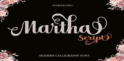 Martha Script feels equally charming and elegant. It looks stunning on wedding invitations, thank you cards, quotes, greeting cards, logos, business cards, and any other design that needs a handwritten touch. This font is PUA encoded, which means you can access all of the glyphs and swashes with ease!
 - Dew by ParaType,
$25.00 Dew is a script font with blobs on the stems that according to author’s imagination resemble dew drops on the caules. It gives an impression of fragrance and freshness and thus can be used for informal headings and short advertising texts for perfumes and cosmetics. The font was developed by Ekaterina Pulenko and released by ParaType in 2009.
 - Debs by Scholtz Fonts,
$9.95 Debs was inspired by a thank you note sent from one of my friends to another. The recipient liked the handwriting so much that he passed the note on to me after having asked permission from Debs, the writer. I enjoyed the vigor and looseness of the handwriting, as well as admiring its legibility and style. Debs has all the characteristics of modern handwriting: It appears loose, unstructured, and free, while maintaining good form and great legibility. Its baseline is varied, creating an impression of notes written by busy people, while its characters remain well formed and readable. Debs comes in five styles, regular, lite, black, wide and wide-black. Use Debs for advertising, for casual greeting cards, for a casual, handwritten look on music or fashion media. Debs has all the features usually included in a fully professional font. Language support includes all European character sets.
 - Dee by Chantra,
$18.00The Dee font family started from letter "d" and "e" followed by the rest of the letters. "Dee" is Thai word mean "Good" in English that is the source of this font name. The Dee XTS style has alternate stroke ends relative to the Dee XT style. It is included as a bonus style in the Dee Regular Set and Dee Complete packages. - Deus by Renegade Fonts,
$22.00 Deus is when type design is brought to extreme. It tries to answer the question whether you can design all glyphs in one axis of stress. It does not try to be all purpose, useful at all sizes, legible or readable and most of all it does not try to be neutral. It has its own style you either accept or not. But if you do so, it has many great stuff inside. Every glyph has the same width across four masters, so you can change the style in one title or even make an animation out of that. It also has some cool animated emojis, so make sure you take all four styles! Deus has two sets of styles. "Deus" that has an expanded glyph set, and "Deus Basic" that comes with a limited glyph set. You can play around with "Deus Basic" since you get it for free, then fall in love with this font family and go for the full version.
 - Sign Rathi by Lemonthe,
$15.00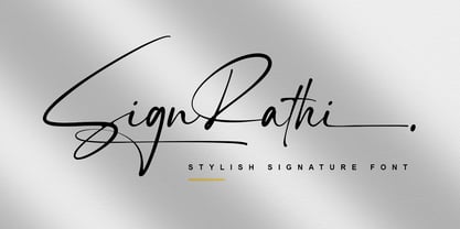 SignRathi is a perfect signature font, with a natural & stylish flow. SignRathi Font is perfect for many different project such as logos & branding, invitation, stationery, wedding designs, social media posts, advertisements, product packaging, product designs, label, photography, watermark, special events or anything.
 - Marat Sans by Ludwig Type,
$45.00 Marat Sans is a clean and lively sans serif typeface designed by Ludwig Übele. It is characterized by excellent legibility and suits a wide range of typography. The entire family contains 27 styles & weights and includes many OpenType features: various numerals, alternate glyphs, fractions, superiors and inferiors, language features, arrows, case sensitive forms and many more. Marat Sans is the perfect companion for Marat, a soft and elegant serif typeface.
 - Basim Marah by Hiba Studio,
$59.00 Basim Marah is an Arabic display typeface and is useful for titles and graphic projects. The font is based on the simple lines of free style calligraphy. A collaborative effort, Basim Marah was designed and drawn by Basim Salem Al Mahdi from Iraq and then digitalized as a typeface by Hasan Abu Afash from Palestine. In November, 2008, Basim Marah was upgraded by working with Mirjam Somers an award-winning Arabic type designer to the DecoType font format for use in WinSoft Tasmeem which is now bundled with InDesign CS4.
 - Dancing Marathon JNL by Jeff Levine,
$29.00 The hand lettered title found on the cover of the 1932 sheet music for “Dancing Marathon” inspired the digital revival of this unusual lettering as well as the font’s name. This eccentric Art Deco design (with a slight bit of Art Nouveau mixed in) is a thin, monoline typeface. Dancing Marathon JNL is available in both regular and oblique versions. Dance marathons got their start during the Great Depression as people desperate to earn a few dollars would enter into contests that went on for hours until the last couple remained standing on the dance floor.
 - Roanne by Tour De Force,
$25.00 Roanne is a sans serif family named after a town in France. This font family contains 2 width variations: Normal and Condensed, and all together counts 44 font styles. Equipped with OpenType features (Tabular Figures, Fractions, Stylistic Alternates, Localization for Serbia, Poland and the Netherlands, Case Sensitive brackets) for extended Latin and Cyrillic character set with a small charming set of Dingbats. For easier usage as webfont, Roanne font files contain numeric values for CSS weight attribute – 100, 150, 200, 300, 400, 500, 600, 700, 800, 850, 900.
 - BN Niv 5000 - Unknown license

- Yoon Gothic 700 by Yoon Design,
$400.00 YD Gothic 700 is a modern sans serif typeface consisting of 9 weights. It supports up to 13 different languages such as English in Latin and other scripts
 - Base 900 Sans by Emigre,
$49.00
- Egyptian 505 SH by Scangraphic Digital Type Collection,
$26.00Since the release of these fonts most typefaces in the Scangraphic Type Collection appear in two versions. One is designed specifically for headline typesetting (SH: Scangraphic Headline Types) and one specifically for text typesetting (SB Scangraphic Bodytypes). The most obvious differentiation can be found in the spacing. That of the Bodytypes is adjusted for readability. That of the Headline Types is decidedly more narrow in order to do justice to the requirements of headline typesetting. The kerning tables, as well, have been individualized for each of these type varieties. In addition to the adjustment of spacing, there are also adjustments in the design. For the Bodytypes, fine spaces were created which prevented the smear effect on acute angles in small typesizes. For a number of Bodytypes, hairlines and serifs were thickened or the whole typeface was adjusted to meet the optical requirements for setting type in small sizes. For the German lower-case diacritical marks, all Headline Types complements contain alternative integrated accents which allow the compact setting of lower-case headlines. - YD Myungjo 200 by Yoon Design,
$400.00
- Egyptian 505 EF by Elsner+Flake,
$35.00 - Sequel 100 Black by OGJ Type Design,
$35.00 Sequel 100 Black is a neogrotesque font family for forceful headlines, confident titles, and striking posters. An extension of Sequel Sans and primarily designed for display use, it has wider proportions than the original typeface. It also sports a larger x-height that allows for maximum impact on the page. And Sequel 100 Black ain’t no lightweight: it’s the boldest member of the Sequel superfamily, with weights starting at 45 (a sturdy medium style) and going all the way up to an ultra-black 115. Use Sequel 100 Black whenever you want to combine a touch of cool mid-century modernism with the scintillating tension of maximum ink use and minimal whitespace.
 - MPI No. 510 by mpressInteractive,
$5.00 No. 510 is a friendly, slim gothic face. Strokes have a gentle inward curve at the median with the tops and bottoms of the letters slightly wider and thicker. The design was first introduced by William H. Page & Company around 1887.
 - Yoon Magazine 700 by Yoon Design,
$49.00 - Egyptian 505 SB by Scangraphic Digital Type Collection,
$26.00Since the release of these fonts most typefaces in the Scangraphic Type Collection appear in two versions. One is designed specifically for headline typesetting (SH: Scangraphic Headline Types) and one specifically for text typesetting (SB Scangraphic Bodytypes). The most obvious differentiation can be found in the spacing. That of the Bodytypes is adjusted for readability. That of the Headline Types is decidedly more narrow in order to do justice to the requirements of headline typesetting. The kerning tables, as well, have been individualized for each of these type varieties. In addition to the adjustment of spacing, there are also adjustments in the design. For the Bodytypes, fine spaces were created which prevented the smear effect on acute angles in small typesizes. For a number of Bodytypes, hairlines and serifs were thickened or the whole typeface was adjusted to meet the optical requirements for setting type in small sizes. For the German lower-case diacritical marks, all Headline Types complements contain alternative integrated accents which allow the compact setting of lower-case headlines. - Page No. 508 by HiH,
$10.00 Page No. 508 was designed by William Hamilton Page in 1887 as one of a series of designs for die-cut wood types for the firm of Page & Setchell of Norwich, Connecticut. Page & Setchell was the successor to The William H. Page Wood Type Company and was sold to the Hamilton Manufacturing Company of Two Rivers, Wisconsin in 1891. 508 is a heavy all-caps font designed for headline work. It has a strong presence that reverses out well (light-colored type on a dark background). Great for retro style posters.
 - MPI No. 508 by mpressInteractive,
$5.00 No. 508 is a chunky, friendly, modulated gothic font. Strokes have a gentle inward curve at the median, with the tops and bottoms of the letters slightly wider. The face was introduced by William H. Page & Company in 1890.
 - Sequel 100 Wide by OGJ Type Design,
$35.00 Sequel 100 Wide is a static sans-serif or neogrotesque with generous horizontal proportions. A variant of the original Sequel Sans, it considerably expands the stylistic scope of the Sequel superfamily. In addition to its wider letterforms, it has got a larger x-height, slightly shifting the historical flavor from the 1950s to the 1960s. Yet, at its core, it’s as clean and functional as the main font family, with perfectly horizontal stroke endings and vertical terminals. Six weights from 45 (Regular) to 95 (Black), matching italics, and limitless possible interpolations by means of two Variable Fonts offer a rich typographic palette for any situation.
 - YD Gothic 200 by Yoon Design,
$400.00
- William Page 506 by Wooden Type Fonts,
$15.00 A revival of one of the popular wooden type fonts of the 19th century, somewhat condensed, square.
 - Caslon 540 EF by Elsner+Flake,
$35.00 - MPI No. 507 by mpressInteractive,
$5.00 No. 507 is an elegant headline font with added angled flourishes. Its unique features are angled terminals, small, pointed serifs, and no contrast in stroke weight. It is similar to No. 506, designed by William H. Page & Company around 1890.
 - YD Gothic 100 by Yoon Design,
$499.00
- YD Gothic 700 by Yoon Design,
$400.00 - Fabulous 50s - Unknown license

- 00:00.0 by 80,
- 00:00.0 by 12,


