10,000 search results
(0.122 seconds)
- Fashion Statement JNL by Jeff Levine,
$29.00 An example of hand lettering from a vintage instructional book was the basis for Fashion Statement JNL; available in both regular and oblique versions. This extra-wide "thick and thin" design is perfect for replicating the classic signage and print work of the Art Deco era.
 - Shady Characters JNL by Jeff Levine,
$29.00Shady Characters JNL places type against a simulated halftone background to produce a "ribbon" with black and white visual contrast. By typing the left bracket key, you produce a wide space for between the words. A narrower space is on the right bracket key. Limited character set. - Wolf Paul by Olivetype,
$18.00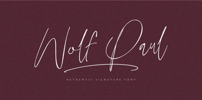 Wolf Paul is an elegant signature script font. This versatile script font has a wide spectrum of applications ranging from greeting cards, product branding to headlines and more. So what’s included : Basic Latin A-Z & a-z Numbers, symbols, and punctuations Ligatures Accented Characters : ÀÁÂÃÄÅÆÇÈÉÊËÌÍÎÏÑÒÓÔÕÖØŒŠÙÚÛÜŸÝŽàáâãäåæçèéêëìíîïñòóôõöøœšùúûüýÿžß Thank you
 - Summer Story by AEN Creative Studio,
$14.00 Summer Story is a delicate, elegant and flowing handwritten font. It has beautiful and well balanced characters and as a result, it matches a wide pool of designs. Summer Calling is PUA encoded which means you can access all of the glyphs and swashes with ease!
 - Orange Mochi by RA Studio,
$14.00 Flying, elegant, handwritten font Orange Mochi. The font is built on the basis of personal handwriting, has narrow and wide glyphs, brave external elements, alternative letters and funny ligatures. The font works well in an array of text, titles and logos. Display font Extended latin & cyrillic
 - Lard Pro by The Type Fetish,
$25.00 Lard Pro Regular is an extreme contrasted extra black typeface designed for usage at larger sizes. Lard Pro Bold is an extra black typeface designed for usage at larger sizes. They contain extended Latin, Cyrillic and Greek alphabets to support a very wide range of languages.
 - Biosphere by Fype Co,
$16.00 Biosphere is inspired by industrial style typeface that's will give look a modern and technical industrial display font. That will take any design idea to the next level, covering a wide range of project types such as poster design, book covers, prints, headlines, id cards, packaging, branding.
 - Overmind Demons by Sipanji21,
$19.00 "Overmind Demond" is a striking display font designed with a futuristic theme in mind. Its sleek and modern letterforms exude a sense of technological advancement and innovation, making it a perfect choice for a wide array of design projects centered around futuristic concepts or space exploration.
 - Bluesman JNL by Jeff Levine,
$29.00 The classic blues album "I'm Jimmy Reed" released on the legendary Vee-Jay label out of Chicago featured title lettering in a bouncy, fun, casual take on the classic Latin Wide style of alphabet. Bluesman JNL offers a full digital typeface based on that album titling.
 - Hiragino Sans TC by SCREEN Graphic Solutions,
$200.00 Hiragino Sans Traditional Chinese is a traditional Chinese font that inherits design characteristics from the Hiragino Sans (Kaku Gothic). The font satisfies the rising demand for a high-quality Big 5 embedded font for multilingual products, allowing it to be utilized in a wide range of applications.
 - Vivala Old by Johannes Hoffmann,
$11.00 The Vivala old black letter font family is characterized by its hard-cut lines. This gives the typeface a special woodcut-like character. The typeface family offers a wide range of possibilities for design. It works well for posters, packaging, and corporate design for restaurants or breweries.
 - FDT_CARRETO_DEMO_VERSION - Unknown license

- Sisterhood - Personal use only

- Herschel by Tried & True Supply Co.,
$30.00 Herschel ventures into the elaborate world of late 19th-century typography to bring its winsome charm and compelling aesthetics into modernity. Staying true to the spirit of its historical era of inspiration, Herschel was designed with extreme attention to detail. Although its aesthetic roots are firmly planted in the treasury of Gilded Age typography, it has been technically constructed to withstand all the rigorous demands that modern technology places on type today. Herschel’s nostalgic, flared, and gently bifurcated serifs shine brightest when employed as display type, but are suited well for any application where inimitable character is needed. Named after designer Brian Brubaker’s maternal grandfather, a retired dairy farmer of more than 60 years, Herschel is available in six delectable weights: Skim, One Percent, Two Percent, Whole, Creamline, and Butter. Features overview: • 800+ glyphs per weight • 120+ stylistic alternates • Upper and lower case • Titling/Drop capitals with multiple and contextual ligatures • Lining, oldstyle, proportional, and tabular figures • Standard and discretionary ligatures • Unique dingbats and special characters • International language support for 200+ latin-based languages, including Vietnamese
 - Camper by Fenotype,
$35.00 Camper is an original font collection of sixteen display fonts and extras. Camper’s core is a low-contrast connected script with three weights. In addition there are Sans, Serif and Slab fonts. All Camper fonts have a coherent style of solid forms with soft edges. They all play well together but work as themselves too. Camper’s Print is the same family with rugged “printed” edges and print texture. Camper Script is packed with several OpenType features: Contextual Alternates and Standard Ligatures help to maintain smooth flow while typing and they’re normally on. If you need more flashy characters try Swash, Stylistic or Titling Alternates or seek for even more Alternates from the Glyph Palette. Camper Script is PUA encoded and you can access extra characters in most graphic design softwares even without OpenType support. From Discretionary Ligatures you will find several flashier ligatures and a set of Catchwords: Access them by typing “The”, “And” or “With” with Discretionary Ligatures turned on. Camper Extras is a pack of strokes and swashes designed to go with the script. Many strokes can also be directly combined with a letter to make a custom “swash letter”. Check out posters for more inspiration. All Camper’s fonts have a wide language support — even Cyrillic. Camper is a recognizable and sturdy display pack with smooth and friendly outfit. It’s great for any display project from posters to identities and from online to print.
 - Bitsumishi Pro v2 by CheapProFonts,
$10.00 A squarish uppercase font perfect for logos and short eye-catching headings. The lowercase contains some alternate letterforms - more specifically: uppercase have closed forms (I made a new A D and R), and lowercase have some open alternatives (new B E F P and T in addition to the A D and R). I noticed the two width version of the H and made similar normal and wide versions of J and L. Then I added lots of missing glyphs and all the diacritic letters, of course - and finally the family has been expanded to 7 weights AND corresponding Italics! Enjoy! ALL fonts from CheapProFonts have very extensive language support: They contain some unusual diacritic letters (some of which are contained in the Latin Extended-B Unicode block) supporting: Cornish, Filipino (Tagalog), Guarani, Luxembourgian, Malagasy, Romanian, Ulithian and Welsh. They also contain all glyphs in the Latin Extended-A Unicode block (which among others cover the Central European and Baltic areas) supporting: Afrikaans, Belarusian (Lacinka), Bosnian, Catalan, Chichewa, Croatian, Czech, Dutch, Esperanto, Greenlandic, Hungarian, Kashubian, Kurdish (Kurmanji), Latvian, Lithuanian, Maltese, Maori, Polish, Saami (Inari), Saami (North), Serbian (latin), Slovak(ian), Slovene, Sorbian (Lower), Sorbian (Upper), Turkish and Turkmen. And they of course contain all the usual "western" glyphs supporting: Albanian, Basque, Breton, Chamorro, Danish, Estonian, Faroese, Finnish, French, Frisian, Galican, German, Icelandic, Indonesian, Irish (Gaelic), Italian, Northern Sotho, Norwegian, Occitan, Portuguese, Rhaeto-Romance, Sami (Lule), Sami (South), Scots (Gaelic), Spanish, Swedish, Tswana, Walloon and Yapese.
 - Unchain My Heart by Harald Geisler,
$68.34 Unchain My Heart is Font that renders hearts on a string with a capital letter in the middle. All hearts are designed to align to a perfect string by remaining the handmade look. Lowercase letters produce a heart with outline. Uppercase letters produce a filled heart. Type in a parenthesis and a loose string end will be rendered either on the right or left side. Look in the full character set to find out more about the special decoration. Ideal for individualized mailings and greeting cards. Unchain My Heart is a part of the Light Hearted Font Collection that is inspired by a recording of Jean Baudrillard with the title, "Die Macht der Verführung" (The Power of Seduction) from 2006. Further inspiration came from the article, "The shape of the heart: I'm all yours". The heart represents sacred and secular love: a bloodless sacrifice. by British writer Louisa Young printed in EYE magazine (#43) London, 2002.
 - Tagettes - Unknown license

- Santa'sSleighFull - Unknown license

- DeiGratia - Unknown license

- XiparosLombard - Unknown license

- TagettesPlus - Personal use only

- JaneAusten - Unknown license

- Andrade by DSType,
$19.00Andrade is a new typeface designed by Dino dos Santos in 2005. This typeface was inspired in the typographic work of Manoel de Andrade de Figueiredo (b.1670-d.1735), Nova Escola para Aprender a Ler, Escrever e Contar, printed in 1722 at Offcina de Bernardo da Costa de Carvalho. This is one of the most important books, and almost forgotten, about Portuguese calligraphy and typography, and the work of Andrade de Figueiredo is among the most amazing examples of type design of the Eighteenth Century. His work inspired Ventura da Silva, a Portuguese typographer, who in 1803 published a book named Regras Methodicas, where he redesigns some of Figueiredo's type specimens. But Ventura's purpose was to create a more elegant and readable typeface than Didot and Bodoni. This kind of typeface used to be called leitura and is a transition between the baroque and modern typography. Andrade is a brilliant text typeface and is available in Regular, Italic, Bold, Bold Italic, Ligatures, Ligatures Italic, Swashes and Ornaments. Andrade is my tribute to Portuguese typography and to the work of Manoel de Andrade de Figueiredo in particular. - LT Panneaux - 100% free

- Aron Grotesque - Personal use only

- Rockabye - Personal use only

- Philosopher - 100% free

- RNS Camelia - 100% free

- KG This Is Not Goodbye - Personal use only

- Negotiate Free - Unknown license

- Phosphorus Selenide - Unknown license

- ImperatorBronze - Unknown license

- Gill Sonos - Unknown license

- Andreas Sans Cnd - Unknown license

- junction regular - 100% free

- Barnard - 100% free

- Ash - Unknown license

- Tuffy - 100% free

- Copyright Violations Nudged - Personal use only


