1,518 search results
(0.013 seconds)
- Pea Kristy - Unknown license

- Krisis Sans by ABSTRKT,
$25.00This font was originally designed for one lettering job with only one simple purpose—to be as much condensed as a font can be. Then it was developed as a font family of 4 weights with regulars and italics. - Adobe Kaiti by Adobe,
$29.00 - MC Kristy by Maulana Creative,
$16.00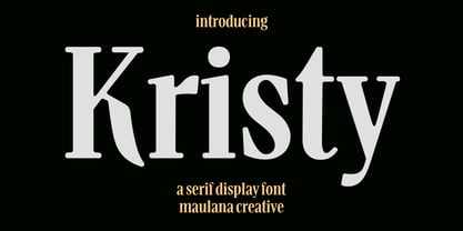 Kristy is a modern display serif font. With Bold low contrast stroke, fun character with a bit of ligatures and alternates. To give you an extra creative work. Kristy font support multilingual more than 100+ language. This font is good for logo design, Social media, Movie Titles, Books Titles, a short text even a long text letter and good for your secondary text font with script or serif. Make a stunning work with Kristy font. Cheers, Maulana Creative
 - 150 by hgo,
$15.00
- Kiti Cuties by Dikas Studio,
$15.00 Hi, i want to introduce my newest font Kiti Cuties. Kiti Cuties is a playful sans serif font, Kiti Cuties is a allcaps font with 4 variations letter in lowercase e,h,o,u that makes your design looks more cheerfull. Kiti cuties is made to help you create a kids and fun theme design such as birthday card, baby shower card, greeting card and many more.
 - Kity love by Gilar Studio,
$16.00 kity love is a beautiful and flowing handwritten font with love. It looks beautiful on a variety of designs requiring a personalized style, such as wedding invitations, thank you cards, weddings, greeting cards, logos and so on. This font is PUA encoded which means you can access all of the glyphs and swashes with ease! kity love a new fresh & modern script with a handmade valentines style, decorative characters and a dancing baseline! So beautiful on invitation like greeting cards, branding materials, business cards, quotes, posters, and more!! The alternative characters were divided into several Open Type features such as , Stylistic Sets, Stylistic Alternates. The Open Type features can be accessed by using Open Type savvy programs such as Adobe Illustrator, Adobe InDesign, Adobe Photoshop Corel Draw X version, And Microsoft Word. And this Font has given PUA unicode (specially coded fonts). so that all the alternate characters can easily be accessed in full by a craftsman or designer. You can mix and match with Opentype feature: Ekstras ligature More than 327 of glyphs Alternates Stylistic sets from ss01 to ss05 The ZIP file are include the following : kity love.OTF kity love.TTF kity love.Web Font If you don't have a program that supports OpenType features such as Adobe Illustrator and CorelDraw X Versions, you can access all the alternate glyphs using Font Book (Mac) or Character Map (Windows). To Access Alternate Characters Click The Link Below: Adobe illustrator CS https://www.youtube.com/watch?v=geL0Ye02Ryk Adobe illustrator CC https://www.youtube.com/watch?v=V25yiUh8BcE Ms Word https://www.youtube.com/watch?v=HxkhZiCuwEw Coreldraw X7 https://www.youtube.com/watch?v=UBVsufJjons Adobe Photoshop CC https://www.youtube.com/watch?v=BYKXl58AdNY Indesign CS https://www.youtube.com/watch?v=HgZTCxKG14Q Check my other Font here : https://gilarstudio.com/
 - Kruti Dev 010 - Unknown license

- Krizi Amo Pro by CheapProFonts,
$10.00 Inspired by the lettering on a perfume, Halmos extrapolated a complete uppercase alphabet, and he also created a matching lowercase. Now the character set has been expanded completely, and this stylish Art Deco font is ready to create some headlines, new logos and wordmarks in many more languages. ALL fonts from CheapProFonts have very extensive language support: They contain some unusual diacritic letters (some of which are contained in the Latin Extended-B Unicode block) supporting: Cornish, Filipino (Tagalog), Guarani, Luxembourgian, Malagasy, Romanian, Ulithian and Welsh. They also contain all glyphs in the Latin Extended-A Unicode block (which among others cover the Central European and Baltic areas) supporting: Afrikaans, Belarusian (Lacinka), Bosnian, Catalan, Chichewa, Croatian, Czech, Dutch, Esperanto, Greenlandic, Hungarian, Kashubian, Kurdish (Kurmanji), Latvian, Lithuanian, Maltese, Maori, Polish, Saami (Inari), Saami (North), Serbian (latin), Slovak(ian), Slovene, Sorbian (Lower), Sorbian (Upper), Turkish and Turkmen. And they of course contain all the usual "western" glyphs supporting: Albanian, Basque, Breton, Chamorro, Danish, Estonian, Faroese, Finnish, French, Frisian, Galican, German, Icelandic, Indonesian, Irish (Gaelic), Italian, Northern Sotho, Norwegian, Occitan, Portuguese, Rhaeto-Romance, Sami (Lule), Sami (South), Scots (Gaelic), Spanish, Swedish, Tswana, Walloon and Yapese.
 - Impossible - 050 - Unknown license

- Impossible - 500 - Unknown license

- Egyptian 505 by Bitstream,
$29.99This face was designed by Andre Guertler’s class in room 505 at the Kuenstgewerbeschule in Basel. It follows the principles of Frutiger’s Egyptienne, and won the first of the VGC type competitions. - Caslon #540 by ITC,
$29.00The Englishman William Caslon punchcut many roman, italic, and non-Latin typefaces from 1720 until his death in 1766. At that time most types were being imported to England from Dutch sources, so Caslon was influenced by the characteristics of Dutch types. He did, however, achieve a level of craft that enabled his recognition as the first great English punchcutter. Caslon's roman became so popular that it was known as the script of kings, although on the other side of the political spectrum (and the ocean), the Americans used it for their Declaration of Independence in 1776. The original Caslon specimen sheets and punches have long provided a fertile source for the range of types bearing his name. Identifying characteristics of most Caslons include a cap A with a scooped-out apex; a cap C with two full serifs; and in the italic, a swashed lowercase v and w. Caslon's types have achieved legendary status among printers and typographers, and are considered safe, solid, and dependable. A few of the many interpretations from the early twentieth century were true to the source, as well as strong enough to last into the digital era. These include two from the American Type Founders Company, Caslon 540 and the slightly heavier Caslon #3. Both fonts are relatively wide, and come complete with small caps, Old style Figures, and italics. Caslon Open Face first appeared in 1915 from the Barnhart Bros & Spindler Foundry, and is not anything like the true Caslon types despite the name. It is intended exclusively for titles, headlines and initials, and looks elegant whether used with the more authentic Caslon types or by itself. - 1550 Arabesques by GLC,
$15.00 Font inspired by the decorative elements and opening capitals frequently in use in the early 1500s, under Geoffroy Tory’s book “Champfleury” influence, especially in Lyon (France). It is an entirely original design. It is used to embellish texts, such as posters, greetings, invitations, gastronomic menus and much more... This font easily supports enlargement to 48, 60, 72 points and more, as it is made for those sizes!
 - Revival 555 by Bitstream,
$29.99 - Aramaic 450 by Archaica,
$30.00This font provides a typical set of characters for the ancient Imperial Aramaic language (the form of Aramaic that saw widespread use in the Persian Empire during the sixth to fourth centuries BC). It includes a full set of alphabetic characters, including some variant shapes, as well as the ancient numeral forms. - Immi 505 by Adobe,
$29.00Immi 505 is another of Tim Donaldson�s prolific works. Inventive and fun-loving as always, Tim used a pen nib called a ?Brause 505? to create the letterforms for this design. The Brause 505 was an invention of Karlgeorg Hoefer. Hoefer created his typefaces Salto" and Saltino" with this nib. The other part of the name, Immi, is the nickname of Donaldson�s five-year-old daughter Imogen. The resulting unusual curves and open character of Immi 505 create a distinctive rhythm and color appropriate for short blocks of ad copy, titles, music CD covers, and Web page headlines where a bit of extra width is needed." - Egyptian 505 by URW Type Foundry,
$35.00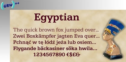
- Transitional 551 by Bitstream,
$29.99 - Egyptian 505 by Linotype,
$40.99 - Caslon 540 by ParaType,
$30.00 The Bitstream version of Caslon 540 of the American Type Founders, 1902. Based on William Caslon I's first English Old Style typefaces of 1725. Caslon modeled his designs based on late 17th century Dutch types, but his artistic skills enabled him to improve those models, bringing a variety of forms and subtlety of details. Strokes in Caslon fonts are somewhat heavier than in earlier Old Style fonts, serifs are thicker and a bit stubby. Italic letters have uneven slope. A text set in Caslon looks legible and aesthetically appealing. Caslon is a favorite font of English printers for setting of classical literature. Cyrillic version was developed for ParaType in 2002 by Isay Slutsker and Manvel Shmavonyan.
 - Caslon #540 by Linotype,
$29.99The Englishman William Caslon punchcut many roman, italic, and non-Latin typefaces from 1720 until his death in 1766. At that time most types were being imported to England from Dutch sources, so Caslon was influenced by the characteristics of Dutch types. He did, however, achieve a level of craft that enabled his recognition as the first great English punchcutter. The original Caslon specimen sheets and punches have long provided a fertile source for the range of types bearing his name. Identifying characteristics of most Caslons include a cap A with a scooped-out apex; a cap C with two full serifs; and in the italic, a swashed lowercase v and w. A few of the many interpretations from the early twentieth century were true to the source, as well as strong enough to last into the digital era. These include two from the American Type Founders company, Caslon 540 and the slightly heavier Caslon #3. Both fonts are relatively wide, and come complete with small caps, old style figures, and italics. - Caslon 540 by URW Type Foundry,
$89.99 William Caslon (1692-1766) laid the foundation for English typefounding, when he cut his first roman face in London in 1722. He modeled his designs on late seventeenth-century Dutch types; thus his typefaces are classified as Old Styles. The original Caslon punches have been preserved, enabling a perfect recutting of his faces. Notice the hollow in the apex of A and the two full serifs or beaks in the C. The italic capitals are irregular in their inclination. The Caslon font family is distinctive for use in subheadings or continuous text.
 - Caslon 540 by Bitstream,
$29.99William Caslon’s design as made regular by ATF at the beginning of this century. - Staccato 555 by Tilde,
$44.75 - Staccato 555 by Bitstream,
$29.99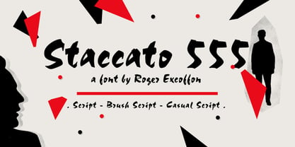
- 500 Guitars by Rocket Type,
$14.00 A chunky, whimsical number that strikes just the right chord for modern and retro projects. Loaded with stylistic alternatives, ligatures and Vietnamese support.
 - YD Myungjo 500 by Yoon Design,
$400.00
- Egyptian 505 SH by Scangraphic Digital Type Collection,
$26.00Since the release of these fonts most typefaces in the Scangraphic Type Collection appear in two versions. One is designed specifically for headline typesetting (SH: Scangraphic Headline Types) and one specifically for text typesetting (SB Scangraphic Bodytypes). The most obvious differentiation can be found in the spacing. That of the Bodytypes is adjusted for readability. That of the Headline Types is decidedly more narrow in order to do justice to the requirements of headline typesetting. The kerning tables, as well, have been individualized for each of these type varieties. In addition to the adjustment of spacing, there are also adjustments in the design. For the Bodytypes, fine spaces were created which prevented the smear effect on acute angles in small typesizes. For a number of Bodytypes, hairlines and serifs were thickened or the whole typeface was adjusted to meet the optical requirements for setting type in small sizes. For the German lower-case diacritical marks, all Headline Types complements contain alternative integrated accents which allow the compact setting of lower-case headlines. - Egyptian 505 EF by Elsner+Flake,
$35.00 - MPI No. 510 by mpressInteractive,
$5.00 No. 510 is a friendly, slim gothic face. Strokes have a gentle inward curve at the median with the tops and bottoms of the letters slightly wider and thicker. The design was first introduced by William H. Page & Company around 1887.
 - Egyptian 505 SB by Scangraphic Digital Type Collection,
$26.00Since the release of these fonts most typefaces in the Scangraphic Type Collection appear in two versions. One is designed specifically for headline typesetting (SH: Scangraphic Headline Types) and one specifically for text typesetting (SB Scangraphic Bodytypes). The most obvious differentiation can be found in the spacing. That of the Bodytypes is adjusted for readability. That of the Headline Types is decidedly more narrow in order to do justice to the requirements of headline typesetting. The kerning tables, as well, have been individualized for each of these type varieties. In addition to the adjustment of spacing, there are also adjustments in the design. For the Bodytypes, fine spaces were created which prevented the smear effect on acute angles in small typesizes. For a number of Bodytypes, hairlines and serifs were thickened or the whole typeface was adjusted to meet the optical requirements for setting type in small sizes. For the German lower-case diacritical marks, all Headline Types complements contain alternative integrated accents which allow the compact setting of lower-case headlines. - 750 Latin Uncial by GLC,
$38.00 This font was inspired by the Latin script used in European monasteries from circa the 5th to 8th centuries, before the Carolingian “Caroline” (look at our 825 Karolus). It was a regular script, rounded, written slowly, used mainly for specially meticulous books, with a few ligatures, legible, but only with lowercase. The capitals consisted of enlarged lower cases, but here, we have preferred to use two slightly different patterns. Our lower cases are a synthesis from a lot of variants (mainly from the “First Bible” of Charles The Bald), the upper cases were mainly inspired from a 700’s manuscript from the abbey of Fécamp (France). We have adapted the font for contemporary users, differentiating between U and V, I and J, which has no relevance for ancient Latin scribes, and naturally with Thorn, Oslash, Lslash, K, W... punctuation and the usual accented characters which did not exist at the time. It can be used with 799 Insular Title.
 - Caslon 540 EF by Elsner+Flake,
$35.00 - William Page 500 by Wooden Type Fonts,
$15.00 A revival of one of the popular wooden type fonts of the 19th century, somewhat condensed, square.
 - YD Gothic 500 by Yoon Design,
$400.00
- Fabulous 50s - Unknown license

- Nabataean 50 by Archaica,
$30.00This font provides a typical set of characters for the ancient Nabataean language, used in what is now Jordan and adjoining regions during the period of the Roman Empire, based on lapidary letter-forms of the first century of the present era. It includes a full set of alphabetic characters as well as the ancient numeral forms, with ligatures and variant shapes for some numerals. - Gracia Series 50 by astype,
$30.00 Gracia is a classic connected script design. OpenType features: - over 700 glyphs - central European faces - connection forms & stylistic alternates - proportional, mediaeval numerals & Roman numerals - numerators, denominators and fractions
 - 50's Headline DSG - Unknown license


Page 1 of 38Next page