10,000 search results
(0.064 seconds)
- Quida Rough by LetterMaker,
$21.00 Quida Rough is a textured display family with three styles; Regular, Italic and Script. The personality of the design comes the rough, worn outlines and concave vertical shapes, which are consistent through all styles. This makes them work together seamlessly. Quida Rough Script is packed with opentype goodness such as swash caps, stylistic alternates, ligatures and ending forms for lowercase letters. All styles have an extended language support for most European languages.
 - Olimpos by Gatype,
$8.00 Olimpos is a Display sans font that is absolutely perfect for editorial headlines. Her large, bold and slender figure is perfect for posters, t-shirts, and magazine covers. Reserved for capital letters only, this calm and bold typeface is a content creator's best friend. font files Uppercase, Numbers, Punctuation & Symbols. Diacritic for Multilingual Support This Olimpos is a modern sans-serif font that includes 4 weights of the normal style and the Italic style.
 - Gutreks by Maulana Creative,
$15.00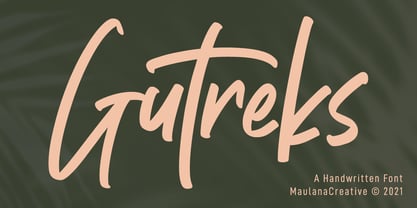 Gutreks is a handwritten feel font. With marker stroke, italic and fun character with a bit of ligatures. To give you an extra creative work. Gutreks font support multilingual more than 100+ language. This font is good for logo design, Social media, Movie Titles, Books Titles, a short text even a long text letter and good for your secondary text font with sans or serif. Make a stunning work with Gutreks font. Cheers, MaulanaCreative
 - Floreal by Reyrey Blue Std,
$16.00 Floreal is an elegant, modern and classy serif font with fashionable touch. That includes two styles : regular and true Italic. This font includes alternates and ligatures, with them you can make your project more elegant and unique. Floreal is perfect for corporate identities, websites, publications, titles, books, magazines, business cards, logos, product labels, packaging, or any kind of advertising purpose. Features : · All Uppercase and Lowercase · Number & Symbol · Supported Languages · Alternates and Ligatures
 - Quebra Ex Condensed by Vanarchiv,
$55.00 Quebra Ex Cn (Extra Condensed) is an extend display sans-serif font family, available with four widths (Extra Condensed, Condensed, Normal and Expanded) and ten weights, italics versions are available. The main strokes contain small breaks simulating modulated variations on the letterforms, these details are more present on large body sizes. All font versions contain Latin and Cyrillic encoding characters and also ligatures, case-sensitive forms, fractions, oldstyle and finally tabular figures.
 - Graviola by Harbor Type,
$30.00🏆 Selected for Tipos Latinos 7 with a Certificate of Excellence. With semi-rounded terminals, Graviola is soft and friendly. The family consists of 16 fonts, from Thin to Black and matching italics. While the intermediate ones are suited for body text, the extreme weights look specially beautiful at display sizes. Each font contains 530+ glyphs, supporting more than 90 languages. Stylistic sets provide alternates in two groupings (a, v, w, y and G, g, &). - Recht by Mint Type,
$32.00 Recht is a geometric sans with much attention to curvature compensations, classifying between classic geometric sans-serif typefaces and neo-grotesques. The family contains 10 weights with corresponding italics, Cyrillic script with inclusion of Ukrainian Cyrillic, and a bunch of OpenType features. Recht has a closed aperture and is extremely versatile, working exceptionally well in both headlines and long text paragraphs. You can use stylistic sets for added geometric or humanist flavour.
 - Rotis II Sans by Monotype,
$50.99 Developed over several years by the late Otl Aicher and first released in the late 1980s, the Rotis® typeface has become a timeless classic. ROTIS II SANS HISTORY Aicher was a renowned German designer and corporate image consultant. He created the four basic designs of Rotis – sans serif, semi sans, semi seif and serif – within an extended typeface family concept, wherein all designs share a common cap height, lowercase x-height, basic stem weight and general proportions. While each version is part of the large, integrated family, each was also designed to function on its own as a distinctive typestyle. The result is that all members of the Rotis family combine smoothly with each other. Aicher, however, did not design the Rotis family with the weights and proportions normal for more contemporary releases. Rotis Sans Serif, for example, was drawn with just six weights and only two italics. Starting in 2010, Robin Nicholas, senior designer for Monotype Imaging in the UK, and freelance designer Alice Savoie collaborated to bring Rotis Sans Serif up to current standards. The result is Rotis II Sans, a completely new addition to the Rotis family. “We devised our approach together,” recalls Savoie, “deciding which weights to start with, what kind of alterations to make to the original Rotis, etc. I went to work on the typefaces, regularly submitting proofs to Robin. We would then decide in tandem on the next steps to take.” Nicholas elaborates, “We revisited the range of weights and added matching italics so that the new additions to the family offer increased versatility. We optimized the outlines, corrected the weight of several letters and re-examined overall spacing and kerning. In addition to a new set of numerals, with a height similar to the capitals, we also drew case-sensitive punctuation.” ROTIS II SANS USAGE The new Rotis II Sans suite comprises 14 typefaces: seven weights, ranging from extra light to black, each with a companion italic. The designs are available as OpenType® Pro fonts, allowing for automatic insertion of ligatures and fractions. Pro fonts also offer an extended character set supporting most Central European and many Eastern European languages. Aicher’s original Rotis designs were widely used for branding and advertising. With the addition of Rotis II Sans, the family is again poised to become a powerful communicator.
 - FF Good by FontFont,
$72.99 FF Good is a straight-sided sans serif in the American Gothic tradition, designed by Warsaw-based Łukasz Dziedzic. Despite having something of an “old-fashioned” heritage, FF Good feels new. Many customers agree: the sturdy, legible forms of FF Good have been put to good use in the Polish-language magazine ‘Komputer Swiat,’ the German and Russian edition of the celebrity tabloid OK!, and the new corporate design for the Associated Press. Although initially released as a family of modest size, the typeface was fully overhauled in 2010, increasing it from nine styles to 30 styles, with an additional 30-style sibling for larger sizes, FF Good Headline. In 2014, the type system underwent additional expansion to become FontFont’s largest family ever with an incredible 196 total styles. This includes seven weights ranging from Light to Ultra, and an astonishing seven widths from Compressed to Extended for both FF Good and FF Good Headline, all with companion italics and small caps in both roman and italic. With its subtle weight and width graduation, it is the perfect companion for interface, editorial, and web designers. This allows the typographer to pick the style best suited to their layout. As a contemporary competitor to classic American Gothic style typefaces—like Franklin Gothic, News Gothic, or Trade Gothic—it was necessary that an expanded FF Good also offers customers both Text and Display versions. The base FF Good fonts are mastered for text use, while FF Good Headline aims for maximum compactness. Its low cap height together with trimmed ascenders and descenders give punch to headlines and larger-sized copy in publications such as newspapers, magazines, and blogs. There is even more good news about FF Good: it has something of a serif companion. Łukasz Dziedzic built FF Good to work together with FF More, creating in a powerhouse superfamily that is versatile in both its function and aesthetic.
 - Riva by ITC,
$29.00ITC Riva is the work of English designer Martin Wait and appeared with ITC in 1994. Its letters form gently flowing words and sentences and the light stroke contrast makes the font stable yet lively. The contemporary typefaces of the 18th century influenced the forms of ITC Riva and its overall image brings to mind flowing white sundresses, fields of flowers and tea parties. Perfect for invitations and greeting cards, the capitals of ITC Riva can also be used as initials and combined with other alphabets. - Fester by Fontfabric,
$150.00 Get inspired with Fester Behance presentation After several years of iterations, our brand new sans family of 16 styles is ready to take over with vector excellence! Fester is a semi-condensed Grotesque developed to beam big messages across the galaxy with a clear, bold voice. Emerging as if from the future, this low-contrast sans warps slick lines and sharp terminals into unexpected geometric shapes for extra flair. Ranging from Thin to Heavy, the typeface is loaded with 8 weights + italics, one variable style, over 760 glyphs, and Extended Latin + Cyrillic for flawless work at hyper-speed. Fester syncs with designs that feature big type, sharp layouts, interfaces, outlines, and raster images to help decipher any cutting-edge idea and make a memorable first contact. Family overview: 8 weights (from Thin to Heavy) + italics Extended Latin Cyrillic 760 glyphs Variable Font 1 free font - Fester-ExraLight 130+ languages OpenType Features: Localized Forms Subscript and scientific inferiors Superscript (Superiors) Numerators and Denominators Fractions Lining Figures Tabular Figures Oldstyle Figures Case-Sensitive Forms Standard and Discretionary Ligatures Stylistic Alternates Contextual Alternates Slashed Zero
 - Novel Sans Pro by Atlas Font Foundry,
$50.00 Novel Sans Pro is the humanist grotesque typeface family within the largely extended award winning Novel Collection, containing Novel Pro, Novel Sans Pro, Novel Sans Hair Pro, Novel Sans Condensed Pro, Novel Mono Pro, Novel Sans Rounded Pro and Novel Sans Office Pro. Novel Sans Pro has a carefully attuned character design and a well balanced weight contrast. Classic proportions and the almost upright italic makes Novel Sans Pro being a modern humanist with the calligraphic warmth of a real italic. Many similarities with the other typeface families within the Novel Collection enable designers to combine the families and reach highest quality in typography. Novel Sans Pro [1020 glyphs] comes in 6 weights and contains small caps, an extra set of alternate glyphs, many ligatures, lining figures [proportionally spaced and monospaced], hanging figures [proportionally spaced and monospaced], small caps figures [proportionally spaced and monospaced], positive and negative circled figures for upper and lower case, superior and inferior figures, fractions, extensive language support, arrows for uppercase and lowercase and many more OpenType™ features.
 - Battista by preussTYPE,
$29.00 The BATTISTA typeface stands in the long tradition of the designs developed by Giambattista Bodoni, who made his famous typefaces in the end of the eighteenth century. Similar designs can be found on various specimen books e.g. Alexander Wilson, John Bell, Edmund Fry and Alexander Thibaudeau. One of the best italics was available by Stephenson Blake & Co. foundry form Sheffield, England. In the end of the nineteenth century an unknown punch cutter at the German type foundry Schelter & Giesecke made an very bold cut of this Bodoni design. He brought both designs, the regular and the italic to an new level of harmony. Compared to the original Bodoni designs the new typeface was a lot bolder, which was well taken by the audience in this time. The BATTISTA typeface is an remarkable design, assembled of ultra bold and very fine shapes, but in all, the spirit of Bodonis design was well preserved. BATTISTA is a classic display design. The fine details are best shown on larger text sizes.
 - Brush Hand Marker by TypoGraphicDesign,
$19.00 The typeface Brush Hand Marker is designed from 2020 for the font foundry Typo Graphic Design by Manuel Viergutz. The rough sans-serif display typeface with 4 font styles (Italic, Invert, Shadow, 3d) is inspired by handwriting. 348 glyphs incl. 100+ decorative extras like icons, arrows, dingbats, emojis, symbols, geometric shapes, catchwords, decorative ligatures (type the word #LOVE for ❤ or #SMILE for ☺ as OpenType-Feature dlig) and stylistic alternates (2 stylistic sets). For use in logos, magazines, posters, advertisement plus as webfont for decorative headlines. The font works best for display size. Have fun with this font & use the DEMO-Font (with reduced glyph-set) for FREE! Font Specifications ■ Font Name: Brush Hand Marker ■ Font Weights: Italic, Invert, Shadow, 3d + DEMO (with reduced glyph-set) ■ Font Category: Display for headline size ■ Font Format:.otf (Mac + Win, for Print) + .woff (for Web) ■ Glyph Set: 348 glyphs ■ Specials: Alternative letters, stylistic sets, automatic contextual alternates via OpenType Feature. Dingbats & Symbols, arrows, hearts, emojis/smileys, stars, further numbers, lines & geometric shapes ■ Design Date: 2020 ■ Type Designer: Manuel Viergutz
 - Novel Sans Condensed Pro by Atlas Font Foundry,
$50.00 Novel Sans Condensed Pro is the humanist grotesque typeface family within the largely extended award winning Novel Collection, containing Novel Pro, Novel Sans Pro, Novel Sans Hair Pro, Novel Sans Condensed Pro, Novel Mono Pro, Novel Sans Rounded Pro and Novel Sans Office Pro. Novel Sans Condensed Pro has a carefully attuned character design and a well balanced weight contrast. Classic proportions and the almost upright italic makes Novel Sans Condensed Pro being a space saving, modern humanist with the calligraphic warmth of a real italic. Many similarities with the other typeface families within the Novel Collection enable designers to combine the families and reach highest quality in typography. Novel Sans Condensed Pro [1020 glyphs] comes in 6 weights and contains small caps, an extra set of alternate glyphs, many ligatures, lining figures [proportionally spaced and monospaced], hanging figures [proportionally spaced and monospaced], small caps figures [proportionally spaced and monospaced], positive and negative circled figures for upper and lower case, superior and inferior figures, fractions, extensive language support, arrows for uppercase and lowercase and many more OpenType™ features.
 - Novel Sans Office Pro by Atlas Font Foundry,
$50.00 Novel Sans Office Pro is the humanist grotesque typeface family optimized for office environments within the largely extended award winning Novel Collection, also containing Novel Pro, Novel Sans Pro, Novel Sans Condensed Pro, Novel Mono Pro and Novel Sans Rounded Pro. Novel Sans Office Pro has a carefully attuned character design and a well balanced weight contrast. Classic proportions and the almost upright italic makes Novel Sans Office Pro being a modern humanist with the calligraphic warmth of a real italic. Many similarities with the other typeface families within the Novel Collection enable designers to combine the families and reach highest quality in typography. Novel Sans Office Pro [1020 glyphs] comes in 6 weights and contains small caps, an extra set of alternate glyphs, many ligatures, lining figures [proportionally spaced and monospaced], hanging figures [proportionally spaced and monospaced], small caps figures [proportionally spaced and monospaced], positive and negative circled figures for upper and lower case, superior and inferior figures, fractions, extensive language support, arrows for uppercase and lowercase and many more OpenType™ features.
 - Mayonez by Sardiez,
$29.00 Mayonez is a typeface with rational structure and axis but softened with rounded contours and cupped serifs, getting as result a balance between seriousness and friendliness. The shapes have a soft appearance but without lacking definition. A more fluid structure influenced by calligraphy is proposed for the italic variants, in this case the uppercase letters adopted a simplified semiserif structure that works better with the lowercase letters. Also the figures are very different from the roman version and follow more faithfully the italic style. In an attempt to give Cyrillic lowercase romans a fresh look, symmetrical serifs inherited from the versal tendency are mostly avoided thus getting simpler structures closer to the latin forms. This type is good for commercial and editorial uses like advertising, packaging and pages with showy headlines where a warm touch wants to be given. The character set includes a group of figures and currency symbols with standard height and another suited to match better with lowercase letters. Mayonez was selected to be part of the Communication Arts Typography annual in 2015.
 - Magendfret by sugargliderz,
$24.00 Magendfret is a typeface that was designed very mechanically. However, it is also the optimal typeface for expressing soft warmth. Magendfret was designed by constructing a "line." That is: it is based on the concept "it is the combination of a straight line and a curve with a character." I made the character from the act of using and constructing a vector graphics editor, a mouse, and a keyboard. That, I thought when constructing it, should make neither a roman type nor italic type into a novel form, and a very general form. Once those characters were bit-map-ized, they traced again mechanically by the vector graphics editor. It became a soft impression by this work. The very mechanical act of changing the thickness of a line uniformly constitutes the family. The thickness of seven patterns was created first and, finally it results in four patterns. Respectively, styles called Light, Regular, Medium, and Bold are attached as usual. The name Magendfret is meaningless. It is an anagram of a certain words selected very arbitrarily.
 - DT Skiart Serif Mini by Dragon Tongue Foundry,
$9.00 ‘Skiart Serif Mini’ is now available online. Originally inspired by the san serif font ‘Skia’ by Mathew Carter for Apple. ‘Skiart’ was designed to feel more like a serifed font, but without any serifs. It took a step between sans serif and serif fonts. Next on the path towards a serif font comes Skiart Serif Mini, with tiny serifs added. This is a true serif font, all be it on the small side. It remains fully readable and feels as clean and normal as any of the best body copy serifs, and yet still has the strong solid bones of all the other Skiart font familys. If compared to one of the more commonly used serifs like ‘Times New Roman’, the ‘Skiart Serif Mini’ lowercase is more open with a taller x-height, increasing its readability and friendliness. The serifs are smaller and less distracting. They are not pretending to be ligatures. Where ‘Times’ makes its p q b d forms out of a barely touching oval and stem, the ‘Serif Mini’ forms are much more firmly attached, appearing clearly as single letters. The standard setting for the g’s are round single storied, (the italic a’s are also), feeling warmer and more inviting in the ‘Serif Mini’ font. Much more friendly than the stuffy double storied versions in fonts such as ‘Times’ etc.
 - Multiple by Latinotype,
$39.00 As its name suggests, Multiple is a family with multiple font styles. The idea that sums up the concept behind the typeface is “workhorse”. The challenge was to develop a useful font fit for any scenario and suitable for any design needs: editorial design, packaging, branding, screen use, etc. Multiple features soft, rounded shapes and large counterforms which make it well-suited for both text and display usage. The proportions are based on classic typefaces yet its design was specially created to provide a high degree of versatility. Multiple contains different stylistic sets whose variety of glyphs provides a wide range of choices for any design project. Partly humanist and partly grotesque, Multiple comes with a number of font variants that will help you choose the style that will best meet your needs. The font also includes a serif version with the same number of variants as its sans counterpart. The sans version includes 4 stylistic sets while its slab companion comes with 3 sets, both available as separate alt family packages (ideal for those seeking ready-to-use alternate glyph sets). These alternate characters are also available as OpenType features in the regular versions. Multiple comes in 5 weights—ranging from Extra Light to Bold - with matching italics, and contains a 395-character set that supports 207 different languages. Multiple: one font, multiple faces.
 - Modesto Initials by Parkinson,
$20.00 Modesto Initials had existed as a single font for several years. I recently added a fill font to put color in the Inlines. The Inline font still works by itself. The Fill font works alone too, as an ultra Modesto on steroids. They work best together. Modesto is a loose-knit family based on a signpainters lettering style popular in the late-19th and early-20th centuries. It evolved from the lettering I used for the Ringling Bros. and Barnum & Bailey Circus Logo. The Modesto family was not planned. It just happened, a few fonts at a time over about fifteen years. In 2014 seven new Italic fonts and two Chromatic families were added. There is a downloadable MODESTO USER MANUAL PDF in the Gallery section for this family.
 - Rational by René Bieder,
$39.00 Rational is a contemporary representative of the Grotesk genre inspired by drawings dating back to the early 20th century. It is a highly utilitarian family focusing on clarity and simplicity by approaching the design with a strong modernist fused attitude. Rooted in Swiss traditional and pragmatic design, Rational contains ingredients like horizontal terminals and uniform widths which result in a highly functional and flexible font. This is juxtaposed with circular and subtle calligraphic elements creating a warm and approachable layer within an objective surrounding. With more than 800 glyphs per font, the family is optimized for numerous scenarios. It comes in 10 weights with matching italics containing opentype features like small caps, stylistic sets, case sensitive shapes, tabular figures and many more, making Rational the perfect choice for modern, contemporary and professional typography.
 - Rotato by VIP Graphics,
$8.49 Rotato is a lowercase only geometric slab-serif typeface that brings versatility to any design. This minimalist but distinctive font is defined by its crisp composition and modern elements — designed for optimal legibility at all sizes. Out now in all lower case, Rotato leaves an understated impression of elegance & futurism. Currently available in three standard weights, more coming soon: Rotato Light - Clean and classy Rotato Regular - Elegant and elite Rotato Bold - Strong and classic FEATURES Three (3) Font Weights + Italics Numbers and Punctuation New (v2): Extended Ligatures & Nordic Character Set Special Characters Rotato is a dynamic font that works great across various applications: from branding & logos to technology & fashion — whether in a giant heading, or paragraphs of body text. Thanks for checking out Rotato; we hope you enjoy using it.
 - Apron by Hurufatfont,
$29.00 The genesis of Apron font type family is inspired by soft-vertical structure of airplane window. On the other hand Apron is making a reference to technological design mentality of early 2000's. In short texts it has stable view and also humanist effect. Very suitable for mobile apps, web designs, sportive & technological product packs and ads designs. Especially Narrow Bold and Condensed Bold Italic weights have fluid and strong expression for striking headlines. User friendly Apron serves rich opentype properties; small capitals, alternative letters (a, c, e, g, k, l, q, s, y, A, C, G, K, M, N, R, S, 3, 6, 9), stylistic sets, standart and optional ligatures, oldstyle figures, tabular linings, arrows, bullets and wide money currencies, fractions and math symbols. Now please fasten your seat belts and enjoy it.
 - Technica by Monotype,
$25.00 Do you remember a typeface called Meccanica? I didn’t think so. Well, it was pretty unique – too unique for most people’s tastes it seems. Anyway, this is Technica, Meccanica’s more conservative little brother. Essentially, this typeface is a geometric sans that retains the structure of Meccanica, but tones down most of the hexagonal elements. The chamfered terminals are retained, but sharpened, and a more technical approach is instilled with each glyph being fine-tuned for optimal performance and aesthetics. The result is a refined sans serif that has enough personality to differentiate itself from the myriad of others available – undoubtedly, Technica will deliver a distinctive tone to your own typographic designs. Key features: • 9 weights in Roman and Italic • Western European character set (Adobe Latin 1) • 250+ glyphs per font.
 - Core Mellow by S-Core,
$20.00 Core Mellow is a condensed geometric sans-serif typeface family that can be used in various applications especially for short texts. The letterforms in roman style are mild, minimal, simple, and clean in appearance. The Core Mellow Family consists of 3 widths (Compressed, Condensed, Normal), 7 weights (Thin, Extra Light, Light, Regular, Medium, Bold, Extra Bold) and Italic for each format. The Core Mellow provides a wide range of character sets to support Cyrillic, Central and Eastern European characters and advanced typographical support with features such as proportional Figures, tabular Figures, numerators, denominators, superscript, scientific Inferiors, subscript, fractions, standard ligatures, discretionary ligatures and stylistic alternates. Core Mellow looks smooth in any layout with its sleek rounded lines, use it for your magazines, brochures, web pages, screens, and so on.
 - Hello Kindess Brush by Lucky Type,
$18.00 Hi designer, let me introduce my newest font Hello Kindess. Hello Kindess is my newest font brush that I made using a simple brush with a modern style and irregular base line. contemporary approach to design, natural handmade, suitable for use in title designs such as clothing, invitations, book titles, stationery designs, quotes, branding, logos, greeting cards, T-shirts, packaging designs, posters, and more. Hello kindess Font consists of 2 kinds of styles namely upright and italic style so that designers are free to choose the desired style. Hello Kindess Font Also has 20 Extras made by hand which are very suitable for various purposes in design. Extras that I made with full detail so it looks very unique. Thank you for seeing I hope you like it.
 - Yotta by Wilton Foundry,
$19.00 Yotta was created for situations where a thin sans with a little extra style is required in branding, advertising promotional projects — it is especially suited for the FASHION retail industry. The extended stroke feature (in u/c B,DP,R and l/c a,b,dg,h,m,npq,u,y) is discreetly applied so it does not dominate. I guess “quasi-serif” might be a way to describe Yotta. “Yotta Thin” and “Yotta Thin Italic” is a friendly Opentype and ready for you to unleash your creativity! btw. Yotta is big, very big: the name comes from YottaByte, as in Megabyte (one million bytes), Gigabyte (one billion (109)Terabyte (one million million (1012), Petabyte (a million gigabytes), Exabyte one quintillion (1018), Zettabyte one sextillion (1021), & Yottabyte (one septillion (1024)
 - Mauritz by Mans Greback,
$59.00 Mauritz is a brush script typeface. A speedy handwriting, Mauritz was drawn and created by Mans Greback in 2021 to be the ultimate set of wild-style scripts for logotypes and branding. This calligraphy family consists of 10 high-quality fonts in a great variety of weights and styles: Mauritz Thin, Light, Regular, Bold and Black, and each one as Italic. The font is built with advanced OpenType functionality and has a guaranteed top-notch quality, containing stylistic and contextual alternates, ligatures and more features; all to give you full control and customizability. It has extensive lingual support, covering all Latin-based languages, from North Europe to South Africa, from America to South-East Asia. It contains all characters and symbols you'll ever need, including all punctuation and numbers.
 - Arek Latin by Rosetta,
$60.00 Arek is Rosetta’s award-winning collection of Latin and Armenian families. Originally designed for use in textbooks and the schoolroom, Arek is an active typeface that holds the reader’s attention with kinetic details tucked into restrained letterforms on the page. For clarity and ease of reading, Arek pairs its nuanced upright and its perky italic styles for both scripts. Though first designed with school books in mind, Arek equips the typographer with eight styles covering a wide range for editorial and other challenging typesetting environments. Essential expert features such as ligatures, lining and ranging figures, and contextual alternates ensure Arek is ready for any assignment. Extras like a full array of bullets, dingbats, and manicules make this family nimble enough to make the grade with readers in all sorts of editorial projects.
 - Megatura by Haksen,
$19.00 Megatura is a Bold elegant modern vintage with upper and lowercase feel nice balanced curves. This font is inspired by lettering from couple of the good talent artist, but it still has a strong modern appearance. Its wide range of stylistic alternates allows versatile design options and works perfectly for headlines, logos, posters, packaging, T-shirts, postcards and much more. Font Features : Regular and Italic version Character set A-Z Stylistic Alternates & Ligatures Numerals & Punctuation Accented Characters Multiple Languages Supported Recommended to use in Adobe Illustrator or Adobe Photoshop with opentype feature. How to access Alternate Characters? Open glyphs panel : - In Adobe Photoshop choose tool Window > glyphs - In Adobe Illustrator choose tool Type > glyphs If you have questions, just send me a message and I'm glad to help Have a great day Haksen Std
 - Cyan Neue by Wilton Foundry,
$29.00 Cyan Neue is a substantial update variation to the original Cyan we launched in 2006. Most notably the contrast has decreased making it more contemporary. Many glyphs have been improved especially in the italics. The design of Cyan Neue was inspired by features found in classic Roman. It shows a preference for geometric Roman proportions while incorporating open centers (B,P,R) and compact serifs. The characters stay true to the same features as the capitals, resulting in an unusually distinctive style. There are many subtle details in Cyan Neue that become more interesting in display sizes, for instance the subtle curves in the serifs and the overall smoothness. Cyan Neue is a robust font that will exceed your expectations. Cyan Neue is clearly ideal for headlines, inscriptions, publications, annual reports, corporate identities, packaging.
 - Arpona Sans by Floodfonts,
$49.00 Arpona Sans is a contemporary sans serif family inspired by the work of Edward Johnston and Eric Gill for London Underground. As well as its serif companion Arpona it is a symbiosis of different design concepts. Arpona Sans combines the esthetics of a geometric Sans with the usefulness of the humanist concept and the calm of the modernist proportions. Arpona Sans is a good choice for editorial design, branding, app design and web design – a workhorse well readable even in running text on screen. The family has nine weights, ranging from Thin to Black plus corresponding italics. Each style includes 590 glyphs supporting all western-, eastern- and central-european languages including four sets of figures and various currency symbols. If you want to go into details visit the microsite: https://www.floodfonts.com/arponasans
 - Bommer Sans by dooType,
$30.00Bommer Sans is a warm and friendly type with a distinguishable look. It has been designed to add our twist to the flavour of English humanistic sans serif typefaces. Bommer Sans works like a charm for editorial, headlining, exhibition, signage and wayfinding projects. The big x-height and ascenders close to cap height favor tighter interlinear spacing. The ‘Q’ tail, resting on the baseline, is an invitation to play vertical, stacking lines of caps. Curved strokes on the ‘i’, ‘k’, ‘l’, ‘K’ and ‘R’ bring a friendly touch without compromising the sturdy structure, a marked characteristic of the design of the figure set. With seven weights in the upright and its matching italics, Bommer Sans has 14 styles and is part of the Bommer family. Check Bommer Slab for a great companion! - Darlene by Dominik Krotscheck,
$12.00 Darlene is a sans with contrast and round corners. The absence of serifs results in a clean look, the contrast adds a touch of elegance and the soft edges help to keep it all friendly looking. So whenever you need to convey any of these traits, Darlene is perfect for you. Mainly intended for headlines, logos, invitations or other display uses, this font family provides enough readability to be used for short texts, especially the lighter weights. This means that Darlene is great if you want to use it as a counterpart to a script or handlettering, or simply to juxtapose a more playful or kitschy font. Darlene is available in three weights with italics and equipped with lots of accented characters to cover heaps of languages using the latin alphabet.
 - Nokrios by Twinletter,
$17.00 Nokrios is a font specifically inspired by the sport of racing. adopts the speed and power it tries to fully reflect to make a bold statement that stands out. We designed it to be a heavy-duty, functional add-on option for big, bold titles or small add-on types. This font features two different font options and two italic options. This font is perfect for adding punch to your projects without losing readability or impact at small sizes. What’s Included : - File font - All glyphs Iso Latin 1 - Alternate, Ligature - Simple installations - We highly recommend using a program that supports OpenType features and Glyphs panels like many Adobe apps and Corel Draw, so you can see and access all Glyph variations. - PUA Encoded Characters – Fully accessible without additional design software. - Fonts include Multilingual support
 - Aestetico by Latinotype,
$29.00 This beautiful font explores 3 very individual styles of one typeface. Each style pays homage to classic sans serif typefaces while adding contemporary flair to its characteristics. With both formal and informal styles, Aestetico explores how the shapes and curves of letters change their perception and focus. The informal letters are rounder and more quirky while the formal style utilizes more traditional sans serif letterforms. The whole set (54 styles) consists of 3 sister families, each in 9 weights with matching italics. The 3 variants ensure every design project is covered by Aestetico; its versatile nature is perfect for a huge variety of applications from editorial design to branding, advertising, publications and digital. As you would expect from Latinotype, this font comes with a standard character set (395 glyphs) and supports over 200 languages.
 - Benda by Suitcase Type Foundry,
$45.00 Benda is a modern geometric script font with roots in the calligraphy and lettering of legendary artist Jaroslav Benda. With bold, predominantly low joins, the robust monolinear character strokes shine in one-word and short inscriptions as well as in longer headlines. The practical letterforms do not clutter the space with loops and curlicues, while the emphasised baseline helps to underline the importance of the message. What’s more – Benda is a smart font, automatically replacing conflicting characters with suitable alternatives as you write so that the final text flows seamlessly. Because Benda is the sequel to Jaroslav, it derives the slant, colour, and geometric characteristics from the sans typeface, forming the perfect companion to the font. So much so, it can serve as a second italic emphasis in long texts.
 - Apium by Spilling Type,
$14.99 Apium is a non-trivial serif typeface. Inspired by the lettering of an old advert, it aims to add fun to a serif with distinctive features. It comes in five weights with matching italics. The typeface performs well in display environment: headings, stand out text, packaging, posters and so on. The regular and medium weights work well as body text. The typeface is suitable for print and digital. Apium has Latin Extended A and Latin Plus Multi-Lingual support. OpenType features include: Small capitals, Discretionary ligatures, Standard ligatures, Lining figures, Oldstyle figures, Proportional figures, Tabular figures, Ordinals, Denominators, Numerators, Scientific inferiors, Subscript, Superscript and Fractions. The word apium is Latin for parsley. The original advert was for a vegetable margarine and that got me on the road of a food theme.
 - Seria Pro by Martin Majoor,
$49.00 The multi award-winning Seria (1996) is Martin Majoor’s second comprehensive typeface family and the successor to his popular text letter Scala. Seria explores the proportions of classical text typefaces. Its degree of sophistication is perfect to be used for poetry and other refined literature, its eye-catching details however makes Seria also suitable as a display typeface. The first sketches for Seria emerged in the summer of 1996 on the train from Berlin to Warsaw, to be precise, on July 25 – the date Majoor noted on the napkins of the train’s on-board restaurant, which he used for lack of suitable drawing paper. The italics are almost upright which contributes much to Seria’s delicately proportioned appearance. The Seria family consists of Seria Serif and Seria Sans. Combining the two creates countless possibilities of expression.