10,000 search results
(0.051 seconds)
- MC Byrdens by Maulana Creative,
$23.00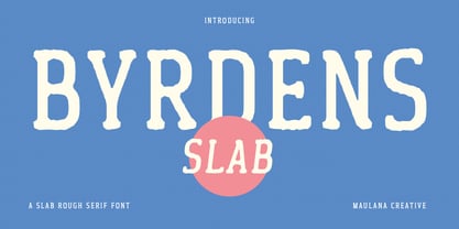 Byrdens is a retro slab serif font. With regular rounded stroke, fun character. To give you an extra creative work. Byrdens font support multilingual more than 100+ language. This font is good for logo design, Social media, Movie Titles, Books Titles, a short text even a long text letter and good for your secondary text font with script typeface. Make a stunning work with Byrdens font. Cheers, Maulana Creative
 - Theo Ballmer by URW Type Foundry,
$39.99 The Theo Ballmer font family is based on Theo’s design ideas which were completed by his son Theo Ballmer (Thierry’s father), and digitized by Thierry, with the help of URW++ and their Ikarus technology. Theo Ballmer is available in 3 x 5 variants: condensed, regular, expanded each in 5 weights. Theo Ballmer is a masterpiece, which fills a historical gap and provides a real font family from the Bauhaus era.
 - Wellness JNL by Jeff Levine,
$29.00 The Federal Art Project of the WPA (Works Progress Administration) employed artists to create posters for various subjects including health, tourism, safety, patriotism, theater and the arts during the Great Depression years of the 1930s on through the early 1940s. One health-related poster had the word “against” in a thin Art Deco monoline which served as the basis for Wellness JNL, which is available in regular and oblique versions.
 - Scootchy by Typogama,
$19.00 Scootchy is a high contrast, narrow typeface destined for use in both large and small point sizes. Blending an industrial and humanist approach, this typeface includes four weights ranging from a slender, regular style to a dark and contrasted Black weight. With an Extended Latin character set and a wide range of Opentype features, Scootchy aims to provide a versatile solution that can be applied to a wide range of layouts.
 - Whistleberry by 10four,
$25.00 Originally given life as a wordmark for the Alt-Country band Woodshed Supply Company, the Whistleberry typeface evolved from a few simple letterforms inspired by early 20th Century signage, into a surprisingly functional typeface. With plenty of rustic charm, a robust glyph set, and a variety of alternate characters, Whistleberry will add flare and appeal to your work. Whistleberry comes in two weights; a modest Regular and a beefy Bold
 - Larantuka by Arterfak Project,
$15.00 Larantuka is a bouncy display typeface. Created by neat strokes and set them to be playful. Inspired by snack packaging and children's book covers, this font is perfect for many purposes. Available in Regular and Outline style that you can use to make your design looks more lovely! Larantuka has a unique letterform that possible to combine the upper & lowercase. Also complete with playful ligatures. Thank you and Cheer your day!
 - Paget by Greater Albion Typefounders,
$8.50 Paget is a modern exploration of Tuscan design. Here you'll find simple geometric outlines with an 'Arts and Craft' charm about them. Paget is beautifully clear and easy to read, but offers a distinctive charm that conventional sans serif and serif faces don't. Paget is offered in regular and oblique forms and is an ideal way to merge tradition and all that is new and fresh in your designs.
 - History Love by Struggle Studio,
$11.00 History Love is a modern calligraphy design, including Regular. This font is casual and beautiful with Extras. Can be used for various purposes. such as logos, product packaging, wedding invitations, branding, headlines, signage, labels, signatures, book covers, posters, quotes, and more. History Love is a love font that emphasizes beauty and luxury, coupled with Extras which is very riveting. has 340 Glyph fonts complete with alternates & ligatures, and has 26 Extras.
 - PH Font by Fontfabric,
$29.00 PH from Fontfabric Type Foundry is a multifaceted font system consisting of different font weights and type of condensation. Every one of these font weights contains a number of extension types - Condensed, Narrow, Regular, Extended and Wide. Along with all of this, you will also discover added groups of extras which could serve as a foundation or add that extra "cherry on the cake" to each unique design.
 - Romagna by AlienValley,
$5.00 Romagna is a modern and highly versatile sans-serif typeface designed for readability without sacrificing aesthetics. There are 8 included styles to pick from including regular + bold weights plus italics and 2 different uppercase styles so you can either go with a classic look or a modern futuristic theme. Features Modern design Easy to read characters Great for both headlines & large chunks of text Multilingual support Great versatility 8 Included styles
 - Skulebuk by WCM,
$20.00Skulebuk is a decorative typeface ideally created for use on edgy/street/urban or sports related design projects. Reminiscent of the early 90s scribblings in the back of my old school books (we all remember right!) instead of doing real work! The two weights available Regular and Heavy will help balance designs that want to over use the typeface i.e Heading and body text. 80s-90s is very now! - Serona by Balevgraph Studio,
$16.00 Serona - Beautiful Duo with Ornaments We are so exited to present Serona, a combination of sans serif fonts and signature styles complemented by beautiful ornaments, Serona with Modern Elegant Style is perfect for branding, logos, invitations, Magazine and more. Serona Features: Multilingual Ligatures Alternates Swashes PUA encoded Files Included: Serona Regular Serona Italic Serona Signature Serona Signature Slanted Serona Ornaments We are ecstatic if our fonts can help your project.
 - Graffick by Graffiti Fonts,
$12.99 Graffick is a mechanical style created by merging a little traditional type design & typography with a little basic graffiti lettering theory. Extra ascenders and descenders have been added to many of the capital letters to add a more varied & specialized appearance. This layered type system provides for the easy creation of outline/fill effects with regular, italic, wide and outline styles as well as baseline & caps-height alignment options.
 - Kiddie Stencil JNL by Jeff Levine,
$29.00 At one time, the Hampton Publishing Company of New York specialized in producing reading and activity books for children. The “Letters and Numbers Stencil Book” (probably from the late 1940s or early 1950s) was the basis for Kiddie Stencil JNL. This bold sans serif type style replicates the handmade steel rule dies used for cutting the stencil pages of the book, and is available in both regular and oblique versions.
 - Spaziel Serif Round by Maulana Creative,
$12.00 Spaziel Round serif is a modern serif font. With regular round stroke, and fun character. To give you an extra creative work. Spaziel font support multilingual more than 100+ language. This font is good for logo design, Social media, Movie Titles, Books Titles, a short text even a long text letter and good for your secondary text font with Script typeface. Make a stunning work with Spaziel font. Cheers, MaulanaCreative
 - Taku by Thinkdust,
$10.00 Taku comes in two styles, Taku regular and Taku Solid. As one of the most creative faces to date, this is a beautiful piece aimed at a whole range of markets for print and digital work. Super creative, extremely eye catching, and almost obsessively accurate. Taku is a typographers dream, over 300 hours of work on aesthetics and technical details, so you can expect the most high quality typeface around.
 - Videomusic by Resistenza,
$39.00 Videomusic is a bubble font based on letterings from POP culture in the eighties. The edges have a pointed shape and a subtle inclination giving the dynamic touch used in many music television networks and videos from that fantastic era. The family contains 5 fonts; regular, thick, bubble, outline and Shadow. Combine them all and create amazing artworks perfect for many purposes like headlines, branding, packaging, poster, magazine & flyer
 - Pacific Atoll JNL by Jeff Levine,
$29.00 Pacific Atoll JNL is a stylized slab serif type design based on the movie title lettering for the 1942 wartime film “Pacific Rendezvous”, and is available in both regular and oblique versions. According to Wikipedia, “…an atoll (sometimes known as a coral atoll), is a ring-shaped coral reef, including a coral rim that encircles a lagoon partially or completely. There may be coral islands or cays on the rim.”
 - TT Prosto Sans by TypeType,
$29.00 Prosto Sans - this font family for any occasion. You can use these fonts almost everywhere. The modern open grotesque forms and classic font family formula: Thin, Light, Regular, Bold, Black and Italics. Prosto Sans is the assistant to work for any projects. Optimized for the websites, mobile applications, and printing materials. We offer you to have a look at this font’s narrow version, which is called TT Prosto Sans Condensed.
 - Felt-Tip Futhark by Thomas Käding,
$1.00The vikings searched in vain for hundreds of years over much of the northern hemisphere, but their dreams of writing with felt-tip pens went unfulfilled--until now! This is a novelty font containing the 24 runes of the Futhark, but with a modern bent. In addition to regular, bold, oblique, and bold oblique, we have included two outline styles. Also included is a PDF page identifying the characters. - Tinman Pro by No Bodoni,
$35.00 TinmanPro is a mildly stressed humanist sans serif type based on the University of California Oldstyle type designed by Frederick Goudy. The design captures the warmth and friendly character of Goudy�s original in a monotone sans. Broad Latin support along with small caps, fraction support and other typographic niceties are included in the ten font family. Weight range includes Regular, Medium, DemiBold, Bold and ExtraBold with matching italics for each.
 - Etched Stencil JNL by Jeff Levine,
$29.00 The American Sign Museum in Cincinnati houses an amazing collection of vintage signage from all kinds of sources and covering many eras of retail advertising. Someone visiting the museum posted online an image of one particular piece of glass with hand lettering saying “gold leaf” in a bold Art Deco stencil style. Etched Stencil JNL was inspired by that image and is available in both regular and oblique versions.
 - Superpop by Resistenza,
$39.00 Superpop is sweet and gentle, a rounded geometric sans with a brushy script twist. Soft and refreshing like a soda, this font gets fizzy when geometric letterforms get mixed with script shapes you wouldn’t expect in a Sans Serif. A display family with two styles ( regular and italic ), 5 weights and an outline version for each style. Opentype Features: https://www.rsztype.com/article/how-to-use-opentype-features-adobe-microsoft-pages
 - Monster Movies JNL by Jeff Levine,
$29.00 A 1967 ad for Aurora “Monster Scenes Custom Builder Kits” featured the drippy, gooey hand lettering long associated with science fiction and horror movies. The letters in the ad were auto-scanned and additional characters were completed with the end result being a horror-themed font with sharper angles and lines instead of drips. This is now available as Monster Movies JNL, which is available in both regular and oblique versions.
 - Souses by Piñata,
$8.00 Souses — original fontfamily, which are made by hand. Universal typefaces formula of 10 fonts: Thin, Light, Regular, Bold, Black and Italics. Souses ideal for use in themes: ecology, village, natural, handmade & toys. Handmade style of the fonts — an advantage that will create loyalty to your products & company. Scope: animation, packaging, logotypes, movie titles, children's products, ecology, cafes, menus, posters, interiors, outdoor advertising. Optimized for the websites, mobile applications and printing materials.
 - Art Party by A New Machine,
$19.00 Art Party is a hand-drawn font suitable for headlines of all kinds when you want a handmade look. Prissy Pots owner Erin Solomon drew the playful letters, which include regular and bold versions. Each face also offers an entirely separate set of upper and lowercase letters accessible in your applications' glyphs palettes. With contextual alternates turned on, these extra letters show up automatically, yielding a more natural, random look.
 - Poster Project JNL by Jeff Levine,
$29.00 An online image of a grid page [circa 1930s] showing teachers how they and their students could create cut-out letters and numbers inspired Poster Project JNL. The typeface is available in both regular and oblique versions. A crude, yet charming simplicity to the lettering can help replicate old time school bulletin boards and posters, or simply provide a less formal typographic approach when that is needed for a project.
 - Advertising Stencil JNL by Jeff Levine,
$29.00 An ad spotted in a 1964 issue of Billboard magazine with the words “STAND BACK…” introduced the first record album from then-new stand-up comedian Bill Cosby. The lettering of those two words was in a stencil sans serif design that was a perfect candidate for developing into a digital font. The end result is Advertising Stencil JNL, which is available in both regular and oblique versions.
 - Deco Drop Caps JNL by Jeff Levine,
$29.00 From the pages of the 1939 French lettering book “Modèles de lettres modernes par Georges Léculier” (“Models of Modern Lettering”) comes an attractive and unusual set of initial drop caps made from square letters adorned with multiple vertical lines. Originally designed as white letters on black backgrounds, an additional set with black letters on white backgrounds comprise Deco Drop Caps JNL; available in both regular and oblique versions.
 - Stylish Classy by Azetype,
$11.00 Have you ever used a handwritten font on your design project? Have you ever felt bored or dissatisfied with its glyphs style that looks stiff and doesn't flow even doesn't really characterize the peculiarities of a handwritten font? Or fonts that don't have alternative glyphs so they look monotonous in a word or even sentence. And in the end, it makes your projects so far from your expectations, even your clients. It's so frustrating, isn't it? Just wake up from your dissatisfaction and this is your time to make a good choice for your design project. So, we have a solution to fix it. We introduce 'Stylish Classy' just for you. This is a font that really characterizes from the handwritten style. This font is crafted carefully in every its single scratch, created to look as close to a natural handwritten script so that it can create the perfect combination on each glyph. When we make this font, we really want to create a touch that is so free-flowing that it gives a natural impression on its use later. For example, if you want letter 's' that has a flow sketch with letter 't', you can find it in 'st' ligature glyph. So if you really want a so natural and flowing touch in your project, Stylish Classy Font gives you 210 Natural Ligatures ( combining of two or more letters in a glyph ), Two Alternates, and Slant Version. Stylish Classy is a fashionable handwritten script font and obviously it's so Stylish and Classy :) Stylish Classy Font offers beautiful typographic harmony for your design projects diversity e.g. logos & branding, wedding designs, social media posts, advertisements, product designs, quotes, watermark, photography, poster design, magazine, stationery, or simply as a stylish text overlay to any background image. - Included Languages support: Afrikaans, Albanian, Catalan, Danish, Dutch, English, Estonian, Finnish, German, Icelandic, Indonesian, Italian, Norwegian, Malay, Portuguese, Spanish, Swedish, Zulu. - All Natural Ligatures (210 Glyphs): Bh Cl Cr Cs Ct Cy Hy Jh Ji Kh Kl Lo My Mrs Mr Mt Si Sl Sp Sp St St1 St2 St3 Ul1 Un1 Ut1 Ul Un Ut Wh Yo aa ab ab1 ab2 ak1 all ant app arr art ask ast at at2 at3 at4 att af ah aj ak ak1 al al1 an ap ap ar av bb1 bb cc ch ck co ct dd ever ee1 ee2 ent er1 err ett ee ek el en er es et ff1 ff2 ful ff fi gg1 gh gh2 ght gn1 gf gg gh gi gl gn hh ight ill1 ill2 it's itt1 if1 ill ion ism it1 it2 ith itt ity if ii il it jj1 jj kk ll1 ll2 la lh ll most nt oll on2 on1 op1 ops or1 orr oth ous of oh ok ol om on oo op or ot ow ox oz ph pp pt rk1 rta rk rr rt sl1 sl2 sl3 ss1 ss2 st1 st2 st3 st4 st5 st sh si sl sp ss st the tt1 tt2 th to tt tv ty ull ure ut1 ut2 ut3 us ut ve vs wh wt yl1 yl2 yl3 you yr yr2 yl yn yr mm1 mm2 mm3 mm ms nn1 nn -Swash on pictures are not included
 - Guitarist by SAMUEL DESIGN,
$19.00 Guitarist, a symbol of freedom and self-confidence. A good font must be enduring and of high quality. This font is simple in shape, and at the same time pays attention to changes in thickness, and strives to be classic and timeless. This font is great for music, fashion, magazines and is very eye-catching. GUITARIST can be matched with various fonts, and the visual effect is very strong. This font is modern and elegant with high-quality details. Designers like listening to jazz very much, looking for freedom, passion, independence, and change in jazz, and integrating these spirits into this font. I hope this font will help your brand be more visible.
 - Violinist by Putracetol,
$22.00 Violinist is a vintage script font. As the name suggests, this font is inspired by classic billboards/boards. Besides that, I also combine it with a script style and it’s a little irregular in its shape style. I strengthen the vintage/retro impression with the character ligatures, there are 140 ligatures in this font. But if you want to use this font with a neater impression, you can disable this ligature feature. This font is perfect for projects with vintage/retro and classic themes. But this font is also suitable for logos, branding, greeting cards, invitation cards, advertisements, titles, healines, book titles, stickers, packaging, quotes, posters, t-shirts/apparel, billboards and others. This font is also support multi language. To access the alternate glyphs, you need a program that supports OpenType features such as Adobe Illustrator CS, Adobe Photoshop CC, Adobe Indesign and Corel Draw.
 - Ambicase Fatface by Teeline Fonts,
$48.00 Most fonts include uppercase and lowercase letters. Some experimentally-minded designers have proposed unicase typefaces as well: rather than having two different forms for a given letter, unicase fonts have one, chosen from the upper- or lowercase forms. Ambicase Fatface takes the next step, offering not "either/or", but rather "both/and". Each letter in Ambicase Fatface is a combination of its traditional upper- and lowercase forms, in an extra-bold style. Its inventive, hybrid forms are a bolder take on those of its 2010 sibling typeface, Ambicase Modern. Ambicase Fatface stands out as a carefully crafted experimental font: its eccentric forms do not hinder its readability. It is suitable for high-style display settings. Ambicase Fatface offers a large character set and extensive OpenType features. Most notably, in modern OpenType-aware applications, Ambicase Fatface can be set in swash mode, which features sophisticated decorative flourishes that differ depending on whether the letter is at the beginning, middle, or end of a word. Ambicase Fatface is available in two optical sizes: Regular and Poster. At very large sizes, the Poster cut, with its finer details, is recommended.
 - Premium Sans by ZeeshanFoundry,
$40.00 Premium Sans is a professional typeface which is aspired to solve the major typographic challenges in editorial, print, Graphic design, Commercial designs and other form of templates and documents such as pdf or ms word. It has four weights light, regular, semi bold, bold. Each with an italic profile, so in total it has 8 typefaces. We created this typeface to have attention of reader in Graphic commercial designs and as well as on editorial designs. The X-height plays a great role in readability of a typeface, so we tried to give it a reasonably high x-height with accordance to ascenders and descenders. We've engineered it in such a way that it can easily be paired with script, slab serif and serif typefaces. Premium sans is made on minimum required character set which will be handy while typing currency symbols like cents, dollars or euro and also be very useful when typing the characters consisting of diacritic. We've designed it in such a way that either you write a long content for editorial purposes or you create a typographic or graphic/commercial design it will look nice and fine which is the uniqueness of this font.
 - Terfens Gothic by insigne,
$29.00 Terfens Gothic is the perfect choice for your next project! With its medium contrast and approachable design, this calligraphic sans serif has a classic feel that will never go out of style. Terfens Gothic is the perfect typeface for anyone looking to add a touch of uniqueness to their designs. With its generous x-height and rounded terminals, it's perfect for creating one-of-a-kind designs that are sure to impress. Its large x-height gives it a welcoming, but not too casual vibe. With forty-eight different typefaces, it has the versatility and aesthetic options you need to make your project stand out. Choose from regular, condensed, and extended styles, each with nine different weights and italics. Terfens Gothic has the look you need to make a powerful impression. Terfens is the ideal typeface for any project that has to stand out, thanks to its towering verticality. Terfens may be utilized for a variety of purposes because of its adaptable design. Terfens is a sans unlike any other- it starts with a beautiful calligraphic chancery script and then adds movement and personality. This sans is guaranteed to make your next project more exciting! The Terfens Type System's third typeface, Terfens Gothic, is an amazing addition to any type collection. The Terfens Type System's adaptability is unrivaled, with its vast choice of styles, widths, and weights. This font family has everything you need to create unique, customized designs that will suit your individual needs. Whether you need a narrow or wide font, or a hairline or bold weight, the Terfens Type System has you covered! And, with its Opentype features, the Terfens Type System is perfect for anyone who wants to add a personal touch to their projects.
 - Delta Hey Max Nine - Unknown license

- Store Clerk JNL by Jeff Levine,
$29.00 The cover of the 1929 sheet music from the First National/Vitaphone picture “The Girl from Woolworth’s” had its title (“Someone”) hand lettered. This single word title was the model for Store Clerk JNL, which is available in both regular and oblique versions as well as solid and solid oblique versions (without an inline). A bold, casual sans serif with rounded ends and an inline, Store Clerk JNL is perfectly suited for projects where a strong, yet playful title is necessary to grab the reader’s attention. For those old enough to remember, Woolworth’s was a leading “Five and Dime” store chain, especially in the days when a nickel or a dime actually could purchase something.
 - Village Green JNL by Jeff Levine,
$29.00 Village Green JNL is based upon a font called “Giraffe Extended” from the 1892 edition of the MacKellar, Smiths & Jordan type specimen book, and is available in both regular and oblique versions. Its Art Nouveau styling can also fit well with 1960s counter-culture revival projects. According to Wikipedia “A village green is a common open area within a village or other settlement. Historically, a village green was common grassland with a pond for watering cattle and other stock, often at the edge of a rural settlement, used for gathering cattle to bring them later on to a common land for grazing. Later, planned greens were built into the centres of villages.”
 - Provan by Matteson Typographics,
$19.95 Provan is a contemporary humanist sans serif with roots in calligraphy and incised letters. These timeless inspirations result in a typeface family that transcends fashion and adds a strong sense of authenticity to brands. The regular version of Provan has angled stem endings and oblique stress in curved shapes which add to its friendly and legible warmth. Provan Formal straightens these stroke endings to bring a more refined alignment of letters. The typefaces include swash capitals, small capitals, old style figures and special Celtic capital variants. The Inline version of Provan is useful for drop capitals, book covers and posters. Provan bucks the ubiquitous neutrality of geometric typefaces and exudes a sense of humanity, craftsmanship and warmth.
 - Caros by cretype,
$20.00 Caros Family is a modern sans-serif typeface that is clean, simple and highly readable. Letters in this type family are designed with geometric shapes without any decorative distractions. The spaces between individual letter forms are precisely adjusted to create the perfect typesetting. Caros is a versatile type family of 18 fonts. Caros family consists of 9 weights (Thin, ExtraLight, Light, Regular, Medium, Bold, ExtraBold, Heavy & Black) with their corresponding italics. The Open Type fonts contain complete Latin 1252, Cyrillic, Central European 1250, Turkish 1254 character sets. Each font includes proportional figures, tabular figures, numerators, denominators, superscript, scientific inferiors, subscript, fractions and case features. We highly recommend it for use in books, web pages, screen displays, and so on.
