10,000 search results
(0.03 seconds)
- Respondent by Mans Greback,
$49.00 Respondent is a flowing and handwritten font. Drawn, created and published by Mans Greback in 2021, this script family has a genuine and empathic personality, while being wild and vivid. Respondent can be used in a product or company logo, or in any digital design where you want the appearance of true, released handwriting. Originally inspired by the lettering on the cover of GTA Vice City, over the design process is has evolved to a very diverse typeface that can be used in a wide variety of contexts, much more than a Grand Theft Auto font. The Respondent Family is provided in five weights: Thin, Light, Medium, Bold and Black The different styles supplies a flexibility in both character and size. The font is built with advanced OpenType functionality and has a guaranteed top-notch quality, containing stylistic and contextual alternates, ligatures and more features; all to give you full control and customizability. It has extensive lingual support, covering all Latin-based languages, from North Europe to South Africa, from America to South-East Asia. It contains all characters and symbols you'll ever need, including all punctuation and numbers.
 - Chicago House_trial - Personal use only

- American Bravado - Personal use only

- Happy Maggie by SIAS,
$29.90 The design of this font was created by a 13-year-old girl. The digitisation is faithful to the original drawings and keeps all of the wonderful special details which make this font absolutely unique.
 - Latok by Juraj Chrastina,
$29.00 Latok is a fat geometric display family with an original vibrant feel for poster and editorial usage. You can choose Latok Small with wider gaps or Latok Large according to the size of the text.
 - Chip by Holland Fonts,
$30.00Chip 01 was originally designed for a high tech transparent anniversary telephone card, to give this card its own identity with a slight technological reference. Chip 02 is an adapted version with slightly increased legibility. - Congratulatory Latin by Dmitriy Shchetinskiy,
$19.00 Congratulatory font consist of 36 calligraphic latin greetings letterings for different event. Letterings are original and handwritten. This font makes it possible to use high quality calligraphy in your projects - greeting cards, invitation cards etc.
 - Trump Deutsch by RMU,
$25.00 This rather modern versions of a Gothic style blackletter were originally drawn by Georg Trump in 1936 and 1937 respectively. To access all ligatures, I recommend to activate both OT features, standard and discretionary ligatures.
 - Water Melon by Struggle Studio,
$16.00 Water Melon – with Extras is a fun and charming display font. It embodies playfulness and originality and is the perfect choice for children’s or parents’ activities and school projects, clothing, food posters and birthday cards.
 - Congrats 36 by Dmitriy Shchetinskiy,
$19.00 Congrats36 font consist of 36 calligraphic greetings letterings. Letterings are original and handwritten. This font makes it possible to use high quality calligraphy in your projects - greeting cards, certificates, invitation cards, letters of commendation etc.
 - AZ Plug Italic by Artist of Design,
$20.00AZ Plug Italic font is inspired from a combination of original early 1900’s Edward Penfield and Franz Hazenplug poster art. This font is designed for use as a worn and antiqued headlines or subheadlines. - Monthier by Aestherica Studio,
$9.00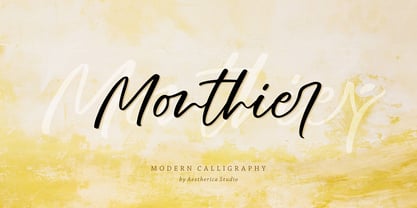 Monthier is a modern and original handwritten font perfect for branding projects, logos, wedding designs, social media posts, advertisements, product packaging, product designs, label, photography, watermark, invitation, stationery, and any projects that need handwriting taste.
 - Buddha by Solotype,
$19.95There are many Oriental-themed fonts, most without lowercase. This one originated in the German foundry of Schelter & Giesecke shortly before 1900. Use this font and an hour later you'll want to use it again. - Subzoete by Subtitude,
$25.00 Subzoete is a gathering of icons used in a cultural agenda for the city of Montreal in Quebec. They are unique and original. Great for simple indications such as tickets, free admission, outdoor events, etc.
 - Eden Pro by Red Rooster Collection,
$60.00 Based on the original 1934 Ludlow drawings by Robert Hunter Middleton, we created two additional weights that round out the family. Eden contains all the high-end features expected in a quality OpenType Pro font.
 - BD LoFi by Typedifferent,
$30.00 The BD LoFi typeface was originally designed on an Amiga 1200 with TypeSmith in 1997. In 2023 BD LoFi received an update with a wider language support and a variable version with a bolder look.
 - FM Easter Pro by The Fontmaker,
$24.00 FM Easter Pro consists of 26 hand-lettered Easter greetings like Happy Easter, Easter Joy, Easter Greetings etc. All the words and phrases are original and handwritten - a high quality calligraphy for your holiday projects.
 - Cooper Poster by GroupType,
$15.00 Cooper Poster was inspired by showcard lettering samples featured in the book, Commercial Art Of Show Card Lettering, published in 1945. Although named ""Western"", the design was modeled after Ozwald Cooper's 1921 original Cooper Black.
 - GHEA Tamara by Edik Ghabuzyan,
$30.00 This SemiBold Italic original Display font GHEA Tamara includes Basic Latin, Latin 1 Supplement, Latin extended A, Cyrillic, Armenian. May be used in titles, posters, labels, etc. The font looks very nice in large sizes.
 - Xmas Stencils JNL by Jeff Levine,
$29.00 A retro delight for the holiday season is Xmas Stencils JNL, assembled from original 1950s holiday stencils and other sources. Twenty-Six designs offer a generous variety of embellishments for all of your seasonal projects.
 - Geogrotesque Condensed Series by Emtype Foundry,
$69.00 The popular Geogrotesque family becomes an extended system with the inclusion of three new members to the family; Geogrotesque Condensed, Geogrotesque Compressed and Geogrotesque Extra Compressed. The condensed series keep the spirit of the original one, and give way to a superfamily up to 56 styles. This new system fluidly varies between widths, ranging from the original width to a 55% of it in the narrower one. As their original partner, the new fonts are great headline families for publications, but will also work in text of intermediate length and point size. The Geogrotesque superfamily offers now one font for each design need. It is available in Open Type format and includes Ligatures, Tabular Figures, Fractions, Numerators, Denominators, Superiors and Inferiors. All of them with support for Central and Eastern European languages. This type family consists of 42 styles, 7 weights plus italics in 3 widths. For more details see the PDF.
 - Roadkill by Device,
$39.00 Derived from a photograph Rian Hughes took in Hong Kong, the Roadkill family of typefaces is a literal interpretation of rough and worn road lettering. The original provided almost all of the key character shapes, with the others being designed to keep the unique hand painted feel intact. Most of the letters have alternate versions provided. This font works equally well at wider letterspacing settings. Roadkill Alternates provides curved versions of the 2 and the S, a G with higher crossbar, and less worn versions of several other characters. The heavy version packs even more gritty wallop in a non-condensed and blacker weight. Roadkill Heavy packs even more gritty wallop in a non-condensed and blacker weight. Use in conjuction with the original Roadkill and Roadkill Alternates. A set of arrows and other road symbols again taken directly from tarmac to Mac, thus preserving the worn and eroded appearance of the original characters is also part of the Roadkill family.
 - Tintoretto by profonts,
$41.99 Tinteretto is a very beautiful, decorative Art-d�co font which is ideal for ad design about fine arts events and the world of arts and crafts as well as in restaurants, bars and for food packaging. Tintoretto harmonizes well with serif and sans serif fonts created at the beginning of the last century. It contains character sets for West and Central European as well as for Romania and Turkey. When Unger started his work on Tintoretto, he had the splendid idea of adding a Fill version to the original 3D characters. Combining both fonts make it even stronger and more beautiful. How to combine both fonts in order to achieve a color fill effect: Type your word or phrase and do not make any changes to the spacing or kerning. Duplicate or copy the original and change it to the Fill version (font change). Apply a color to the copy and position it exactly behind the original. See and love the result.
 - Mercedes1937 by scarab13,
$9.00 There is an interesting story about this vintage professional Mercedes typewriter I’ve used to make this font. My grandfather, who was a Yugoslavian partisan during the WWII captured it from a Wehrmacht command building during an attack, and he kept it in a perfect shape for so many years. After I inherited it, I wanted to share it’s uniqueness (as well as it’s story). I’ve intentionally kept it in it’s original condition - I haven’t replaced the ribbon that was some 34 years old (or more) before sampling the font, and it turned out really nice. One more important thing - I have used ONLY it’s original set of characters (Latin with some Balkan-based letters). With it’s untouched originality and uniqueness it fits to our modern culture perfectly. There are no compromises here - there are no popular @,#,$ and other characters you would expect in a font. You will get EXACTLY what’s on this genuine “Mercedes” typewriter with so much soul.
 - Eixample Dip by Type-Ø-Tones,
$55.00 The Eixample project is inspired by modernist signage of various examples found in the Eixample neighbourhood in Barcelona. The name of each subfamily is related to its location or to specific elements of the original sign. Dip is the abbreviation for Carrer Diputació (Diputació Street), where the original sign spells Farmacia Específicos Diputación. The reference taken from the pharmacy sign is a curious model, where sans-serif lowercase letters coexist with script uppercase. This fundamentals create the system that we have introduced in Eixample Dip. The capitals are built with contained decoration to achieve maximum compatibility between letters. The script capitals are the default uppercase but we have also included alternative capitals, a slab style that can be combined with the scripts. The narrow influence of the original sign is correlated with the Narrow styles of the Dip family. But for more versatility, Eixample Dip explores normal widths and weights as well. Furthermore an Inline version was added to the suite.
 - Ruskye by LetterStock,
$25.00 Introducing "Ruskye" - Your Original Hand-Drawn Retro Lettering Font Step into the nostalgic embrace of "Ruskye," a font crafted with a blend of original hand-drawn charm and retro lettering vibes. Perfect for posters, invitations, and vintage-themed branding projects, this font encapsulates the essence of a bygone era, offering a timeless touch to your designs. Key Features: Original Hand-Drawn Craftsmanship: Each character in "Ruskye" is meticulously hand-drawn, adding a touch of authenticity to your projects. Retro Lettering Vibes: Immerse your designs in the classic charm of retro lettering, making "Ruskye" an ideal choice for projects seeking a vintage aesthetic. Why Choose "Ruskye": Craft posters that evoke the timeless spirit of hand-drawn artistry. Design invitations that transport recipients to the golden era of retro aesthetics. Establish a brand presence with a font that effortlessly captures the essence of vintage lettering. Download "Ruskye" Now and Infuse Your Designs with Timeless Retro Charm!
 - Academica by Storm Type Foundry,
$44.00 Josef Týfa first published the Academia typeface in 1967-68. It was the winning design from competition aimed at new typeface for scientific texts, announced by Grafotechna. It was cut and cast in metal in 1968 in 8 and 10 point sizes of plain, italic and semi-bold designs. In 2003 Josef Týfa with František Štorm began to work on its digital version. During 2004 Týfa approved certain differences from the original drawings in order to bring more original and timeless feeling to this successful typeface. Vertical stem outlines are no more straight, but softly slendered in the middle, italics were quietened, uppercase proportions brought closer to antique principle. Light and Black designs served (as usual) as starting points for interpolation of remainig weights. The new name Academica distinguishes the present digital transcription from the original idea. It comprises Týfa’s rational concept for scientific application with versatility to other genres of literature.
 - Scala Jewel Pro by Martin Majoor,
$29.00 Scala Jewels is a set of four highly decorative typefaces, based on the bold capitals of Scala. Whereas Crystal and Pearl are modelled on historic examples, Diamond and Saphyr are original designs. Scala Jewels offers the possibility to set decorated borders, designed in the style of each of the four variations. There are corners and different sorts of long and short elements. One of the best ways to use Scala Jewels is as a two- or three-line drop cap at the start of a chapter. The award-winning Scala family (1990-1993) is a worldwide bestseller and has established itself as a ‘classic’ among digital fonts.
 - Bookman Old Style by Monotype,
$40.99 The origins of Bookman Old Style lie in the typeface called Oldstyle Antique, designed by A C Phemister circa 1858 for the Miller and Richard foundry in Edinburgh, Scotland. Many American foundries made versions of this type which eventually became known as Bookman. Monotype Bookman Old Style roman is based on earlier Lanston Monotype and ATF models. The italic has been re drawn following the style of the Oldstyle Antique italics of Miller and Richard. Although called Old Style, the near vertical stress of the face puts it into the transitional category. The Bookman Old Style font family is a legible and robust text face.
 - Barbieri by Re-Type,
$45.00 Barbieri is a casual sans type family, based on a German lettering style from the 1960s. The original hand-drawn alphabet was used in a rather peculiar edition of Der Barbier von Bagdad, an opera composed by Peter Cornelius. Our efforts to identify the cover designer have been, so far, unsuccessful. As fans of informal typography and popular lettering styles, we thought these few thin letters deserved a re-incarnation as a complete type family. Andrés Torresi and Marta Sánchez Marco were in charge of the production work. Now Barbieri has 6 weights suitable for packaging, posters, and music covers. It resembles a certain 'Americana' spirit, though with a Germanic twist.
 - 1456 Gutenberg by GLC,
$38.00 Font designed from that used by Gutenberg in Mayence to print the 42-line bible in 1456. The original font has too many characters for a true type font. Many of them have - in 2008 - no more utility. This font include "long s", naturally, as typicaly medieval, but also a lot of ligatures and abbreviations as "...us", "...rum" "...s" "...r...". A render sheet, added, help to identify them on keyboard. Uses include web-site titles, posters and flier designs, editing ancient texts or greeting cards as a very decorative font... This font support easily as enlargement as small size, remaining clear and easy to read.
 - Waratah Gothic by Bean & Morris,
$35.00 The Waratah flower is the the emblem of the State of New South Wales, Australia and is unique in its color and design. So too is this new contemporary sans serif typeface that bears its name. With a warmth and friendliness that echoes its origin Waratah Gothic is at home in both text and display and has potential to become a font family with a variety of weights and italics. For corporate, packaging or simple one-line display settings Waratah Gothic is sure to please. Waratah Gothic features a generous x-height and subtle rounding on alternate terminals providing a softness that makes for easy reading.
 - Controller by Dharma Type,
$19.99 Controller is a geometric rounded sans serif including 5 weights and corresponding obliques and their extended style are ready. Originally, the designer was inspired by a mixture of techno and organic design in the end of 20th century around the West Coast. The letterforms of this font are designed geometric but are also slightly rounded to make a natural, warm and organic impression. Uppercase N has its alternative glyph that can be accessed by using OpenType stylistic feature. Controller is a versatile and useful family for a wide range of projects. We released 4 big Sci-Fi families in 2013. Check it out! Clonoid Controller Geom Graphic Space Colony
 - Tin Roof by Jukebox Collection,
$32.99 Tin Roof is a unique and original Jukebox font based on the 1958 hand lettered movie poster from "Cat on a Hot Tin Roof". The slightly modulated baseline and shaky letters give the font both a silly and sinister aspect. Perfect for any dramatic, spooky or sultry subject, Tin Roof has all the allure of a hot southern night! Jukebox fonts are available in OpenType format and downloadable packages contain both .otf and .ttf versions of the font. They are compatible on both Mac and Windows. All fonts contain basic OpenType features as well as support for Latin-based and most Eastern European languages.
 - Good Eatin Pro AOE by Astigmatic,
$24.95 A heavy weight - softened sans serif that is not only friendly, but easy on the eyes. Good Eatin was inspired by the title screen from the 1942 Warner Bros. cartoon titled, "Dog Tired". The original all capitals setting had a charming & quiet nature to it, which became even more pronounced when drawn out to include a lowercase set. Later expanded upon to include a Small Caps set, Good Eatin Pro achieves a wider, even more electric appeal. Loaded with personality, Good Eatin Pro is joyful and stands out without being an eyesore, and while being based on vintage lettering it has a contemporary feel.
 - Seabright Monument by Device,
$39.00 During a ‘type walk’ at the 2007 AtypI conference in Brighton, typographer Phil Baines pointed out what he considered to be a particularly egregious example of over-decorative art nouveau lettering on a war memorial. This made me determined to use it as the basis for a font. Released in Opentype, it now features ligatures, swashes and alternates. It’s not certain if the curved top bars on the E and F are a feature of the original design or due to climbers using them as footholds, but I incorporated them anyway. It has recently been used for invitations and supporting print material for formal charity dinners at the House of Lords.
 - Mentha by Resistenza,
$39.00 This new script font was based on our previous font ‘Rachele’. Mentha is a very flexible script with a big set of swashes, condensed, strong and with nice loops at the end of some letter shapes. This font script was designed using small brush pens and playing with pressure and release methods. Mentha Medium has a tiny extra stroke, that helps to make this font a bit stronger and solid, specially if you need to use in a very small scale. Mentha is fresh! If you are looking for a new and original script Mentha suits your needs! We recommend to combine Mentha with Turquoise
 - Johny Fyn by Akrtype Studio,
$15.00 Johny Fyn Handwritten font is a seductive font that is made with a touch of elegance and feeling to give the best touch. Johny Fyn Handwritten font an elegant combination of a script. It is slender, feminine and classy, while still maintaining a friendly feel. Johny Fyn Handwritten font is versatile and will work perfectly for fashion, e-commerce brands, trend blogs, wedding boutiques or any business that wants to appear upscale and chic. With its stylistic character Johny Fyn Handwritten font is perfect for creating original and functional designs. It has extensive language support and alternates, stylistic sets that add visual interest to every letter.
 - URW Form by URW Type Foundry,
$35.99 URW Form by Volker Schnebel is the quintessence of a modern sans. Originally inspired by the timeless classic Futura, URW Form is a mix of classic and modern geometric typefaces, yet still incorporates the fundamental rules of design and looks and functions like a contemporary sans. In addition to its strong identity, URW Form has all the quality characteristics we come to expect from a Schnebel typeface. Available in 80 styles and four widths, there is also a much sought-after semi-condensed extension to broaden its creative spectrum. Weights range from the filigree Thin to the forceful Poster, making it a truly versatile sans serif typeface.
 - Mistral by URW Type Foundry,
$89.99 Named after the strong cold winds on Southern France, the Mistral font family is another original creation displaying the panache of the French graphic artist Roger Excoffon. Mistral is an informal script in which all letters link up in vigorous strokes. First issued in 1953, its brush-like stems look spontaneous and fresh. The descenders are fairly long and the whole alphabet has a distinctive and unforgettable effect on the page. Mistral is a good complement to sans serif typefaces. Mistral is a trademark of Heidelberger Druckmaschinen AG, which may be registered in certain jurisdictions, exclusively licensed through Linotype Library GmbH, a wholly owned subsidiary of Heidelberger Druckmaschinen AG.

