10,000 search results
(0.028 seconds)
- Comicraft by Comicraft,
$19.00 FIFTEEN YEARS! Hundreds of fonts of Unique Design, Thousands of pages of Fine Lettering, Millions of satisfied customers and Elephantmen served! Yes, this month marks Comicraft's fifteenth anniversary and we're celebrating with the relaunch of the COMICRAFT website and the launch of a brand new font... a font that's not just a bunch of letters arranged in alphabetical order... this one's Carefree, Original, Mirthful and Interesting, it's Clever, it's a little bit Raunchy, a little bit Adventurous, Friendly and Tenacious all at the same time -- and if that doesn't spell COMICRAFT, then we just didn't eat enough chocolate today. COMICRAFT: Stimulating the release of endorphins in your system preferences since 1992.
 - Banco by ITC,
$29.00Banco was the first typeface work of French designer Roger Excoffon and was released in 1952. The strong forms look as though they were rolled out of sheet metal and feature upright, tapering strokes. The slight slant, the varying heights of stroke ends, and the relationships between line and curve give Banco font its sense of liveliness and dynamism. Excoffon did not design a matching lower case alphabet for his capitals, but this was accomplished later by Phill Grimshaw, who also designed the light weight. He deliberately 'underdesigned' the lower case forms, producing a more reserved alphabet based on the design ideas of the original. - Greycliff Arabic CF by Connary Fagen,
$35.00 Greycliff Arabic CF adapts Greycliff’s popular soft, geometric design to the Arabic script. Both Latin and Arabic glyphs are included, allowing for visually cohesive multiple-script applications. Greycliff’s original nine weights are covered, alongside Arabic script diacritics and wide language support, including Modern Standard Arabic, Persian, Pashto, and more. Greycliff Arabic CF works as a complete, self-contained type system, with both Arabic and Latin scripts included and designed to compliment one another. It also pairs well with contrasting typefaces, such as serifs, in both Arabic and Latin scripts. All typefaces from Connary Fagen include free updates, including new features, and free technical support.
 - Lilette by Elyas Beria,
$5.00 This elegant typeface came out of a quick, back-of-the-napkin, sketch I did for a different typeface. After toiling on that typeface I looked back at the sketch and realized that I had lost some of the elegance and playful character of my original sketch. So, it was back to the drawing board and Lilette was born. Lilette is fun but also serious. Playful but elegant. Personal yet also industrial. That’s the power of a slab serif. Perfect for magazine headlines, wedding invitations, signs, posters, slides, promotions, product design, branding, logos, and so much more. Make this versatile typeface with 10 styles yours.
 - Hanseat by profonts,
$41.99 Hanseat is a profonts typeface family by Ralph M. Unger, heavily inspired by Germany’s official DIN 1451 Engschrift. Originally, the German DIN (Deutsches Institut für Normung / German Committee for Industrial Standardization) typefaces were taken as the standard traffic fonts for street signs and house numbers. During the 1980s, the DIN fonts became digitally available for sign making systems, initially again primarily for traffic sign purposes. However, later on, the DIN fonts became also popular in the world of designers and art directors. Hanseat is a modern, contemporary interpretation of the DIN fonts, responding to the ever growing demand for such typeface designs reflecting the spirit of the industrial area.
 - Jacky Chan by Asd Studio,
$15.00 Introducing, Jacky Chan - Brush Font Jacky Chan font preserves all the high definition detail of the original handwritten letters. This font it truly looks realistic. Take your design to the up level with a hyper-realistic font that truly looks hand painted. Jacky Chan uses feature Bitmap Trace in Inkscape that makes way for more authentic looking fonts and is sure to grab the attention of customers and designers alike. Jacky Chan installs like any other font, and can be used in any color, on any background. What's Included? :: Uppercase & Lowercase (Regular and Italic Version) :: Numbers & Punctuation : Swashes Ligature :: Multilingual Support Enjoy our font, thank you.
 - Melandria by Akrtype Studio,
$19.00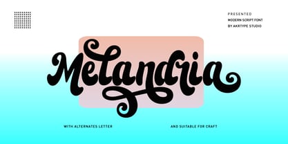 Melandria script is a magical script font carefully created with a touch of elegance. This is a beautiful combination of timeless elegance and authentic calligraphy. It features an incredibly classic style, while still keeping a friendly feel. Melandria script is the perfect font for making original and outstanding designs. This script supports multilingual and many alternative lowercase and uppercase characters, allowing you to make your design truly unique. The Melandria script is a beautiful, classic calligraphic font which will add a sweet, elegant, and perfect feel to your design. It’s perfect for logo projects, wedding invitation cards, branding, home designs, product packaging, and every other design that needs an elegant typeface.
 - HS Hadeel Serif by Hiba Studio,
$50.00 HS Hadeel Serif is a versatile display typeface designed for use in titles and graphic projects that support Arabic, Persian and English. It draws inspiration from the modern kufi style and features a unique blend of sharp and curved lines that lend a beautiful and geometric structure to each character. Based on the original HS Hadeel typeface, HS Hadeel Serif includes a serif on some of its characters to provide a more traditional look. Two weights are available for this typeface: Regular and Bold. HS Hadeel Serif represents a valuable addition to Arabic typography, offering designers a visually striking and flexible option for their projects.
 - Ten Mincho by Adobe,
$69.00Ten Mincho is a Japanese typeface design from Adobe Originals, designed by Ryoko Nishizuka and useful for a broad range of settings, such as advertising copy, book titles, and headings. As a traditional Mincho-style design the strokes are slightly heavy and rounded, and exhibit smaller counter spaces. Ten Mincho also features a full set of Latin glyphs, collectively known as Ten Oldstyle and designed by Robert Slimbach. This relatively feature-rich Latin subset includes OpenType features such as small caps and old-style figures. Finally, look for a small number of color emoji in an SVG table, some of which are accessible as alternates. - Lalola by Type-Ø-Tones,
$60.00 Lalola (whose early version was released as ‘Lola’ by the spanish foundry Type-Ø-Tones in 1997) is a display typeface with strong attitude. It was inspired by a lettering model by Eugen Nerdinger and Lisa Beck. From a few letters of that model, Lalola became an original design and a single font, comprising all the necessary characters for languages based on the Latin alphabet. You can ‘say it loud’ with Lalola, either in lower or uppercase, yet with wit and a unique, distinctive friendly voice. Lalola received already two mentions, the Typefacts’ Best Typefaces of 2013 and the prestigious TDC 2014 Certificate of Excellence.
 - Sirichana Thai by Linotype,
$40.99Sirichana is a monolinear Thai typeface with Light and Bold weights. The modern design is characterized by its traditional proportions but with almost geometric construction. Originally released by Linotype for digital photocomposition, it is now in OpenType format. This makes it possible to dynamically and precisely position the various levels of superscript and subscript vowel signs and tonal marks. In addition to this, the complete Unicode page range for Thai is covered to ensure flawless conversion between other OpenType fonts using Unicode. The accompanying Latin design matches well in scale and texture and supports most Western European languages making it ideal for setting bilingual texts. - Karika Swirls by Deniart Systems,
$20.00 Add charm with intricate swirls! Karika Swirls was inspired by our obsessive love of swirly patterns and symmetric designs. Karika, a Hungarian word for circle, is a charming way of saying we love circular symmetrical forms. These 52 original illustrations are great for creating stationery, adding borders to greeting cards or design projects, background images, etc. The glyphs can be used individually or combined with other glyphs to form complex patterns. Karika Swirls is part of the Karika Collection of fonts. These intricate swirls are symmetrically sized in height and width so they'll work charmingly together for any project. See also Karika Hearts and Karika Encore .
 - Sign and Display JNL by Jeff Levine,
$29.00 Sign and Display JNL is a long-overdue companion font to 2009’s Sign and Poster JNL. The original design models were Art Deco influenced die-cut cardboard letters and numbers manufactured by the Duro Decal Company of Chicago. Square in shape with rounded corners, the thick cardboard letters were used for making show-cards and other display signage. Subsequently, Duro used the same style of lettering to manufacture water-applied decals for boat identification and other uses. It was a set of these decals (with a black outline and yellow interior) that inspired the outline typeface Sign and Display JNL, which is available in both regular and oblique versions.
 - Cord by Roland Hüse Design,
$20.00 Cord (Zsinór in Hungarian) was originally a commissioned work for a tablecloth pattern with a thread like frame decoration that is actually consist of letters. The lettershapes were being created based on Rovas characters, which were reinterpreted without decreasing legibility. Therefore, the Rovas alphabet was designed in the first place followed by its matching Latin company. The full character set contains: Western, Central and South Eastern European Latin characters basic symbols and punctuation Rovas alphabet Rovas number symbols and punctuation Display font, best fit in larger sizes for souvenirs, folk art theme, embroidery, ribbon like decorative texts and signages. Good luck and Happy Creating! Roland
 - Teaspoon by Canada Type,
$29.95 Teaspoon was originally designed by Haley Fiege as a project-specific font in 2007, then completed and produced by Canada Type for commercial viability in 2008. With a personality that can only be described as “ironic cute”, it serves as a much needed alternative for the old overused poster faces, such as Cooper Black and Gill Sans Extra Bold. Words that look good set in Teaspoon include puppies, rainbows, salmonella poisoning and Tom Cruise. Teaspoon is available in all popular formats, comes with plenty of alternate characters, and supports a wider than normal range of Latin-based languages, as well as Cyrillic and Greek.
 - Rahayu by Shaltype Co,
$12.00 RAHAYU is Monoline Script Font that is well-produced by hand and generates into a clean form, that will be best when used in any placement like logo, poster, t-shirts, or any display. Build manually, and reform into a clean Typeface. Natural stroke from original hand-lettering. It can be used for just Titles or even writing. In this font, you will get: Over 289 glyphs 43 Ligatures in 2 OpenType features Support for 66 languages Please contact for files package Get RAHAYU now! It will be best used for any design requirement, many fonts will come with a unique concept. Thank you! Best Regards, PUDJI PANGESTOE STUDIOS
 - Zigarre by Canada Type,
$24.95 Though Zigarre can easily be categorized a brush script, Jim Rimmer actually drew it using a big marker. Jim’s original face, inspired by inter-war German poster lettering, was a rough one, with the marker’s juicy ink roughing it out all over the place. The smooth version, Zigarre Script, was produced as part of a major update and remastering the design underwent in 2012. Both Zigarre Script and Zigarre Rough come with extended Latin language support, as well as a few built-in stylistic alternates. 20% of this font’s revenues will be donated to a GDC scholarship fund, supporting higher typography education in Canada.
 - Ribbon Cursive by Okaycat,
$29.50 Ribbon Cursive was developed largely from Mercator's Italic Hand, which originated from Italy, during the Renaissance. Ribbon Cursive is fancy, legible, and luxurious text. Works great if you are designing a logo, or use it to create some beautiful titling. Use it for advertisement copy, or even for short to medium-length bodies of text. It should be noted that, due to the heavy embellishment of all the capital letters, this font will not work well if your text is set in all capitals! Ribbon Cursive is contains the full West European diacritics and a full set of ligatures, making it suitable for multilingual environments and publications.
 - Pudgy Puss NF by Nick's Fonts,
$10.00Here’s a new take on an old favorite, the Lubalin-Carnase classic Fat Face. This version, intended for large headlines, cranks the original’s very high contrast up another notch. Both versions of this font contain the complete Unicode Latin A character complement, with support for the Afrikaans, Albanian, Basque, Bosnian, Breton, Catalan, Croatian, Czech, Danish, Dutch, English, Esperanto, Estonian, Faroese, Fijian, Finnish, Flemish, French, Frisian, German, Greenlandic, Hawaiian, Hungarian, Icelandic, Indonesian, Irish, Italian, Latin, Latvian, Lithuanian, Malay, Maltese, Maori, Moldavan, Norwegian, Polish, Portuguese, Provençal, Rhaeto-Romanic, Romanian, Romany, Sámi, Samoan, Scottish Gaelic, Serbian, Slovak, Slovenian, Spanish, Swahili, Swedish, Tagalog, Turkish and Welsh languages, as well as discretionary ligatures and extended fractions. - Makeshift by Create Big Supply,
$25.00 Elevate your designs with the captivating allure of Makeshift Font. This extraordinary display typeface brings a bold and fun look, infusing your creations with a powerful and distinctive touch. Perfect for designers seeking originality, Makeshift Font is poised to make a lasting impression on logos, headlines, posters, product packaging, and more. Its versatility shines through in both digital and print mediums, making it a must-have for innovative projects. Makeshift Font boasts an extensive range of features, including uppercase and lowercase letters, numbers, punctuations, and comprehensive multilingual support. With PUA encoding, accessing the wide array of glyphs and swashes becomes effortless, empowering you to effortlessly customize your designs.
 - Adams by Canada Type,
$24.95 Adams is a revival and major expansion of Dolf Overbeek's Studio typeface and Flambard, its bold counterpart, originally published by the Amsterdam Type Foundry in 1946 and 1954. This digital version adds small caps and a new light weight. Adams is a simple upright, flat brush script, with stroke angles carefully designed to give the same color in all sizes. It is reminiscent of the sign lettering commonly found in the 1930s and 1940s. The Adams fonts are available in all popular font formats, and the character sets cover a wide range of codepages, including Central and Eastern European languages, Esperanto, Turkish, Baltic, Celtic/Welsh.
 - Aurelia by Linotype,
$29.99The design for Aurelia is based on the forms of Jenson, an Old Style typeface developed by Nicolas Jenson in 1470 which still influences type design today. Zapf gave Aurelia a bit of his own personal style and adapted it to the demands of modern technology. The family of typefaces was originally designed for use with the typesetting machines produced by the German company Dr.-Ing Rudolf Hell GmbH which was later merged with Linotype. The name Aurelia is a nod to the Roman emperor Aurelianus (214–275), who built the Via Aurelia in Italy. Aurelia is a robust and classic font, suitable for both text and headlines. - DBXLNightfever by VetteLetters,
$- DBXL Nightfever was originally designed by Donald Beekman in 2001 for the disco-techno-house record label of the same name, an imprint of United Recordings. Geometric and gridded, with a solid sci-fi techno feel, Nightfever still contains a lot of soul. Three additional wider weights were added for more design flexibility, as well as italics for all widths. After the record label was terminated the Nightfever fonts were used for many other DBXL design projects. It was put online for free download first in 2008, this year (2019) the design got more refined with additional accurate kerning and spacing. All fresh and new, ready for a new space age!
 - Shubbak by Archetype Foundry,
$30.00 Shubbak ('window' in Arabic) is a highly flexible Arabic Sans (Kufic) typeface that was designed to work with a wide range of Latin counterparts. A friendly and human typeface family that is very flexible to use when coupled with many popular fonts you may use. Full set of Arabic, Farsi (Persian) and Urdu character sets as well as a basic Latin set are included. There is also a Variable version of Shubbak. Designed originally by British designer Ruh Al-Alam, further developed by Mohammed Gabr, Muhammad Hadi and then fully expanded by Abdelrahman Farahat. Archetype Foundry aims to help revolutionise and spread the use of beautiful Arabic and multi-lingual typefaces.
 - Berling Nova Sans by Linotype,
$40.99Berling Nova Sans Pro is the companion famous Berling Nova type family. Made by Pangea design, the sans family consists of seven fonts: Light, Regular, and Bold - all with true italics - and the additional weight of Extra Bold for real impact. The original Berling spirit was transfered into this sans design so it functions well as a pairing with its serifed counterpart. Useful for anything from text through display sizes, this clear and modern humanist design is sure to add just the right amount of personality to your project. For more information on this extended type system, be sure to check out the Berling Nova family! - Longtype by Luxfont,
$18.00 Introducing original Longtype font family. Elongated in height and fully balanced in width. This font looks unusual and evokes a flight of imagination. Typeface in combination with the simplest graphic design techniques instantly turns into a modern object that attracts attention. Use it in short texts or headlines, add some color to enhance the effect. Fits well with modern minimal abstract design. Longtype is a stand-alone typeface that can be the centerpiece of a cover. And 3 types of thickness included in the family will give more freedom for creativity. Features: Elongated form 6 fonts in family: - Thin, Thin Italic - Regular, Italic - Bold, Bold Italic Kerning ld.luxfont@gmail.com
 - Saturday Morning Toast by Nick's Fonts,
$10.00Based on the logotype font of the Saturday Evening Post from the 20s, Saturday Morning Toast is warm, cuddly and endearing in its quirky charm. All versions of this font contain the complete Unicode Latin A character complement, with support for the Afrikaans, Albanian, Basque, Bosnian, Breton, Catalan, Croatian, Czech, Danish, Dutch, English, Esperanto, Estonian, Faroese, Fijian, Finnish, Flemish, French, Frisian, German, Greenlandic, Hawaiian, Hungarian, Icelandic, Indonesian, Irish, Italian, Latin, Latvian, Lithuanian, Malay, Maltese, Maori, Moldavan, Norwegian, Polish, Portuguese, Provençal, Rhaeto-Romanic, Romanian, Romany, Sámi, Samoan, Scottish Gaelic, Serbian, Slovak, Slovenian, Spanish, Swahili, Swedish, Tagalog, Turkish and Welsh languages, as well as discretionary ligatures and extended fractions. - IronOn by Fontasmic,
$16.99 The IronOn fonts are a collection of geometric display faces that were inspired by the iron-on t-shirt lettering of the 70s. The original source came from a submitted sample to the MyFonts "What the Font" forums, and while it had similarities to ITC Machine, it could not be tied to any existing typeface. And so, this new geometric sans family was born, exhibiting a more open letterstyle with several weights and widths, with a complete capital and lowercase set, no allcaps set here. Ideal for packaging, T-shirts, advertising, or for industrial applications like signage and newsletter headlines, this powerhouse font family offers a unique rigid flexibility.
 - Rifleman by Open Window,
$19.95 What a nice tranquil feeling you get from the wide forms of this font. The air of spontaneity was the most important thing about developing Rifleman. The forms were carefully and slowly constructed and then loosely traced with a paintbrush. Maybe the original drawings will become a font someday but i like to think that they won't for some reason. Surprisingly Rifleman is left to only the bare essential elements, anything that wasn't necessary was left out or removed. The goal was to make it as lightweight as possible to make up for the intricate detail. Rifleman is a surprisingly lightweight font offering lends itself to speedy typesetting!
 - Ongunkan Death Space by Runic World Tamgacı,
$50.00 Dead Space is a science fiction/horror media franchise created by Glen Schofield and Michael Condrey, developed by Visceral Games, and published and owned by Electronic Arts. The franchise's chronology is not presented in a linear format; each installment in the Dead Space franchise is a continuation or addition to a continuing storyline, with sections of the storyline presented in prequels or sequels, sometimes presented in other media from the originating video game series, which includes two films and several comic books and novels. This font is related to the video game Death Space, I redrawn this font to make it a font with a minimum character set.
 - Boucherie by Laura Worthington,
$30.00 Finding fonts that work together to capture the aesthetic of an era is one of the biggest challenges designers face. Boucherie captures the lively essence of 19th-century French advertising typography with a collection of original designs. Use Boucherie to create typographic compositions that are at once fresh and familiar. Boucherie provides four distinct display fonts – plus ornaments, catchwords, and frames – that beautifully complement each other. See what’s included! http://bit.ly/2dqI1Ov *NOTE* Basic versions DO NOT include swashes, alternates or ornaments These fonts have been specially coded for access of all the swashes, alternates and ornaments without the need for professional design software! Info and instructions here: http://lauraworthingtontype.com/faqs/
 - TX Manifesto by Typebox,
$39.00Manifesto was designed for an article written in response to opinions that philosophy and personal expression have been wiped clean from today's design profession. Contemporary design is sterile and sublime. Enter Ken Garland's revision of the original 1964 Manifesto. The publishing of the "First Things First" manifesto 2000 is exhibit A that a trend for social belief systems is growing. Or is it? Many comfortably accept that designers are indeed "engaged in nothing less than the manufacture of contemporary reality". The four 'voices' of the TX Manifesto Family (Regular, Slant, Stout and Stencil) is intended for your typographical response, and push for conscientious design. - Grok by PintassilgoPrints,
$20.00 Bold as love, Grok is a hand-drawn typeface, assertive but soft. Showy and friendly. It's an all caps font with 2 choices for each letter, accessible via keyboard upper and lower case slots. For that handcrafted look, you know. Turn on the contextual alternates feature to automatically alternate these. Grok originally comes in two cuts: bold and… less-bold :) Later the outline style was added as a gift, a free font. And finally, there's yet a nifty picture font with dozens of dingbats to beautify your words every now and then. Perfectly suited for display uses: packaging, signage, web titlings, editorial design, book covers – and not-only-covers. Grok it?
 - Bodoni Campanile Pro by Red Rooster Collection,
$60.00 Bodoni Campanile Pro is a font that bridges the gap between a “fat” and a compressed traditional serif typeface. It was originally designed in 1936 by Robert H. Middleton for Ludlow. International TypeFounders exclusively licensed the family from the Ludlow Collection, and Steve Jackaman (ITF) produced a digital version in 1998. Jackaman completely redrew the font for its 2017 release. Bodoni Campanile Pro, much like its transitional status as a font, is successful in both formal and casual roles. The free-flowing aspects of the family, seen especially in the lowercase ‘g’ and the leg of the uppercase ‘R,’ give the family an air of elegance.
 - Lisboa by Vanarchiv,
$35.00 This humanist sans-serif typeface was exhaustively designed, full-featured typeface family that reveals its character and distinctiveness in complex text. It features a large complement of ligatures, lining and old-style figures, expert characters, dingbats (arrows, brackets, and symbols for both Regular weights). In the original Lisboa Pro the forms of the letters are humanist, with hooked headterminals, the characters contains medium contrast with a left-angled stress on the strokes. After ten years from the first version publication, this new version (0.2) is available with Latin (Western, Central Europe) and Cyrillic alphabets. It was selected by Our Favorite Fonts of 2005 (Typographica).
 - Cadmus Pro by Canada Type,
$39.95 Cadmus Pro is the newly remastered and greatly expanded version of a Jim Rimmer design based on a type originally done by hand lettering artist Robert Foster. Foster’s type, named Pericles, was published by ATF in the 1930s, and used in lettering magazines and advertising headings. The design is based closely on early inscriptional Greek. Cadmus Pro comes with over 1130 glyphs, covering pretty much all Latin languages (including Vietnamese) as well as Cyrillic, Greek and Hebrew. OpenType features include stylistic alternates, automatic fractions, ordinals, and small figure ranges for superiors and inferiors. Proceeds from this font will be put towards a variety of Canadian typography education causes.
 - Threepoints North by Type Associates,
$30.00 The Threepoints Series is the result of several years of work that bases three different sans serif type designs on one “shell”. Designed for optimal readability North, with its squarish shapes and rigidity are suggestive of an upright Swiss or Inserat typeface. The East variant takes on the look of another popular condensed grotesk with a softer, more rounded basic shape whilst maintaining the purpose of the original design. With minimal adjustments West leans towards more contemporary European designs. Although these are primarily display typefaces they function extremely well in text sizes in either upper or lowercase composition. Excellent for signage. Each variant comes with matched italic at no additional cost.
 - Francker by Linotype,
$29.99 Francker is a sans-serif, based on clean and simple design principles that betray its Danish origin. Its curves are based on the “super ellipse”, a mathematical shape about half-way between an ellipse and a rectangle. Francker’s lowercase lettershapes a, b, n, and u, have no spurs, emphasizing the simplicity of their construction. The Francker family is available in two widths, normal and condensed, each in nine weights, from extra light to extra black. Use Francker for signage, posters, magazines, advertisements, or corporate identity projects—wherever an industrial, contemporary look is needed. The Francker type was developed and designed by Anders Francker, an engineer and designer living in Denmark.
 - Castellar MT by Monotype,
$29.99 Castellar is a capital letter typeface from John Peters, named after a location in the Alps. It first appeared in 1957 with Monotype. Peters modelled the design on the Roman script Scriptura Quadrata as it was used in the first two centuries of the Roman Empire. One distinguishing characteristic is the quadratic proportions of many letters, which are however mixed with circular and narrow forms. The original script was called Scriptura Quadrata because the ancient engravers used rectangular stone plates for their work. Castellar is a typical title typeface and is best used in large and very large point sizes to highlight its classic elegance.
 - Zwart by Holland Fonts,
$30.00Originally created with cutting in red litho film, as a headlining typeface for Vinyl music magazine. Its geometric structure was very applicable for early type design experiments on the computer. ...in the early 1980s, he (Max Kisman) became the designer of a small, independent music magazine Vinyl. This Amsterdam-based publication was set up very much as a response to the innovative British magazine, The Face. Responding to Neville Brody's radical designs for that magazine, Kisman began to experiment by creating new headline typefaces for each issue... (Emily King. New Faces: type design in the first decade of device-independent digital typesetting. 1987-1997.