10,000 search results
(0.049 seconds)
- Gothic by Wooden Type Fonts,
$15.00 Gothic Bold Condensed, first shown in 1889 by Hamilton wooden type founders. With lowercase. Gothic Bold Expanded.
 - BF Corpa Gothic Pro by BrassFonts,
$39.00 BF Corpa Gothic™ Pro is a kind of “Neue”-Edition of the beloved typeface designed by Guido Schneider. Inspired by hand-drawn geometric fonts from 1920s posters, this sans serif typeface is slightly condensed, and it appears compact and captivates with its expressive shapes and unique details, despite its pronounced Grotesque character. With its rather constructed, technical – but also vivid – appearance, the BF Corpa Gothic™ Pro is not only suitable for headlines and display applications, but is also pleasant to read in short and middle length text. The type family is engineered for exciting, professional but unusual designs. It is equipped with OpenType Features like 4 figure sets (LF, TF, OSF, SC), nice ligatures, many currency symbols, fractions, alternates, special characters, arrows and symbols – and small caps. 9 style sets give you the option to individualize and adjust the typeface to the requirement of your design, without changing the general visual feeling. In this way you can also switch the simply slanted styled Italic into a “real Italic”. Each of the 16 fonts (Upright and Italic) contains more than 940 glyphs and supports up to 220 Latin-based languages.
 - Iwata News Gothic Pro by IWATA,
$309.00
- Alternate Gothic Pro EF by Elsner+Flake,
$35.00 In 1903, the typeface family Alternate Gothic was developed for ATF (American Type Foundry) by Morris Fuller Benton. It was Benton’s intent to solve many diverse layout problems with the development of a narrow Sans with different width values. The Alternate Gothic enjoys great popularity to this day. Therefore, Elsner+Flake re-worked the typeface family, added all European fixed accents and complemented it with an Antique version.
 - Iwata Maru Gothic Pro by IWATA,
$199.00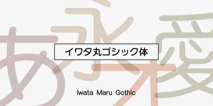 書き文字のような柔らかみのある丸ゴシック体です。字面が大きくラインが揃うデザインです。あたたかさや優しさ、親しみやすさを表現しやすい書体です。
 - Iwata GNew Gothic Pro by IWATA,
$199.00 教科書や参考書、問題集などの教育教材作成のために開発された新ゴシック体です。 筆やペンの入り、押さえ、ハネ、トメ、筆順などを理解しやすいようデザインしています。
 - Iwata GMaru Gothic Pro by IWATA,
$199.00 教科書や参考書、問題集などの教育教材作成のために開発された丸ゴシック体です。 筆やペンの入り、押さえ、ハネ、トメ、筆順などを理解しやすいようデザインしています。
 - Alternate Gothic Pro Antique by Elsner+Flake,
$35.00 In 1903, the typeface family Alternate Gothic was developed for ATF (American Type Foundry) by Morris Fuller Benton. It was Benton’s intent to solve many diverse layout problems with the development of a narrow Sans with different width values. The Alternate Gothic enjoys great popularity to this day. Therefore, Elsner+Flake re-worked the typeface family, added all European fixed accents and complemented it with an Antique version.
 - Iwata New Gothic Pro by IWATA,
$199.00 漢字・仮名とも天地左右を広くとり、 均整のとれたデザインのゴシック体です。 縦組み横組みどちらでもきれいにラインが揃い、 バランスがとれた美しい組版を実現します。
 - Iwata Gothic Old Pro by IWATA,
$199.00 ?????????????????????????????????? ???????????????????????????????????????????????
 - Iwata G Gothic Pro by IWATA,
$199.00
- M XiangHe Hei SC Pro by Monotype,
$187.99The M XiangHe Hei Simplified Chinese typeface merges traditional brush strokes with modern letterforms to carefully balance traditional calligraphy with humanist design. Named for the smooth movements of a flying crane, the M XiangHe Hei typeface is designed to glide across the page, and features strokes that are partly derived from the Kaishu calligraphic style – an everyday script which dates back hundreds of years. Seol Sans features Neue Frutiger for its Latin glyphs, and works harmoniously with Neue Frutiger World and Monotype’s CJK typefaces Tazugane Info (Japanese) and Seol Sans (Korean). M XiangHe Hei is a great choice for global brands using sans serif Latin typefaces looking to maintain their visual identity, and communicate with a consistent tone of voice with Simplified Chinese. - M Metallic Hei PRC by Monotype HK,
$523.99 M Metallic Hei PRC is a graphic style Simplified Chinese typeface. Graphic font designs have strong personalities and visual impact. Graphic style Simplified Chinese fonts feature decorative elements and pronounced graphics characteristics, suitable for catching attention in display applications.
 - M Elite Hei PRC by Monotype HK,
$523.99 M Elite Hei PRC is a graphic style Simplified Chinese typeface. Graphic font designs have strong personalities and visual impact. Graphic style Simplified Chinese fonts feature decorative elements and pronounced graphics characteristics, suitable for catching attention in display applications.
 - M Comic 2 PRC by Monotype HK,
$523.99 Stripy strokes with more open to curves, designed for Young Urban, Professionals! PRC series fonts are in Unicode encoding and consists covers GB 2312 character set. It conforms to GB12345 standard. The character glyphs are based on the regular simplified Simplified Chinese writing form and style. It is generally used in China Mainland PRC and Singapore.
 - M Stiff Hei PRC by Monotype HK,
$523.99 Stems (豎) and crossbars (橫) are direct and simple, dots (點) are short but authoritative, downstrokes (撇、捺) are no longer curvy but straight and sharp, thus, a smart and straightforward typeface. Bold in this family is rough and tough, demonstrating a high extent of muscularity. Meanwhile Light is neatly, naturally and nicely crafted, aiming to achieve high legibility. A popular choice for advertising with diverse usages.
 - M Zhi Hei PRC by Monotype HK,
$523.99 M Zhi Hei's design concept comes from M Stiff Hei , where horizontal and vertical strokes (橫、豎) are direct, dots (點) are short but forceful, downstrokes(撇、捺) are straight and sharp - everything bold and straightforward. One big difference between M Zhi Hei and M Stiff Hei, is the similar thickness of horizontal strokes (橫) across all font styles, so that there would be a strong contrast formed by the thin horizontal and thick vertical strokes (橫、豎) in the bold face. Still, remains bright, neat and beautifully crafted, it is a multi-purpose typeface that convince audiences and cater for different needs.
 - M Qing Hua PRC by Monotype HK,
$523.99 Among the world of Chinese commercial fonts, M Qing Hua has a relatively high flexibility to be used in different areas, for instance, media of advertising. Its design concept is to combine the neatness of Hei typeface with the roundedness of Yuen typeface. The typeface tries to revitalize the boring traditional design by adding energy, simplicity and modernness to it, which could be shown in the small features in strokes like delicate and curvy finishings. More is the appropriate mix of masculinity and femininity, so as to enable a more effective communication, stronger visual attractiveness and higher affections.
 - M Felt Pen PRC by Monotype HK,
$523.99 To blend a handwritten style with a graphical aesthetic, Monotype designers paid attention to the balance between the two, hence harmoniously combine their qualities like a mix of tradition and modern. M Felt Pen references the unified stroke thickness and rounded terminals of rounded Heiti typefaces, imitating the fluidity of marker writing. The linked strokes are vivid and suggest the presence of the human hand.
 - M Kai 2 PRC by Monotype HK,
$523.99 M Kai 2 PRC is a handwritten style Simplified Chinese typeface. Handwritten font designs are derived directly from hand-drawn lettering or handwriting using analogue tools. Handwritten style Simplified Chinese fonts can include typefaces that reference or reinterpret traditional calligraphy, using classical exemplars by calligraphic masters.
 - M Ying Hei PRC by Monotype HK,
$523.99 M Ying Hei™ is designed by type designer Kenneth Kwok and Robin Hui. Unnecessary details have been eliminated to pursue a minimal form. The structure of characters are well balanced, neat and dignified. Different components of a character are cooperating perfectly in an appropriate proportion. Thickness of strokes are modified according to the number of strokes, thus achieving an even texture throughout the paragraphs. Therefore a perfect choice for prints, user interface and signages. M Ying Hei™ is equipped with 7 weights, which is sufficient for various occasions like matching with different Latin typefaces and handling complex information hierarchy.
 - M Zuo Hei PRC by Monotype HK,
$523.99 M Zuo Hei PRC is a graphic style Simplified Chinese typeface. Graphic font designs have strong personalities and visual impact. Graphic style Simplified Chinese fonts feature decorative elements and pronounced graphics characteristics, suitable for catching attention in display applications.
 - M Young Hei PRC by Monotype HK,
$523.99 M Ying Hei™ is designed by type designer Kenneth Kwok and Robin Hui. Unnecessary details have been eliminated to pursue a minimal form. The structure of characters are well balanced, neat and dignified. Different components of a character are cooperating perfectly in an appropriate proportion. Thickness of strokes are modified according to the number of strokes, thus achieving an even texture throughout the paragraphs. Therefore a perfect choice for prints, user interface and signages. M Ying Hei™ is equipped with 7 weights, which is sufficient for various occasions like matching with different Latin typefaces and handling complex information hierarchy.
 - M Zhi Ngai PRC by Monotype HK,
$523.99 Zhi series is inspired from vertical shop banners/signages from Japan, where each banners is attached to a slim simple structured skeleton. M Zhi Ngai™ takes reference from M Zhi Hei’s straightforwardness and masculinity but inserted plenty of ornaments and gentleness. Featuring a strong thick–thin contrast in the strokes, the typeface looks bright, smart and contemporary, suitable for promotional materials and more other media.
 - M Banquet P PRC by Monotype HK,
$523.99 M Banquet is a humanistic script written by a Chinese restaurant owner, which the name ‘Banquet’ comes from. It is a calligraphic style that always being seen in traditional Chinese banquet menu. Incorporated a feeling of masculinity, fill with strength and energy and attracts eyeballs of customers. It was written with a thin ball pen in a unique, personal and expressive writing style, such that it is realistic, natural and masculine. Contrast of strokes is low and the text is visible and eye-catching. Its light to medium stems (豎) make it suitable for small text to subheading with little conglutination. All strokes are irregular, inconsistent, irregularly oriented and tightly coupled. Spatial distribution, positioning, size and relative proportion of radicals fully reflect a natural and personal style. It is one of the few proportional-width font in a full scale. It is best suited for casual lively atmosphere, illustrations, set upright (non-slanted), non-condensed.
 - M J Ngai PRC by Monotype HK,
$523.99 M J Ngai PRC is a graphic style Simplified Chinese typeface. Graphic font designs have strong personalities and visual impact. Graphic style Simplified Chinese fonts feature decorative elements and pronounced graphics characteristics, suitable for catching attention in display applications.
 - M+ 1m - Unknown license

- BOSS M - 100% free

- M+ 2c - Unknown license

- M+ 2m - Unknown license

- M+ 1p - Unknown license

- M+ 2p - Unknown license

- M+ 1c - Unknown license

- Courier M by URW Type Foundry,
$89.99 - Bodoni M by URW Type Foundry,
$35.00
- Tozuna - Personal use only

- Poruka by Tour De Force,
$30.00 Poruka is slanted script typeface with connected letters with gently condensed look. Letters are designed as monoline forms with decent dose of elegancy and stylistic uniformity. Poruka is imagined mainly as typeface for shorter texts or headlines, where text needs to stand out from other elements of content. It can be used successfully both as webfont and on printed materials – all kinds of invitations, labels, packages, posters and editorial use. Poruka comes with two Stylistic Sets – 01 which activates uppercase letters with full font height (from the top of ascender to the bottom of descender) and 02 – which activates handwritten forms on "b", "d", "h" and "l" letters. Also, Poruka is equipped with Swashes and Discretionary Ligatures which doesn't really represent classical pack of expected ligatures, but more as graphical version of a couple of words like "yes", "no", "wait", "ciao" and a few more.
 - Kazuwa by Scratch Design,
$9.00 It introduces a cute display font "Kazuwa". This font is complete with all punctuation and multi-languages support. Kazuwa also has a unique casual shape and looks like a natural kid handwritten, so this font will be perfect when applied to the fun concept design. This font will be useful for posters, name cards, books, comics, presentations, or packaging designs. Enjoy this font, it also supports multi-languages. In some features like stylistic alternates, we put some cute illustrations to make your design more cheerful. Features: Stylistic Alternates & Ligatures Numerals & Punctuation Accented characters Multiple Languages Supported HOW TO ACCESS ALTERNATE CHARACTERS Open glyphs panel: In Adobe Photoshop go to Window - glyphs In Adobe Illustrator go to Type - glyphs
 - TT Norms Pro by TypeType,
$39.00 Introducing TT Norms® Pro, version 3.200! The updated font now supports more languages and boasts a larger character set. These implementations have made the typeface even more advanced and convenient. TT Norms® Pro is a functional geometric sans serif for aesthetic design choices and TypeType studio's bestseller. It has been a massive success since its release, and rightfully so! This stylish, elegant, and versatile font will become the full-fledged core of your collection. TT Norms® Pro is ideally suited for products in any domain: streaming services, banking, clothing brands, or the automotive industry. It's equally convenient to use in both web and printing. Now, the TT Norms® Pro typeface includes the most extensive font package, both in terms of font styles and character sets. The base version of TT Norms® Pro consists of 22 fully redesigned font styles and 4 additional subfamilies. Besides, this font boasts the most comprehensive language support in the TypeType collection. We've added the characters of extended Cyrillic and Latin writing systems to the updated TT Norms® Pro and configured the new languages support. The character set has become more extensive—we've added currency symbols with their minuscule version and minuscule mathematical symbols. The 3.200 version of TT Norms® Pro includes: 44 roman font styles, 44 italics, and 2 variable fonts; 7 roman and 7 italic font styles in TT Norms® Pro Mono; 2 variable fonts: TT Norms® Pro Variable with three parameters of variation (weight, width, and slant) and TT Norms® Pro Mono Variable with weight and slope axes of variation; 1993 characters in each font style, including an extended set of punctuation marks, symbols, and currencies; 5 widths: TT Norms® Pro with classic proportions, monospaced TT Norms® Pro Mono, narrower-proportioned TT Norms® Pro Compact and TT Norms® Pro Condensed, and wider TT Norms® Pro Expanded; 38 OpenType features, including a large number of ligatures, fractions, numerators, and denominators; 17 stylistic sets; - 280+ languages support, counting in new symbols for French, Norwegian, Bulgarian, Uzbek, Abkhaz, and more; Flawless kerning and manual TrueType hinting. TT Norms® Pro has already become the signature font of Intercom, Inc., Sartorius AG, CSN, CBSN, Shieldex, and many other global brands. Customization is available for TT Norms® Pro upon request—we adjust the font to suit your project. Learn more about customization options in the corresponding website section. In addition to the TT Norms® Pro, we've designed the TT Norms® Pro Serif typeface. These fonts complement each other perfectly, making an ideal typeface pair.
 - Kozuka Mincho Pr6N by Adobe,
$125.00


