6,107 search results
(0.074 seconds)
- Battle Damaged by Comicraft,
$19.00 Some say The Silver Age Will End in Fire; others say The Silver Age Will End in Ice! Know, O Prince, that In Your Darkest Hour, the Masters of Evil Will Live Again! But from The Ashes of the Bitter Taste of Defeat, A New Power will be Unleashed! Lo, There Shall be A Frenzy in a Far Off Land, There Will be a Great Price AND a Great Prize! There Will Be a Bitter Victory in a World Gone Mad -- a World You Never Made... Face it, Tigers, You are Captives of The Coming of The Return of The Mad Mysterious Menace of He Who Would Destroy You...This Man, This Monster... This Final Font in our collection of Silver Age Display Lettering -- BATTLE DAMAGED! See the families related to Battle Damaged: Battle Cry & Battle Scarred .
 - Paradox Runa by Dawnland,
$13.00 Paradox Runa is based on the futhark, norse elder runes. “Missing” characters has been replaced with either other “real” runes, or “new” ones have been “invented” so that the font hold all characters for the latin alphabet (A-Z + swedish Å Ä & Ö) + “Numbers” 0-9. I do not claim that this rune alphabet is totally authentic nor correct! All upper and lower-case letters are the same except for the letter S. “Ligatures” have been created for the th, ng and eo sounds. These are accessed by writing TH, NG and EO (in upper case letters). Space is automatically replaced by a ‘colon’ (':') - if you want a “real” space, write an underscore! (open type version of the font and open type compatible layout application required). Paradox Runa goes perfect with the font Paradox X (regular yet enigmatic hand drawn latin letters)!
 - Blackhawk by Set Sail Studios,
$14.00 Blackhawk is a supercharged, street-wise brush font bursting with energy. With extra attention to quick strokes and sharp details, Blackhawk is guaranteed to deliver an unapologetically loud & fast-paced message; ideal for logos, apparel, quotes, product packaging, or anything which needs a typographic turbo-boost. Blackhawk Consists of; Blackhawk ~ A hand-made, all-capitals brush font which has a complete set of alternate A-Z characters. Simply switch between upper & lower case to access the alternates. (Tip: Try mixing up both upper and lowercase characters in a word to achieve the best text layout). Blackhawk Italic ~ A slanted version of the regular font, creating faster movement in the characters. Blackhawk Swashes ~ A bonus set of 11 swashes and 4 paint-splatters. Simply select this font and type any A-O character to create one of the bonus elements.
 - Tusque by Eclectotype,
$40.00 Tusque is a layered chromatic type family with a Tuscan flavor. Regular, Circus and Tooled can stand alone, while Highlight and Deco are purely for layering up multicolored gorgeousness. Tusque lends itself to fairy tales, wine labels and boutique logos, and makes some particularly delectable drop caps. Although it’s all caps, the lower case slots are all different from the upper case so you can mix and match to your heart’s content. There are also a bevy of swash alternates and ligatures at your disposal. The contextual alternates feature cleverly substitutes alternate versions of more triangular glyphs like A and V to give a better fit. The ordinal feature changes ‘a’ and ‘o’ to the feminine and masculine ordinals for Spanish etc. but also changes ‘c’ and ‘ac’ to superscript lowercase versions for names like McBride and MacDonald.
 - 1543 German Deluxe by GLC,
$38.00 This family was inspired by the sets of fonts used in 1543 by Michael Isengrin, printer in Basel (Germany) to print the splendid New Kreüterbuch...(New herbal...), with numerous nice pictures, the masterpiece of Leonhart Fuchs, father of the modern botany. It is a Schwabacher pattern, with three different sets of fonts, small (± 4mm for the upper case) in the main text, larger for titles (± 8mm for the upper case) and large Initials or lettrines (five lines of main text). This font contains standard ligatures and German historical ligatures (German double s, long s, tz, ch,...) and diacritics (special umlaut "e superscript" and "∞" unstead of dieresis with letters a, o and u,) naturally, we have added numerous letters lacking in the original to permit a contemporary use of the font. It can be used in complement with 1538 Schwabacher or/and 1534 Fraktur.
 - Lotto by Canada Type,
$24.95 Designed by expert ad artist Herbert Thannhaeuser for East German foundry Typoart in 1955, Lotto was until now one of the long lost gems of European sign and brush lettering faces. Unlike in Kurier (Thannhaeuser’s other brush face digitized by Canada Type as Puma), the forms’ brush construct uses a series of strokes that are mostly sudden, whimsical, and at times even look like great genius being born out of simple afterthought or straight-forward idiosyncracy. For instance, check out the simple brush pause that is the top of the f, the confident yet welcoming serifs on the T, the similarly-themed C/E and O/Q relationship, and much more. Lotto comes with over 400 glyphs, contains a few alternates and ligatures sprinkled throughout the character set, and includes support for the majority of Latin languages.
 - Catesque by Gumpita Rahayu,
$20.00 After several months discovering and developing the traits and personalities well balanced typefaces such like Frutiger and the other identical typefaces, Catesque was born as the new typefaces. The vocal flourish yet harmonious shapes not purely geometrically, it has imperfect rounded characters such as “O” “C” and “G”. Catesque can make some distinctness for large scale design as well as small text. The traits versatilities usable for many design applications, it’s comes with five weights from light to black plus mathcing italics. All characters included the Tabular figures, case-sensitive forms, fractions, and another most common numerals features such as super & subscript to accomplish the numeric design works such like menu, annual reports, etc. The alternate characters are included as well, all features can accessed with OpenType-savvy programs on Adobe Creative Suite via OpenType Panel.
 - Bayer Sans by Victory Type,
$20.00Bayer Sans, is based on the typography of the Austrian-born artist Herbert Bayer. Bayer worked as a teacher and graphic designer at the Bauhaus, a revolutionary German art school, during the 20's. His specialty was commercial art and he had many "radical" views on typography and its interaction with society. Bayer felt that written language should be merely a graphic version of spoken language. Thus, he advocated a single alphabet without majuscules and miniscules. Bayer's designs are simple, geometric letterforms that lend themselves to lowercase form. This font, based on the typography of Bayer and his students at the Bauhaus Werkstatt (studio), was digitally modeled by Noah Rothschild. Bayer Sans features a complete character set including European characters, alternate letters with adjusted widths and designs and ligatures. Included are the "f" characters and a special linked double-o. - Mr Anteater by Hipopotam Studio,
$20.00 Hand drawn serif typeface designed for one of our books. You can use just the regular style or set the fill style over the stroke style to get a more colorful version. It has upper and lowercase characters with up to three alternate glyphs. Build in OpenType Contextual Alternates feature will automatically set alternate glyphs depending on frequency of appearance of the same character (even in web font but only in HTML5 browsers). The script doesn’t throw random glyphs (so it won't break the layered, two colored version). For example in the word “HIPPOPOTAMUS” you will automatically get three different “P” glyphs and two “O” glyphs. It really works great but of course you can always fine tune it by hand. Mr Anteater has younger sister. Mrs Ant was designed for side notes in the same book.
 - Romena by Brenners Template,
$19.00 It is a modern grotesque family that can feel strong power. Hairline Styles are designed to be thinner than the average Thin Styles and have a lower x-height than Black Styles. So when you design your typography using the entire font family, you get a great sense of balance and harmony. And with creative Alternates, you can make your logo and product branding design work unique. Cropped glyphs provide meaningful metaphors for logo design. Be sure to try the Stylistic Alternates and Ligatures this family has to offer. OpenType Features Stylistic Alternates - C, G, K, N, R, S, a, e, g, i, o, s, u, y Standard Ligatures - ff, ffi, fi Discretionary Ligatures - tt, rr Fractions Oldstyle Figures Tabular Figures Circled Numbers Multilingual Support Western Europe, Central/Eastern Europe, Baltic, Turkish, Romanian Basic Cyrillic Ukraine
 - Wiesbaden Swing by Linotype,
$29.99 German designer Rosemarie Kloos-Rau created Wiesbaden Swing in 1992 for Linotype. This light, informal typeface is based on her own handwriting, and the strokes have a feeling of spontaneity and energetic flair. Characters like the D, O, W, g, n and y really do swing with unbridled confidence and joy. Kloos-Rau says about her typeface: “From the experience with my design company I recognized the need for fonts with personality. Wiesbaden Swing is my contemporary contribution to the field of calligraphy, a headline font which offers a fresh and unconventional approach to typography.” This family has both regular and bold weights, and a set of Dingbats. The Dingbats are light-hearted and zippy symbols for holidays, children’s products, menus, and more. Wiesbaden Swing will add zest to packaging, catalogs, menus, websites, greeting cards, and magazine layouts.
 - Type Ultimate by VP Creative Shop,
$39.00 Type Ultimate is an exquisite serif font that combines elegance and sophistication. It comes in regular and italic versions, each containing a stunning collection of 383 ligature glyphs and alternate glyphs, as well as 26 swashes for both regular and italic versions. With its extensive character set, Type Ultimate supports a wide range of languages, making it a versatile choice for various projects. This font is perfect for creating a memorable logo, establishing a strong brand identity, and making headlines that stand out. Its timeless and refined design also makes it an excellent choice for elegant wedding invitations and other formal occasions. Overall, Type Ultimate is a font that exudes beauty and refinement, adding a touch of sophistication to any project it's used in. Language Support : Afrikaans, Albanian, Asu, Basque, Bemba, Bena, Breton, Chiga, Colognian, Cornish, Czech, Danish, Dutch, Embu, English, Estonian, Faroese, Filipino, Finnish, French, Friulian, Galician, Ganda, German, Gusi,i Hungarian, Indonesian, Irish, Italian, Jola-Fonyi, Kabuverdianu, Kalenjin, Kamba, Kikuyu, Kinyarwanda, Latvian, Lithuanian, Lower Sorbian, Luo, Luxembourgish, Luyia, Machame, Makhuwa-Meetto, Makonde, Malagasy, Maltese, Manx, Meru, Morisyen, North Ndebele, Norwegian, Bokmål, Norwegian, Nynorsk, Nyankole, Oromo, Polish, Portuguese, Quechua, Romanian, Romansh, Rombo, Rundi, Rwa, Samburu, Sango, Sangu, Scottish, Gaelic, Sena, Shambala, Shona, Slovak, Soga, Somali, Spanish, Swahili, Swedish, Swiss, German, Taita, Teso, Turkish, Upper, Sorbian, Uzbek (Latin), Volapük, Vunjo, Walser, Welsh, Western Frisian, Zulu Ligatures Uppercase - AB,AC,AD,AG,AK,AL,AM,AN,AP,AR,AS,AT,AV,AY,BE,BL,BO,BU,CE,CH,CK,CO,CT,DE,DI,DO,EA,ED, EE,EF,EI,EL,EM,EN,EP,ER,ES,ET,EV,EX,EY,FA,FE,FF,FI,FO,FR,FT,FU,GA,GE,GH,GO,GR,HA,HE,HI, HO,HT,KE,KI,KN,LA,LD,LE,LF,LI,LL,LO,MA,ME,MI,MM,MO,MP,MU,NA,NC,ND,NE,NG,NK,NO,NS,NT, NY,OA,OD,OK,OL,OM,ON,OO,OP,OR,OS,OT,OU,OW,PA,PE,PL,PO,PP,PR,RA,RD,RE,RI,RO,RR,RS,RT, RY,SA,SE,SH,SO,ST,SU,TA,TE,TH,TI,TL,TO,TR,TS,TT,TU,UG,UL,UN,UR,US,UT,VE,VI,WE,WH,WI,WO,YO, YS,MEN,WER,FRO,RON,ROM,THE,AND,ING,HER,HAT,HIS,THA,ERE,FOR,ENT,ION,TER,WAS,YOU,ITH, VER,ALL,THI,TIO,OUL,ULD,IGH,GHT,AVE,HAV,ICH,HIC,HIN,HEY,ATI,EVE,HING,WERE,FROM,THAT,THER, TION,OULD,IGHT,HAVE,THIS,THIN,THEY, ATIO,EVER,MENT Lowercase - ab,ad,ag,ai,ak,al,am,an,ap,as,at,av,ay,ba,be,bl,bo,bu,ca,ce,ch,ck,co,ct,de,di,do,ea,ec,ed,ee,ef,eg,ei,ej,el,en,ep,es,et,ev,ew,ey,fa,fe,fi,fo,fr,fu,ga,ge,gh,gi,gr,ha,he,hi,ho,ht,ic,id,ie,ik,il,im,in,io,ir,is,it,iv,ke,ki,kn,la,ld,le,lf,li,lo,ly,ma,me,mi,na,nc,nd,ne,ng,ni,nk,nl,no,nt,ny,oa,oc,od,of,oi,ok,ol,om,on,oo,op,ot,ou,ov, ow,pa,pe,pi,pl,po,pp,qu,ra,rd,re,ri,rm,rn,ro,rr,rs,rt,ru,ry,sa,se,sh,si,so,sp,ss,st,su,ta,te,th,ti,tl,to,ts,tt, tu,uc,ug,um,un,up,ur,us,ut,va,ve,wa,we,wo,xp,ye,yo,ys,men,wer,fro,rom,ron,the,and,ing,her,hat,tha, ere,for,ent,ion,ter,you,ver,thi,ght,ave,hey How to access alternate glyphs? To access alternate glyphs in Adobe InDesign or Illustrator, choose Window Type & Tables Glyphs In Photoshop, choose Window Glyphs. In the panel that opens, click the Show menu and choose Alternates for Selection. Double-click an alternate's thumbnail to swap them out. Mock ups and backgrounds used are not included. Thank you! Enjoy!
 - Hacjiuza - Personal use only

- Summer Morning by Seemly Fonts,
$12.00 Summer Morning is a striking, bold display font. It can easily be matched to an incredibly large set of projects, so add it to your creative ideas and notice how it makes them stand out!
 - Hello Jones by Typefactory,
$14.00 Hello Jones is a unique Vintage Sans font. It can easily be matched to an incredibly large set of projects, so add it to your creative ideas and notice how it makes them stand out!
 - Bakulipack by IbeyDesign,
$18.00 Bakulipack Handwritten Script Font is a lovely script font featuring charming, playful characters that seem to dance along the baseline. Add it to your most creative ideas, and notice how it makes them stand out.
 - Fubrica by Sakha Design,
$12.00 Fubrica is a whimsical and clean handwritten font. It can easily be matched to an incredibly large set of projects, so add it to your creative ideas and notice how it makes them stand out!
 - So Much Love by Seemly Fonts,
$14.00 So Much Love is an incomparable handwritten font. It can easily be matched to an incredibly large set of projects, so add it to your creative ideas and notice how it makes them stand out!
 - Christmas Glee by Seemly Fonts,
$14.00 Christmas Glee is a simple lettered handwritten font. It can easily be matched to an incredibly large set of projects, so add it to your creative ideas and notice how it makes them stand out!
 - Loving Moment by Seemly Fonts,
$14.00 Loving Moment is a simple lettered handwritten font. It can easily be matched to an incredibly large set of projects, so add it to your creative ideas and notice how it makes them stand out!
 - Harvest Joy by Seemly Fonts,
$12.00 A truly stunning handwritten font is Harvest Joy. It can easily be matched to an incredibly large set of projects, so add it to your creative ideas and notice how it makes them stand out!
 - Easter Meadow by Seemly Fonts,
$14.00 Easter Meadow is a striking, bold display font. It can easily be matched to an incredibly large set of projects, so add it to your creative ideas and notice how it makes them stand out!
 - Express Christmas by Seemly Fonts,
$14.00 Express Christmas is a simple lettered handwritten font. It can easily be matched to an incredibly large set of projects, so add it to your creative ideas and notice how it makes them stand out!
 - Doodle by WAP Type,
$15.00 Doodle is a cool and friendly display font. It can easily be matched to an incredibly large set of projects, so add it to your creative ideas and notice how it makes them stand out!
 - Nimble Bear by Seemly Fonts,
$14.00 Nimble Bear is a simple lettered handwritten font. It can easily be matched to an incredibly large set of projects, so add it to your creative ideas and notice how it makes them stand out!
 - Frisco Antique Display SG by Spiece Graphics,
$39.00 Here is a decorative condensed antique design that is sure to fit a variety of contemporary situations. The Bruce Type Foundry (later acquired by V. B. Munson) developed this wonderfully shaded Tuscan in the 1880s - or possibly earlier. It was known back then as Style No. 1050 and carried a pronounced three-dimensional look with a thin hairline at the bottom and right of each stroke. It is best to use Frisco Antique in large display sizes because it is easy to lose these delicate hairlines. A lowercase and several alternate characters have been provided for your convenience. Frisco Antique Display is also available in the OpenType Std format. Some new characters have been added to this OpenType version. Advanced features currently work in Adobe Creative Suite InDesign, Creative Suite Illustrator, and Quark XPress. Check for OpenType advanced feature support in other applications as it gradually becomes available with upgrades.
 - Armature Neue Sans by fontBoy,
$15.00 Armature Neue Sans is an extension of the original Armature Neue family released in 2010. Like Armature Neue, Armature Neue Sans consists of six weights with accompanying italics. Armature is one result of my interest in typefaces that are constructed, rather than drawn. Although it is basically a monoline design, there are subtle details throughout that compensate for a monoline’s evenness. As with all fontBoy fonts, there are dingbats hidden away in the dark recesses of the keyboard. When I first started designing this face in 1992, I called it Dino - I thought I would name all my fonts after famous pets, so the dingbats for Armature are dinosaurs. To access the alternate characters (closed counter B and R, and others) use Stylistic Set 1 or the glyphs palette in your OpenType-enabled application. Designed by Bob Aufuldish with editing and production by Psy/Ops.
 - Corner C by CarnokyType,
$20.00 Corner C is a part of Corner type family. This subfamily is designed with rounded shapes in the corners. The concept of the typeface Corner is based on variation of corner shapes in font characters, from what is also its name derived. The basis is a bitmap modular principle, to which by simple addition of “the missing pixels” in corners of the characters ( Corner A ) to the shape of diagonal ( Corner B ), curvature (Corner C), or inversion curvature ( Corner D ), three more font variations are created. The basic monolinear bitmap weight is supplemented by two more extreme thicknesses – hairline and fat weight. The character set supports the complete Latin, while the x-height of lowercase is drawn at the same height as in the uppercase characters. Corner is a strong display typeface, which allows you to easily experiment and to combine it with its mutual font variations.
 - HG Marugothic by RICOH,
$199.00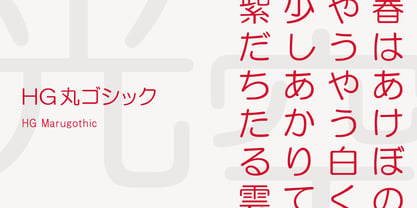 HG丸ゴシックは、リョービの書体「シリウス」を字母とする丸ゴシック体です。L、M、Bと、3つの太さがあります。線はやわらかで、全体的に明るく、あたたかさがあります。ふところは大きくとられていて、かつ、仮名も大きめに作られていて、判別もしやすくなっています。また、それらの特徴から、カジュアルな印象を強く与えますが、ややコントラストがあるため、すっきりとしていて、優しい印象も与えます。
 - Ergonomique by Monotype,
$31.99 Ergonomique is a humanist sans serif typeface that has been designed to be efficient and comfortable to use across all applications. Ergonomique’s personality is defined by its spurless lowercase glyphs – the stems are truncated and blend into their adjoining arcs, as can be seen in the a/b/d/m/n/p/q/r/u characters. Ergonomique is ideal for branding and display purposes, but also performs well as body copy if you’re seeking a unique style for your text. With its nine weights and complementing italics, Ergonomique is highly versatile, especially when you consider that there are small caps and old style figures included, along with a Latin Extended character set. Key Features: • 18 font family – 9 weights in Roman and Italic • Small Caps, Ligatures, with Proportional, Old Style, and Small Cap figures, plus Fractions, Numerators, Denominators, Superiors, and Inferiors • Full European character set (Latin Extended) • 800+ glyphs per font.
 - Chord Symbols by Tijs Krammer,
$24.00 Chord Symbols is a font for musicians. With this font, you can quickly write beautiful chords, using only simple keyboard characters as input. Musicians tend to write chords with regular characters. They use # instead of a genuine sharp, b instead of a genuine flat, dim instead of a small circle, etc. With Chord Symbols, your chords will be better looking, more easily readable and more efficiently notated. Chord Symbols helps you to write the chords the way you like it. Whether you prefer ‘maj7’ or ‘m7’ or a small triangle for a major seventh, whether you want ‘m’, ‘mi’, ‘min’ or a horizontal line for a minor chord, this font will suit you. Chord Symbols is originally created out of the need to write chords above pop song lyrics. It is designed to also work smoothly in music notation software, like Sibelius, Finale and Encore.
 - Core Sans C by S-Core,
$20.00 Core Sans C family is a part of the Core Sans Series, such as N, M, E, A, D, G, R and B. Core Sans C is inspired by classic geometric sans (Futura, Avenir, Avant Garde etc.). It is based on geometric shapes, like near-perfect circle and square. It has a much higher x-height (height of lowercase letters), an effect which promotes readability especially at small print sizes. The Core Sans C Family consists of 9 weights (Thin, Extra Light, Light, Regular, Medium, Bold, Extra Bold, Heavy, Black) and Italics for each format. Core Sans C supports complete Basic Latin, Cyrillic, Greek, Central European, Turkish, Baltic character sets. Each font includes proportional figures, tabular figures, oldstyle figures, numerators, denominators, superscript, scientific inferiors, subscript, fractions and case features. Core Sans C is an ideal font family for use in magazines, web pages, screens, displays, and so on.
 - Terafile by Sudtipos,
$39.00 Terafile, a sans serif family designed by Raúl Plancarte who was inspired by hi-tech aesthetics. It is made up of eight weight variants with their respective italic versions. Ideally it works to capture in a graphic way the universe related to technology, sci-fi, industry and similar topics. It is a mixed family, because the construction of certain letters (as in "a", "f", "z", "B", "P", among others) is enriched with different finishes in structure to gain differentiation and plasticity. In other words, it moves away from an entirely academic design. Another important line in the creative concept of this typeface is the function of its ink traps, which, in addition to fulfilling their primary function, serve to gain gestuality in its use. This font is capable of covering complex design needs by enabling association with specific themes, which makes it highly competitive in its graphic line.
 - Corner D by CarnokyType,
$20.00 Corner D is a part of Corner type family. This subfamily is designed with inverse rounded shapes in the corners. The concept of the typeface Corner is based on variation of corner shapes in font characters, from what is also its name derived. The basis is a bitmap modular principle, to which by simple addition of “the missing pixels” in corners of the characters ( Corner A ) to the shape of diagonal ( Corner B ), curvature ( Corner C ), or inversion curvature (Corner D), three more font variations are created. The basic monolinear bitmap weight is supplemented by two more extreme thicknesses – hairline and fat weight. The character set supports the complete Latin, while the x-height of lowercase is drawn at the same height as in the uppercase characters. Corner is a strong display typeface, which allows you to easily experiment and to combine it with its mutual font variations.
 - Kashi by Naghi Naghachian,
$64.00 Kashi is the Persian word for tile. This font is inspired from building decorations of 16th and 17th centuries in Iran. It is extremely legible even in very small size. Kasha design fulfills the following needs: A Explicitly crafted for use in electronic media fulfills the demands of electronic communication. B Suitability for multiple applications. Gives the widest potential acceptability. C Extreme legibility not only in small sizes, but also when the type is filtered or skewed, e.g., in Photoshop or Illustrator. Nima’s simplified forms may be artificial obliqued in InDesign or Illustrator, without any loss in quality for the effected text. D An attractive typographic image. Kasha was developed for multiple languages and writing conventions. Kashi supports Arabic, Persian and Urdu. It also includes proportional and tabular numerals for the supported languages. E The highest degree of calligraphic grace and the clarity of geometric typography.
 - Quadrim by Artisticandunique,
$40.00 Quadrim - Serif Font Family - Multilingual -12 Style (2020) On the basis of Quadrim, it is a mix of the old-fashioned Roman serif family. The old style serif combination combines, modern aesthetics with fantasy and Art Nouveau serif fonts, making Quadrim a versatile family that can be used in many different design projects. This font offers a wide variety of styles to help you discover the best mood for your projects, from body text to large titles, from classic styles to modern and bold styles. It is very suitable for book and magazines, magazine covers, editorial, titles, websites, logos, invitations, branding, advertising and more. CHARACTER RANGES : Basic Latin, Latin-1 Supplement, Latin Extended-A, Latin Extended-B, General Punctuation, Currency Symbols, CJK Symbols And Punctuation, Private Use Area (plane 0), With this font you can create your unique designs. If you have a question, please contact me. Have a good time.
 - Corner A by CarnokyType,
$20.00 Corner A is a part of Corner type family. This subfamily is designed with square shapes in the corners. The concept of the typeface Corner is based on variation of corner shapes in font characters, from what is also its name derived. The basis is a bitmap modular principle, to which by simple addition of “the missing pixels” in corners of the characters (Corner A) to the shape of diagonal ( Corner B ), curvature ( Corner C ), or inversion curvature ( Corner D ), three more font variations are created. The basic monolinear bitmap weight is supplemented by two more extreme thicknesses – hairline and fat weight. The character set supports the complete Latin, while the x-height of lowercase is drawn at the same height as in the uppercase characters. Corner is a strong display typeface, which allows you to easily experiment and to combine it with its mutual font variations.
 - Jack Stanislav by deFharo,
$22.00 Very condensed typography, thick line and fun look for headlines and advertising where you are looking for saving space and originality at the same time. The upper inclination of the letters, the combination of horizontal with inclined forms, the ascending and descending short, and the lower elongation of some antlers will allow you to print varied styles with a lot of movement according to the context of the design. I started drawing this font with the intention of creating a new decorative typeface Blackletter style but modernizing the strokes, after drawing several letters imitating the ductus of this type of fonts trying to simplify them, emerged all the DNA of the current Jack Stanislav, finally a retro typography without Serif of linear strokes that mimic the angle of a thick pen. Use the following keys to write the bitcoin symbol and the Jack icon: b #, a #
 - Bodoni Classic by Wiescher Design,
$55.00 I became interested in designing Bodoni Classic because of a lazy graphic designer at Jacques Damase publishing house. He had to change a single letter on a bookcover about J. B. BODONI. The French call him Jean Baptiste instead of Giambattista! And that unknown graphic designer just took any old “J” from some newly cut Bodoni. All the new Bodoni cuts have square serifs, whereas the originals had rounded serifs and slightly concave feet. The single letter “J” with the squared off serif was for me like a road sign to start redesigning the entire Bodoni family. That’s exactly what I started in 1993 and a dozen years later I am finished. Okay, I am still adding new Bodoni Classics, but those are my personal additions. Recently I designed a family of seven »Bodonian Script« fonts, that can be mixed with most of my Bodonis. Yours very retro, Gert Wiescher
 - The "New Gothic Style" font, while not directly associated with a specific existing typeface, can be interpreted through the lens of contemporary design trends and the historical context of Gothic ty...
