9,750 search results
(0.032 seconds)
- Caliny by Marc Lohner,
$21.00 This cheerful font family combines cuteness and fun, making it a great choice for any kid’s app, book, toy, packaging, movie, theme park and so much more. Caliny’s curves are drawn with care and love. It covers more than 200 languages and has some advanced typographic features, like case sensitive forms to offer.
 - Lovan by Sign Studio,
$15.00 Lovan will bring an elegant, romantic and warm feeling of love to your design project. Equipped with a choice of Alternative Characters and Discretionary Ligatures, all of which are PUA Encoded. Lovan will be a versatile font because it can be used as a Display Font and is still good for writing text.
 - Miamour by Tigade Std,
$35.00 Miamour is a cartoon-like and quirky display font. Get creative with its childlike style, and use it to brighten up any project. It will add an incredibly joyful touch to your designs. Add this beautiful display font to each of your creative ideas and notice how it makes them stand out!
 - Spooky Christmas by Stefani Letter,
$12.00 Spooky Christmas is an incredibly unique and spooky display font. Add this font to your favorite Halloween-themed ideas: invitations, banner, logo, app game scary or horror, and notice how it makes them come alive! Spooky Christmas is PUA encoded which means you can access all of the glyphs and swashes with ease!
 - Bought Something by Aldedesign,
$25.00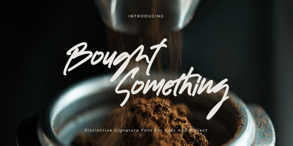 Bought Something is a simple, quirky and adaptable handwritten font. Its informal style and casual vibe will make this font a go-to choice for each of the creations that require a relaxed touch. Bought Something is PUA encoded which means you can access all of the glyphs and swashes with ease!
 - Matthew Woolsen by Letterara,
$12.00 Matthew Woolsen is a sweet, soft hand-lettered font and monogram. Fall in love with its authentic feel and use it to create gorgeous wedding invitations, beautiful stationary art, eye-catching social media posts, Logo, Brand, and cute greeting cards. This display font is the perfect choice for making original and outstanding designs.
 - Revain by Sign Studio,
$24.00 Revain has the power to be mindful of typographic design. Equipped with an OpenType feature that can make a variety of style choices, namely: Small Caps, Stylistic Set 1 (for Uppercase), Stylistic Set 2 (for Lowercase). All characters have been PUA Encoded so that they can be accessed on most software in general.
 - Power Smash by Crumphand,
$20.00 Power Smash is a cool and bold display font. Whether you use it for cartoon-related designs, children’s games, or just any creation that requires a playful touch, this font will be an amazing choice. Whats Included ? Uppercase Lowercase Symbols Numerals European Multilingual Also Outline, Shadow One, Shadow Two Thank for stopping by.
 - Distingue by Burntilldead,
$18.00 Introducing Distingue, an elegant ligature serif font. This font is made to bring strong statement, design with bold geometric face and have swash on alternate characters to keep it look stylish and sharp. An easy & perfect choice to make your design projects; logo, branding, invitation, social media ads & website have classy looks.
 - AT Lagermont by Amera Type,
$20.00 Lagermont is inspired by console games, labels and print media from the 19th century. With a strong and bold serif font style comes with an elegant, where every curve is made very gracefully and gently. It will be a perfect choice for graphic design, clothing, books, logos and many other visual displays
 - Classy Jazzy by Epiclinez,
$18.00 Classy Jazzy is a lovely serif font featuring charming, playful characters that seem to dance along the baseline. Add this font to your most creative ideas, and notice how it makes them stand out! So what's included : Basic Latin A-Z & a-z Numbers, symbols, and punctuations Accented Characters : ÀÁÂÃÄÅÆÇÈÉÊËÌÍÎÏÑÒÓÔÕÖØŒŠÙÚÛÜŸÝŽàáâãäåæçèéêëìíîïñòóôõöøœšùúûüýÿžß Thank you
 - Linotype Arab Stroke by Linotype,
$29.99Arab Stroke is an exotic typeface with an Arabian touch which makes a variety of applications possible. Whether for products from far away lands travel advertisements or anything needing a dynamic look, Arab Stroke is an excellent choice. The font is particularly eyecatching in headlines and combines well with sans serif fonts. - Legendaria by Corradine Fonts,
$59.95 Legendaria is a very sophisticated and elegant connected script font. Its more than 1300 ornamented characters make it incredibly versatile. Most lower case letters have at least 15 different options, including tails and flourishes. For Open Type users “Legendaria OT” is the best choice instead the separated files of ornamental complementary fonts.
 - Marky Marker NF by Nick's Fonts,
$10.00Here's a nifty single-stroke marker font based on the work of Mike Stevens, long-time contributor to Signcraft magazine. Clean, crisp and stylish, it's the perfect choice for appealing subheads. This font contains the complete Latin language character set (Unicode 1252) plus support for Central European (Unicode 1250) languages as well. - Roseblue by Sign Studio,
$15.00 Roseblue is a font that was built in a modern style. Has a smooth appearance on each side. The opentype feature is very helpful in the design process. Equipped with adequate alternative characters and ligatures will provide choices for designers. It is suitable for product branding, logotype, quote, and various other printed products.
 - Hallo Skull by Letterara,
$14.00 Hallo Skull is a fun friendly and spooky display font. It is suitable for each of your party designs or Halloween creation. Add it to your creative Halloween-themed ideas and notice how it makes them stand out! This font is PUA encoded which means you can access all of the glyphs.
 - Slapsie Maxi NF by Nick's Fonts,
$10.00Our old friend Carl Holmes, in another offering from his ABC of Lettering, takes the blacks to the max with this commanding face. A perfect choice for can't-miss headlines. Both versions of this font contain the Unicode 1252 (Latin) and Unicode 1250 (Central European) character sets, with localization for Romanian and Moldovan. - Sigmathin by Typebae,
$15.00 Sigmathin is a graceful and refined script font designed to resemble a handwritten signature. Its smooth curves and delicate strokes give it an elegant and sophisticated appearance. This font exudes a sense of style and professionalism, making it an excellent choice for projects that require a personal touch or a touch of class.
 - Thinker Justice by Balpirick,
$15.00 Thinker Justice is a Modern Handwritten Font. Thinker Justice is a trendy and modern handwritten font. Simple and natural, this font will become your top choice for formal and informal designs in no time! Thinker Justice also multilingual support. Enjoy the font, feel free to comment or feedback, send me PM or email.
 - Trinidad Neue by Sudaca Type Design Studio,
$40.00 Trinidad Neue™️ is a geohumanistic typeface developed by the Chilean Type Design Studio Sudaca. The origin of this work lies in an exercise of comparing classic Roman proportions (Trajan Columns) with the capital letter set of Futura by Paul Renner. I wanted to create my own Sans Serif interpretation of classic proportions. I started working with letters A, H, N, O, R and S. When I finished the uppercase set, this exercise transformed itself into a project. I started to develop a set of lowercase letters choosing as direct references Futura and Kabel by Rudolph Koch; always having in mind that the objective was to find a balance between the humanist and the rational or geometric. Here is when this group is formed, giving its name and identity to this family: Paul, Rudolph & Alexis. The result is a typeface with an elegant, modern and versatile aspect. Its seven stylistic sets make Trinidad Neue™️ into a Swiss army knife to compose short and medium texts for editorial design, branding, exhibitions, motion graphics, etc. The family consists of nine weight variants and its corresponding oblique versions. It counts with many OpenType characteristics in each variant, including small caps, seven stylistic sets that can be combined, standard ligatures and discretionals ligatures, proportional numerals, tabular numbers, fractions, superscript, subscript, normal punctuation and also aligned to small caps and capital letters, arrows, emojis and more. With more than 1000 glyphs, this typeface has a wide idiomatic range that includes more than 190 Latin languages. Trinidad Neue™ is the new and alternative version of LC Trinidad™.
 - Taca by Rúben R Dias,
$42.00 Taca is a typeface built around a shape that Portuguese designer Rúben R Dias calls a “squircle” — neither square nor circle. We usually associate the rounded, convex box with the television screens of the 1960s and Aldo Novarese’s classic typeface, Eurostile. But whereas Eurostile is cold and machined, Taca is warm and rugged, as if it was molded from clay or carved from stone. Taca’s organic nature is also derived from another unique feature: rounded crotches at the right angles where perpendicular strokes meet. This subtle finish, along with blunt stroke endings, softens the otherwise rigid skeleton. With such a strong conceptual vision, Taca could be relegated to the bin of experimental designs, severely limited in their application. But that fate is usually born of a less experienced maker. As a teacher, designer, and letterpress printer, Dias is a type user, keenly aware of the functional requirements of good type. Taca is therefore not a slave to its concept, but a working font family, effective in various sizes and environments. Its lettershapes break away from the base shape whenever it makes sense for legibility, while still maintaining the flavor of the design as a whole. That said, a set of squircle-shaped alternates give the user the flexibility to get more stylized if the situation calls for it. Fitting to its functional aims, Taca has many of the features one expects of a proper text font: upper and lowercase figures, case-sensitive punctuation, and Extended Latin language support. The simplicity, openness, and squareness of Taca’s forms also make it an ideal design for the pixel grid of screen displays.
 - Minotaur by CastleType,
$59.00 Minotaur is an original monoline design based on an Oscan (http://en.wikipedia.org/wiki/Oscan_language ) votive inscription from the second century B.C.E. The letterforms immediately caught my eye in the wonderful book, Lettering by Hermann Degering, and I decided to create a typeface based on them with only enough compromises to make it usable as a modern alphabet. Not quite as straightforward as I had hoped. For example, the Oscan language (the predominant language in the Italian peninsula before the ascendance of Latin), has no letter "O", so the distinctive curve of the "D" was used as the model for the rounded letters "C" and "G" and more subtly for "O" and "Q"; this shape is also echoed in the original design of "B", "P" and "R". Also, the Oscan letterforms for A, K, L, M, N, S, and U are rather quaint, so I've included modern forms as alternates. Minotaur offers the best of both worlds: Just as the mythical Minotaur is half man and half bull, the font Minotaur is half modern and half ancient. Thanks to OpenType features (stylistic sets), you can easily switch from ancient letterforms to modern (if you have an OpenType-savvy application such as Adobe InDesign) for Latin, Greek, and Cyrillic alphabets. Minotaur supports all modern European languages, including Modern (monotonic) Greek and those that use the Cyrillic alphabet. And, yes, it supports Oscan, both right-facing and left-facing. Minotaur includes 3 OpenType Stylistic Sets: 1 - converts ancient (default) letterforms (A, K, L, M, N, S, and U) to modern alternates; 2 - converts Latin letterforms to equivalent left-facing (standard) Oscan letterforms; 3 - converts Latin letterforms to equivalent right-facing Oscan letterforms.
 - Cairoli Now by Italiantype,
$39.00 Cairoli was originally cast by Italian foundry Nebiolo in 1928, as a license of a design by Wagner & Schmidt, known as Neue moderne Grotesk. Its solid grotesque design (later developed as Aurora by Weber and Akzidenz-Grotesk by Haas) was extremely successful: it anticipated the versatility of sans serif superfamilies thanks to its range of weights and widths, while still retaining some eccentricities from end-of the century lead and wood type. In 2020 the Italiantype team directed by Cosimo Lorenzo Pancini and Mario De Libero decided to produce a revival of Cairoli, extending the original weight and width range and developing both a faithful Classic version and a Now variant. The Cairoli Classic family keeps the original low x-height range, very display-oriented, and normalizes the design while emphasizing the original peculiarities like the hook cuts in curved letters, the high-waisted uppercase R and the squared ovals of the letterforms. Cairoli Now is developed with an higher x-height, more suited for text and digital use, and adds to the original design deeper ink-traps and round punctuation, while slightly correcting the curves for a more contemporary look. Born as an exercise in subtlety and love for lost letterforms, Cairoli stands, like its lead ancestor from a century ago, at the crossroads between artsy craftsmanship and industrial needs. Its deviations from the norm are small enough to give it personality without affecting readability, and the expanded weight and width range make it into a workhorse superfamily with open type features (alternates, stylistic sets, positional numbers) and coverage of over two hundred languages using the latin extended alphabet.
 - Caribe by Andinistas,
$37.00 Caribe is an expressive typefamily like the blue sky and bright Caribbean sun, designed by CFCG @andinistas. We love to design experimental fonts with a large amount of ligatures and swashes, drawn with special respect and study for what is handmade by ancient artisans. In this context, Caribe is an impressive typefamily of 5 fonts to create logos, posters, book covers, menus, labels, packaging, etc. The 5 Caribbean fonts add up to more than 1500 glyphs that serve to be mixed or independent, functioning as a springboard to encourage your creativity in the design of words, phrases or remarkable headlines of the elements that appear around them. Caribe Script has lowercase letters such as "b d f g h i j k l p q y z" with extremely short ascending and descending strokes achieving generous height x in: "a c e m n o r s u v w x". Caribe Script Produces visual attraction in words and phrases that need lowercase letters with sparing horizontal space width and bold stroke thickness, producing exceptional legibility in headlines or advertising texts. Caribe Script & Caps are based on ancient and multiple letterings from the 40s and 50s that were useful inspiration tools to produce visual pleasure. Caribe Words has more than 60 script words drawn diagonally generating greater intensity within a sentence. Caribe Shields & Digits has more than 50 designs each and they have containers and numbers designed to accompany words, phrases or drawings that serve to harmonize different writings. ENJOY more than 1500 glyphs: + Caribe Script: 743 glyphs + Caribe Caps: 507 glyphs + Caribe Words: 71 glyphs + Caribe Shields: 230 glyphs + Caribe Digits: 40 glyphs
 - Baroniene ML by HiH,
$12.00 Genovaite Baroniene is former school teacher and a native of Lithuania who loves fancy letters. When she writes, she likes to add extra flourishes to her handwriting and printing. It simply appeals to her to do so. While living in the United States a few years ago and working in the health care field, she put pen to paper to provide a specimen of her writing from which a font could be developed. The process has taken longer than either of us expected. Now we are finally able to present Baroniene ML, a stylishly unique example of what we call Lithuanian Folk Baroque. Baroniene ML has a total of 362 glyphs, including the Unicode Latin Extended-A glyphs (0100 to 017F), covering the more widely-used Central European languages. To resolve the cedilla/undercomma conundrum, we have chosen to design a hybrid disconnected accent for use with C, G, K, L, N, R, S & T. We hope this solution is acceptable to users of Albanian, Catalan, French, Latvian, Portuguese, Romanian and Turkish. Baroniene ML also comes with four ligatures: gh, Th, th and Ch (167, 172, 177 and 181). Baroniene ML is certainly not the polished script of a professional calligrapher. It is very personal. The human source is still visible in its form. The letter spacing is uneven. Some of the curves are not quite perfect. In sum, the individuality has not been refined out of it. That is why it is so charming. If you want for a font that has a very different look, perhaps Baroniene ML is what you need.
 - Range Serif by Eclectotype,
$36.00 Range Serif is a sharp, contemporary, wedge serif typeface with just a hint of fraktur influence. There are five weights from light to black, each with corresponding italics. This is a typeface designed for demanding typographic work; it’s legible at small sizes, but unique at display sizes. There is an abundance of OpenType features in each font, including: Ligatures - all fonts contain standard f-ligatures. Contextual Alternates - Range Serif has been carefully designed to not ‘need’ ligatures. If you choose to deactivate them, the contextual alternates feature will make sure an alternative f is used before certain letters to avoid clashing. Fractions - When activated, numbers separated by a slash will automagically turn into fractions. Numerals - There are many different figure sets. These are Proportional Lining, Tabular Lining, Proportional Oldstyle, Tabular Oldstyle, Superiors and Scientific Inferiors. A slashed zero feature is also included. Small Caps - All styles include small caps, for both small caps and capitals to small caps functions. Ornaments - For convenience, the arrows are grouped in the ornaments feature. Case Sensitive Forms - There are different punctuation and bracket glyphs for all caps usage. Stylistic Alternates / SS01 - The italic fonts contain alternates for the letters A, K, R, U and X. Range Serif is a versatile and fully-featured typeface, ideal for corporate identities, contemporary art catalogs, even t-shirt slogans. The language coverage is impressive (Latin Extended A is fully covered) so Range Serif should prove a useful text and display workhorse for speakers of many different tongues. The typeface includes an array of currency symbols, including the new symbols for Indian Rupee and Turkish Lira. Also check out the accompanying sans serif version, Range Sans.
 - Cairoli Classic by Italiantype,
$39.00 Cairoli was originally cast by Italian foundry Nebiolo in 1928, as a license of a design by Wagner & Schmidt, known as Neue moderne Grotesk. Its solid grotesque design (later developed as Aurora by Weber and Akzidenz-Grotesk by Haas) was extremely successful: it anticipated the versatility of sans serif superfamilies thanks to its range of weights and widths, while still retaining some eccentricities from end-of the century lead and wood type. In 2020 the Italiantype team directed by Cosimo Lorenzo Pancini and Mario De Libero decided to produce a revival of Cairoli, extending the original weight and width range and developing both a faithful Classic version and a Now variant. The Cairoli Classic family keeps the original low x-height range, very display-oriented, and normalizes the design while emphasizing the original peculiarities like the hook cuts in curved letters, the high-waisted uppercase R and the squared ovals of the letterforms. Cairoli Now is developed with an higher x-height, more suited for text and digital use, and adds to the original design deeper ink-traps and round punctuation, while slightly correcting the curves for a more contemporary look. Born as an exercise in subtlety and love for lost letterforms, Cairoli stands, like its lead ancestor from a century ago, at the crossroads between artsy craftsmanship and industrial needs. Its deviations from the norm are small enough to give it personality without affecting readability, and the expanded weight and width range make it into a workhorse superfamily with open type features (alternates, stylistic sets, positional numbers) and coverage of over two hundred languages using the latin extended alphabet.
 - La Luxes by Set Sail Studios,
$22.00 Indulge yourself in a luxurious typography pairing with La Luxes; a classic font duo consisting of an elegant Script & ligature-rich Serif. These fonts are designed to pair harmoniously, and lend themselves to high end branding, logo designs, product packaging & invitation designs. Here’s a run through the fonts in more detail; 1. La Luxes Script • A clean, elegant hand-drawn script font containing upper & lowercase characters, all punctuation and numerals. Also contains 30 ligatures to help the text flow naturally and add a custom-made feel. 2. La Luxes Serif • A stylish & modern all-caps serif containing upper & new lowercase characters, all punctuation & numerals. Also contains 38 ligatures and 11 special characters giving you a variety of layout options. Using Ligatures and Special Characters; Both fonts contain a large range of ligatures (unique double-letter pairings) to provide you with more customisation options; Most programs will automatically have Standard Ligatures switched on for you, if not you will need to enable this OpenType feature. The Serif font contains a number of raised ‘small caps’ (A, E, O, U, C) and characters with elongated tails (L, K, R,). These can be accessed by switching on ‘Stylistic Alternates’ in any OpenType capable software and typing these characters. The star icon can be accessed simply by typing the asterisk key (*) with the Serif font. All Ligatures and Special Characters can also be accessed via a Glyphs panel. This is available on most Adobe software & Affinity Designer. The stylised vertical ‘AND’ and ‘CO’ icons can only be accessed this way. Language Support; Both fonts support English, French, Italian, Spanish, Portuguese, German, Swedish, Norwegian, Danish, Dutch, Finnish, Indonesian, Malay, Hungarian, Polish, Turkish, Slovenian
 - Hagrid by Zetafonts,
$39.00 Crypto-typography - the passion for unknown, weird and unusual character shapes - is a disease commonly affecting type designers. Cosimo Lorenzo Pancini has celebrated it in this typeface family, aptly named Hagrid after the half-blood giant with a passion for cryptozoology described by R. K. Rowling in her Harry Potter books. Extreme optical corrections, calligraphic counter-spaces, inverted contrast, over-the-top overshoots: all the inventions that abound in vernacular and experimental typography have been lovingly collected in this mongrel sans serif family, carefully balancing quirky solutions and solid grotesque design. Hagrid is a typeface designed for editorial & display use, bringing dynamism to the printed and digital page thanks to its extreme contrast and unique details. It has been developed in a range of six display weights ranging from the monolinear and more traditional thin to the expressive heavy weight. For better readability in small sizes and on the web, a companion text family has been developed, with a slightly different selection of weights, wider metrics, and fine adjustments to keep the dynamic expressivity of the design without sacrificing legibility. This is evident in the design of italics: while the display italics sport a cursive feel with calligraphic terminals to lowercase letters, the text design is more restrained, with a more classical geometric grotesque slanted look. Given the crypto-typographer love for foreign specimens of letters, special care has been put into making Hagrid ready for multilingual projects, giving it an extended character sets covering over two hundred languages that use Latin, Cyrillic and Arabic alphabets and adding a selected range of OpenType features to handle alternate forms and stylistic sets.
 - Monotalic by Kostic,
$30.00 Monotalic was created as a fun experiment, exploring better solutions for the monospaced type design. Most monospaced (fixed-width) typefaces have the same main design problem regarding the lowercase – filling the empty space around l, f, i, j and r. That usually brings the addition of slab serifs to those narrow characters, causing many monospaced fonts to look and feel alike. Monotalic solves that problem by adopting the handwritten (or cursive) form for those problematic characters, which allows them to be defined in more strokes, thus getting a better distribution of form in that fixed-width space. On the other hand, cursive writing usually lacks the legibility of a Roman (Regular upright) style, so Monotalic was created to be a hybrid, taking the best of both worlds. Monospaced fonts today are mostly used for coding. Modern code editors use colored text in order to differentiate between different kinds of code. So, in that environment there’s actually no need for traditional text styling by adding Italics, Bold or other styles, because the code lines are overstated as it is. That is why Monotalic focuses on one style only, in three widths and four weights. The weights allow users to choose the perfect contrast of text on screen, depending on their monitor resolution and background color in the editor. Movie scripts are almost exclusively set in 12pt Courier. It became the industry standard because when set in the specific “screenplay format" it helps with the breakdown of the schedule and budgeting process of the film production. Although it looks completely different, text set in Monotalic (Normal width) will take the same amount of space as Courier.
 - Mr Eaves Modern by Emigre,
$59.00 Mr Eaves is the often requested and finally finished sans-serif companion to Mrs Eaves, one of Emigre’s classic typeface designs. Created by Zuzana Licko, this 2009 addition to the Emigre Type Library expands the versatility of the original Mrs Eaves with two complimentary families: Mr Eaves Sans and Mr Eaves Modern. Mr Eaves was based on the proportions of Mrs Eaves, but Licko took some liberty with its design. One of the main concerns was to avoid creating a typeface that looked like it simply had its serifs cut off. And while it matches Mrs Eaves in weight, color, and armature, Mr Eaves stands as its own typeface with many unique characteristics. The Sans version relates most directly to the original serif version, noticeably in the roman lower case letters a, e, and g, as well as in subtle details such as the angled lead in strokes, the counter forms of the b, d, p, and q, and the flared leg of the capital R, the tail of the Q. The distinctly loose-fitting letter spacing of Mrs Eaves was applied also to the Sans version. This, together with generous built-in line spacing due to a small x-height and extended ascenders and descenders, renders the same kind of lightness and airiness when setting text that is so characteristic of Mrs Eaves. Deviations from the original Mrs Eaves are evident in the overall decrease of contrast, as well as in details such as the flag and tail of the f and j, and the finial of the t, which were shortened to maintain a cleaner, sans serif look. And the lower case c had to be balanced out differently after it lost its top ball terminal. And with the loss of serifs, Mr Eaves set width is slightly narrower. Mr Eaves Italic also carries over many forms from its Mrs Eaves model, most notably the v, w, and z, which are unusually flamboyant for a sans italic design. It also utilizes lead in and terminal tails that are reminiscent of the serif italic. The biggest departure here is the width of the characters. The extra narrow gauge and delicate features seemed more appropriate for the Serif than the Sans. To allow for a comfortable fit, Mr Eaves Italic has a more robust design and wider character width. Meanwhile, the Modern family provides an overall less humanistic look, with simpler and more geometric-looking shapes, most noticeably in the squared-off terminals and symmetric lower case counters. This family has moved furthest from its roots, yet still contains some of Mrs Eaves’ DNA. The Modern Italic is free of tails, and overall the Modern exhibits more repetition of forms, projecting a cleaner look. This provides stronger differentiation from the serif version whenever a more contrasting look is desired. Each version (Sans and Modern) contains its own set of alternates providing unique options for applications such as headlines, word logos, letterheads, pull quotes, and other short text settings. Both the Sans and Modern come in six weights. The simpler forms of a sans-serif provide the opportunity of more weights than do serif letter forms, which are more complex in structure, making it difficult to accommodate additional weight without distortions. Regular and Bold match the original Mrs Eaves weights, while the Heavy provides an additional weight for extra emphasis.
 - Mr Eaves Sans by Emigre,
$59.00 Mr Eaves is the sans-serif companion to Mrs Eaves, one of Emigre’s classic typeface designs. Created by Zuzana Licko, this 2009 addition to the Emigre Type Library expands the versatility of the original Mrs Eaves with two complementary families: Mr Eaves Sans and Mr Eaves Modern. Mr Eaves was based on the proportions of Mrs Eaves, but Licko took some liberty with its design. One of the main concerns was to avoid creating a typeface that looked like it simply had its serifs cut off. And while it matches Mrs Eaves in weight, color, and armature, Mr Eaves stands as its own typeface with many unique characteristics. The Sans version relates most directly to the original serif version, noticeably in the roman lower case letters a, e, and g, as well as in subtle details such as the angled lead in strokes, the counter forms of the b, d, p, and q, and the flared leg of the capital R, the tail of the Q. The distinctly loose-fitting letter spacing of Mrs Eaves was applied also to the Sans version. This, together with generous built-in line spacing due to a small x-height and extended ascenders and descenders, renders the same kind of lightness and airiness when setting text that is so characteristic of Mrs Eaves. Deviations from the original Mrs Eaves are evident in the overall decrease of contrast, as well as in details such as the flag and tail of the f and j, and the finial of the t, which were shortened to maintain a cleaner, sans serif look. And the lower case c had to be balanced out differently after it lost its top ball terminal. And with the loss of serifs, Mr Eaves set width is slightly narrower. Mr Eaves Italic also carries over many forms from its Mrs Eaves model, most notably the v, w, and z, which are unusually flamboyant for a sans italic design. It also utilizes lead in and terminal tails that are reminiscent of the serif italic. The biggest departure here is the width of the characters. The extra narrow gauge and delicate features seemed more appropriate for the Serif than the Sans. To allow for a comfortable fit, Mr Eaves Italic has a more robust design and wider character width. Meanwhile, the Modern family provides an overall less humanistic look, with simpler and more geometric-looking shapes, most noticeably in the squared-off terminals and symmetric lower case counters. This family has moved furthest from its roots, yet still contains some of Mrs Eaves' DNA. The Modern Italic is free of tails, and overall the Modern exhibits more repetition of forms, projecting a cleaner look. This provides stronger differentiation from the serif version whenever a more contrasting look is desired. Each version (Sans and Modern) contains its own set of alternates providing unique options for applications such as headlines, word logos, letterheads, pull quotes, and other short text settings. Both the Sans and Modern come in three weights. The simpler forms of a sans-serif provide the opportunity of more weights than do serif letter forms, which are more complex in structure, making it difficult to accommodate additional weight without distortions. Regular and Bold match the original Mrs Eaves weights, while the Heavy provides an additional weight for extra emphasis.
 - Valley - 100% free

- Kigo by Prominent and Affluent,
$30.00 Artistic, bold and creatively designed - Kigo Font is the perfect choice for graphic designers who want to add an element of fun to their designs. Inspired by retro sans serif and the beloved shape of a cat, Kigo Font combines classic design with whimsy. With 4 styles including Regular, Round, Regular Italic and Round Italic, this font family offers versatility in every project you undertake. The multilingual support of Kigo allows you to seamlessly incorporate your message in any language without compromising on style or clarity. Perfectly suited for professional use, Kigo Font adds that touch of personality without sacrificing professionalism. Whether it's for branding projects or marketing collateral, let Kigo Font be your go-to choice when looking to create something truly unique. Upgrade your designs today with this playful yet sophisticated font!
 - Joyful Turkey by Putracetol,
$16.00 Joyful Turkey - Display Thanksgiving Font is a charming and playful typeface designed to embrace the spirit of Thanksgiving. Its quirky and rounded characters add an element of fun and warmth to your designs, making it the perfect choice for projects that celebrate this special holiday. This font includes seven delightful decorative variations with Thanksgiving-themed elements such as turkey, pumpkin, pie, leaves, and more. Ideal for Thanksgiving-themed designs, including invitation cards, birthday invites with a Thanksgiving theme, party decorations, logos, stickers, clothing, packaging, children's books, magazines, and more, Joyful Turkey brings a delightful and heartwarming touch to your creative projects. With its whimsical and cheerful style, this font captures the essence of gratitude and celebration, making it an ideal choice for designs that reflect the Thanksgiving spirit.
 - Thanksgiving Joy by Putracetol,
$16.00 Thanksgiving Joy - Various Fun Font is a whimsical and playful typeface designed to celebrate the spirit of Thanksgiving. With its rounded and friendly characters, this font adds an element of fun and warmth to your designs, making it a perfect choice for projects related to this special holiday. This font boasts nine delightful decorative variations, each inspired by different Thanksgiving motifs like turkey, pumpkins, pie, leaves, and hats. It's an ideal font for creating Thanksgiving-themed designs, including invitation cards, birthday invites with a Thanksgiving theme, party decorations, logos, stickers, clothing, packaging, children's books, magazines, and more. With its charming and playful style, Thanksgiving Joy captures the essence of gratitude, celebration, and the joy of Thanksgiving, making it an ideal choice for any project that aims to bring the warmth of this holiday to life
 - Merong by Yahya Type,
$22.00 Introducing Merong, a versatile serif font that adds a touch of elegance and sophistication to your design projects. Whether you're creating a print or digital design, Merong is the perfect typeface for capturing attention and delivering your message in style. With its variable font technology, Merong offers a range of styles, from regular and elegant to bold and dramatic. You can easily adjust the weight and width of the font to suit your needs, making it a flexible choice for a variety of projects. Merong is an excellent choice for a variety of design projects, from branding and marketing materials to editorial layouts and web design. It's a font that can adapt to your needs and help you achieve your desired aesthetic. WHAT’S INCLUDED? Numbers Punctuation Ligatures Multilingual support...
 - Bigail by Mevstory Studio,
$25.00 Bigail condensed design makes it an ideal choice for display purposes, such as headlines, titles, and logos. Its clean and legible appearance makes it suitable for short text applications, such as captions or taglines, where space is at a premium. Bigail is versatile and well-suited for a variety of design fields, including branding, advertising, editorial design, and web design. Its condensed design is particularly useful for designs where space is limited, such as packaging, signage, and mobile app interfaces. Overall, Bigail is a high quality font that offers excellent readability and legibility while conveying a sense of modernity and sophistication. Its sleek and streamlined design makes it a great choice for a wide range of design applications, making it a valuable addition to any designer’s font library.
 - Amadi by Craft Supply Co,
$20.00 Amadi - Quirky Serif Font is a delightful typeface that dances to its own beat, infusing a dash of whimsy and charm into your designs. With its quirky serifs and playful letterforms, Amadi takes the traditional serif style and gives it a whimsical twist. This font is the perfect choice for projects that aim to stand out and make a statement with a touch of quirkiness. Whether you're working on invitations, posters, or any creative endeavor, Amadi adds a distinctive and charismatic touch. Its irregular flows and unique character shapes inject a sense of fun and individuality into your designs. Amadi is like a joyful dance in the world of typography, making it an excellent choice for projects that want to break free from convention and embrace a playful, quirky spirit.
 - Christmas Chances by Putracetol,
$16.00 Christmas Chances - Christmas Font is a captivating display typeface designed to evoke the festive spirit of Christmas. With its elegant serif letterforms, this font adds a touch of sophistication to your holiday-themed designs. It comes with ligatures and six unique alternative decorations, including Santa hats, Christmas trees, Santa Claus, festive ornaments, Christmas cakes, and more. These decorative elements allow you to infuse the holiday spirit into your projects, making it perfect for various Christmas-themed designs. This font is specifically crafted for Christmas-themed projects, making it a versatile choice for a wide range of applications, including t-shirt designs, invitation cards, greeting cards, mugs, gift designs, Christmas ornaments, and much more. Christmas Chances - Christmas Font is your go-to choice for spreading holiday cheer and warmth in your creative endeavors.
