9,578 search results
(0.045 seconds)
- Express 18 by Kosinsky,
$30.00 Express 18 is a sans-serif with open forms and optically balanced noticeable contrast. typeface is designed for universal use. supports extended latin and open type function.
 - Flexible by Art Grootfontein,
$40.00 Inspired by late 19th century’s gothic typefaces from broadsides, Flexible uses the latest font technology to allow designers to play with each letter height and width easily. This versatile uppercase typeface is available in 8 widths and 8 heights, and as a variable font which gives you unlimited font possibilities! By using the variable version you only need to install one font file instead of the entire family and you take full advantage of the tremendous scope for design. Flexible was also developed with animation in mind to create amazing kinetic typography videos. Please have a look at this video to see animation examples. This family is a perfect choice for standout headlines, displays, packaging, flyers, logos, and works well in both print and digital environments like sophisticated web design or kinetic typography. The complete family pack includes the variable font. Language support : Afrikaans, Albanian, Azerbaijani, Basque, Bosnian, Catalan, Croatian, Czech, Danish, Dutch, English, Estonian, Faroese, Filipino, Finnish, French, Galician, German, Hungarian, Icelandic, Indonesian, Irish, Italian, Latvian, Lithuanian, Malay, Norwegian Bokmål, Polish, Portuguese, Romanian, Slovak, Slovenian, Spanish, Swahili, Swedish, Turkish, Welsh, Zulu
 - Bernhardt Standard by Linotype,
$40.99Bernhardt Standard, which was designed in 2003 by Julius de Goede, is a flowing Bastarde script. Bastarde is one of the sub-categories of Blackletter typefaces. The term Blackletter refers to typefaces that have evolved out of Northern Europe’s medieval manuscript tradition. Often called gothic, or Old English, these letters are identifiable by the traces of the wide-nibbed pen stroke within their forms. Of all of the various sorts of Blackletter styles, Bastarde scripts are the most flowing, or Italic. The first Bastarde typefaces, cut in the late 1400s, were based on French handwriting styles, especially those styles popular in Burgundy. The flowing nature of Bernhardt Standard makes it similar to some other sorts of Blackletter typefaces as well. Bernhardt Standard, because of its handwritten roots, is also similar to Kurrent, a style of handwriting that was popular in Germany prior the 20th Century. Bernhardt Standard is a very calligraphic face, suitable for formal applications. This typeface would be an excellent choice for certificates or awards. The old style figures in the font allow for nice short settings of text as well. - Black Child by Blankids,
$23.00 Hello, Are you looking for a Blackletter font? Do you want of creating Something that stand out and inspire creativity, imagination, and endless fun? Wait no more, we will give you the best choice. Black Child a Natural Blackletter Font Black Child a Blackletter Font, Inspiring from gothic style typography. This font is perfect for a design that makes it more attractive and playful. made with a very good level of aesthetics making this font suitable for book cover, children book, comic, poster, packging, merchandise, logotype and much more. Black Child font includes Multilingual Support, among others : Afrikaans, Albanian, Asu, Basque, Bemba, Bena, Breton, Catalan, Chiga, Cornish, Danish, Dutch, English, Estonian, Faroese, Filipino, Finnish, French, Friulian, Galician, German, Gusii, Indonesian, Irish, Italian, Kabuverdianu, Kalenjin, Kinyarwanda, Luo, Luxembourgish, Luyia, Machame, Makhuwa, Meetto, Makonde, Malagasy, Manx, Morisyen, North Ndebele, Norwegian Bokmål, Norwegian Nynorsk, Nyankole, Oromo, Portuguese, Quechua, Romansh, Rombo, Rundi, Rwa, Samburu, Sango, Sangu, Scottish Gaelic, Sena, Shambala, Shona, Soga, Somali, Spanish, Swahili, Swedish, Swiss German, Taita, Teso, Uzbek (Latin), Volapük, Vunjo, Zulu FEATURES : Uppercase Lowercase Number Punctuation Multilingual PUA Encode Opentype
 - Blue Goblet Drawn by insigne,
$5.00 This best selling series has now been extended to include a new member, Blue Goblet Drawn. Blue Goblet is hand-drawn by the artist, Cory Godbey, and is organic, charming and exuberant. Characters bounce and dance above and below the baseline and x-height, making this a whimsical and fun script. Not only is Blue Goblet Drawn a excellent choice, it also is also a versatile member of a wide family of different fonts. You can use it side by side with the original Blue Goblet fonts, and there are a wide range of ornaments available in the supplemental ornament sets--over 370 illustrations! These illustrations include doodley frames, lovely florals and other text ornaments that can be inserted into your text and resized at will. This makes the Blue Goblet series a great pick when you want a type system for a very unique and consistent look. The Blue Goblet series also continues to expand, making any of these family members a valuable investment for the future. Blue Goblet Drawn comes in three weights and three widths in each weight, with complementary italics for maximum impact for a total of eighteen pro fonts. The compact thin weights are delicate and tall, while the Regular has just enough heft for those situations where subtlety doesn't work. If you don't need the professional features, there are three stripped down fonts that include only the basic character set! Blue Goblet Drawn also includes auto-replacing ligatures that make it appear that the script was drawn by the artistís own hand--just for you! Blue Goblet Drawn also includes a wide variety of alternates that can be accessed in any OpenType enabled application. Blue Goblet includes over 190 additional glyphs and is loaded with features including an even more unique alternate alphabet. Included are swash alternates, style sets, old style figures and small caps. Please see the informative PDF brochure to see these features in action. OpenType enabled applications such as the Adobe suite or Quark can take full advantage of the automatic replacing ligatures and alternates. This family also includes the glyphs to support a wide range of languages. Blue Goblet Drawn is a great choice for friendly display type in children's books, packaging, organic packaging or other unique applications. Use Blue Goblet whenever you want to inject a handmade sense of fun and whimsy to your designs. Give the Blue Goblet series a whirl today!
 - Glary Tropic by Product Type,
$17.00 Say hello to Glary Tropic, the top choice for stunning, tropical-inspired designs. With boldness and strength imbued in every accent, this font brings a bold touch that immediately steals the show. Glary Tropic's bold style brings strong and eye-catching design elements. Filled with a fun tropical feel, each letter creates a fresh, vibrant atmosphere, perfect for projects that require exceptional visual appeal. This font is designed to provide maximum clarity and impact. With a strong tropical theme, Glary Tropic will be the perfect choice for posters, announcements, branding designs, or other creative projects that require a fresh and dynamic touch. Enhance your creativity and create unforgettable designs with Glary Tropic. With strength and uniqueness in every accent, this font will be an undeniable choice to take your design projects to the next level.
 - Stalker by Canada Type,
$24.95 Stalker is one of those necessary fonts in a designer's toolbox: Grungy sans serif caps that are most useful for entertainment project chores. Originally made in the summer of 2003 for set and prop design of an Alliance film, Stalker is now available in retail form for those who are particular about their entertainment design or those who use broken letters in their design as means of social commentary or statement on style.
 - Channel Surfing JNL by Jeff Levine,
$29.00In 1999, Jeff Levine released a freeware font called "Channel Tuning JL" scanned from drawings made with a felt tip marker and designed as if the letters were breaking up due to poor reception such as on pre-digital TV sets. Over a decade later, Jeff has totally reworked the font—giving it cleaner lines, an extended character set and renaming it Channel Surfing JNL to set it apart from the roughly-drawn original. - Janson Text by Linotype,
$29.99 The Janson font was based on the matrices made for the typeface in the 17th century. It originated from the Dutch typeface designer Anton Janson and was cut by Nicholas Kis. The strong main strokes and fine hair strokes were influenced by the art of copper engraving. In 1983, Prof. Horst Heiderhoff led the expansion of the Janson into a font family with various stroke contrasts and gave it the name Janson Text.
 - Blackcurrant by Device,
$39.00 Lively, friendly and fun. Blackcurrant is derived from a poster campaign Rian Hughes designed for the youthful Japanese woman's outfitters, Yellow Boots. The original logo formed the basis of the Black version; the narrower Squash version was added fro the commercial release. The lower case was added two years later due to popular demand. In 2010 the font was further accessorised with extensive ligatures, made possible with the then-new Opentype technology.
 - HiFi by Pelavin Fonts,
$25.00 HiFi is a geometric script whose genesis lies in drive-in movie theaters, vintage auto emblems and radio dials. It embraces the stylistic tenets of retro futurism and proposes that the evolution of design styles, rather than being linear, is a circular process, continually revisiting and reshaping itself. It evokes the 40s & 50s and pre-transistor electronics when you turned your radio on and waited patiently for the tubes to warm up.
 - Crowbar by Hanoded,
$15.00 Technically a crowbar is a straight metal rod used for digging. The tool I had in mind when I named this font is called a jemmy or pry bar, but I guess I liked the name crowbar better. Crowbar font, like its namesake, is a very useful tool: its brush-like appearance fits any design, especially if you are aiming for the ‘scary’ look. Comes with a toolbox full of diacritics too!
 - De Fonte Plus by Ingo,
$39.00 A variation of ”Helvetica according to the blur principle.“ The underlying typeface is ”Helvetica“, the only true ”run-of-the-mill“ typeface of the twentieth century. The distortion principle used simulates the photographic effect of halation and/or overexposure. The light weight, »DeFonte Léger«, nearly breaks on the thin points, whereas on those points where the lines meet or cross, dark spots remain. The characters are ”nibbled at“ from the inner and outer brightness. On the normal and semibold typestyles, »DeFonte Normale« and »DeFonte Demi Gras«, the effect is limited almost exclusively to the end strokes and corners, which appears to be strongly rounded off. The bold version »DeFonte Gros« is especially attractive. As a result of ”overexposure“, counters (internal spaces) are closed in, while characters become blurred and turn into spots; new characteristic forms are created which are astoundingly legible. The fat version »DeFonte Gros« is particularly appealing. “Overexposure” leads to drifted counters, letters blur into spots; new characteristic forms emerge, which are surprisingly easy to read.
 - Cabaret by Solotype,
$19.95We've always liked Art Gothic (you've seen it on the titles and credits for TV's Murder She Wrote) but felt it was far too animated for most uses. Here is our super-simplified version, a calmer font that will fit many display uses. - Vafthrudnir by Scriptorium,
$18.00Vafthrudnir is an original font design which draws on the tradition of Germanic uncial and early gothic calligraphy. It is designed to be extra bold and somewhat rough-hewn, for use in title design, and features variant versions of many of the characters. - Tinderbox by Device,
$29.00 16th and 17th century formal handwriting forms the basis for Tinderbox, an antique script. Preserving the rough impression of a quill pen on parchment, Tinderbox evokes old manuscripts, ecclesiastical texts, gothic inscriptions, faded tattoos and horror literature; spooky calligraphy for the digital age.
 - GrottoGoth by Grey Fortress Ent,
$20.00 GrottoGoth is a sans serif created to expand the availability of fonts used in creating Gothic, Halloween, and overall spooky designs. This is the first font designed by Grey Fortress Enterprises. Additional variations are planned and other original fonts are in the works.
 - Remnant Sorts JNL by Jeff Levine,
$29.00 Remnant Sorts JNL is an assortment of twenty-six various images. Pointing hands, price tags, vintage stencil designs and other miscellany comprise the choices gathered in this font.
 - Lizadah by IbeyDesign,
$17.00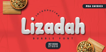 Lizadah Bubble font is a cool, trendy, and bubbly display font. It embodies playfulness and authenticity and is the perfect choice for any children's activity or school project.
 - Lu Px by Letradora,
$15.00 Based on an architect's handwriting, Lu has a good balance between quirkiness and legibility. With an extended character set, it is a good choice for setting short texts.
 - Aliman by Cititype,
$9.00 Aliman is a simple and neat lettered handwritten font. Add this font to your creative ideas and notice how it will make them stand out! All Caps fonts.
 - Kezuri by Powerfonts,
$16.99 Kezuri is a great choice to give your project a unique feel. Modern yet edgy, Kezuri is suited to high tech applications as well as urban / street projects.
 - Void Reaver by Zamjump,
$17.00 Introducing Void Reaver, a chilling masterpiece perfectly blending the themes of crash and horror. This unique typeface is meticulously crafted to evoke an unsettling and edgy atmosphere, making it an ideal choice for various applications. This font is your go-to choice for infusing a dark and mysterious atmosphere into a variety of creative projects, from social media graphics to website design. Elevate your designs with a font that leaves a lasting impression and invites exploration into the realms of crash and horror.
 - Alfaline by Arkalandara,
$130.00 "Alfaline" is Italic style handwriting is a beautiful and sophisticated script characterized by its slanted and slightly cursive letterforms. Italic handwriting dates back to the Renaissance and has evolved into a popular choice for individuals seeking a refined and artistic script, elegant Italic style handwriting combines grace and legibility, making it a popular choice for formal invitations, personal correspondence, and artistic endeavors. Learning and mastering this script can be a rewarding pursuit for those who appreciate the artistry of handwriting.
 - Meredia by IbraCreative,
$17.00 Meredia is a striking modern space sans serif typeface that embodies contemporary design principles with its clean lines and geometric shapes. This versatile font exudes a sense of sophistication and minimalism, making it an ideal choice for a wide range of applications, from digital interfaces to printed materials. With its well-balanced letterforms, Meredia exudes a sense of professionalism and readability while embracing a futuristic aesthetic, making it a standout choice for designers seeking a sleek and timeless typeface for their projects.
 - Abendschroth by SIAS,
$34.90 Abendschroth is a wonderful dreamy and whimsical typeface for novel titlings and other fiction headline settings. Also a sophisticated choice for lullabies, girl’s literatur, murder poems, fairy tales, short stories and christmas gift books. New! There is now two alternative fonts: Abendschroth Scriptive and Abendschroth Slim. Even more jolly, whimsical and – wonderfully odd! – Enhance your means of typographic expression with this brandnew romantic fonts. Abendschroth supports every Euro-Latin language. For the choice of a similar font go to Albyona.
 - Lovina Script by Alit Design,
$14.00 Lovina Script is our first font in 2019 and has a handwritten script style with a touch of natural rough from the shape of the brush. For Scripts, Lovina fonts have 2 choices namely "Lovina 1" and "Lovina 2" and in this font script there are many alternative choices of characters from Swash Lowercase, SS01 to SS06. Lovina Script is very worthy of being the newest collection in 2019 as a project design creation, social media quote, badges, logotype, fashion design etc.
 - Mariage by Linotype,
$40.99Morris Fuller Benton, the principal designer of the American Type Founders, designed Mariage in 1901. Mariage, which has been sold under a plethora of different names during the last century, is a blackletter typeface belonging to the Old English category. The term blackletter refers to typefaces that stem out of the historical printing traditions of northern Europe. These letters, called gebrochene Schriften, or "broken type" in German, are normally elaborately bent and distorted. Their forms often print large amounts of ink upon the page, creating text that leaves a heavy, black impression. The Old English style is a subset of blackletter type that dates back to 1498, when Wynken de Worde introduced textura style printing to England. Continental printers had been printing with textura style letters since Gutenberg's invention of the printing press fifty years earlier. Italian printers stopped using them around 1470. For northern Europeans, texturas remained the most popular form of typeface design until the invention of the fraktur style in Nuremberg. Mariage is heavily classicized sort of Old English type. During the Victorian era, designers admired the Middle Ages for its chivalric, community-based values and its pre-industrial lifestyle. Yet they also found the basic medieval textura letterform too difficult to read by present standards. They desired to modernize this old style. Today, this sort of update is often referred to not as "modernization" but as classicism. Benton's design for ATF builds upon earlier Victorian classicist interpretations of Old English/textura letters. For an example of what these Victorian designs looked like, check out the popular 1990 revival of the genre, Old English . Old English style types often appear drastically different from other blackletters. For contrast, compare Mariage to a classical German fraktur design, Fette Fraktur , a schwabacher style face, or the popular early 20th Century calligraphic gothic from Linotype, Wilhelm Klingspor Gotisch . Especially in the United States, classicist Old English typefaces are thought to espouse tradition and journalistic integrity. These features, together with the inherent, complex beauty of Mariage's forms, make this typeface a perfect choice for certificates, awards, and newsletter mastheads. - Patihan by Jehoo Creative,
$19.00 Introducing Patihan, the font that will bring your designs to life! With sharp, strong, bold characters. Patihan font family is a combination of three different styles – Sans, Slab, and Serif – each with nine different weights: Thin, Extra Light, Light, Regular, Medium, Semibold, Bold, Extrabold, and Black. This font has beautiful Ligature and Stylistic Alternate settings, Patihan font is also equipped with the Smallcaps feature which gives more control over the typography, allowing you to create elegant and unique typography. Sans version of this typeface is versatile and easy to read, with a minimalist but impactful aesthetic. The Slab version is characterized by its solid, powerful strokes, while the Serif style has that extra classic flair with elegant curves and extreme contrast to its look. Patihan font is optimized for readability, making it a great choice for headlines, titles, and any long-form content. Ligature settings and discretionary styling add an extra layer of sophistication, making this font a great choice for magazines, branding and advertising. Overall, this font is a great choice for those looking to make a lasting impression. Its versatility, readability and unique features make it an excellent choice for any project.
 - Menhart by Monotype,
$29.99Czech designer Oldrich Menhart (1897-1962) devoted his life to making letters. He was a calligrapher, lettering artist, and typeface designer with over twenty faces to his credit. The Monotype typeface, Menhart, was the second of his designs. Menhart began work on the design in the early 1930s and turned over his final artwork to the Monotype Drawing Office in 1934. The first size cut was 14 Didot (Didot points are the traditional European system of type measure, and are roughly equivalent to the point system commonly used by today's digital fonts). The 14D font was followed by 18D and 24D, indicating that the design was considered most suitable for display work. However, a 10D size was later cut from the same master drawings at the request of a Monotype customer. Menhart's design was light and open, with an even color and a slight squareness" to its round shapes. Because the Czech alphabet has 15 accented letters, Menhart included these diacritics as an integral part of his design, not as an afterthought. As a result, accented copy set in Menhart has a cohesive quality rarely seen in other typefaces. Monotype's new digital release of Menhart is the first revival since the hot metal fonts were cut. Menhart Display is based on the original Monotype drawings, while a slightly heavier, re-spaced version has been created for text sizes. Both versions offer the full capabilities of the OpenType format, such as the automatic insertion of old style figures, ligatures and small caps. In addition to English, the extended character set supports most Central European and many Eastern European languages. One of Menhart's lifelong goals was to share the richness of his Czech culture by drawing typefaces that uniquely served Czechoslovakia literature. In his words: "I believe that a Czech style of type comes above all from the spirit in which it was designed, which gives it its 'signature,' and not so much from decorative composition, and even less from the geographic location of its creation." The typeface Menhart is a tribute to his values. Now, Menhart Pro and Menhart Display Pro capture the unique personality of this timeless design while greatly extending its range of use. " - Rockabye - Personal use only

- Complete - Unknown license

- Verdaguera by Type-Ø-Tones,
$40.00 Another rebirth: Verdaguera. The all time Catalan people's choice. Now with a complete set of characters that covers a wide range of latin alphabet languages. Catalan included, of course.
 - The Good Feeling by Alfareaniy,
$100.00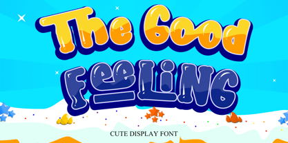 The Good Feeling is a fun, jolly, and incredibly charming display font. It embodies playfulness and authenticity and is the perfect choice for any children’s activity or school project.
 - Kris Kringle by Sealoung,
$15.00 Kris Kringle is a bold and chunky lettered display font. Add this font to your creative ideas and notice how it will make them stand out! All caps fonts.
 - Zombielicious by Zombie Font Group,
$- A meticulously-designed font that captures the spirit of the undead in a modern world. One will notice ample graveyard influence crossed with the newer, emerging trends in typography.
 - Elgista by Zealab Fonts Division,
$10.00 Elgista is modern serif display font with design choices and a combination between high contrast, experimental, and brutalism style. Elgista comes with stylistic, alternates, ligatures and supports multilingual languages.
 - Vasavine by Rvandtype,
$9.00 Vasavine is a Blackletter font. Its elegant and cool look makes it the perfect choice for logos, branding, invitations, stationery, wedding designs, social media posts, and so much more.
 - Tokyotrail by Dharma Type,
$9.99 Tokyotrail is inspired by the capital of Japan. Over 2,000 square kilometers to explore. Lines run vertically horizontal and aslant. Square and geometric form attracts notice in various scenes.
 - Sillyheads by PizzaDude.dk,
$10.00 Need something VERY silly for your headlines and still keep the legibility?! Then Sillyheads could be your no. 1 choice! Sillyheads has got that funny, weird, cute, crazy look!

