9,063 search results
(0.071 seconds)
- The Grinched 2.0 font is a display sans-serif typeface that is both highly decorative and playful, making it instantly suitable for cartoon and holiday themes. The characters are heavy and bold, with...
- Indie by Lián Types,
$37.00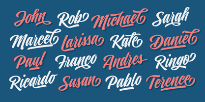 A FEW THOUGHTS Indie is a trendy script, result of the wide range of possibilities that can be achieved using a pointed brush. (1) “You Only Live Once” say The Strokes, (to me, symbols of indie music) so, what would represent that sensation of volatility better than a brush? As you may already know, this time inspiration came from hipsters and indies around us: We may sometimes criticise them, we may sometimes want to be like them, but the truth is that the universo gráfico they generated these past years is gigantic, full of colour and variations. (2) Brush lettering and Sign painting are fields I've been fond of since I started as a designer. Nowadays, these styles are getting a lot of attention and maybe it’s due to the undeniable mark of life that is materialised when using a brush. This tool is so expressive that shows the passions and fears of the artist, and materialises that idea of “living the present”, so popular in this era. When you see Indie, you think of skaters, rollers, surfers, hiphop dancers, street artists, summer, and why not? California beaches. So if you feel life is only one, it’s high time you got Indie into your fonts' collection! STYLES Indie comes in 4 styles plus another one which consists only in capitals. Indie; Indie Shade; Indie Shade Solo; Indie Inline are all open-type programmed and have exactly the same glyphs and metrics, so you can combine them without probem. (I.E. You may use Indie Inline, then write the same word using Indie Shade Solo, and finally put them together). In applications such as Adobe Illustrator, the font has nice results when fi ligatures is activated. However, if you want a more casual look, activate the contextual and the decorative ligatures. NOTES 1. After several years of practicing calligraphy I can say that to me, there’s nothing more satisfying than being able to create fonts out of your own handlettering. I owe a lot of this brush-style to Carl Rohrs. He was the very first calligrapher who taught it to me. His style is unique and what he can do with a brush is truly marvelous. I'm serious. 2. In spite of some particular cases, I can say I'm happy to live in a present in which Typography is living a kind of Renaissance along with Lettering. Like it happened with W. Morris a hundred years ago, handcrafts are being revalued/reborn, and some of this may be happening thanks to these indie designers that, trying to be unique, gave new/fresh air to different areas of graphic design.
 - Schnorr Gestreckt by HiH,
$12.00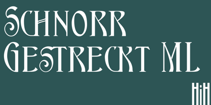 Peter Schnorr was a German artist/illustrator of Art Nouveau period (called Jugendstil in Germany and Austria). He was quite adept at calligraphy and did a variety of commercial work, including business signs. He designed at least four different alphabets and collaborated with Bruce Rogers on advertising work and title page designs for books. One of their clients was the publishing house of Houghton Mifflin. I have not been able to discover anything else about him, but I suspect he might be the grandson of the Bavarian artist Jules Schnorr von Carolsfeld, who was once commissioned to do a mural by Ludwig II of Bavaria (whose famous castle was copied by Disneyland). Schnorr did not give individual names to his fonts. Where there is no historical name, we like to follow the tradition initiated by Bauer and name fonts after their designer, with a descriptive adjective in the designer’s native language. Gestreckt is German for stretched or elongated. An interesting deign detail of this typeface is the cross bar of the “T” --it is NOT symetrical. The right hand side extends only 88% as far as the left hand side (a ratio of 9:8). I presume this was done for a more pleasing letter fit. Today Schnorr’s design is frequently offered under the name “Ambrosia.” However. close inspection will usually reveal that the serifs have been treated differently. I believe our font has a greater fidelity to the original design. Please also compare the design of the various auxiliary characters to those in other fonts. Often they are either borrowed from an inappropriate font of a different period or are missing altogether. We make every effort to design characters that are in keeping with the overall design and spirit of the typeface. For example, see the superscript Registered Trademark symbol (0174) and the Double s (0223). I think both are quite successful. Schnorr Gestreckt ML represents a major extension of the original release. In addition to the standard 1252 Western Europe Code Page with character slots up to decimal position 255, there are glyphs for the 1250 Central Europe, the 1252 Turkish and the 1257 Baltic Code Pages. There are also two alternate letter forms, one ornament and seven ligatures with Unicode codepoints (Private Use Area) and OpenType aalt, ornm & liga GSUB layout features. There are a total of 318 glyphs and 351 kerning pairs. Please note that some older applications may only be able to access the Western Europe character set (approximately 221 glyphs). This release also incorporates a redesign of several glyphs: the comma, quotes, acute accent, and grave accent.
 - Bethlehem Star by HiH,
$10.00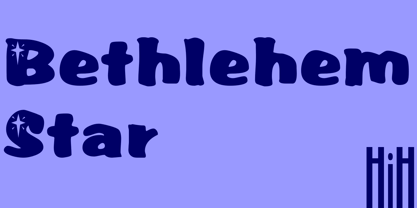 For much of the world, the last half of December encompasses the beginning of winter and the a season of gift-giving, marked by Hanukkah and Christmas. It is generally accepted that the tradition of giving of gifts at this time was begun by The Three Wisemen. As described in The Gospel According to Matthew, the wisemen, led by a star from a distant land to the east, found the baby Jesus. First, they worshipped him and then, "they presented him with gifts: gold, frankincense and myrrh." (Matthew 2:11). Thus began the tradition of celebrating the birth of Christ with the giving of gifts. There is a parallel tradition in the Jewish faith of the giving of gelt or gold at Hanakkuh to help support poor students, in keeping with the rich history of scholarship that is fundamental to the rabbinic system. Inevitably, in our secular culture, there has been a blending and a secularization of these traditions. The reasons have gotton lost in the “gimme.” What is often overlooked is what Paul realized when he told Timothy, “Neglect not the gift that is in thee.” The most importent gift is the gift inside of us, the gift of sacrificial love for others. When we let that gift be diminished in our minds amid the clutter of modern day material seeking, we can recall the prophesy of Micah over 2800 years ago, But thou, Bethlehem Ephratah, though thou be little among the thousands of Judah, yet out of thee shall he come forth unto me that is to be ruler in Israel: whose goings forth have been from of old, from everlasting." (Micah 5:2 KJV) Never underestimate the impact you have on others. Words of kindness can change people’s lives. The Talmud says that the highest form of wisdom is kindness. Be wise this holiday season. The font BETHLEHEM STAR was originally designed for the church to which I belong, The Star Bethlehem Church of Ansonia, Connecticut, USA and is based on the typeface Accent with the permission of URW++ of Hamburg, Germany. You might choose BETHLEHEM STAR for your personal greetings as well as for flyers and programs at your church this holiday season. Like most display fonts, it is most effective at 18 points and larger. Like most script fonts, it is most effective when set with both upper and lower case. All caps with this font is like eating two pieces of pecan pie — too much of a good thing.
 - Van den Velde Script by Intellecta Design,
$68.90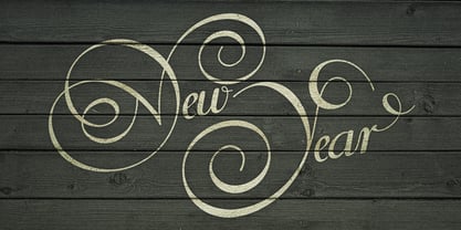 Iza and Paulo W (Intellecta Design) are proud to announce Van den Velde Script. A free interpretation of the work of the famous master penman Jan van den Velde, to be found in the “Spieghel der schrijfkonste, in den welcken ghesien worden veelderhande gheschrifften met hare fondementen ende onderrichtinghe. ” (Haarlen, 1605). Van den Velde Script has evocative ancient ligature forms from the XVII Century Dutch master penman Jan van den Velde. Your indescritible writing-book was important not only with regard to the specific period it represents, but also in relationship to the entire history of calligraphy as an art: Van den Velde is rightly credited with having introduced and perfected a new trend in Dutch calligraphy. Our font, Van den Velde Script merges modern necessities o better legibility without loose the taste of his archaic origins. This enhanced OpenType version is a complete solution for producing documents and artworks whith a evocative and voluptuous style of calligraphic script: - dozens of stylistic alternates for each letter (upper- and lowercase), accessed with the glyph palette; - historical ornaments and fleurons in the typical style (and motifs) from the XVII century at the Lower Countryes accessed with the glyph palette using the Ornaments feature); - an extensive set of ligatures (100s of contextual alternates plus discretionary ligatures) providing letterform variations that make your designs really special, resembling real handwriting on the page; - a tour-de-force kerning work: over 700 gliphs in this font was adjusted to your kern pairs handly. In non-OpenType-savvy applications it works well as an unusual and beautiful script style font. Because of its high number of alternate letters and combinations (over 700 glyphs), we suggest the use of the glyph palette to find ideal solutions to specific designs. The sample illustrations will give you an idea of the possibilities. You have full access to this amazing stuff using InDesign, Illustrator, QuarkXpress and similar software. However, we still recommend exploring what this font has to offer using the glyphs palette: principally to get all the power of the Contextual Alternates feature. You can has an idea of the power of this font looking at the “Van den Velde User Guide”, a pdf brochure in the Galçlery section. Two last things: take a special look at the Van den Velde Words (ready words) font and another super script font, Penabico. Van den Velde Script has original letters designed by Iza W and overall creative direction plus core programming by Paulo W.
 - Figgins Tuscan by HiH,
$12.00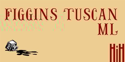 Early in the 19th century, foundries began releasing a variety of decorated ornamental letters based on the Tuscan letterform. Fancy Tuscan letters quickly became so popular, they eventually came to represent the cluttered extremes of Victorian design. Foundries competed with each other to produce most extravagantly decorated letterforms. As often happens, success turned to excess. What is often overlooked is the long history of the Tuscan style. Early examples have been traced back to ancient Rome. Indeed, the characteristic bifurcation may have represented a fishtail to the early Christians, thus sharing in the roll of symbolic identification played by the simple drawing of a fish as a whole. Later. trifurcation was developed as an alternate termination, followed by loops, full fishtails, curls, hooks and other fancy variations. Nicolete Gray provides an extensive history in her Appendix One of NINETEENTH CENTURY ORNAMENTED TYPEFACES. According to Gray, the first metal typeface based on the Tuscan form was the Ornamented of 1817 by Vincent Figgins of London. Thorowgood followed suit in 1821, Fry in 1824 and Caslon in 1830. Each was to re-visit the form many times during the Victorian era. Here we present our interpretation of what Figgins might have produced in a basic, plain Tuscan form - free of the decorative additions. We are pretty safe here because Figgins was very creative. He explored many of the terminal variations listed above and combined them with different decorative devices to produce a constant stream of new faces to meet the demands of the marketplace. Figgins Tuscan ML represents a major extension of the original release, with the following changes: 1. Added glyphs for the 1250 Central Europe, the 1252 Turkish and the 1257 Baltic Code Pages. There are also a few glyphs for Anglo-Saxon, Gaelic and Old Gaelic. Total of 355 glyphs. 2. Added OpenType GSUB layout features: aalt, ornm and liga ˜ with total 34 lookups. 3. Added 351 kerning pairs. 4. Redesigned several glyphs: the comma, quotes, brackets, braces, acute accent, and grave accent. 5. Revised vertical metrics for improved cross-platform line spacing. Please note that some older applications may only be able to access the Western Europe character set (approximately 221 glyphs). The zip package includes two versions of the font at no extra charge. There is an OTF version which is in Open PS (Post Script Type 1) format and a TTF version which is in Open TT (True Type)format. Use whichever works best for your applications.
 - PF DIN Serif by Parachute,
$36.00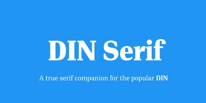 DIN Serif: Specimen Manual PDF The DIN Type System: A Comparison Table This is the first ever release of a true serif companion for the popular DIN typeface. DIN Serif originated in a custom project for a watchmaking journal which required a modern serif to work in unison and match the inherent simplicity of DIN. As a result, a solid, confident and well-balanced typeface was developed which is simple and neutral enough when set at small sizes, but sturdy and powerful when set at heavier weights and bigger sizes. It utilizes the skeleton of the original DIN and retains its basic proportions such as x-height, caps height and descenders, whereas ascenders were slightly increased. DIN Serif makes no attempt to impress with ephemeral nifty details on individual letters, but instead it concentrates on a few modern, functional and everlasting novelties which express an overall distinct quality on the page and set it apart from most classic romans. This is a low contrast typeface with vertical axis and squarish form which brings out a balance between simplicity and legibility. Its narrow proportions offer economy of space which is critical for newspaper body text and headlines. At small sizes the text has an even texture, it is comfortable and highly readable. The serifs are narrow at heavy weights and when tight typesetting is applied at large sizes, the heavier weights become ideal for headlines. DIN Serif was inspired by late 19th century Egyptian and earlier transitional roman faces. Bracketed serifs were placed on the upper part of the letterforms (this is where we mostly concentrate our attention when we read) whereas small clean square serifs were placed on and under the baseline to simplify the letterforms. In order to reduce visual tension at the joins and make reading smooth and comfortable, a slight hint of bracketed serif was added at the joins in the form of a subtle angular tapered serif, which softens the harsh angularity. These angular tapered serifs tend to disappear at smaller sizes (or smooth out the joins) but stand out at bigger sizes exuding a strong, modern and energetic personality. What started out as a custom 2 weight family, it has developed into a full scale superfamily with 10 styles from Regular to ExtraBlack along with their italics. Additional features were added such as small caps, alternate letters and numbers as well as numerous symbols for branding, signage and publishing. All weights were meticulously hinted for excellent display performance on the web. Finally, DIN Serif supports more that 100 languages such as those based on the Latin, Greek and Cyrillic alphabet.
 - Picture it: a font that stalks the night, looming from the shadowy corners of design like the legendary vampire it's named after. "Nosferatu," conjured into being by the creative blood magicians at K...
- The SKULL TS 2 font, designed by the notable font designer Billy Argel, stands out as an emblematic representation of creativity melded with an edgy, gothic aesthetic, reflecting Argel's penchant for...
- Sure, diving into the essence of a font named "Oneworldonefuture" designed by Dieter Schumacher is like embarking on a journey through artistry and vision. This is not just a mere collection of lette...
- HACKED font is a digital typeface that encapsulates the essence of cyberpunk and technological disruption. Picture a visual style that might adorn the interfaces of futuristic software, games, or the...
- Gr-Memories, is a font that is designed to evoke a sense of nostalgia and personal connection. Its creation is inspired by the handwritten letters and notes we once received or wrote, capturing the w...
- Ah, the elusive font EMILKOZAK.COM | fartdeco, a typographical enigma that caters to the refined taste of those who appreciate a good giggle alongside their graphic design. Picture this: the roaring ...
- Duddy by Letritas,
$30.00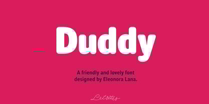 Duddy is a “friendly” sans-serif typography designed by Eleonora Lana and the Letritas team. The shape of Duddy was created based on sketches that looked after carrying the concept of kindness as far as possible, keeping always in mind the readability and functionality of the font. In the stage of brainstorming, the team started listing things that were friendly to the touch or sight, such as a candy gum, or marshmallow, to become acquainted with the intended goal. Although slowly, as the letters were being created, the objects associated with the forms were not satisfactory, since when forming words a special personality of its own appeared. By reconceptualizing everything, the personality of the letter the team wanted to work with had to be redefined. Thus it went from "caramel" to "teddy bear", from "teddy bear" to "puppy" and from "puppy" to "dolphin". And Duddy is the perfect name for a dolphin. Duddy was a sound idea: friendly, intelligent, social. Once the concept was nailed, the design of graceful and “soft” shapes started. Almost chewable, almost huggable, as if composing words was a game. Duddy has a slanted version with "real italics". These italics are slightly more condensed than the regular version, in order to give it a different text texture. The typeface has 9 weights, ranging from “thin” to “heavy”, and two versions: "regular" and "italic". Its 18 files contain 729 characters with ligatures, alternates, small caps, oldstyle and tabular numbers, fractions, case sensitive, and unicase figures. It supports 219 Latin-based languages, spanning through 212 different countries. Duddy supports this languages: Abenaki, Afaan Oromo, Afar, Afrikaans, Albanian, Alsatian, Amis, Anuta, Aragonese, Aranese, Aromanian, Arrernte, Arvanitic (Latin), Asturian, Atayal, Aymara, Bashkir (Latin), Basque, Bemba, Bikol, Bislama, Bosnian, Breton, Cape Verdean Creole, Catalan, Cebuano, Chamorro, Chavacano, Chichewa, Chickasaw, Cimbrian, Cofán, Corsican Creek,Crimean Tatar (Latin),Croatian, Czech, Dawan, Delaware, Dholuo, Drehu, Dutch, English, Estonian, Faroese, Fijian Filipino, Finnish, Folkspraak, French, Frisian, Friulian, Gagauz (Latin), Galician, Ganda, Genoese, German, Gikuyu, Gooniyandi, Greenlandic (Kalaallisut)Guadeloupean, Creole, Gwich’in, Haitian, Creole, Hän, Hawaiian, Hiligaynon, Hopi, Hotc?k (Latin), Hungarian, Icelandic, Ido, IgboI, locano, Indonesian, Interglossa, Interlingua, Irish, Istro-Romanian, Italian, Jamaican, Javanese (Latin), Jèrriais, Kala Lagaw Ya, Kapampangan (Latin), Kaqchikel, Karakalpak (Latin), Karelian (Latin), Kashubian, Kikongo, Kinyarwanda, Kiribati, Kirundi, Klingon, Ladin, Latin, Latino sine Flexione, Latvian, Lithuanian, Lojban, Lombard, Low Saxon, Luxembourgish, Maasai, Makhuwa, Malay, Maltese, Manx, M?ori, Marquesan, Megleno-Romanian, Meriam Mir, Mirandese, Mohawk, Moldovan, Montagnais, Montenegrin, Murrinh-Patha, Nagamese Creole, Ndebele, Neapolitan, Ngiyambaa, Niuean, Noongar, Norwegian, Novial, Occidental, Occitan, Old Icelandic, Old Norse, Oshiwambo, Ossetian (Latin), Palauan, Papiamento, Piedmontese, Polish, Portuguese, Potawatomi, Q’eqchi’, Quechua, Rarotongan, Romanian, Romansh, Rotokas, Sami (Inari Sami), Sami (Lule Sami), Sami (Northern Sami), Sami (Southern Sami), Samoan, Sango, Saramaccan, Sardinian, Scottish Gaelic, Serbian (Latin), Seri, Seychellois Creole, Shawnee, Shona, Sicilian, Silesian, Slovak, Slovenian, Slovio (Latin), Somali, Sorbian (Lower Sorbian), Sorbian (Upper Sorbian), Sotho (Northern), Sotho (Southern), Spanish, Sranan, Sundanese (Latin), Swahili, Swazi, Swedish, Tagalog, Tahitian, Tetum, Tok Pisin, Tokelauan, Tongan, Tshiluba, Tsonga, Tswana, Tumbuka, Turkish, Turkmen (Latin), Tuvaluan, Tzotzil, Uzbek (Latin), Venetian, Vepsian, Volapük, Võro, Wallisian, Walloon, Waray-Waray, Warlpiri, Wayuu, Welsh, Wik-Mungkan, Wiradjuri, Wolof, Xavante, Xhosa, Yapese, Yindjibarndi, Zapotec, Zulu, Zuni.
 - Skolar Sans PE by Rosetta,
$70.00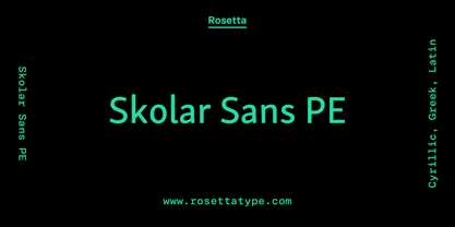 Any prototype you can imagine, Skolar Sans can materialise. This industrious type family is more than just a versatile partner for our award-winning Skolar collection: it is a true sans-serif type system envisioned for the age of responsive design. We developed Skolar Sans to accommodate contemporary typographers and the challenges they confront: an ever-changing spectrum of outputs and devices, in which serious typography can get lost. Skolar Sans is engineered to cope with complex editorial texts and data-rich layouts alike. Its construction is designed for easy reading, and its subtle personal style and a touch of flourish. From gently thin to black, the finely-tuned weight variants will fit any composition from wide-screen dashboards to compact mobile editorial designs. Its four subtly graded width variants allow you to fit any page context with comfort. The 72 styles; 36 weight and width variants in uprights and true italics with ligatures, arrows, scientific figure variants, and fleurons. The two variable fonts (one for uprights and one for the italics) allow user precise navigation of the Skolar Sans design space and streamline delivery. The linguistic scope of Skolar Sans PE is an exact match to Skolar PE: Latin, Cyrillic, and Greek (including polytonic) scripts and support for hundreds of languages and transliterations.
 - LiebeDoni by LiebeFonts,
$29.90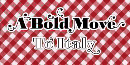 LiebeDoni is pure Italian art. A contemporary nod to Italian typographic heritage, LiebeDoni’s warm and friendly style is perfect for—literally—bold headlines and impressive invitations. Take a seat on LiebeDoni’s Vespa and enjoy the sweet curves of dolce far niente. But don’t let the relaxed hand-crafted appearance fool you: You’re dealing with a solid quality typeface that has received painstaking attention to detail. Round like the Colosseum, some lines are as colloquial as the Tower of Pisa—but all this with almost Teutonic obsession for technical perfection. Feature-wise, we went the full quattro stagioni: Variations and alternatives for many letters, swashy initials and swirly ligatures—plus language support that goes way beyond English and Italiano. Double-o ligature, anyone? Two different www ligatures? Check. (Please make sure your software supports OpenType if you wish to use the advanced features.) Get both the outline and the filled version and go crazy on creative layering and endless possibilities. Each font contains over 600 glyphs and both contain the full character set. Make a bold move to italy—treat yourself with this font. If you like LiebeDoni, you may also like its perfectly matching sisters LiebeErika and LiebeOrnaments—or any of our other 100% compatible LiebeFonts.
 - Nanami Handmade by Thinkdust,
$10.00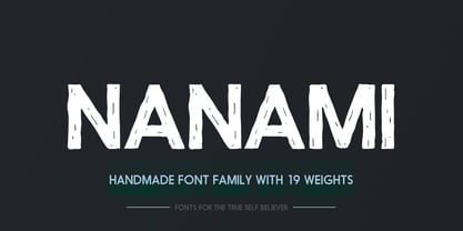 Can we get a drum roll please? It’s not every day that a new link in a best selling chain is forged. First, there was Nanami, a font which took the world of type by force, storming to the top of MyFonts Hot New Fonts list; then there was Nanami Rounded, the most successful follow-up since Terminator 2. Well, say Hasta La Vista to boring design because now, there’s Nanami Handmade. With all the geometric, Japanese inspiration and style of the first two iterations, Nanami Handmade carries a quirky, mischievous charm. The font has a charisma matched by roguish anti-heroes; bad guys you love to love and good guys the other good guys hate, but everyone knows they’re what the audience turns up to see. Nanami Handmade comes in two styles, a solid and a hand-drawn, each of which has eight weights. Mix and match between these options to create a balanced piece which makes good use of the tactile, warm, earthy nature of the font. With these sans-serif styles working well in small and large sizes, both on and off screen, Nanami Handmade’s applications are virtually endless. Get your own piece of typography’s elite now, with Nanami Handmade, by Thinkdust.
 - Ionic No 5 by Monotype,
$51.99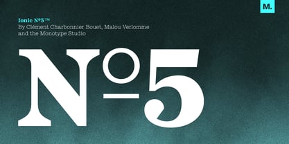 Ionic No5 is a refresh of a classic Linotype Clarendon-style serif, another restored classic from the Monotype library, much like the recent updates to Walbaum and Helvetica Now. The original typeface was designed to be printed and read at small sizes, popular with newspapers in the 20th Century at its birth. The restoration and refinement of this typeface has bestowed a greater sense of clarity and directness, smartly stylish, and an utterly captivating appeal. Because these styles were so popular for books and newspapers for so long we associate them with being editorial or bookish, not dull, but thoughtful. Designers today can use that association to their advantage as a visual shortcut to convey similar meaning and tone. More attention was given on modernising the typeface with precious use and the introduction of sharp edges & finishes. The thinnest weights can give a dancing typewriter aesthetic, being low stroke contrast. The heavy weights have an unquestionable presence on the page. Overall, the typeface has a richness and almost illustrative quality about it. The true depth of Ionic No.5 could enable each weight to be a poster by itself. Ionic N°5™ font field guide including best practices, font pairings and alternatives.
 - Ribbons by Positype,
$20.00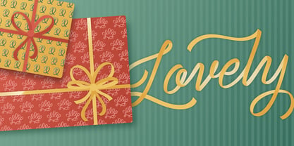 Ribbon type. Holy grail of complex-lettering-turned typeface or an elusive Loch Ness monster that is often teased, possibly seen in the wild, but never confirmed? From the amazing lettering artist and author Martina Flor and masterful type designer Neil Summerour, comes the aptly named Ribbons. Ribbons is a sincere and well-conceived approach to providing a reliable solution to ribbon and ribbon-styled type for creative professionals when a lettering artist just isn’t available. Ribbons provides both flat and ‘folded’ options with the Regular and Fold styles, but then raises the bar with separate layer styles that will allow you to easily create the elegant back and forth movements produced with ribbon-style lettering we have all come to appreciate. These layer options are provided in both ‘smooth’ and ‘pleated’ connected styles. Flor and Summerour didn’t stop there. Each typeface was expanded with a number of stylistic alternates, additional swashed and flourished letters, ligatures, and even more in order to provide as many decorative options as possible to the creative. To round out the nine fonts available in the typeface and to ‘put a bow on it’, they’ve added a separate Shadow style and two different color fonts (available exclusively with family purchases).
 - Peach Lotus by Nathatype,
$29.00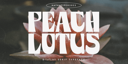 It can be a tough challenge to present the best display for your projects, especially in limited options of fonts. For that reason, let us introduce you to our display serif font to amaze your audience with your projects. Peach Lotus is a display serif font we created by mixing the classical serif elements with big, bold-sized letters for you to impress and attract your audience. On top of that, it gives you more artistic, creative touches as a result of the display font combinations. A display font with thickly-lined and high contrast capital letters will produce a prominent display to strengthen the impressions delivered. In addition, you can apply this font for big-sized texts to be legible. Also, you can enjoy the available features here. Features: Multilingual support PUA encoded Numerals and punctuations Peach Lotus fits best for various design projects, such as brandings, posters, banners, headings, magazine covers, quotes, printed products, merchandise, social media, etc. Find out more ways to use this font by taking a look at the font preview. Thanks for purchasing our fonts. Hopefully, you have a great time using our font. Feel free to contact us anytime for further information or when you have trouble with the font. Thanks a lot and happy designing.
 - Pinkerton by LetterStock,
$20.00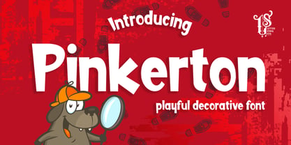 Pinkerton Introducing Pinkerton font. It was inspired from a cartoon that i saw on television, and it was originally crafted by hand to add natural handmade feeling than i make it clean with pentool. We improvise it a little bit to make a playful feel, this font is bold so and it can look strong if you use it for branding or even title for your poster design with playful decorative style. Opentype features Pinkerton Font is very good looking in playful decorative logotype, labels, t-shirt prints, product packaging, invitations, advertising and others. If you looking for a playful decorative font, than this item is a good choice for you because this font have a strong playful feel. This fonts works with folowing languages: Afrikaans, Albanian, Asu, Basque, Bemba, Bena, Chiga, Cornish, Danish, English, Estonian, Filipino, Finnish, French, Friulian, Galician, German, Gusii, Indonesian, Irish, Italian, Kabuverdianu, Kalenjin, Kinyarwanda, Low German, Luo, Luxembourgish, Luyia, Machame, Makhuwa-Meetto, Makonde, Malagasy, Malay, Manx, Morisyen, North Ndebele, Norwegian Bokmål, Norwegian Nynorsk, Nyankole, Oromo, Portuguese, Romansh, Rombo, Rundi, Rwa, Samburu, Sango, Sangu, Scottish Gaelic, Sena, Shambala, Shona, Soga, Somali, Spanish, Swahili, Swedish, Swiss German, Taita, Teso, Vunjo, Zulu Thank you for using this font. LS
 - Kevong Gabion by Product Type,
$13.00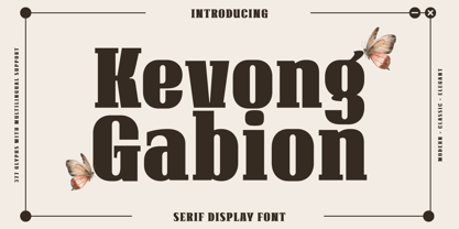 Kevong Gabion Serif font is the epitome of timeless elegance and classic style. The font boasts a sleek and sophisticated design that is perfect for a range of projects, from branding to editorial design. Its classic serif form is perfect for adding a touch of sophistication to your work. In addition to its timeless design, Kevong Gabion Serif font is also incredibly versatile. It comes with a wide range of language support, making it the ideal choice for projects with a global audience. Whether you’re designing a website or creating a marketing campaign, this font is sure to impress. Overall, Kevong Gabion Serif font is a must-have for any designer who values classic design and versatility. Its timeless elegance and wide range of language support make it the perfect choice for a range of projects. So why not add it to your font library today and take your designs to the next level? What’s Included : - File font - All glyphs Iso Latin 1 - We highly recommend using a program that supports OpenType features and Glyphs panels like many Adobe apps and Corel Draw, so you can see and access all Glyph variations. - PUA Encoded Characters – Fully accessible without additional design software. - Fonts include Multilingual support
 - Sun-kissed by Krafted,
$10.00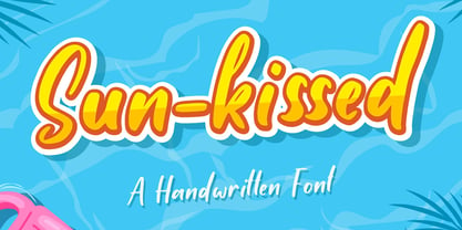 “Live in the sunshine. Swim in the sea. Drink the wild air.” ― Ralph Waldo Emerson Hey there sun-kissed beauties! Are you looking for a gorgeous handwritten font that’ll captivate your viewers and make your branding shine as bright as the sun? Introducing Sun-kissed - A Handwritten Font. With every hand-drawn stroke and curve, Sun-kissed will delight and add brightness, modernity, and fun to wherever it’s placed. Impress your party guests with gorgeous invitations, make a statement on your social media banners, and add a little bit of sunshine to your corporate identity. This stylish Handwritten font is also can be used for headings, logos, business cards, printed quotes, cards, packaging, and presentations. What you’ll get: Multilingual & Ligature Support Full sets of Punctuation and Numerals Compatible with: Adobe Suite Microsoft Office KeyNote Pages Software Requirements: The fonts that you’ll receive in the pack are widely supported by most software. In order to get the full functionality of the selection of standard ligatures (custom created letters) in the script font, any software that can read OpenType fonts will work. We hope you enjoy this font and that it makes your branding sparkle! Feel free to reach out to us if you’d like more information or if you have any concerns.
 - Burnt Rose by Krafted,
$10.00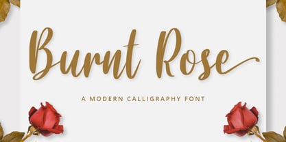 Want to transport your audience to a world of wonder with your branding? Want your headings to spark happiness and engagement? Introducing Burnt Rose - A Modern Calligraphy Font. A modern and elegant handcrafted calligraphy font that’ll make your audience swoon and enhance your branding projects, printed materials, and website design. Every stroke and curve was created to capture the essence of elegance and style. Ideal for social media banners; posts, and ads, printed quotes, t-shirt designs, packaging, or even as a modern text overlay to any background image. Burnt Rose includes Ligature & Stylistic Sets as well as Multilingual Support to make your branding globally acceptable. Get ready to engage and captivate your audience with Burnt Rose. What you’ll get: Multilingual & Ligature Support Full sets of Punctuation and Numerals Compatible with: Adobe Suite Microsoft Office KeyNote Pages Software Requirements: The fonts that you’ll receive in the pack are widely supported by most software. In order to get the full functionality of the selection of standard ligatures (custom created letters) in the script font, any software that can read OpenType fonts will work. We hope you enjoy this font and that it makes your branding sparkle! Feel free to reach out to us if you’d like more information or if you have any concerns.
 - Mon Nicolette by Sudtipos,
$49.00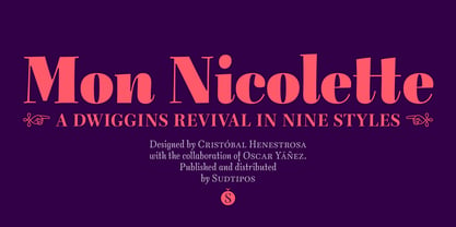 This is a digital revival by Cristóbal Henestrosa based on an experimental typeface named Charter, designed – yet never fully accomplished – by the prominent William Addison Dwiggins. It is an upright italic, unconnected script typeface, whose main features are a pronounced contrast, condensed forms and exaggerated ascenders. While Dwiggins worked on this project from 1937 to 1955, he only completed the lowercase and a few other characters. However, it was used to set a specimen in 1942 and a short novel in 1946. The sources that Cristóbal used for Mon Nicolette were the original sketches by WAD as well as printing trails kept at the Boston Public Library, and a copy of the 1946 edition of The Song-Story of Aucassin and Nicolette. This gorgeous typeface can be used successfully in headlines, subheads and short passages of text from 12 points onwards, in applications such as fashion magazines, soft news, advertising, poetry, albums, and book covers. This project started ten years ago, while Cristóbal was studying the Type@Cooper Extended Program at New York City. A previous version was selected to be part of the Biennial Tipos Latinos 2018, and now Mon Nicolette is finally ready for commercial distribution with Sudtipos… and we are very proud of it! Festina lente.
 - Afical by Formatype Foundry,
$30.00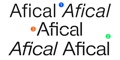 Afical update 2.0 version Afical Composed of 3 set families, consists of 35 fonts matching italic: Afical Std, Afical Neue, Afical Stencil. families all with distinctive qualities and features but share the same basic construction and proportions. Afical has been carefully crafted to focus on Text sizes and legibility with a high x-height, we developed it with Manual TrueType Hinting. Afical It's a perfect choice for publication, Packaging, logo, branding, Signage, wayfinding design systems, as well as web and screen design OpenType features: Alternate Characters SS.01, SS.02, SS.03, SS.04, SS.05, Denominators Case-Sensitive Forms, Tabular Lining, Fractions, Ordinal, Ligatures, Discretionary Ligatures, Subscript, Superscript, Language Support: 63+ (Latin based) languages Afrikaans, Albanian, Asu, Basque, Bemba-language, Bena, Danish, Dutch, English, Estonian, Faroese, Filipino, Finnish, French, Friulian, Gaelic (Irish, Scots), German, Gusii-language, Hungarian, Icelandic, Indonesian, Irish, Italian, Kabuverdianu, Kalenjin, Cornish, Luhya, Luo-Language, Machame, Madagascan, Makhuwa-Meetto, Makonde, Malayan, Manx, Morisyen, North-Ndebele-Language, Norwegian, Bokmål, Nynorsk, Nyankore, Oromo, Pare, Portuguese, Rombo, Rwandan, Rukiga, Rundi, Rwa, Samburu, Sango, Sangu, Swedish, Swiss German, Sena, Shambala, Shona, Soga, Somali, Spanish, Swahili, Taita, Teso, Vunjo, Zulu Behance Looking for custom Afical? Please send us an email at hello@formatypefoundry.com Designed 2017 Published 2021 2021 Copyright © Formatype Foundry All rights reserved
 - KERASIH by Product Type,
$15.00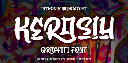 Keraasih is a graffiti display font that combines art, freedom, and the beauty of handwriting. Crafted with boldness and expression, this font is the perfect solution for projects that require a unique artistic touch and beautiful handwriting. With Keras, you can create striking and eye-catching designs. This font gives you the freedom to express your creativity and exudes a style like no other. The expressive look and strong character make Kerasih a standout choice among other fonts. The artistic touch in each letter and the intricate details make Keraasih so attractive. Every cut, line, and stroke exudes boundless creative courage and passion. The bold graffiti design and the feel of beautiful handwriting create a unique and eye-catching combination. Keraasih takes you into the world of art and freedom. Use this font to create eye-catching posters, memorable logos, or cool merchandise designs. With Kerashy, you can bring an interesting and evocative touch of art to your projects. What’s Included : - File font - All glyphs Iso Latin 1 - Ligature, Alternate - We highly recommend using a program that supports OpenType features and Glyphs panels like many Adobe apps and Corel Draw, so you can see and access all Glyph variations. - PUA Encoded Characters – Fully accessible without additional design software. - Fonts include Multilingual support
 - Ekko by L'île Foundry,
$30.00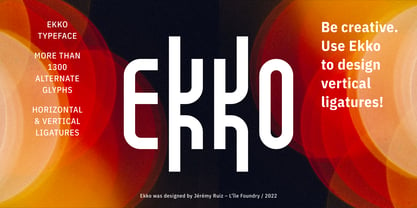 Ekko is a typeface that gives you tools to be creative. Indeed, it contains more than 1300 alternate glyphs. By combining these alternate glyphs between them, you can design real vertical ligatures. The graphic possibilities are numerous and various. Ekko gives you the opportunity to play, to experiment and to discover, in order to associate the various vertical ligatures between them, in a balanced and harmonious way. Thus, Ekko makes it possible to express the musicality of each word, and to give a specific, original and unique rhythm to each composition. Following the spirit of jazz music: nothing is predefined, but everything remains open. Be creative and enjoy! We recommend that you use Ekko with a line spacing suitable to the font size with a ratio between 0,54 and 0,6. For example, if the font size is 100 pts, the best line spacing will be between 54 and 60 pts. In order to give the best flexibility to Ekko, you can also find, through other alternate glyphs, different widths for each letter (except: M, N, V and W in uppercase). Each letter, lowercase and uppercase combined, is thus available in dimensions: 3x8, 5x8 and 7x8. Ekko also contains 28 horizontal ligatures.
 - Universo by PeGGO Fonts,
$12.00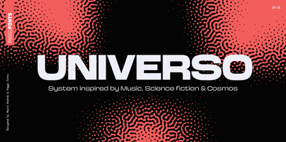 Universo and Universo Stencil by Mauro Andrés and Peggo Fonts is a display font family for “Caos Sagrado” specially designed for informative fanzine and magazines. Its name “Universo” comes from the quote “we have to talk about the horrible things of Universe” with the main idea of supporting and help to expose social problems. Inspired on Retro-Futuristic fonts and poster design and old scientific publications that is becoming a new design trend nowadays, and strongly influenced by the Italian type designer Aldo Novarese’s work, developed in the 50’s. "Universo CS" and "Universo CS Stencil" were produced between mid-September and October 2018 by Mauro Andrés under the creative direction of Victoria Rivas and those versions were publicly showed at “Impresionante” (a massive independent printing expo in Chile) with a printed specimen. That phase of the project was updated and completed in March 2019 and was lastly finished between November 2019 and April 7, 2020, developing it in six styles, under the co-production of Peggo Fonts. "Universo" and "Universo Stencil" are both suitable for headlines and short text lines, music and concert posters, books and magazines covers, branding, logotype and graphic design. All stylistic alternates are accessible via OpenType features or character map.
 - KOEEYA by Product Type,
$13.00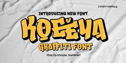 Koeeya is a font with a charming Display Graffiti theme. Created to give your projects a touch of freedom and uniqueness, Available in three different variations, Koeeya provides flexibility and the opportunity to express your creativity in limitless ways. You can choose between solid and plain styles, dramatic shadows, or interesting textures. With eccentric designs and beautifully handwritten characters, Koeeya gives each design a different and memorable impression. This font combines the boldness and creativity of graffiti writing with the amazing smoothness and clarity of handwriting. By using Koeeya, you can give a unique and stylish touch to your promotional materials, posters, merchandise designs, and much more. This font exudes energy and freedom, capturing the attention of potential customers in an instant. Now is the time to let your imagination run wild and express yourself through eye-catching designs. Choose Koeeya as your main font and watch how your project becomes unique, interesting, and unforgettable. What’s Included : - File font - All glyphs Iso Latin 1 - Ligature, Alternate - We highly recommend using a program that supports OpenType features and Glyphs panels like many Adobe apps and Corel Draw, so you can see and access all Glyph variations. - PUA Encoded Characters – Fully accessible without additional design software. - Fonts include Multilingual support
 - Obidel by LetterStock,
$20.00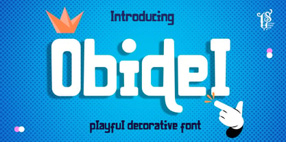 Obidel Introducing Obidel font, that was inspired from a lettering design that i saw on pinterest. It was originally crafted by hand to add natural handmade feeling than i make it clean with pentool. We improvise it a little bit to make a playful feel, this font is bold so and it can look strong if you use it for branding or even title for your poster design with playful decorative style. Opentype features Obidel Font is very good looking playful decorative font for logotype, labels, t-shirt prints, product packaging, invitations, advertising and others. If you looking for a playful decorative font, than this item is a good choice for you because this font have a strong playful feel. This fonts works with folowing languages: Afrikaans, Albanian, Asu, Basque, Bemba, Bena, Chiga, Cornish, Danish, English, Estonian, Filipino, Finnish, French, Friulian, Galician, German, Gusii, Indonesian, Irish, Italian, Kabuverdianu, Kalenjin, Kinyarwanda, Low German, Luo, Luxembourgish, Luyia, Machame, Makhuwa-Meetto, Makonde, Malagasy, Malay, Manx, Morisyen, North Ndebele, Norwegian Bokmål, Norwegian Nynorsk, Nyankole, Oromo, Portuguese, Romansh, Rombo, Rundi, Rwa, Samburu, Sango, Sangu, Scottish Gaelic, Sena, Shambala, Shona, Soga, Somali, Spanish, Swahili, Swedish, Swiss German, Taita, Teso, Vunjo, Zulu Thank you for using this font. LS
 - Rekusen by Product Type,
$15.00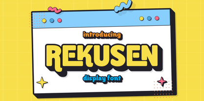 Rekusen is a modern and bold sans-serif display font that stands out with its cleanness. Perfect for branding, headlines, and editorial design, this font is sure to make a statement. The unique combination of thick and thin strokes creates a dynamic and eye-catching appearance that draws attention to your message. In addition to its stylish design, Rekusen also features a wide range of alternate characters and ligatures that allow for creative customization and increased versatility. With alternates and ligatures, this font provides endless possibilities for unique and impactful designs. And with support for multiple languages, it can be used across a variety of projects with ease. Whether you’re designing a logo, creating a poster, or crafting a website, Rekusen is a powerful tool that will help you achieve your design goals with style and sophistication. Its modern, clean, and versatile design makes it a perfect fit for any project that needs a touch of boldness and professionalism. What’s Included : - All glyphs Iso Latin 1 - We highly recommend using a program that supports OpenType features and Glyphs panels like many Adobe apps and Corel Draw, so you can see and access all Glyph variations. - PUA Encoded Characters – Fully accessible without additional design software. - Fonts include Multilingual support
 - Scream Explode by Ditatype,
$29.00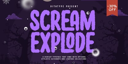 It is crucial to pick a perfect font for your project designs as they should be as great as your fonts to help you deliver your messages and feelings accurately. We would like to introduce you to our display font to help you create dazzling, unique designs. This is the Scream Explode. It is designed in firm characters and unique styles to help you deliver your messages quickly. This capitalized, thick weight font creates a bold, prominent display. Moreover, the uneven edge lines on our display font will give extra creativity touches to show a unique, attractive display. In addition, you can apply this font for big text sizes to be legible and you can enjoy the available features here as well. Features: Alternates Ligatures Multilingual Supports PUA Encoded Numerals and Punctuations Scream Explode fits best for various design projects, such as brandings, posters, banners, headings, magazine covers, quotes, printed products, merchandise, social media, etc. Find out more ways to use this font by taking a look at the font preview. Thanks for purchasing our fonts. Hopefully, you have a great time using our font. Feel free to contact us anytime for further information or when you have trouble with the font. Thanks a lot and happy designing.
 - Ongunkan Phrygian by Runic World Tamgacı,
$50.00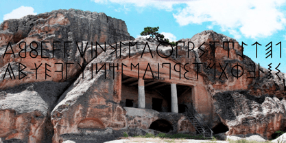 Phrygia is the Greek name of an ancient state in western-central Anatolia (modern Turkey), extending from the Eskişehir area east to (perhaps) Boğazköy and Alishar Hüyük within the Halys River bend. The Assyrians, a powerful state in northern Mesopotamia to the south, called the state Mushki; what its own people called it is unknown. We know from their inscriptions that the Phrygians spoke an Indo-European language. Judging from historical records supported by ceramic evidence, settlers migrating from the Balkans in Europe first settled here a hundred or more years following the destruction of the Hittite empire (ca. 1200 B.C.). Most of what is known about Phrygian archaeology and its language derives from excavations at the capital city Gordion, located about 60 miles southwest of the modern Turkish capital of Ankara (also a Phrygian site). Gustav and Alfred Körte first excavated Gordion in 1900. The excavators did not reach Phrygian levels, but they did reveal burials dated to the late eighth century B.C. with Phrygian ceramic, metal, and wooden artifacts. From 1950 to 1973, Rodney S. Young of the University of Pennsylvania led excavations at Gordion. Archaeological work at the site resumed in 1988 and continues to the present.
 - Fresh Spirit by Yumna Type,
$25.00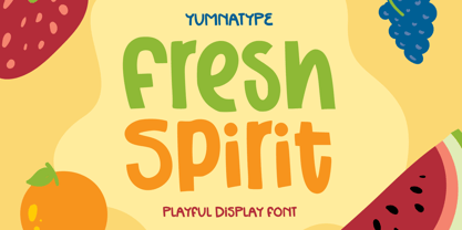 It can be a time-wasting process to find a perfect font for your projects that unfortunately may end in unexpected results as you want to stand out your unique designs without spending hours on searching the right font. For that reason, we would like to introduce you to Fresh Spirit. Fresh Spirit is a unique display font in round, twisting styles on the letters' edges. It is very suitable to apply for products related to food and drink especially fruit due to its fun, cute characteristics. Fresh Spirit font, which provides a clipart in line with the theme as a bonus, will create some soft, fun, adorable nuances and increase visual attractiveness to your designs. In addition, you can enjoy the available features here. Features: Multilingual Supports PUA Encoded Numerals and Punctuations Fresh Spirit fits best for various design projects, such as brandings, headings, magazine covers, quotes, printed products, merchandise, social media, etc. Find out more ways to use this font by taking a look at the font preview. Thanks for purchasing our fonts. Hopefully, you have a great time using our font. Feel free to contact us anytime for further information or when you have trouble with the font. Thanks a lot and happy designing.
 - Nanami Rounded by Thinkdust,
$10.00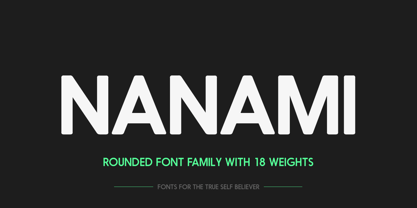 Nanami Rounded is a heavily engineered follow up to the hugely successful Nanami, which debuted at MyFonts #1 Hot New Fonts for over 2 weeks. Nanami Rounded is a carefully engineered take on the original Nanami family. We kept the curve very slight in order to keep the clean corporate balance, and not to go into a style that was too friendly. Nanami Rounded consists of 18 weights ranging from Thin through to Black. It has also extensive support for over 50 languages, and as a font family that works well both in headlines and bodycopy, Nanami Rounded is the perfect choice for a whole variety of creative briefs. The gentler, softer follow-up to the popular Nanami, Nanami Rounded is also motivated by the artistry of Japan. Smoothing the hard lines and definite corners of its predecessor just slightly, Nanami Rounded is still clearly defined and crisp enough to work in whatever context you need. If Nanami is a battle hardened Samurai, Nanami Rounded is the lotus blossom favour handed to him as he leaves his home village to go to war. If Nanami Rounded isn't quite floating your boat why not check out it’s counterparts Nanami and Nanami Handmade.
 - Koo Koo Puff by astroluxtype,
$20.00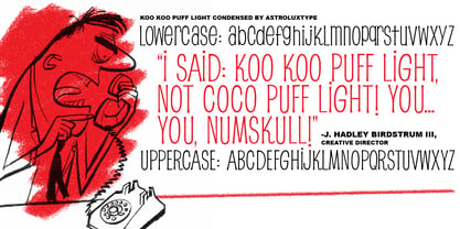 Does the world really need one more vernacular pop culture typeface? We here, at astroluxtype shout a resounding yes! Sure, at myfonts.com, you can find the apex of fine font design that will have your mind and eyes burst with joy at the level of sophistication and craftsmanship they exhibit- Koo Koo Puff Light Condensed and Regular Condensed are not one of those fonts. But if kooky goofy is your thing, we're selling it at the astroluxtype booth. Koo Koo Puff Regular Condensed is the companion font to Koo Koo Puff Light Condensed. Both fonts includes an upper and lowercase glyph set. Regular Condensed has a different upper and lowercase “O” from the original Koo Koo Puff Light Condensed. Spacing metrics are looser, as well. The font is not a match for Light Condensed, it is a separate font. Both are headline display faces, for optimum usage it is recommended to be set at 48 points or larger in size. Look to astroluxtype’s Sugarbang ! as the first in a series of fonts inspired by vintage product packaging, Koo Koo Puff is the second release in the Cerealboxx series. The third font is in the fridge getting cool now, watch for it in the future. Rave on you design genius.
 - Drafbink by Twinletter,
$17.00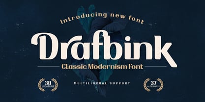 Say hello to classic elegance with the Draftbink font. With a compelling classic serif theme, this font is the perfect choice for creating projects with an elegant touch of classic modernism. Draftbink brings powerful features to give you unlimited flexibility and creativity. The ligature and alternate features allow you to combine interesting characters and create unique and attractive typography compositions. Not only that, Draftbink also supports multilingualism, so you can easily adapt this font to various languages. This opens up the opportunity to reach a wider audience and increase the attractiveness of your project. With its distinctive classic serif characteristics, Draftbink gives your design an elegant and bold impression. Each letter is carefully designed to display stunning beauty and sharpness. Make Draftbink your best choice to present an unforgettable classic modernism feel. Get this font now and show elegance in every detail of your project. What’s Included : File font All glyphs Iso Latin 1 Alternate, Ligature Simple installations We highly recommend using a program that supports OpenType features and Glyphs panels like many Adobe apps and Corel Draw so that you can see and access all Glyph variations. PUA Encoded Characters – Fully accessible without additional design software. Fonts include Multilingual support
 - Bembo Book by Monotype,
$34.99The origins of Bembo go back to one of the most famous printers of the Italian Renaissance, Aldus Manutius. In 1496, he used a new roman typeface to print the book de Aetna, a travelogue by the popular writer Pietro Bembo. This type was designed by Francesco Griffo, a prolific punchcutter who was one of the first to depart from the heavier pen-drawn look of humanist calligraphy to develop the more stylized look we associate with roman types today. In 1929, Stanley Morison and the design staff at the Monotype Corporation used Griffo's roman as the model for a revival type design named Bembo. They made a number of changes to the fifteenth-century letters to make the font more adaptable to machine composition. The italic is based on letters cut by the Renaissance scribe Giovanni Tagliente. Because of their quiet presence and graceful stability, the lighter weights of Bembo are popular for book typography. The heavier weights impart a look of conservative dependability to advertising and packaging projects. With 31 weights, including small caps, Old style figures, expert characters, and an alternate cap R, Bembo makes an excellent all-purpose font family. Bembo® Book font field guide including best practices, font pairings and alternatives. - Kunhety by Twinletter,
$18.00 Introducing Kunhety, a groovy retro font display perfect for bringing a vintage touch to your designs. This font features bold and quirky letters that will make your projects stand out and evoke a feeling of nostalgia. Whether you’re working on a poster, or an album cover, or want to add some retro vibes to your latest project, Kunhety is the perfect font for you. With a range of alternative characters and multilingual support, this font is versatile and ready to add some groovy flavor to your work. Don’t miss out on the opportunity to elevate your designs with Kunhety. Furthermore, Kunhety is user-friendly and easy to use. Making it compatible with a wide range of software and devices. And with its clear and distinct letterforms, it’s sure to grab the attention of your audience and leave a lasting impression. So, add a touch of retro cool to your next project with Kunhety today! What’s Included : - File font - All glyphs Iso Latin 1 - Alternate, Ligature - Simple installations - We highly recommend using a program that supports OpenType features and Glyphs panels like many Adobe apps and Corel Draw so that you can see and access all Glyph variations. - PUA Encoded Characters – Fully accessible without additional design software. - Fonts include Multilingual support