9,063 search results
(0.05 seconds)
- Geogrotesque Sharp by Emtype Foundry,
$69.00 Geogrotesque Sharp is a superfamily of seven widths and 99 styles, that puts together the work of a decade. Some design aspects has been simplified but without losing its soul, we have removed ink traps and rounded corners. This update lead Geogrotesque to another dimension, becoming more usable and less idiosyncratic. A Variable Font version is included with the family, or as a separate style. Despite being more web oriented, this new format has gained popularity in recent years, so we thought it was the right moment to launch a variable Geogrotesque. For more info visit emtype website or see the Geogrotesque Sharp PDF.
 - Alifira Style by Sensatype Studio,
$15.00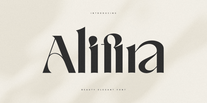 A Beauty Elegant font that we created special for elegant branding needs, with extra ligatures in unique shape will be ready to add value of your brand. It so nice to leverage designer or product owner that need solutions to make their design look more classy and modern. And specially for Alifira font, We prepared any ligatures and any unique characters to help you create unlimited variations for your creative needs. Alifira Beauty Elegant font ready with: Any options to get creative variations (combination of Ligatures) Preview as a inspirations that you can do with Alifira font Ready with Lowercase and Uppercase characters Wish you enjoy our font. :)
 - Quloon Style by Sensatype Studio,
$15.00 New Ligature font that we created special for modern projects with extra ligature and alternates in unique shape will be ready to add value of your brand. It so nice to leverage designer or product owner that need solutions to make their design look more elegant and luxury. And specially for Quloon font, We prepared any ligatures and any alternate characters to help you create unlimited variations for your creative needs. Quloon modern ligature font ready with: Any options to get creative variations (combination of Alternate and Ligatures) Preview as a inspirations that you can do with Quloon font Ready with Lowercase and Uppercase characters Wish you enjoy our font. :)
 - Voyage Style by Sensatype Studio,
$15.00 A Beauty serif font that we created special for elegant branding needs, with extra alternates in unique shape will be ready to add value of your brand. It so nice to leverage designer or product owner that need solutions to make their design look more classy and modern. And specially for Voyage font, We prepared any alternate characters to help you create unlimited variations for your creative needs. Voyage Modern Classy Serif Font ready with: Any options to get creative variations (combination of Alternate characters) Preview as a inspirations that you can do with Voyage font Ready with Lowercase and Uppercase characters Wish you enjoy our font. :)
 - Crimson by Sensatype Studio,
$15.00 An Elegant serif font that we created special for elegant branding needs, with extra alternates in unique shape will be ready to add value of your brand. It so nice to leverage designer or product owner that need solutions to make their design look more classy and modern. And specially for Crimson font, We prepared any alternate characters to help you create unlimited variations for your creative needs. Crimson - Elegant Ligature Font ready with: Any options to get creative variations (combination of Alternate characters) Preview as a inspirations that you can do with Crimson font Ready with Lowercase and Uppercase characters Wish you enjoy our font. :)
 - Machera by Sensatype Studio,
$15.00 A serif font that we created special for elegant branding needs, with extra ligature and alternates in unique shape will be ready to add value of your brand. It so nice to leverage designer or product owner that need solutions to make their design look more classy and modern. And specially for Glimse font, We prepared any ligatures, and any alternate characters to help you create unlimited variations for your creative needs. Machera serif font ready with: Any options to get creative variations (combination of Alternate and Ligatures) Preview as a inspirations that you can do with Machera font Ready with Lowercase and Uppercase characters Wish you enjoy our font. :)
 - GS Slim One by GalaStudio,
$15.00 We, GalaStudio (Lilia & Galina) represent the SlimOne Normal font from our MELTING FONTS collection. On typing in Google the words "to slim" you can see immediately that the most in demand on the subject is: "to slim in one month", "to slim tips", "to slim - what should I do". We are obsessed with the idea to lose weight. It means now to become more healthy, more fashionable, self-confident and successful. Font as an important element of environmental design reflects contemporary reality. We want to respond to this challenge in our font design. Thus, in our GalaStudio the MELTING FONTS series was born. The fonts of the SlimOne family have a concept of disappearing graphic elements. The letters of these fonts look like melting, dissolving into the space. INCLUDED: GS_SlimOne_Normal.otf GS_SlimOne_Normal.ttf Numbers, additional glyphs & basic punctuation are included. PERFECT FOR: using in books titles, textbooks, notebooks, different brochures and advertising, especially for kids, home-ware design, packaging design; magazines, posters and flyers titles; logos design, books design, fashion design, slogans etc. :) Multilingual support included for the languages based on Latin alphabet.
 - Edelgotisch by HiH,
$10.00 Edelgotisch is a bold Jugendstil design that shows its strong blackletter roots. This typeface, along with a set of initial letters, was released by Schelter & Giesecke of Leipzig, Germany about 1898 and is very similar to Eckmann-Schrift released by Rudhard'schen Giesserie (later Klingspor) during the same period. One suspects they may have been in direct competition. The decorative devises of the initial letters for Edelgotisch have a simpler, bolder line than for Eckmann. In the initial letter set, the ligatures aesc (AE) and ethel (OE) were generated by embedding the ‘A’ and ‘O’ respectively inside the upper left corner of the ‘E.’ The accented caps were given similar treatment, with the exception of the cedilla. Regarding the I-diaeresis, we considered rotating the accent ninety degrees to avoid and possible misconstruction. On further reflection however, we realized it was silly and unnecessary. No one would look at the accented letterform and see anything but what it is. We have also included four decorative ornaments and a frame with each font.
 - Mareka Japanese Style by Twinletter,
$15.00 Mareka, our newest font, is now released. Beautiful, tidy, and elegant font with a distinctive shape. If you employ this typeface, your once-good project will become something truly unique. This typeface is appropriate since the shape of each letter may be used in a variety of ways, including serious, relaxed, and natural. Because everyone does not necessarily understand Japanese letters, we supply fonts with letters that can be utilized for your project. We produced this display font with a Japanese theme or an Asian font, which we designed to fulfill the needs of your Japanese-themed project. Of sure, your initiative will be understood by people all around the world. Logotypes, food banners, branding, brochure, posters, movie titles, book titles, quotes, and more may all benefit from this font. Of course, using this font in your various design projects will make them excellent and outstanding; many viewers are drawn to the striking and unusual graphic display. Start utilizing this typeface in your projects to make them stand out.
 - TT Norms Std Condensed by TypeType,
$35.00 TT Norms® Std Condensed useful links: Specimen | Graphic presentation | Customization options TT Norms® Std Condensed is the logical development of our bestselling TT Norms®. Since the release of TT Norms®, we received a bunch of requests to create its narrow version and even managed to make several custom projects of the narrow TT Norms® before we decided to start creating a full-fledged commercial version of the typeface. At the very beginning of the project, we did some research and tested several options for the possible width of the typeface. Despite the fact that TT Norms® Std Condensed has narrower proportions than the original family, it inherited the classic proportions of characters, attention to detail and meticulous elaboration of each character in the typeface. The TT Norms® Std Condensed font family consists of 18 faces (9 upright and 9 italics). Each style includes a sufficient set of characters that allow you to solve most of the problems that arise in the field of graphic design, branding, packaging design or website design.
 - Rome Ionic by 38-lineart,
$17.00 Rome Ionic is a serif display font inspired by architectural features in ancient Roman building columns. The Ionic columns are taller and slender compared to 'Doric and Corinthian' columns. On the Ionic Capitol column, there is a geometric spiral like a paper roll. We used those elements in this roman style font. The base of this font is serif shaped, more slender and towering, and equipped with 8-18 stylistic set alternates. This is the development of the basic shape on which we added spiral ornaments to the left and right. This serif font's characteristic is soft and simple, not sharp and complicated like Doric and Corinthian. The composition of the softness of the basic and alternate fonts does not reduce the splendor of this font. We complemented this font with support for the Latin extend as an analogy to the Roman region. Rome Ionic is perfect for 'impressive luxury and power' designs. With this font, your branding will show the robustness and refute the splendor of other products.
 - Hillstone by 38-lineart,
$14.00 Hillstone is a handwritten font with a rough texture, the process of making letters with scratched with strong and fast stroke on paper to make the rough texture that characterizes of Hillstone, so this is a font with a rough and dry brush style. We repaired the letters computerically and if they didn't unite well and we made several alternate glyph. There is no problem for long or short text, so this font can be used in various designs widely. you can use this font for instagram, quotes and other long text, this font is also unique for one word text or short typing, that you can use for product brands, company logos, books and magazine covers, everytype will look very typical. use ligatures and alternatives to your taste.38. Anything made with this font will definitely be wrapped in a very contemporary style and elegance. We make several priview images as a guide for designing directions, please check them all Best regard and thank you very much.. 38.lineart studio
 - The Parthenon by 38-lineart,
$19.00 The Parthenon Font is a calligraphy script font in lettering style. This font consists of 6 to 7 alternates, this combination creates an amazing lettering style. The lettering style formed by The Parthenon is very suitable for brands and packaging design. To complement this need, we also include swashes and ligatures to support the creation of logotypes. Please feel free to combine alternates in any way you see fit! You will see several different views, please choose any model that matches your character. In the preview images, we provide some examples for using this font for logotype. Like the Parthenon temple in Greece, designed with calculable scales, this very measurable series of letters allows you to make pleasing words that are like a parthenon which is visually pleasing from all points of view. I hope you can enjoy and feel the joy of playing with The Parthenon! Finally, thank you for your positive response and please write to us via email if there is anything else we can support.
 - 1066 Hastings by GLC,
$38.00 In 1066, William, duke of Normandy, was invading England. He was demanding the crown for himself, against King Harold the Saxon. He killed Harold and reached the crown at Hastings, the well-known battlefield. A few years later, in Bayeux (Normandy, French)was displayed a large tapestry (almost 70 m long) who was telling the story of the conquest. Along the tapestry was written a comment in Latin, using Roman capitals influenced a little by English or Scandinavian style (as it is visible in the Eth character). We have created the font, inspired from this design, adapted for contemporary users, making difference between U and V, I and J, which has not any relevance for ancient Latin scribes, and naturally with Thorn, Oslash, Lslash... and usual accented characters did not exist at the time. We also have reconstructed the K, German double s and Z, always using patterns of the time. We have scrupulously respected the poetic irregular and distressed original forms with two or three alternate for each characters, including reconstructed numerals.
 - Antica by Sudtipos,
$39.00 Antica has sharp triangular serifs, and in 8 weights with true italics, it forms a family that stylistically finds its origins in Latin styles of the nineteenth century. The font incorporates additional swashes, small caps and stylish alternates that advance the aesthetic from its roots and make it appropriate for modern design. Commonly named ‘Latin types’ did not vary in weight, but we decided to create Antica with a range that goes from thin to black and we also added extra curlicues to the letterforms. Antica borrows from the versatility and freedom granted to type founders of the nineteenth century – a time when the meteoric growth of mass-produced consumer goods led to an increased demand for publicity that needed fresh, attention grabbing typefaces. And as an homage to these Latin types we designed Antica to function well with an array of projects from stylized labels and formal editorial design requiring small type sizes to large-scale posters and billboards. The Antica family supports a wide variety of Latin alphabet-based languages.
 - Royal Avenue by Prestigetype Studio,
$21.00 Introducing Royal Avenue, a display serif font that exudes the sophistication and fancy feels you're looking for. Each is carefully character crafted with a unique touch. It's versatility and stylish appearance make it an excellent choice for any project, from logos and branding to packaging and social media graphics. Royal Avenue is the perfect choice for any project. With multilingual support, ligatures, and an extensive alternate feature set, this font allows for freedom to explore and experiment with different variations, adding a unique touch to your designs and making them truly one-of-a-kind. It enables greater flexibility and creativity in your design work. This font is perfect for catching your audience's attention and is ideal for any design project that requires a touch of elegance and style, making it a must-have for any designer or creative. We recommend using it for titles, headlines, and other attention-grabbing elements. To get the most out of Royal Avenue, we recommend using programs that support OpenType features and Glyphs panels, such as Adobe apps and Corel Draw. This will enable you to access all the glyphs and variations of the font and make your design projects truly unique. We hope you enjoy using Royal Avenue as much as we enjoyed creating it. For any questions or inquiries, please email us at info@prestigetype.com. Get your hands on Royal Avenue today and elevate your design projects to new heights.
 - Benguiat Caslon by House Industries,
$33.00 Designed to be set in big, large and huge sizes in classic TNT (tight-not-touching) style, Benguiat Caslon is dynamite for a wide range of display demands. We also included outline and drop-shadow versions as well as numerous swash caps, ligatures, contextual alternates and automatically-shifting punctuation. Ed Benguiat originally designed this alphabet for the Photo-Lettering library during his tenure as the legendary type house’s art director. When we purchased Photo-Lettering in 2003, one of the first things we did was start picking some of our favorite films to digitize as fonts. Photo-Lettering partner Christian Schwartz chose this expressive serif specimen for its high contrast strokes that stand up to the most vigorous display typography demands without withering against pesky design limitations like screen resolution, ink spread and dot gain. FEATURES: Alternate characters, ligatures and contextual substitutions add an unexpected flair to words and phrases. We also provided a drop shadow to add depth and dimension. Shifting punctuation marks take care of those optical tricks so you don't have to. A delicately expressive outline version adds color even in black and white. BENGUIAT CASLON CREDITS: Typeface Design: Ed Benguiat Typeface Digitization: Christian Schwartz, Bas Smidt Typeface Production: Ben Kiel, Jason Campbell Like all good subversives, House Industries hides in plain sight while amplifying the look, feel and style of the world’s most interesting brands, products and people. Based in Delaware, visually influencing the world.
 - Jantze by Fontosaurus,
$19.95The Jantze font is a project undertaken by Dan Bailey of Fontosaurus and Michael Jantze, creator of the nationally-syndicated comic strip, The Norm. All their royalties from the font will go to The Lance Armstrong Foundation. For those that have been living under a rock for the last five years, Lance is a professional bike racer that overcame advanced testicular cancer to not only come back to his sport, but to dominate its premiere event, the Tour de France. In climbing to the top of his sport, he has become a legend among cyclists and a beacon of hope for those battling cancer and their families. His foundation provides financial grants to researchers working to improve our odds against the disease, individuals stricken with cancer, and survivors of the disease that are advocates for survivorship issues in their communities. Michael Jantze and Dan Bailey would like you to consider the quote from Ralph Waldo Emerson that brought us to this project: "The purpose of life is not to be happy. It is to be useful, to be honorable, to have it make some difference that you have lived and lived well. We hope that you will help us help Lance Armstrong's legacy be more than that of just sports legend. We hope that you will help those that may someday help you as much as we hope that you will never have to suffer the ravages of cancer. We hope. - Jasna by Naghi Naghachian,
$95.00 Jasna is designed by Naghi Naghashian. This Font is developed on the basis of specific research and analysis on Arabic characters and definition of their structure. This innovation is a contribution to modernisation of Arabic typography, gives the font design of Arabic letters real typographic arrangement and provides more typographic flexibility. This step was necessary after more than two hundred years of relative stagnation in Arabic font design. Jasna supports Arabic, Persian, and Urdu. It also includes proportional and tabular numerals for the supported languages. Jasna Font is available in two weights, Jasna Regular and Jasna Bold. Jasna design fulfills the following needs: A Explicitly crafted for use in electronic media fulfills the demands of electronic communication. Jasna is not based on any pre-digital typefaces. It is not a revival. Rather, its forms were created with today's technology in mind. B Suitability for multiple applications. Gives the widest potential acceptability. C Extreme legibility not only in small sizes, but also when the type is filtered or skewed, e.g., in Photoshop or Illustrator. Jasna's simplified forms may be artificial obliqued in InDesign or Illustrator, without any loss in quality for the effected text. D An attractive typographic image. Jasna was developed for multiple languages and writing conventions. E The highest degree of geometric clarity and the necessary amount of calligraphic references. This typeface offers a fine balance between calligraphic tradition and the contemporary sans serif aesthetic now common in Latin typography.
 - Parsi by Naghi Naghachian,
$105.00 Parsi Font family is designed by Naghi Naghashian. This Font is developed on the basis of specific research and analysis on Arabic characters and definition of their structure. This innovation is a contribution to modernization of Arabic typography, gives the font design of Arabic letters real typographic arrangement and provides more typographic flexibility. This step was necessary after more than two hundred years of relative stagnation in Arabic font design. Parsi supports Arabic, Persian, and Urdu. It also includes proportional and tabular numerals for the supported languages. Parsi Font is available in Light, Regular and Bold. Parsi design fulfills the following needs: A Explicitly crafted for use in electronic media fulfills the demands of electronic communication. Parsi is not based on any pre-digital typefaces. It is not a revival. Rather, its forms were created with today’s technology in mind. B Suitability for multiple applications. Gives the widest potential acceptability. C Extreme legibility not only in small sizes, but also when the type is filtered or skewed, e.g., in Photoshop or Illustrator. Parsi's simplified forms may be artificial obliqued in InDesign or Illustrator, without any loss in quality for the effected text. D An attractive typographic image. Parsi was developed for multiple languages and writing conventions. E The highest degree of geometric clarity and the necessary amount of calligraphic references. This typeface offers a fine balance between calligraphic tradition and the contemporary sans serif aesthetic now common in Latin typography.
 - Squalo by Letritas,
$30.00 Squalo, the genesis The idea of this project called Squalo popped into my mind while I was working with excitement on some sketches. I was chasing after a strong typographical character, something that for me has to be crystallized in form which is always legible and functional. The concept The concept of Squalo arises from the observation of an athlete’s body: you notice that even if most are lean, they are also strong, cut and chiselled. The sport they play molds and modify their bodies. Just think, for instance, on a professional swimmer: during the competition every single muscle, tendon, tissue, cell is working to swim faster. Every single part is there to give strength and speed like in a “squalo” (shark in italian). Not as an eel, nor as a mermaid, nor as a hake. Just like a shark. If you take a quick look, you will notice that the width of the typeface is slightly more condensed than that of a standard sans serif. We designed Squalo this way specifically to assist and strengthen your concepts through stylized typography. We designed the joins and terminals (tip ends) of the characters A, V, W, Z, v, w, z, to create a feeling of “tension”, reinforcing the concept of shark, danger, caution, as well explicit, intentional movement. Pure strength. We wanted to recall the exact moment of the start of the 100 meters race: when the sprinter initially spreads all of his powerful energy. The italic version, starting with the former two typographical concepts of width and tension, emphasizes them. First of all, we compressed the characters 10 percent more, and slanted it 10 degrees to the right. With this movement I intended to convey the gorgeous feeling of tension in power and rapidity. The typeface has 9 weights, from “hair” to “black”, and two versions, “regular” and “italic”. All 18 fonts include small caps, unicase, tabular and oldstyle numbers, numerators and denominators, and much more. Squalo is an ideal typeface that I recommend for use in marketing campaigns, design of packaging, magazines, branding for tv programs, films, book texts, editorial, publications, logos, corporate projects, web texts, and graphic design in motion. Squalo supports the following languages: Abenaki, Afaan Oromo, Afar, Afrikaans, Albanian, Alsatian, Amis, Anuta, Aragonese, Aranese, Aromanian, Arrernte, Arvanitic (Latin), Asturian, Atayal, Aymara, Bashkir (Latin), Basque, Bemba, Bikol, Bislama, Bosnian, Breton, Cape Verdean Creole, Catalan, Cebuano, Chamorro, Chavacano, Chichewa, Chickasaw, Cimbrian, Cofán, Corsican Creek,Crimean Tatar (Latin),Croatian, Czech, Dawan, Delaware, Dholuo, Drehu, Dutch, English, Estonian, Faroese, Fijian Filipino, Finnish, Folkspraak, French, Frisian, Friulian, Gagauz (Latin), Galician, Ganda, Genoese, German, Gikuyu, Gooniyandi, Greenlandic (Kalaallisut)Guadeloupean, Creole, Gwich’in, Haitian, Creole, Hän, Hawaiian, Hiligaynon, Hopi, Hotcąk (Latin), Hungarian, Icelandic, Ido, IgboI, locano, Indonesian, Interglossa, Interlingua, Irish, Istro-Romanian, Italian, Jamaican, Javanese (Latin), Jèrriais, Kala Lagaw Ya, Kapampangan (Latin), Kaqchikel, Karakalpak (Latin), Karelian (Latin), Kashubian, Kikongo, Kinyarwanda, Kiribati, Kirundi, Klingon, Ladin, Latin, Latino sine Flexione, Latvian, Lithuanian, Lojban, Lombard, Low Saxon, Luxembourgish, Maasai, Makhuwa, Malay, Maltese, Manx, Māori, Marquesan, Megleno-Romanian, Meriam Mir, Mirandese, Mohawk, Moldovan, Montagnais, Montenegrin, Murrinh-Patha, Nagamese Creole, Ndebele, Neapolitan, Ngiyambaa, Niuean, Noongar, Norwegian, Novial, Occidental, Occitan, Old Icelandic, Old Norse, Oshiwambo, Ossetian (Latin), Palauan, Papiamento, Piedmontese, Polish, Portuguese, Potawatomi, Q’eqchi’, Quechua, Rarotongan, Romanian, Romansh, Rotokas, Sami (Inari Sami), Sami (Lule Sami), Sami (Northern Sami), Sami (Southern Sami), Samoan, Sango, Saramaccan, Sardinian, Scottish Gaelic, Serbian (Latin), Seri, Seychellois Creole, Shawnee, Shona, Sicilian, Silesian, Slovak, Slovenian, Slovio (Latin), Somali, Sorbian (Lower Sorbian), Sorbian (Upper Sorbian), Sotho (Northern), Sotho (Southern), Spanish, Sranan, Sundanese (Latin), Swahili, Swazi, Swedish, Tagalog, Tahitian, Tetum, Tok Pisin, Tokelauan, Tongan, Tshiluba, Tsonga, Tswana, Tumbuka, Turkish, Turkmen (Latin), Tuvaluan, Tzotzil, Uzbek (Latin), Venetian, Vepsian, Volapük, Võro, Wallisian, Walloon, Waray-Waray, Warlpiri, Wayuu, Welsh, Wik-Mungkan, Wiradjuri, Wolof, Xavante, Xhosa, Yapese, Yindjibarndi, Zapotec, Zulu, Zuni
 - Share-Regular - Unknown license

- Steelplate Textura - Personal use only

- Paulus Franck Initialen - Personal use only

- Naratif Condensed by Akufadhl,
$25.00 Naratif is a condensed display based on an early 1900 sans-serifs and gothic faces and it has 7 weights including italic. Great for anything big and for not so small text or display. With a wide range of latin support, and OpenType features such as Small Caps, Fractions, Alternates Character, Inferior and Arrows.
 - TV Western JNL by Jeff Levine,
$29.00 In the 1889 Franklin Type Foundry specimen book is a type face called “Armenian”. With lighter weight horizontal slab serifs than more traditional Western fonts, it could be pictured as being used as copy on wanted posters or town notices. This is now available as TV Western JNL in both regular and oblique versions.
 - Perfect Island by Balpirick,
$15.00 Perfect Island is a Modern Handwritten Font. Perfect Island is a lovely script font featuring charming, playful characters that seem to dance along the baseline. Add this font to your most creative ideas, and notice how it makes them stand out! Perfect Island also multilingual support. Enjoy the font, feel free to email. Thank you!
 - FS Koopman by Fontsmith,
$80.00 FS Koopman is a hard-working typeface. A crossbred workhorse that draws on inspiration from Swiss grotesks, American gothics and early British grotesques. It refuses to fit neatly into any of these categories, it’s neither one nor the other, but all of the above. It’s kinda Swiss meets American… (but with a slight Yorkshire twang).
 - Tabor Sinfonia by Mans Greback,
$59.00 Tabor Sinfonia is a blackletter typeface that marries the historic beauty of Gothic script with the rhythm and harmony of music. This decorative font is perfect for logotypes, artistic projects, and designs that require a touch of vintage elegance. The inspiration for Tabor Sinfonia came from a fascinating combination of medieval manuscripts and musical compositions.
 - Beyond Comfort by Tom Chalky,
$16.00 Introducing Beyond Comfort - A classy and stylish font duo inspired by 80's editorial type. At first glance, they look pixel perfect, but on further inspection, you'll notice perfect imperfections, revealing that the fonts are in fact entirely hand-drawn; As all of my fonts are, adding to the overall character of the duo.
 - Saneyi by Andfonts,
$14.00 Saneyi is a fun, rich and emotional display font. This font is perfect for parties, birthdays, celebrations, names. Use it for your designs and explore its endless possibilities. It can easily be matched to an incredibly large set of projects, so add it to your creative ideas and notice how it makes them stand out!
 - Maximillian CT by CastleType,
$19.00 Another one of those faces that caught my eye in one of my art deco type books, and I wanted it. After I finished the face, I noticed that there is a more clean-cut version of this face in digital format, but my version retains more of the funkiness of the original drawings.
 - Misty Gold by ErlosDesign,
$15.00 Misty Gold is a delicate, elegant and flowing signature font. It has beautiful and well balanced characters and as a result, it matches a wide pool of designs.Misty Gold features a varying baseline, smooth lines, gorgeous glyphs and stunning alternates. Add it to your most creative ideas and notice how it makes them come alive!
 - Jakarta Night by Hatftype,
$16.00 Jakarta Night is a relaxed and flowing handwritten script font. Incredibly versatile, this font fits a wide pool of designs, elevating them to the highest levels. Add this font to your favorite creative ideas and notice how it makes them come alive! Features: A-Z Character Set Numerals & Punctuations (OpenType Standard) Stylistic Alternates Multilingual Ligatures
 - Grendel Regular by Robert Petrick,
$19.95 “Grendel Regular” Evolved out of a hand lettering piece I designed for a record album (Royal Crescent Mob). Inspired by old gothic forms, my intention was to create a playful letter form that could be used in an antique as well as a modern context such as food product packaging or fun video projects, etc.
 - Upperclass by Enrich Design,
$24.95Upperclass was a font I created back in 1995. I had a brainstorm about the uppercase letter “A”. I noticed that the cross bar for the letter A is always toward the bottom, what if I moved it toward the top. The result is a unique font, a great addition to your font collection. - Rogain by Lone Army,
$17.00 Rogain is a unique font that seamlessly blends modern elegance with tropical charm and a touch of gothic influence. Inspired by lush tropical landscapes, Rogain features sleek serifs and subtle floral motifs. Perfect for a wide range of designs, it captures the essence of sophistication and natural beauty. Experience the fusion of styles with Rogain.
 - UpsidedownTOC by Ingrimayne Type,
$9.95 Have you ever wanted to print text upside down? There is, or course, software the lets you rotate text, but another way is to use an upside-down font like UpsidedownTOC. Notice that to use it to get upside-down printing, you must type in the words backwards. UpsidedownTOC is derived from the font TiredOfCourier.
 - UpsidedownJJ by Ingrimayne Type,
$9.95 Have you ever wanted to print text upside down? There is, or course, software the lets you rotate text, but another way is to use an upside-down font like UpsidedownJJ. Notice that to use it to get upside-down printing, you must type in the words backwards. UpsidedownJJ is derived from the font JetJane.
 - Guglia by Leo Colalillo,
$20.00 Guglia is an extra textura typeface ispired by the gothic architecture shapes and in particular to his vertical extremization based on a rigid scheme, like the calligraphy of that period. A spire (Guglia in italian) is a tapering conical or pyramidal structure on the top of a building, often a skyscraper or a church tower.


