9,434 search results
(0.04 seconds)
- Olde Megrat NF by Nick's Fonts,
$10.00This rough-hewn offering is patterned after Antikva Margaret, designed by Zoltán Nagy for VGC in the mid-60s. Its energetic and, at times, eccentric letterforms make this face a perfect choice for headlines and subheads that will be noticed. Both versions include the complete Latin 1252, Central European 1250 and Turkish 1254 character sets, as well as localization for Moldovan and Romanian. - TA Bankslab by Tural Alisoy,
$33.00 The building of the Northern Bank of St. Petersburg's Baku branch was built in 1903-1905. It was the first Art Nouveau-style building in Baku, Azerbaijan. Later the bank was transformed into the Russian-Asian Bank. After the oil boom in Baku in the 19th century, branches of many banks and new banks were opened in the city. The branch of the Northern Bank of St. Petersburg was among the first banks that was opened in Baku. N.Bayev was the architect of the building for the branch of the Northern Bank of St. Petersburg located at Gorchakovskaya 3 in 1903-1905. The building currently houses the Central Branch of the International Bank of Azerbaijan. My purpose in writing this is not to copy and paste the information from Wikipedia. What attracted me to the building was the word "Банкъ" (Bank) written in Cyrillic letters, which was also used in Azerbaijan during the Soviet era. The exact date of the writing is not known. Every time I pass by this building, I always thought of creating a font of this writing someday. I had taken a photo of the building and saved it on my phone. I did a lot of research on the font and asked a lot of people. However, some did not provide information at all and some said they did not have any information. I was interested in the history of this font but I do not know if this font really existed or it was created by the architect out of nowhere. If there was such a history of this font, I wanted to recreate this font and make it available. If not, I had to create it from scratch in the same way, using only existing letters on the building. Finally, I made up my mind and decided to develop the font with all letters I have got. It was difficult to create a font based on the word, Банкъ. Because in the appearance of the letters, the midline of the letters on A, H, K was very distinct, both in the form of inclination and in more precise degrees. The serif part of the letters, the height of the upper and lower sides, differed from each other. I don't know whether it was done this way when the building was constructed or it happened over time. I prepared and kept the initial version of the font. I took a break for a while. I started digging on the story of the font again. Meanwhile, I was researching and got inspired by similar fonts. Unfortunately, my research on the font's history did not yield any results. I decided to continue finishing up the font. After developing the demo, I created the font by keeping certain parts of these differences in the letters. In addition, I had to consider the development of letters in the Cyrillic, as well as the Latin alphabet, over the past period. Thus, I began to look at the appearance of slab-serif or serif fonts of that time. In general, as I gain more experience in developing fonts, I try to focus on the precision of the design for each font. In recent years, I specifically paid attention to this matter. YouTube channel and articles by Alexandra K.'s of ParaType, as well as, information and samples from TypeType and Fontfabric studios on the Cyrillic alphabet were quite useful. I gathered data regarding the Latin alphabet from various credible sources. I do not know if I could accomplish what I aimed at but I know one thing that I could develop the font. Maybe someday I'll have to revise this font. For now, I share it with you. I created the font in 10 styles. 7 weight from Thin to Extra Black, an Outline, Shadow, and Art Nouveau. The Art Nouveau style was inspired by the texture in the background used for the text on the building. The texture I applied to capital letters adds beauty to the font. If you like the font feel free to use it or simply let me know if your current alphabet doesn't support this font.
 - TA Bankslab Art Nouveau by Tural Alisoy,
$40.00 TA Bankslab graphic presentation at Behance The building of the Northern Bank of St. Petersburg's Baku branch was built in 1903-1905. It was the first Art Nouveau-style building in Baku, Azerbaijan. Later the bank was transformed into the Russian-Asian Bank. After the oil boom in Baku in the 19th century, branches of many banks and new banks were opened in the city. The branch of the Northern Bank of St. Petersburg was among the first banks that was opened in Baku. N.Bayev was the architect of the building for the branch of the Northern Bank of St. Petersburg located at Gorchakovskaya 3 in 1903-1905. The building currently houses the Central Branch of the International Bank of Azerbaijan. My purpose in writing this is not to copy and paste the information from Wikipedia. What attracted me to the building was the word "Банкъ" (Bank) written in Cyrillic letters, which was also used in Azerbaijan during the Soviet era. The exact date of the writing is not known. Every time I pass by this building, I always thought of creating a font of this writing someday. I had taken a photo of the building and saved it on my phone. I did a lot of research on the font and asked a lot of people. However, some did not provide information at all and some said they did not have any information. I was interested in the history of this font but I do not know if this font really existed or it was created by the architect out of nowhere. If there was such a history of this font, I wanted to recreate this font and make it available. If not, I had to create it from scratch in the same way, using only existing letters on the building. Finally, I made up my mind and decided to develop the font with all letters I have got. It was difficult to create a font based on the word, Банкъ. Because in the appearance of the letters, the midline of the letters on A, H, K was very distinct, both in the form of inclination and in more precise degrees. The serif part of the letters, the height of the upper and lower sides, differed from each other. I don't know whether it was done this way when the building was constructed or it happened over time. I prepared and kept the initial version of the font. I took a break for a while. I started digging on the story of the font again. Meanwhile, I was researching and got inspired by similar fonts. Unfortunately, my research on the font's history did not yield any results. I decided to continue finishing up the font. After developing the demo, I created the font by keeping certain parts of these differences in the letters. In addition, I had to consider the development of letters in the Cyrillic, as well as the Latin alphabet, over the past period. Thus, I began to look at the appearance of slab-serif or serif fonts of that time. In general, as I gain more experience in developing fonts, I try to focus on the precision of the design for each font. In recent years, I specifically paid attention to this matter. YouTube channel and articles by Alexandra K.'s of ParaType, as well as, information and samples from TypeType and Fontfabric studios on the Cyrillic alphabet were quite useful. I gathered data regarding the Latin alphabet from various credible sources. I do not know if I could accomplish what I aimed at but I know one thing that I could develop the font. Maybe someday I'll have to revise this font. For now, I share it with you. I created the font in 10 styles. 7 weight from Thin to Extra Black, an Outline, Shadow, and Art Nouveau. The Art Nouveau style was inspired by the texture in the background used for the text on the building. The texture I applied to capital letters adds beauty to the font. If you like the font feel free to use it or simply let me know if your current alphabet doesn't support this font.
 - De Fonte Plus by Ingo,
$39.00 A variation of ”Helvetica according to the blur principle.“ The underlying typeface is ”Helvetica“, the only true ”run-of-the-mill“ typeface of the twentieth century. The distortion principle used simulates the photographic effect of halation and/or overexposure. The light weight, »DeFonte Léger«, nearly breaks on the thin points, whereas on those points where the lines meet or cross, dark spots remain. The characters are ”nibbled at“ from the inner and outer brightness. On the normal and semibold typestyles, »DeFonte Normale« and »DeFonte Demi Gras«, the effect is limited almost exclusively to the end strokes and corners, which appears to be strongly rounded off. The bold version »DeFonte Gros« is especially attractive. As a result of ”overexposure“, counters (internal spaces) are closed in, while characters become blurred and turn into spots; new characteristic forms are created which are astoundingly legible. The fat version »DeFonte Gros« is particularly appealing. “Overexposure” leads to drifted counters, letters blur into spots; new characteristic forms emerge, which are surprisingly easy to read.
 - cafeta - Unknown license

- Flexible by Art Grootfontein,
$40.00 Inspired by late 19th century’s gothic typefaces from broadsides, Flexible uses the latest font technology to allow designers to play with each letter height and width easily. This versatile uppercase typeface is available in 8 widths and 8 heights, and as a variable font which gives you unlimited font possibilities! By using the variable version you only need to install one font file instead of the entire family and you take full advantage of the tremendous scope for design. Flexible was also developed with animation in mind to create amazing kinetic typography videos. Please have a look at this video to see animation examples. This family is a perfect choice for standout headlines, displays, packaging, flyers, logos, and works well in both print and digital environments like sophisticated web design or kinetic typography. The complete family pack includes the variable font. Language support : Afrikaans, Albanian, Azerbaijani, Basque, Bosnian, Catalan, Croatian, Czech, Danish, Dutch, English, Estonian, Faroese, Filipino, Finnish, French, Galician, German, Hungarian, Icelandic, Indonesian, Irish, Italian, Latvian, Lithuanian, Malay, Norwegian Bokmål, Polish, Portuguese, Romanian, Slovak, Slovenian, Spanish, Swahili, Swedish, Turkish, Welsh, Zulu
 - ITC Kabel by ITC,
$40.99 The first cuts of Kabel appeared in 1927, released by the German foundry Gebr. Klingspor. Like many of the typefaces that Rudolf Koch designed for printing use, Kabel is a carefully constructed and drawn. The basic forms were influenced by the Ancient Roman stone-carved letters, which consisted of just a few pure and clear geometric forms, such as circles, squares, and triangles. Koch also infused Kabel with some elements of Art Deco, making it appear quite different from other geometric modernist typefaces from the 1920s, like Futura. Linotype has two versions of Kabel in its library. Kabel has a shorter x-height, with longer ascenders and descenders, making it a bit truer to Koch's original design than the second version, ITC Kabel, which was designed by Victor Caruso. This version, also known in the United States as Cable, has a larger x-height, shorter ascenders and descenders, more weights ,and a diamond shaped i-dot. Typefaces in the same oeuvre include Avenir Next, ITC Avant Garde Gothic, Metrolite, Metromedium, Metroblack, and Erbar, just to name just a few."
 - Bordonaro Script by Estudio Calderon,
$35.00 Bordonaro Script - Bordonaro Spur’s partner - is an interpretation of the “English Roundhand” style with a strong influence by the logos of American basketball and baseball teams. It is designed from simple shapes ideal to be used in long titles and fits perfectly into the branding design. Psss...Check out the NEW Bordonaro Script with Rounded corners , same version but soft! Bordonaro has a complete set of special and original characters: Stylistic Ligatures, Discretionary Ligatures, Swashes, Contextual Alternates, Titling, ss01,ss02, ss03 & apostrophes' ligatures that work as complements to enrich the text composition. Bordonaro Script and Bordonaro Spur are two typographic styles that were designed under the same characteristic features with the idea of combining them to obtain better results, for that reason, we recommend merging them in a creative way and you will realize everything you can design with them. The banners designs are based on old brands of beer labels, coffee packaging, sports logos and in some cases we use Copperplate Gothic but only as a complementary font in order to harmonize the layout of the elements in each banner.
 - Lotter by Kaer,
$19.00 Lotter blackletter with Drop caps One fine day I found a vintage book, it called “A treatise by the Dominican friar-writer Marcus von Weida on the Brotherhood of the Holy Rosary”. It was printed in 1515 by Melchior Lotter in Leipzig. The text was illustrated by hand-colored engravings on religious and liturgical themes and beautiful initials I like. Lotter was the last name of a family of German printers, intimately connected with the Reformation. An innovation by the elder Lotter was his use of Roman types for Latin, reserving the Gothic types for German. I'm happy to present to you my new font family. Lotter font family has Drop cap and Regular styles. It's all you need to precisely imitate medieval style text. Use Drop cap style as a decorative element at the beginning of a paragraph or section, other part of the paragraph should be in Regular style. You’ll get: * Drop cap & Regular styles * Uppercase and lowercase * Multilingual support * Numbers * Symbols * Punctuation * Ligatures Please feel free to request any help you need: kaer.pro@gmail.com Best, Roman.
 - Vinicius by Jehoo Creative,
$19.00 Introducing the Vinicius font, a gorgeous typeface that combines the timeless allure of gothic typefaces with a contemporary twist. Inspired by the rich heritage of medieval calligraphy, Vinicius offers beautiful forms that attract attention and inspire courage. Vinicius offers a range of Stylistic Alternate, allowing you to explore artistic possibilities and customize your typography creations. One of Vinicius' standout features is his striking collection of ligatures. These skillfully crafted letter combinations enhance the flow and coherence of your text, giving it a harmonious and seamless appearance. Whether you're crafting a headline, invitation or logo, Vinicius ligatures add a signature touch that sets your design apart. Italic variants add a touch of dynamism and flair to your text, allowing you to emphasize specific words, phrases or paragraphs with a visually appealing slant. Vinicius font is ideal for a variety of creative projects, including branding, editorial design, packaging, and more. Its ability to seamlessly blend tradition and modernity makes it a powerful tool for conveying both classic and contemporary aesthetics.
 - Pacific Clipper SG by Spiece Graphics,
$39.00 Pacific Clipper has its roots in an old 1930s showcard lettering style. An extra bold version of this sign painter’s relic is shown in Carl Holmes' wonderful book on lettering. It may be described as what happens when Rudolf Koch's Kabel Heavy meets ATF's Novel Gothic. Also known as Sam’s Tune, Pacific Clipper’s noteworthy features include wedged crossbars in the capital A, E, F, and H. Overcurving is present in the capital B, D, P, and R while vertical strokes in the lowercase b, d, h, k, l, and t are chopped off obliquely. Figures in Pacific Clipper are also refreshingly different, particularly the number 4. This lettering favorite turned retro typeface has been extended to include a variety of weights. Pacific Clipper is now available in the OpenType format. Some new characters have been added to this OpenType version as Stylistic Alternates and Historical Forms. These advanced features work in current versions of Adobe Creative Suite InDesign, Creative Suite Illustrator, and Quark XPress. Check for OpenType advanced feature support in other applications as it gradually becomes available with upgrades.
 - Trovoada Mono by SullivanStudio,
$25.00 Trovoada Mono is a monospaced font for use in print (but also looks great on display). Hand-drawing glyph by glyph, my intention was to get that old manual typewriter look, with uneven inks, but with a totally up-to-date, emotional and admittedly humorous attitude. Trovoada Mono borrows from classics like Courier and Letter Gothic, reinventing serifs here and there. The result is a font that is both familiar and unusual. As I love Greek typography, I made sure to include a full polytonic alphabet, in the same vintage spirit: the text looks very legible and matches the Latin characters. The font has no kerning, obviously, and no ligatures (this is a typewriter, my friend!), but it has important OpenType features: fractions, subscripts/superscripts, slashed zero and stylistic alternatives for some characters. The italics are 11 degrees, which brings a strong personality. Some characters have true italics, giving the text an overall texture different from the upright type. All that is missing is that nervous typewriter noise. Enjoy!
 - Ansage by Sudtipos,
$49.00 Ansage does not claim to be neutral; it escapes from the rationalist sans of closed strokes and regular forms. Meaning Announcement in German, Ansage is versatile and communicates effectively across a broad range of media and formats such as branding, posters, websites, apps, titles and compositions with little spacing). Ansage is a sans serif font with a strong personality that emerges from an interest in and the study of a wide variety of typographic specimens of Gothic fonts from the nineteenth century. The design process behind Ansage brought about constant transformations in form; the result is a compact and robust font, with a large x-height, small ascenders and descenders, and open terminals that grow in expressiveness as it increases in weight. It is available in 10 weights, ranging from Hairline to Black, and 3 widths – Condensed, Regular and Expanded – plus italics, which make a total of 60 perfect variables to combine and contrast with each other. In addition, it also includes multiple open-type functions such as alternative styles, Old Style Figures, Tabular Forms, fractions, case sensitive, ligatures and more.
 - Bernhardt Standard by Linotype,
$40.99Bernhardt Standard, which was designed in 2003 by Julius de Goede, is a flowing Bastarde script. Bastarde is one of the sub-categories of Blackletter typefaces. The term Blackletter refers to typefaces that have evolved out of Northern Europe’s medieval manuscript tradition. Often called gothic, or Old English, these letters are identifiable by the traces of the wide-nibbed pen stroke within their forms. Of all of the various sorts of Blackletter styles, Bastarde scripts are the most flowing, or Italic. The first Bastarde typefaces, cut in the late 1400s, were based on French handwriting styles, especially those styles popular in Burgundy. The flowing nature of Bernhardt Standard makes it similar to some other sorts of Blackletter typefaces as well. Bernhardt Standard, because of its handwritten roots, is also similar to Kurrent, a style of handwriting that was popular in Germany prior the 20th Century. Bernhardt Standard is a very calligraphic face, suitable for formal applications. This typeface would be an excellent choice for certificates or awards. The old style figures in the font allow for nice short settings of text as well. - Seibi Isarago by Nihon Literal,
$169.00 Gothic in a contemporary style designed with a broad skeleton. Considering line alignment, we have aimed for a sense of harmony in both vertical and horizontal typesetting. フトコロ(画と画の間の空間)を広くデザインした現代的感覚のゴシック体。組み版時のライン揃えを考慮し、タテ組ヨコ組で違和感のない書体を目指しました。木版時代から手書きレタリングへと引き継がれてきた精美堂ゴシック体をデジタルフォントで再現。手書き文字を組んだ印象はそのままに、フトコロを広く現代風にアレンジしました。遠くからでも近くからでも読みやすい、目を引く見出し用ゴシックです。
 - Liliane Classe by Brenners Template,
$25.00 This is a challenge for elegant but radical typography layouts. Standard styles include classic and sophisticated serifs, while italic styles are designed with more adventurous handwritten touches. This serif font family included a total of 14 styles, including 7 weights and separately created italics. It can be the best choice for a unique and meaningful logo and branding design, and it will maintain a refined sense of unity. You need to understand OpenType Features to use these fonts well. Please check first whether the your apps plan to use supports these OpenType Features. Thanks. OpenType Features Discretionary Ligatures : ac, ad, ai, ak, ar, ay, az, ce, ci, ck, co, de, do, dr, er, ft, he, ho, ng, ro, se, sp, te, to, tr Standard Ligatures : fi, fl Alternates : a, d, h, i, k, n, u, z Oldstyle Figures Tabular Figures Fractions
 - Paul6 - Unknown license

- Creepy Halloween Monogram by AEN Creative Studio,
$15.00 Creepy Halloween Monogram is a detailed and creepy duo font (display and decorative). It is perfectly suitable for any Halloween-related project or crafty idea! It is also PUA encoded which means you can access all of the glyphs and swashes with ease!
 - Milky Quaker by Almarkha Type,
$23.00 Milky Quaker is a - Playful Display Font that will make your designs look modern, unique and fun. It’s perfect for labels, quotes, posters, DIY projects, branding, packaging, greeting cards, websites, photos, photography overlays, signs, window art, scrapbooking, tags and so much more!
 - Cute Christmas Monogram by AEN Creative Studio,
$18.00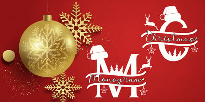 Cute Christmas Monogram is a joyful and festive duo font (decorative + script). It is ideal for Holiday-themed greeting cards and for any crafting project. This font is PUA encoded which means you can access all of the glyphs and swashes with ease!
 - Little Kisses by Gassstype,
$22.00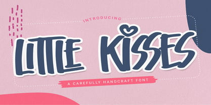 Little Kisses is a Playful Display Font that will make your designs look modern, unique and fun. It’s perfect for labels, quotes, posters, DIY projects, branding, packaging, greeting cards, websites, photos, photography overlays, signs, window art, scrapbooking, tags and so much more!
 - Antiquel by Lemonthe,
$14.00 Antiquel Font Duo: Is the perfect combination of clean and modern all caps sans-serif style with a classic script touch. It's suitable for creating various design projects such as logos, branding, labels, posters, titles, packaging, quotes, with a retro or modern style.
 - Kaliurang Signature by Letterafandi Studio,
$10.00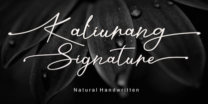 Kaliurang Signature is a modern handwritten font by Letterafa Studio. It has flowing letters that will give your designs a unique and sweet look. Kaliurang Signature is perfect for logos, greeting cards, package design, brand identity, craft design and any DIY project.
 - Cotton Hill by Gassstype,
$27.00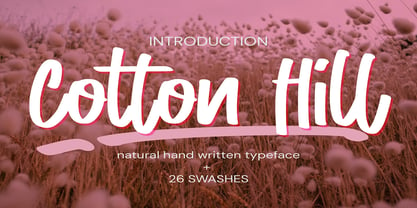 Cotton Hill - Natural Hand Written Typeface Font that will make your designs look modern, unique and fun. It’s perfect for labels, quotes, posters, DIY projects, branding, packaging, greeting cards, websites, photos, photography overlays, signs, window art, scrapbooking, tags and so much more!
 - Banana Juice by Almarkha Type,
$29.00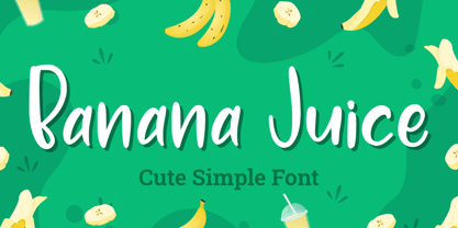 Banana Juice is a cute & playful font that will make your designs look modern, unique and fun. It’s perfect for labels, quotes, posters, DIY projects, branding, packaging, greeting cards, websites, photos, photography overlays, signs, window art, scrapbooking, tags and so much more!
 - Klisse by Gassstype,
$22.00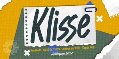 Klisse is Handmade Carefully Playful Font Display Font that will make your designs look modern, unique and fun. It’s perfect for labels, quotes, posters, DIY projects, branding, packaging, greeting cards, websites, photos, photography overlays, signs, window art, scrapbooking, tags and so much more!
 - Breaking The Comic by Gassstype,
$23.00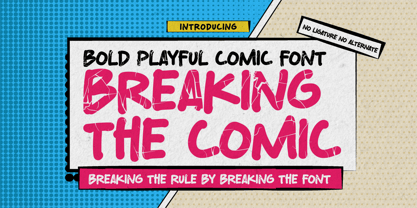 Breaking The Comic is a Cartoon Display Font it will make your designs look modern, unique and fun. It’s perfect for labels, quotes, posters, DIY projects, branding, packaging, greeting cards, websites, photos, photography overlays, signs, window art, scrapbooking, tags and so much more!
 - Classroom JNL by Jeff Levine,
$29.00A set of old die-cut cardboard letters and numbers used by teachers directly on bulletin boards or for tracing was the inspiration for Classroom JNL. In turn, these letters take their cue from typefaces such as Franklin and earlier wood type designs. - Yummi Lassi by Gassstype,
$23.00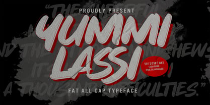 Yummi Lassi is a Playful Display Font that will make your designs look modern, unique and fun. It’s perfect for labels, quotes, posters, DIY projects, branding, packaging, greeting cards, websites, photos, photography overlays, signs, window art, scrapbooking, tags and so much more!
 - Santa Christmas by Ake,
$12.00 Santa is a lovely duo font (display and script). Together or apart, these fonts are ideal for adding a chic and cheery touch to your crafts. This font is PUA encoded which means you can access all glyphs and swashes with ease!
 - Kinglead by Almarkha Type,
$23.00 Kinglead – Fun Display Playful Sans full of charm . It will take any DIY-project to the next level! Kinglead is perfect for Craft , product packaging, product designs, label, branding projects, logo, wedding designs, social media posts, advertisements, watermark, invitation, stationery and any projects
 - Rockbitz by Almarkha Type,
$25.00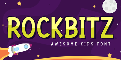 Rockbitz is a cute & playful font that will make your design looks modern, unique and fun. Perfect for labels, quotes, posters, DIY projects, branding, packaging, greeting cards, websites, photos, kids photography , signs, window art, scrapbooking, tags and so much more! Thank You
 - Urban Pollution by Gassstype,
$23.00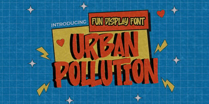 Urban Pollution is a Fun Display Font that will make your designs look modern, unique and fun. It’s perfect for labels, quotes, posters, DIY projects, branding, packaging, greeting cards, websites, photos, photography overlays, signs, window art, scrapbooking, tags and so much more!
 - Something Straight by Gassstype,
$25.00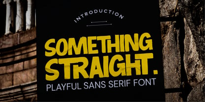 Something Straight is a Playful Display Font that will make your designs look modern, unique and fun. It’s perfect for labels, quotes, posters, DIY projects, branding, packaging, greeting cards, websites, photos, photography overlays, signs, window art, scrapbooking, tags and so much more!
 - Dausby by Corien’s Handwritingfonts,
$20.00 Dausby is the elegantly slanted handwriting of the 1850s. It was based on records written with a flexible tip dip pen and jet black ink by Mr. Dausby. Made for those of you who are just looking for an affordable handwriting font.
 - Heellaaz by Almarkha Type,
$23.00 Heellaaz is a Fun Bold Display Sans that will make your designs look modern, unique and fun. It’s perfect for labels, quotes, posters, DIY projects, branding, packaging, greeting cards, websites, photos, photography overlays, signs, window art, scrapbooking, tags and so much more!
 - Business Matter by Gassstype,
$23.00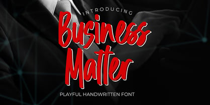 Business Matter is a Playful Handwritten Font that will make your designs look modern, unique and fun. It’s perfect for labels, quotes, posters, DIY projects, branding, packaging, greeting cards, websites, photos, photography overlays, signs, window art, scrapbooking, tags and so much more!
 - Heckel by Hanoded,
$15.00 Erich Heckel (1883 - 1970) was a German painter and printmaker. He was a founding member of Die Brücke (The Bridge), a group of German expressionists. Heckel font somewhat resembles the loose (and messy) handwriting Erich Heckel used in some of his drafts.
 - Science Fair JNL by Jeff Levine,
$29.00 Science Fair JNL emulates the effect of connecting the broken lines of a stencil alphabet into a solid letter form, such as many students did for posters on their science project. In this case, the base font was Jeff Levine's Paramilitary JNL.
 - Homebreaks by HRDR,
$13.00 Homebreaks is a handwritten new font duo, with different style making beautifully looking font combinations to bring more fun to your projects! Homebreaks Perfect for creating inspirational quotes, posters, blog headers,logos, or just adding a hand-written touch to any project!

