10,000 search results
(0.029 seconds)
- Hebrew Compressed by Samtype,
$39.00 Modern Sans Serif Hebrew type. This font isbest for use in titles and small texts.
 - Ormond JNL by Jeff Levine,
$29.00 Ormond JNL and Ormond Inline JNL are two Deco-inspired Roman typefaces with rounded serifs.
 - Informatic by Fatchair,
$9.95A clean and simple sans-serif, Informatic was designed as a friendlier alternative to DIN. - Snaggle by BA Graphics,
$45.00A unique serif face with a happy look; great for kids books or fun ads. - Rabelo by Pedro Teixeira,
$- Rabelo font is an elegant sans serif, comes in six weights and is very readable.
 - flutSaus by JOEBOB graphics,
$- Another font by Hilde Rikken (age 10) with crazy serifs and almost every special sign.
 - Manometer by Fontador,
$18.99 Manometer is a pneumatic ultra-black slab serif typeface with soft corners and fine counters.
 - Whipsmart - Personal use only

- Arzachel by CAST,
$45.00 Arzachel is a humanistic sanserif with a big x-height and a specific organic look. Its design is scientifically sharp and efficient in small type sizes as well as rugged and dramatic in headlines. Arzachel’s essential feeling comes from several features: all the letters are slightly sloped, stem terminations are flared at the top, and the terminals in letters a, c, e, f… are widening with the inside parts completely flat. The stroke contrast is low in the regular weight while it increases in the black; finally the capitals have an inscriptional flavor. Despite being a sanserif (thus a product of recent typography) Arzachel’s roots stretch back to the Renaissance tradition: Olocco took inspiration from some of the early and rather weird types cut in Venice in the 15th century. Arzachel was conceived during Olocco’s MA in Reading to provide a companion for his Zenon for use in small type sizes. But instead of expanding the Zenon family with optical sizes, the designer decided on a sans with its own personality rather than a sanserif version of Zenon with chopped-off serifs.
 - ITC Caslon No. 224 by ITC,
$40.99 The Englishman William Caslon (1672-1766) first cut his typeface Caslon in 1725. His major influences were the Dutch designers Christoffel van Dijcks and Dirck Voskens. The Caslon font was long known as the script of kings, although on the other side of the political spectrum, the Americans used it as well for their Declaration of Independence. The characteristics of the earlier Renaissance typefaces are only barely detectable. The serifs are finer and the axis of the curvature is almost or completely vertical. The overall impression which Caslon makes is serious, elegant and linear. Next to Baskerville, Caslon font is known as the embodiment of the English Baroque-Antiqua and has gone through numerous new interpretations, meaning that every Caslon is slightly different. ITC Caslon 224 was designed by Edward Benguiat and appeared with ITC in 1982. It is the text font which expanded upon the title font ITC Caslon 223. The alterations in the proportions of the letters make this Caslon 224 a noticeable departure from the original, but make the font overall more legible.
 - Sequel Geo by OGJ Type Design,
$35.00 Sequel Geo is a geometric/neo-grotesque hybrid superfamily, influenced by formalized sans-serif typefaces from Germany and Swiss modernist type design—particularly Max Bill’s greek-styled lettering. 8 subfamilies and 120 individual fonts allow for a wide range of typographic expressions. Sequel Geo’s hallmark features, such as the circular “G” and punctuation, simple “t”, and two-story “a” turning one-story in bolder weights, persist throughout all styles. But it’s the formal and functional differences between subfamilies that let you really fine-tune your layouts. The three optical sizes of the core collection, “Body Text”, “Headline”, and “Display”, boast optimized spacing for the intended use. “Extended” packs some extra punch with 18 display-oriented styles. Finally, 48 “Graphic” styles in 4 subfamilies push to the Geometric side, replacing horizontal and vertical stroke endings with angular ones, simplifying letterforms. Sequel Geo is a journey through time and space. From 1920s Germany to 1950s Switzerland. All the while, its archetypal shapes are neutral yet confident, its appearance is classic.
 - Enamela by K-Type,
$20.00 Enamela (rhymes with Pamela) is a monoline square sans that is available in normal width and condensed versions. Although rooted in the early years of sans serif type, the Enamela fonts have a timeless quality that is practical and unpretentious. The letterforms derive from vitreous enamel signage dating from the Victorian era and widely used in Britain for street nameplates, Post Office signs, the plates on James Ludlow wall postboxes, railway signs and direction signs, as well as for circular Automobile Association wayfinding plaques throughout the first half of the twentieth century. The quirky terminals, stemming from the compression of geometric type, invite comparison with the Charles Wright fonts used for UK vehicle registration plates. Enamela and Enamela Condensed are both available in three weights – regular, medium and bold – and as italics (optically corrected obliques). A commonly used alternative M with a vertex that touches the baseline is provided at the Alt-M (µ) keystroke on a Mac, or Alt-0181 on Windows. A commonly used G with a plain vertical throat, no crosspiece, is assigned Unicode FF27 (full width capital G).
 - Slate by Monotype,
$34.99 A typeface of grace, power and exceptional versatility, the Slate collection is a truly beautiful design that achieves stellar levels of readability, both in print and on screen. Created by the award winning type designer Rod McDonald, this six-weight sans serif family is a rare example of sublime aesthetics meeting world-class functionality. The typeface’s legible letterforms embody an amalgam of the best traits of both humanistic and grotesque letterforms. “I didn’t want a face with an ‘engineered’ look, or with any noticeable design gimmicks or devices,” admits designer McDonald. “I wanted a pure design. I confess that I was ruthless with any character that wanted to stand out from the rest.” The Slate collection is available in six weights with complementary italics, with slight changes in structure from the light to the black weights. Its light weight is reminiscent of early American sans. Whether for use in display work or in longer-form settings, few typefaces possess the beauty and power of this design, leaving the Slate family an excellent addition to any designer’s typographic quiver.
 - Eloquia by Typekiln,
$30.00 Eloquia is a neo-grotesque sans serif type family with geometric roots. Though it's a neutral typeface the unmistakable influence of geometric shapes gives it warmth and a unique flavor. With 34 fonts in total, Eloquia comes in two distinct optical sizes Text and Display. The Display styles are spaced tightly keeping headlines in mind while the Text styles feature a larger x-height and wider apertures with loose spacing making them highly legibility at small sizes. The elegant balance of neutrality and modernism makes Eloquia extremely versatile in its functionality. Whether it's being in the spotlight or in the background blending in, Eloquia can do it all. Eloquia is equipped with powerful OpenType features like Small Caps, Capitals to Small Caps, Stylistic Alternates, Ligatures, Case Sensitive Forms, Superscripts, Subscripts, Numerators, Denominators, Fractions, Ordinals, Proportional Lining, Tabular Lining, Oldstyle Figures, Scientific Inferiors, Localised Forms, Historical Forms, Capital Spacing and more. Eloquia supports more than 88+ languages including all major Latin languages. The Eloquia Display ExtraBold & Eloquia Text ExtraLight are completely free of charge.
 - Mairy by Typesketchbook,
$39.00 Mairy font family is a modern sans serif font family. Featuring 9 separate weights each followed by own true italics Mairy is positioned somewhere between rounded sans with humanist touch. In fact the humanist presence in Mairy is a little bit more than the usual doze adding more calligraphic elements mostly noticeable in italic weights but also very important in regulars. This symbiosis of Grotesk geometry with handwriting is well balanced regarding contrast and legibility so that at the end we have a highly usable font family. Light weights are very tender and elegant while the old and blacks are soft, friendly and full of vitality. The mid weights are just perfect with their medium contrast and excellent legibility. Mairy is very fresh font family and is surprisingly flexible when it comes to screen or print use – it is optimized for both even if the conditions are poor. Use it with OpenType compatible software and explore its true potential by accessing additional set of ligatures, alternates and multilingual support.
 - ITC Merss by ITC,
$29.99ITC Merss proves that sometimes accidents work out just fine. Late one evening Eduardo Manso, an Argentinean graphic and type designer, spilled coffee on his desk. When he began to wipe up the mess, he noticed that one of the splashes looked like a roman letter 'l' - complete with serifs. This triggered his imagination. “What if a complete alphabet was created with this same irregular flow to the character designs?” ITC Merss was the result of Manso's experiments with “fluid” letter shapes. The oddly handsome design looks aged and spontaneous at the same time. Its irregular texture is striking-the result of careful modeling of character shapes. While Manso wanted to maintain the free-form character of spilled liquid, he also knew the individual letters had to work together with an underlying harmony. When not experimenting with typefaces - or spilled coffee - Manso creates award-winning graphic and publication designs. A contributor to the design magazine el Huevo (the Egg), he also writes articles on type and typography and is part of the publication's design team. - Mangerica by Ndiscover,
$25.00This design incorporates different styles into a consistent look. A pinch of script, a little of geometric and some humanistic shapes as well create a very distinguishable sans-serif. It has an overall good feeling specially on the heavier weights that have intended contrast irregularities to create a 'cartoonish' look. On the intermediate weights the design will preform well on small font sizes because of its large counters, low contrast and large x-height, but as you go to the extremes you will see shapes full of personality that will pop out in large font sizes. The font is loaded with opentype features such as small caps, ligatures, alternates, old style figures, and much more. The italic version is deeply rooted in the calligraphic heritage of the Italics. This way the brush inspired strokes are emphasized as well as an overall calligraphic look. Far from being a mere slant, Mangerica Italic had every lowercase glyph redesigned as well as some uppercase, besides that, every glyph was optically adjusted to ensure not only aesthetics but functionality too. - DT Partel by Dragon Tongue Foundry,
$9.00 DT Portal: This stylised, partially serifed font, made with a slightly rounded square form, may have been inspired initially by old cathode ray tubes and computer screens. Although not intended to be purely a ‘tech’ font, it can have a strong tech feel to it. More suited to being a headline font than body text. It also appears to have a monospaced look to it, since most letters, (other than letters like ‘i, l and t’), do have the same width. There is some automatic contextual shape adjustment happening in places, to avoid taking up too much space, so contextual ligatures should be turned on. As is the case with most of my fonts, when given the choice, ‘metric’ spacing should be used in preference to ‘optical’. Initially this font was going to be called ‘DT Portal’, because its form was similar to that of a window or doorway. But due to other fonts already having that name, I chose to rename it as ‘DT Partel’, for no reason other than it is only a very small change visually.
 - Moneymachine by Mans Greback,
$49.00 Moneymachine is a sans and serif combined display typeface. Inspired by the art of money printing, the typography used for certificate production and classic letterforms, Moneymachine uses a traditional and perfected serif font and blends it together with a modern and clean sans-serif. The result is an original and confident work, which fits perfectly as a logotype or headline in any context that requires that extra touch of coolness. The Moneymachine family consists of six fonts: The Regular that combines sans and serif. Inverted for a white-on-black version. The Serif and Sans for more basic writing. White and Black for a lettering with a banner. The font is built with advanced OpenType functionality and has a guaranteed top-notch quality, containing stylistic and contextual alternates, ligatures and more features; all to give you full control and customizability. It has extensive lingual support, covering all Latin-based languages, from North Europe to South Africa, from America to South-East Asia. It contains all characters and symbols you'll ever need, including all punctuation and numbers.
 - Organica Pro by Sudtipos,
$39.00 Just as most buildings are based on a structure of vertical columns, horizontal floors, square angles and the occasional arch, most Latin typefaces are designed within a largely uniform, static, alphabetic structure that provides a framework for playing with the style of the terminals —serif, sans-serif, slab-serif, flared, Tuscan— without significantly modifying the deep anatomy of the letters. Orgánica Pro, by contrast, proposes a different structure: curvilinear, subtle and sophisticated, beyond the typical «sticks and balls» model. Organic anatomy, in one word; deliberately dynamic and asymmetrical. Over this radically distinct structure, terminals play a characteristic, expressive role that challenges easy classifications: Is this a serif or a sans font? A semi-serif? A semi-sans? For text or display? Modern or ultra-modern? Joke or serious? All answers are valid. Anyway, its six stylistic variants allow for multiple, diverse uses in text setting, headings and logotypes. In spite of —or perhaps thanks to— its innovative, uncommon structure, Orgánica’s personality is sweet to the eyes, wittily elegant and surprisingly legible.
 - Badinjal by Issam Type,
$14.00 Badinjal – Modern Serif Font By Issam Type Badinjal serif font can be used for many project such as: book, magazines, logo, branding, photography, crafts, quotes, blog header, poster, advertisements, and much more. What’s Included? Uppercase & lowercase letters, numbers, punctuation Multilingual support If you have any questions, please feel free to get in touch. Thank you
 - Truens by Seventh Imperium,
$15.00 Truens is a vintage display typeface. It's an all uppercase serif font collection with a Script font that was inspired by the look and feel of old serifs. Truens features include badges, ornaments, catchwords, and Multiple Language Support. This fonts is very versatile, all the styles work well together and can look authentically vintage.
 - ITC Tiepolo by ITC,
$29.99ITC Tiepolo font is from the design team at AlphaOmega Typography and named after Italian artist Dominic Tiepolo. The designers describe it as a sans serif with serifs" and it has also been referred to as a calligraphic design. Similar to Asian calligraphy, ITC Tiepolo font has personality yet does not detract from the text." - Lineam by Richarts,
$9.00 In old Latin language Lineam mean line and that what Lineam is: a line based Sans Serif Display font. Lineam is a simple and clean looking font family and can be used for a range of cases. It is a modern sans serif font with geometric feeling and comes with 8 weights and matching italics.
 - Hoplight by Smith Hands,
$20.00 Hoplight is a friendly, curvy, hybrid. A fusion of the cool character of a roman, with the flow and informality of an italic. Throughout Hoplight, many sharp serifs have been replaced by dot style serifs, to allow the contours of the letters to flow seamlessly into the terminations. Hoplight embodies a sense of playful ease.
 - Malven by Craft Supply Co,
$15.00 Malven is a modern serif features thin stroke, low-contrast modulation, with small serif that make it elegant and classy. It can be used to create almost all types of design projects like print materials. Just use your imagination and your project will become more alive and look great than ever with this typeface.
 - Tabloid News by Jeff Levine,
$29.00 Sans serif characters re-drawn from old newspaper headlines (and used in the design for Late Breaking News JNL) were given a slab serif treatment in order to create a condensed type face with both grotesk and block influences. The end result is Tabloid News JNL, which is available in both regular and oblique versions.
 - Bogosa by Issam Type,
$14.00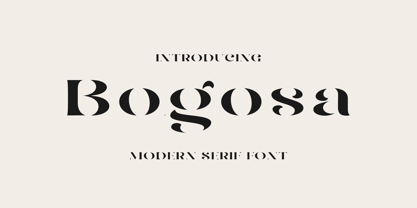 Bogosa – Modern Serif Font By Issam Type Bogosa serif font can be used for many project such as: book, magazines, logo, branding, photography, quotes, blog header, poster, advertisements, and much more. What’s Included? Uppercase & lowercase letters, numbers, punctuation Multilingual support If you have any questions, please feel free to get in touch. Thank you
 - Glinde by Nurrontype,
$13.00 Glinde is a bold serif font with extra ligature. It was design to be a versatile display font. Perfect for your instagram post title, headline on your cover magazine, and yes in your wedding invitation project also. A bold serif with neat ligature, plus some alternate and stylistic, ready to escalate your next project.
 - Anzeigen Grotesk by Linotype,
$40.99Anzeigen Grotesk is a heavy, condensed sans serif face drawn in the style of typefaces popular during the early 20th Century. It was originally intended for use in advertising design, a field for which it is still well suited. Anzeigen Grotesk (which means “advertising sans serif” in German) is best used in larger point sizes. - Bear Anark by Ingrimayne Type,
$9.00 BearAnark is a decorative slab-serifed typeface that can be used for some text purposes. It has moderate contrast and comes in five weights, each with a true italic. The development of the family began with a blending of two other slab-serif faces, Anarckhie and BearButteT, and this origin is reflected in its name.
 - Ganora by Eotype,
$12.00 Ganora is a semi serif decorative font. This font has a beautiful and aesthetic look. This font has classic serif legibility as well as beautiful modern curves. This combination makes type interesting in its own way. This font has alternate and ligature features that can help you complete projects like logos, magazines, brands and more.
 - Stout by Greater Albion Typefounders,
$10.00 Stout is a deliberately aggressively solid family of four faces, offered in two weights and in serif (deliberately large serifs) and sans forms. It’s ideal for signage that needs to be read over long distances or for anything where an emphatic statement is needed. Stout is big and clear and always makes a statement.
 - August Rush by Callie Sharp,
$13.00 August Rush is a delicate handwritten script font. The font comes in 2 weight options: regular and semi-bold. It's best used as a main headlines or as a secondary headline combed with other simple serif or sans-serif fonts. It can be used for various designs such as packaging, wedding stationery or branding.
 - Hisav by Flawlessandco,
$9.00 Hisav is a modern elegant serif, with some connected letters that are perfect for branding materials, t-shirt, logo, poster, photography, quotes, and many more. Modern serif font type to complete your display creation such as wedding invitation card, etc. If you need help, just write me! Thanks so much for checking out my shop!
 - Los Banditos by Dicky Syafaat,
$15.00 The classical vintage font Los Banditos comes in a serif and sans serif form with a lot of of stylistic alternates and ligatures that will give a unique, classic, amd retro look on your design projects. Use it as a Display font on a poster, logo, menu, clothing brand, magazine, movie, website and much more.
 - Grimalda by Hikhcreative,
$20.00 Grimalda is an elegant serif typeface with taste of modern and simplicity. It is perfectly for magazine cover, headline, wedding invitations, logo, brand, and many more. Grimalda have more than 100 characters of ligatures and alternates. You can create any imagination with this serif font. What's included? - Uppercase & Lowercase Characters - Multilingual support - Ligatures & Alternates Characters
 - Arsis by Linotype,
$40.99Arsis is a condesed modern headline face that was originally produced and cast in hot metal by the Dutch type foundry Lettergieterij Amsterdam. The Arsis font family was designed by Gerry Powell in 1937. Arsis is a Serif (Antiqua) Modern Style font. Arsis font family attributes include roman serif, Didone, elegant, formal, modern style, feminine. - Amelia Harper by Letterhend,
$14.00 Amelia Harper , a new font duo where the elegance of a serif font intertwines flawlessly with the beauty of a handwritten script. This font duo is carefully crafted to bring together the classic charm of serifs with the contemporary edge of modern scripts. Features : Uppercase & lowercase Numbers and punctuation Alternates & Ligatures Multilingual PUA encoded
 - Abramo by PeachCreme,
$16.00 Abramo is a perfect blend of elegance and modernity. Abramo is a set of two modern fonts: an all-caps serif and a stylish script. the smooth curves of the serif create a feminine feel. Abramo works great for logos, social media posts, invites and many other projects. It comes with multilingual support also.
