10,000 search results
(0.024 seconds)
- Konae by Twinletter,
$13.00 Introducing "KONAE Font" - Your Passport to a Summer Wonderland. KONAE Font is your key to unlocking the magic of summer in your design projects. With its playful and vibrant summer theme, this font is the perfect choice for adding a touch of the season's joy to your creations. What’s Included : File font All glyphs Iso Latin 1 Alternate, Ligature Simple installations PUA Encoded Characters – Fully accessible without additional design software. Fonts include Multilingual support
 - Kona by Linecreative,
$14.00 Kona is a display font perfect for branding, homeware design, product packaging, magazine headers - or just perfect as display text against any background.
 - Kora Kora by HansCo,
$12.00 Kora Kora is a display kind of sans serif font with a rough texture on the edges and fun look. This font is perfect for use for logos, print templates, packaging in food industries such as bread, and many other projects. Several alternative crumbs are available in this font. Highly recommended to use it in OpenType capable software - there are plenty out there nowadays as technology catches up with design. The OpenType features can be accessed by using programs such as Adobe Illustrator, Adobe InDesign, Adobe Photoshop Corel Draw X version, Afinity and more. Enjoy!
 - KonQa - Unknown license

- Monas by TypeClassHeroes,
$14.00 Introducing Monas is a Modern Modern Display Font, access your OpenType features to access the large selection of alternate letters and ligatures. Use this font for any branding, product packaging, invitation, quotes, t-shirt, label, poster, logo etc. Feature Uppercase & Lowercase Number & Symbol International Glyphs Multilingual support Alternative Ligature Feel free to drop us a message any time Hope you enjoy it.
 - Oona by Autographis,
$39.50 Oona is a joining script with that classic, elegant "Old England" touch.
 - Mona by WildOnes,
$12.00 Mona hand lettered font is a hand drawn brush font. It has contrasting thin and bold lines. This is a decorative font, so it works best for short descriptions, logos, identities, packaging design. Also looks great on diferent invitations and posters. The typeface has two styles - regular and bouncy. Boucny is ideal for designs where you need just a little bit more playfulness.
 - Iona by ITC,
$29.99 - Kono by Thinkdust,
$10.00 Kono is a font straight from the modern, gritty, warfare computer game genre. Rough and ready, with letters that double as numbers and look fit to be sprayed on a bunker wall, Kono brings you a bleak example of the near-future, where pragmatism rules out over artistry. Kono itself, ironically, is stylistically crafted to capture this feeling, carefully selecting the perfect mix between flat, straight lines and rounded corners, using wide, squat characters to mimic practical architectural styles. Kono is great for capturing a bleak but somewhat heroic attitude, whether you want to use that to encourage optimism or advertise pessimism.
 - Dona by Harbor Type,
$30.00 🏆 Selected for Tipos Latinos 9. Dona is a non-boring sans serif. While very legible in text sizes, its friendly details really come to life on headlines, packaging and visual identities. To make it even more interesting, Dona Alt brings a different feeling with just a few different glyphs. The Dona type family comes in 5 weights, from Regular to Black, matching italics and an Alt version, totalling 20 fonts. If you need even more control, variable fonts are also available. Each font contains 528 glyphs and supports over 200 languages.
 - Kopa by The Hiscott Foundry,
$30.00This font is good clean fun. "Kopa" is a word that means "soap" in the Hawaiian native language. The thickness and rounded edges mimic the form of solid soap. Some additional design involving the base of the glyphs brings out the style just a bit more. This font works especially well with colorful designs. - Kondes by Tour De Force,
$25.00 Kondes is our "101 Dalmatians" – it's 101th release in our catalog! And it is the 1st one that belongs to variable typefaces. Kondes (which is made up word as mixture of "condensed" and "kondezovan" on Serbian) is simple, compact, straight-in-your-face sans serif family with 9 weights and 9 Italics. It was designed with purpose to serve and to be use in any project, from editorial to website. For example, Black weight could be used effectively as poster type, in big sizes while Regular fits perfectly as main webfont. Stem joining is done with generous ink trap that divides and opens letter contours, so letter breaths in smaller sizes. Contains extended Latin character set. Enjoy!
 - Konya by 38-lineart,
$12.00 Konya is a signature script-style font with a very luxurious look. It can look very soft and very firm in an elegant frame, high but not too towering, and flat but not too low. Its appearing with a balance like dervish whirling around in ‘Konya town’ with two hands stretched, one hand facing to the sky and the other hand facing to the earth. This font is perfect for branding, as we equipped it with a number of alternatives that allow you to make it a feminine and masculine logo, and some swash to add to the firmness of signature. This font also has ligatures to present a natural handwritten impression.
 - Koni by Anastasia Kuznetsova,
$17.00 Get to know the beautiful natural and neat font "Koni"! This beautiful neat retro sans-serif font with imperfect ink edges and a little sloppy shading is inspired by nature. This is a textured font in vintage style with capital letters. The letters here are clearly distinguishable, and interesting touches give it uniqueness. Eco-friendly fashion takes into account the health of consumers, the health of the planet. The font "Koni" is perfectly combined with any stylized graphics, watercolors, and also looks great on its own as part of a minimalist design. Play with letters to get different effects. Great for branding, invitation design, packaging design, quotes, label design and more. Font features: - A-Z; character set a-z; - 1 language (English); - numbers and punctuation marks, symbols. Fonts can be opened and used in any software that can read standard fonts, even in MS Word. No special software is required, and to get started. It is recommended to use it in Adobe Illustrator or Adobe Photoshop Made with love and magic ♡ Thank you for checking this out and feel free to write me a message if you have any questions! ~ Anastasia
 - Bolded by We Make Font,
$16.00 Bolded is a new complete type family, designed and developed by creative professionals. Contains geometric and rounded features, optimized for both long texts and small screens and texts. The complete family offers seven weights divided between the basic, italic, condensed and condensed italic family. Created in 2022, Bolded has a modern and functional look, designed for the most diverse uses and projects. Bolded is a geometric rounded family that can meet the needs of the most varied professionals looking for a clean and elegant font family with a wide set of Latin characters.
 - Bolde by Figuree Studio,
$18.00 Bolde is a powerful sans serif font family with modern touches. A balance of hard lines and smooth curves makes them able to stand on their own dynamically Features: five all caps font, Numbers & Punctuation / Extensive Language Support Bolde works great in any branding, logos, magazines, film. The different styles give you the full range to explore a whole host of applications. Thanks for having a peek at Bolde. As always, if you have any questions just send me a message!
 - Kimono Kong - Unknown license

- Kimono Kong - Unknown license

- VKB KonQa - Unknown license

- Zona Armada - Unknown license

- Konga Next by RodrigoTypo,
$25.00 Konga has gone through different changes, the first idea was born in 2014 with the help of Andrey Kudryavtsev, then some time passed and the Rough version was developed, and a long time passed and in 2022 the idea of redesigning was taken with Bruno Jara, in addition to making many styles such as Rough, Inline, Shadow, as well as dingbats which was based on Stefania Ahumada's graphics, which results in a family of 6 styles, with different Alternatives, perfect for informal titles.
 - Kong Script by Talbot Type,
$19.50 Kong Script is a contemporary, geometric, script typeface, a modern interpretation of a traditional style. The upper and lower case character sets link seamlessly, in the manner of a traditional script, to create an easy, flowing look. It's full of character and works well as a stylish, memorable display font.
 - Kana Sans by GT&CANARY,
$32.00 A new modern classic. Kana Sans is a versatile sans serif font family that’s ideal for building a contemporary yet timeless brand look. Inspired by iconic typography, Kana Sans is designed to be balanced, modern and easily adaptable to web, print, and signage applications. From fashion to corporate industry, this font gives the designer full flexibility to express his/her vision. With Six different weights and matching italics, Kana Sans is a powerful communication tool for today.
 - Kota Datoma by Alcode,
$23.00 Kota datoma an luxury and unique calligraphy font. Carefully designed to work together in harmony that makes it perfect for wedding media, book covers, greeting cards, logos, branding, business cards and certificates, even for any design work that requires unique, formal or luxury. Try Kota datoma, enjoy the richness of OpenType features and let her fun and elegant excitement make you happy and enhance your creativity! You can use this font very easily. Included Multilingual Support And Special Ligatures Your download will include OTF format files. If you do not have programs that support OpenType features like Adobe Illustrator and CorelDraw X Versions, you can access all alternative flying machines using Font Book (Mac) or Character Map (Windows)
 - Kontes Compressed by Gatype,
$14.00 The Compressed Contest font is packaged in a modern font that is unique, elegant, feminine, sensual, glamorous, simple and very easy to read. The classic style is very suitable to be applied in various formal forms such as invitations, labels, menus, logos, fashion, make up, stationery, letterpress, romantic novels, magazines, books, greeting/wedding cards, packaging, labels. Hope you enjoy this font!!
 - Bona Nova by Borutta Group,
$- ☞ Bona Nova is a collective revival project of Bona typeface designed in 1971 by the author of polish banknotes Andrzej Heidrich. Besides giving the project a digital font form the aim was to expand the base character set: preparation of small caps, designing the alternative glyphs and multiple opentype features. Working together with the author we designed two new text versions: regular and bold – to give the family a form of a classic script triad. ☞ It is accompanied by three title versions and three contour styles under the name of Bona Sforza. All styles contains over 1200 glyphs. ☞ Bona Nova is an unprecedented typographic adventure for our team. We hope that our work will allow the cultural heritage of Bona and the work of Andrzeja Heidricha to gain new followers and fans. This project connected three generations of graphic designers who graduated the same school – the Academy of Fine Arts in Warsaw. ☞ Bona Nova isn’t only a typeface. We have also prepared a book about the project (including an interview with Andrzej Heidrich, my text about the digitalisation and a font specimen). The Bona Nova release party was a big exhibition (over 1000 guests). I’ve invited 26 graphic designers to prepare their own initials of Bona Nova – they were presented as posters on exhibition too. LINKS Bona Nova WEB Bona Nova FP Bona-Nova-(FREE-FONT) Bona Nova Book BONA NOVA IN THE MEDIA Typeroom Typography Guru Slanted Designalley Stgu Typografie Info Wikipedia Bona Nova is a non-profit project, all founds that we raise we reinvest to develop the Bona Nova project (new styles, Cyrillic & Greek, extend character set).
 - Dona Freddie by Forberas Club,
$16.00 Donna Freddie is handwritten style font. Monoline script style. Coolectible font for your special moment.
 - Koning Display by LucasFonts,
$49.00 Koning transports high-contrast sans serifs into the present. Koning is the Dutch for king. Given the design’s elegance, this name should come as no surprise. It has been recognized with numerous awards: TDC Certificate of Typographic Excellence and Award of Excellence from Communication Arts both in 2018, and Gold from German Design Awards in 2020.
 - Koya Sans by JAM Type Design,
$15.00 Koya Sans is a contemporary, humanist sans with a friendly yet clear and distinct personality. It is designed for excellent legibility, particularly for long continuous reading. The sharp terminals add liveliness and variety to the carefully crafted letterforms. Koya Sans, a highly versatile type family consisting 12 styles that are designed to work equally well on paper and on screen. The family ranges from Thin to Black variations, with complimenting italics. Inspired by a trip to the Buddhist temple of Kōyasan south of Osaka, Japan, this carefully crafted sans serif typeface with its sharp terminals loosely emulating the sharp corners of the temple’s pagoda roof.
 - Zona Black by Intelligent Design,
$8.00 Zona Black is a geometric sans–serif display black typeface. It was inspired by typography from 1920's posters featuring clean lines and some quite distinct glyphs such as the uppercase B and the H. Despite being black it's tall x–height makes Zona quite legible even in smaller sizes.
 - Dona Siona by Gatype,
$12.00 Dona Siona is a beautiful, light handwritten font with a unique feel and stunning impact. This will add a spark of luxury to any design project you want to create! This font is PUA encoded which means you can access all the amazing glyphs and ligatures with ease!
 - Kuna Kuni by Javanice Studio,
$16.00 Introducing Kuna Kuni by Javanice Studio Kuna Kuni is A All Caps Handwritten Typeface Font Kuna Kuni is perfect for branding project, apparel, labels, magazines, books, greeting / wedding cards, packaging, fashion, make up, stationery, and any type of advertising purpose or just used to express words above the background. This font includes OTF&TTF&Woff, Kuna Kuni also multilingual support. Enjoy the font, feel free to comment or feedback, send me PM or email.
 - Kora Vibes by Jehansyah,
$15.00 Kora Vibes is an elegant and modern serif font with a luxurious feel. Perfect for any title or large font, emails, magazines, book titles, movies, notes, brands, logos and more. This font is PUA coded, which means you can easily access all the glyphs and swashes!
 - Monas Grotesk by Arodora Type,
$30.00 With Monas Grotesk, you can write bold banner writings and bring your slogans to life. Monas supports many language options and will not let you down. Also includes many alternative glyphs, ligatures and more.
 - Konga Rock by RodrigoTypo,
$35.00 It is a new style of Konga Pro, now more rough and ornaments.
 - Nona Manis by Gilar Studio,
$16.00 Nona Manis is a Handwritten Display Font With 3 Style (Regular,Outline and Shadow) You Can Mix And Match for Your Awesome Project This fonts is ideal for crafting, branding and decorate your any project. This fonts are perfect for wedding invitation or your blog. Also with their help, you can create a logo or beautiful frame for your home. Or just use for your business, book covers, stationery, marketing, magazines and more. FEATURES : Uppercase & Lowercase Number & Punctuation More than 244 of glyphs Support for 60+ Multilingual languages PUA Encode 12 Ligatures Alternate 7 OpenType features ( aalt dlig frac liga ordn sups kern ) The font Nona Manis contains 18 ligatures in 3 OpenType features The alternative characters were divided into several Open Type features can be accessed by using Open Type savvy programs such as Adobe Illustrator, Adobe InDesign, Adobe Photoshop Corel Draw X version, And Microsoft Word. And this Font has given PUA unicode (specially coded fonts). so that all the alternate characters can easily be accessed in full by a craftsman or designer. Check my other Font here https://gilarstudio.com/
 - Kong Lupasem by Maulana Creative,
$15.00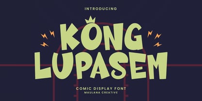 Kong Lupasem comic display font. Heavy stroke, fun character with a bit of ligatures. To give you an extra creative work. Kong Lupasem fun display font support multilingual more than 100+ language. This font is good for logo design, Social media, Movie Titles, Books Titles, a short text even a long text letter and good for your secondary text font with script or serif. Make a stunning work with Kong Lupasem fun display font. Cheers, Maulana Creative
 - King Kong by Aminmario Studio,
$20.00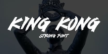 This is a supercharged font, with natural brush, quick strokes and sharp details. Perfect for challenging jobs, titles, movie,logos, apparel, t-shirts, hoodies, quotes, product packaging, or anything that needs a typographic turbo-boost and a typographic unique style. Thanks for checking out this font. I hope you enjoy it!
 - Zona Pro by Intelligent Design,
$10.00 Zona Pro is a geometric sans-serif type family of 8 styles plus matching italics, designed by Kostas Bartsokas in 2013/14. It draws inspiration from 1920’s geometric style faces, having clean and highly readable shapes, and mixes it up in the heavier weights with a slight variance in the stroke widths, lending it a grotesque-ish unique and distinctive look. Zona Pro is multifunctional and versatile. With its modern yet elegant form it performs amazingly in display sizes and headlines. At the same time its really tall x-height makes Zona Pro equally suited for editorials and shorter lines of text in smaller sizes (magazines, newspapers). Zona Pro supports Greek, Western, Central and Eastern European languages, ligatures and special characters.
 - Konga Pro by RodrigoTypo,
$35.00 Konga is a typeface that was designed in 2012. Konga Pro version is a redesign and now includes Cyrillic And alternatives.


Page 1 of 250Next page