100 search results
(0.18 seconds)
- Koliba JY by JY&A,
$39.00Inspired by architecture and hand-lettered posters of the 1940s, JY Koliba makes a statement that is very 21st century. With an ultra-light weight plus an elegant book and bold, Koliba was designed to be flexible. Fine-tuned with a full Latin glyph complement, and Windows kerning support for designer Jure Stojan’s Slovenian mother tongue, Koliba is set to be one of the foundry’s best-loved sans serifs. - Artemis JY by JY&A,
$39.00Mark Geard’s Artemis is a contemporary humanist sans serif. Its flourishes and unusual cuts give the typefaces huge distinctiveness—yet they remain highly legible. Glyphs begin with something that resembles a serif, leading the eye across their body and on to the next letter. - Tranquility JY by JY&A,
$39.00 - Dandy JY by JY&A,
$29.00 Danielle Smith describes her friendly, hand-drawn typeface family, available in roman and italic, as ‘non-élitist and accessible’. Originally created for a theatre project at Massey University, Dandy is reminiscent of Pablo Ferro’s hand-lettering.
 - Novalis JY by JY&A,
$39.00 - Rebeca JY by JY&A,
$39.00JY Rebeca was our first attempt using Fontographer to develop a typeface from scratch. It possesses some experimental characteristics in its design, e.g. the mixture between a transitional and modern typeface. - Raj JY by JY&A,
$39.00JY Raj has had a lengthy gestation. The original one was a sans serif adaptation of a slab serif typeface design by Jure Stojan. Raj looked instantly better as a sans serif. After refining it further one lengthy night in 2001, he showed the drafts to Jack Yan, who completed the character sets and finished the kerning. A characterful sans serif, JY Raj pushes the boundaries of what is possible with various geometric shapes, combining legibility and tradition with sharp, unexpected angles. As with Stojan's earlier JY Koliba, it possesses a delightful balance, thanks to the designer's eye for detail and typographic harmony. The name has little to do with the Asian subcontinent: it translates to paradise in Stojan's mother tongue, Slovenian. - Pinnacle JY by JY&A,
$39.00 - JY Shapa by JY&A,
$45.00 Designed by Jure Stojan, JY Shapa—his first serif family for JY&A Fonts—has a wide-pen, calligraphic feel, with the upper half of the letters reasonably conservative to aid recognition, but the lower half more decorative and dynamic to achieve a specific rhythm. The italics are more dynamic, with the upper halves more flowing, with Stojan taking greater liberties with the design. Ligatures such as ct and st are included, as well as small caps for all weights. The JY Shapa fonts come with over 5,000 kerning pairs each.
 - Klin JY by JY&A,
$49.00Jure Stojan first created JY Klin for a student magazine in Ljubljana, Slovenia. ‘It was borne out of my frustration with layout [programs] and their taste for messing with decent fonts (making the headline occupy the entire column width at any cost, for instance). Therefore, I designed a “heavy duty” display font—it can be extended up to 120 per cent without any loss in quality (it is fairly condensed, so no one could think of squeezing it any further). I even used the font, stretched by the very 120 per cent, for 10 point text and the result was surprisingly legible (given some peculiar details prominent at display size).’ - Integrity JY by JY&A,
$49.00 - Saj JY by JY&A,
$39.00 Designed by Jure Stojan, JY Saj is a typeface family that successfully balances the artistic and the conventional. With 10 weights (UltraThin to ExtraBold, with italic complements), it works at a variety of sizes, in print and on screen. There are both oldstyle and lining figures, the rupee symbol is supported, and roughly 3,500 kerning pairs were added per font.
 - Circles JY by JY&A,
$39.00Based on electrical circuitry, David Philpott's Circles typefaces are oddly legible, even though one might think they were destined for display usage only. The circle is the base form, repeated throughout the design. Originally drafted during his time at the Massey University School of Design, subsequent refinements have turned Circles into two complete fonts with a full character set. - Flax JY by JY&A,
$39.00David Philpott was inspired by the flax growing on the side of the motorway out of Wellington, New Zealand, and crafted this very distinctive, natural typeface family based on the plants. - Boomerang JY by JY&A,
$39.00Based around the Australian boomerang, Greg Bastin’s design originally appeared on private Christmas cards and individual projects. It was formalized into a font in 2002 by David Philpott (JY Circles) and brings a quirky antipodean style to the JY&A Fonts range. This display family is available in Solid and Outline forms, the latter containing patterns that parody those of Aboriginal culture. - Aetna JY by JY&A,
$39.00 - Tranquility JY Pro by JY&A,
$39.00 A tranquil and formal serif type family, JY Tranquility is ideal for text applications. It is based on Renaissance type forms.
 - Pinnacle JY Pro by JY&A,
$55.00 JY Pinnacle is a distinctive text family, with at least 3,100 kerning pairs (for text fonts) and collections of alternative characters for roman, italic and cap and small cap. Pinnacle has an awareness of tradition, but is individual and fresh. Its oblique axis for lowercase letters such as the o and e is meant to aid legibility.
 - Decennie Express JY by JY&A,
$29.00 - Decennie JY Pro by JY&A,
$45.00 JY Décennie has been designed for both the web and print. Essentially applying the principles of newspaper typefaces, attention has been paid to the Windows versions of the family to ensure clarity when used in web browsers. It was originally conceived with an Australian broadsheet newspaper in mind, and ultimately launched to commemorate JY&A’s 10th anniversary. The design itself is based on Australian and New Zealand wood type, which was used widely by European settlers during the nineteenth century.
 - Comic Pro JY by JY&A,
$39.00 - Aetna JY Pro by JY&A,
$49.00 JY Ætna was designed originally by Francesco Griffo in 1495, and appeared in a book by Cardinal Bembo the following year. The typeface was re-created by Jack Yan in 1994, in time for its 500th anniversary. The original x-heights, quaint letters and other niceties have been restored. An italic complement, based on the design by Giovantonio Tagliente, has also been developed. JY Ætna has been one of JY&A Fonts’ more popular families over the years, with some typographers preferring its taller ascenders and descenders for headline work.
 - Decennie JY Titling by JY&A,
$39.00 - Integrity JY Pro by JY&A,
$49.00 Because of the need for a new condensed serif font family, Jack Yan created this individualistic style of typefaces complete with one of the largest collections of unusual ligatures available at the time of launch in the mid-1990s. As well as the usual selection of double-f and ct, JY&A has provided gr, gt, ty, and other ligatures for JY Integrity Roman and Italic.
 - Koldby by Factory738,
$15.00 Koldby is a modern and elegant serif font family. The combination of modern and vintage elements renders an elegant design. The variety of weights provide a range of choices that will help you find the best typographic colour for your project. Lighter weights are well-suited for body text while heavier ones are ideal for high impact headlines. The available stylistic lignatures and alternates offer a number of different characters that give your project or logo a unique look.
 - Kolega by Just My Type,
$25.00 Maybe I should have named this font “Communist Block”. But it also works well for Colonial-style tavern signs. It’s square, geometric and rigid, and is the perfect thing for totalitarian themes. The family consists of three fonts: Kolega (“Comrade” in Polish), Kolega Tall, and Kolega Podrobska (Fake Comrade). Kolega and Kolega Tall are fully charactered with U.S., European, Greek and Cyrillic glyphs. The latter font is meant to use in English only; although it contains many accents and character variations, they mean nothing. It’s a joke.
 - Galiba by Juraj Chrastina,
$29.00 Give your voice an eye-catching hand-drawn look thanks to this playful font family. You'll get three styles, along with OpenType features including alternates, ligatures and stylistic sets. Galiba Regular works very well with his small brothers Light and Thin. In addition Galiba Light can be used at smaller size along with the other styles to keep the same line thickness. To achieve a random-like effect, the regular style is packed with 4 different variants of each glyph, that automatically cycle if stylistic alternates are turned on. Also you can choose from 5 stylistic sets to easily change the look of a given string, or pick alternates by hand. Not to mention that we've attentively fine-tuned the kerning that’s crucial for this kind of typeface.
 - Molika by Khaiuns,
$13.00 ay hello to "molika" :) molika has two types of fonts namely sans serif and handwritten, both have a firm character and also elegant-lettered font - perfect for casual type in greeting cards, illustrations, quotes, quaint branding, book covers, social media posts, packaging and so much more :) The duo fonts consist of all uppercase letters and remain elegant for your project. I hope you have a blast using Molika. Thanks for use this font ~ Khaiuns
 - Solida by Graviton,
$4.00 Solida font family has been designed for Graviton Font Foundry by Pablo Balcells in 2012. It is display typeface with a geometric angular look. Solida consists of 10 styles.
 - Solina by Scratch Design,
$14.00 Solina is an exciting typeface that is inspired by the future life which is full of robots, mechanics, speed races, automotive and life in space. References to this font are based on the science-fiction visual of the modern-futurism mindset, making it perfect for any project that requires a futuristic and technologically advanced design. This font is perfect for creating sci-fi movie posters, technology-based branding, packaging, event and festival materials, automotive designs, and many more.
 - Bolita by Mariaes,
$16.95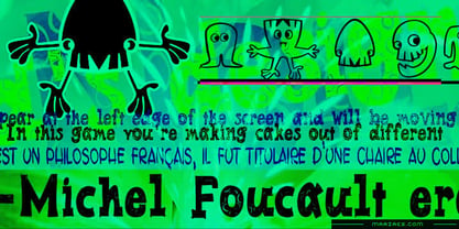
- Solitas by insigne,
$- You request perfection--that ideal equilibrium of compact dimensions and geometric underpinnings that leaves you with pure, clean lines of a highly legible sans. We give you Solitas, a 7-weight sans-serif from Jeremy Dooley. Made of 42 fonts, from the slender thin to the powerful bold and their matching italics, this typeface family features typographic options including ligatures, fractions, alternate unicase, upright italics, and titling caps. Coupled with its pure design and style, this makes Solitas a successful workhorse typeface. The result of simplification and reduction, Solitas is well-suited for the headlines and shorter texts of promotions, packaging, editorials and branding, both in print and on your website. That's it. It's that clean, that simple, and possibly that perfect for your next layout. Get it today.
 - Kalimba by JVB Fonts,
$30.00 Kalimba (name of an African percussion musical instrument) is inspired from common simple shapes present in many visual elements of African and Afro-American cultures. With more than 500 glyphs, Kalimba can be used in European languages (central/east). The font includes some OpenType features as ligatures, fractions and ordinals among others. Recommended for logos, illustrations, games and more graphic design pieces that requires an African taste and essence.
 - Nolita by Sakha Design,
$12.00 Introducing the Nolita Font Duo, a classy pair of script and serif fonts. Nolita offers beautiful typographic harmony for a diversity of design projects.
 - Polina by GRIN3 (Nowak),
$16.00Polina (previously named Dobra) is a handmade, layered type family which includes several textures and shadows. Different font types can be created using various combinations of Polina fonts and colors. Language support includes Western, Central and Eastern European character sets, as well as Baltic and Turkish languages. - Zolina by Creativemedialab,
$20.00 Unique and fashionable font, the straight lines combined with a slight curve that makes Zolina looks modern and pretty. Try uppercase for clean and elegant look. Zolina is perfect for website header, logo, instagram story, or fashion related branding. This versatile family consists of 9 weights, variable styles as well as multilingual support, numbers, and currency symbols.
 - Kokila by Microsoft Corporation,
$49.00 - Volika by Slide Shoot,
$17.00 Volika Sans Serif is a balanced, smooth, elegant and stylish sans serif font. He has a beautiful character. It fits perfectly with invitation card designs, company logos, movie titles, movie names, business cards, book titles, brand names and various other designs. Volika Sans Serif is a subtle sans serif font that exudes sophistication and elegance. Its stylish alternations and ligatures make this font the perfect partner for any project.
 - Oliva by Viktor Nübel Type Design,
$25.00 Oliva & Oliva Italic are two strong and funky display fonts. Influences came from typefaces like Futura Black by Paul Renner and Motter Ombra by Othmar Motter, but also Stilla by François Boltana and Allegro by Hans Bohn lay on the desk. All these ingredients were mixed to a new and contemporary type experience and packed in proper OpenType files Oliva & Oliva Italic are OpenType Pro, featuring full Western, Central European, Baltic, Turkish and also Cyrillic language support. They contain ligatures, superior numerals, and a stylish set of decorative ornaments and arrows.
 - Polias by Esintype,
$23.00 Polias is an all-caps uniwidth typeface inspired by an ancient inscription carved on a monoblock stone in hybrid characters — between no-contrast linear sans to low-contrast flared serif. The inspiring inscription is the dedication by Alexander the Great, discovered in the Temple of Athena Polias in the ancient Ionian city of Priene. Stanley Morison mentioned this inscription in one of his lectures: “The distinctive feature of this inscription consists of a consistent thickening towards the ends of perpendiculars and horizontals.” … “We have not the right to say that the serif was invented for Alexander the Great's inscription, only that this is its first datable appearance.” The letter proportions are almost identical to the original, but the stroke features have been reinterpreted and characterized. Serif-like nodes at the end of the strokes are subtle extensions that serve to accentuate rather than break its monoline elegance. With an analogy, they are not flowers, but like blooming buds. Polias is a flared sans typeface which is closer to sans-serif forms on the spectrum between sans and serif. It’s especially light looking by design to convey rather thin and white typographic color of its original monumental look. It comes in eight weights and a variable font, scaled from Thin to Bold. It is multiplexed, so the weights do not affect text lengths. Light weights are closely based on the actual carving of the inscription. Thicker weights can be used on smaller typesettings to compensate for the weight difference of larger letters’ strokes, and to keeping the monoline appearance of the entire text block intact. This method can be used for any purpose, such as setting a hierarchy between the lines or to justify their lengths. Some of the original letterforms have been preserved and stylistic alternatives such as Ionic four-bar Sigma, dotted Theta, palm Y are provided as open type feature. Some of the other ancient forms, such as the three-bar Sigma (S), the pointed U, were also added for both the Greek and Latin scripts. Polias is preferable for big type settings such as logos and headlines as a modern representation of perennial classical forms. Its a fine fit for product branding, movie posters, book covers, packaging materials, and more, which require an epic look to attracting attention with a distinctive elegance. Polias can be considered for distinctiveness wherever Roman Capitals work. As a noun, Polias is one of the epithets of Athena / Minerva, and in this case referring to her role as the protector of the city of Priene. Polias is one of the seven typeface designs in Esintype's ancient scripts of Anatolia project, Tituli Anatolian series.
Page 1 of 3Next page