3,267 search results
(0.013 seconds)
- Rapier by ITC,
$40.99 Rapier, designed by Martin Wait for ITC in 1989, is an impulsive, energetic script font with strong ties to the brush and advertisement typefaces of hte 1940s. The zestful capitals contrast with small, narrow lower case letters, lending the font its dynamism and liveliness. Desinger Wait reached the energetic, almost aggressive feel of Rapier with snappy base forms and especially with ascending strokes. For an optimal look it is advisable to set Rapier's forms near to one another, so that the ends of the strokes of one figure touch the beginning of the next. Rapier is best used for headlines and short texts.
 - Superscience by Storm Type Foundry,
$39.00 A font drawn in a rounded rectangle looks modern – if we do not mind that it was in vogue mainly in the 80s of the last century and was created in the fifties, when various Italian designers noticed that the outline of a glass TV screen is actually the letter “o“. Since then, this progressive idea has undergone many improvements, which can be summarized in the notion of “popular-scientific typographic revival”. The present incarnation called “Superscience” has the advantage of having extreme variations and nicely simplified letters, as well as the usual repertoire of OTF functions and playful variations.
 - Millestones by Haksen,
$13.00 MILLESTONES Brush Font Introducing "MILLESTONES" Brush Font! If you are needing a touch of horror sensation for your designs, this font was created for you! What's Included: All Set Character in Uppercase & Lowercase style Number and Punctuation Support Language Ligatures All above mentioned available in (OTF) This font works best in a program that supports OpenType features such as Adobe Indesign, Adobe Illustrator CC and CS, or Adobe Photoshop CC and CS also CorelDraw More Questions? Here are some (potential) answers! Do not to resell this font in any way. Multilingual Support is included for Western European Languages Cheers!
 - Livington by Skinny Type,
$12.00 Livington is a handwritten SVG font that has the look and feel of a true hand drawing. The handwritten Livington font requires Photoshop CC 2017 or Illustrator CC 2018 (or later) to work, but the OTF Livington Script doesn't require any special software and can be used on any computer and on any software. INCLUDING: Livington SVG handwriting font Livington All Caps font LANGUAGE SUPPORT: Please note that the Livington SVG Handwritten Font is English only, but Livington's script contains the following characters: aàáâÃäåcçdðeèéêëiìíîïnñoøòóôõöuùüúill, Danish, English, French, German, German (Switzerland), Norwegian Bokmål, Portuguese, Spanish, Swedish, Swiss German. Thank you!!
 - Mandasari Script by Letterlite Studio,
$15.00 Mandasari Script is a stylish and delicate script font. It has a clean, thin and smooth vibe. Fall for its ravishing style and use it to create gorgeous wedding invitations, beautiful stationary art, eye-catching social media posts, and much more! Features : - Mandasari Script (TTF) - Standard & Multilingual glyphs - Ligature - Works on PC & Mac - Simple installations - Accessible in the Adobe Illustrator, Adobe Photoshop, Adobe InDesign, even work on Microsoft Word. - PUA Encoded Characters - Fully accessible without additional design software. - Fonts include multilingual support for; Afrikaans, Danish, Dutch, French, German, Indonesian, Irish, Italian, Norwegian, Portuguese, Scottish, Spanish, Swedish, Swiss. Hope you enjoy with our font!
 - Eclectic Three by Altered Ego,
$45.00STF Eclectic Three contains dingbats and a special set of glyphs which make it simple and easy to create registration and fill-in forms for print materials. Create rules with hash lines, fill-in boxes and many other variations. Also includes handicapped, recycled and arrow right/left symbols. The Eclectic family is legendary, with a cult-like following among the inititated. With over 100 characters in the complete set, you'll find yourself using Eclectic Three almost daily to add spice to your otherwise san-serif typographic existence. Available in Mac and PC formats. License it today! - Hustle Actlife by Letterena Studios,
$10.00 Hi, Everyone! If you’re looking for a cute but elegant font to captivate your audiences or customers then we’ve got the font for you! Introducing Hustle Actlife - A Serif Font This typeface with elegant style looks very interesting for loads of different projects and promotions. It is perfect to be used on your website, for your social media branding, Pinterest banners, printed products, and more! This font is inspired by the classy style of women who are very luxury so it is perfect for a high-class business. Includes: Hustle Actlife (OTF) Features: Ligatures Alternates Multilingual Support PUA Encoded Numerals and Punctuation
 - Bannock Brae Gothic by Red Rooster Collection,
$45.00 Bannock Brae Gothic is a sans serif typeface. It is an original creation of Steve Jackaman (ITF) and was created for the Red Rooster Collection in 1999. The typeface was loosely inspired by a typeface from an old obscure wood type specimen book from the turn of the 20th century. Due to its turn-of-the-century roots, Bannock Brae Gothic has an informal 1920’s art deco look. It finds an ideal home in lighthearted projects concerning crafts, food, festivals, and music, but its alternates still give it the flexibility to showcase a classic and timeless feel in any project.
 - DXAngelus Mediaval by DXTypefoundry,
$45.00 The font DXAngelusMediaval was developed on the basis of the Angelus Mediaval font, which was issued by Russian type foundry from the beginning of the 20th century (type foundry of G. Bertgold, St. Petersburg and Moscow, before 1904). Probably, the font is a reworking of the DeVinne font (1892 (?), Designer Nicholas J. Werner) of the American Central Type Foundry. For the reconstruction, we used examples of font prints: Cyrillic from the catalog "Art Fonts", 1929, Latin part - Chicago font, from the catalog "La Fonderie Typographique Francaise" (FTF) 1924. In addition, in the font are available Digits of the old style and ligature.
 - Captain Fenris by Keristyper Studio,
$14.00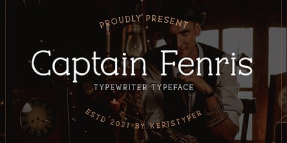 Captain Fenris is a custom handmade/handwritten Serif typeface with a simple and casual personality. This font is good for logo design, Social media, Movie Titles, Books Titles, short text even long text letters, and good for your secondary text font with sans or serif. Featured: OTF Standard Uppercase & Lowercase Numeral & Punctuation Multilingual : ä ö ü Ä Ö Ü ß ¿ ¡ Alternate & Ligature PUA encoded We recommend programs that support the OpenType feature and the Glyphs panel such as Adobe applications or Corel Draw. so you can use all the variations of the glyphs. Hope you enjoy our fonts!
 - Cristal Bendilar by Gian Studio,
$18.00 About Product Cristal Bendilar, Display Typography with Variable Weight and Width. Cristal Bendilar is an elegant modern variable font. It's basically Sans with a touch of serif to each letter. A Simplicity yet very legible with various widths and weights that you can explore, combine, create and help you design things. Font Styles on OTF files or even more if you use Single File Variables, you can shift weight and width in the sweetest places in Cristal Bendilar. What you get: Language Support: English, French, German, Indonesia, Ireland, Italy, Low German, Norwegian, Portuguese, Swedish, Swiss German. Thank You.
 - Gosford by Factory738,
$15.00 Gosford is a luxury and elegant serif font. It teases your eyes with its curves yet still able to maintain its classy composure. The variety of weights provide a range of choices that will help you find the best typographic colour. The available stylistic Ligature and Alternate offer a perfect font for anything your creativity takes you. 5 Weights (Light, Regular, Semibold, Bold, Black) Basic Latin A-Z and a-z Numerals & Punctuation Stylistic Alternates & Ligatures Multilingual Support for ä ö ü Ä Ö Ü ... OTF file format Free updates and feature additions Thanks for looking, and I hope you enjoy it.
 - Flanela by Gatype,
$12.00 Flanela is my new elegant serif font that will give your projects a touch of luxury and style. It's perfect for logotypes, branding, monograms and wedding invitations, blog headlines, and more. Browse through all the previews and get as inspired as I was when creating this font. What do you get? - Flanella (OTF,) -Uppercase Letters, Numbers, Punctuation & Symbols. Multilingual Support Important information: To access the alternatives, you must have access to an older version of Photoshop to copy/paste the glyphs from the included PSD, OR the Glyphs Panel, which can be found in Photoshop CC or any Version of Adobe Illustrator.
 - Lilatia by Zaki Creative,
$10.00 Please welcome Lilatia. Lilatia is a display serif font. Lilatia is specially designed to make your typography design result looks more beautiful with tons of alternates and ligatures characters. Lilatia is versatile font for many different projects such as logo, branding, poster, magazines, labels, merchandise, invitation, presentation, advertising, quotes and so much more! FEATURES: TTF File Playfull to use (with ligatures and alternates options) Multilingual support PUA Encoded If you need support or more information about this item, please kindly contact me : zakicreative6@gmail.com Thank you so much.. I really hope you enjoy when using it!
 - Ivoor by Cloveron Media,
$18.00 Meet Ivoor, a new sans serif typeface of the 21st century. It has distinct letter accents and comes with beautiful ligatures. It's a very versatile font that works as standalone or paired with other fonts. It is a great design choice for branding, logo, labels, packaging, magazine headers & so much more. Features: Weights - Regular & Bold Lowercase & Uppercase Classy Ligatures Numerals & Punctuation Multilingual Characters In .otf file Language Support: Western Europe Follow my shop for upcoming updates and new products that you might be interested in next time. Please message me for any suggestions and support. I would like to hear it. Thank you!
 - Phosphate Pro by Red Rooster Collection,
$60.00 Phosphate Pro is an all-caps sans serif font family with an inline weight, and was created by Steve Jackaman (ITF) and Ashley Muir in 2010. The original Phosphate was published by International TypeFounders, and the family was based on the ‘Phosphor’ typeface created by Jakob Erbar for Ludwig and Mayer, circa 1922-30. Jackaman created a condensed variant, 'Phosphate Condensed Pro,' in 2017. Phosphate Pro has incredible presence, and its power shines in display format. Apple, who is notoriously selective about their software choices, included Phosphate Pro in the system fonts for Apple’s OS X 10.10 Yosemite.
 - Hearth Stone by Mightype,
$15.00 Hearth Stone Script is a modern calligraphy font with the current handwriting style, this font is perfect for branding, wedding invites, magazines, mugs, business cards, quotes, posters, and more, you can try first if you want to buy this font. Hearth Stone Script is equipped with 309 glyphs. With so many glyphs, you can choose the letters according to your liking. There are many variations and options for each letter, so you can customize based on your design needs. This font contains: Hearth Stone Script OTF If you have any question, do not hesitate to contact me by email: mightype89@gmail.com
 - Darkness of the Night by Letterara,
$10.00 Darkness of the Night is a modern style sans serif brush font. What’s included: 1. Darkness of the night TTF 2. Style in this font include: Regular & Italic 3. Works both on Mac & PC 4. Simple installations 5. Accessible in the Adobe Illustrator, Adobe Photoshop, Adobe InDesign, CorelDraw, even work on Microsoft Word. 6. Support multilingual; ä ö ü Ä Ö Ü ß ¿ ¡ To access the alternate glyphs, you need a program that supports OpenType features such as Adobe Illustrator CS, Adobe Photoshop CC, Adobe Indesign and CorelDraw. More information about how to access alternate glyphs, check out this link
 - Elongated Roman by Red Rooster Collection,
$45.00 Elongated Roman is a Didone-style serif typeface. It was originally designed in 1950 by typographers at Stephenson Blake. After International TypeFounders, Inc. acquired exclusive licensing rights to the Stephenson Blake Collection, Steve Jackaman (ITF) digitally revived the typeface in 1997 for the Red Rooster Collection. Much like other Didone typefaces, Elongated Roman’s strong contrast between thick and thin strokes and hairline serif design strengthen its elegance as a “modern face.” Unlike other Didone typefaces in the Red Rooster Collection, Elongated Roman was designed with display size in mind thanks to its strong variance in stroke weight.
 - Keyboard by Red Rooster Collection,
$45.00 Keyboard is a condensed and elongated Egyptian font family with thin serifs and a large x-height. Its original design was created in 1951 by Stephenson Blake. International TypeFounders, Inc. gained exclusive licensing rights to the Stephenson Blake Collection, and then Paul Hickson (P&P Hickson) and Steve Jackaman (ITF) created its digital form in 1994. Keyboard excels in display and subhead sizes, and brings a formal feel to any project. Its condensed nature gives it great visual density in the bolder weights, and the lighter weights allow it to retain legibility at both small and massive sizes.
 - Valorica by Keristyper Studio,
$14.00 Valorica is a modern design with a vintage feel. A monoline display font that combines classic & modern styles. This font is good for logo design, Social media, Movie Titles, Books Titles, short text even long text letters, and good for your secondary text font with sans or serif. Featured: OTF Standard Uppercase & Lowercase Numeral & Punctuation Multilingual : ä ö ü Ä Ö Ü ß ¿ ¡ Alternate & Ligature PUA encoded We recommend programs that support the OpenType feature and the Glyphs panel such as Adobe applications or Corel Draw. so you can use all the variations of the glyphs. Hope you enjoy our fonts!
 - Ozzi Modo NF by Nick's Fonts,
$10.00This double-wide wonder is based on Oswald Cooper’s original drawings for the typeface Cooper Fullface. ATF rejected this offering because they felt that several of the letterforms, and particularly the numbers, were a little too wacky for the mainstream. By now, you know that such an accusation is a "Please don't throw me in the briar patch" plea to yours truly. So, here, proudly and true to their designer’s original intent, are two versions of a really fun font. Both versions of this font include the complete Unicode 1252 Latin and Unicode 1250 Central European character sets. - Gold Rush by FontMesa,
$25.00This old classic font has an interesting history, it was originally cut with lowercase by the Bruce Type Foundry in 1865 and listed as Ornamented No. 1514. Around 1903 the Bruce foundry was bought by ATF, in 1933 this font was revived by ATF as Caps only and was given the Gold Rush name but was sometimes called Klondike. A similar version of this font with lowercase and radiused serifs was produced by the James Conner's Sons Type Foundry around 1888. In the past other foundries such as the Carroll foundry, Type Founders of Phoenix and the Los Angeles Type Foundry have produced an all caps version of this font. After examining several printed sources of this font from more recent books I found that the original from Bruce's 1882 book was by far the best in design quality, it was also the only printed source that included the lowercase. New open faced, ornamented and distressed versions have been added to this old classic font, there are also many extended characters for Western, Central and Eastern European countries. The Gold Rush Trail OpenType version has alternate double letter pairs included in the font and will automatically be substituted when used in Adobe CS products or other software that takes advantage of OpenType features. Also available is a spurred version of this font listed under the name Gold Spur. - ThreeDee by URW Type Foundry,
$99.99The idea for this completely new font design with overlapping characters came when Axel Stoltenberg, longtime IKARUS program developer at URW + +, visited a restaurant. As it can be seen quite often , the daily specials were offered handwritten with chalk on a blackboard applying a writing technique never been available before for digital fonts: each character is partly covered by its predecessor creating a three-dimensional effect. The implementation of this unusual notation for digital setting required a lot of programming and testing until all necessary character variants were produced and set properly always using the correct form. In order to achieve this, the OpenType Pro font ThreeDee contains about 12,400 characters and all the necessary OpenType features (GSUB ) for the automatic setting in OTF savvy application programs. The slightly playful basic design for ThreeDee was created by Anna Stoltenberg , the daughter of Axel, specially devised for the innovative representation and support of its special nature. The shadow generated with IKARUS even intensifies the 3D effect. As is well-known, making use of the embedded OTF features, i.e. the automatic access to all the 12,400 character variants , a corresponding text / layout program ( InDesign, Quark Xpress, current Open / LibreOffice or MS Word etc. ) is required. ThreeDee is a headline font that will unveil all its charisma and exceptional quality at appropriate, larger sizes. - Mersin by Hurufatfont,
$29.00 Mersin is a modern sans serif font family. The asymmetrical structure of the beginning and ending shapes of letters such as "Cc, Ss" is its most distinguishing feature. Mersin has a total of 20 fonts, includings 10 weights and their appropriate italics. With its 2-axis (Weight & Italic) Variable Version, Mersin offers the advantage of using a very rich weight between 100-900. It includes detailed ligatures such as "Th, Tl, Ti, Tä, Tä, Tü, Tö, iï, fä, fä, fö fü" for very wide and different accents. “Mersin Book” and “Mersin Book Italic” are specially designed for body texts and small fonts usages. Ideal for corporate identity, posters, brochures, guidance signages and all other kinds of graphic design works.
 - Blackhaus by Canada Type,
$25.00Almost a half of a millennium after being mistaken for the original 4th century Gothic alphabet and falsely labeled "barbaric" by the European Renaissance, the blackletter alphabet was still flourishing exclusively in early 20th century Germany, not only as an ode to Gutenberg and the country's rich printing history, but also as a continuous evolution, taking on new shapes and textures influenced by almost every other form of alphabet available. Blackletter would continue to go strong in Germany until just before the second World War, when it died a political death at the height of its hybridization. For almost 50 years after the war, blackletter was very rarely used in a prominent manner, but it continued to be seen sparely in a variety of settings, almost as a subliminal reminder of western civilization's first printed letters; on certificates and official documents of all kinds, religious publications, holiday cards and posters, to name a few. In the early 21st century, blackletter type has been appearing sporadically on visible media, but as of late 2005, it is not known how long the renewed interest will last, or even whether or not it will catch on at all. The last few years before World War II were arguably the most fascinating and creative in modern blackletter design. During those years, and as demonstrated with the grid-based Leather font, the geometric sans serif was influencing the blackletter forms, taking them away from their previous Jugendstil (Art Nouveau) hybridizations. Blackhaus is a digitization and elaborate expansion of a typeface called Kursachsen Auszeichnung, designed in 1937 by Peterpaul Weiss for the Schriftguss foundry in Dresden. This is one of very few designs from that time attempting to infuse more Bauhaus than Jugendstil into the Blackletter forms. This is why we used a concatenation of the words blackletter and Bauhaus to name this face. The result of injecting Bauhaus elements into blackletter turned out to be a typeface that is very legible and usable in modern settings, while at the same time harking back to the historical forms of early printing. The original 1937 design was just one typeface of basic letters and numbers. After digitizing and expanding it, we developed a lighter version, then added a few alternates to both weights. The Rough style came as a mechanically-grunged afterthought, due to current user demand for such treatment. Having the flexibility of 2 weights and many alternates of a blackletter typeface is not a very common find in digital fonts. More specifically, having the flexibility of 2 weights and alternates of a 20th century blackletter typeface is almost unheard of in digital fonts. So the Blackhaus family can be quite useful and versatile in an imaginative designer's hands. - Zoelander by Locomotype,
$15.00 Zoelander is an experimental geometric font. The distinctive feature of this font is having an irregular x-height. This will look unusual, but if you are looking for something unique and looks different, Zoelander can be an alternative to making an attractive typography. Zoelander comes in two versions, Zoelander Regular and Zoelander TF. Each has a bold and rounded style. Zoelander Regular is a sans serif font with irregular x-height but if you want the same x-height size, the stylistic alternates feature allows you to do it. While Zoelander TF is the development of a regular version where each letter is connected in a line at the baseline. Some of the other opentype features make it easier for you to explore more interesting typographic designs.
 - ENYO Serif Light - Personal use only

- Aracne Regular - Personal use only

- Sticky Shoes by Bogstav,
$15.00 Sticky Shoes was inspired by a sign at a local flea market. The artist behind the sign obviously didn’t care much about painting the letters “in the right way” - leaving a slobby and uneven impression. And what is wrong with that? Nothing, if you ask me. I tried my best to capture the charm and innocence behind that sign in Sticky Shoes. I even made the paint version go outside the outline in the Regular version! I added 6 different versions of each letter, and they automatically changes as you type. That goes for all 4 versions, and they even mix very nicely!
 - Rosmerta by Reyrey Blue Std,
$18.00 Introducing, Rosmerta Typeface. It's elegant, classy, and a little vintage look. Rosmerta Typeface has a few stylistic alternatives and ligatures so that you can mix and match your best combination. Rosmerta Typeface is perfectly suitable for a layout design for quotes or body copy, best used as a display for headings, logos, branding, magazines, product packaging, invitations: logotypes, and much more. Don't wait to add this font to your collection and explore the uniqueness of this typeface! Features : All Uppercase and Lowercase Number & Symbol Supported Languages Ligatures Stylistic Alternate PUA Encoded Hope you enjoy our font!
 - K haus 105 by Talbot Type,
$19.50 K-haus 105 is inspired by the work of graphic designer and typographer, Herbert Bayer, during his time at the Bauhaus around 100 years ago — work that kick-started graphic design as we know it, to this day. It owes something to the simple geometry of Bayer’s hand-drawn, ‘universal typeface’, updated and expanded to deliver a clean, balanced, geometric sans for today. Also available as K-haus 205 , featuring a few, more 'daring' characters here and there, chiefly in the lower case set. Both variations include an extended character set, featuring accented characters for Central European languages.
 - Night Sign JNL by Jeff Levine,
$29.00 For decades, the soft glow of a neon sign beckoned weary travelers to roadside rest courts, told the hungry individual where to eat; let enthusiastic revelers know where the night life was happening. There is something special about a neon sign, yet changing times, city ordinances and even technology itself is turning this staple of urban life for over a hundred years into a museum piece. Night Sign JNL emulates the craft of hand-formed neon signage and it (along with a few added special effects) can really add some good-old-fashioned pizzazz to a print or web project.
 - Clumsy by Gaslight,
$15.00 Clumsy is a two weight all caps handcrafted awkward font with alternates for all characters and digits. The font was inspired by a few lines of text from an old soviet book about vine. Clumsy is a good choice for small amounts of text. When Clumsy is used in OpenType applications, its Contextual Alternates feature produce a striking random-like effect on glyphs distribution, achieved by cycling through alternates. When not using the Contextual Alternates feature, you can still pick the alternates in the Glyphs palette or use the alternates available from the keyboard upper and lower case.
 - Durango Western by Sharkshock,
$100.00 This all caps display font is defined by its close spacing and thick serifs for a distinct appearance. Inspiration came from old movies set in the Wild West. The characters are tall in stature so works well in spots with limited space. Use Durango Western for a wanted poster, social media, or team logo. Basic/Extended Latin, European accents, punctuation, diacritics, kerning, and Cyrillic characters are included. The eroded version features varying levels of distress between the uppercase/lowercase and contains a few alternates. NOTE: Due to the level of detail in the eroded version temporary computer slowdown may occur.
 - Modulario by K-Type,
$20.00 Modulario is a geometric sans with some disturbingly individual features. A few capitals owe a bit too much to Roman proportions. The circular O serves to distinguish it from the zero, and the luxuriously wide W and M are both pointed in the middle, although alternatives to the more contentious letters are available within the font. The lowercase shows a little more handwriting influence than is customary – we are used to seeing a writing-style curve at the base of the l, Modulario extends the influence to the i and a, and also sports a uniquely scripty s.
 - Taro by Dharma Type,
$19.99 Taro Why do designers make more and more geometric fonts? There are already many geometric sans in the world. Because It is a natural flow of design. It is true that we like geometric type instinctively. Taro was designed to archive a good balance between the following three things geometrically. 1. To be Natural, Flowing, Organic. 2. To be Neutral, Unbiased, Universal. 3. To be legible, distinguishable, readable. Consists of eight weights and their matching italics. Supporting almost all latin languages. All-caps text for one line or a few is as wonderful as normal mixed-case typesetting.
 - DEADman by Volcano Type,
$29.00The font family "DEADman" is mostly inspired by the weird style of the British illustrator Ralph Steadman. He had a long partnership with the American journalist Hunter S. Thompson, drawing pictures for several of his articles and books e.g. "Fear and Loathing in Las Vegas." Like Steadman's artwork all the letters are painted with ink. The best ones were selected out of hundreds of variations to get the whole character set complete and look uniform. By combining the regular weight with one (or both) of the additional weights "Blotting" and "Squirting" you can achieve a more freaky and psychadelic look. - Sushi Bar by Hanoded,
$20.00 Since I am still in a Japanese mood, I decided to name this font after my favourite pastime in Japan: hunting for the smallest, nicest sushi bar in town. After all, there’s just nothing like eating freshly made sushi and washing it all down with a cup of green tea or a warm sake. Sushi Bar is a very detailed brush font - all caps, but upper and lower case differ and can be mixed. It is an ideal font for posters, albums, headlines and book covers. Comes with a bento box full of diacritics as well!
 - Torio by DSType,
$55.00 Our main purpose while developing this typeface was to reconstruct, in the most precise way, the first ten plates of the “Arte de Escribir”, in a chapter named “Enseñanza de la letra italiana, y sus principales variaciones, autores, sistemas, &c.”, dedicated to the analysis of the Italian Script. We decided by this plates because those are the few that don’t refer, directly or indirectly, to any author in particular. We strongly believe that these plates reflect the freedom of his very own calligraphy and are closely related to the calligraphic style that was a success among the spanish calligraphers: the Spanish Bastarda.

