10,000 search results
(0.056 seconds)
- FF Kievit Serif by FontFont,
$68.99 FF Kievit Serif subtlety melds oldstyle design traits and a 21st century mien into a clean, straightforward suite of typefaces. As part of the FF Kievit super family it helps brands carry their voices effectively and legibly. This includes small text to display sizes, in both print and digital environments, for internal and external audiences. FF Kievit takes inspiration from classic designs like Garamond and Granjon, and is available in seven weights, plus italics. Drawn as a collaboration between Michael Abbink, Paul van der Laan, FF Kievit Serif is a natural extension to the other members of the FF Kievit super family, that also includes FF Kievit and FF Kievit Slab. FF Kievit Serif stands on its own as a multi-talented and exceptionally legible design. Large counters, a generous x-height and ample apertures ensure that FF Kievit Serif translates well to both hardcopy and interactive environments. FF Kievit Serif is available in carefully defined weights, ranging from Light to Black. The Regular, Book and Bold weights are ideally suited to long form text copy. Ligatures, several suites of numbers and small caps are also available. In addition, FF Kievit Serif benefits from the same extensive language support of the other designs in the family.
 - Motorway by K-Type,
$20.00 MOTORWAY is the companion typeface to TRANSPORT, the British road sign lettering. The Motorway alphabet was created for the route numbers on motorway signage, and is taller and narrower than the accompanying place names and distances which are printed in Transport. However, for Motorway Jock Kinneir and Margaret Calvert created only the numbers 0 to 9, the capitals A, B, E, M, N, S and W, ampersand, slash, parentheses and a comma. So, although the lettering made its first appearance on the Preston bypass in 1958, K-Type Motorway is the first complete typeface and contains all upper and lower case letters, plus a full complement of punctuation, symbols and Latin Extended-A accented characters. As with the Transport alphabet the starting point was Akzidenz Grotesk, Motorway taking inspiration from condensed versions. Changes were mainly driven by a quest for legibility, resulting in some reduced contrast between horizontal and vertical strokes, and Gill-esque straight diagonal limbs on the 6 and 9, and high vertex for the M. Kinneir and Calvert designed the limited range of characters in two weights; a SemiBold 'Permanent' weight for use as white letters on blue motorway signs, and a Bold 'Temporary' weight for heavier black letters on yellow non-permanent signage. In addition to creating full fonts in both original weights, the K-Type family adds a new Regular weight, plus a set of italics, completing a highly usable condensed typeface which, while rooted in history, is fully functional for both print and web usage. The K-Type fonts are spaced and kerned normally, simply increase the tracking to recapture the generous spacing of motorway signage.
 - Vershen by Page Studio Graphics,
$25.00A calligraphic roman sans-serif, with large x-height, the Vershen font is available in four weights, plus a series with small capitals and old-style figures, also in four weights, and finally, a four-weight set of universal fraction generators. The fonts are thoroughly pair-kerned, including all accented characters and letter pairs not commonly found in English, but frequent in other western European languages. Each font package includes both TrueType and PostScript versions, and is avialable in either PC/Win or Macintosh format. Numerals and currency symbols in the standard font set are monospaced for orderly columns; but a narrower numeral '1' is also provided, along with an alternate lowercase 'g' and ampersand. - Quadon by René Bieder,
$25.00 Quadon was designed to fill the gap between traditional serifs and the lasting trend of using sans serif fonts for contemporary design. The result is a modern, clear and infinitely flexible interpretation of slab serif fonts. The open shapes and a large x-height keep the font legible in small sizes while the short descender supports the compact heart and strength of a slab serif. Quadon has a wide range of typographic features and alternative glyphs to create your own and unique version of it. It comes in nine different weights with matching italics. From the sensitive but sharp thinner weights to the punchy and powerful heavy weights, Quadon is well-suited for a wide range of versatile tasks.
 - Ares by Adam Jagosz,
$15.00 Ares is a crisp all-caps display typeface suitable for sci-fi logos and titles. It owes its peculiar futuristic vibe to angular, top-heavy letters that hang from the cap-height instead of sitting on the baseline. The typeface consists of six subfamilies available in 10 weights, as well as as two variable fonts of three axes: Weight [wght], ranging from 1 to 1000, Mid-height [MHGT], ranginf from 0 to 1000, Tracking [TRAK], ranging from 0 to -40. The mid-height axis affects the typeface's waistline, including crossbars, and divides the fonts into three subfamilies: Ares Lo, Ares, and Ares Hi. These three families are solid-stroked, and the other three families are their stencil-stylized counterparts: Ares Broken Hi, Ares Broken, and Ares Broken Lo. The tracking axis is only available in the variable versions, and proportionally affects the kerning, thus helping set the type more tightly without effort. Ares supports a wide range of Latin-based orthographies, including not only European, but also Vietnamese as well as major African languages like Hausa, Fula or Ewe.
 - Ravensara Sans by NaumType,
$19.00 Ravensara Sans — fashionable, high-contrast humanist sans. Ravensara family was born from the idea of taking the concept of Didone to weight extremes. Ravensara Sans is available in 7 weights, including Thin, Light, Regular, Medium, SemiBold, Bold and Black. Depending on weight, Ravensara Sans, like the other members of this font family, show quite different behavior. Heavy weights function above all as display fonts and work particularly great in all-caps. Medium weights of Ravensara Sans represent humanist grotesque, descended from the pages of fashion magazines. Thin weight perfectly complements the others if you need an especially wide choice of weights. Also, all the weights work great in all-caps. Ravensara Sans is a part of the Ravensara superfamily, united by the same anatomy, which currently also includes Ravensara Serif and Ravensara Stencil. If you need to achieve classic Haute Couture look — Ravensara Sans is a great choice. It’s a perfect choice for fashion logos, headlines, short texts, magazines, due to its simplicity looks great in oversize typography, branding, identity, website design, album art, covers, posters, advertising, etc. Ravensara Sans extends multilingual support to Basic Latin, Western European, Euro, Catalan, Baltic, Turkish, Central European, Pan African Latin and Afrikaans.
 - FS Truman by Fontsmith,
$80.00 Beyond broadcast Like Truman Burbank, the star of The Truman Show, FS Truman was born for TV. You’ll know it from Sky One’s on-screen trails and announcements, but it’s just as at home in other media. Its starting point was the skeleton of a highly legible, space-saving, corporate font with some of FS Dillon’s geometric discipline built in. Its distinctive tone of voice and “ownability” are in its boxy but friendly shapes, and characters with hybrid features. FS Truman’s weights and widths were honed to work at TV screen resolutions. A face for TV it may have been, but this is a font that works on every level, on screen, in print, in headlines, in listings, in longer text, in tight corners and open spaces. The space-saver Compact, condensed but crystal clear, FS Truman comes into its own where a lot needs to be said in not a lot of space. Its letter spacing allows the type room to breathe, even at small sizes, while its fulsome x-height and diminutive descenders pave the way for tighter leading. A natural for headlines and titles over three or four lines. “Hybrid” features With every font, Fontsmith look for crafty new ways to imbue letterforms with a consistent character. The idea with FS Truman was to introduce “hybrid” features. In open letters such as “c” and “s”, for example, the top terminals have straight, vertical cuts while their lower terminals have a more angular, cursive finish. Boxy, spacious forms with unusual curves and angles create not just highly legible and efficient letters but strongly distinctive ones, too.
 - Arrow Hero by Alit Design,
$21.00 Introducing "Arrow Hero" - A Typeface of Elegance and Adventure Unleash the power of elegance and adventure with our latest font creation, "Arrow Hero." This unique serif font seamlessly blends the mystique of archers, the allure of elves, and the boldness of superheroes. Crafted with precision, this font is more than just letters; it's a journey into a world where every curve and angle tells a story of heroic feats and enchanted realms. Key Features: Elegant Serif Design: The Arrow Hero font boasts a sophisticated serif style that adds a touch of refinement to your projects. Each letter is meticulously crafted to exude an aura of strength and grace, perfectly suited for a variety of design applications. Illustrated Elements: Dive into the fantastical with Arrow Hero's unique illustrations. Arrows gracefully adorn each character, symbolizing precision and direction. Delicate elf ears and majestic wings enhance the overall aesthetic, creating a harmonious balance between the worlds of archers, elves, and superheroes. Versatile Usage: Whether you're working on branding, book covers, invitations, or digital designs, Arrow Hero is a versatile font that adapts to various contexts. Elevate your projects with a touch of magic and heroism that this font effortlessly provides. Tailored for Storytelling: Arrow Hero is not just a font; it's a storyteller. Use it to bring narratives to life, creating visual experiences that resonate with the mythical and the extraordinary. Let the characters on your screen or page become heroes in their own right, guided by the elegance of Arrow Hero. Multiple Styles: The font comes in various styles and weights, allowing you to express different moods and atmospheres within your designs. Whether you're aiming for a bold statement or a subtle enchantment, Arrow Hero has the right style for you. Elevate your design projects to new heights with Arrow Hero, where the elegance of serif meets the magic of arrows, wings, and elf ears. Download this font today and embark on a design journey that transcends the ordinary, celebrating the hero within every letter.
 - Clementine by Okaycat,
$24.50Clementine, from Okaycat, is a font designed to be expressive. First, we wanted Clementine to be uplifting, friendly and warm. Secondly, we wanted it to be familiar, but neither staid nor boring. To make Clementine more warm and friendly, 90 degree corners and cubic forms were not allowed. All straight edges are either subtly curved or lightly tapered (with the small exception of the serif foundations, to create a secure base). To add an uplifting feel, all tapering flows towards the apex of the forms and the ascenders were allowed extra rising freedom above the capital height, similar to the effect intended in the architecture of old European churches -- to point all elements gently upwards towards heaven. To keep Clementine familiar, traditional type setting shapes were used throughout the font. To avoid the usual coldness of typical typewritten fonts, all forms were opened up, calligraphic touches were introduced, and any unnecessary serif elements were omitted. The result is a look that brings a touch of nostalgia or a "retro" feel. Clementine is highly appropriate anywhere a soft and friendly feel is desired. Can work well as a body text, or as ad copy. Clementine is extended, containing the full West European diacritics & a full set of ligatures, making it suitable for multilingual environments & publications. - Monolight by Mostardesign,
$25.00 The Monolight font family is a modern and versatile creation that perfectly blends roundness and simplicity to give your designs a modern and elegant look. With its low-contrast characteristics, this font family can be used for a wide variety of communication projects, ranging from advertising posters to institutional communication media, to professional presentations. In addition to its aesthetic design, Monolight offers advanced technical features, including a set of stylistic variants that allow you to explore different options for customizing letter style. This font is also case sensitive, meaning uppercase and lowercase letters are designed to work harmoniously together. Furthermore, Monolight comes equipped with a complete set of old-style and tabular numerals, providing great precision in tables and professional documents. This feature is particularly useful for professionals in marketing, finance, and accounting who seek to give their tables a professional and well-organized appearance. Finally, the Monolight font is available in 9 weights ranging from Thin to Heavy with corresponding italics, allowing designers to play with contrasts and typographic effects to give their creations a unique and personalized look. With its advanced features and elegant design, the Monolight font is the perfect tool for communication and design professionals looking to create modern and professional projects that stand out from the competition.
 - Mayberry by Ascender,
$92.99The Mayberry® is an extensive family of 14 OpenType fonts. Mayberry was initially designed by Steve Matteson to emulate the technical behavior of a font family called Tiresias™ for use in set top TV devices and user interfaces. Mayberry is a significant improvement in aesthetics and functionality over Tiresias. Mayberry includes true italics and a wide range of weights to provide the highest quality and readability on low resolution devices, while also featuring a range of OpenType features that will appeal to creative professionals. Mayberry is a slightly condensed humanist sans serif which allows for more readable text in a narrower column. Open counters and upright stress help keep the design of Mayberry readable at low resolutions. A significant amount of care has been given to design subtleties allowing the design to function well at large sizes. The Mayberry character set supports Cyrillic, Greek, Central and Eastern European, Turkish and Baltic, Mayberry also includes a slashed zero for use where absolute distinction between 'O' and zero is a concern. Also included are typographic features such as old-style figures, fractions, superior and inferior numbers for use with applications that provide advanced OpenType typographic support. A set of closed captioning symbols and arrows add to the font's versatility in interface design. - Ahmed by Linotype,
$187.99Ahmed is a modern Arabic headline face, first produced by Linotype-Hell Ltd. in the early 1980s. Originally developed as a simplified face, its design recalls the inscriptional and decorative tile work lettering of the medieval period. The strong treatment of the tails of certain characters departs from the more traditional style of tapering these finials, introducing a modern feel to the design. The contrasting proportions of the tall vertical strokes and the rather elongated counters lend a monumental look to Ahmed, allowing its effective use in titling. During the later 1980s Ahmed was developed into a traditional typeface, with the introduction of medial forms to improve character spacing and balance. Recently, Ahmed has been converted into the OpenType font format, ensuring its continued popularity as a heading face for newspaper typesetting. The Ahmed typeface contains two weights, Ahmed and Ahmed Outline. Both of the OpenType fonts include Latin glyphs from Clearface Gothic Roman inside the font files, allowing a single font to set text in both most Western European and Arabic languages. The two Ahmed fonts include the Basic Latin character set and the Arabic character set, which supports Arabic, Persian, and Urdu. They include tabular and proportional Arabic, Persian, and Urdu numerals, as well as a set of tabular European (Latin) numerals. - Zin Slab by CarnokyType,
$46.00 Zin Slab is a contemporary slab-serif typeface designed for various situations of typographic usage. Characteristic feature is a large x-height and balans between neutral construction of letters (strictly vertical axis) and dynamic open forms (opened terminals). Another typical feature is a visually narrower connection between stems and strokes. The complete font family consist of three width proportions (Normal, Condensed and Extended). Every sub-family has 5 weights, ranging from Light to Black with matching Italics. Each font includes small capitals, old-style and tabular figures, standard and discretionary ligatures, alternate glyphs and a many of typographic options applied by the Opentype features. Zin Slab can be effectively used for both text and display typesetting. It can be used especialy in magazine layouts and editorial design, as well in advertising typography, orientation systems, corporate identities and many other situations. Zin Slab is a member of the Zin super family, which also includes Zin Sans, Zin Serif and Zin Display fonts. You can try Demo styles in Medium weight fully for free.
 - Zin Sans by CarnokyType,
$46.00 Zin Sans is a contemporary sans-serif typeface designed for various situations of typographic usage. Characteristic feature is a large x-height and balance between neutral construction of letters (strictly vertical axis) and dynamic open forms (opened terminals). Another typical feature is a visually narrower connection between stems and strokes. The complete font family consist of three width proportions (Normal, Condensed and Extended). Every sub-family has 5 weights, ranging from Light to Black with matching Italics. Each font includes small capitals, old-style and tabular figures, standard and discretionary ligatures, alternate glyphs and a many of typographic options applied by the Opentype features. Zin Sans can be effectively used for both text and display typesetting. It can be used especially in magazine layouts and editorial design, as well in advertising typography, orientation systems, corporate identities and many other situations. Zin Sans is a member of the Zin type system, which also includes Zin Slab, Zin Serif and Zin Display fonts. You can try Demo styles in Medium weight fully for free.
 - Wien Pro by Wannatype,
$36.00 Wien Pro, the sans serif by Ekke Wolf. Typeface lovers looking for a modern, well-developed sans serif font with a touch of retro and warm, individual lettering will get excited about a new addition to the font market. The more than complete Wien Pro front comes in three styles and four different weights. In addition to the upright Wien Pro there is the Wien Pro Oblique with a moderate 6° slant and the Wien Pro Superoblique with an 18° slant. Available weights are light, regular, medium, bold and black. These fonts are equipped with extended Latin alphabet for Central and Eastern Europe and also Cyrillic and Greek alphabet. The set of characters includes nine different sets of numbers, plus its own set for the small caps, as well as alternative characters and groovy ligatures. In addition, all Wien Pro styles are also available as unicase with upper case and lower case x-height alignment. The style, metrics and proportions of Wien Pro combine perfectly with the Liebelei Pro and the script fonts of the Calafati Pro.
 - PF Nuyork Arabic by Parachute,
$79.00 Nuyork Arabic was designed to emphasize on the individual Arabic letter visual traditional characteristics. Including 5 weights, it was designed with both text and display applications in mind. This font is intended to produce virtually cursive texts without eliminating the clarity or look-and-feel of the individual Arabic letters. Offering glyphs for the full Extended Arabic Unicode Standards 6.1, including the latest Arabic Supplement and Extended-A Unicode blocks, Nuyork Arabic incorporates comprehensive support for Quranic texts and other Arabetic scripts, including African sub-Saharan scripts. Careful design considerations were given to make sure that composed Arabetic text is visually prominent and stands well next to Latin. To insure legibility in all sizes, vertical strokes are emphasized when possible, while utilizing multiple x-heights to give a traditional Arabic feel. The design of this font follows the general guidelines of the Mutamathil type style developed by the designer, a decade ago, to enrich and diversify user typographic options, and to address the Arabetic scripts challenges of literacy, education, economics, and technology. Based on this style, it uses one glyph for every basic Arabic Unicode character or letter, as defined by the latest Unicode Standards, and one additional final form glyph, for each freely-connecting letter in the traditional Arabic cursive text. Nuyork Arabic includes the required Lam-Alif ligatures in addition to all vowel diacritic ligatures. Soft-vowel diacritic marks (harakat) are selectively positioned, with most of them appearing on similar high and low levels to clearly distinguish them from the letters. Tatweel, or Kashidah, is a zero-width glyph. Arabetics Latte includes both Arabic and Arabic-Indic numerals. Available in Open Type format, the Nuyork Arabic font family includes regular, light, bold, extra bold, and black.
 - Trivial - Unknown license

- Black Orchestra by 38-lineart,
$16.00 ‘Black Orchestra’ is a black letter font inspired by heavy metal. This font consists of uppercase and lowercase and is supported by ‘Latin extended’ which allows wider use of this font. This font will turn any horror project into a standout!
 - Smile Darling by Prioritype,
$19.00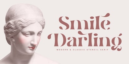 Introducing. Smile Darling: Modern and classic style that allows your project to be more beautiful to look at. Perfect for branding, social media posts, magazines, wedding invitations and more. Features: Uppercase, Lowercase, Numeral, Punctuation, Multilingual, Ligature, Alternates & PUA Encoded. Thanks.
 - Realiztix by ZetDesign,
$10.00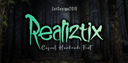 Realiztix is a playful, handmade font which is perfect for branding, clothing, logos, projects, headlines, posters and packaging. Realiztix allow unique and versatile design options and is equipped with multilingual accents, so it can be used in several Latin languages.
 - ABTS Aviator by Albatross,
$19.95 ABTS Aviator is a font inspired by the 1950s and mixed with letterforms of the Art Deco era of design. It's simple, yet stylish and modern, yet retro. A nice mix of personality and geometry allowing for a variety of applications.
 - Marquee by Pelavin Fonts,
$15.00 Marquee is a family of two fonts, containing both faceted and solid characters which can be layered to effect 3D, dimensional and translucent marquee-style typography, allowing for the creation of headlines reminiscent of classic theater and motion picture marquee signage.
 - Klip Klop by Samuelstype,
$24.00 Designed by Hans Samuelson in 2023. With two weights and many variations Klip Klop offers a large set of characters for playful lettering. The flavouring is strong avant garde and the build is strict geometrical with even stroke thickness throughout. One unusual feature is that the bottom and top horizontal strokes are centered on the baseline and capital height. This renders the same optical size between the thin and the medium but different actual heights and baselines. Use it for Headlines or signage in any medium! Klip Klop!
 - Dear Sans by Stiggy & Sands,
$24.00 The Dear Sans Collection is comprised of four widths ranging from Condensed, Regular, Expanded, and Wide; each of which are comprised of a three font family of weights: Book, Regular & Bold. Cleanly readable, with just a slight hint of silliness, the Dear Sans Collection brings adds the perfect level of lightheartedness to your designs. The Dear Sans Collection comes with: - Approx. 367 Character Glyph Set per font - including standard & punctuation, international language support, and basic “fi fl” ligatures per font. - 3 Weights per family including: Book, Regular, and Bold. - Loads of Personality for your designs.
 - Avenir by Linotype,
$42.99 In drawing the Avenir® typeface, Adrian Frutiger looked to both the past and the future for inspiration. His goal was to reinterpret the geometric sans serif designs of the early part of the 20th century in a typeface that would portend aesthetics of the 21st century. He succeeded handsomely. In doing so, Frutiger added a bit of organic humanism to the design, freeing Avenir from the rigid geometric overtones of the earlier designs. Avenir is employed on signage at Dallas Fort Worth and Hong Kong international airports. The city of Amsterdam adopted Avenir as its corporate typeface in 2003. The original Avenir family is made up of designs with gradual weight changes in order to satisfy the needs of specific text applications. While the book and light weights have similar stroke widths, the book weight is well suited for body text, whereas the light was designed for captions and subhead text. Featured in: Best Fonts for Resumes
 - HU Milksherbet KR by Heummdesign,
$25.00 This typeface was inspired by milk sherbet, which is enjoyed cold on a hot summer day. Rounded shapes and soft stroke endings make the typeface look cute. Heavy works great for headlines with its extra-heavy stroke weight and size, while Regular and Light are best for body text.
 - HU Milksherbet by Heummdesign,
$15.00 This typeface was inspired by milk sherbet, which is enjoyed cold on a hot summer day. Rounded shapes and soft stroke endings make the typeface look cute. Heavy works great for headlines with its extra-heavy stroke weight and size, while Regular and Light are best for body text.
 - Churchward Legible by BluHead Studio,
$25.00 Churchward Legible is an extensive typeface family designed by New Zealand type designer Joseph Churchward. A geometric sans serif, it is, as its name boasts, highly legible and readable on screen as well as in print. The family includes five weights from Light to Extra Bold, with companion italics.
 - Eirlys by Typomancer,
$24.00 Eirlys a Gothic serif typeface with a touch of Celtic feeling. A combination of sharp serif and smooth joint gives a sweet & smart characteristic. Font comes with 4 weights: Light, Regular, SemiBold, Bold and suitable Italic, Especially Small Caps, Swash styles and dozen of alternates for your own experiment.
 - Britva by Juraj Chrastina,
$39.00 Derived from Valibuk, Britva is designed like from broken glass for eye-catching headlines. It's a heavy, condensed face with a high x-height and tight spacing. While Valibuk can write it loud, Britva literally shouts it out even louder. The unbroken glyphs are accessible through OpenType contextual alternates.
 - Ruqia Arabic by Zaza type,
$29.00 Ruqia Arabic typeface is a modern Arabic typeface designed by Ahmed Zaza. the design is inspired by the Naskh style. The result is a hybrid that combines modern proportions with Classic Arabic scriptsit's suitable for branding, editorial, packaging, and advertising.Ruqia Arabic Features five weights from Light to Black.
 - Mafra by DSType,
$26.00 Mafra, the debut typeface by Pedro Leal, a type family suited both for editorial and corporate design, available in five weights, ranging from Light to Black with matching italics. Mafra is a contemporary typeface with plenty of style, asymmetrical and very dynamic serifs, and pleasant openness and balance.
 - Commentary JNL by Jeff Levine,
$29.00Commentary JNL is a serif treatment of Jeff Levine's popular Stylor JNL sans serif font. Offered in two weights—regular and light—Commentary is a perfect alternative to formal text fonts and has just a touch of hand-made design to make for a more casual reading experience. - FF Kurt by FontFont,
$41.99 German type designer Vivien Palloks created this display FontFont in 1998. The family contains 3 weights: Light, Regular, and Bold and is ideally suited for festive occasions. FF Kurt provides advanced typographical support with features such as ligatures and case-sensitive forms. It comes with proportional oldstyle figures.
 - Cyntho Next by Mint Type,
$35.00 Cyntho Next is a totally reworked typeface based on our previous bestseller Cyntho Pro. It also has a slab-serif counterpart - Cyntho Next Slab. Cyntho Next is a modern geometric sans based on a hybrid waterdrop-like shape with eight weights varying from Thin to Black and featuring Cyrillic.
 - Chauncy Pro by Chank,
$99.00 Chauncy Pro is a bouncy, artistic, childish handwriting font that comes in four practical weights: Regular, Italic, Bold and Bold Italic. The jaunty little font is based on the left-handed penmanship of an artist and it's ready to go play with some of your fanciful, light-hearted designs.
 - Theatrical Stencil JNL by Jeff Levine,
$29.00 A vintage hand-punched brass stencil for the Pasadena Playhouse spotted online was the basis for Theatrical Stencil JNL. Slight variations in the letter forms from other similar designs might not quickly be noticed, but there is always a charm in the hand-made look of any stenciled lettering.
 - Visage LP by LetterPerfect,
$39.00 Visage is a contemporary text family designed by Garrett Boge in 1988. Its delicate serifs, subtly tapered stems, and generous proportions offer both distinction and readability to the text at any size. The family consists of five weights - Light, Book, Medium, Bold and Black, with corresponding oblique styles.
 - Wendy LP by LetterPerfect,
$39.00 The Wendy family is a cursive script provided in three weights -- Light, Medium and Bold. The design is an upright, casual handwriting style, with natural joins and connecting strokes. Wendy, in her various modes, projects a friendly persona, adding an approachable quality to headlines and short runs of text.
 - Mafra Display by DSType,
$26.00 Mafra, the debut typeface by Pedro Leal, a type family suited both for editorial and corporate design, available in five weights, ranging from Light to Black with matching italics. Mafra is a contemporary typeface with plenty of style, asymmetrical and very dynamic serifs, and pleasent openness and balance.
